Weatherz | Design & Development
Weatherz Design
Why Weather?
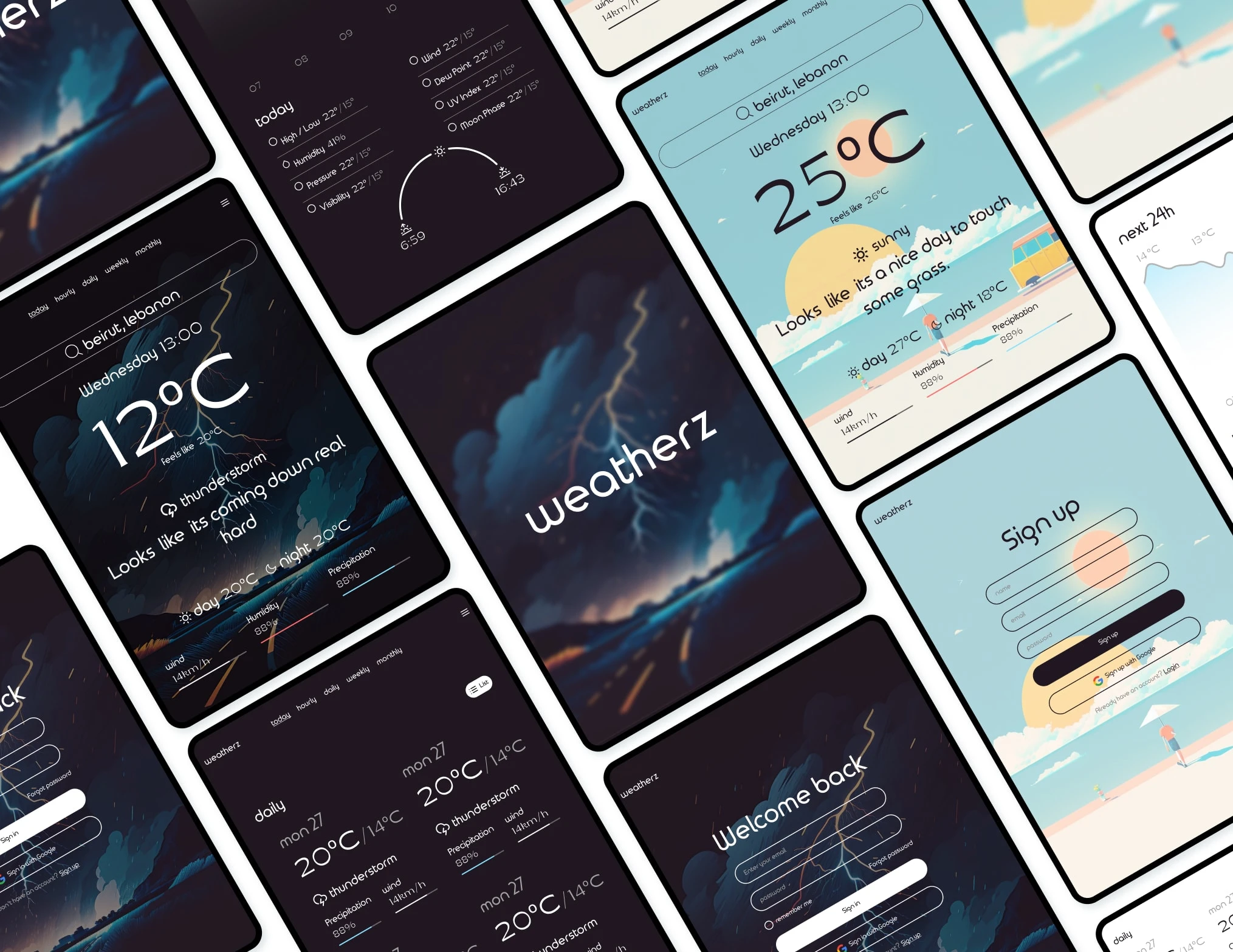
It’s simple, to learn to use the weather API. That was the mission of this website, utilizing the weather API and creating an appealing UI to match it. User Experience wasn’t the goal in this and not much research went into it, I just wanted aesthetics, but there was just a bit that went into it.
The Homework Part
As someone who’s lived in a place where weather makes or breaks a day, I’ve used weather apps for a long time, but that doesn’t make me an expert on how to design them. So I jumped in, mood boarding, researching the data to be displayed, everything there is about weather, but it was all useless in the end.
After designing the first draft I started looking into the API and I was hit with a wall, a pay wall… Obviously this is just a fun project, I have no interest in paying the huge fees that come with using said API. Luckily the free version gives you access to just a little bit of information, and all that research got thrown out the window and I focused on only the information that can be provided by the free version of the API.
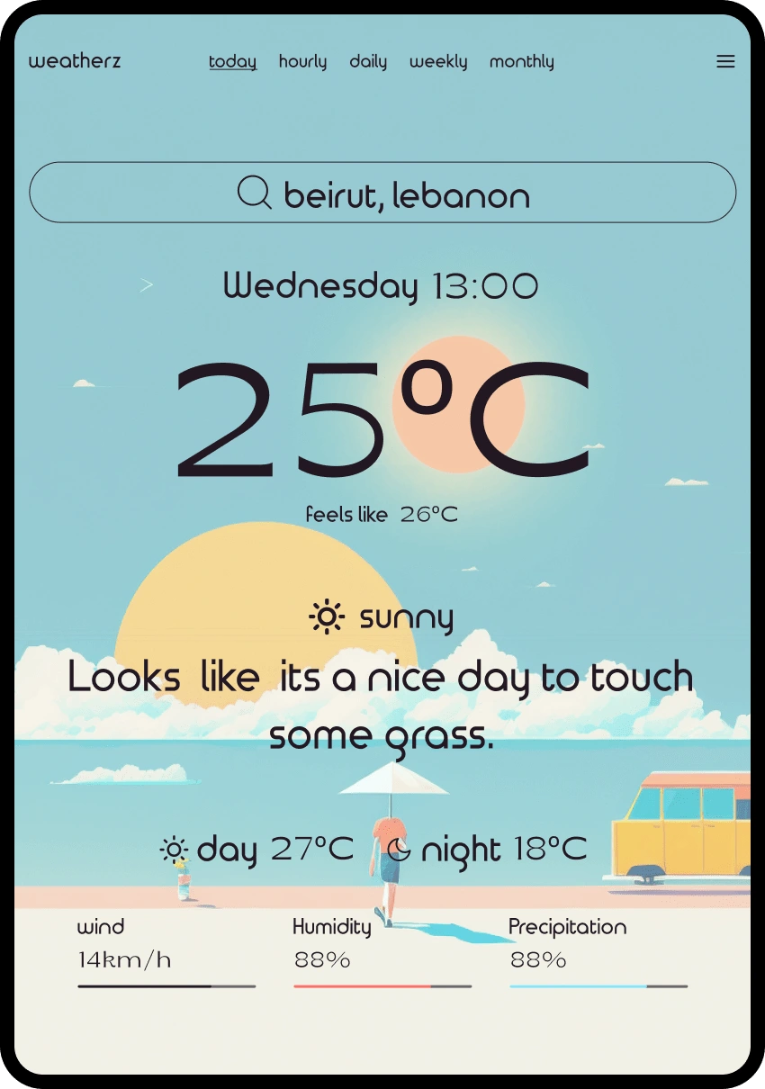
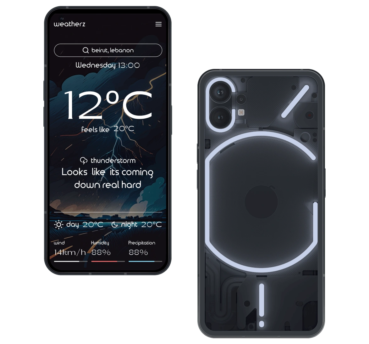
The result? A minimal, modern, and sleek weather app. We also used AI to spice things up.
Design
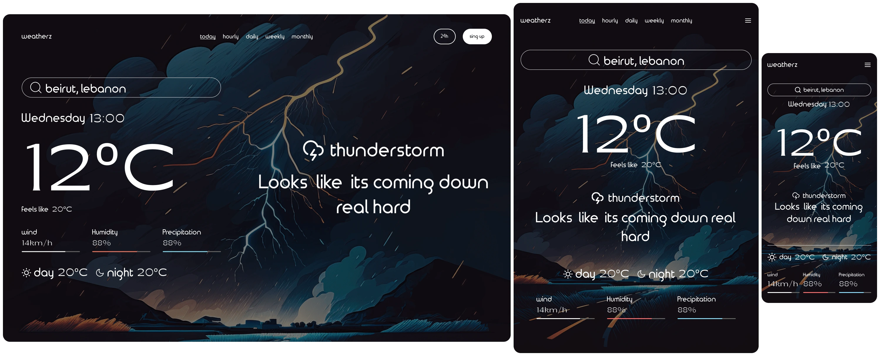
Dark Mode when the weather is in bad conditions
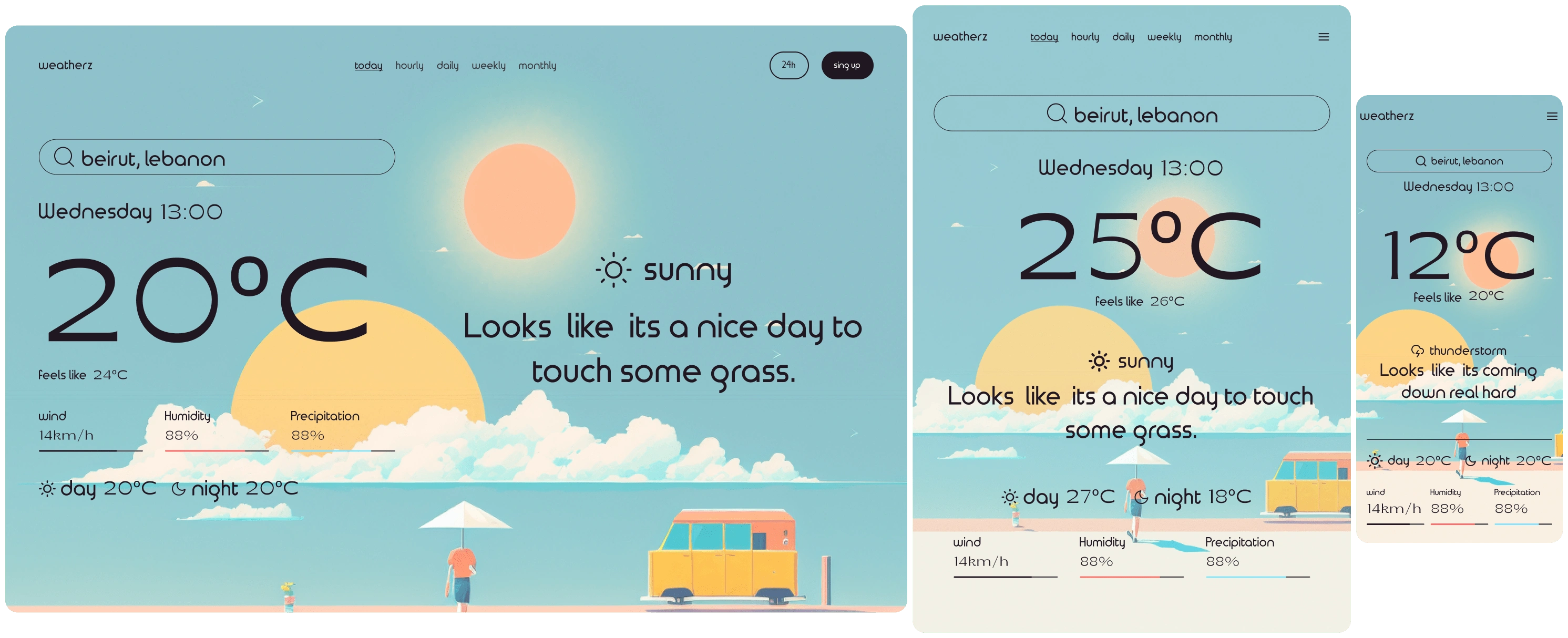
Light Mode when the weather is nice
The Theme:
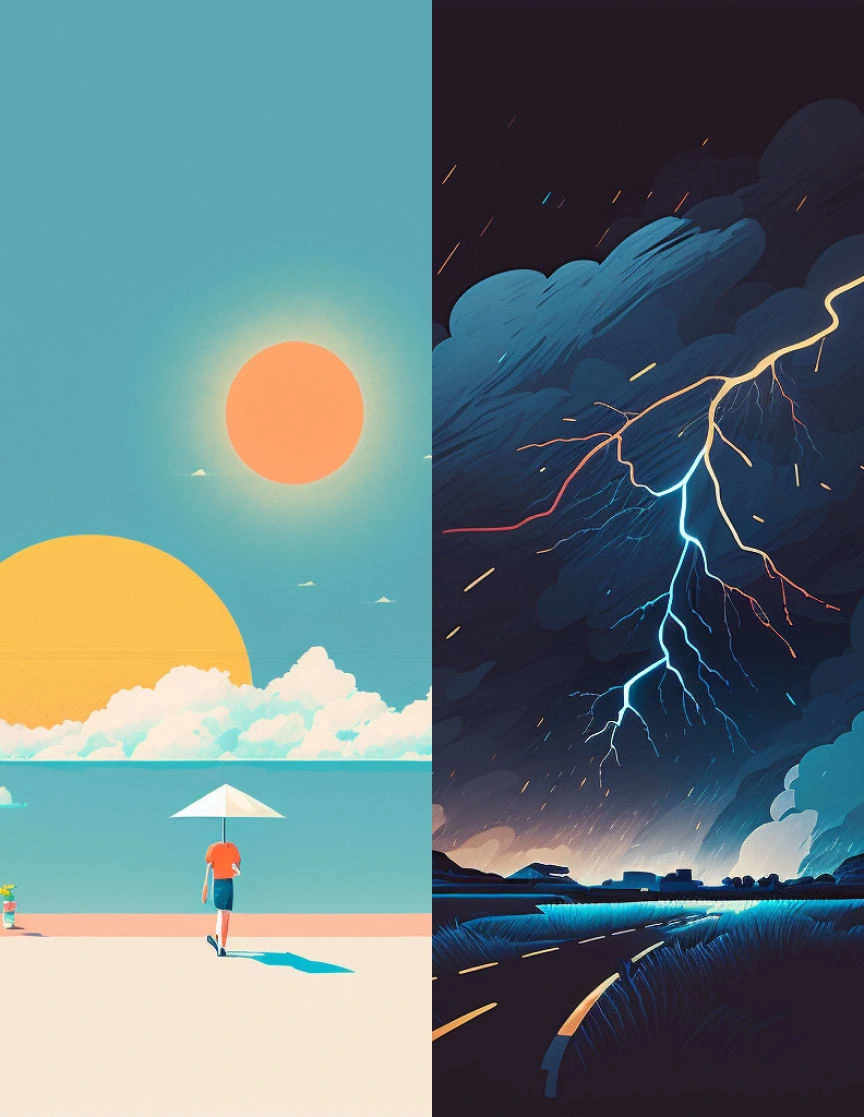
The alternating theme was inspired by a game that had a different main menu depending on what time you log in. The images were created using MidJourney AI.

Dark Mode

Light Mode
Gallery
Reflection Time
Should I have payed for the API or designed it in a way that matches the premium? Maybe. Do I regret it? Kinda… Limiting my design to match the budget, the mission, and the time is something you have to deal with as a designer daily, and it taught me that, but that doesn’t remove from the disappointment of not being able to bring your real vision to life. I am still pretty happy how it turned out, only took a couple of days and was able to achieve my goals.
THANK YOU FOR READING
Wow you really made it this far, you might actually be interested in me? You should definitely CONTACT ME
Like this project
Posted Jun 14, 2023
Weather experience with Weatherz, a clean, minimal platform focused on user needs and key info, combining research insights with thoughtful UI/UX and branding.
Likes
0
Views
23

