NOIR & BLANC CLOTHING
Noir & Blanc: A Journey Through Luxurious Collections
Elevating Fashion with Sustainability and Sophistication
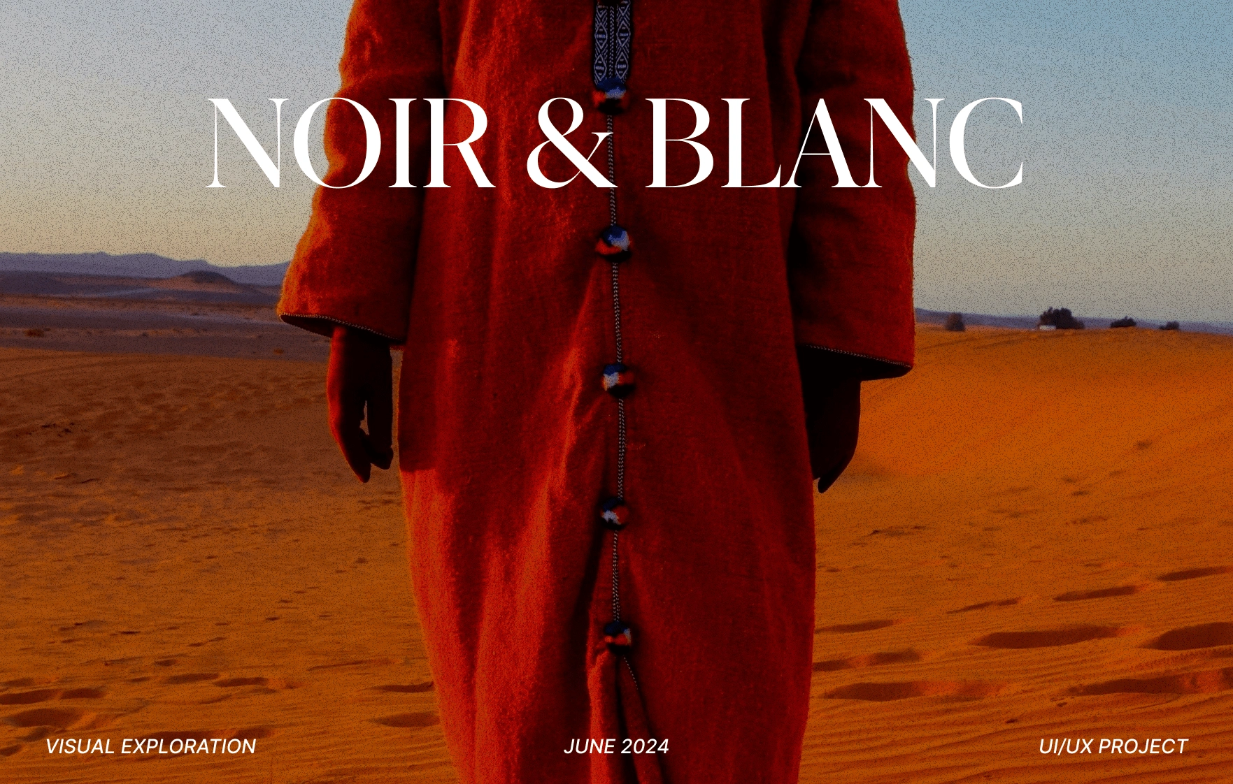
Welcome to Noir & Blanc
Where luxury meets sustainability. Our brand is dedicated to creating high-end, sophisticated fashion that not only elevates your wardrobe but also respects the environment. We believe in timeless elegance, exceptional quality, and responsible production practices. Join us as we take you through our exclusive collections and the unique elements that make Noir & Blanc a leader in sustainable luxury fashion.
Clothing? How Did It Come To This?
I’ve always been interested in fashion, and I fell in love with minimal design and fashion, this website was just my love and hopes into my career. I simply wanted to work on something I love and see what I can do.
Okay But This Doesn’t Look Like Your Typical Fashion Site
That’s right, it’s futuristic fashion. After watching Dune and Blade Runner, all I could think of was the soundtrack and the clothing. Of course in the future fashion changes and that’s why somethings are missing from your typical fashion site. For instance, Color options. In my perspective you either buy it as the designer intended it to look or don’t buy it at all, you don’t have options. Sure that’s a dystopian way of looking at things but I believe artists try to say something in their art, and color is one of the most important parts. You don’t look at Van Gogh’s Starry Night and say “This could have been better in my living room if it was red”. It is an insult to the artist to change their intention.
Okay Okay, Enough Of Your Rant Against Personalization. What About The Clothing?
Most of every piece of clothing I actually saw online is real, but good lord are they expensive. Which makes sense, the material used and the amount of design put into it shows. I simply thought it fitting for the theme I was going for, I see that style as being the future, but at the very least, ALOT cheaper to buy.
Home Page
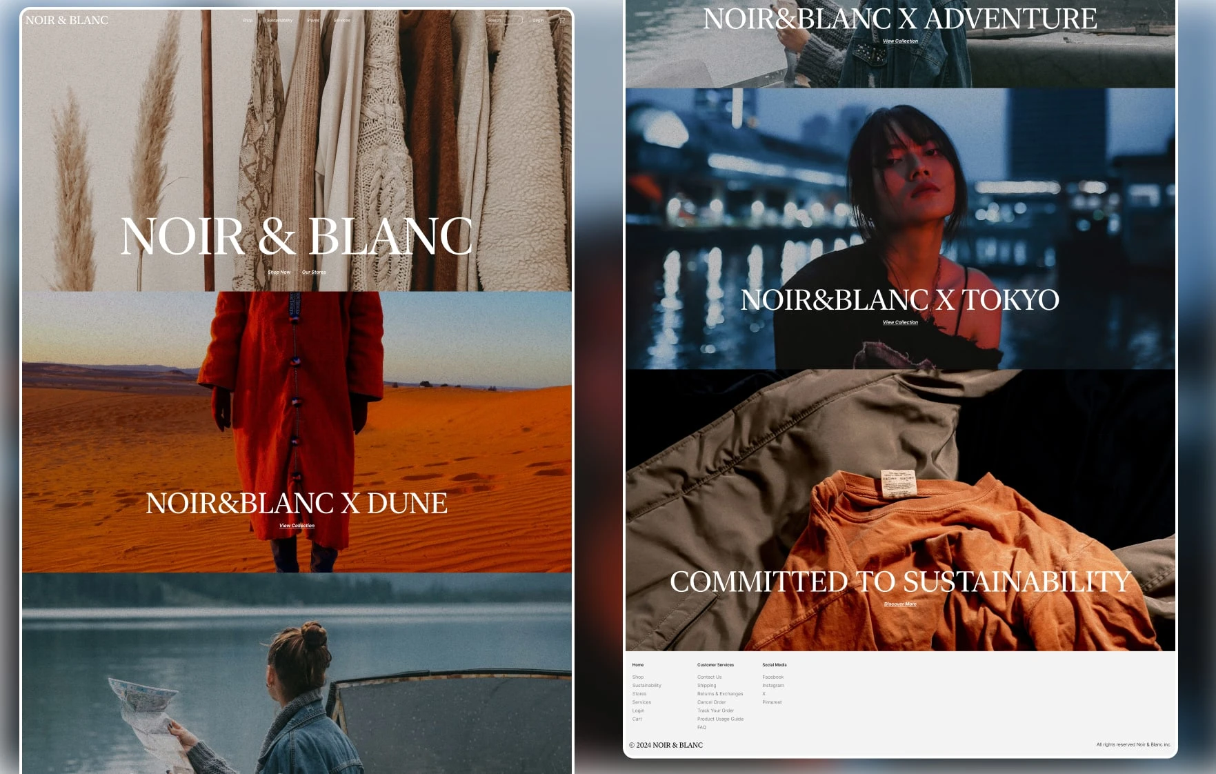
The home page serves as the gateway to our brand, with a pure focus on the collections, no distractions, see the things you want to see instantly.
COLLECTIONS
Dune Collection Page
ITEM DISPLAY
FULLY RESPONSIVE
Designed in Figma and built in Framer (Mini prototype, not finished). My focus was to make it fully responsive, nothing fancy, testing out Framer's capability of translating Figma designs to Framer.
The Looking Back Part
I really wish I spent way more time on this and that it was an actual project! Despite the fact that I love how it turned out, there are some things here and there that a couple months later I would love to change, but once again I will let it be as a reminder of how much I need to learn and study. Also I really wish I can buy those clothes that I showed, I'd look like an actual designer!
THANK YOU FOR READING
Wow you really made it this far, you might actually be interested in me? You should definitely CONTACT ME
Like this project
Posted Jun 25, 2024
A concept web design project that has elements of minimalism and utilitarianism. Designed in Figma and Implemented in Framer.
Likes
0
Views
13

