PropertyCard | Web Design
Naram Ziady
PropertyCard Redesign
So What Am I Reading?
You are reading an 8 month project, that took blood, sweat, and tears. A project that introduced me to my passion of Design Systems. Discover the challenge of simplifying property management for landlords and tenants. The extremely exciting task of a product designer that involved overhauling PropertyCard's system, prioritizing accessibility and usability. Witness the results of countless user interviews and many nights utilizing market data analysis, to eventually reach a redesigned platform that now caters to users of all ages, ensuring an intuitive experience. Draw upon the the comprehensive design system, crafted in Figma from scratch, and maybe just enjoy reading something I spent around a year on.
The What Should I Be Doing Part
Problem
Property management is a daunting and overwhelming responsibility for both landlords and tenants. So here is where we come in, the platform to streamline the process, making it more efficient and effortless for everyone involved. The challenge lies in simplifying complex tasks so that individuals with limited tech knowledge can use the platform effectively. When I joined, PropertyCard's design was unintuitive, with a steep learning curve that required significant technical expertise to navigate. Even with my Computer Science Degree it took me around 5 minutes before I realized where the home button was.
The Goal
To create an intuitive, visually appealing, and user-centric digital environment that effectively addresses the needs and pain points of property management professionals. (Very Professional)
Responsibilities
As Product Designer, I led user-centric research, shaped visual design, and developed prototypes through iteration. I focused on creating an exceptional user experience by prioritizing accessibility, usability, and aesthetics.
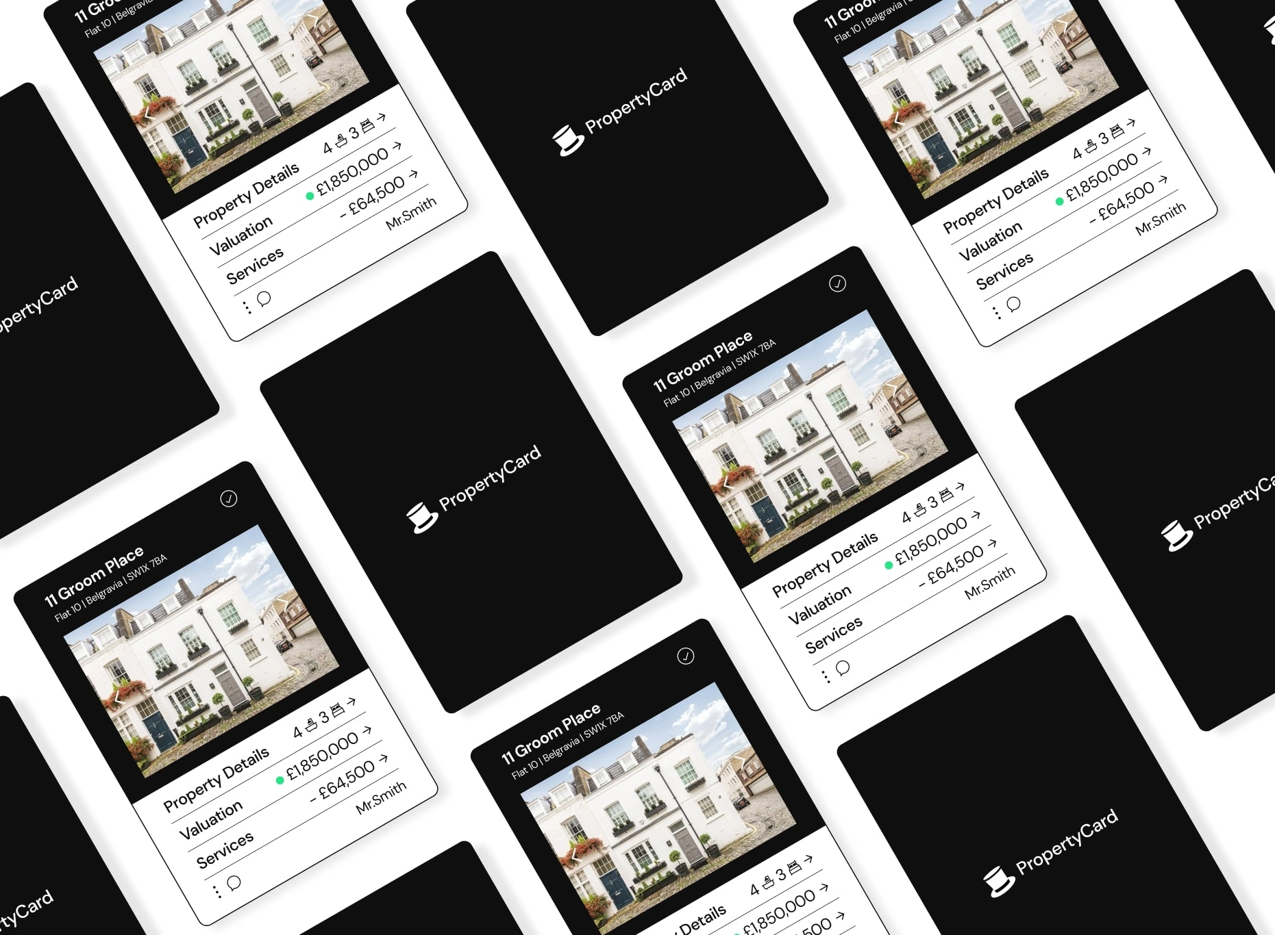
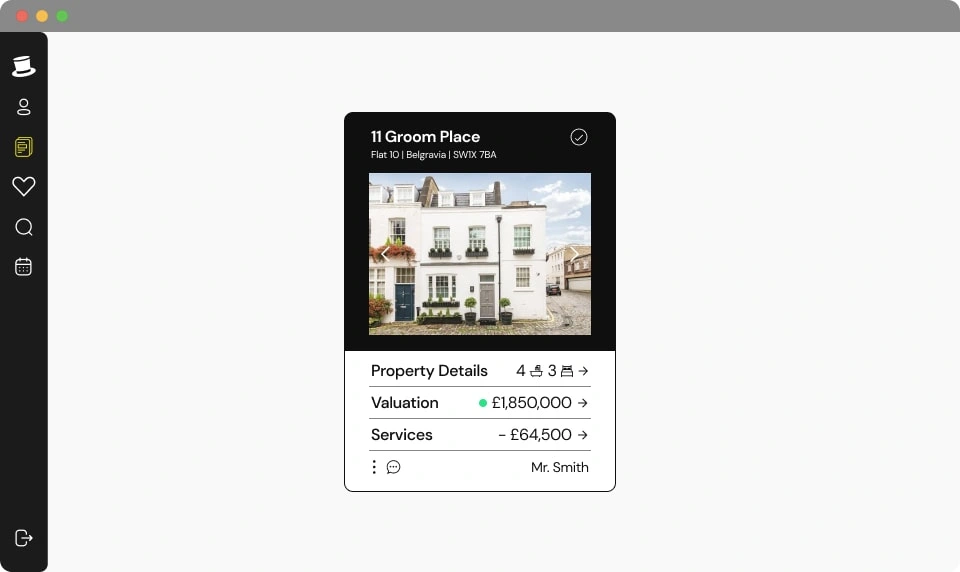
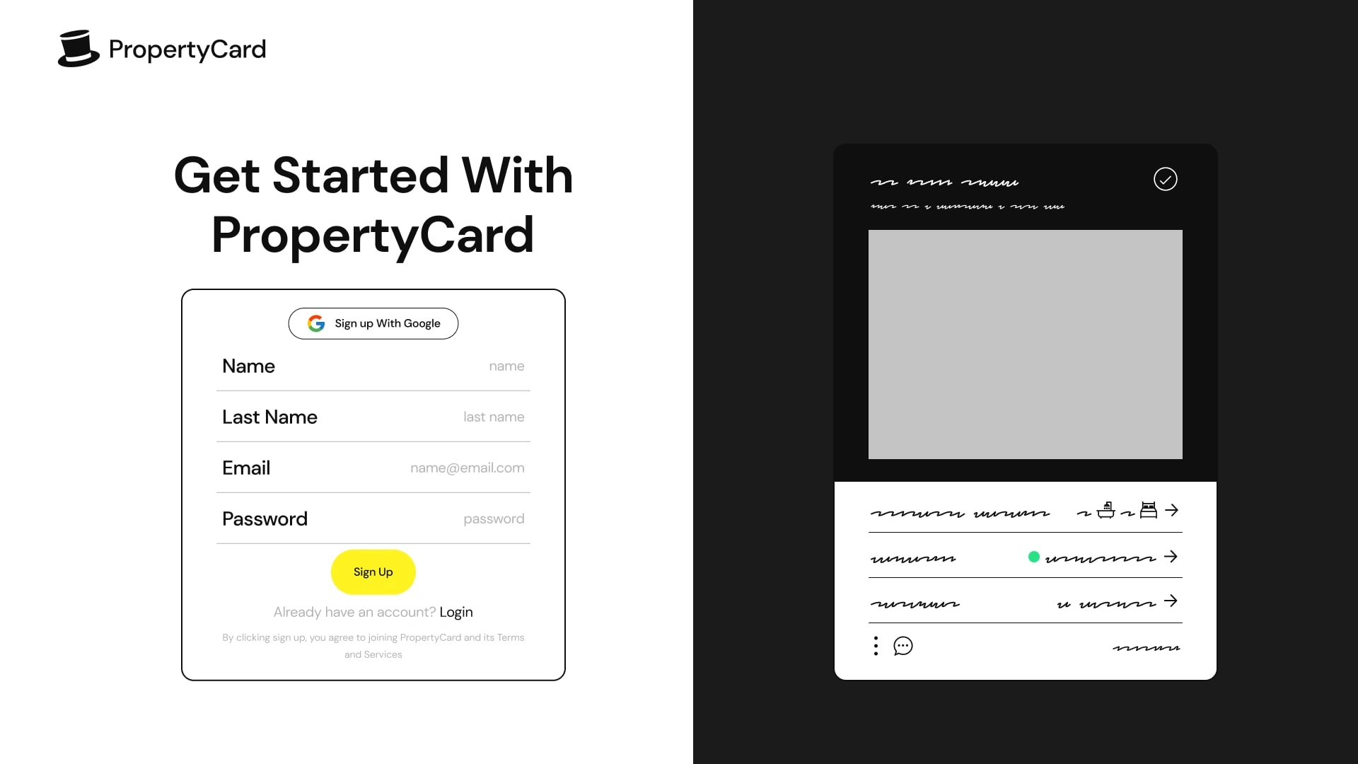
Main Screens, in App
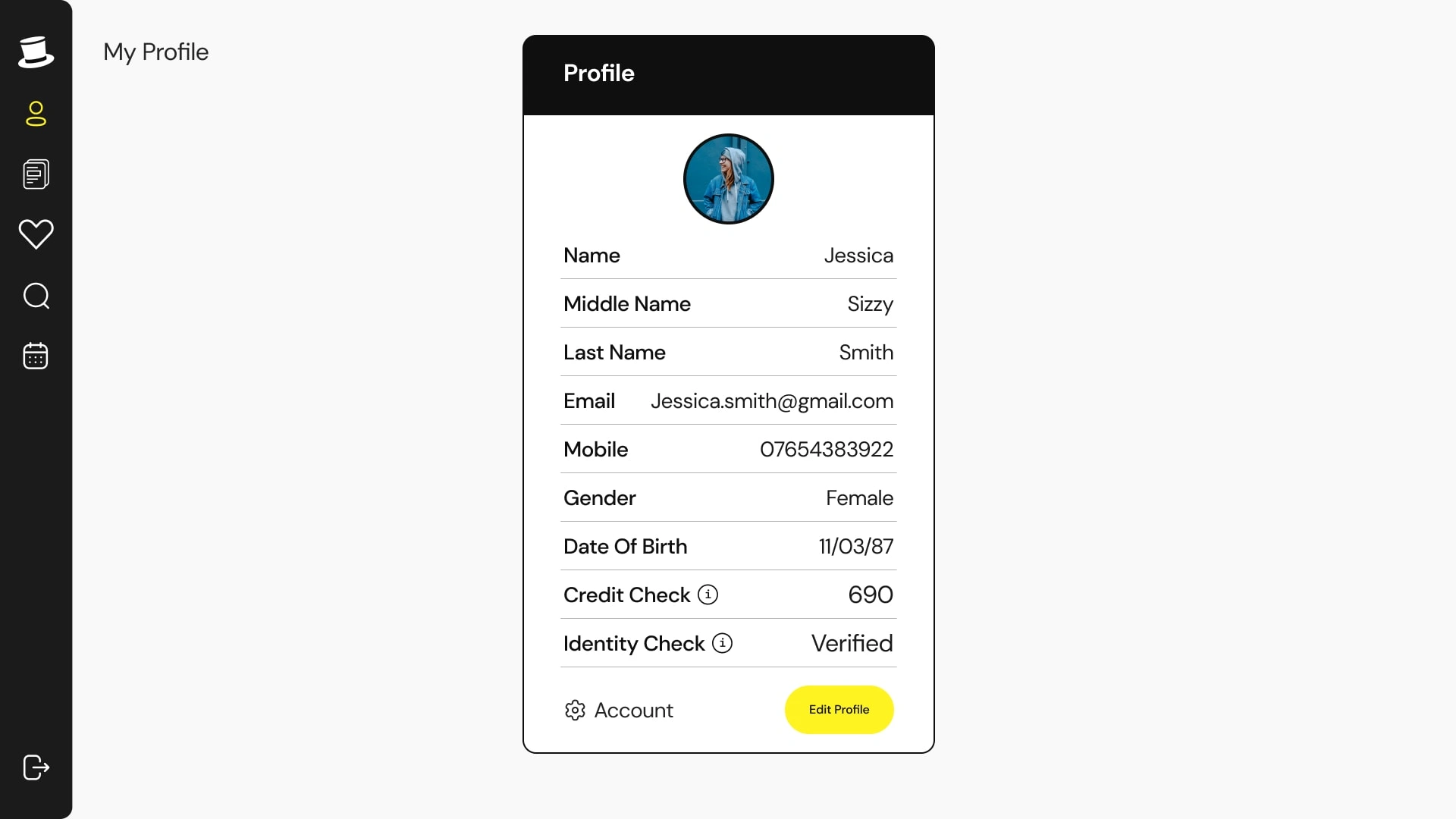
Profile Section
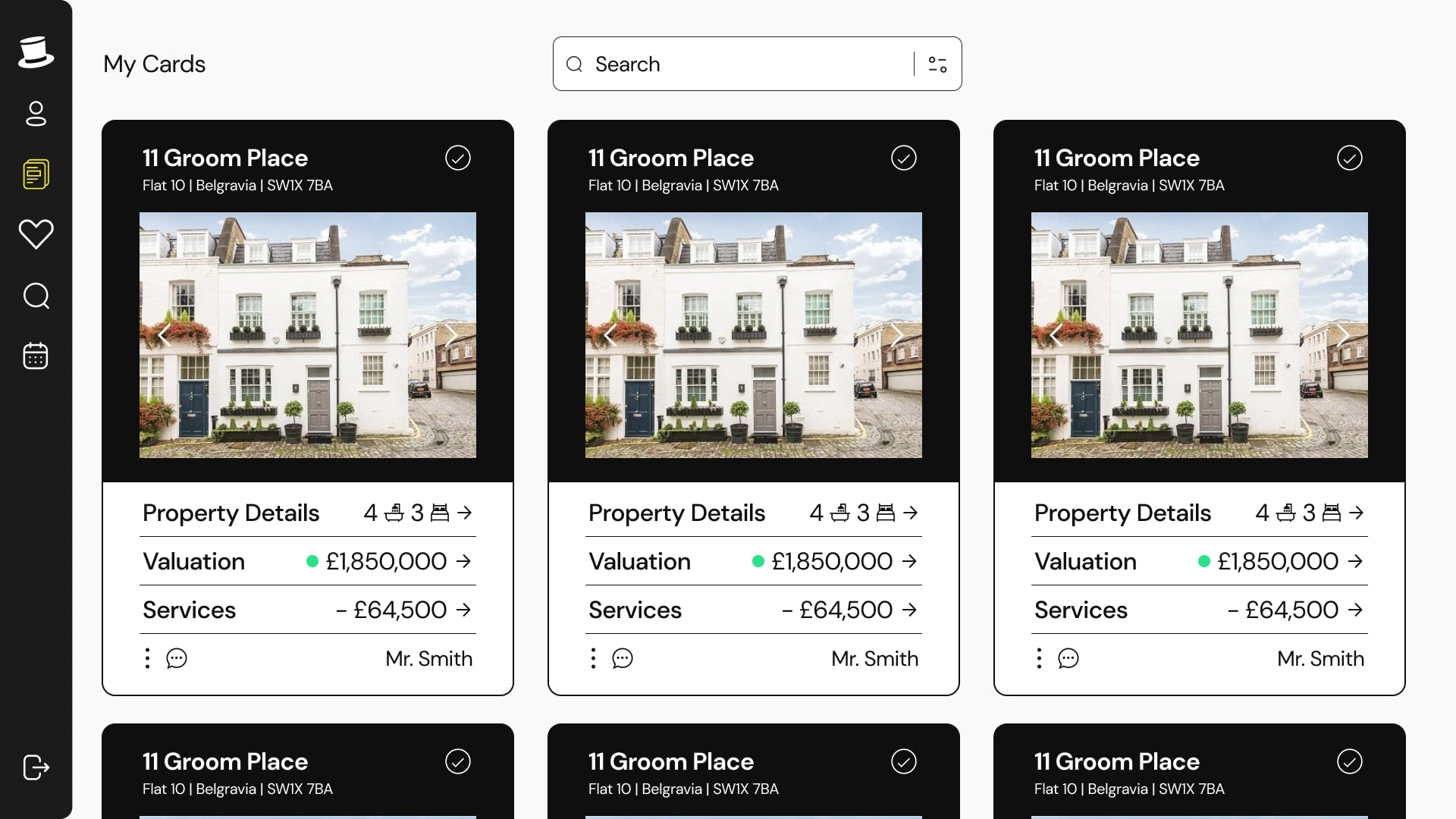
User Property Sections
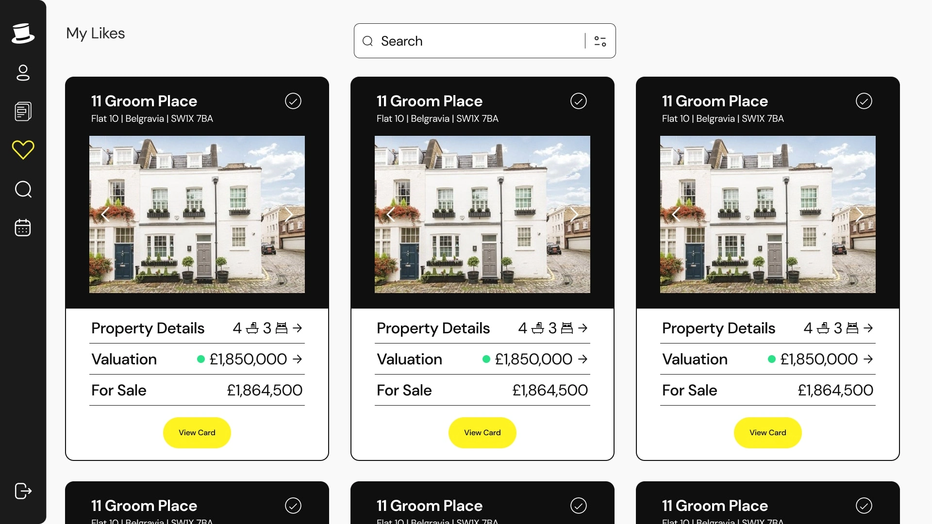
User Like Properties Section
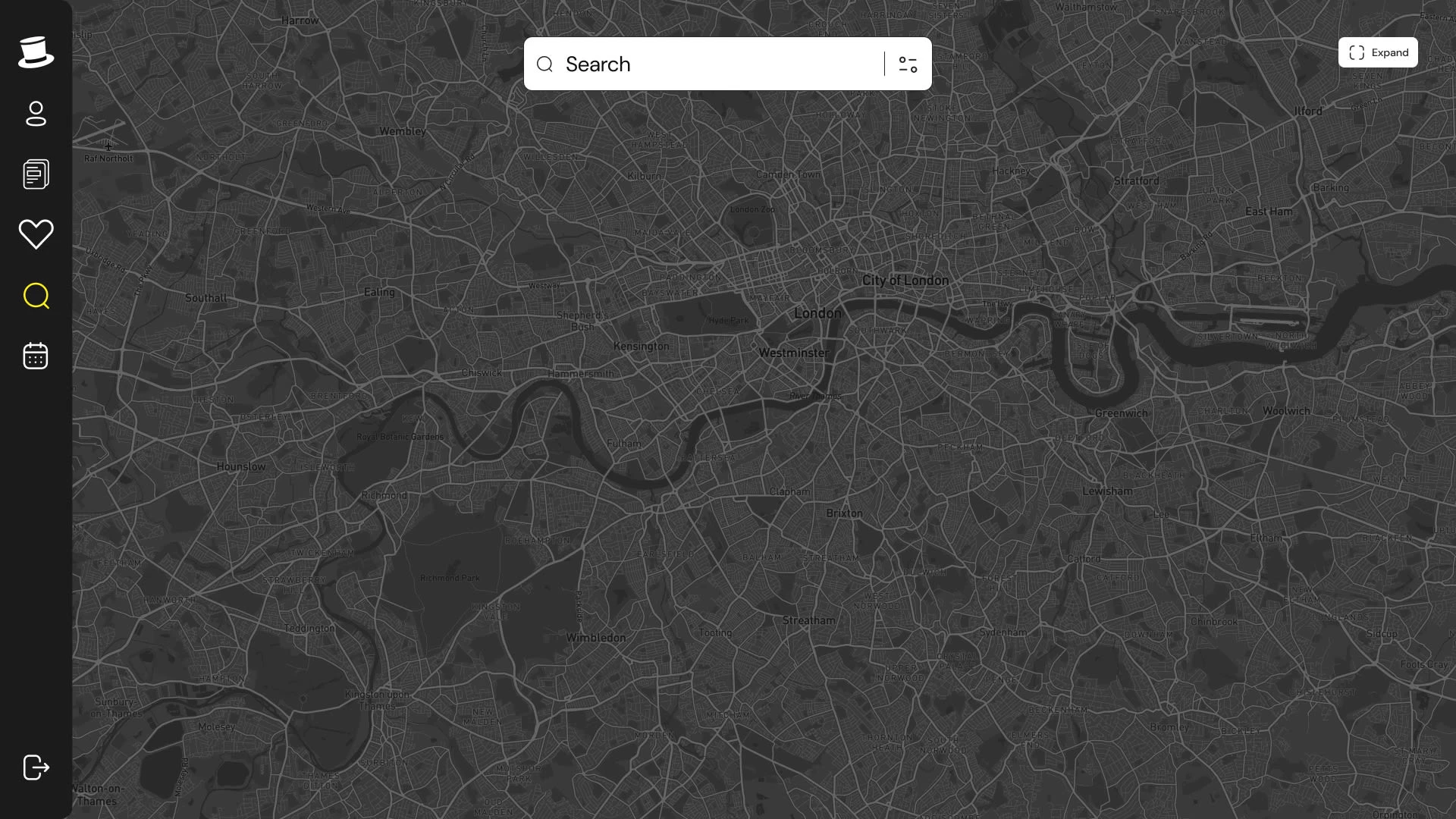
Map Area
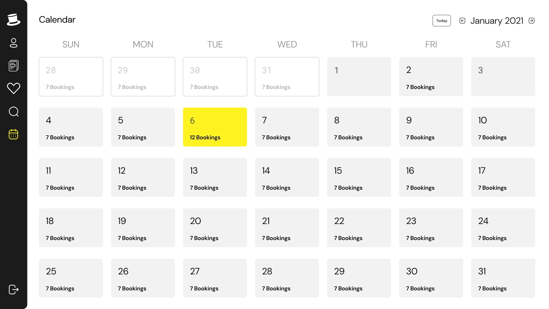
User Calendar Section
The Part Where I Did Some Homework (Research)
One of the main ways I understood what users need from this platform is by user interviews. I interviewed home owners that just wanted a way to display their properties as well as manage the monthly/yearly services in an efficient way. I also used market data to learn what properties needed to display and the constant expenses on them that needed to be highlighted on the platform. The age range of home owners and land lords was between 40-75 which highlighted that I needed to create a platform that needed almost zero technical ability to manage or our users will be confused. By understanding the users, as well as the market data I was provided, I was able to create a user experience that meets all of their needs and achieve the companies goal.
Paint Points Found
High Learning Curve → Users quit the product
Difficulty in Property Analysis → PMs (property managers) find lack of use for the product.
Complex Onboarding → User’s input wrong data or quit half way through
Lack of Real-time Updates → Mistrust in product
Design
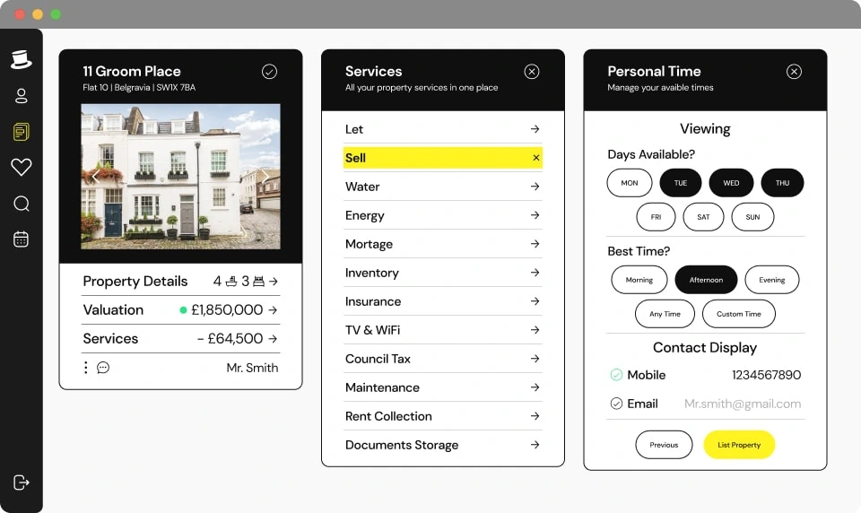
Wireframes:
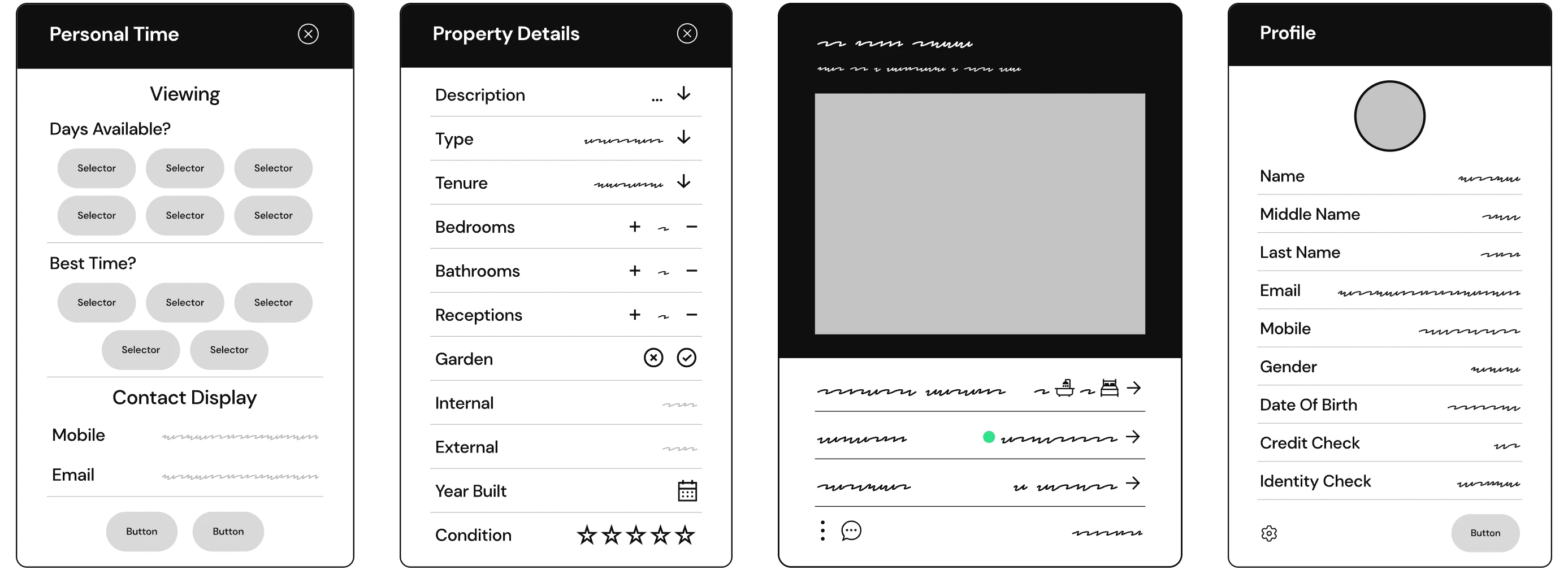
PropertyCard, Property Details, Personal Time, and Profile Cards
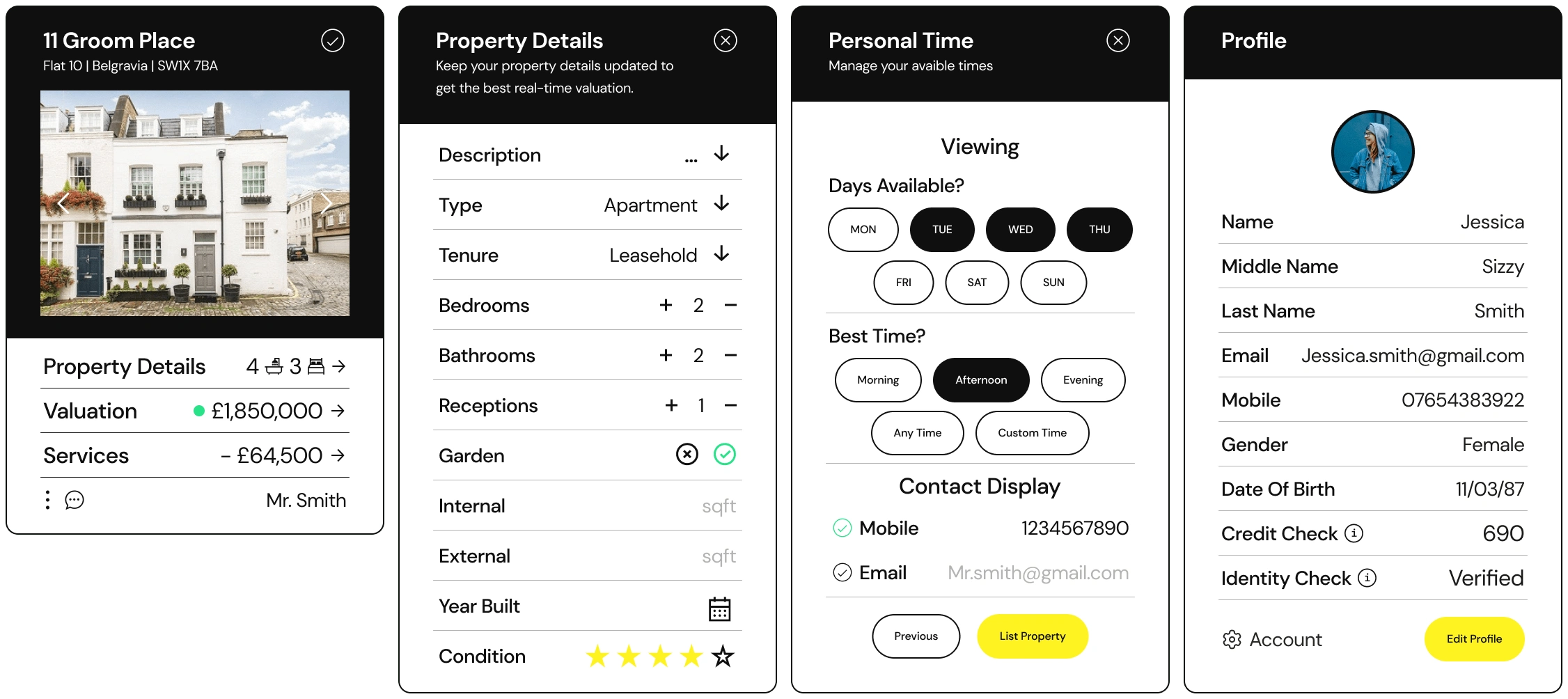
Designs:
The What I Did After Research Part
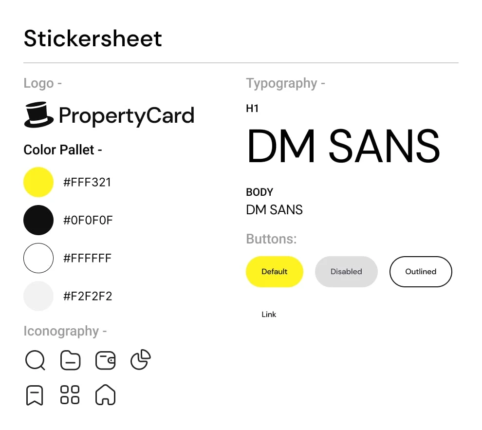
First, Why Design System?
Because I looked at it in terms of 10 years time, and the amount of properties needed to be managed. In 2021 there were 1.03 Million occupied dwellings in London’s private rented sector, with each property manager potentially managing 40-200 properties.
Using Atomic Design methodology, I began by creating the components and building upwards. Focusing on simplicity, usability, usefulness, and user-centric. By the time I had finished, the design system had reached well over 200 custom made components.
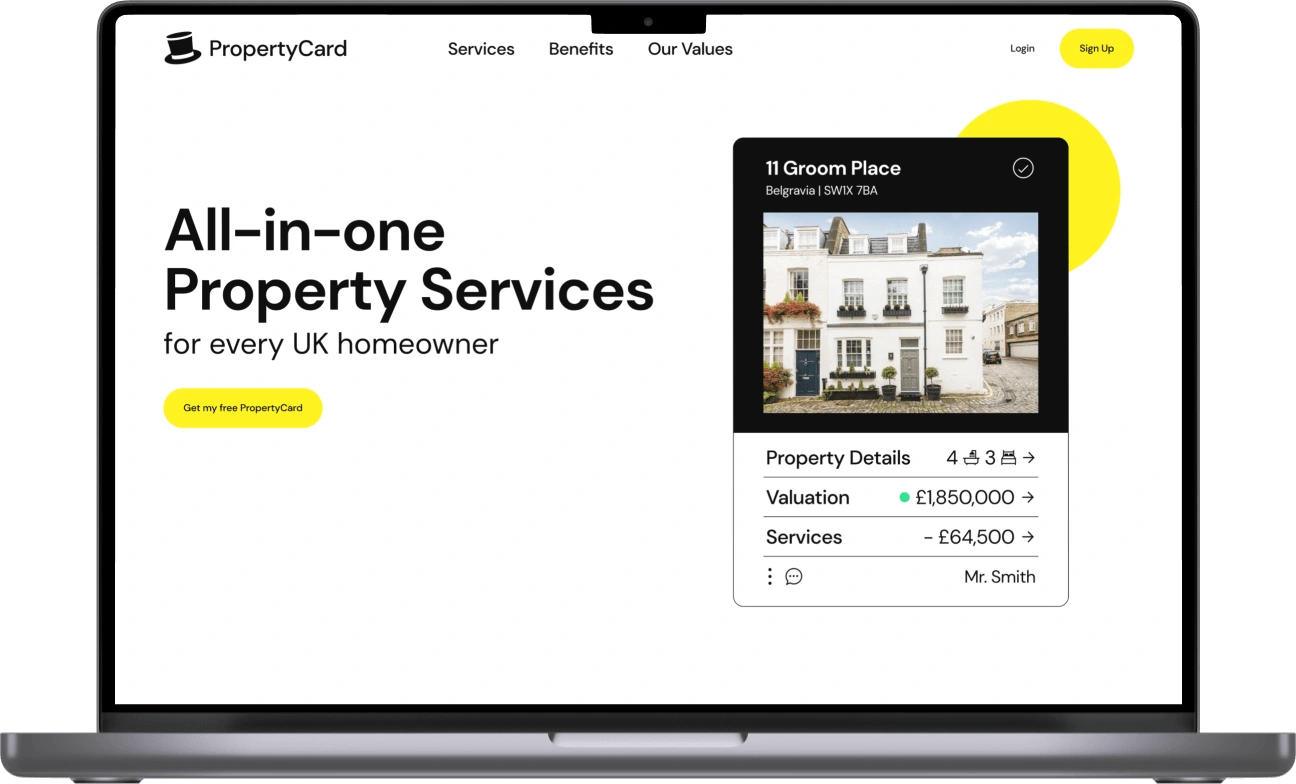
What’s With The Yellow and Black
BOLD, modern, and sophisticated brand identity. Yellow represents energy, optimism, and friendliness. Black represents power, sophistication, and elegance. Blend it all in with the minimalism and simplistic WHITE and it can balance it all. Together they create a strong visual impact that is needed for a property management platform. Definitely not because I was listening to BLACK AND YELLOW song.
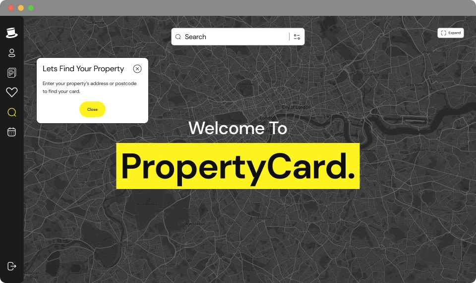
More Images
The Looking Back Part
The development of PropertyCard was a challenging but a rewarding experience. I was able to create a platform that simplified property management for landlords and tenants. Creating a design system that was complex and had more than 200 components.
Creating with a responsive first mentality taught me that you start small and go bigger, and with auto layout, making components responsive was a huge step in the right direction. The art of minimal design really struck with me, because through minimal design, users of any age and technical ability are able to use the platform with little to no problems, unlike other designs which require a certain degree of technical ability.
It is now 2025 and unfortunately it seems that the website is no longer operational. I left the company due to creative differences but I do not regret it, my time there was fun, a constant move, working remotely was awesome, and the people I met were great! I hope that the company regains itself and the product launches again!
THANK YOU FOR READING
Wow you really made it this far, you might actually be interested in me? You should definitely CONTACT ME
Like this project
Posted Jun 20, 2023
Redesigned PropertyCard to simplify property management for users, improving usability through user research and a comprehensive Figma-based design system.