Android 12 Music App | App Design
Naram Ziady
Play Music Android 12 Redesign
It’s 2021, I’m Bored, What’s The Solution?
Well of course my dear readers, it is a RANDOM PROJECT because how else do you cure boredom?
Let Me Explain
In 2021, Google announced it’s killing Play Music in favor of keeping Youtube Music, and boy was I mad. Not to mention the new Google Pixels were coming out, and Material Design is popping. So as all people do (I think) You design your own app in the delusional hope that Google is going to contact you after.
Wait, why do you hate Youtube Music?
WHY??!! Because it’s confusing, it lacks a friendly User Experience, where are my device downloads, wait I need to click there? Wait I need to be online for this to work, hold up WHY IS THIS HOW I PLAY MUSIC, STOP WHY ARE YOU PLAYING THE VIDEO TOO!!! I just can’t, I am an avid Spotify User, not that I don’t have my fair share of complaints about that too.
Okay, I get it, So What’s The Goal Here?
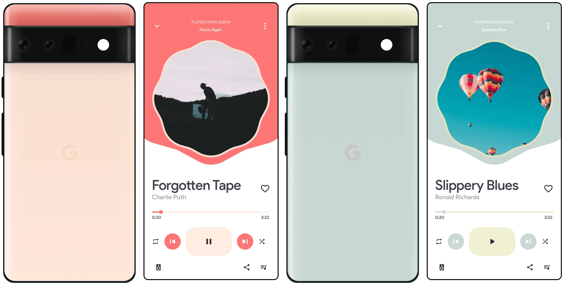
Well, I’m glad you asked. It’s really simple, create an Android 12 Music App that is consistent with the new Material Design System Library. Of course, I’m only focusing on the Pixel phone, because that’s as much Material Design can get!
Design
Wireframes:
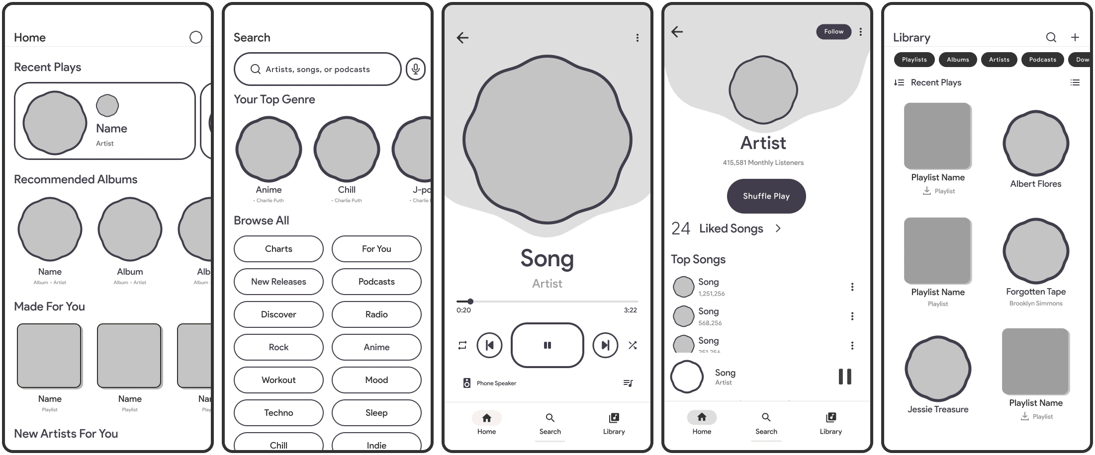
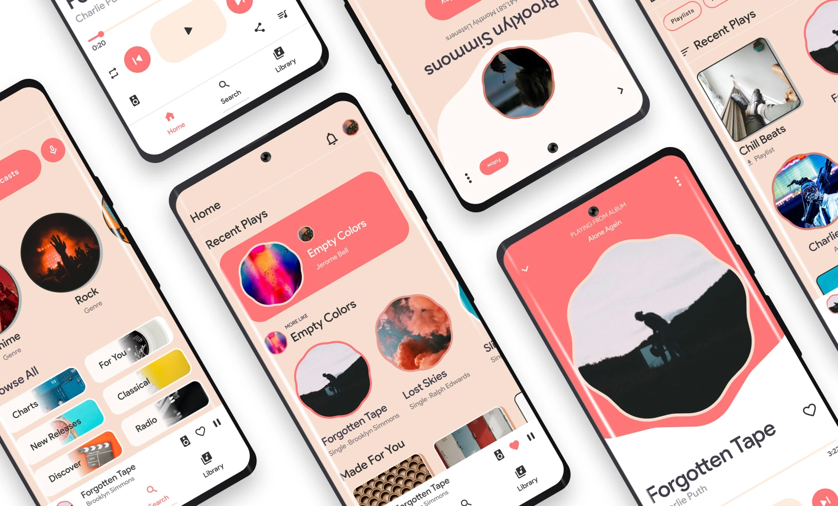
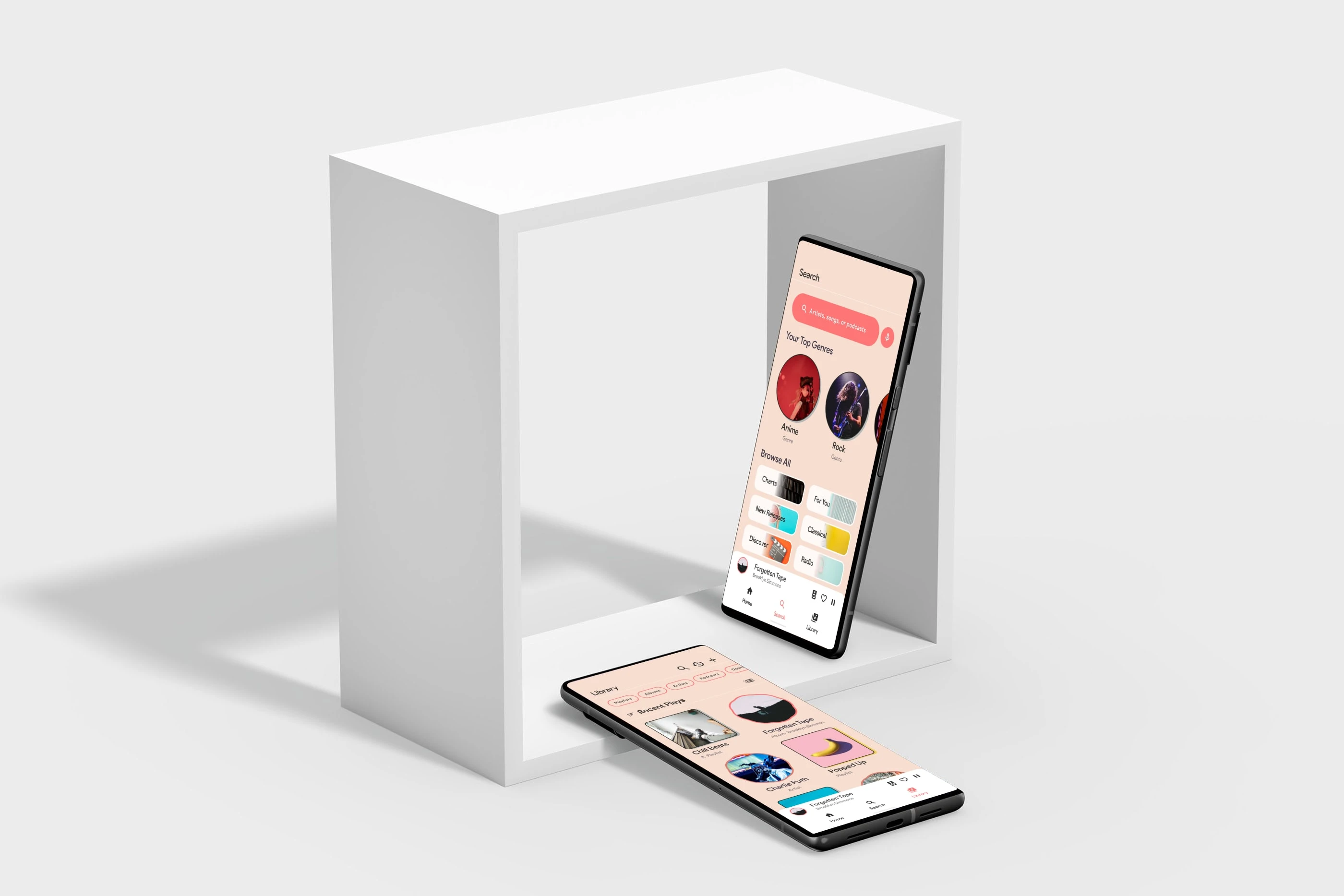
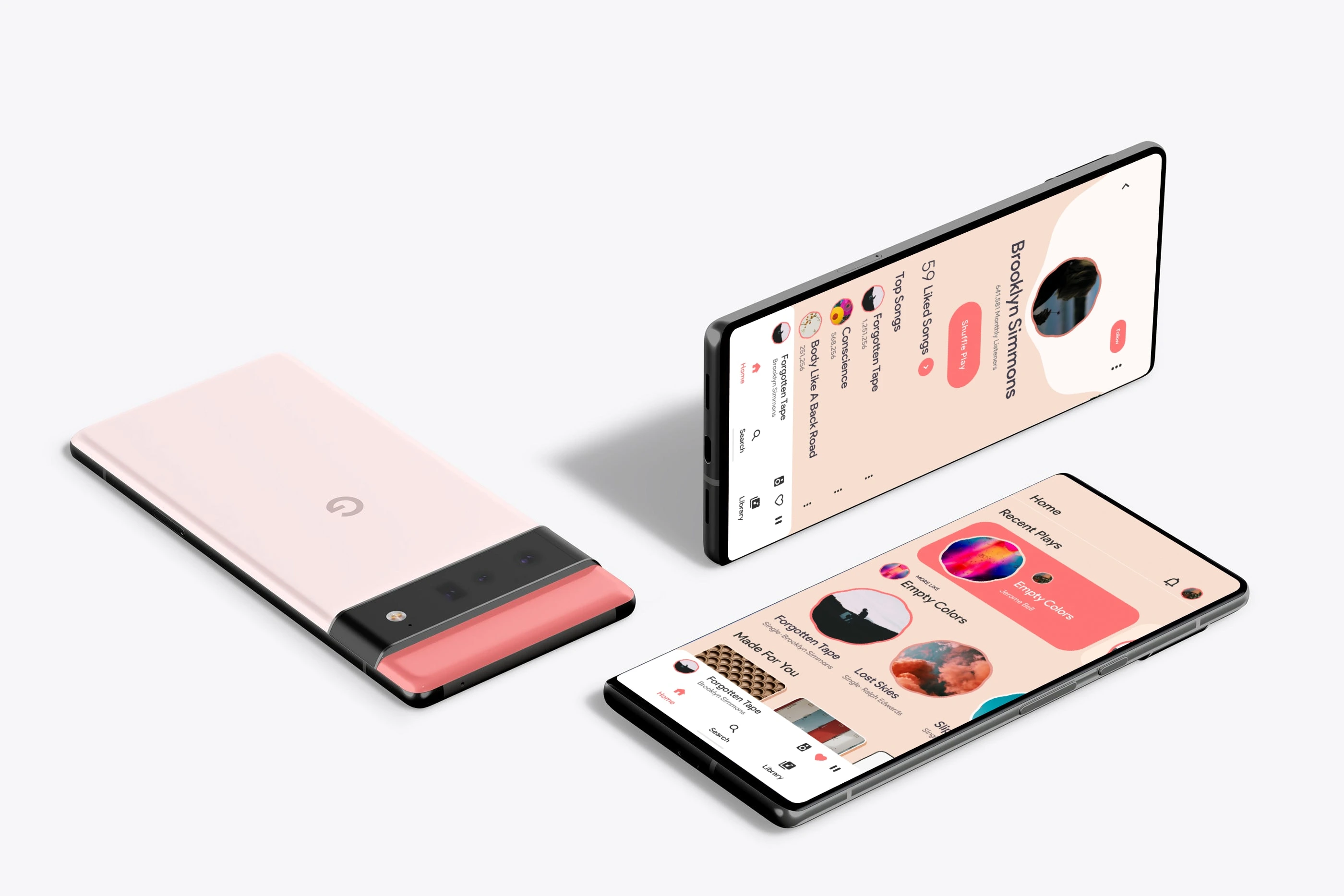
The Home, Explore, Now Playing, Artist, and Library screens
Polished Designs:
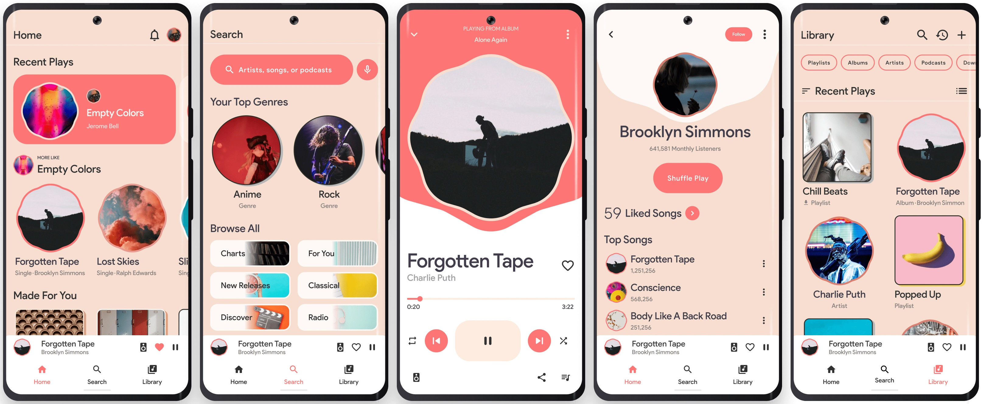
The Home, Explore, Now Playing, Artist, and Library screens
Material Design:
The Part Where I Did A Tiny Bit Of Research
Of course this was a random project to fill my time for a bit, and use it as a learning experience, so I didn't dive too deep.
So what did you find?
I asked a bunch of my musicophile friends, looked up reviews on youtube music to confirm my hatred, it was satisfying seeing all those negative reviews (ring… ring… This is Naram from 2025, Google has done some work on Youtube Music, it’s now a kinda great app… CLOSED) I don’t believe you 2025 Naram, anyways back to my findings. The Video and Music in one app was annoying, 5/7 people chose the music only platform. Design was too confusing, nothing made sense, it was just a train wreck.
Okay… What did you do
I learned Material Design. You see Google had just released their new documentation for Material You, and I was in love, the shapes, the colors, everything about it was AMAZING, and it made me wonder, why haven't they created an app like this? So here I stand, on the edge of the design world, a fresh graduate with ideas that can shape… my phone mainly!
Gallery
The Looking Back Part
So it’s 2025, I still really like my design. I can see some flaws here and there, some modern ways of designing things, and of course new ideas that can make it even better, but it’s good to let lions sleep. I feel like I could have been a bit more creative in my approach, but the animations I had made and the overall vision I think still holds ground to this day. Good Job 2021 Me!
THANK YOU FOR READING
Wow you really made it this far, you might actually be interested in me? You should definitely CONTACT ME
Like this project
Posted Jun 14, 2023
Designed a native-feeling music player app for Android 12, focusing on design consistency and a user-first listening experience.
Likes
0
Views
26