Blah Soda | Brand Design
BLAH SODA
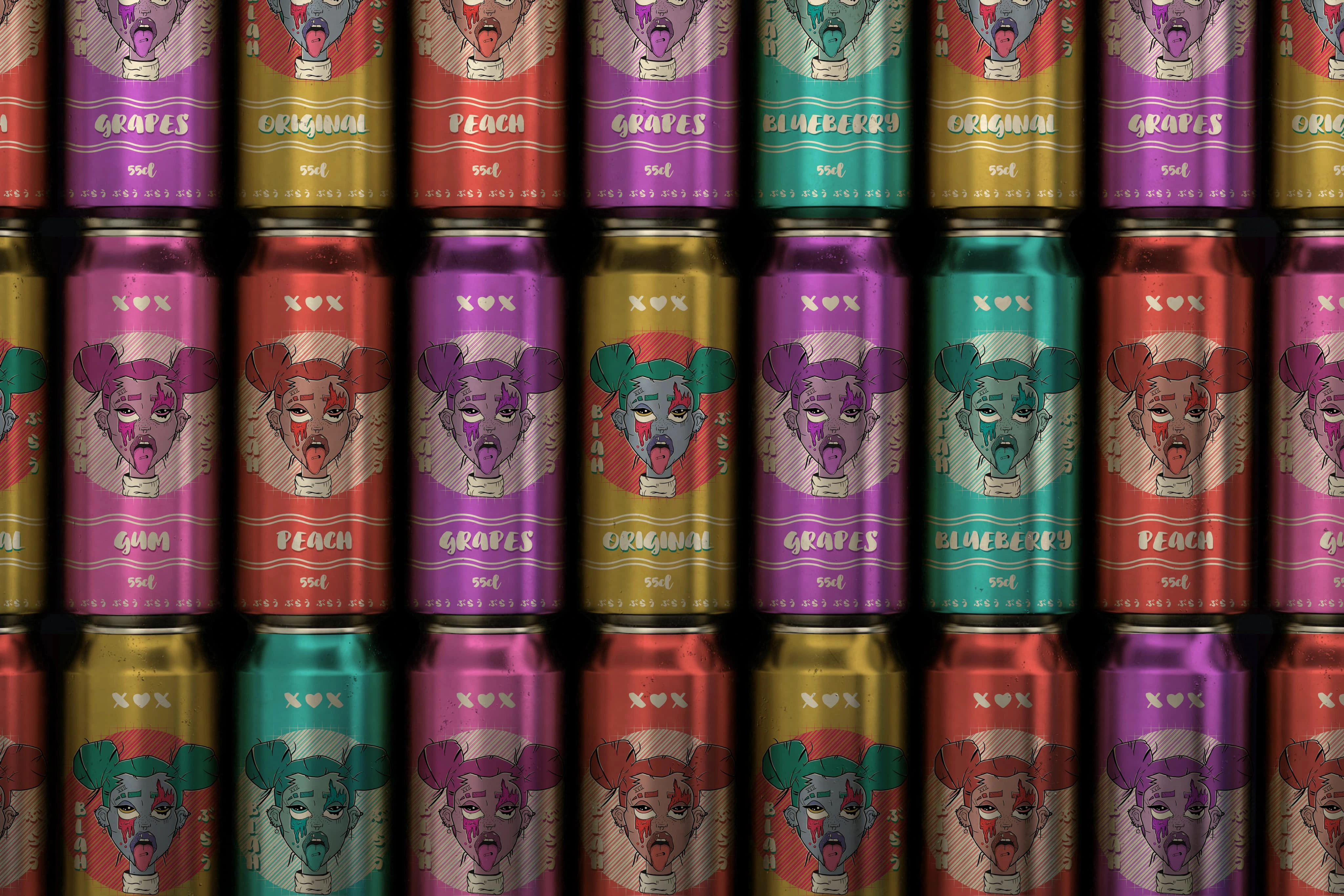
What Are You Looking At?
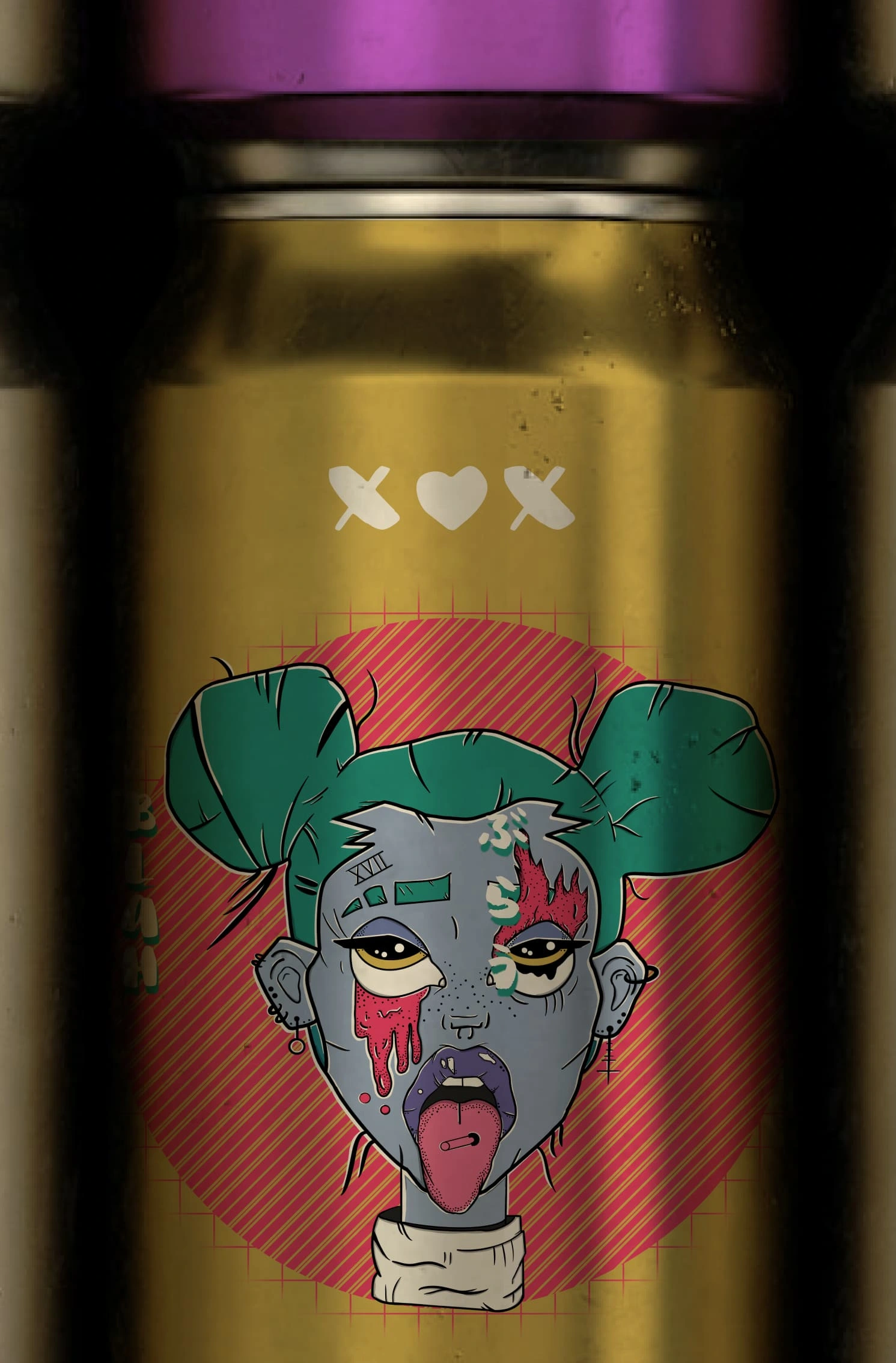
Well dear reader, you are looking at a project that started out as a joke. After my friend drew that character and I digitized it, I was drinking soda and I said “Blah, this tastes terrible” and for some reason the character popped into my head, AND BLAH SODA WAS BORN.
As a designer the most fun thing is the fact that I can design whatever I want, so I set out to design a brand. So how do you take an illustration like that and turn it into a brand? Hours of mood boarding and laughing with a friend, that’s how!
A big influence was Japanese soda, they have this distinct style in designing things, and I found it very interesting. I also just wanted to make something look fun, I didn’t really care for anything else, I wanted to bring the feeling of laughter when someone sees this on a shelf, because why would you drink a soda named Blah? From a marketing perspective I can see it, but it has to be done in a funny way.
So What Work Did I Do?
RESEARCH, the best part in a fun project is looking up random stuff related to what you’re trying to make. I compiled the designs of Coca-Cola, Pepsi, Red Bull, and Monster and jotted down the design elements that make it different. I then complied the designs of Fanta, Tomamosu Soda, and Ramune for Japanese drinks and did the same.
I noticed one thing in common with all of them! The drink itself isn’t what’s being marketed, it’s whatever the act is and the soda is secondary. Like Red Bull, its 90% extreme sport shots and then there is one or two shots of the athlete is drinking Red Bull. So what should the act be associated with Blah??
Of course it has to be THE BEACH. When you come out from a swim and you just want something refreshing, that’s when you take a sip of Blah!
Design
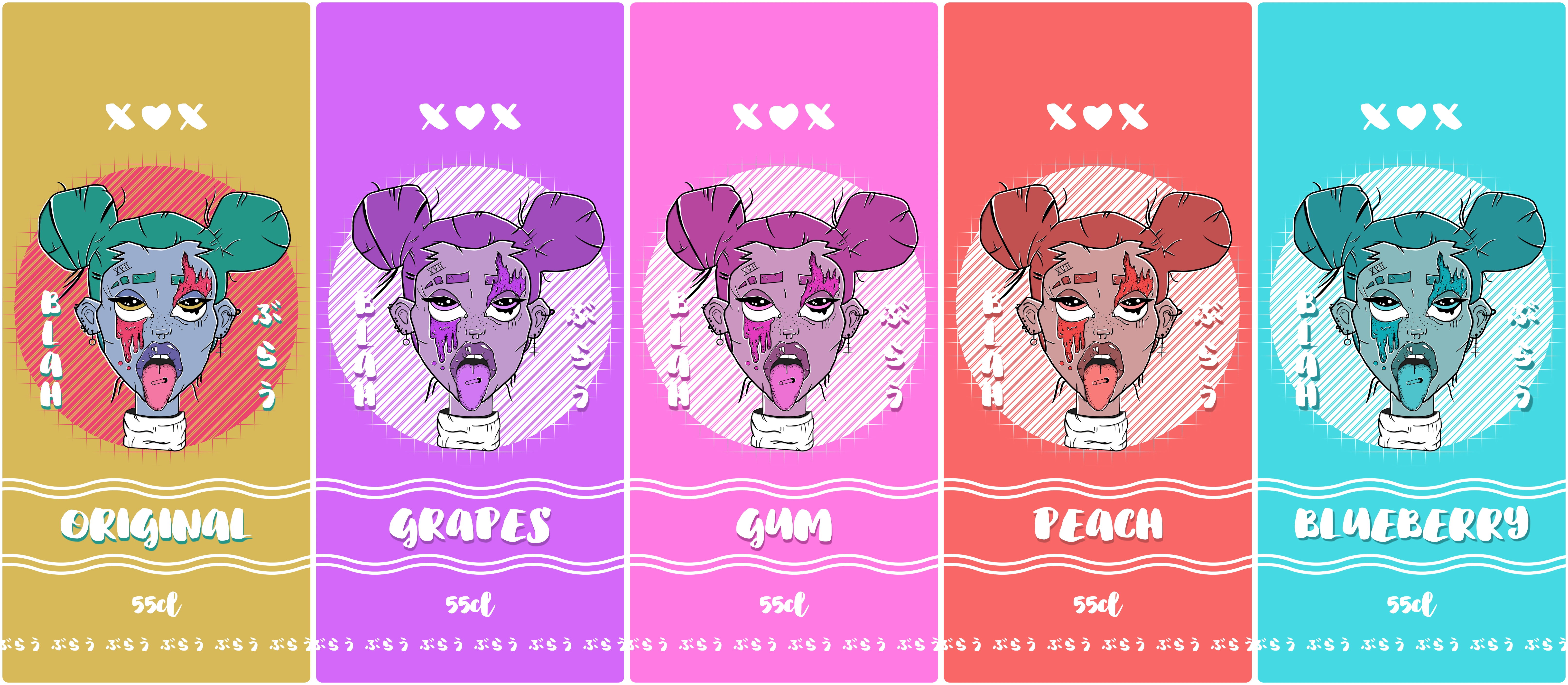
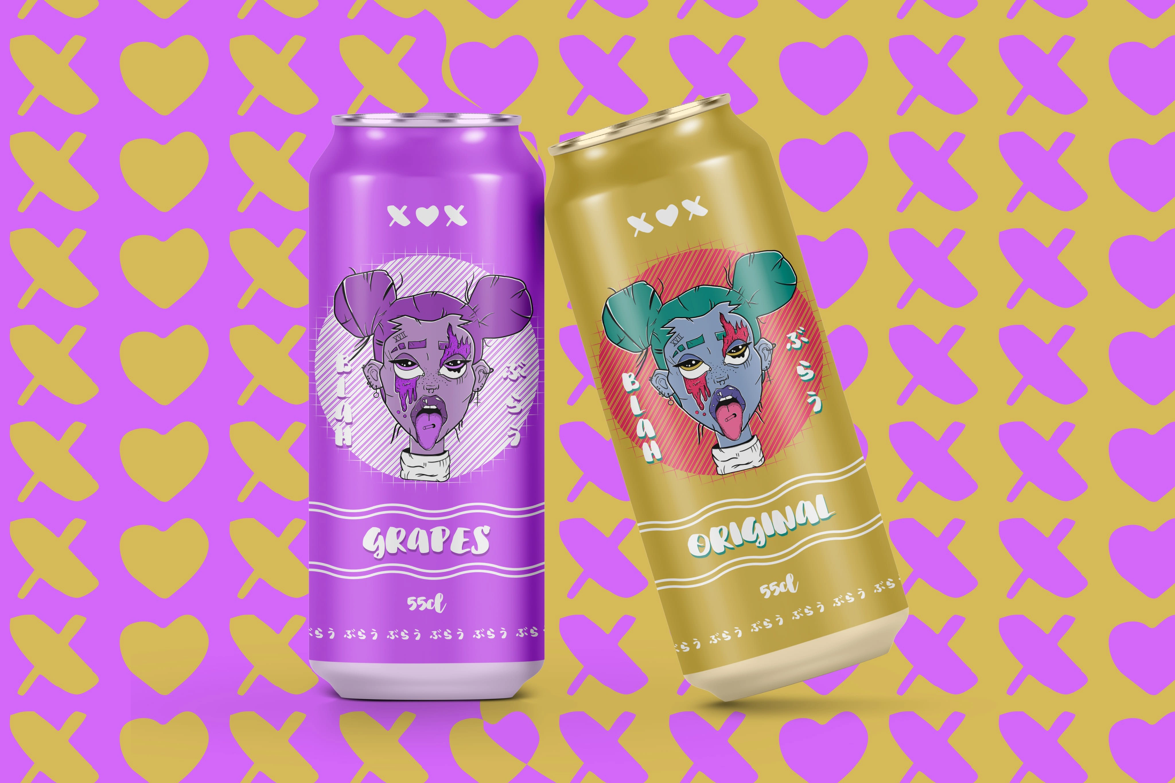
Original Illustration
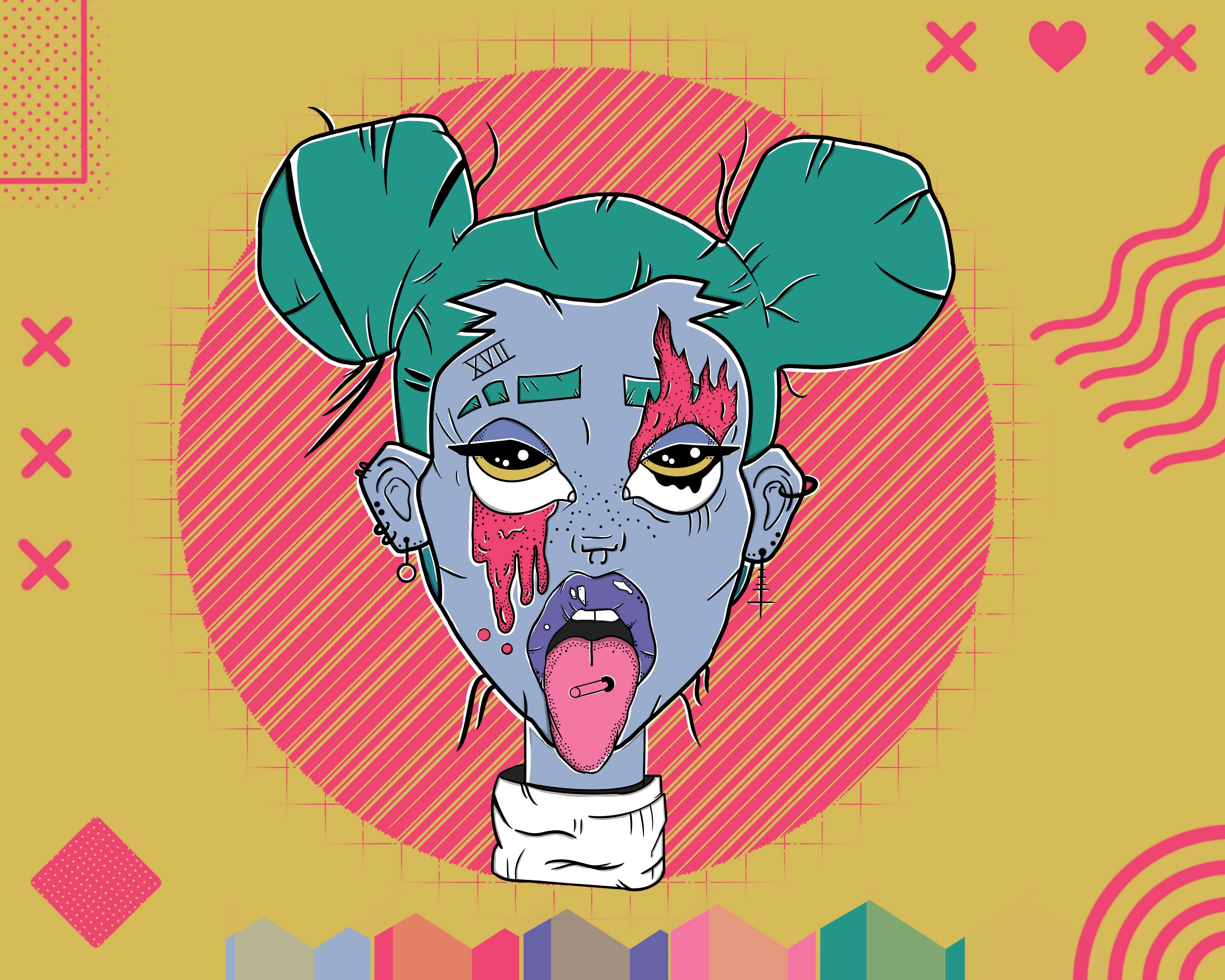
Original Artwork Used
The Looking Back Part
I really wanna dive back into this and actually flesh it out, but I will let it sit just a bit more. I had lots of fun making this, and it was a great bonding exercise with my friend, we bounced design ideas of each other and through that we made a cool blah looking soda!
THANK YOU FOR READING
Wow you really made it this far, you might actually be interested in me? You should definitely CONTACT ME
Like this project
Posted Jun 14, 2023
Transformed a bold illustration into the core of BLAH Soda’s brand using research-driven design and adaptable layouts to capture its unique expressive identity.

