CSD Fintechs: Brand Identity for a Digital Banking SaaS

Pedro Lopes


The first version of this brand belonged to a different company. Same client, different name, different market, different future.
CSB Fintechs arrived as a banking-as-a-service platform aimed at the Brazilian market: young, tech-forward, shaped by neobank references. The first visual direction followed that brief.
What the strategy phase found
Positioning studies, personas and verbal structuring surfaced a different company underneath. A global SaaS platform, built by professionals with more than twenty years in financial infrastructure, selling trust to international clients. The Brazilian-niche framing was capping the business before design ever became the question.
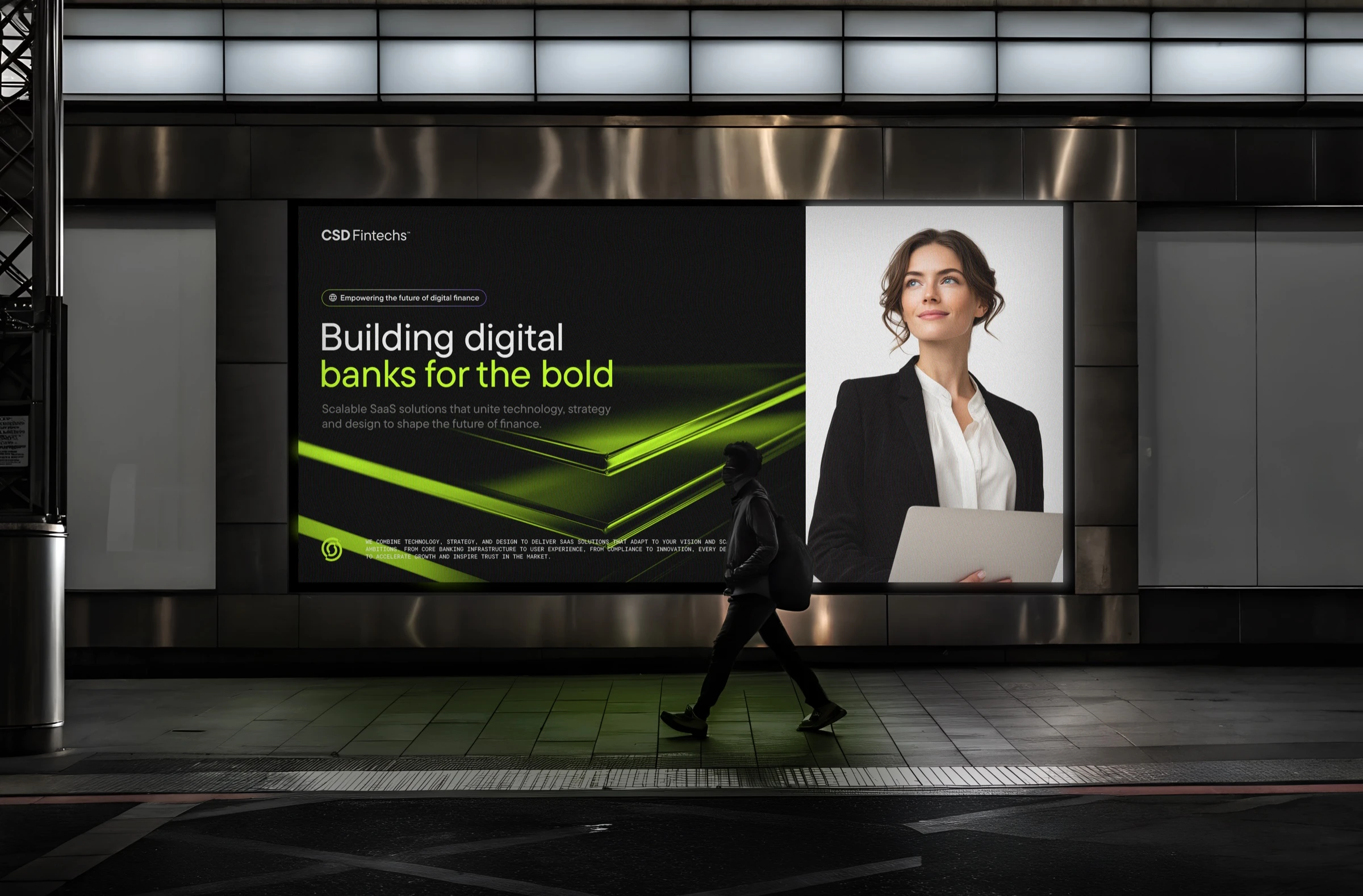
The institutional register, carried across surface and message.
The repositioning
The name matured from CSB to CSD Fintechs. The language moved from playful to institutional. The visual system traded youthful energy for restrained black and graphite architecture with a single neon accent.
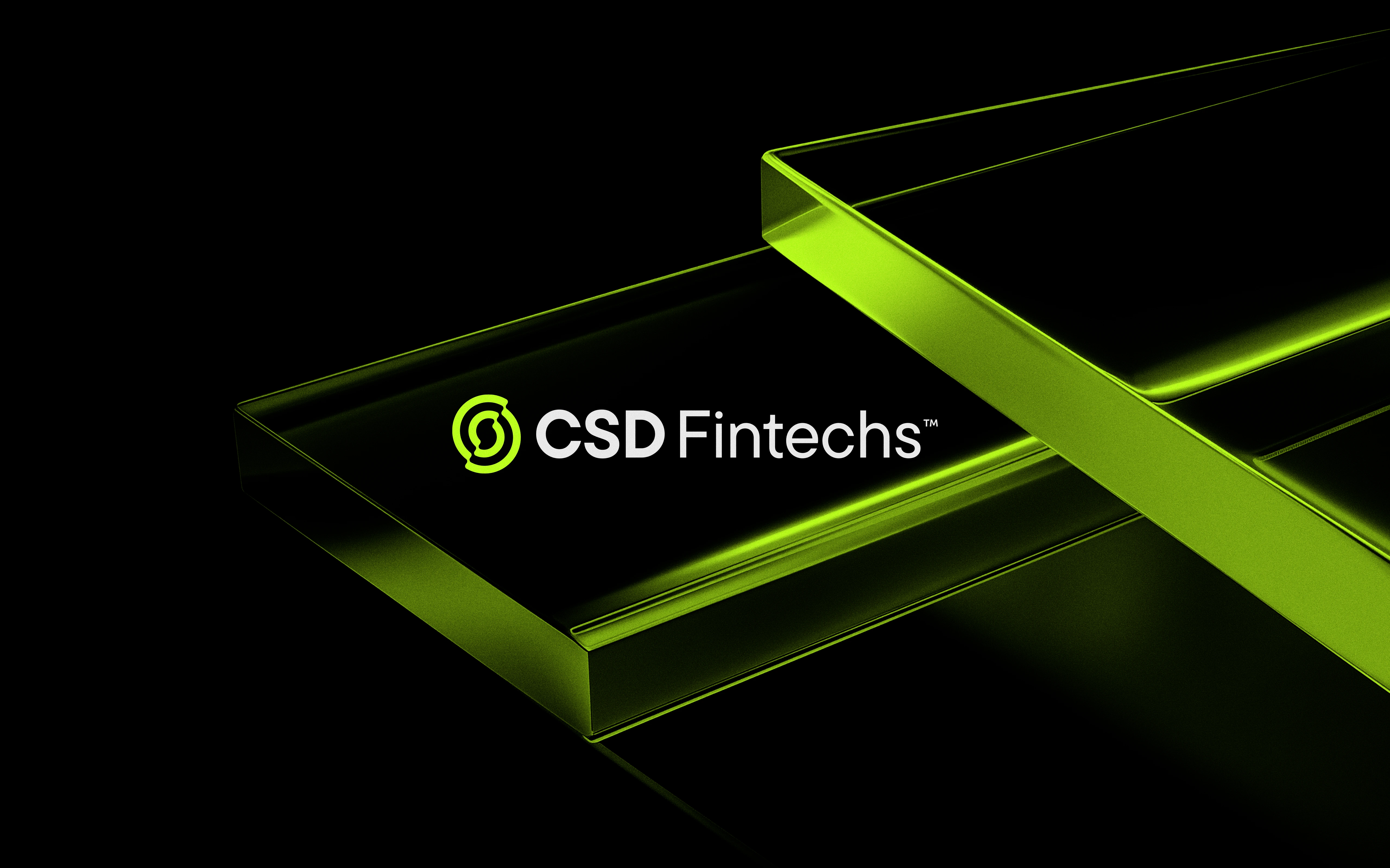
One accent, used once. The system reads as architecture, not as decoration.
Three decisions carried the system:
Architecture over ornament. Black and graphite as structure, not as mood. The accent earns attention because it appears once, never twice.
Built for the smallest surface first. The mark holds from an app icon to a credit card, which is where banking brands are actually seen.
Institutional voice. Typography and spacing set for a buyer who evaluates financial infrastructure, not for a consumer scrolling a feed.
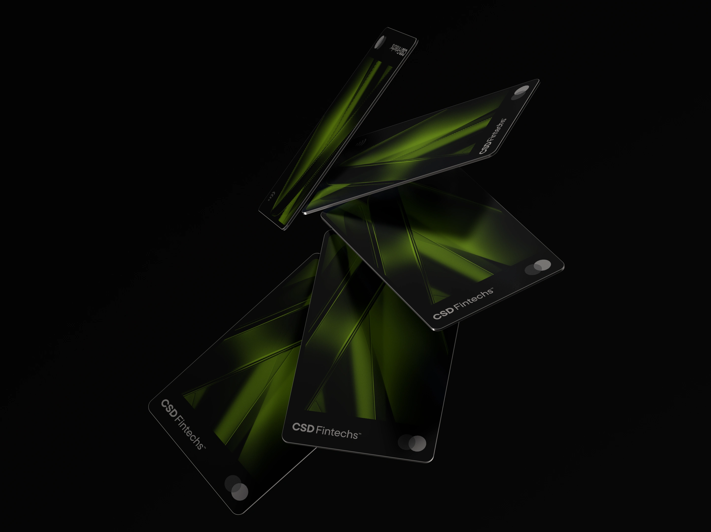
Decision two at card scale, where a banking brand is handled every day.
Why this project exists in this portfolio
A precise foundation turns design decisions into consequences instead of taste. The repositioning came from research, and every visual decision after it had a reason that could be written down and handed to the client.
The identity that shipped is the one the company could defend to an international buyer.
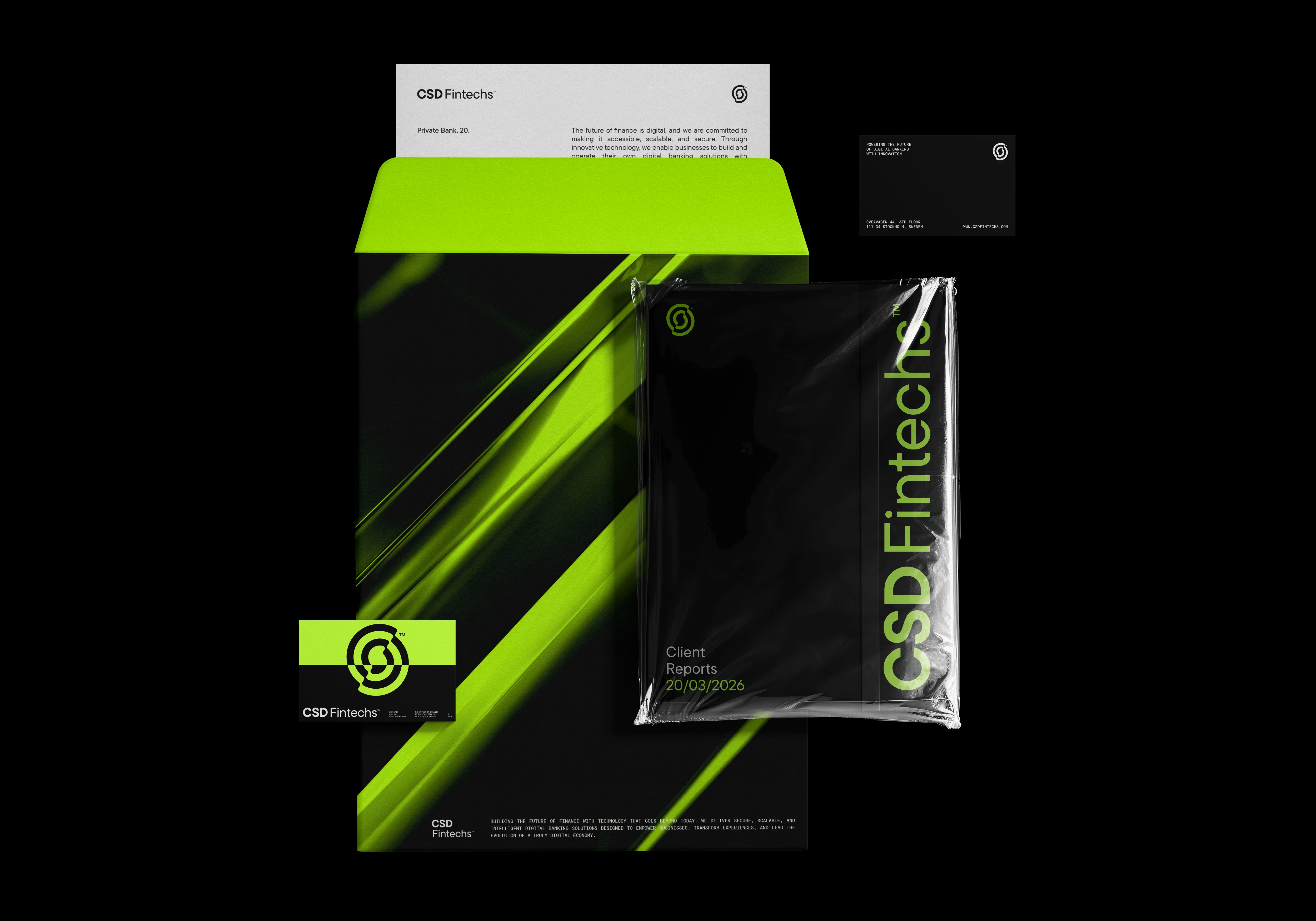
The system away from the screen, applied by teams the studio never meets.
Like this project
Posted Nov 28, 2025
Brand identity and design system for a Swedish SaaS platform that builds and operates complete digital banks.