Baronesa Visual Identity Design
Pedro Lopes
Context
Baronesa crafts varied handmade products, with a story rooted in family tradition.
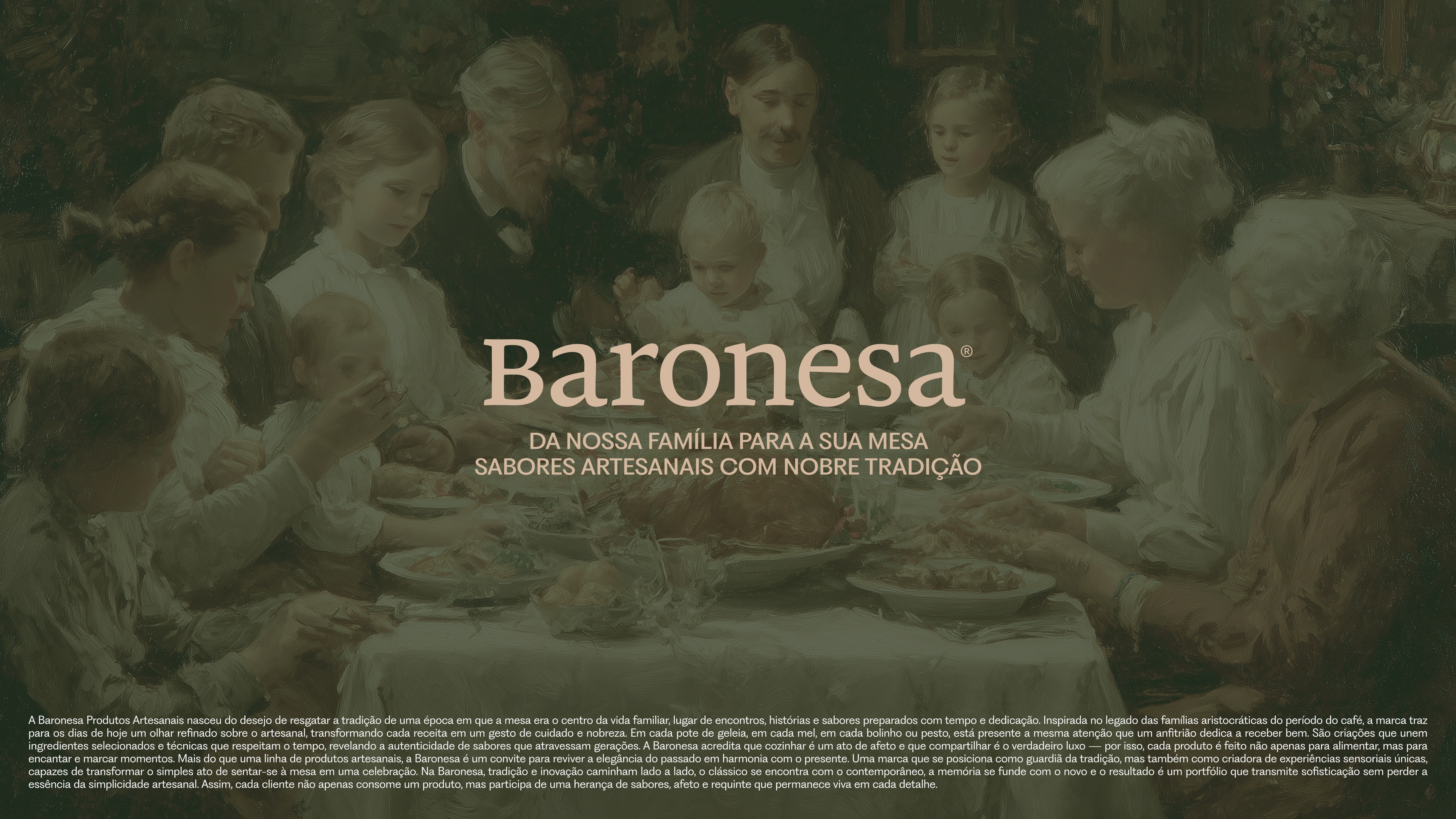
Baronesa brand identity
Challenge
Translate family heritage into a brand with shelf presence and tactile coherence.
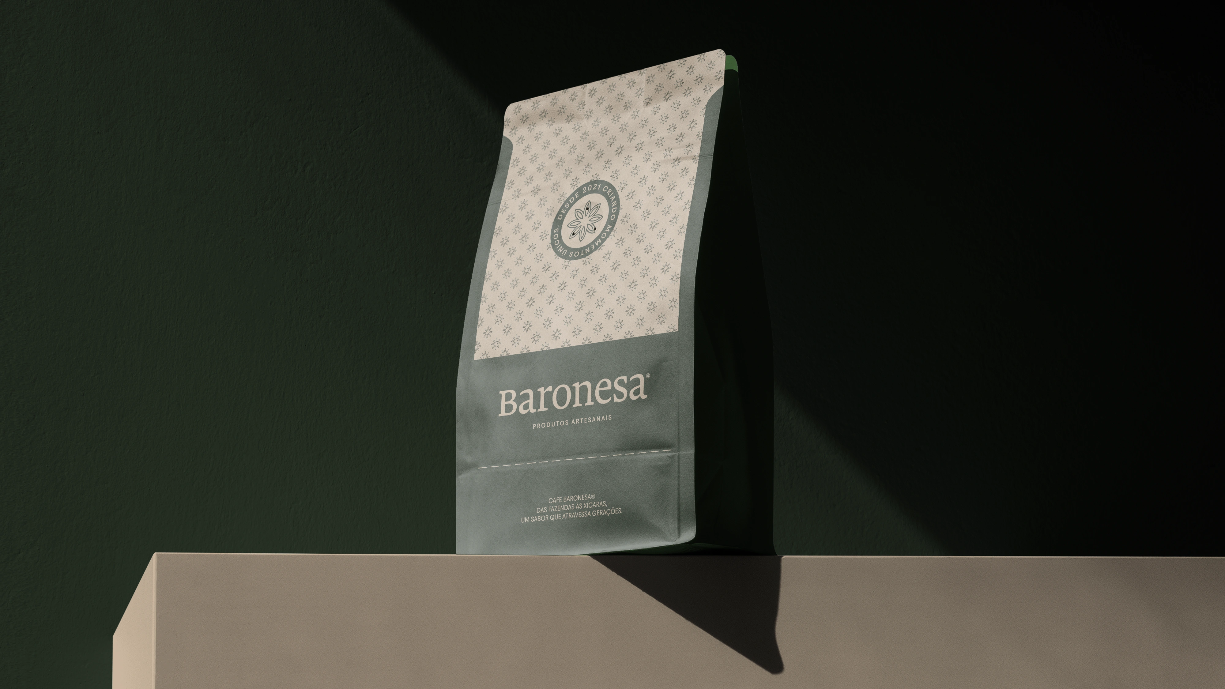
Baronesa coffee packaging
The system
A visual identity built around tradition and craft: logotype, palette and packaging direction shaped for handmade product lines.
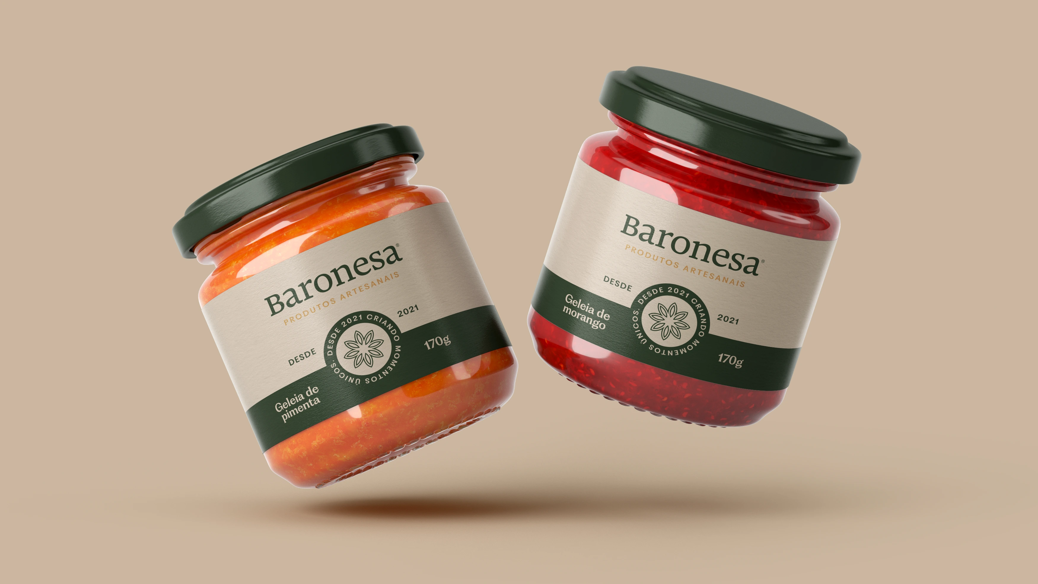
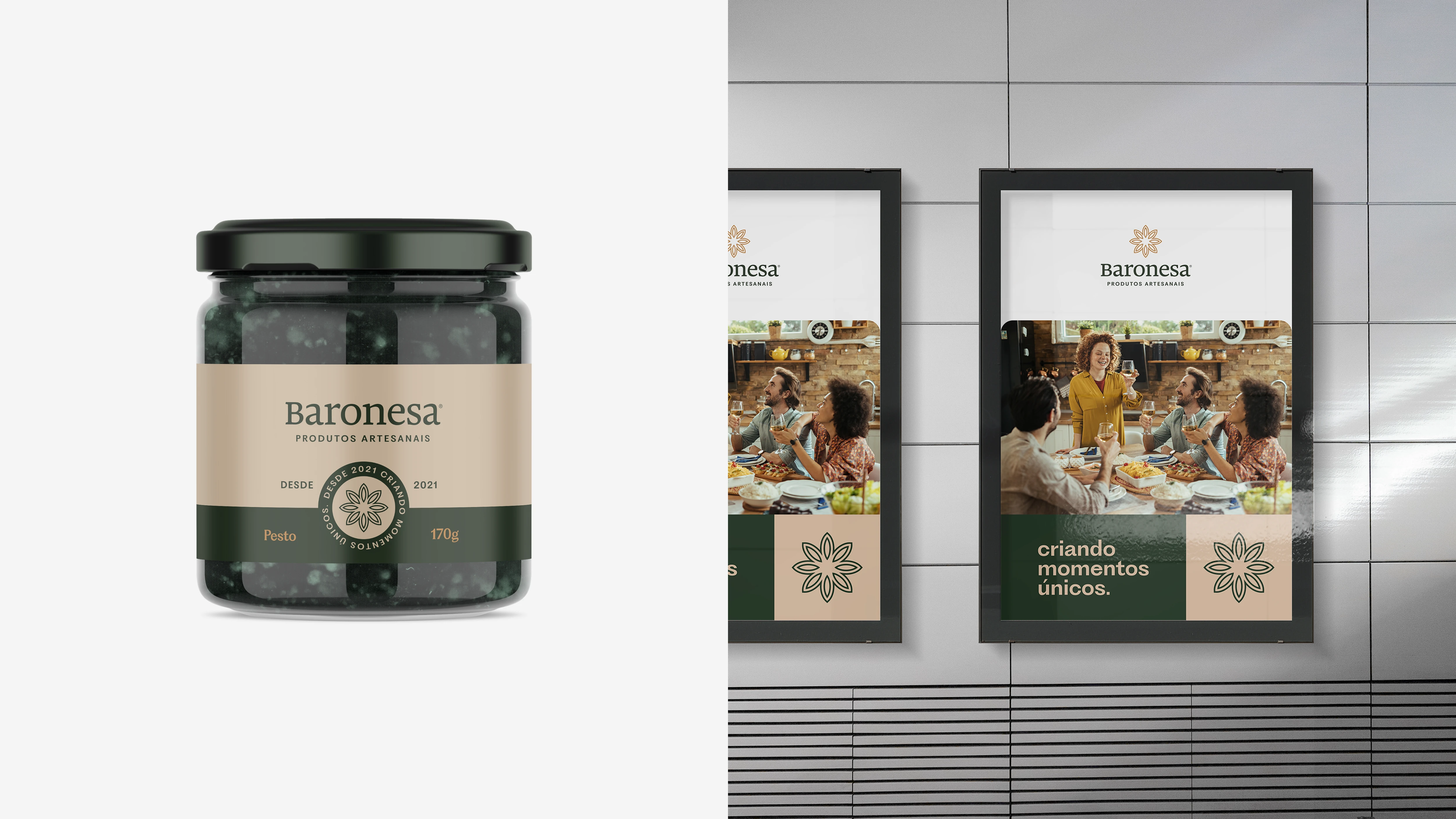
Baronesa jam jars
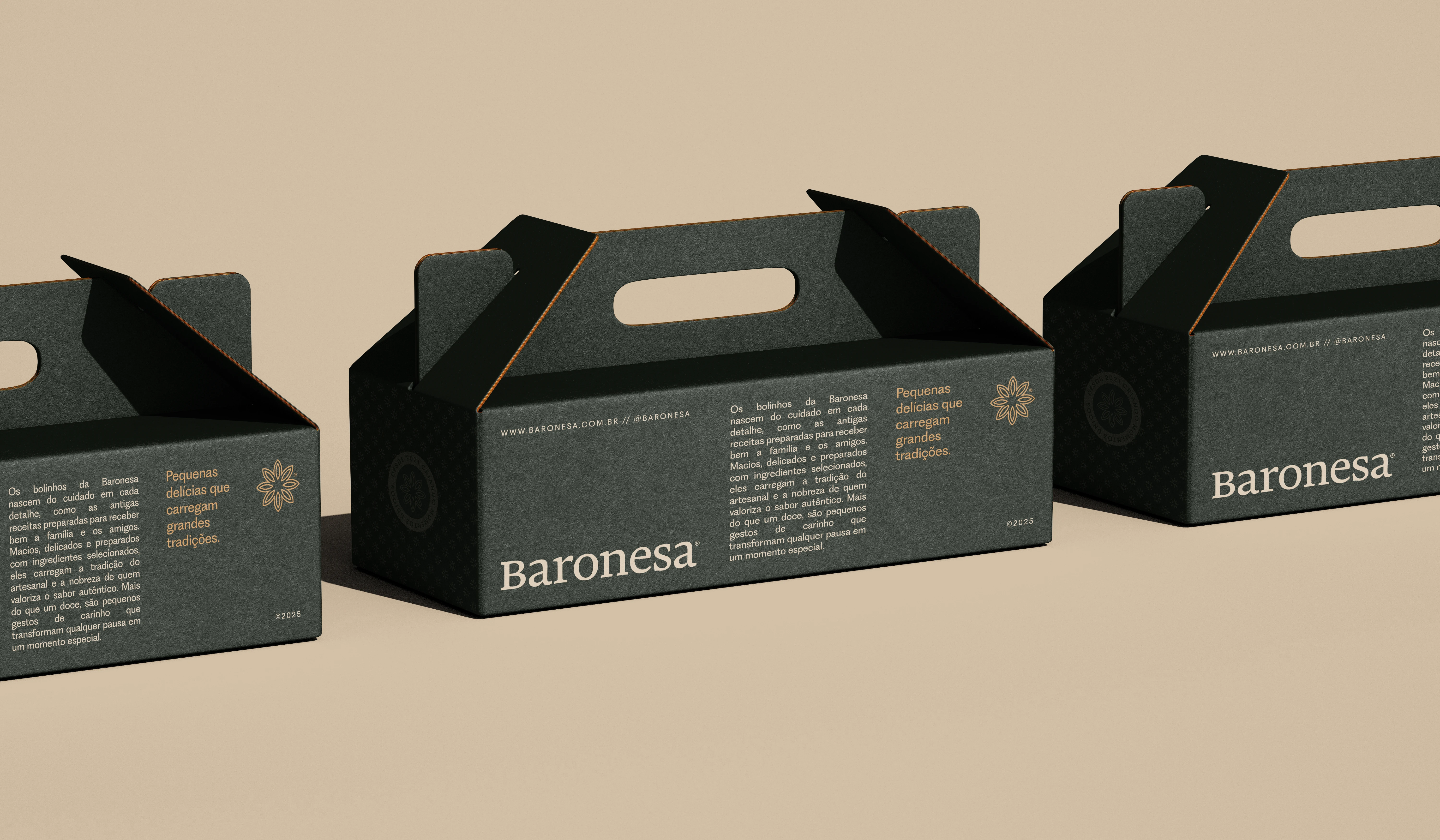
Baronesa gift boxes
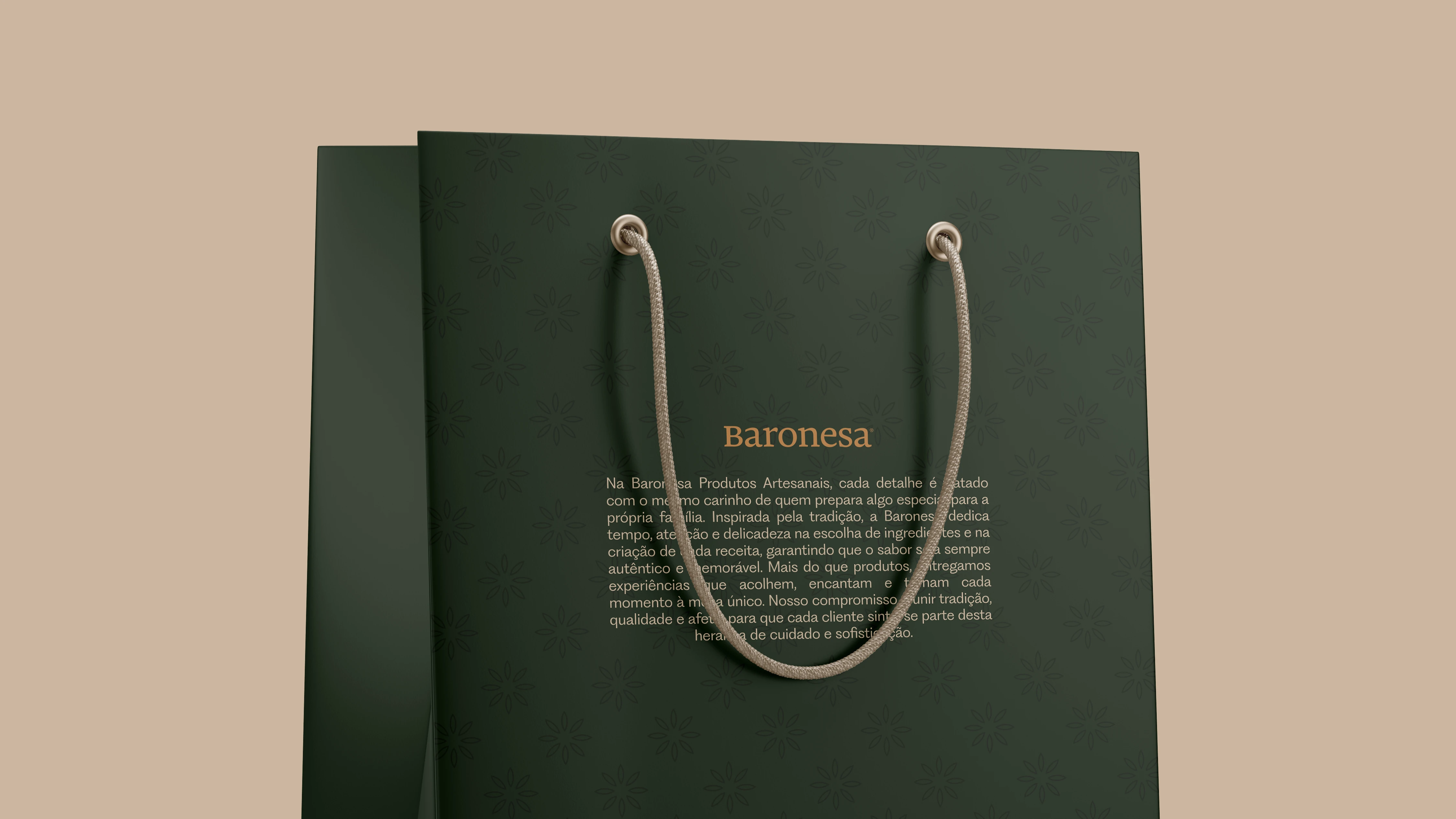
Baronesa shopping bag
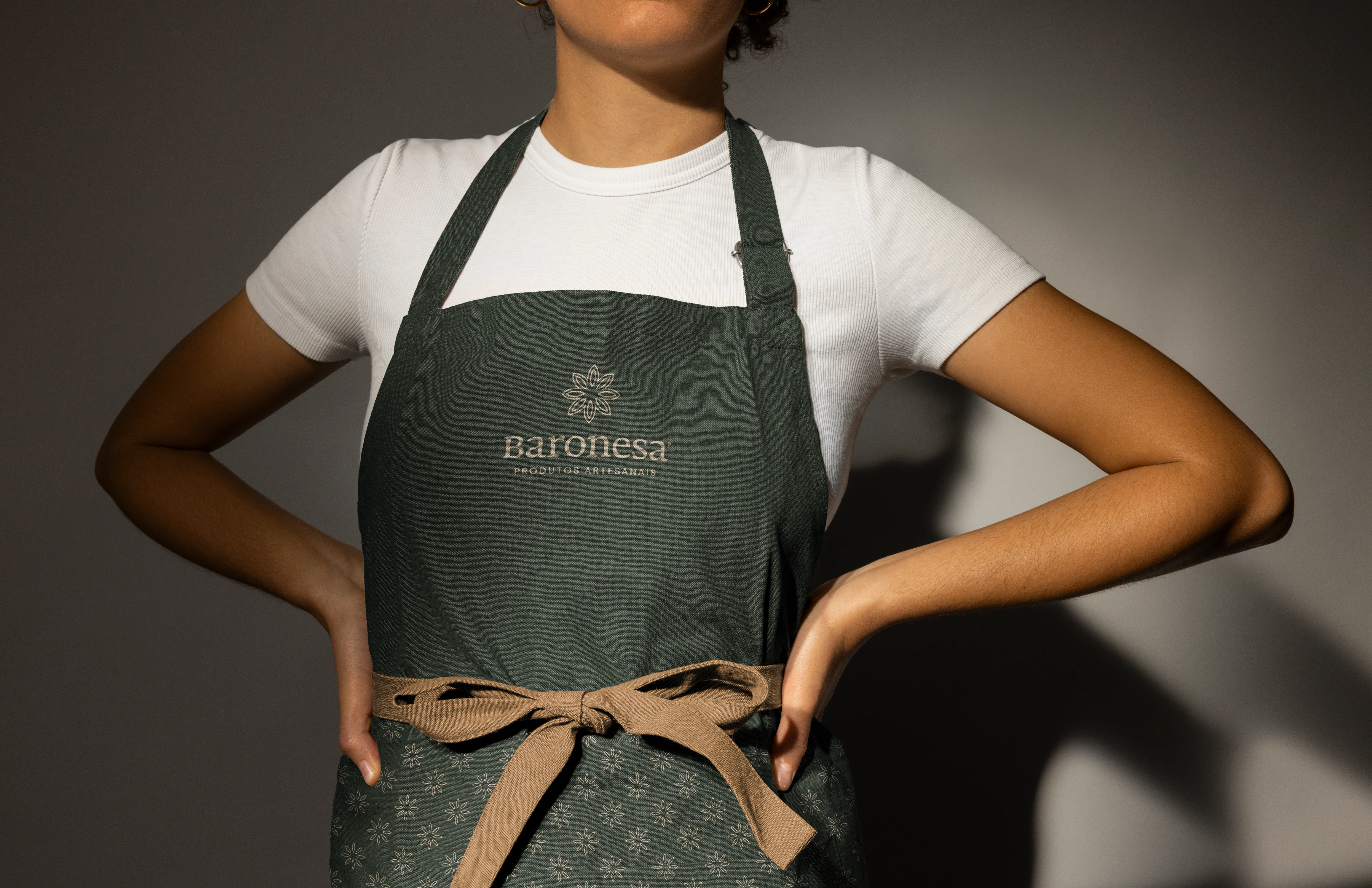
Baronesa apron
Delivered
Visual identity and brand applications for packaging and communication.
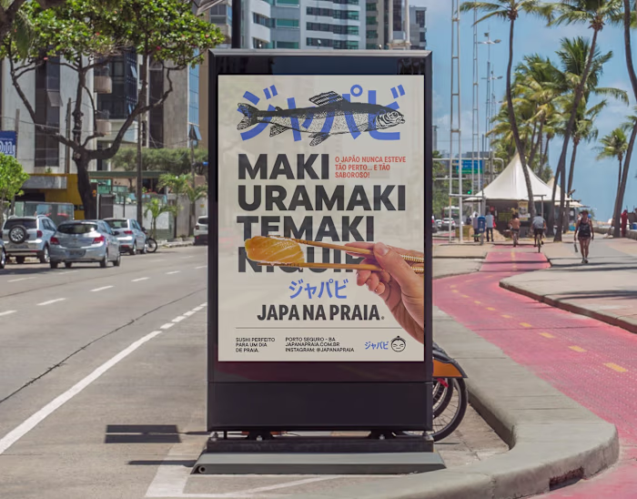
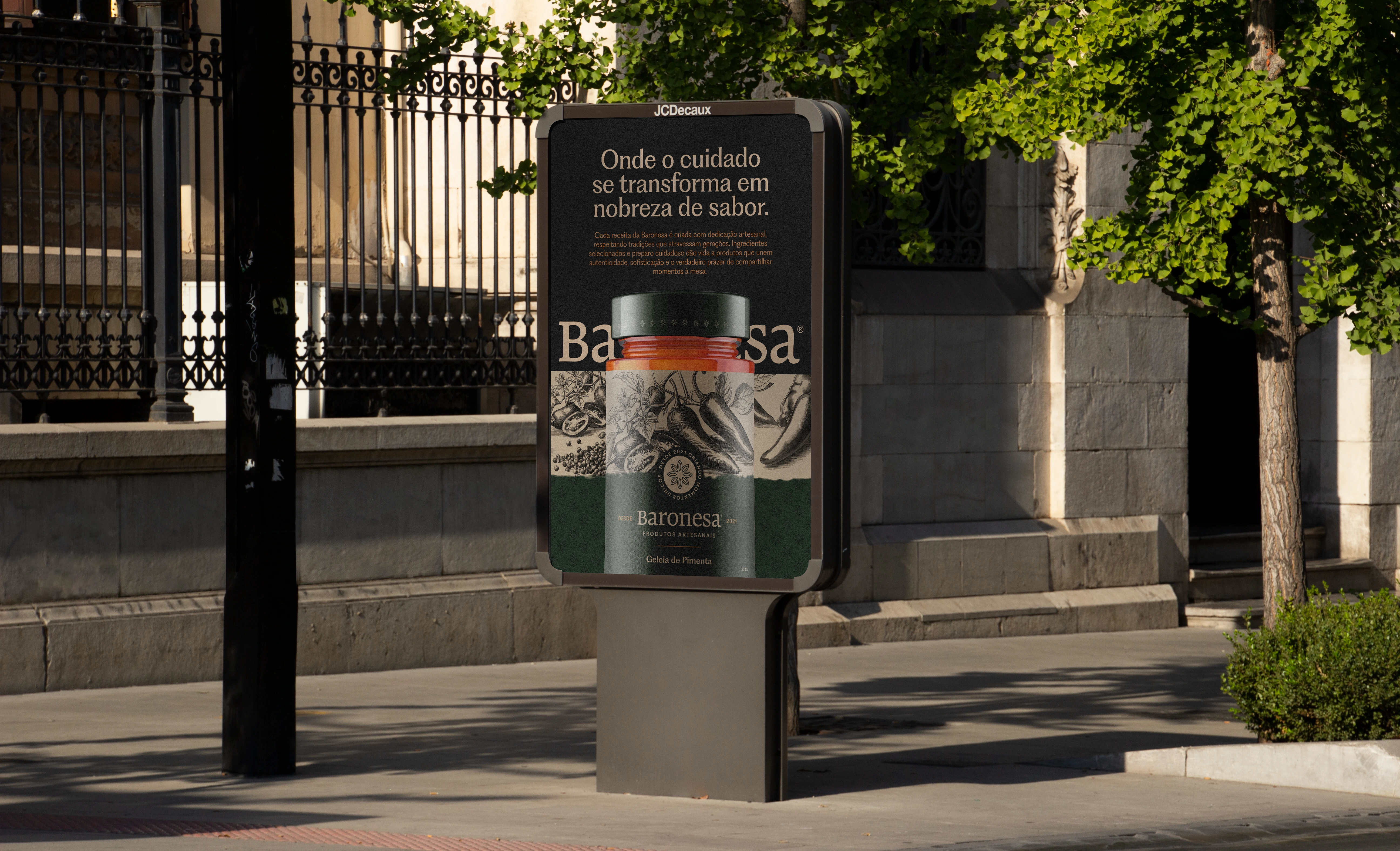
Baronesa street poster
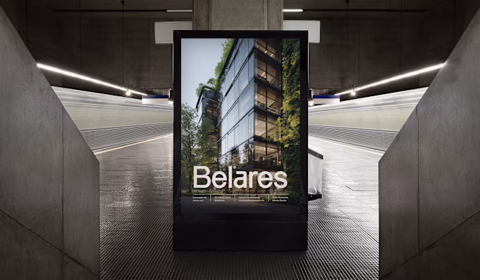
Baronesa poster and signage
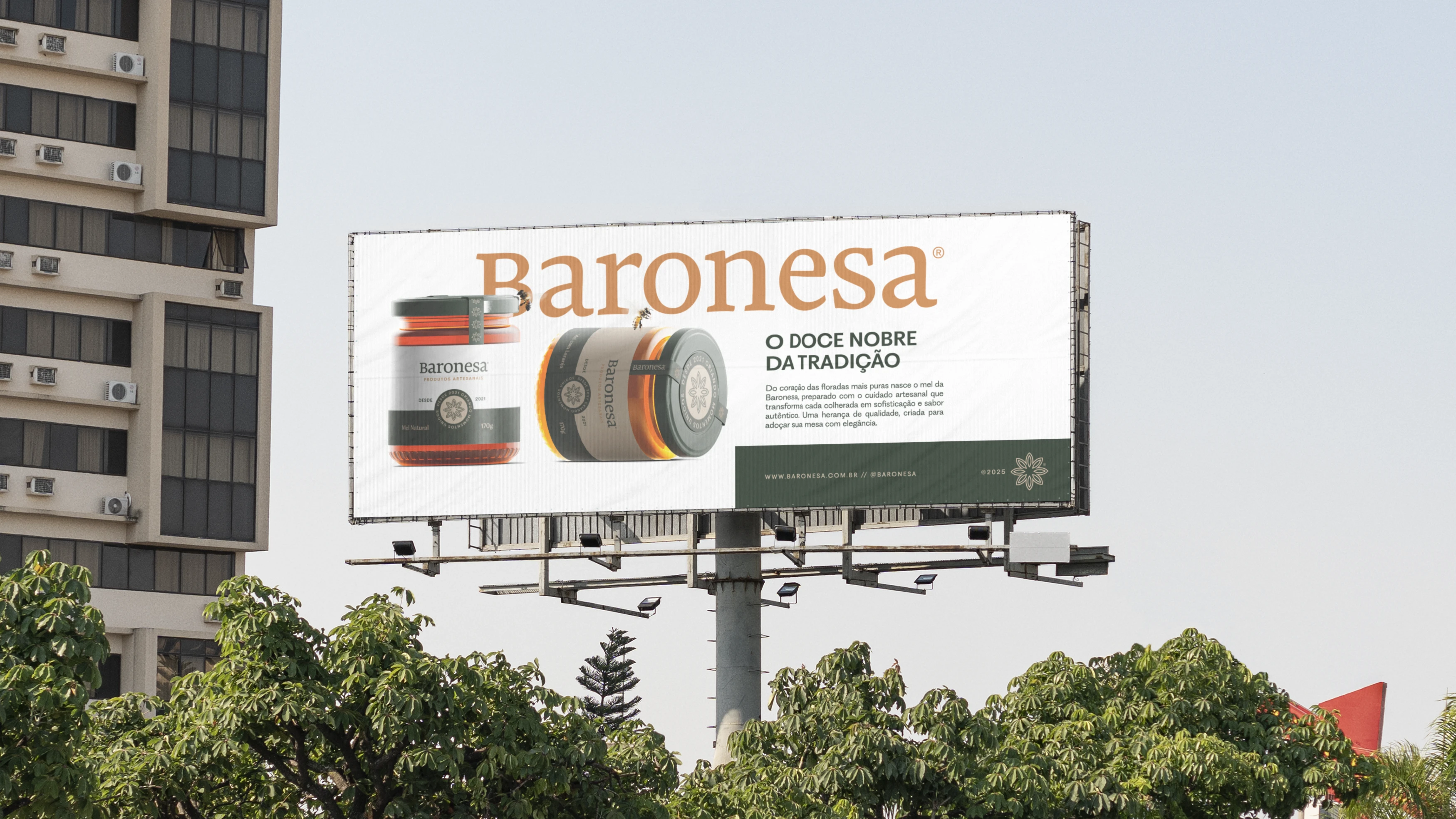
Baronesa billboard
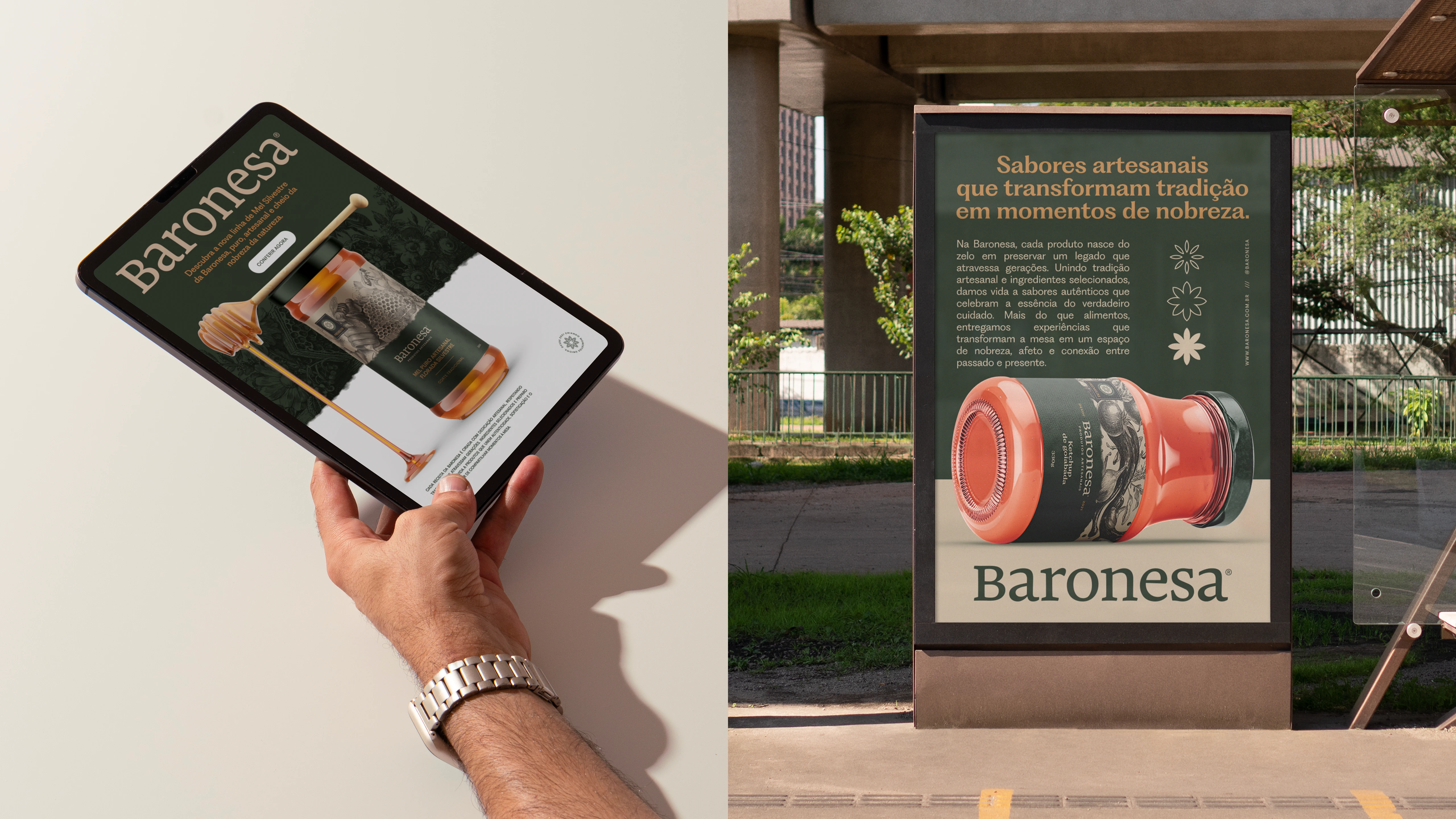
Baronesa tablet and poster
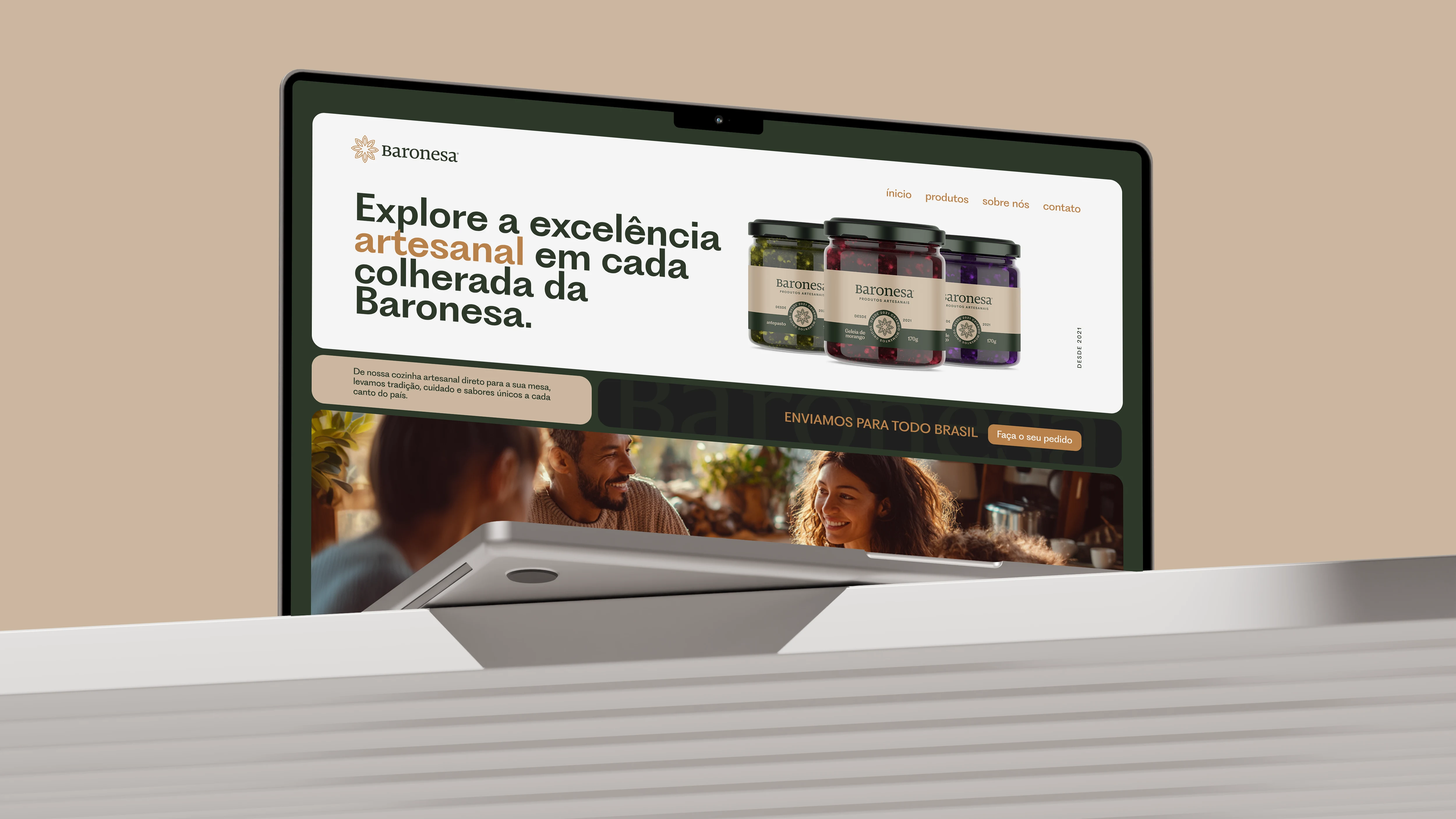
Baronesa website
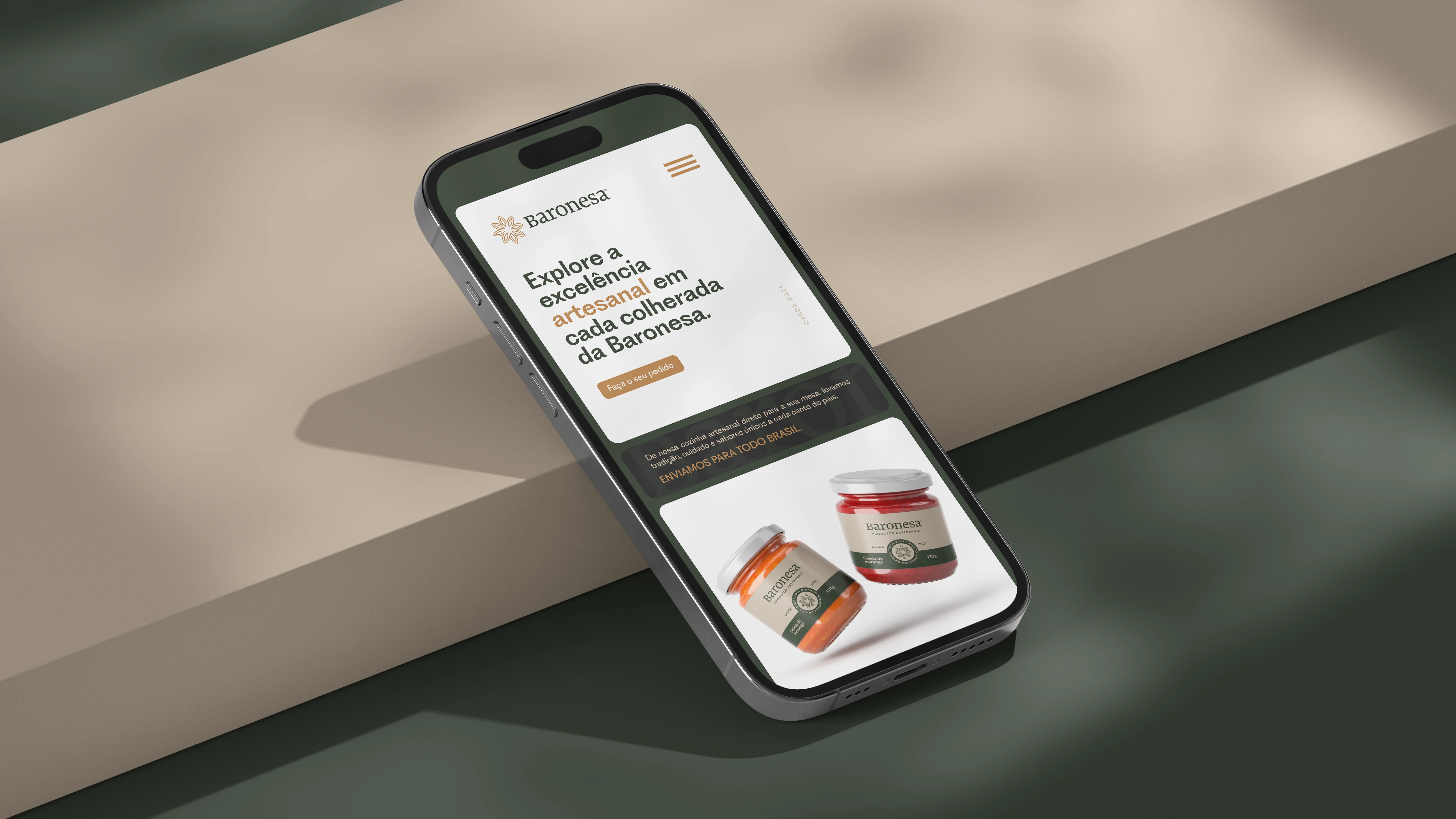
Baronesa mobile website
Like this project
Posted Nov 28, 2025
Visual identity for a handcrafted products brand rooted in family tradition: logotype, palette and packaging direction.