Built with FlutterFlow
Tendral Health - Brand identity & product design — by Kaleo

Jacob Lovett


Clinicians don't have spare attention, and they don't trust easily. Every extra tap, vague label, or unclear payout is a reason to close the tab. Tendral needed a brand that reads as clinical-grade credible in the first three seconds, and a product that answers the only two questions that matter to a physician mid-shift: is this worth my time, and will I actually get paid
The Brand
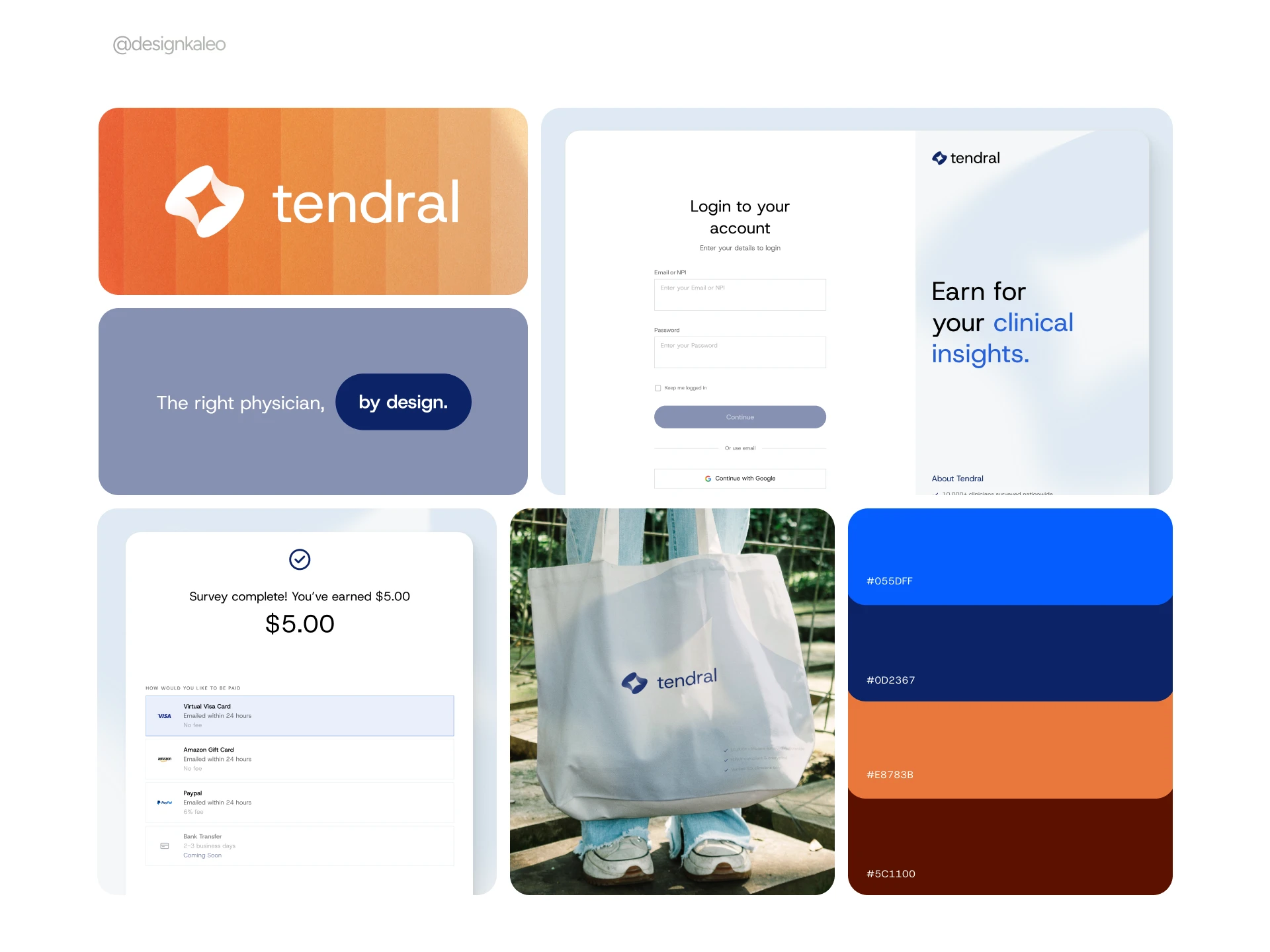
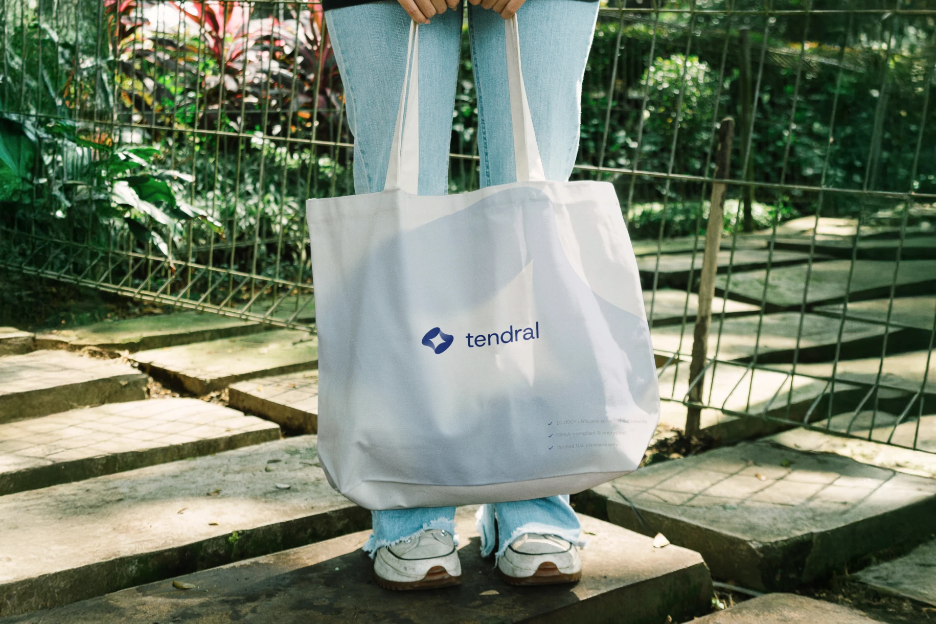
The mark is a sleek twisting diamond — two perspectives resolving into one. It's a quiet nod to what the product actually does: turning individual clinical opinions into decision-grade data. It also had to work small — favicon, app icon, pin badge — so the form stays legible at almost any size.
The palette splits the brand in two. Navy and blue carry the clinical, trustworthy half — the register a physician expects from anything touching their license or their patients. Orange carries the human half — warmth, energy, the "you're getting paid for this" feeling. Keeping them separate instead of blending them let each screen lean into whichever register it needs.
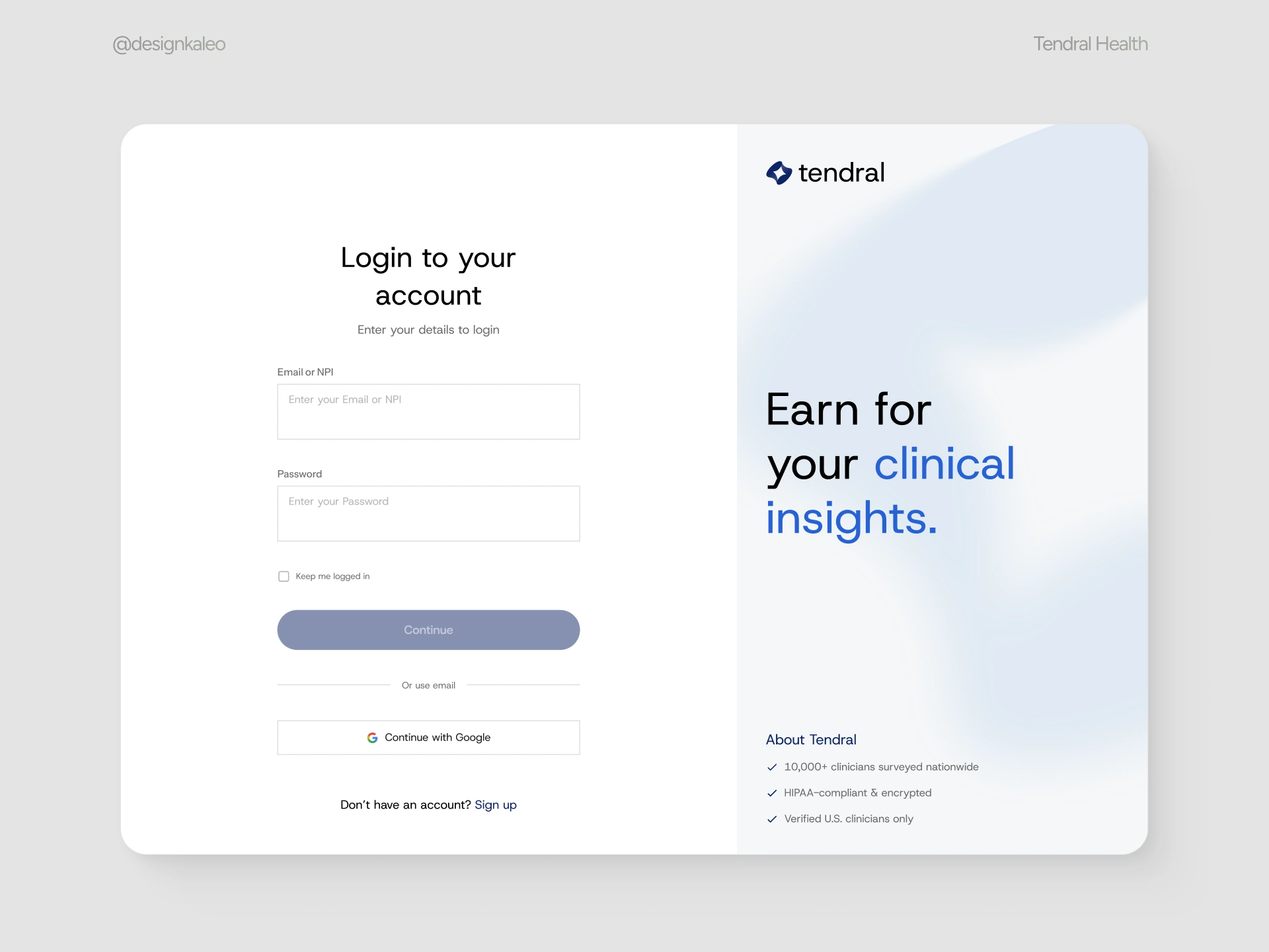
Two lines do most of the work across the brand. "The right physician, by design" is the company-level promise — matching the right expert to the right question. "Earn for your clinical insights" is the product-level promise — the thing a clinician actually reads before they click in. Both are direct about value, on purpose. Nothing about this audience responds to being sold to.

The product had to look as credible on a laptop in a break room as it does on a marketing page — no separate "polished" version for the pitch and rougher version for the real thing. Recruitment swag needed the identity to survive outside a screen entirely — on fabric, on metal, at a conference table. The mark and wordmark were built to hold up at that scale without extra ornamentation propping them up.
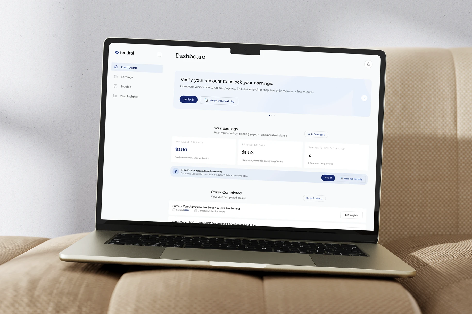
The Product
Every screen in the survey flow was designed around one job: move a verified clinician from interested to paid with as few decisions as possible standing in the way.
Sign-in asks for email or NPI number — recognizing clinicians up front as clinicians, not generic users. HIPAA-compliance and verification messaging sit right on this screen, not buried in a footer, because trust has to be established before anyone is asked to type a password.
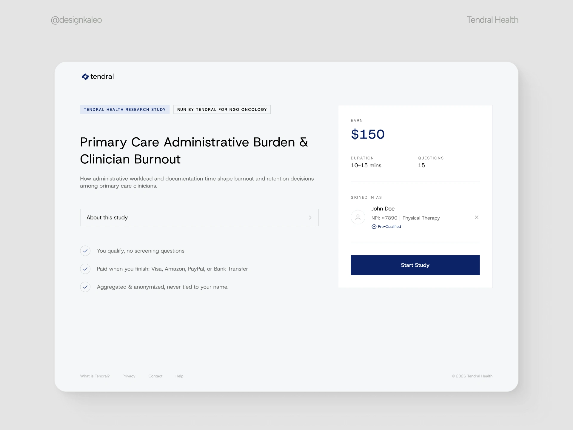
Before a single question loads, the welcome screen shows the payout, the time commitment, the number of questions, and who's signed in. Nothing is revealed gradually or gamified — a clinician should be able to decide in five seconds whether this is worth fifteen minutes, with the full deal in front of them.
The core question types were built to feel like one continuous form, not a patchwork of components. Single- and multiple-choice cover the fast, low-effort questions; open text and voice input give clinicians a way to answer in their own words when a checkbox can't capture the nuance of clinical judgment.
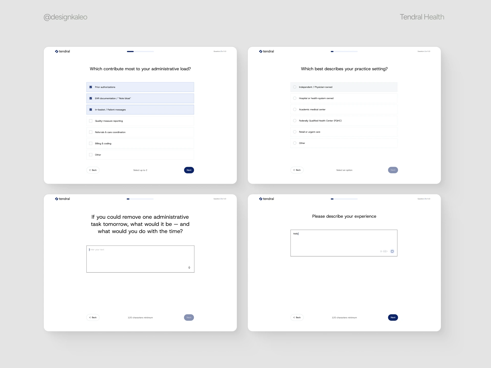
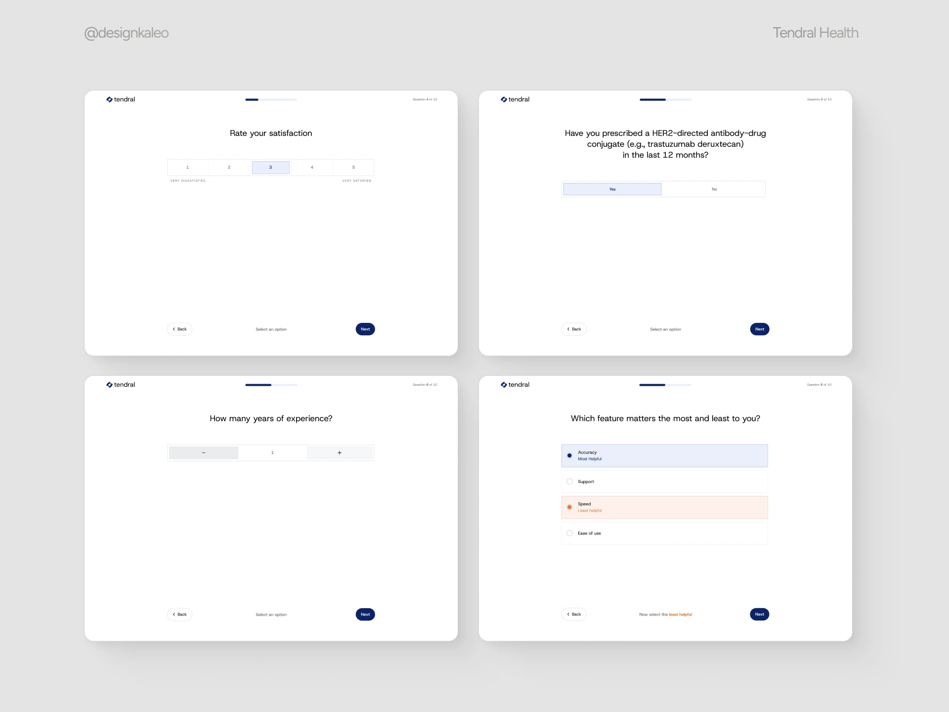
Ratings, binary calls, steppers, and rankings handle the more structured, data-hungry questions researchers actually need — the kind that produce clean, comparable answers across hundreds of respondents. Each still uses the same button placement, spacing, and progress indicator as every other screen, so switching question types never breaks the rhythm of the survey.
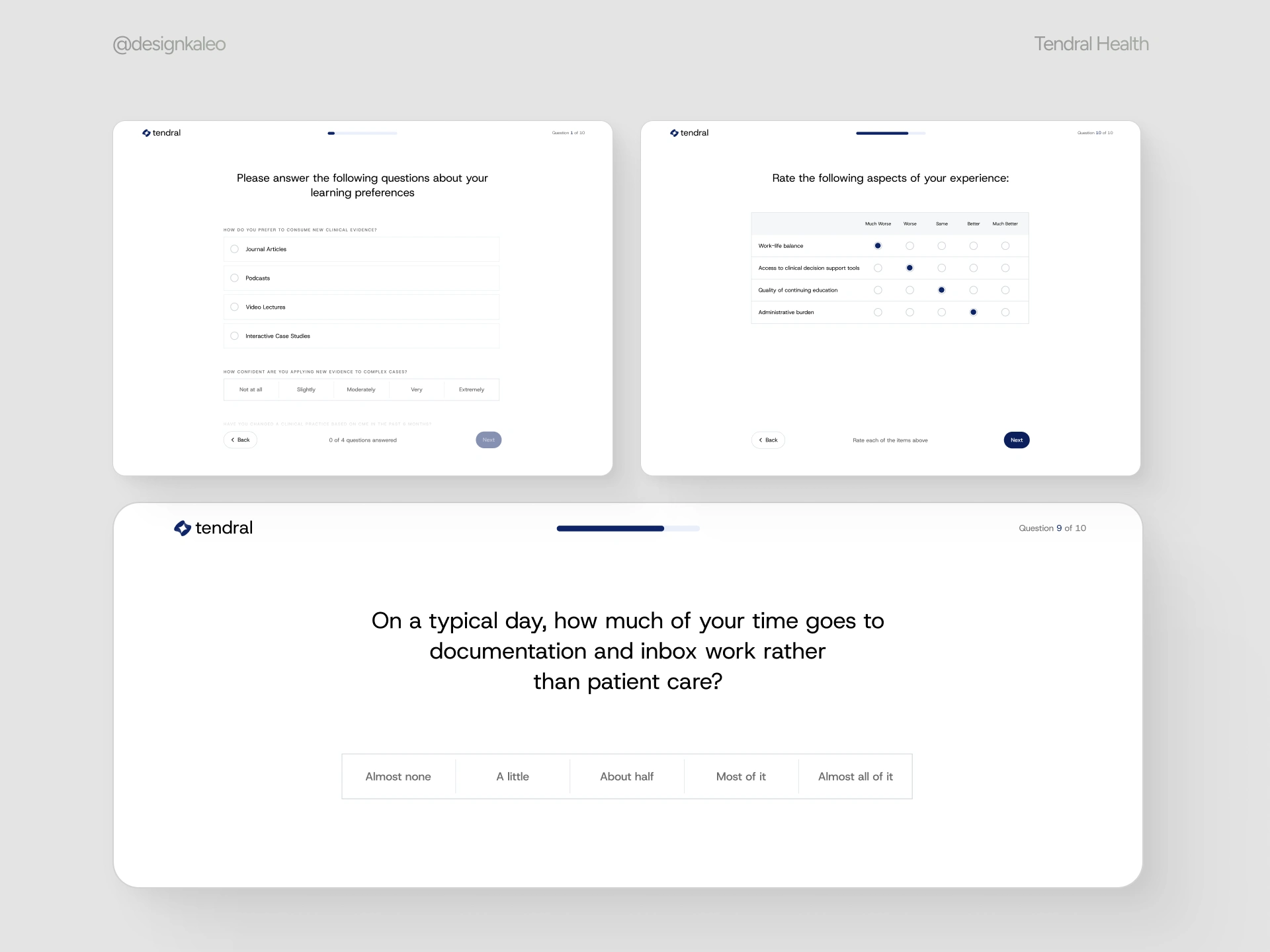
The comparative table and stacked-question formats exist for the surveys that need to ask several related things at once without turning into ten separate screens. It's the most information-dense format in the system, so it was the one most tested for staying scannable at a glance — labels, scale points, and rows all had to hold their alignment without extra explanation text.
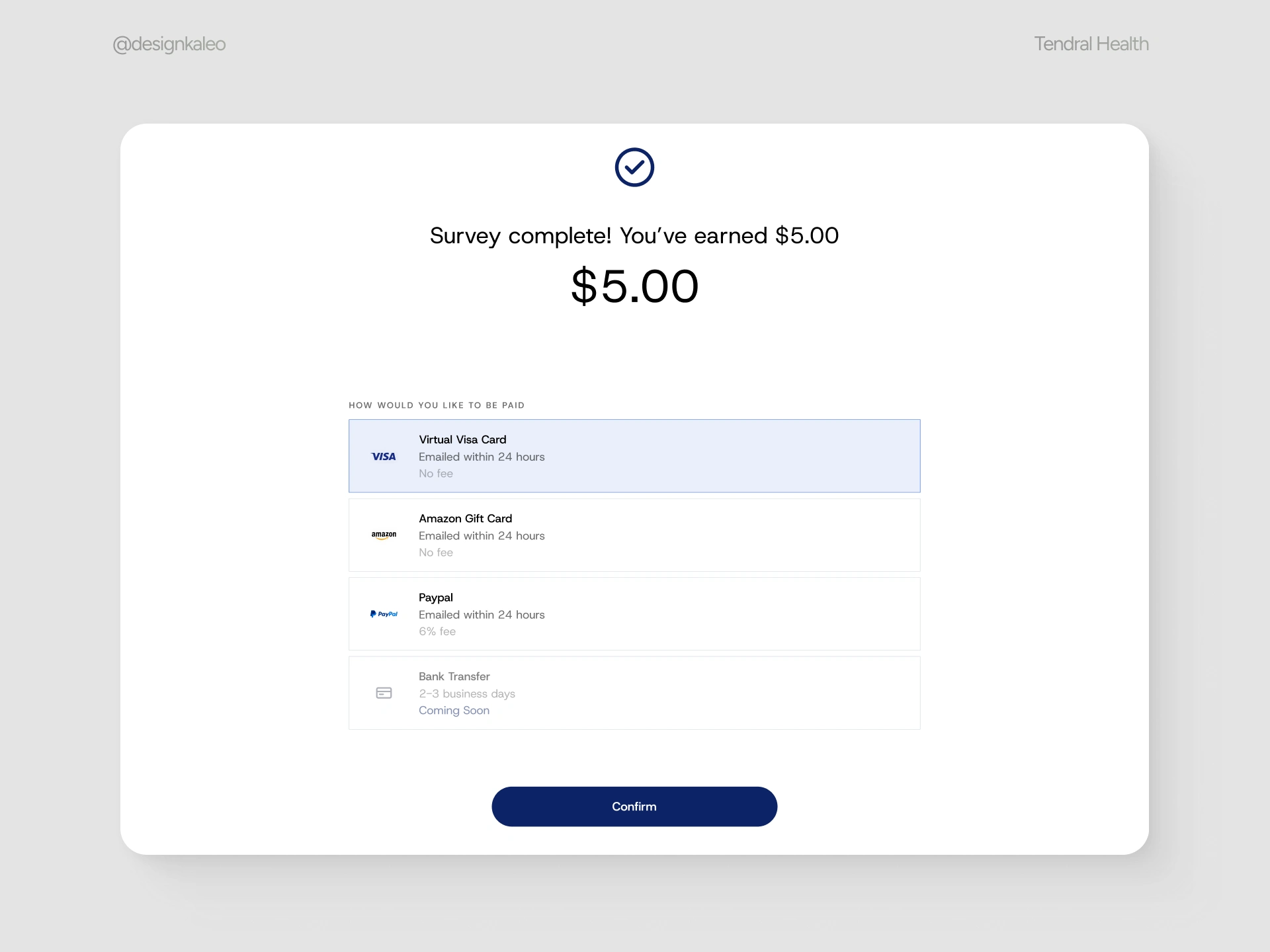
Completion is immediate and unambiguous — the earned amount is the largest thing on the screen, followed straight away by how to get paid. Four payout options are shown with their fee and delivery time up front, so the last decision in the flow is as friction-free as the first.
Outcome
The result is a brand and product that don't read as two separate efforts stitched together. The same navy-and-orange system, the same directness in the copy, and the same "here's exactly what you get" logic run from the sign-in screen through to the payout confirmation, the laptop mockup, and the tote bag someone carries out of a recruiting booth.
Design: Kaleo Client: Tendral Health
Like this project
Posted Jul 30, 2026
Developed a cohesive brand and product for Tendral Health to enhance credibility with clinicians.
Likes
1
Views
28
Clients
Tendral Health