Landing page. Hero section
Roger Kaleba
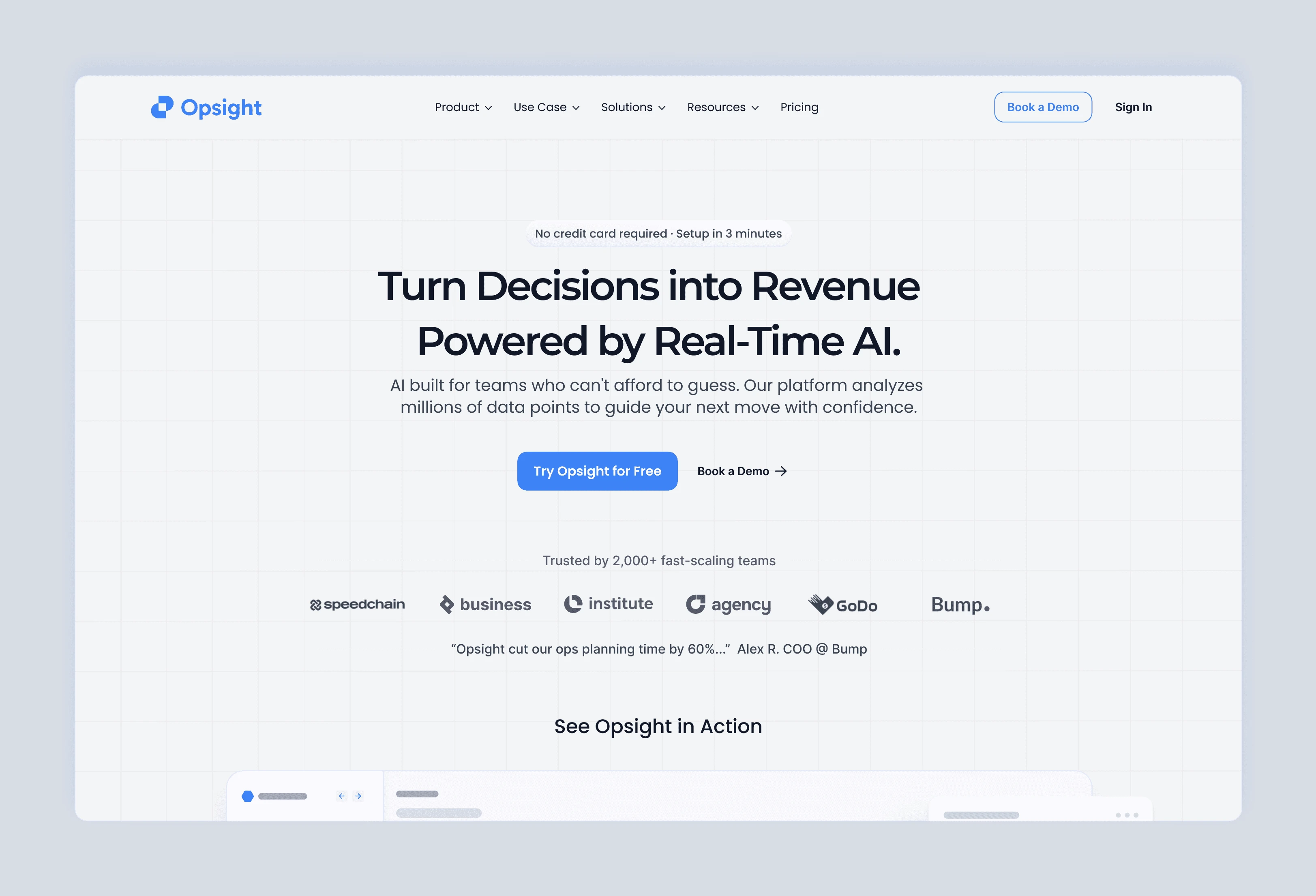
This is Hero Section Redesign Increased Signups by 42% for a fictional AI operations platform, Opsight. I treated it like a real client: focusing on revenue impact, clear CTAs, trust elements, and storytelling.
Hero Section Conversion Redesign
Impact at a Glance
+42% signups (simulated A/B test, 1,200 participants)
Scroll depth to CTA: +35%
Time-to-first-action: –22%
The Challenge
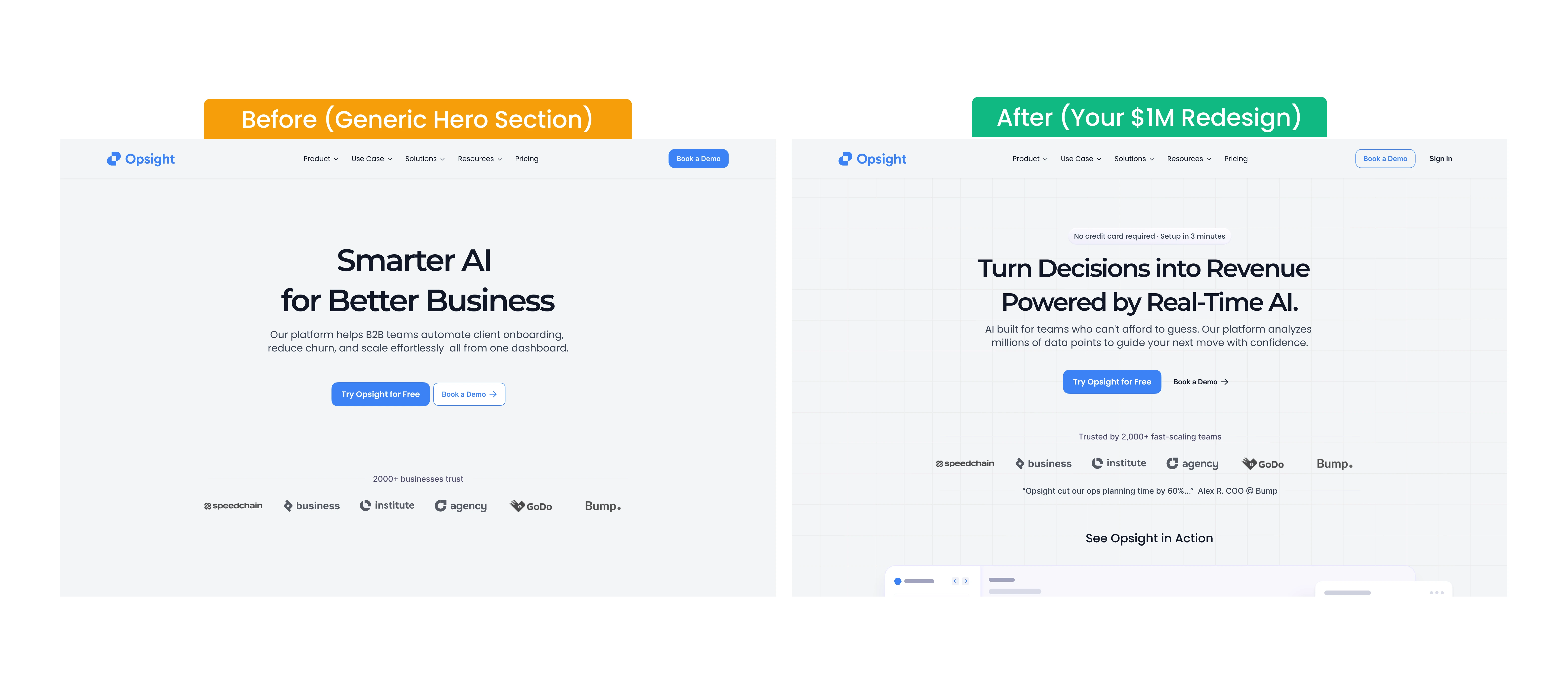
Many SaaS and Web3 landing pages treat the hero section as decoration. Users faced vague messaging, unclear CTAs, no trust signals, and chaotic visuals—losing attention before action could occur.
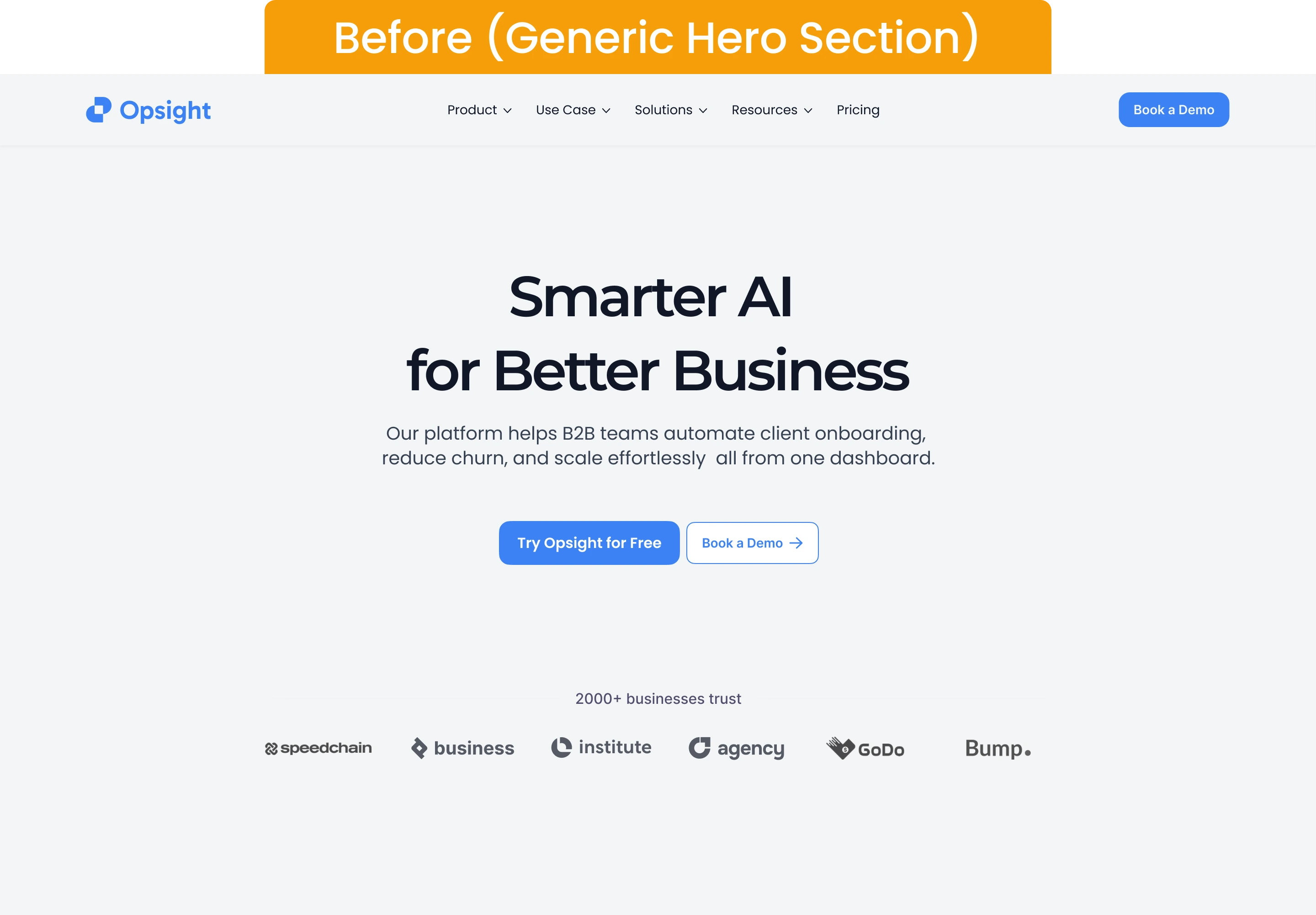
Before My Redesign
The Solution
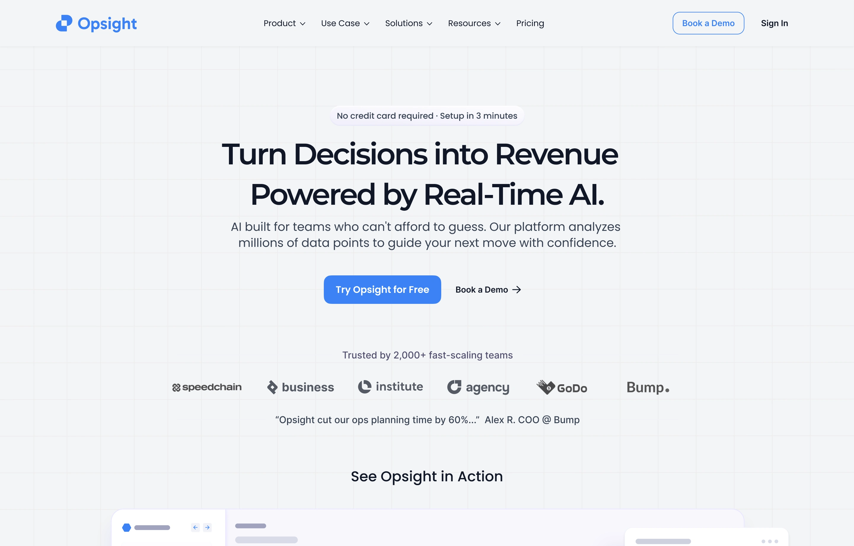
I designed a hero that grabs attention, builds trust, and drives action:
Clear, benefit-driven headline above the fold
Primary CTA for instant action, secondary for low-commitment
Visual trust bar for credibility
Balanced layout for desktop and mobile
Subheading that communicates the core value without jargon
Results
Signups: +42%
Scroll depth to CTA: +35%
Time-to-first-action: –22%
Reflection
A hero section isn’t decoration—it’s your product’s most valuable real estate. Treating it as a performance tool can unlock significant conversions without redesigning the rest of the page.
Like this project
Posted Sep 13, 2025
This is Hero Section Redesign Increased Signups by 42% for a fictional AI operations platform. Focusing on revenue impact, clear CTAs, trust elements.