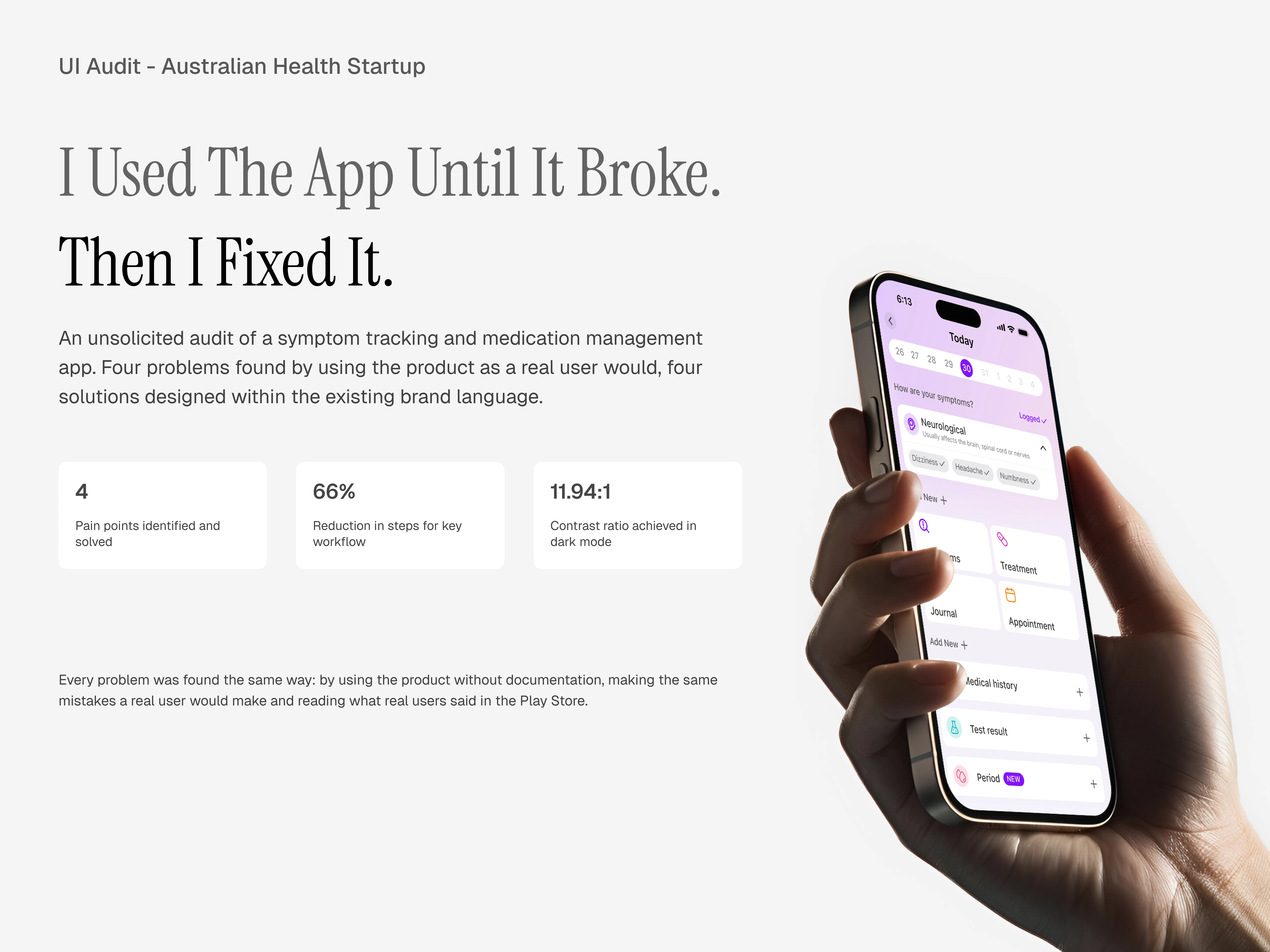
Human Health iOS App UI Design audit & Redesign
Oluwatobi Adetunji
Overview
4 key opportunities identified in Human Health v6.13.1
Unnatural button placement (The “Log Today” screen breaks expected navigation patterns, leading to repeated missclicks)
Titles for Journal Entry (Adding titles helps users scan and revisit journal entries faster, improving content structure and readability)
Treatment Management (Current navigation to manage treatments is complex and inconsistent; simplified access reduces friction by 66%)
Accessibility Standards (Text contrast fails AA and AAA standards in dark mode; adjustments improve readability and inclusivity)
Background & Goals
In this project, I’ll be walking you through my redesigns for the Human Health app and explaining the thought process behind each one.
While working on this, I used the latest version available on the Apple App Store (v6.13.1).
My goal wasn’t to change the app’s identity but to make small, meaningful improvements that make it easier, faster and more intuitive to use.
Redesign 1: Unnatural Button Placement
This redesign was prompted by a particular mistake I kept making in the “log today” screen.
The button to go back/exit the screen is placed in an unnatural position - bottom center. Years of using several operating systems has taught millions of users to reach for the top left corner when they want to go back, it has now become muscle memory that users don’t have to think about before taking the action.
In this particular screen however, the button that occupies the top left corner is a button that looks exactly like it but doesn’t perform the expected action, it controls the calendar component instead.
This caused so many missclicks from me personally before i realized that the button to go back/exit is elsewhere - bottom center.
Moving away from the “log today” screen, other screens in the app have the back button exactly where it is expected to be - top left corner, the “log today” screen looks like the only odd one out there and that violates Nielsen’s consistency and standards’ heuristics.
Redesign 1: Unnatural Button Placement - Solution
To solve this, I redesigned the calendar component so that the user can still interact with it as intended and also have the back button work as users expect it to work.
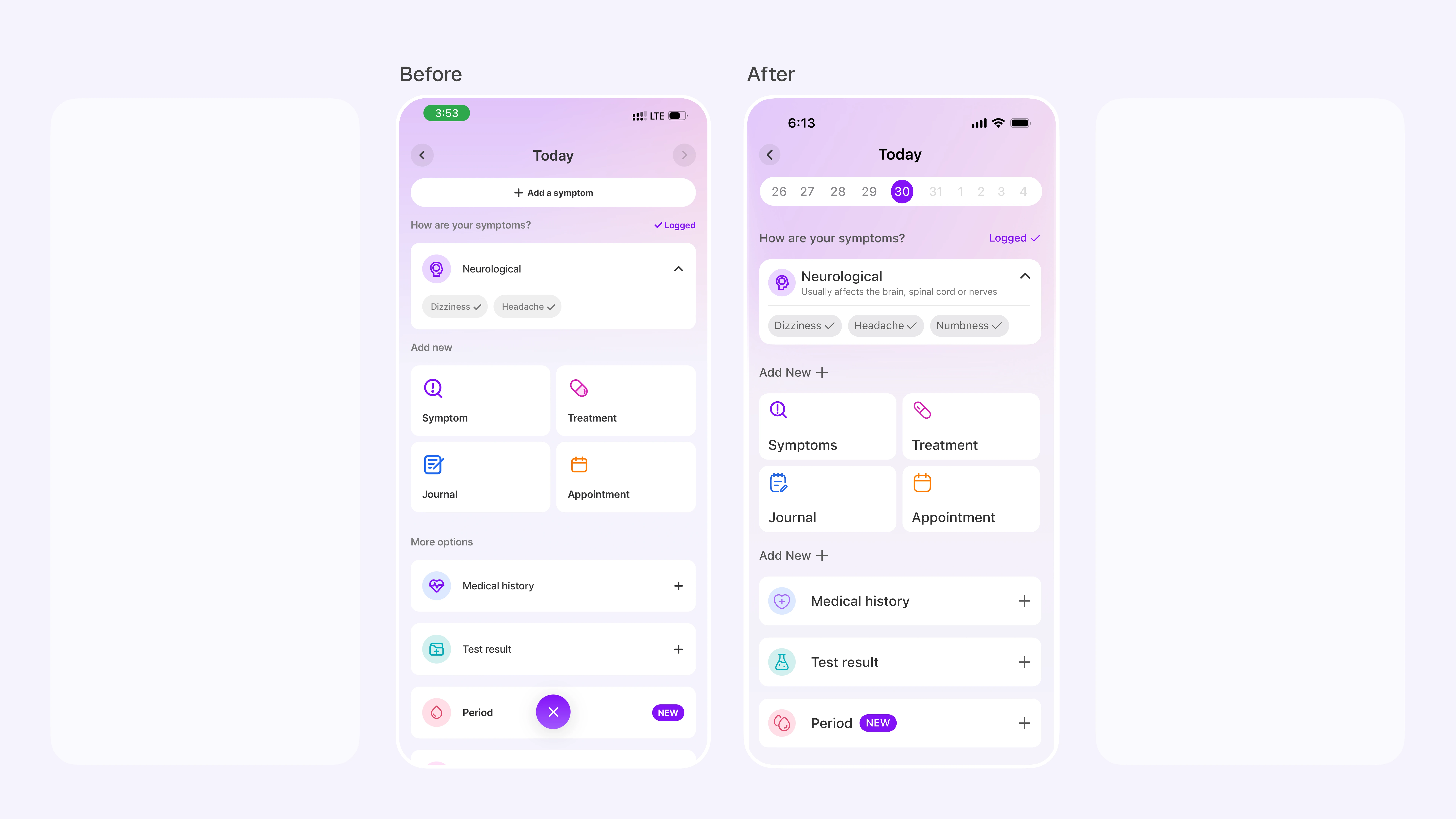
Before and after image of the the "Log today" screen where the calendar component at the top has been redesigned and the back icon works as expected
Redesign 2: Titles for Journal Entry
The journal entry feature is an excellent addition to the app and I love it. Adding a title for user’s journals will make it even better.
It will help users scan through their entries much faster whenever they are trying to revisit it for any reason.
This will help users categorize their feelings, thought processes and everything in-between.
This also helps improve the information architecture of user’s journals
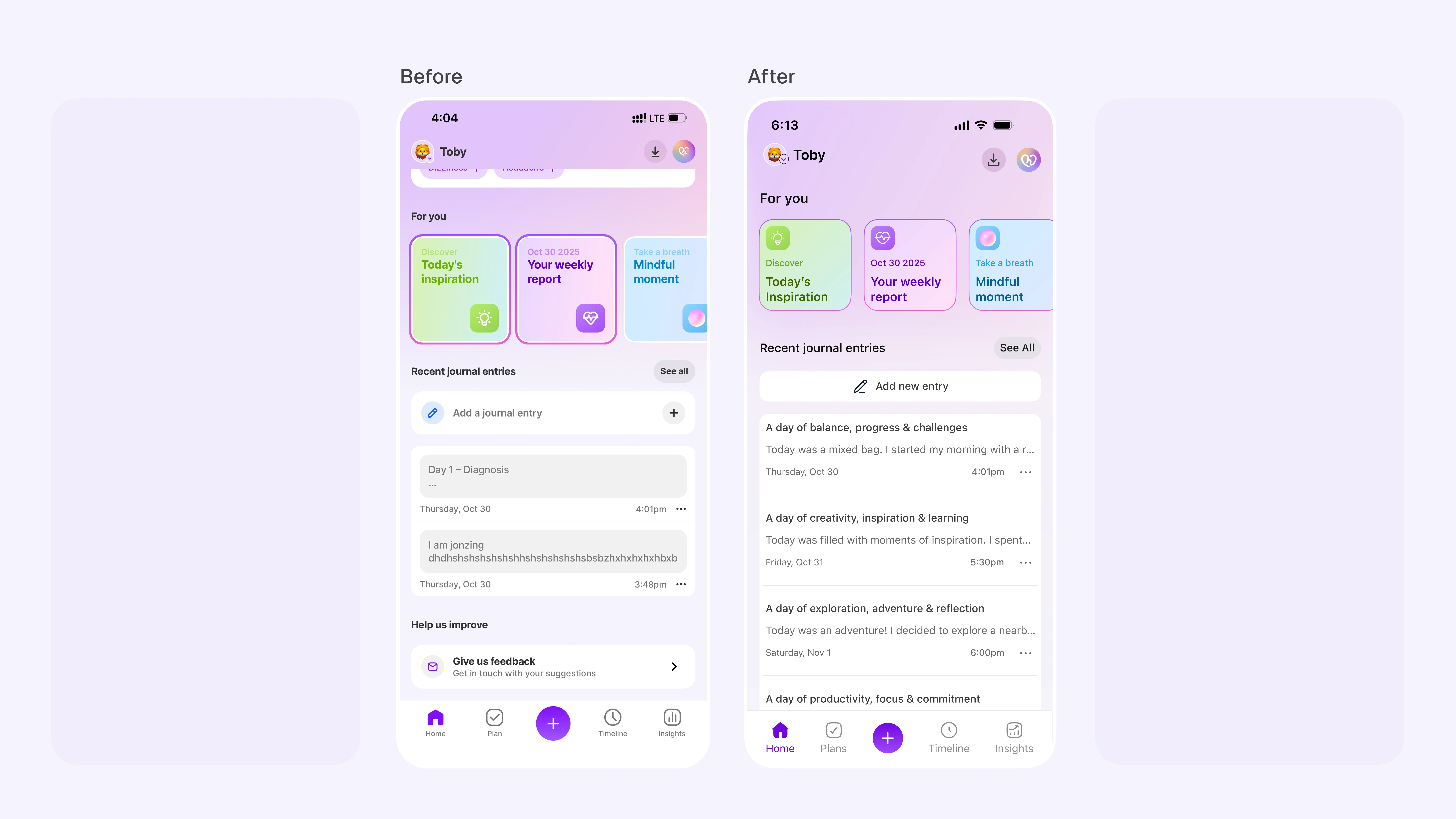
Before and after image of the Journal entries with the headers
Redesign 3: Treatment Management
While working on this audit, I decided to take a look at what existing users of the app think so I went through the app’s reviews on the Google play store where I found a review that caught my attention so I decided to solve the user’s pain point.
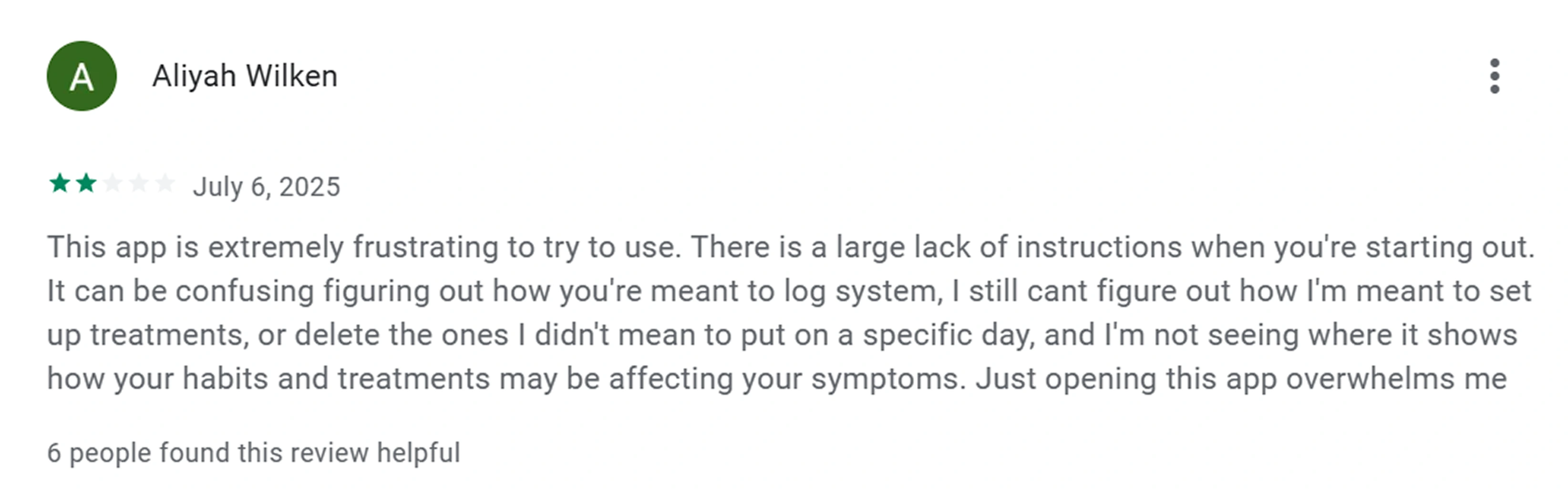
Google play user review
It looks like this user input the wrong treatment information during their onboarding flow and they are now trying to make changes to it but they cant figure out how.
Currently, navigating to the manage treatment screen where they can make these changes can be done in 3 ways:
Through the plans tab > more > manage treatment.
Through the profile icon > treatments > manage treatment.
Through “your assistant” > more > Manage treatment (This method is not always available because once the user has logged their treatment for the day, it disappears)
So this user is frustrated and overwhelmed because they don’t know that they can take either of the first two routes to edit their treatment after their onboarding (assuming the 3rd route has disappeared)
Redesign 3: Treatment Management - Solution
To solve this user’s pain point, I addressed two issues at the same time.
The salutation section of the homepage is taking up an excessive amount of space that can be put to better use.
I designed a component that will be dedicated to treatment logging and also provide a single click button into the manage treatment screen all from the home page. (A variant of this component already exist for symptom logging on the home page)
Reduced number of clicks by 66%. From 3 clicks to 1
This way, the user has a direct, permanent and easy-to-locate link to their treatment management screen.
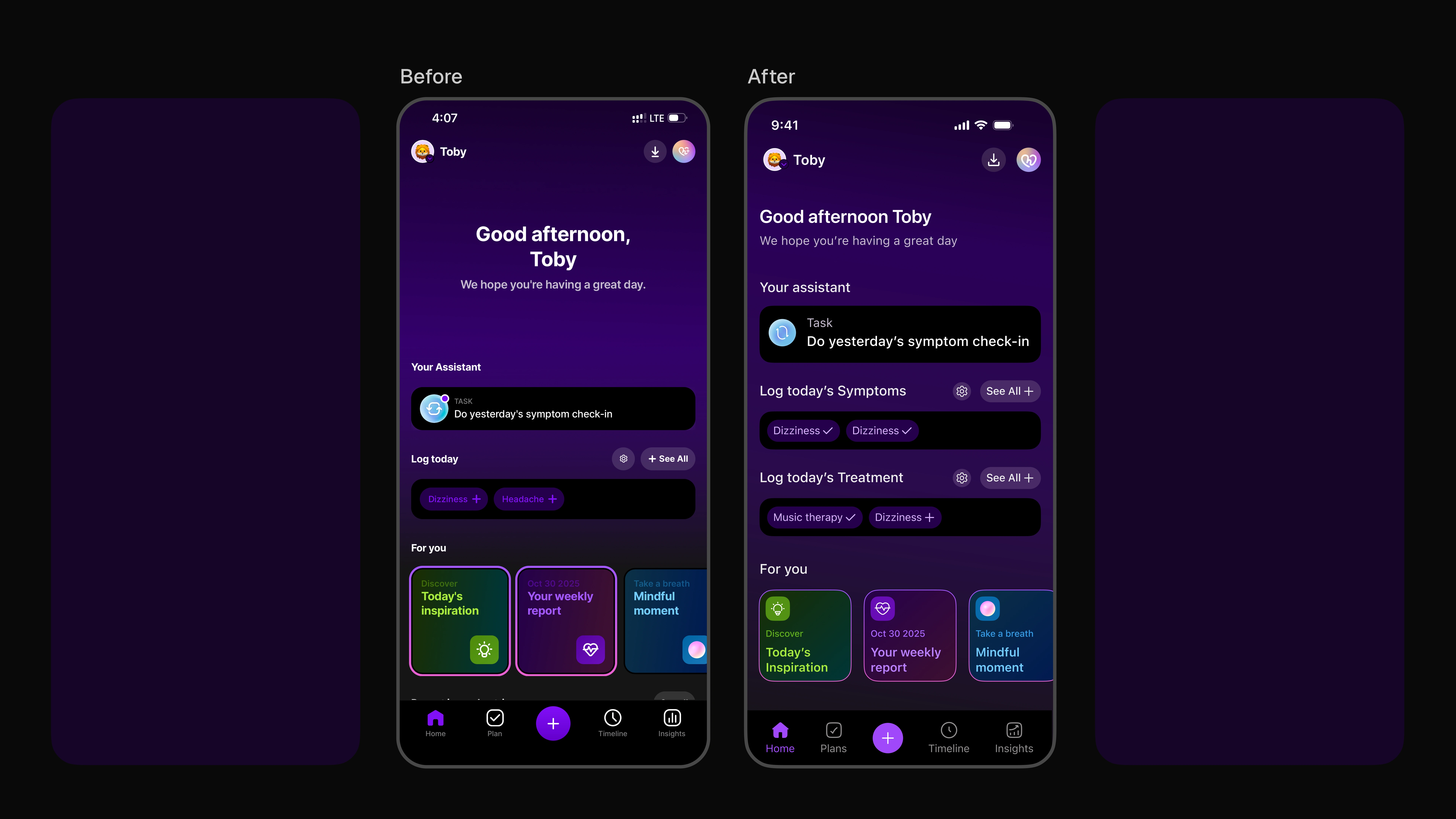
Before and after image of the home screen showing the new component
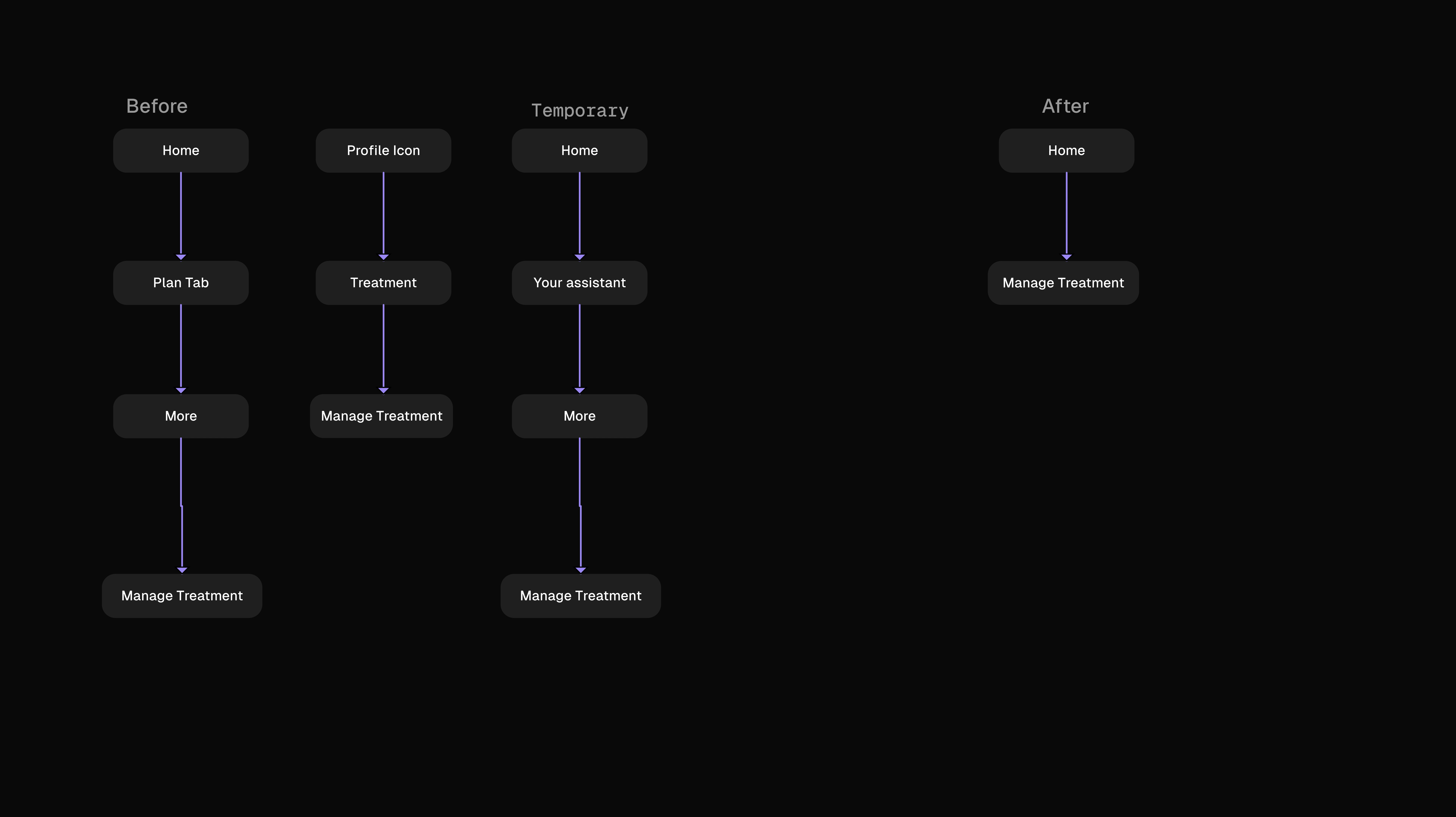
Before & after image of userflow for users to navigate to "manage treatment" page
Redesign 4: Accessibility Standards
A recurring issue I saw throughout the app especially in dark mode is how some texts do not meet important accessibility standards, AA and AAA WCAG to be exact.
It is imperative for physical and digital product to meet their respective accessibility standards because there is a large population of user who will want to use these products and when these standards are not met, they are going to feel left out which is not good for business.
I did a little test on these texts on the Human Health app and found that the text to background contrast ratio is 3.35:1 which falls below both AA and AAA at 4.5:1 and 7:1 respectively.
Users with visual impairment, low vison and users without any impairment may have a hard time reading these texts. Sometimes, in the right lighting, these texts can even hurt the eye to look at.
Redesign 4: Accessibility Standards- Solution
Accessibility isn’t just compliance, it is care. Improving readability directly supports users managing health under stress or in low-light conditions.
To solve for this problem, I used a lighter tint of the same hue and saturation to achieve a significantly higher contrast ratio of 11.94:1
Not only does this pass both the AA and AAA WCAG standards, it is easier on the eye and will immensely help every user demographic of the app see the texts better.
Before and after of improved legibility, accessibility and aesthetics
Results
After rounding up this project, i sent it over to the team at Human Health and they confirmed that these redesigns were spot on, their, users had already given them feedback on them and the internal team were already working on it to help improver their user's experience
Like this project
Posted Nov 5, 2025
I worked on this UI design audit to explore usability & accessibility opportunities in the app. Helping users achieve 66% less clicks to get to their goal
Likes
2
Views
14
Timeline
Oct 29, 2025 - Nov 4, 2025