Espresso Joint Brand Identity and Packaging

Mohammad Umer


Espresso Joint — Brand Identity, Packaging & Web
The brief
Espresso Joint is a specialty roaster that didn't want to look like one. No kraft paper, no hand-lettered warmth, no burlap sacks and sepia photography. The category has settled into a single well-mannered look, and the ask was to leave it: a coffee brand with the posture of a streetwear label, loud enough to read across a café from the cup in someone's hand.
Identity
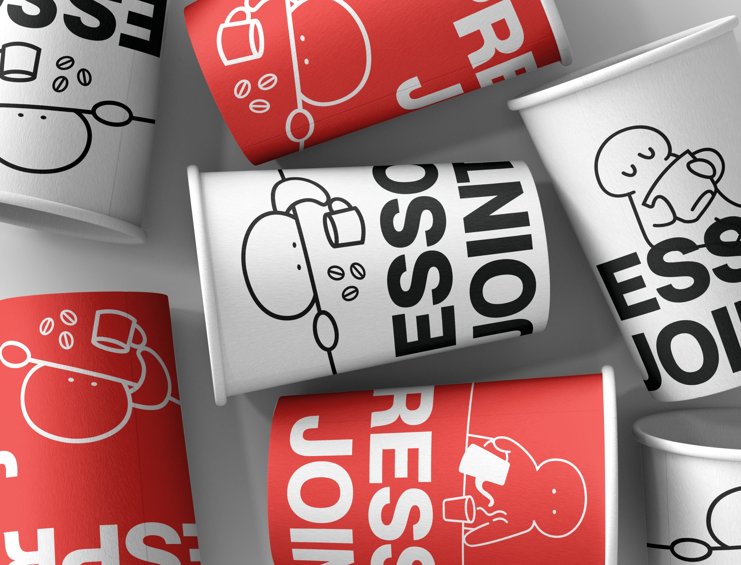
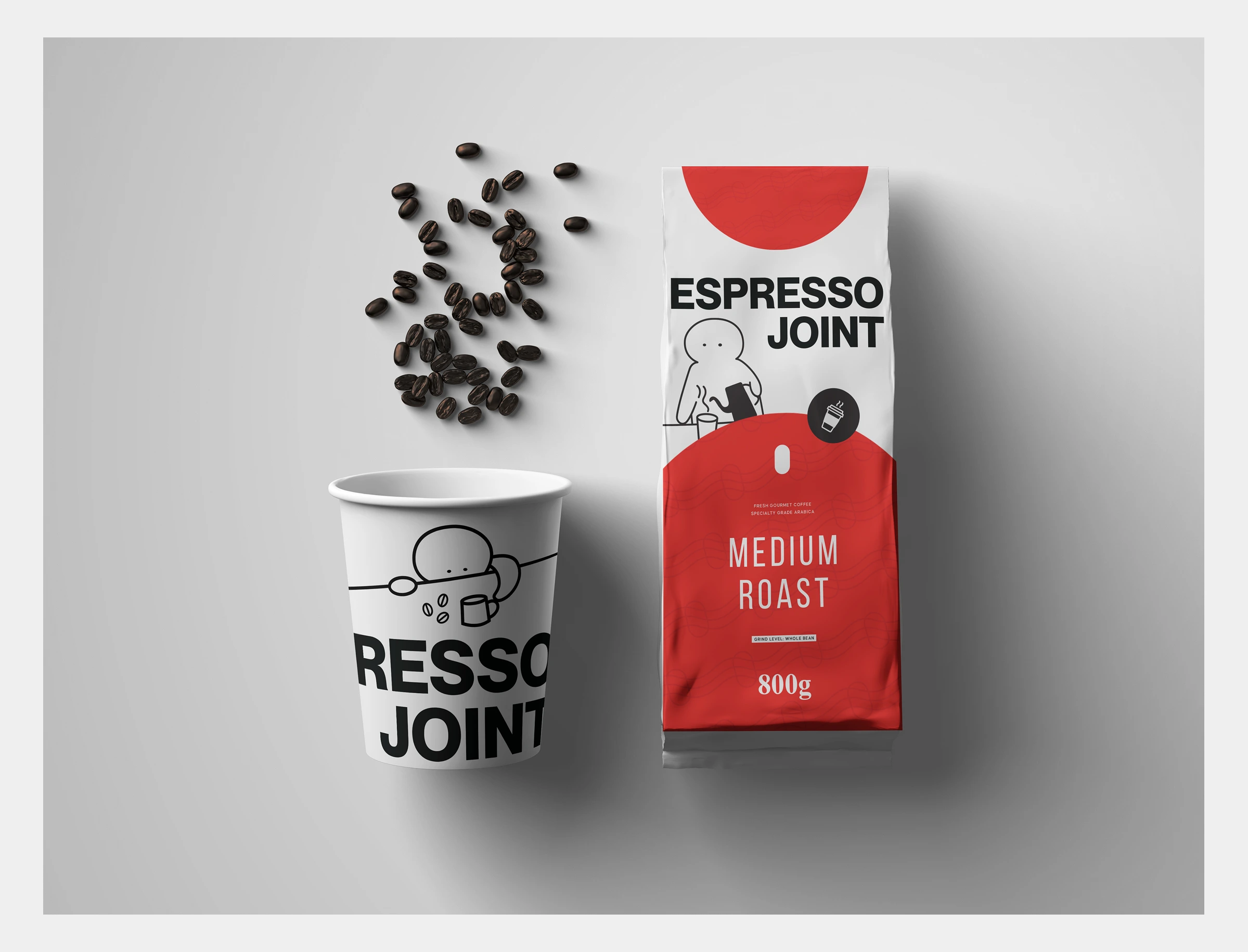
Everything rests on two elements. The first is a heavy grotesque wordmark, set tight and stacked, built to be cropped — letters run off the edge of a cup or a can and the brand still reads. The second is a red pill, drawn from the silhouette of a coffee bean, which works as a standalone mark at sizes where the wordmark falls apart.
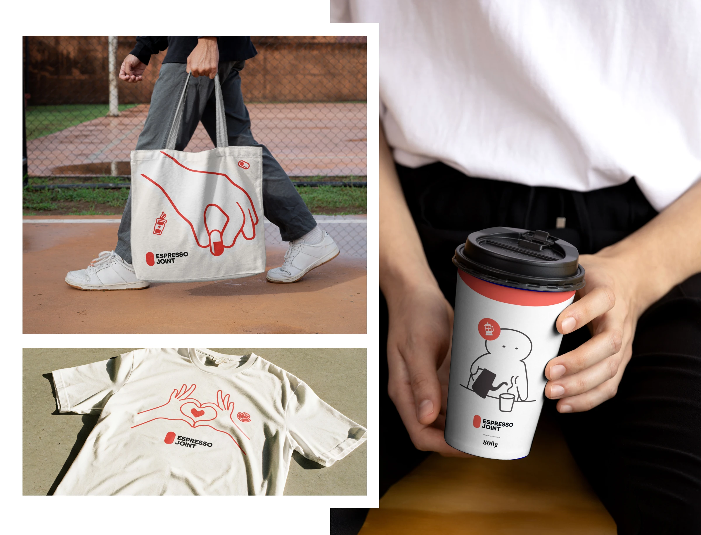
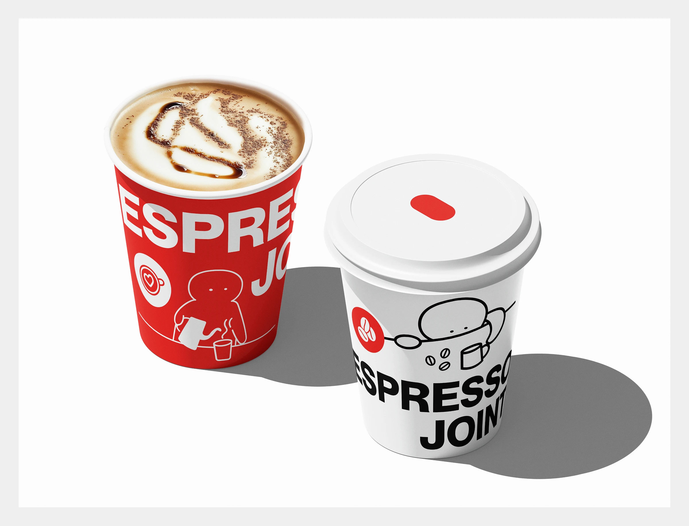
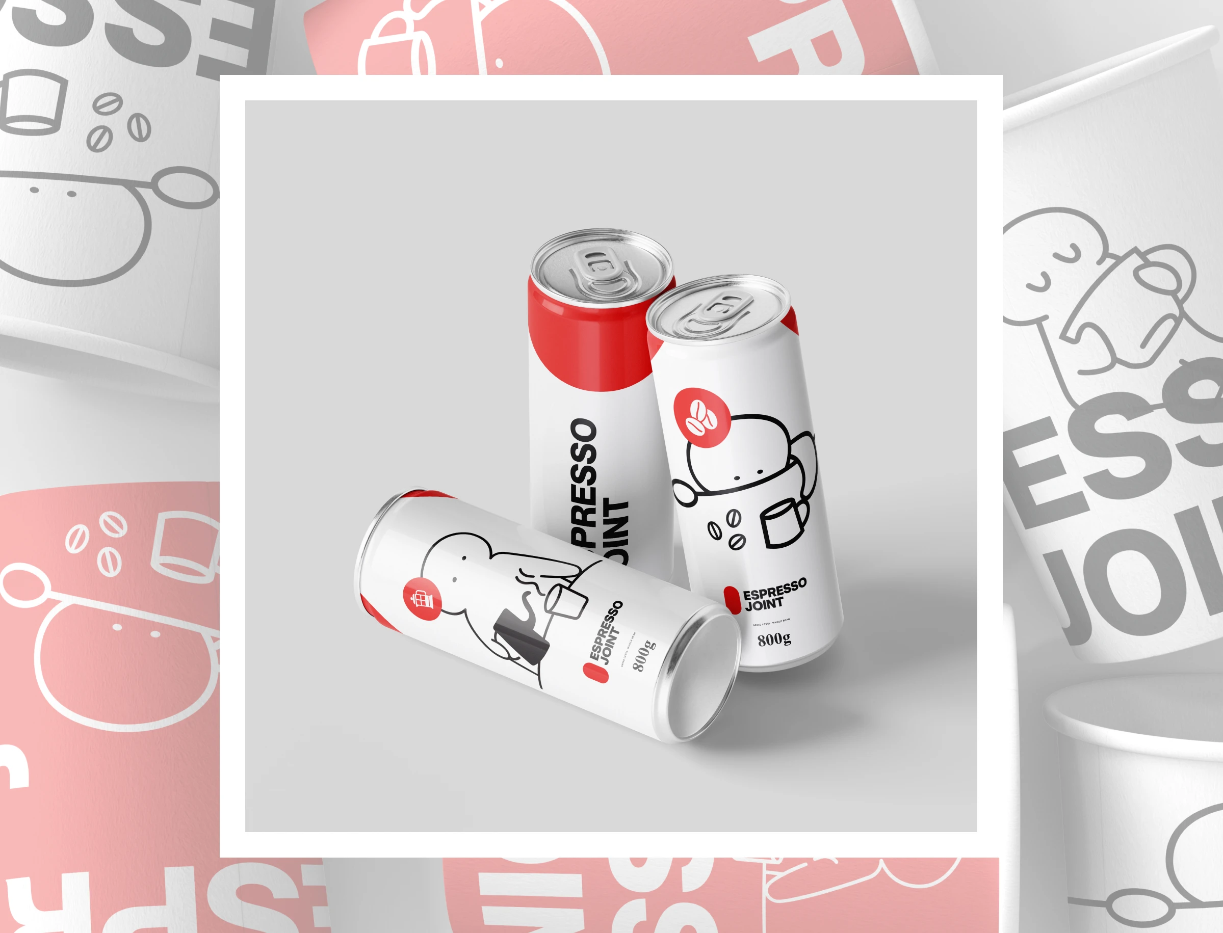
The palette is deliberately narrow: one red, black, and an off-white paper tone. Nothing else. A three-colour system this blunt needed somewhere to be warm, so the third element is a cast of single-weight line characters — small blobs pouring from a kettle, hugging an oversized mug, slumped across the counter before the first cup of the day. They're drawn in one consistent stroke weight so they sit inside the system rather than decorating it, and they carry all the humour the typography refuses to.
Packaging
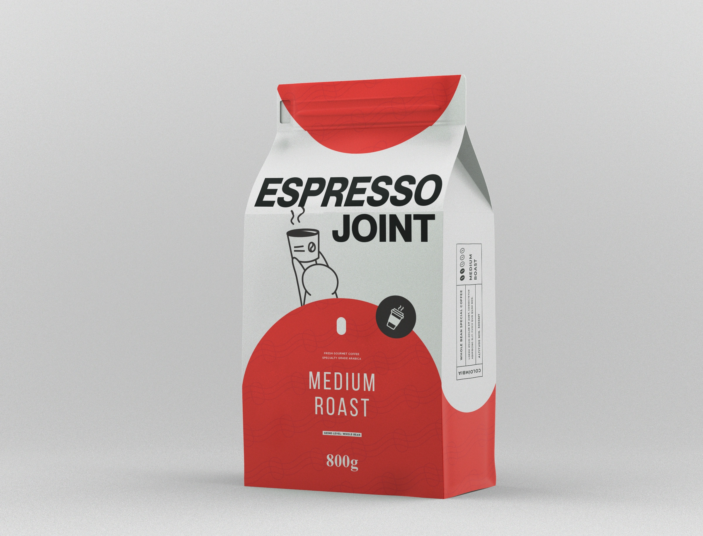
The system was applied across three formats at three different scales of information. The 800g bag is the most complete expression: a red arc anchoring the base, a character above the fold, and a vertical spec panel running the side with origin, altitude, process and a five-dot roast scale. Cups drop the detail and let the wordmark run off both edges, so no two cups on a table look identical. Cans strip it further — one character, the pill, and a red cap band. Tote and tee take the line work on its own, printed red on natural cotton.
Website
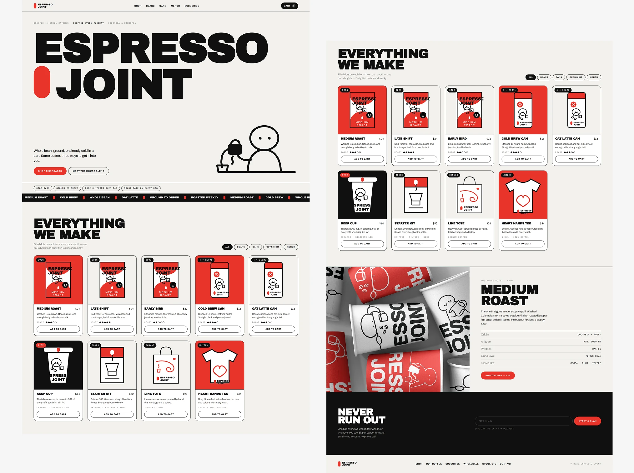
The site translates the same rules into a working storefront rather than a portfolio page. The wordmark opens at full bleed with the pill set inline, product artwork is drawn as vector so it scales cleanly at any size, and the five-dot roast scale from the bag's spec panel becomes the filter people actually shop with — a packaging detail promoted into a piece of interface. Cart, filtering and subscription flows are built and functional.
One system, three surfaces, no dilution between them.
Designed by Muhammad Umer — Brand identity, visual systems, presentation design & UI/UX. Portfolio: behance.net/umeryrr · muhammadumer-portfolio.netlify.app
#BrandIdentity #PackagingDesign #GraphicDesign #WebDesign #CoffeeBranding #VisualIdentity #BrandDesign #UIDesign #DesignPortfolio #Typography
Like this project
Posted Aug 26, 2026
Espresso Joint is a specialty roaster that didn't want to look like one. No kraft paper, no hand-lettered warmth, no burlap sacks and sepia photography.