Brand Identity & Launch Campaign for Peak Motion Activewear

Mohammad Umer


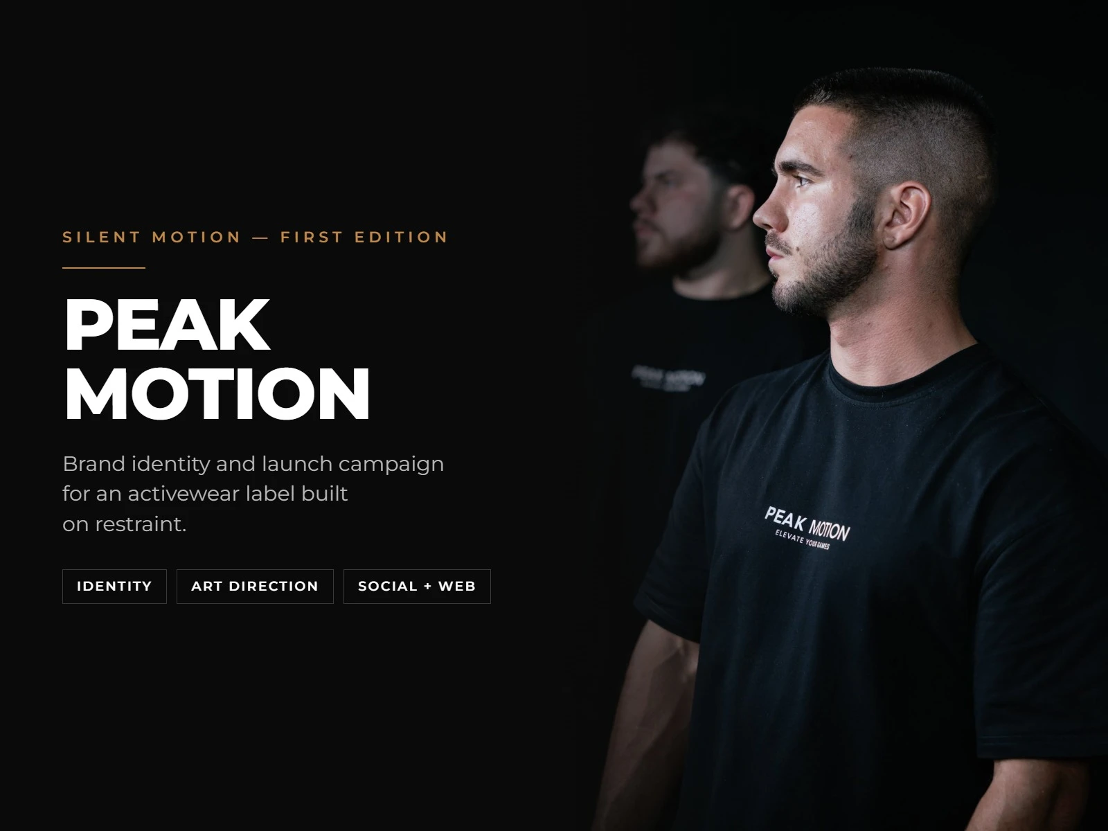
Peak Motion — Brand Identity & Launch Campaign for an Activewear Label
Client: Peak Motion Services: Brand Identity, Art Direction, Social + Web Design Deliverable: Full identity system, "Silent Motion" launch campaign (social, stories, storefront assets)
The Challenge
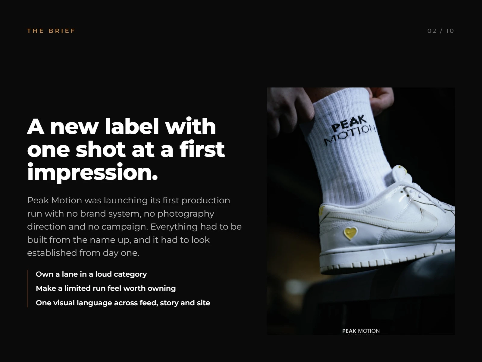
Peak Motion was about to ship its first production run with nothing behind it — no brand system, no photography direction, no campaign. Everything had to be built from the name up, and it had to look like an established label from day one: own a lane in a loud, crowded category, make a limited first run feel worth owning, and hold one consistent visual language across feed, story, and site.
What I Did
I built the brand from the mark outward, then carried it through a full launch campaign rather than treating identity and marketing as separate jobs:
- Designed a logo that folds three ideas into one silhouette a summit for the A, a motion wave for the N, an ascent vector reading left to right — with four locked variations (standard, reversed, icon-only, stacked) and clearance/minimum-size rules so it holds up from a 25mm garment print to a full-width web header
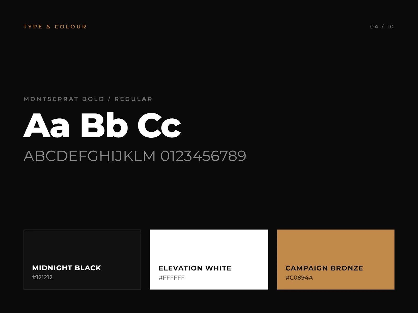
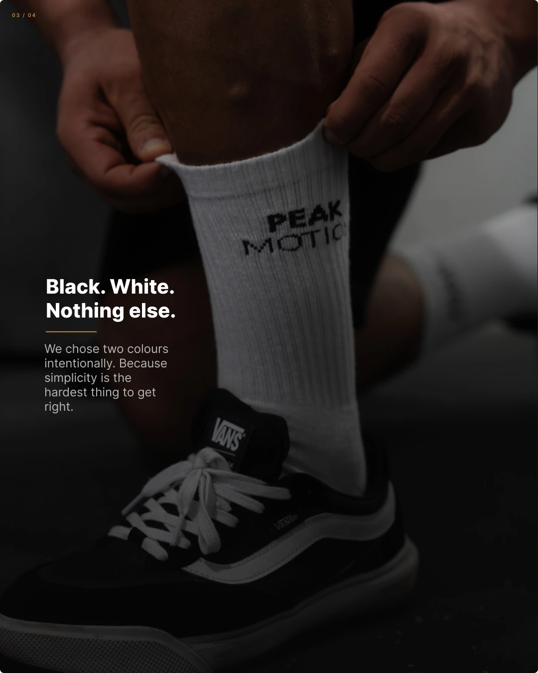
- Built a deliberately restrained two-color system (Midnight Black, Elevation White, plus a Campaign Bronze accent) on Montserrat Bold/Regular, treating simplicity as the hardest design constraint to get right
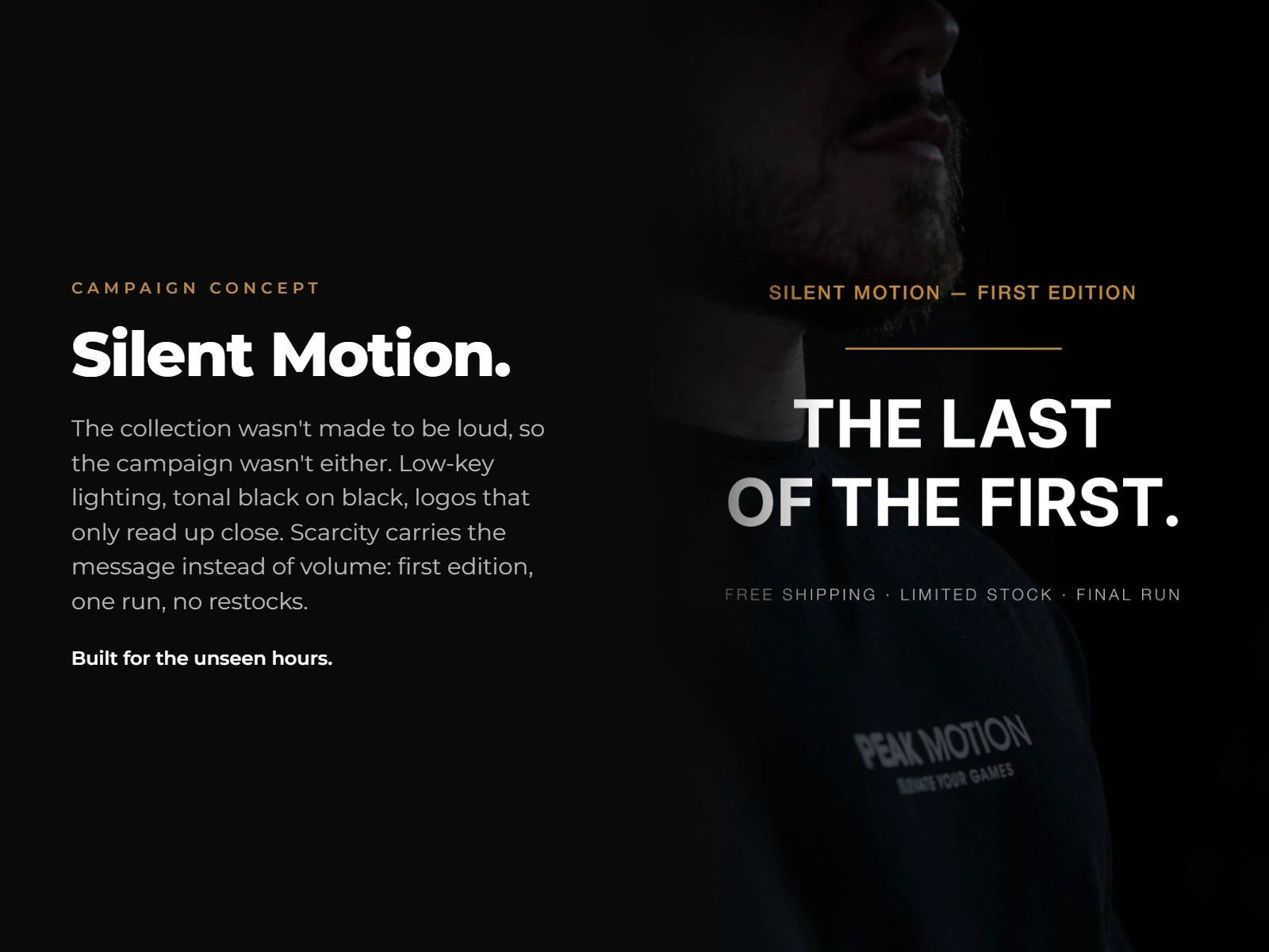
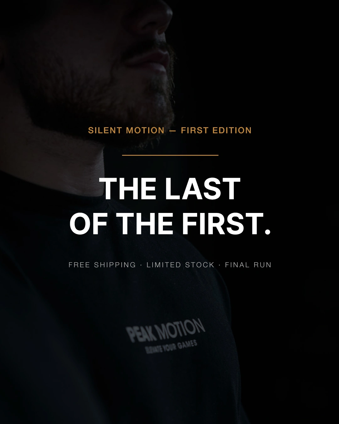
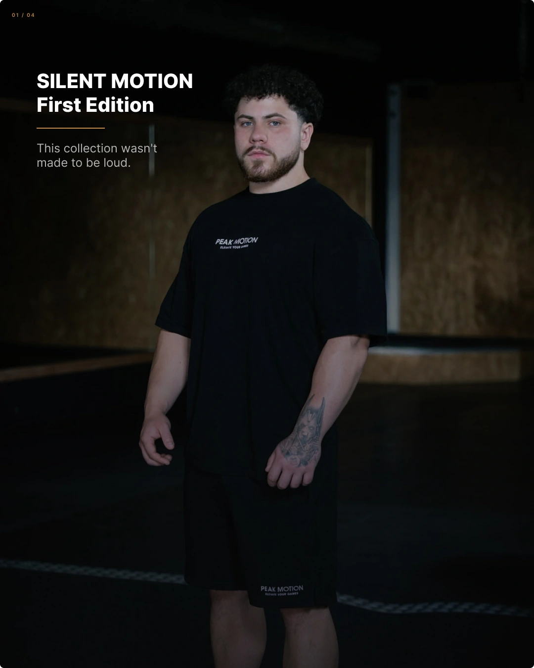
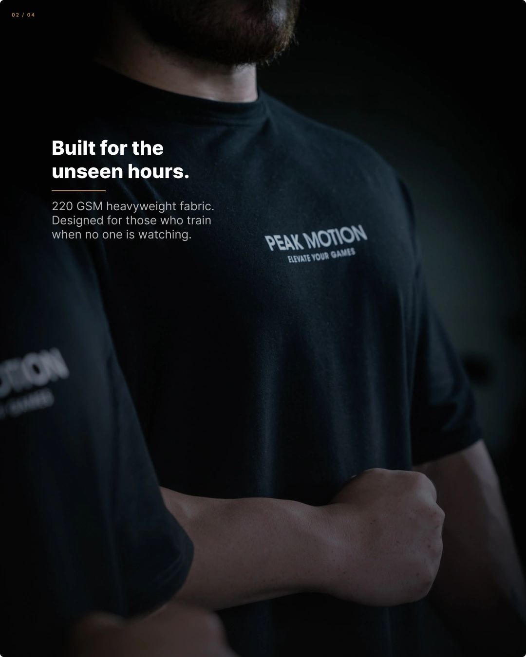
- Developed "Silent Motion — First Edition" as the campaign concept: low-key lighting, tonal black-on-black photography, logos that only read up close — letting scarcity (one run, no restocks) carry the message instead of loud visuals
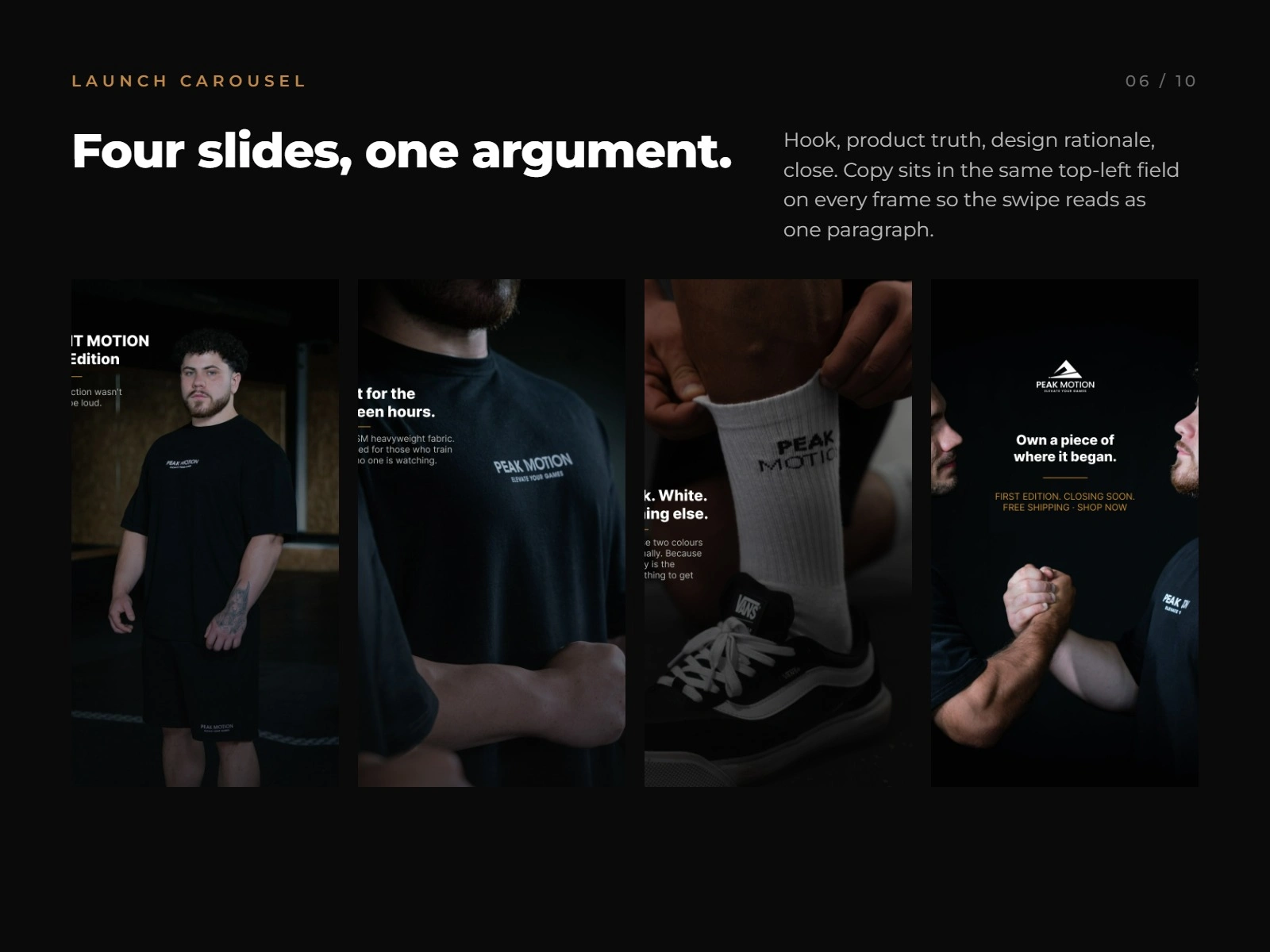
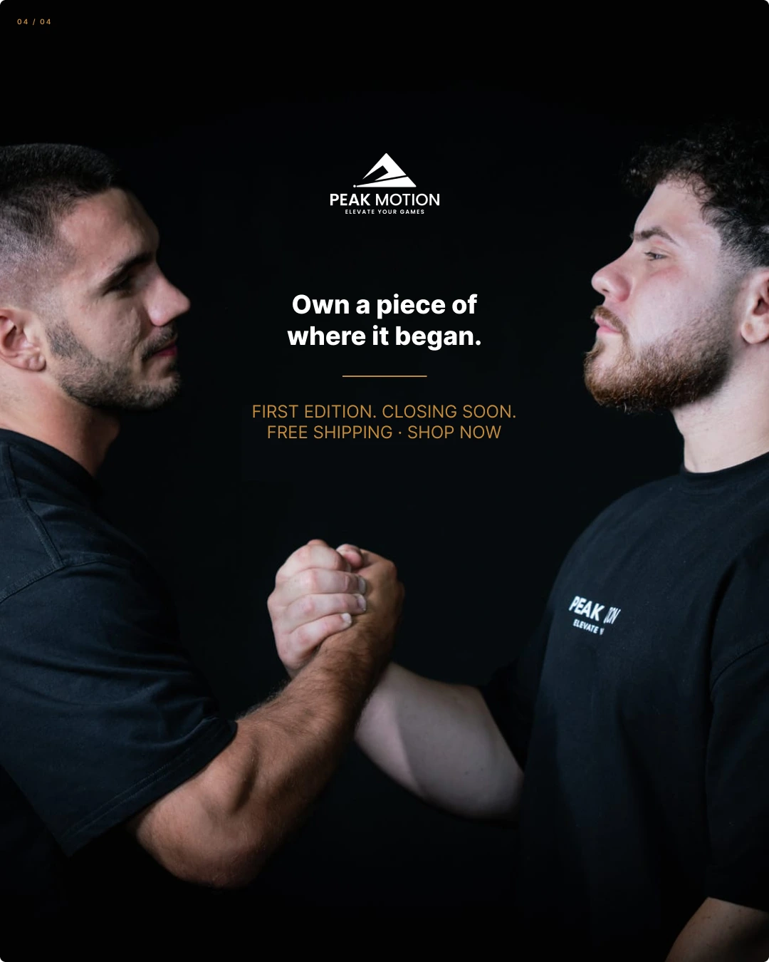
- Directed a 4-slide launch carousel built on a single structural rule — hook, product truth, design rationale, close — with copy locked to the same field on every frame so the swipe reads as one continuous argument
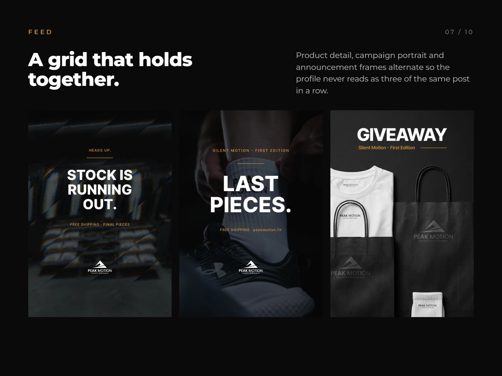
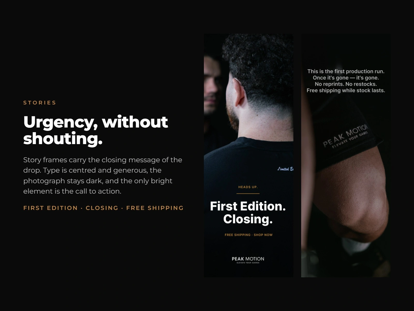
- Designed the ongoing social system: feed posts, story frames, and announcement graphics that alternate product detail, campaign portraiture, and urgency messaging so the grid never repeats itself
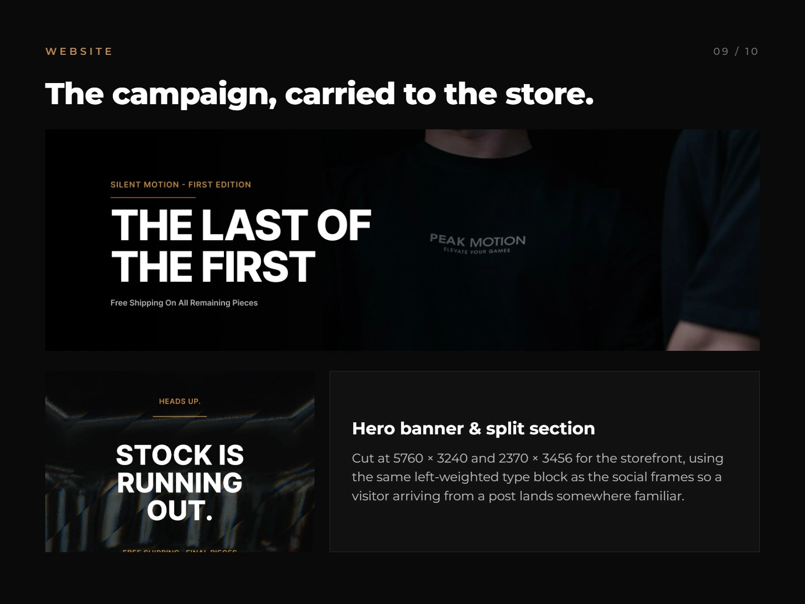
Produced production-ready storefront assets (hero banner and split-section, exported at 5760×3240 and 2370×3456) using the same left-weighted type block as the social frames, so a visitor arriving from a post lands somewhere familiar
The Result
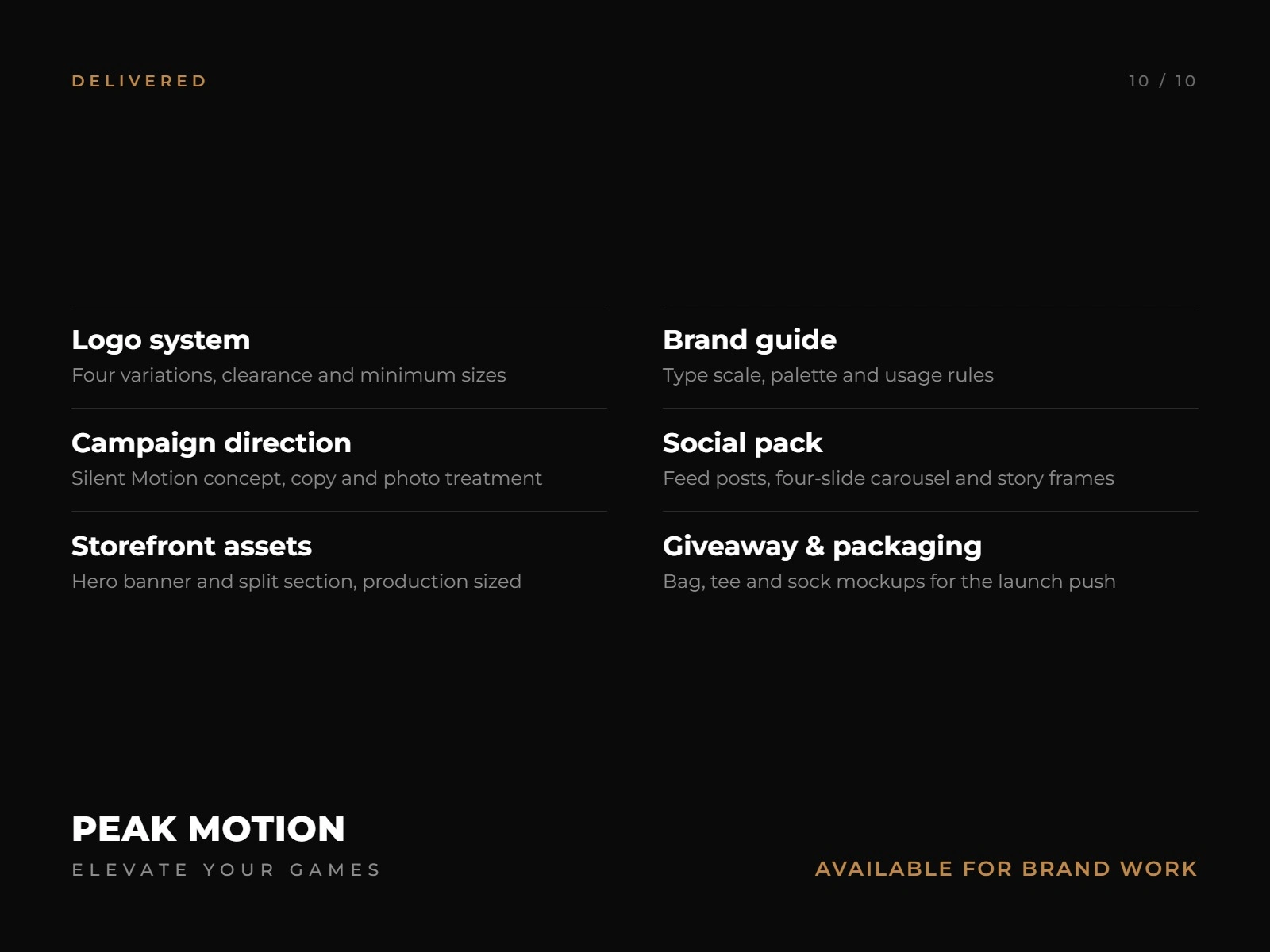
A complete brand system and first-edition launch campaign , logo, guide, campaign direction, social pack, storefront assets, and packaging that gave Peak Motion one coherent visual language from garment tag to checkout page, built to make a quiet collection feel deliberately exclusive rather than unfinished.
Like this project
Posted Sep 9, 2026
A complete brand system and first-edition launch campaign that gave Peak Motion one coherent visual language, built to collection feel exclusive.
Likes
0
Views
2
Clients
Peak Motion