OrbitalSocket Brand Identity and Landing Page Design

Mohammad Umer


OrbitalSocket — Brand Identity, Brand System & Product Landing Page
Clarity without the complexity: building a full visual identity and go-to-market design system for a senior-led brand strategy consultancy.
Project snapshot
Client: OrbitalSocket — brand strategy & creative consultancy
Stakeholder: Greg Johnson, Co-Founder
My role: Sole designer — brand identity, visual system, collateral, web design
Services: Logo design · Visual identity · Brand guidelines · Print & environmental collateral · Sales enablement design · Landing page UI
Deliverables: Primary logo + variation suite, app icon, badge mark, colour & type system, 8-section brand book, business cards, email signatures, presentation template, billboard/OOH mockup, sales one-pager, multi-page product brochure ("The Orb"), landing page design
Timeline: 3 weeks
Tools: Figma, Adobe Illustrator, Photoshop, After Effects
The brief
OrbitalSocket is a small consultancy of senior brand strategists the kind of team that has spent twenty-plus years inside big agencies and left to do the work without the layers. They came to me with a positioning statement, a signature methodology, and no visual identity at all.
The core problem they described was credibility at first contact. They sell to marketing leaders — CMOs, VPs of brand — who are already fluent in agency language and immune to it. OrbitalSocket needed to look established enough to sit in a boardroom, but distinct enough that a decision-maker would remember them a week later.
Their own promise gave me the design brief almost verbatim:
"Clarity without the complexity."
Everything I built had to earn that line. If the identity looked busy, the brand would be contradicting itself on the first slide.
Strategic direction
Three constraints shaped every decision:
1. It had to read "strategic," not "creative agency." The category is saturated with soft gradients, pastel blobs and lowercase wordmarks. Playing there meant blending in. I went the other direction: hard black, high-contrast structure, and one aggressive accent colour doing all the emotional work.
2. The system had to survive a very wide range of surfaces. The same identity needed to hold up on a business card, a building-scale billboard, a 12-page brochure and a favicon. That ruled out anything detailed or illustrative at the mark level.
3. The methodology needed its own visual weight. OrbitalSocket sells a productised offer called The Orb — their strategic framework, delivered as a defined 10–12 week engagement. The Orb needed to feel like a product, with its own hierarchy inside the parent brand, not just a service line buried in a deck.
The mark
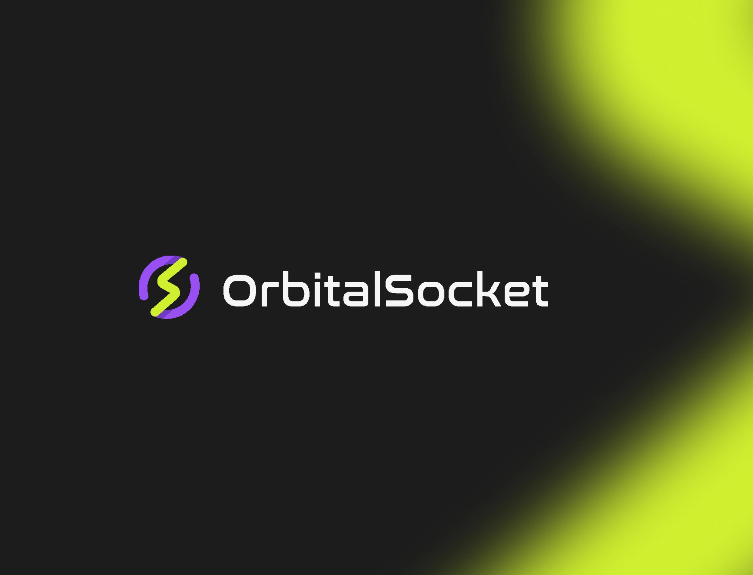
The name carries two ideas — orbital (motion, systems, things in relation to each other) and socket (connection, power, energy transfer). I built the mark from exactly that collision.
A circular orbit in violet, drawn as an open ring with a break in it — a system in motion rather than a closed loop.
A bolt form in electric lime cutting through the ring, which reads simultaneously as a lightning strike and as the letter S.
Where the two forms overlap, a darker violet multiply layer creates depth without adding a third element. The mark has dimension but stays a flat vector — no gradients, no effects, no reproduction problems.
The result is a monogram that works at 16px as an app icon and at 6 metres on a facade, and that means something in under a second: energy moving through a
system.
Logo suite
I delivered a full variation set rather than a single lockup, because the client sells across print, social, web and pitch decks:
Horizontal lockup (light and dark backgrounds)
Circular badge lockup — the wordmark set around the orbit as a seal, for stamps, email signatures and social avatars
Icon-only mark and rounded app icon
Monochrome and reversed variants
Colour
The palette is deliberately narrow and deliberately loud.
Primary
#D9F049 — Electric Lime · the signal colour. Used for emphasis, section numbers, CTAs, and nothing else.
#8651EF — Orbit Violet · the strategic, considered counterweight.
#222222 — Deep Black · the dominant surface.
#FFFFFF — White · structural breathing room.
Secondary
#EEC13C — Amber
#633DBB — Deep Violet
The logic is a two-tone tension: violet reads as intellect and strategy, lime reads as energy and urgency. Black holds them apart so neither one gets shrill. Across the whole system, lime never appears as decoration — if something is lime, it's the thing you're supposed to act on or read first.
Typography
Nasalization — display. A squared, technical face used only for headlines and section titles. It gives the brand its engineering-adjacent, systems-thinking edge.
Causten — text and UI. A humanist geometric sans that keeps long-form strategy copy readable across brochures, decks and web without softening the brand.
The pairing does the "clarity without the complexity" job structurally: something distinctive at the top of the hierarchy, something quiet and confident everywhere else.
The brand book
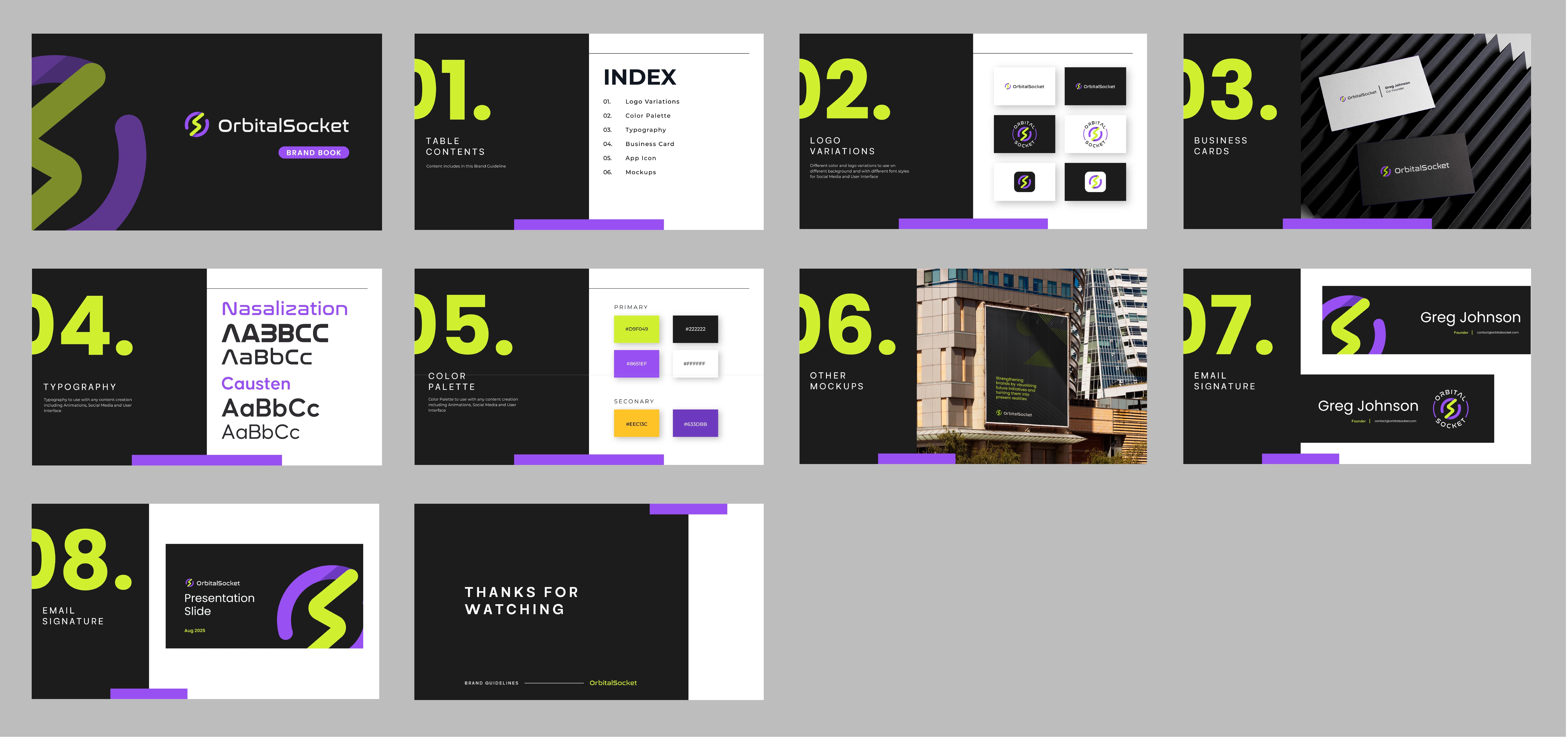
I produced an 8-section brand guideline document so the client's team could deploy the identity without me in the room.
Contents: Logo Variations · Colour Palette · Typography · Business Card · App Icon · Mockups · Email Signature · Presentation Slide
The layout system itself is part of the brand: an oversized lime section number anchoring each left page, a black-and-white split grid, and a violet rule running along the base as a consistent horizontal marker. Every spread teaches the reader the brand's proportions while it explains the rules.
Identity in application
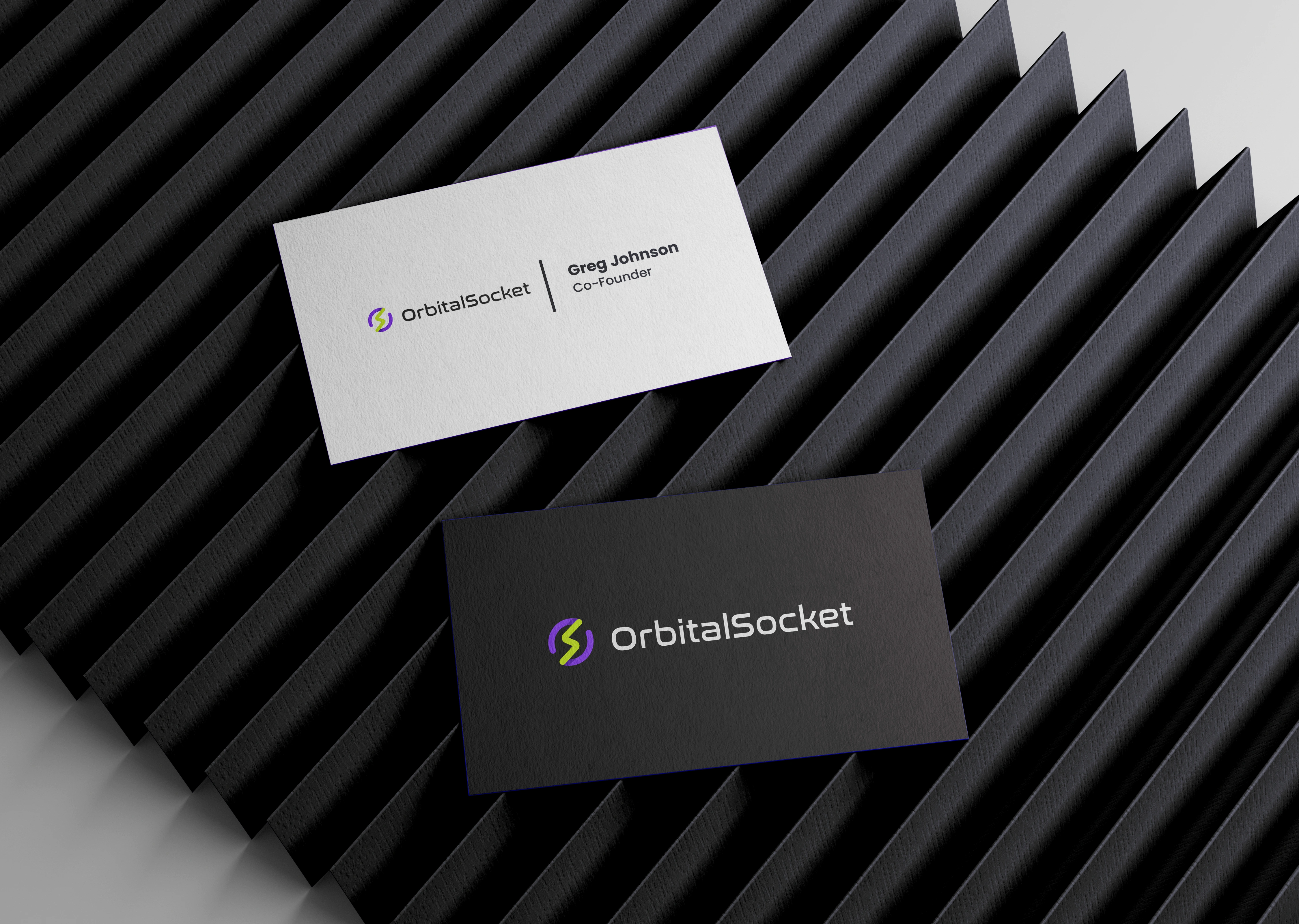
Business cards — Two-sided, two-finish. A white uncoated front with the horizontal lockup and a hairline-divided name block; a black reverse carrying only the logo at scale. Restraint on the front, confidence on the back.
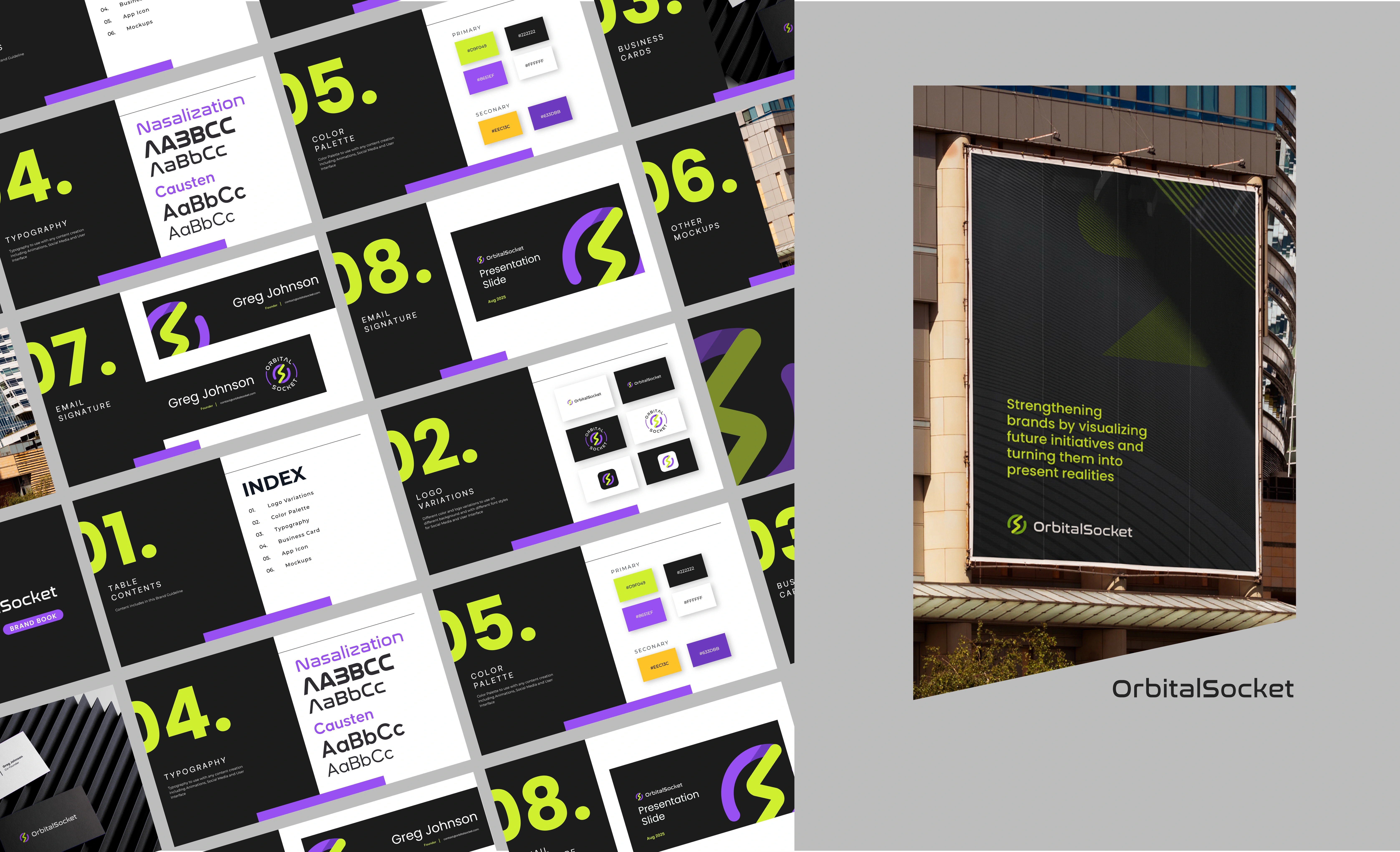
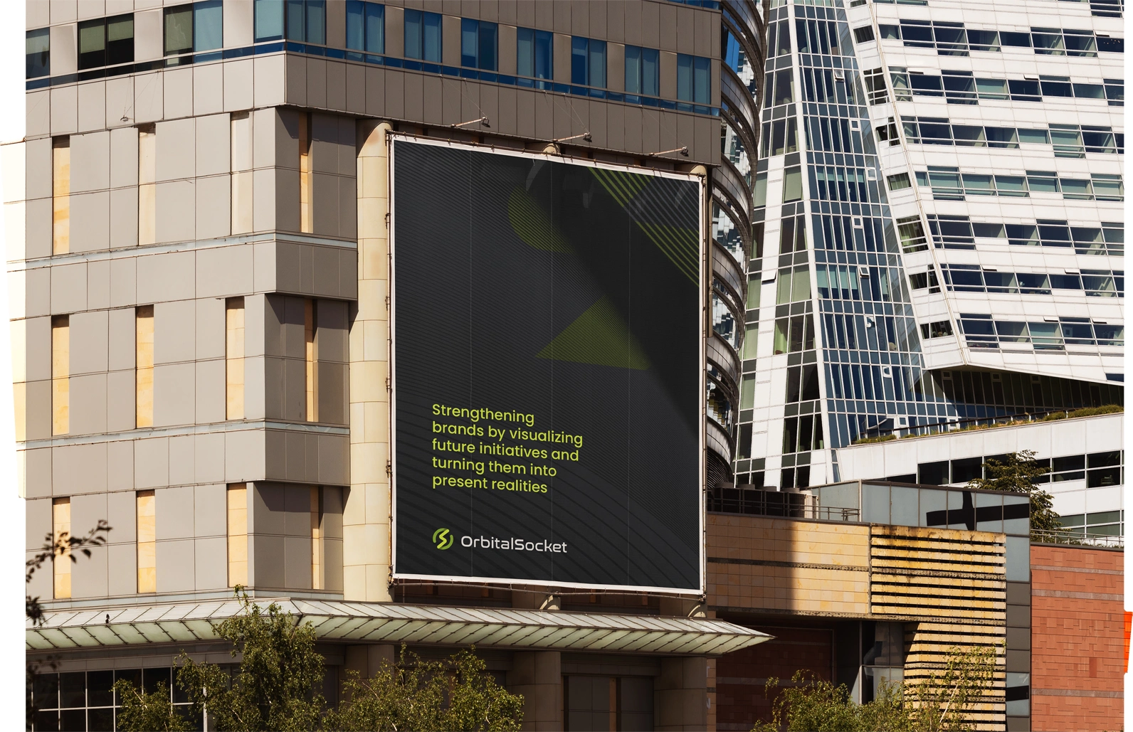
Billboard / OOH — The environmental mockup exists to prove the system scales. Black field, subtle diagonal texture, and the positioning line set in lime: "Strengthening brands by visualizing future initiatives and turning them into present realities." No image, no clutter — the brand argument made in one sentence.
Email signature — Two variants: a horizontal card built around the icon mark, and a version using the circular badge lockup, for team members who wanted a more formal sign-off.
Presentation template — Title slide and body layouts using the brand's split-grid structure, so client-facing decks stay on-system without design support.
Sales one-pager
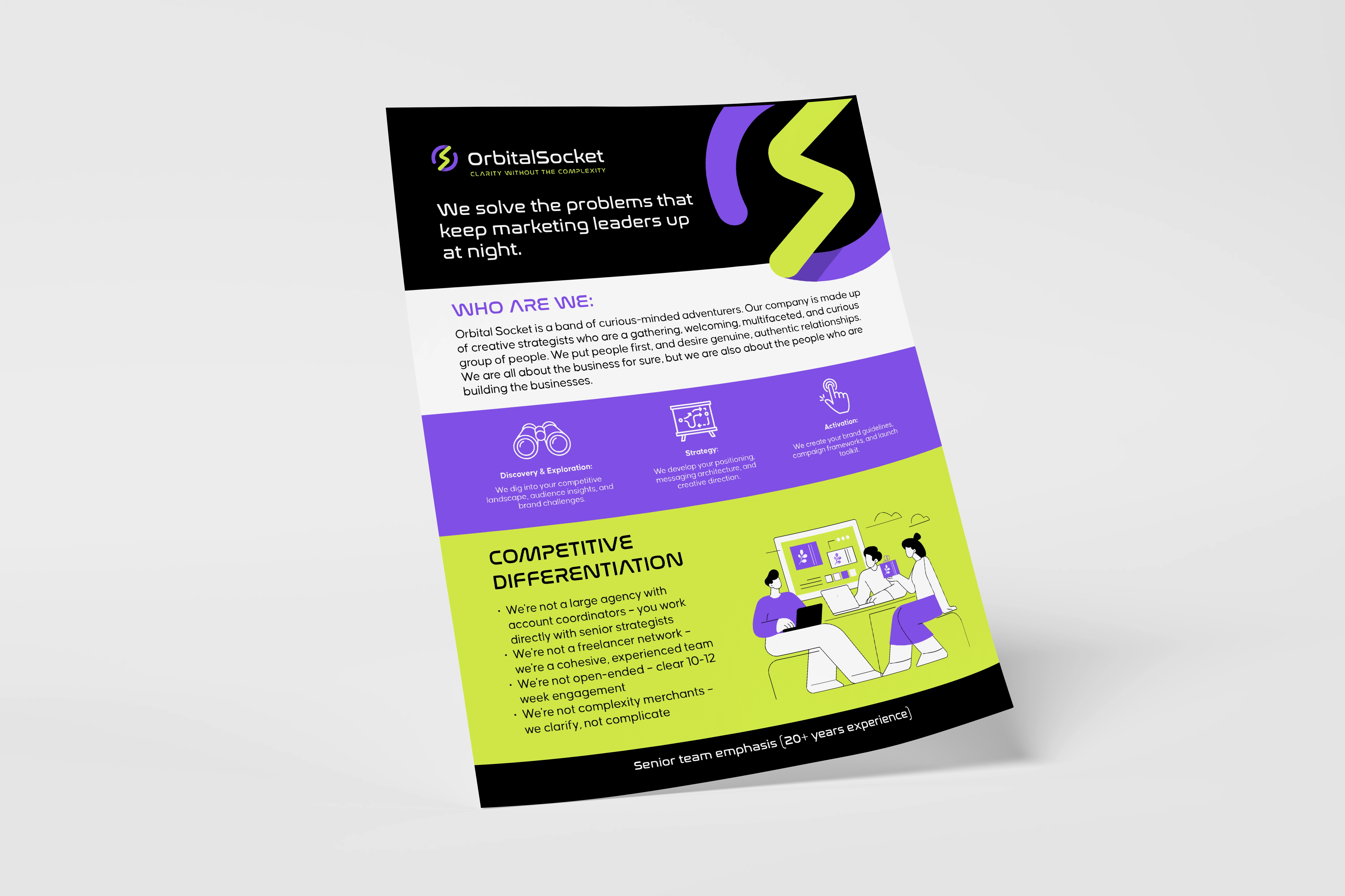
A single-sheet leave-behind for prospect meetings, built as a colour-blocked vertical narrative with curved section breaks that keep the eye moving down the page.
It opens with the hook — "We solve the problems that keep marketing leaders up at night" — then moves through Who Are We, the three-stage process (Discovery & Exploration → Strategy → Activation) with custom line icons on violet, and closes on a lime Competitive Differentiation block that states the positioning as four clean negations:
Not a large agency — you work directly with senior strategists
Not a freelancer network — a cohesive, experienced team
Not open-ended — a clear 10–12 week engagement
Not complexity merchants — we clarify, not complicate
Design-wise, this was the piece with the most copy and the least room. The colour blocking is doing the work of headings: each band is a distinct idea, so the reader can skim it in fifteen seconds or read it in three minutes and get the same argument either way.
"The Orb" — product brochure
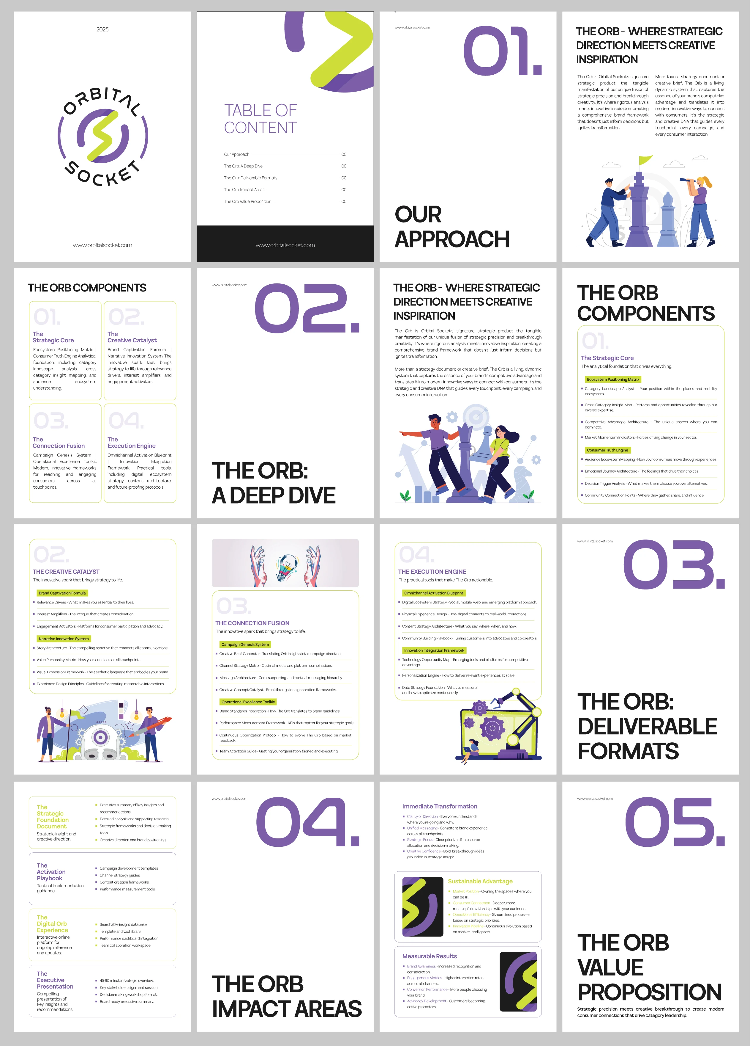
A multi-page document introducing OrbitalSocket's signature framework in depth: Our Approach → The Orb: A Deep Dive → Deliverable Formats → Impact Areas → Value Proposition.
For this piece I shifted the visual register on purpose. Where the parent brand is black-dominant and high-contrast, the brochure is white-dominant with violet display type and lime accent rules — lighter, more editorial, easier to read across sixteen pages of dense strategic content.
The Orb's four components each got a consistent card treatment — numbered, outlined, with highlighted sub-system labels — so a reader can navigate the framework structurally instead of reading linearly:
01. The Strategic Core · 02. The Creative Catalyst · 03. The Connection Fusion · 04. The Execution Engine
Custom-selected vector illustrations in the brand's violet-and-lime range break up the density and keep the document from reading as a whitepaper.
Landing page design
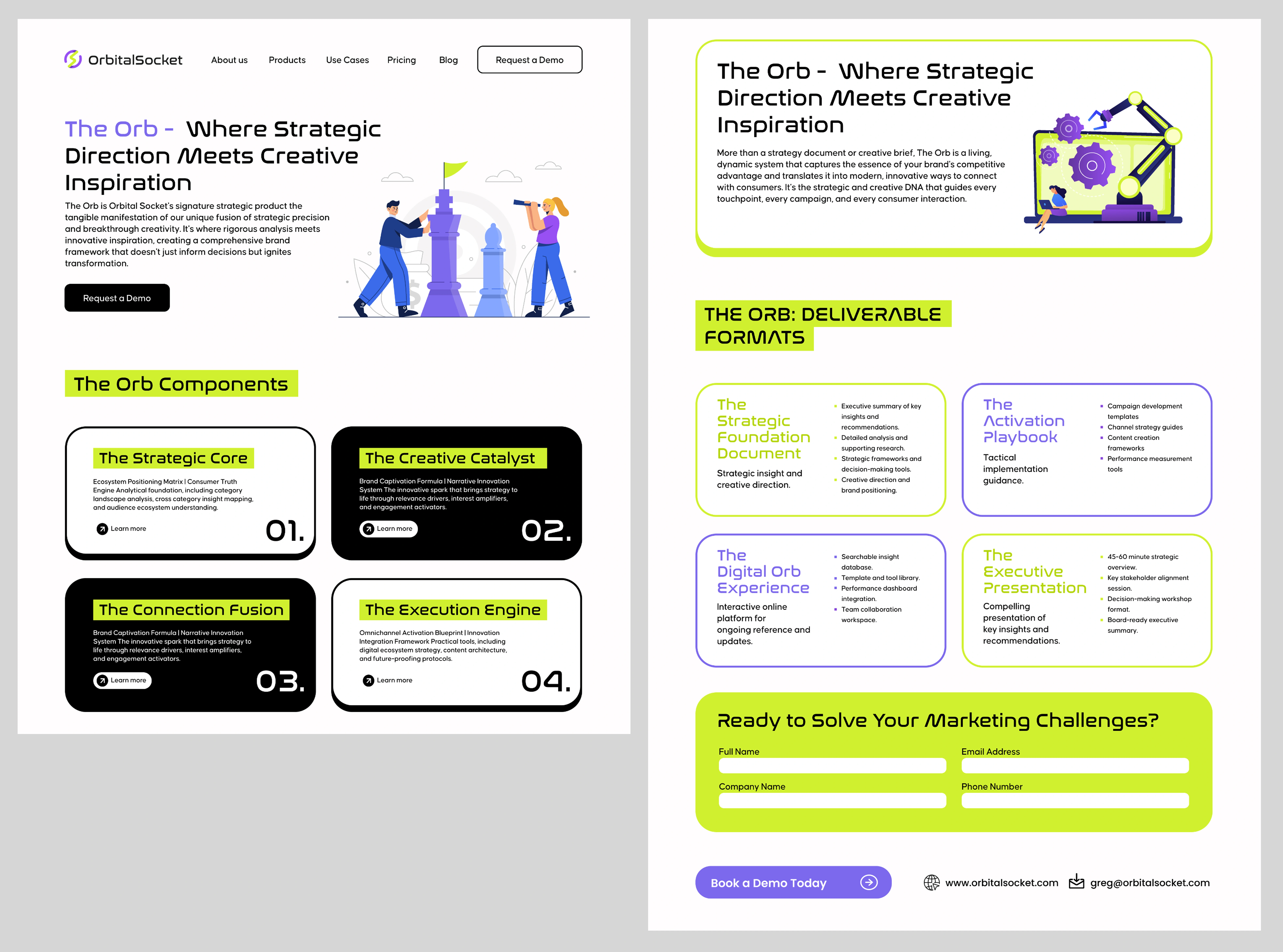
The final deliverable was a product landing page for The Orb, designed to convert marketing leaders into demo bookings.
Structure:
Nav + hero — headline with "The Orb" set in violet against black body copy, a supporting illustration, and a single primary CTA
The Orb Components — a 2×2 card grid in alternating black and white fills, each with a lime highlight label, a short description, an oversized outline numeral, and a Learn more affordance
Deliverable Formats — four outlined cards (violet and lime borders alternating) breaking down exactly what the client receives
Conversion block — a full-bleed lime form panel, "Ready to Solve Your Marketing Challenges?", with four fields and a violet pill CTA
The two key UI decisions: alternating card fills so the grid has rhythm instead of uniformity, and reserving the loudest colour in the palette for the single moment where the user is asked to act. By the time a visitor reaches the lime block, they've been trained by the whole page to read lime as "this is the point."
Outcome
The client received a complete, self-sufficient brand system: a scalable mark, a documented visual language, sales collateral for both first contact and deep consideration, and a conversion-focused web design for their flagship offer — all delivered as a single coherent argument for the positioning they already believed in.
"We love working with Umer! He's very responsive and meets the delivery date. He has a great design aesthetic. We've gotten so many compliments on the new brand identity he did for us" - Deel zone
What I took from it
The hardest constraint on this project was self-imposed. When a brand's entire promise is clarity without the complexity, every design instinct toward "one more element" becomes a liability. Most of the work was subtraction — cutting a third accent colour, removing a gradient from the mark, deleting a decorative layer from the brochure grid.
The system holds together because it repeats a small number of decisions with discipline: black surface, one signal colour, one structural rule, hard geometric hierarchy. That's what let the same identity survive a business card and a building.
Designed by Muhammad Umer — Brand identity, visual systems, presentation design & UI/UX. Portfolio: behance.net/umeryrr · muhammadumer-portfolio.netlify.app
Like this project
Posted Aug 25, 2026
OrbitalSocket is a small consultancy of senior brand strategists the kind of team that has spent twenty plus years inside big agencies.