
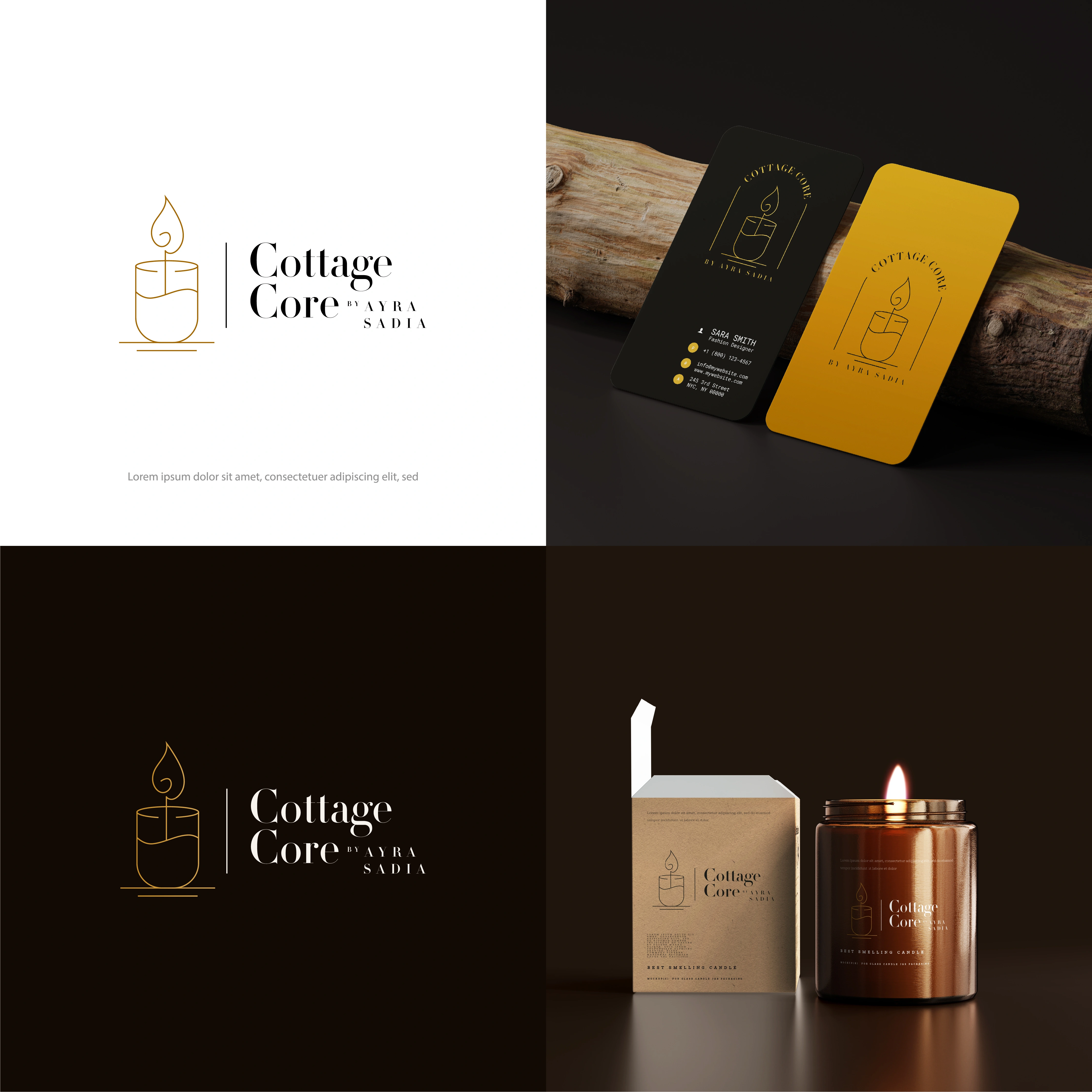
Cottage Core - A candle brand that had to sell in the dark
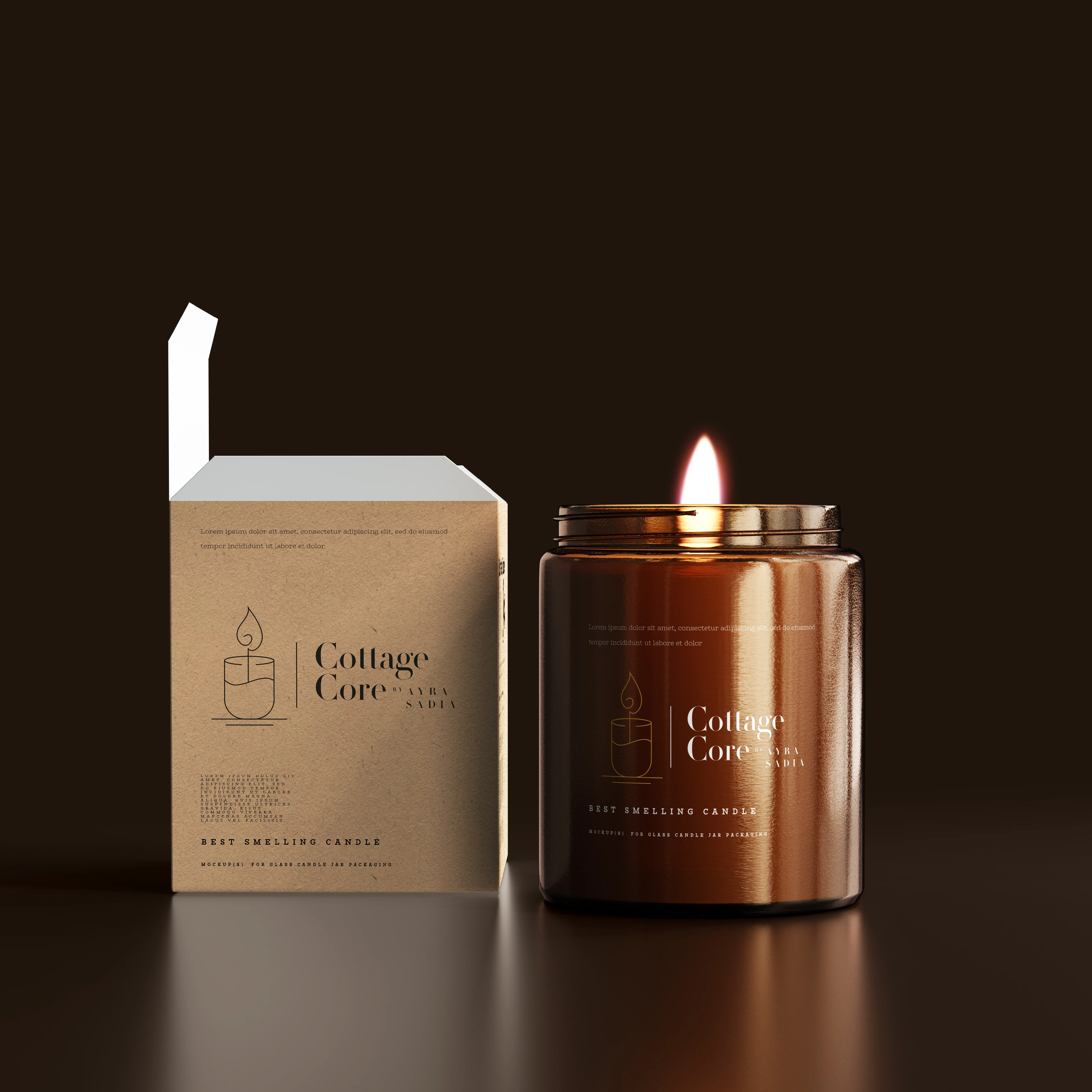
Handmade candle brands almost all reach for the same shelf language: a warm script, a dried flower, a kraft label. It reads as pleasant and it reads as everyone. The problem is that a candle is bought twice once on a lit shelf or a bright feed, and once as an object sitting in a dim room, half-burned, where the label is the only thing still doing brand work.
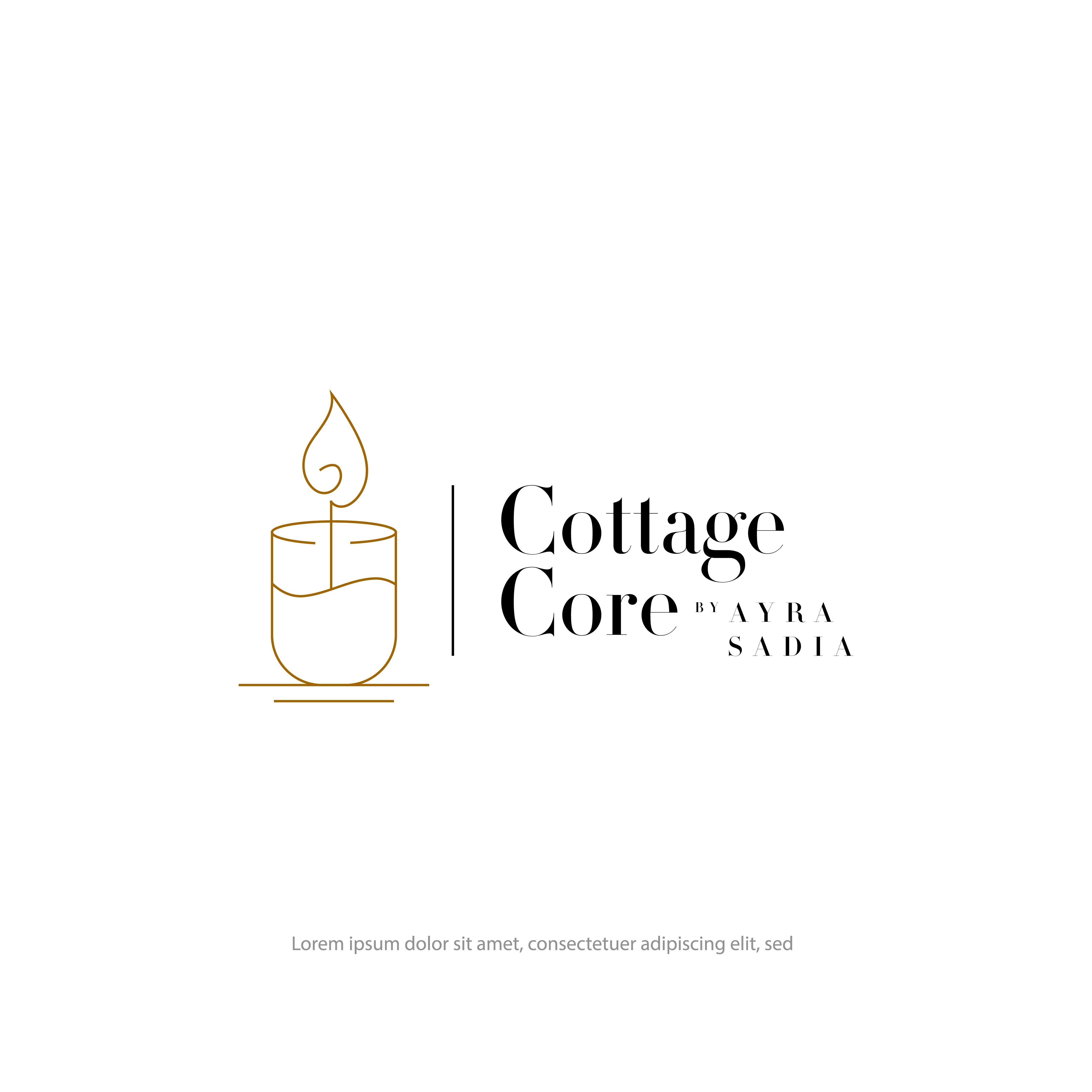
So the mark was drawn as a single continuous line: a candle in a jar with the flame open at the top, thin gold on whatever it sits on. Line art survives what a filled logo doesn't foil stamping, a curved jar, an embossed box, a 2cm label. Same drawing everywhere, no simplified version needed.
The rest holds the same restraint. A high-contrast serif for the name, the maker's credit set small and letterspaced beneath it so the brand reads as a house, not a hobby. Deep espresso and cream do the heavy lifting; gold appears only as the line and the flame - the one warm thing in the system, which is what the product is.
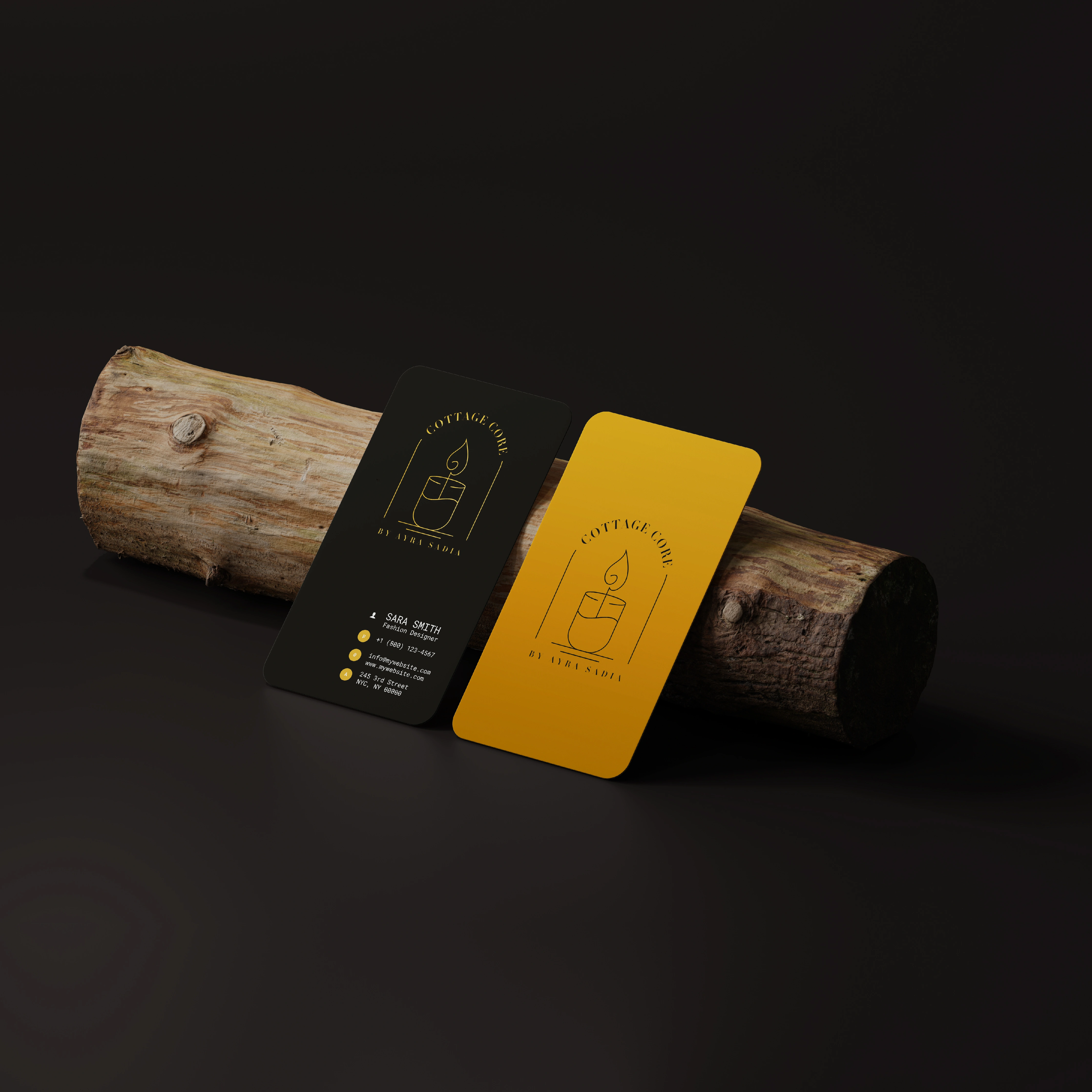
The business cards test it in both directions: black for the version you hand someone, mustard for the version that catches an eye first.
A product brand isn't finished until it works on the object, in the room, at the size it will actually be seen.
1 like · 13 views · Aug 25, 2026
Cottage Core is a scented candle brand it has a luxury feel to it. I have developed brand identity, assets and packaging for them.


