exellius | Brand Identity Design

Mohammad Umer


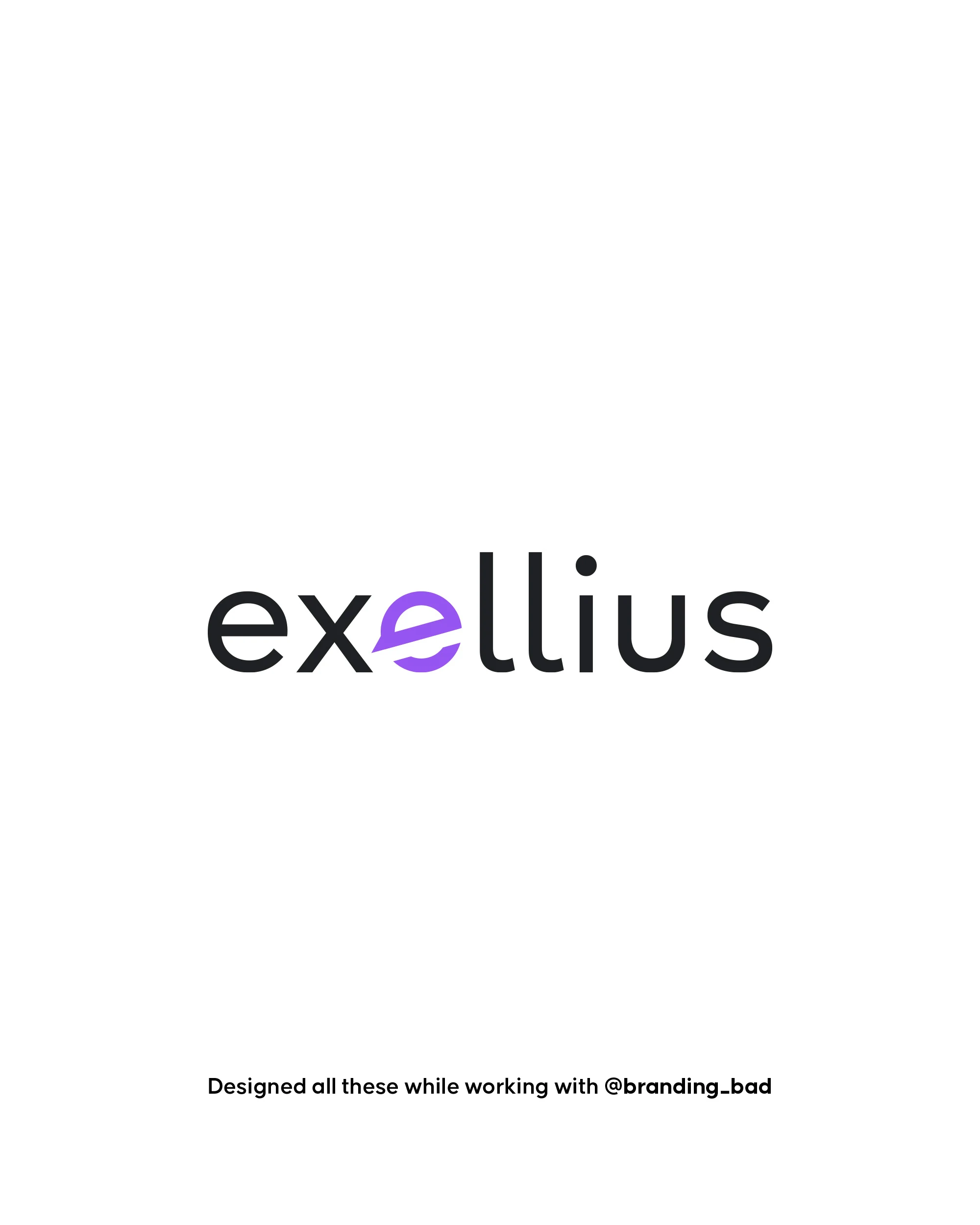
Exellius — The letter that had to hold the whole brand
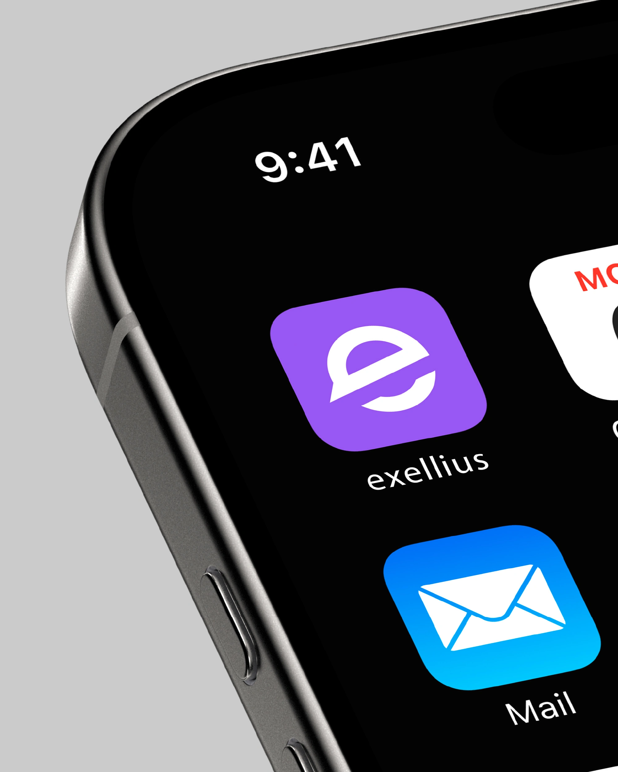
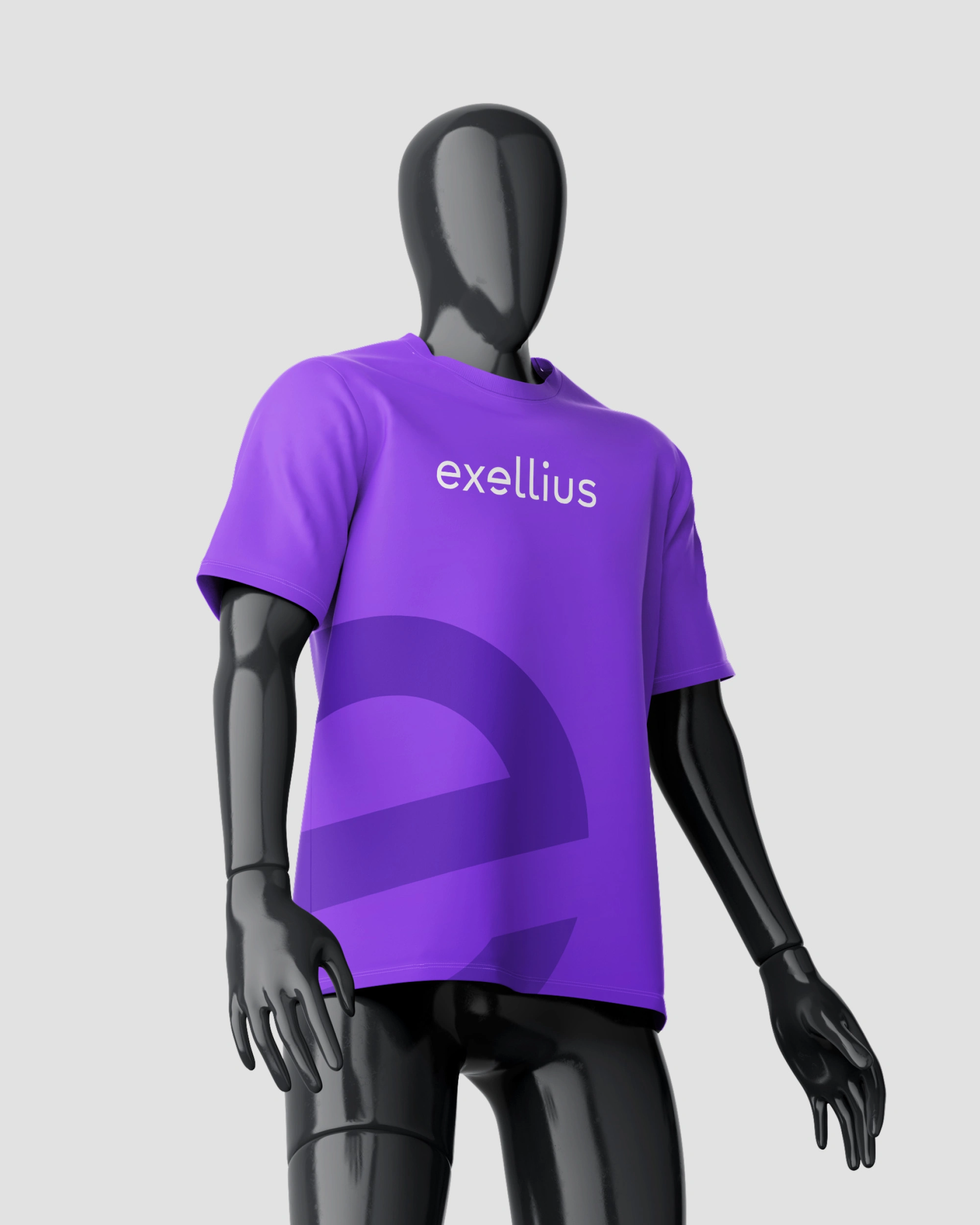
Most identities in SAAS arrive as a name in a sans-serif and a color someone liked. That works until the brand needs to exist somewhere the full name won't fit: an app icon, a favicon, a chest-height logo on a shirt.
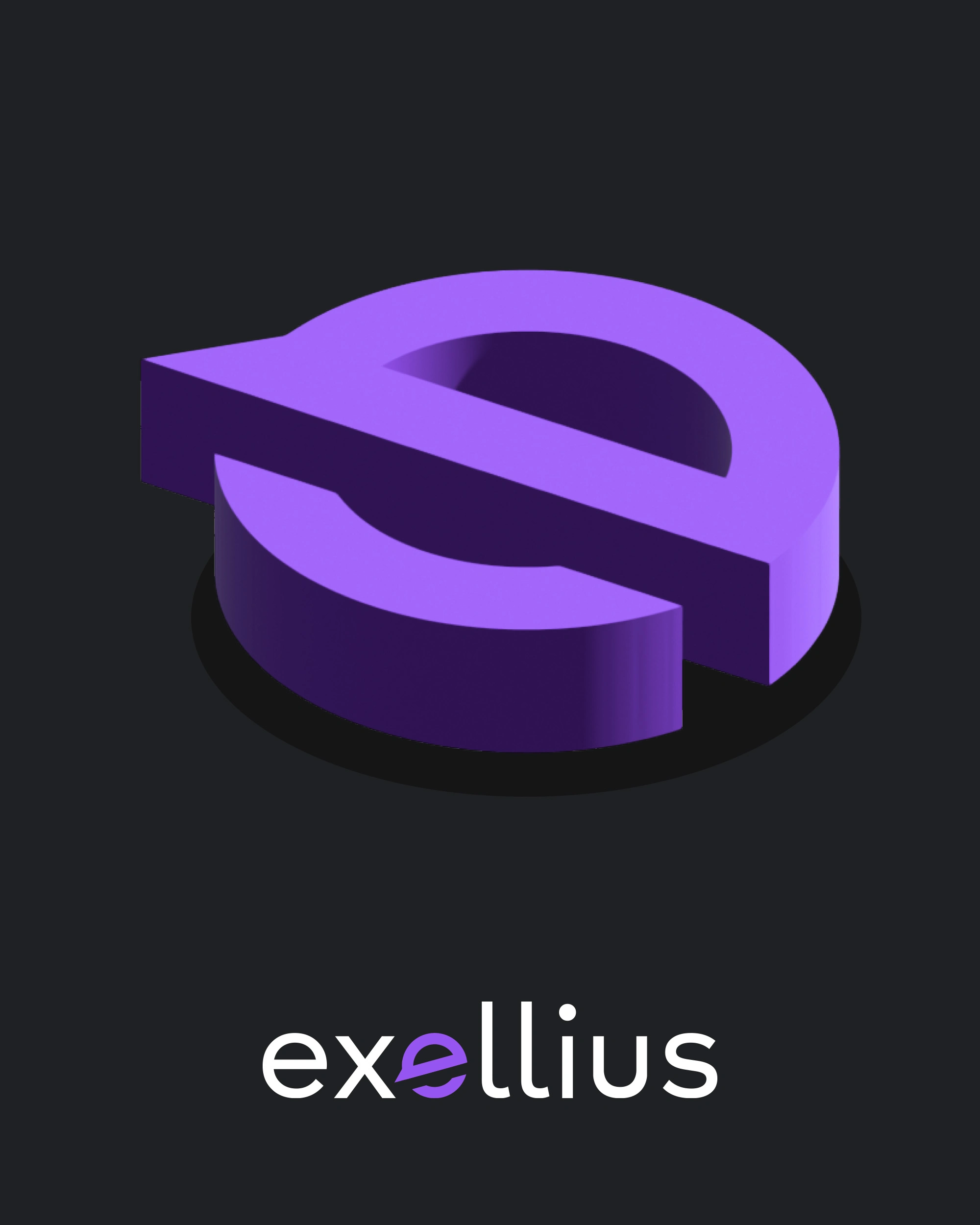
So the system was built from the letter outward. The mark is an e drawn as a closed circle with a single horizontal sweep cutting through it a letterform at small sizes, an orbit at large ones. It carries the brand alone, which is why the wordmark could stay quiet: a light, unfussy lowercase setting with that same e dropped in as the only colored character. The mark and the wordmark are the same idea at two volumes.
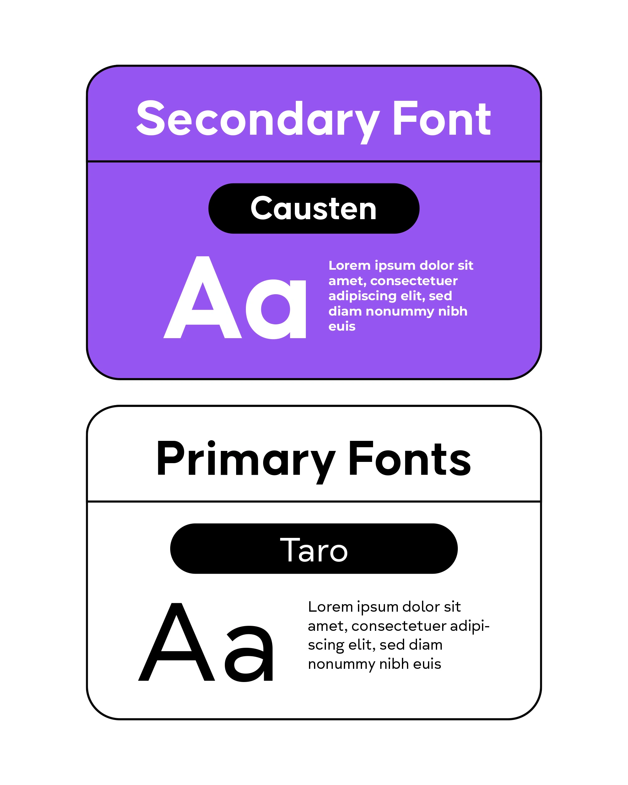
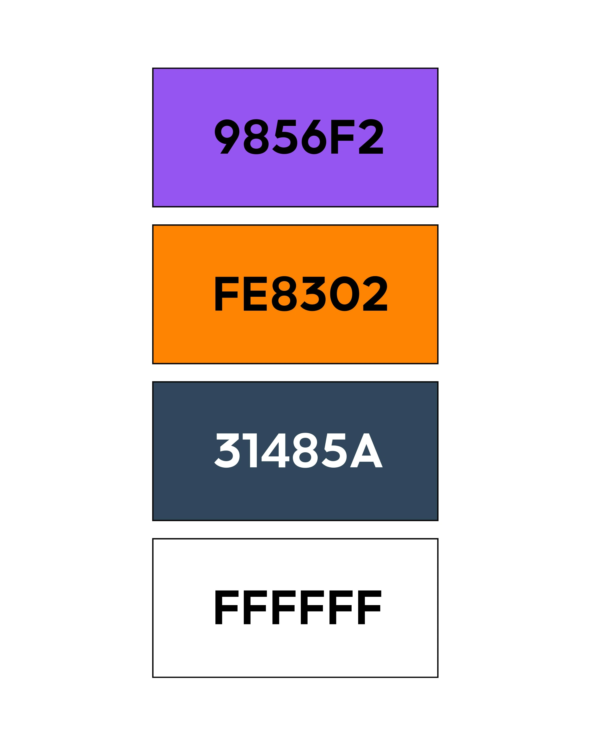
Color does the rest of the work. Violet is the brand, navy grounds anything that needs to feel established, and a single orange is held in reserve for one thing per screen the moment you're meant to act on. Taro carries structure, Causten handles running text.
The test was applied throughout: a shirt, an app icon, a laptop screen across a room. If the e survives at that size, the brand does.
An identity isn't finished when it looks right. It's finished when the smallest version still argues for you.

Like this project
Posted Aug 25, 2026
The mark is an *e* drawn as a closed circle with a single horizontal sweep cutting through it a letterform at small sizes, an orbit at large ones.