Triccord Poster Designs

Mohammad Umer


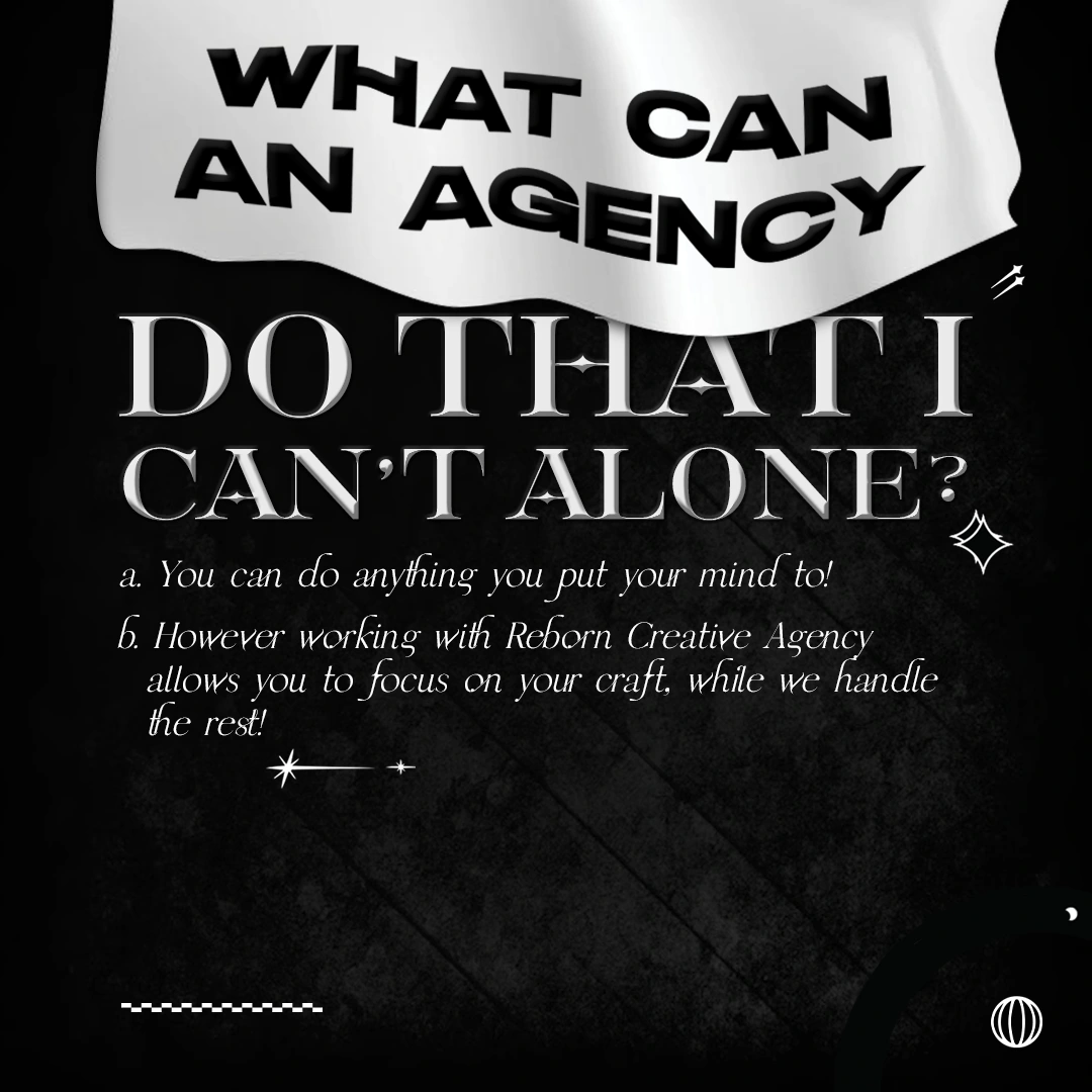
Triccord - A creative agency can't post like a corporate one
An agency's feed is its portfolio whether it wants to be or not. Post polite sans-serif quote cards on a clean gradient and you've told every prospective client exactly how safe your work will be before they've seen a single project.
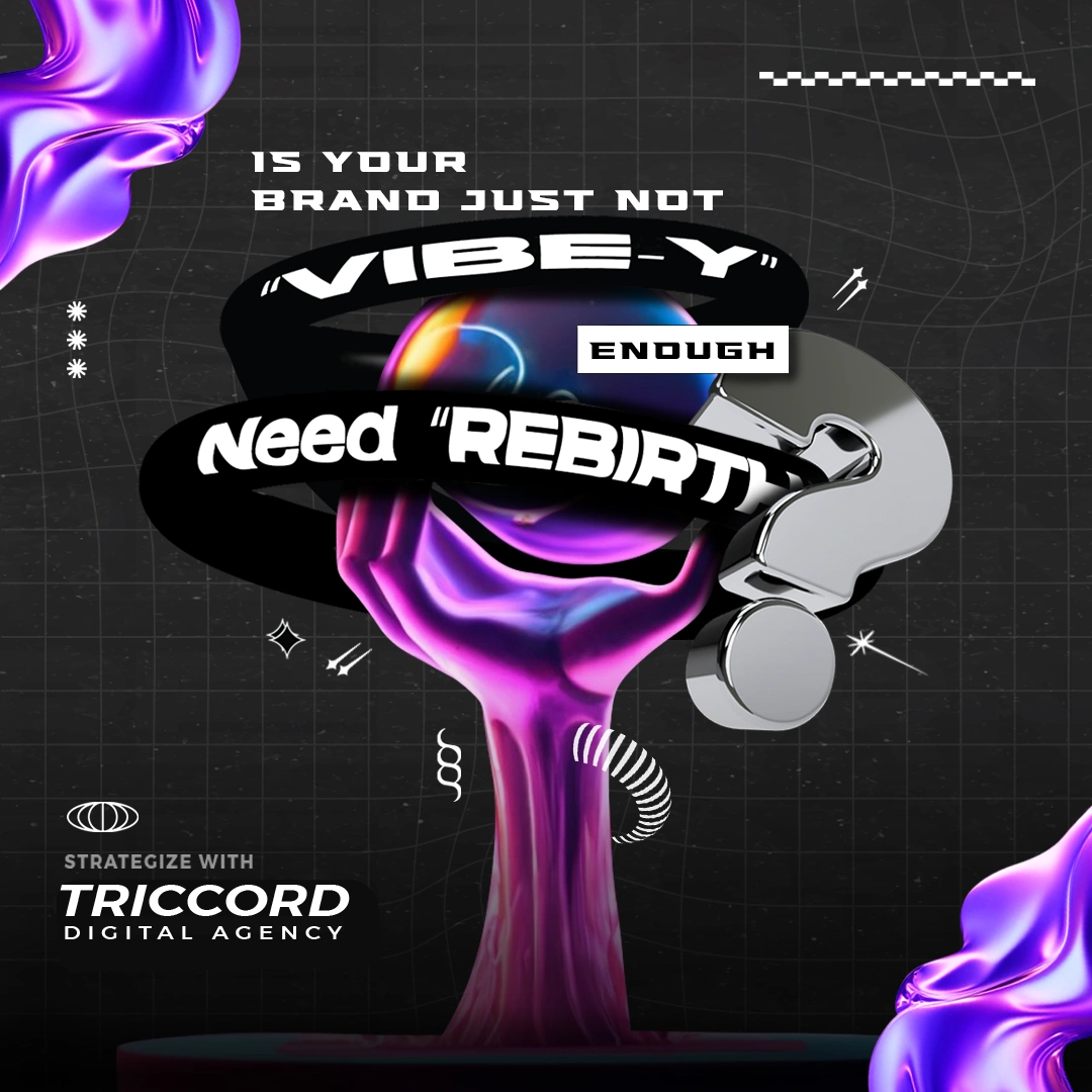
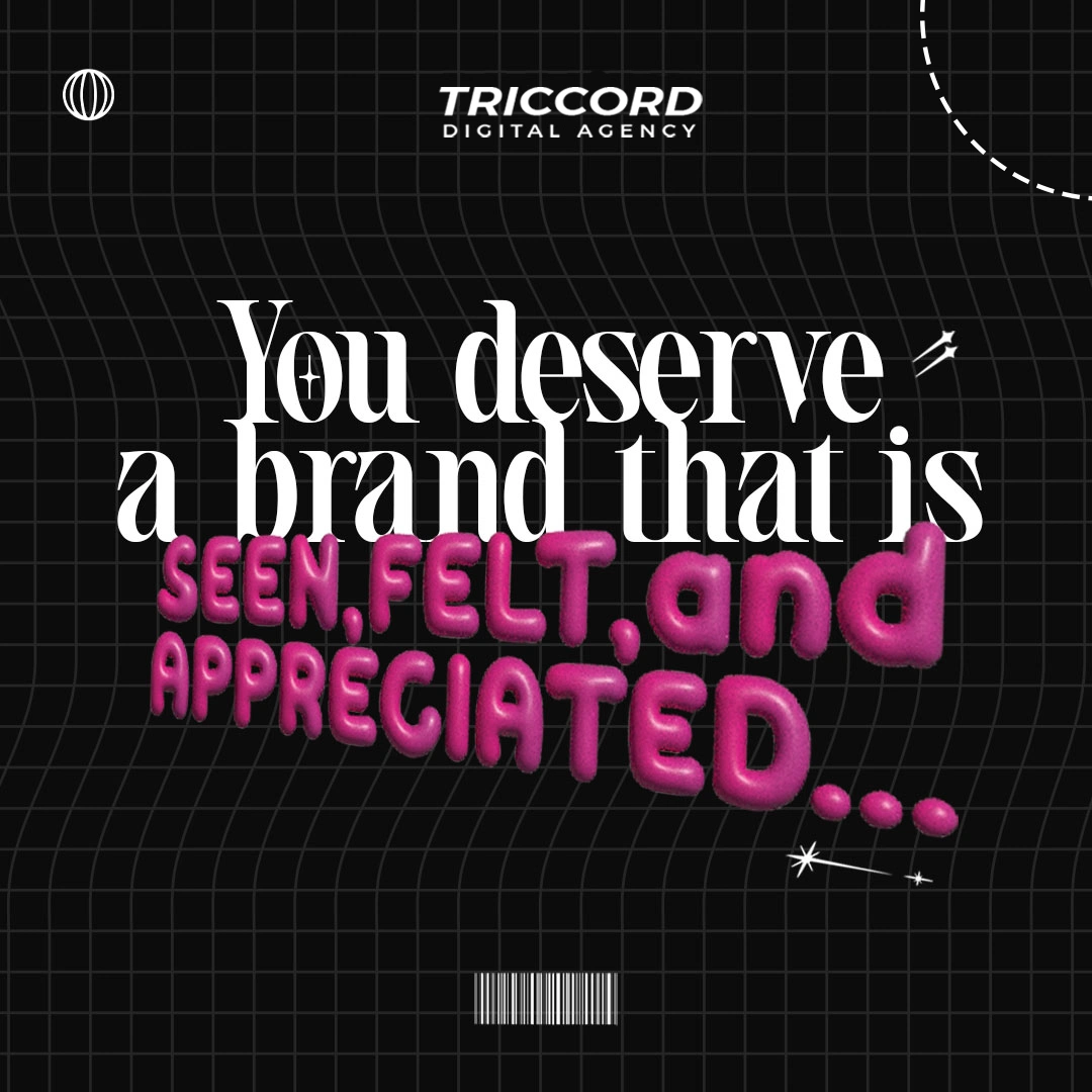
Triccord sells rebrands to people who feel invisible. The copy says it plainly: is your brand just not vibe-y enough. That pitch can't be made from a template.
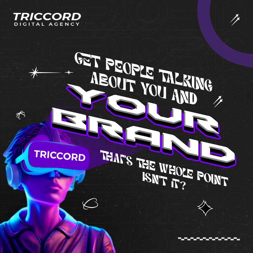
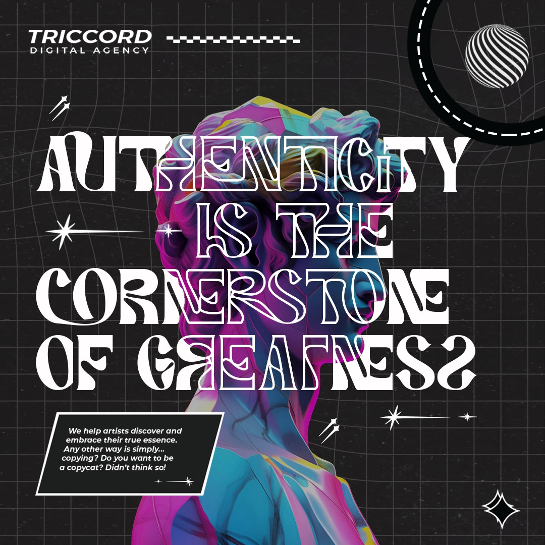
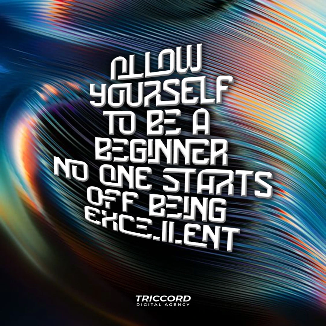
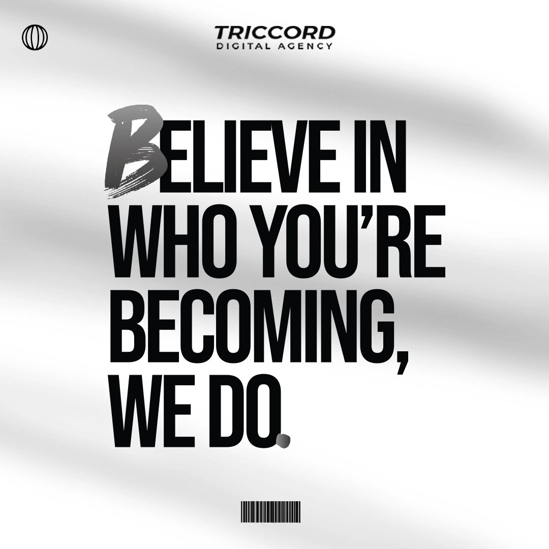
So the system was designed around a deliberate constant and a deliberate variable. The constant is structure always square, always a black or white ground, wordmark and the globe monogram anchored in a fixed corner, headline dominating two-thirds of the frame. The variable is texture, and it swings hard: iridescent chrome liquid, silk folds, warped grids, prismatic light streaks, a VR headset in cyan and violet.
Type carries the same logic. Every headline uses a distorted display face melted counters, stretched terminals, letters that look wrong on purpose while body copy stays in a clean italic serif or a plain sans so the actual message never becomes a puzzle.
That split is what keeps the feed from reading as chaos. A viewer scrolling past six of these recognizes them as one account without any two looking alike.
For a creative agency, the feed isn't marketing for the work. It is the work.
Like this project
Posted Aug 25, 2026
Triccord sells rebrands to people who feel invisible. The copy says it plainly: is your brand just not vibe-y enough. That pitch can't be made from a template.