The Future | Branding

Mohammad Umer



TheFuture A school brand that couldn't look like a school
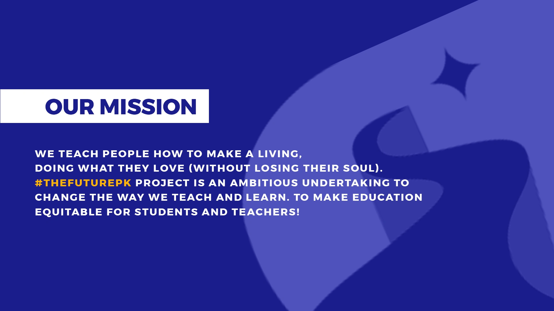
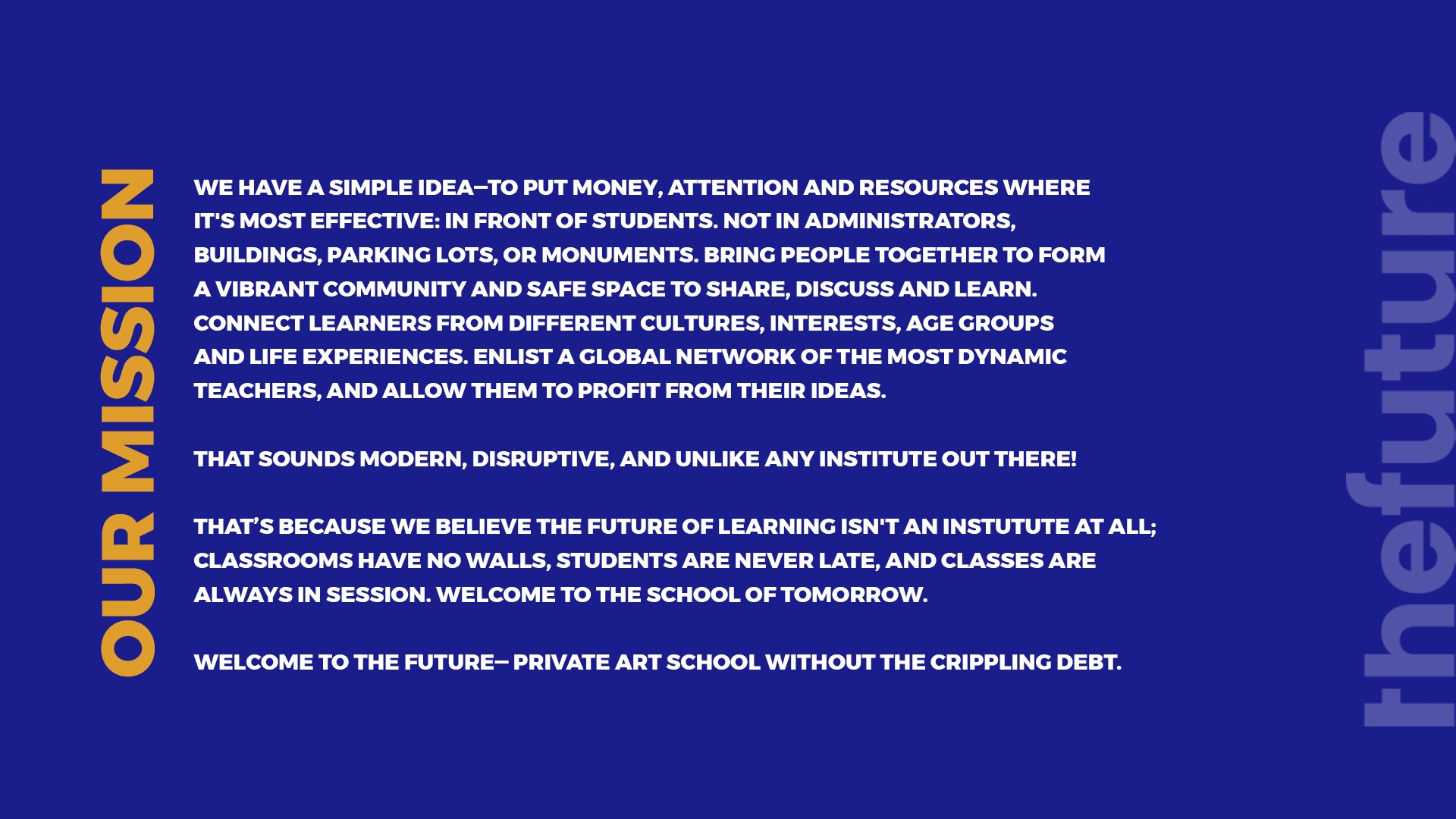
thefuture teaches people to build freelance careers. The mission is blunt about what it's against: money spent on students instead of administrators, buildings, parking lots, and monuments. A private art school without the crippling debt.
That rules out most of the visual language available. Crests, laurels, serif academia every one of them signals the institution the brand exists to argue with. Bootcamp minimalism was the other trap: it looks disposable, and this is asking people to bet a career on it.
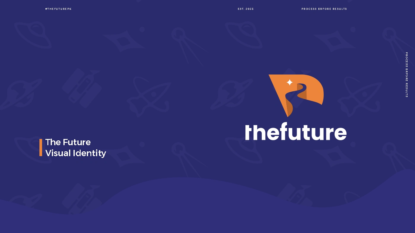
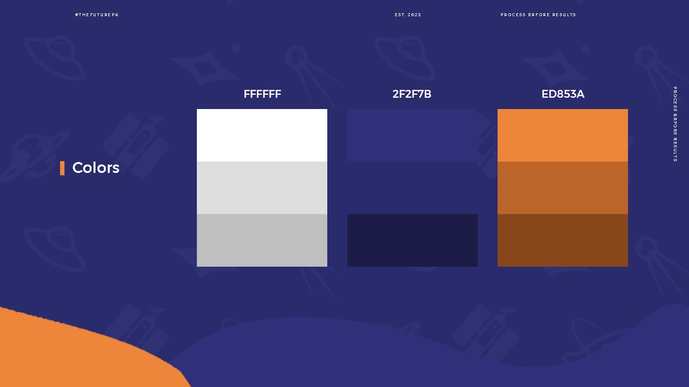
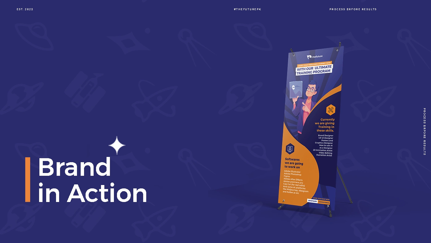
The system splits the difference by borrowing from space rather than campus. Deep indigo grounds everything with the seriousness of an institution; a single warm orange carries momentum and optimism, and appears only where the brand wants energy.
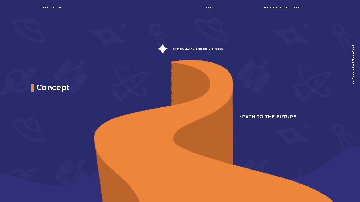
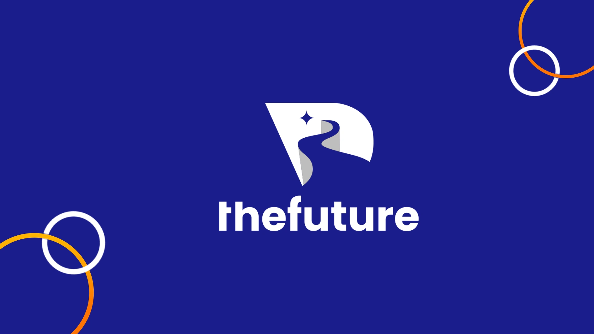
The mark is a road curving away toward a four-point star, set inside an angular form that reads as an f. Not a destination, a route which is what the product actually sells. Step-by-step blueprint, consistent supervision.
The pattern layer does the atmospheric work: rockets, planets, satellites, compasses, tiled at low contrast behind everything. It gives the brand exploration without a single literal illustration of a classroom.
An education brand's hardest job is looking legitimate without looking like the thing its students are trying to escape.





Like this project
Posted Aug 25, 2026
Future teaches people to build freelance careers. The mission is blunt about what it's against: money spent on students instead of administrators, buildings etc