The Ceramic Warehouse - Full Branding and Landing Page

Mohammad Umer


The Ceramic Warehouse - Making a warehouse look like a manufacturer
TCW's problem was in its own name. "Warehouse" says distributor someone who buys other people's coatings and puts them on a shelf. The company was repositioning as a leading UK manufacturer of ceramic coatings, which is a fundamentally different claim, made to a fundamentally different buyer.
The category didn't help. Car care branding runs on chrome, carbon fibre, flames, and an aggressive shout. That's aftermarket retail language. It undercuts a manufacturer before the conversation starts.
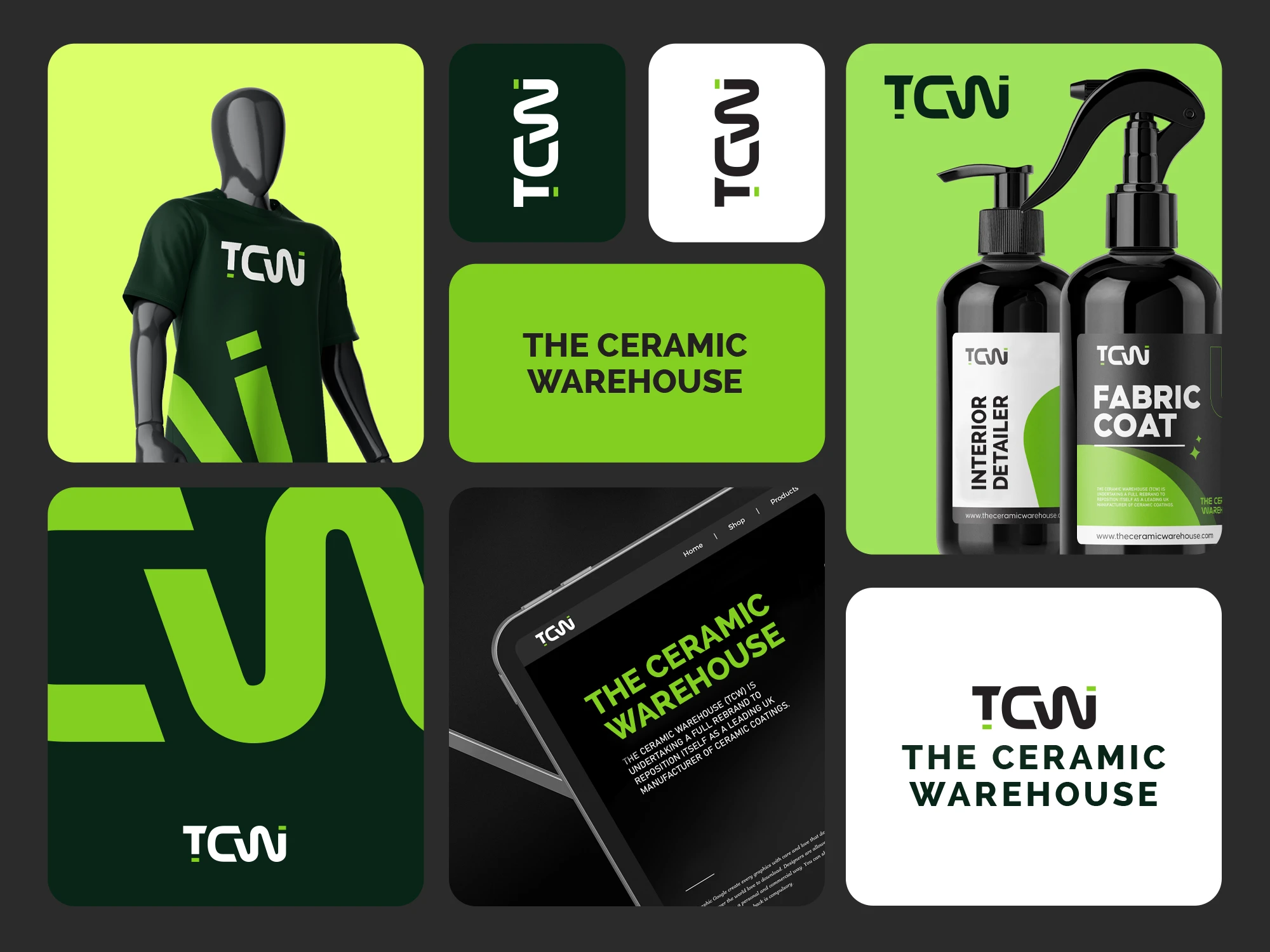
So the identity was built to read as industrial rather than aftermarket. The monogram draws TCW as a single unbroken stroke one continuous line the way a coating goes down in one pass with a squared terminal and two small green marks holding the T and the i. It works as a full lockup, a standalone monogram, and an app-sized square without redrawing.
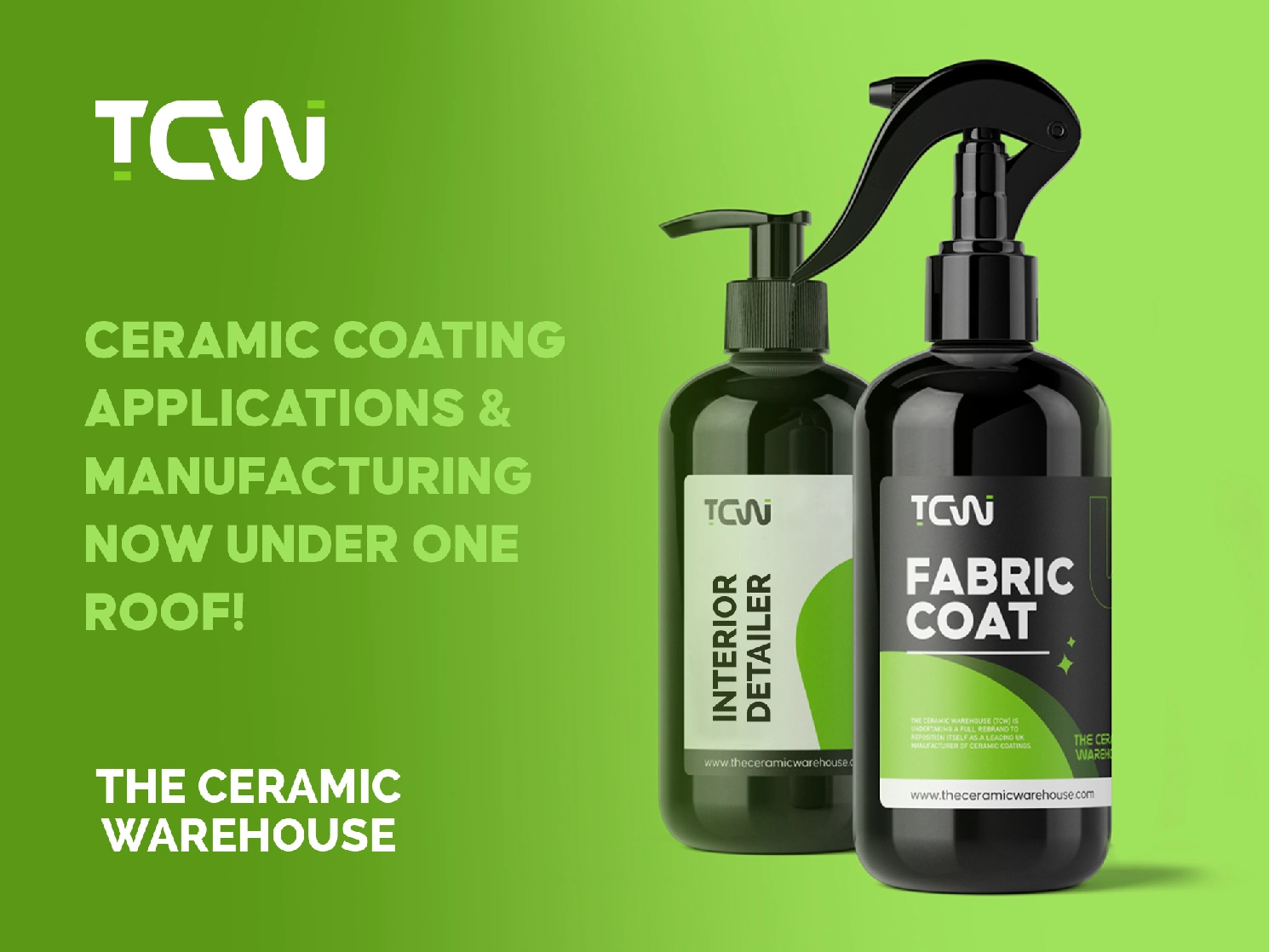
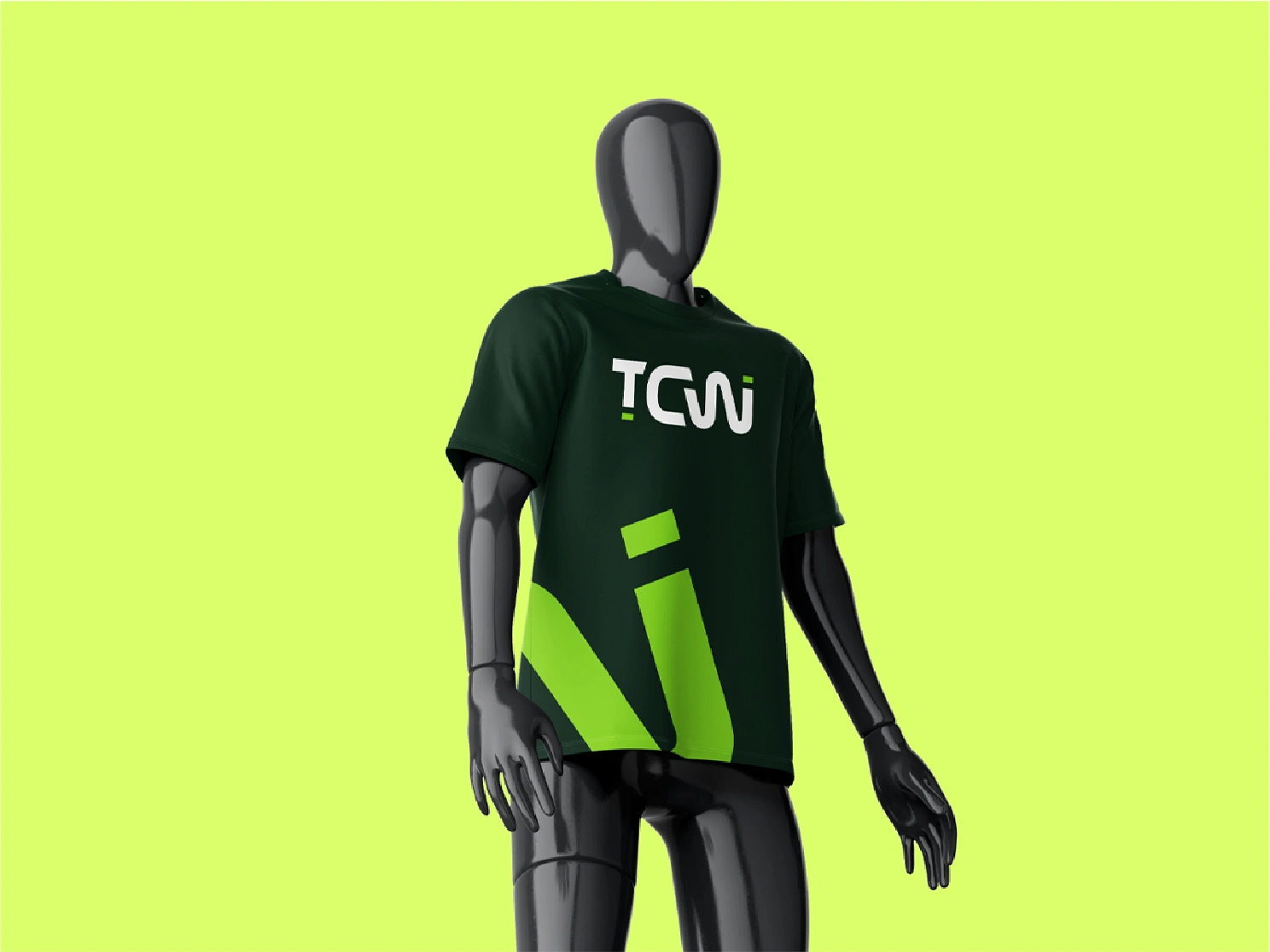
Acid green against near-black does the rest. The choice is practical: the product is applied to dark paint, and the bottles themselves are black, so the green is the only thing carrying brand at arm's length on a shelf.
The labels prove it. Interior Detailer in white, Fabric Coat in black, same architecture, same curve, instantly a range rather than two products.
When a name works against the positioning, the identity has to do the arguing.

Like this project
Posted Jun 20, 2025
Car care branding runs on chrome, carbon fibre, flames, and an aggressive shout. That's aftermarket retail language. The labels prove it.
Likes
1
Views
9
Timeline
Apr 23, 2025 - May 22, 2025