Logofolio version 2023

Mohammad Umer


Logofolio 2023 - Twenty clients, no house style
You can tell when a designer has one look and sells it repeatedly. Every client gets the same geometric sans, the same muted palette, the same tasteful restraint and every brand ends up sounding like the designer instead of themselves.
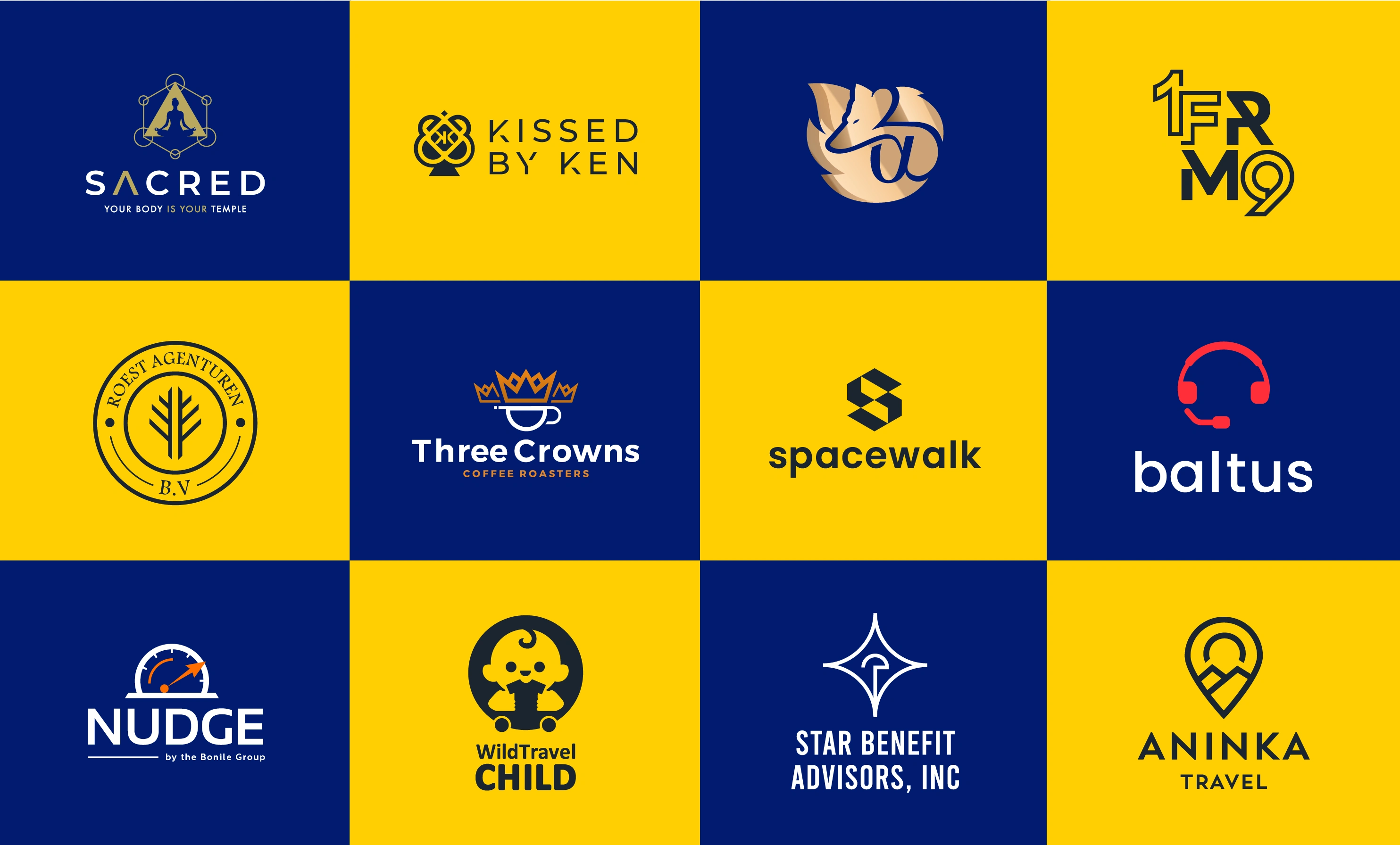
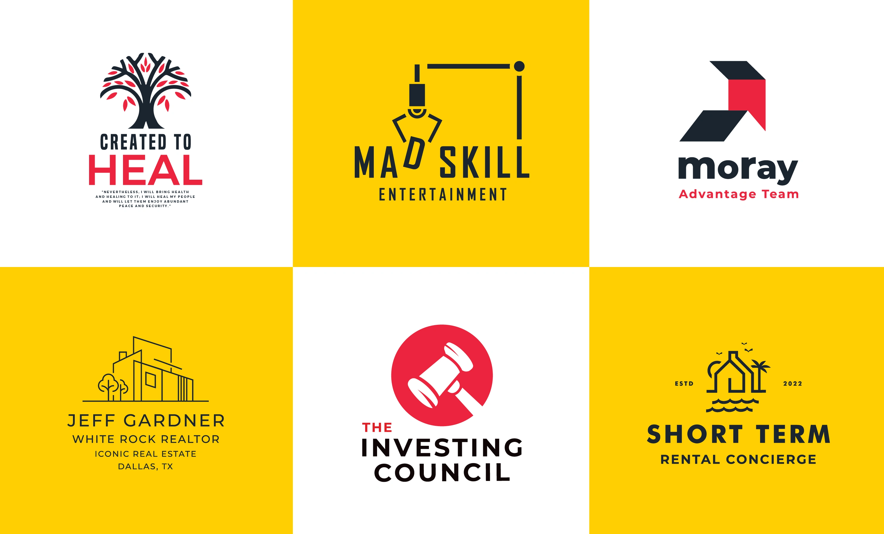
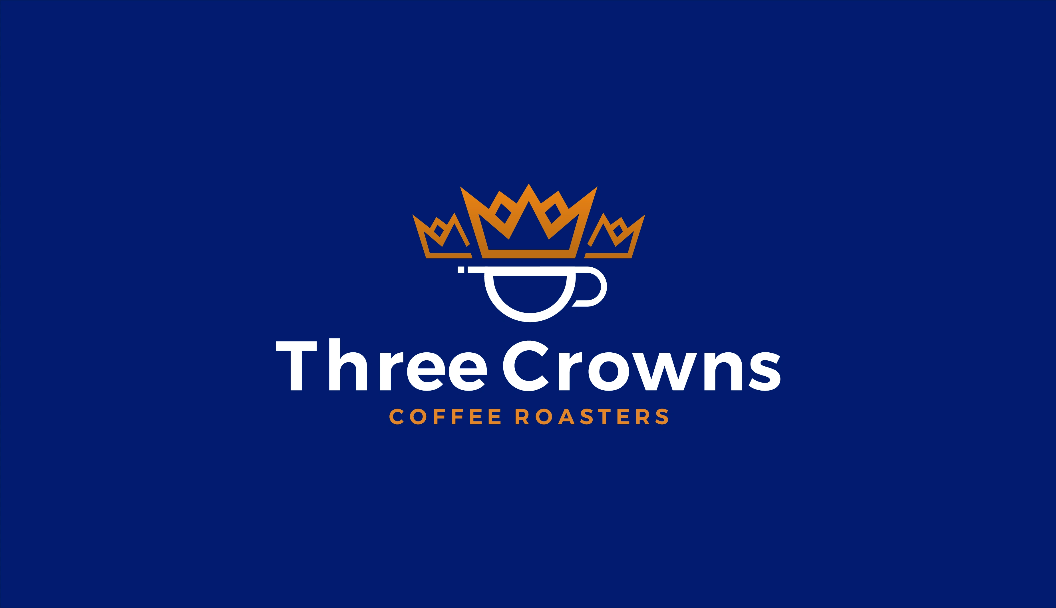
This is a year of work that deliberately doesn't do that. A coffee roaster gets a crown over a cup, warm and traditional, because that category rewards heritage. An entertainment company gets a boom mic drawn as the letter D, because the joke is the point. A concierge rental brand gets a fine-line house between palm trees and an estd. 2022, because it's selling a place, not a service. A healing practice gets a tree with red leaves. A legal-adjacent investing council gets a gavel in a circle, blunt and unarguable.
What stays constant isn't a style. It's the method: find the one idea the business is actually built on, then build the mark so that idea is the first thing anyone reads. Every mark here is monochrome-safe, works at favicon size, and survives being embroidered.
The presentation is where the consistency lives a single navy and yellow grid so twenty different brands can sit together without competing.
A logo shouldn't tell you who designed it. It should tell you who hired them.



Like this project
Posted Jun 20, 2025
Logofolio 2023 - Twenty clients, no house style You can tell when a designer has one look and sells it repeatedly.
Likes
0
Views
12