Building Empires Thumbnail Design

Mohammad Umer


Building Empires - Twenty thumbnails that had to look like money
The Lawton Review was launching a YouTube series profiling twenty musicians who built businesses, ending in an NCAA-style bracket ranking whose enterprise is most durable. The client arrived with a strong instinct already formed: currency. Banknote engraving, monotone portraiture, the visual language of value itself.
The problem
Twenty episodes means twenty thumbnails, and thumbnails are where YouTube series usually fall apart. Each one has to be distinct enough that a returning viewer knows it's new, and identical enough in structure that they recognize the channel in a crowded sidebar. Most series solve half of that and lose the other half by episode six.
The second constraint was subject matter. Music and money is an easy thing to design badly chains, dollar signs, gold gradients. The series is analytical, not celebratory. It had to look like a financial publication that happens to cover musicians.
The approach
Build the currency conceit as a fixed frame with one variable: color.
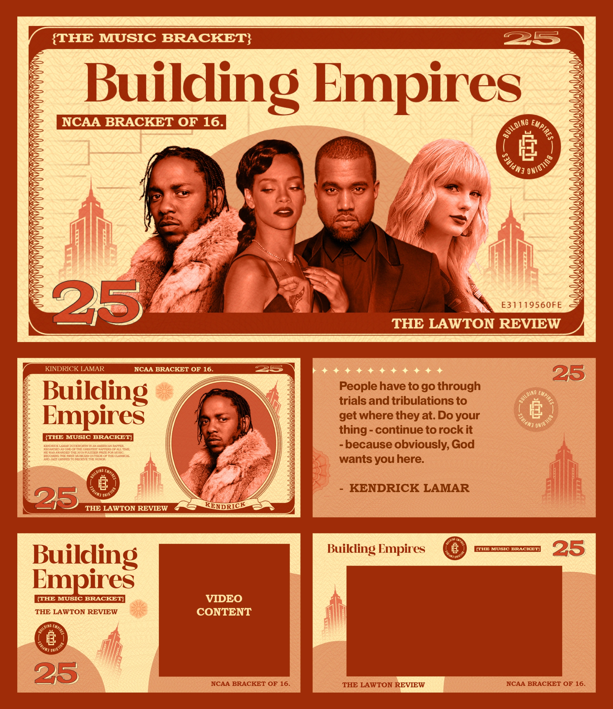
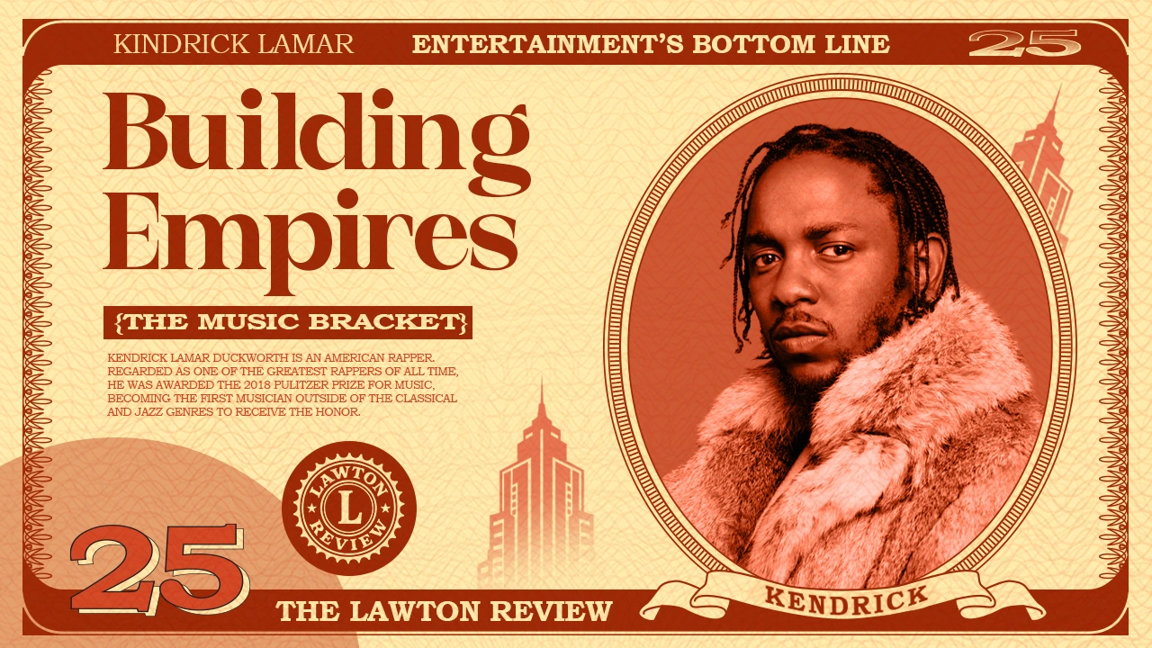
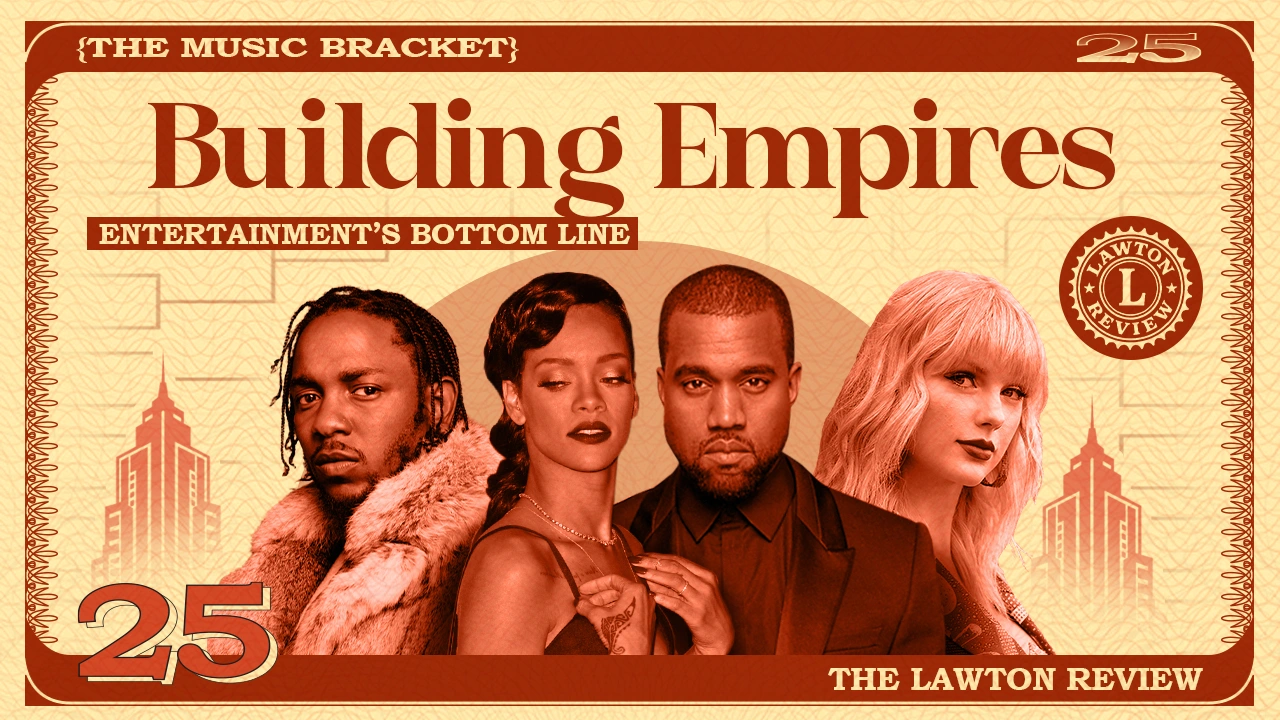
Every thumbnail uses the same architecture engraved border, guilloché line texture, denomination numeral bottom-left, the seal, the skyline motif, the publication name along the bottom rail. That structure never moves. What changes per profile is the duotone, so Kendrick's episode and Rihanna's episode are unmistakably the same series and unmistakably different episodes.
The bracket background pulls double duty: at low opacity it sits behind the group shot as texture, and it's also the actual competitive premise of the series.
Execution
- Master thumbnail template with locked structure and swappable duotone
- Individual profile thumbnails, portrait framed in an engraved oval with a name ribbon
- Series title lockup in a high-contrast editorial serif, sitting against a slab caps secondary
- The Lawton Review seal, built to read at thumbnail scale
- Quote card layout for pull-quotes and soundbites
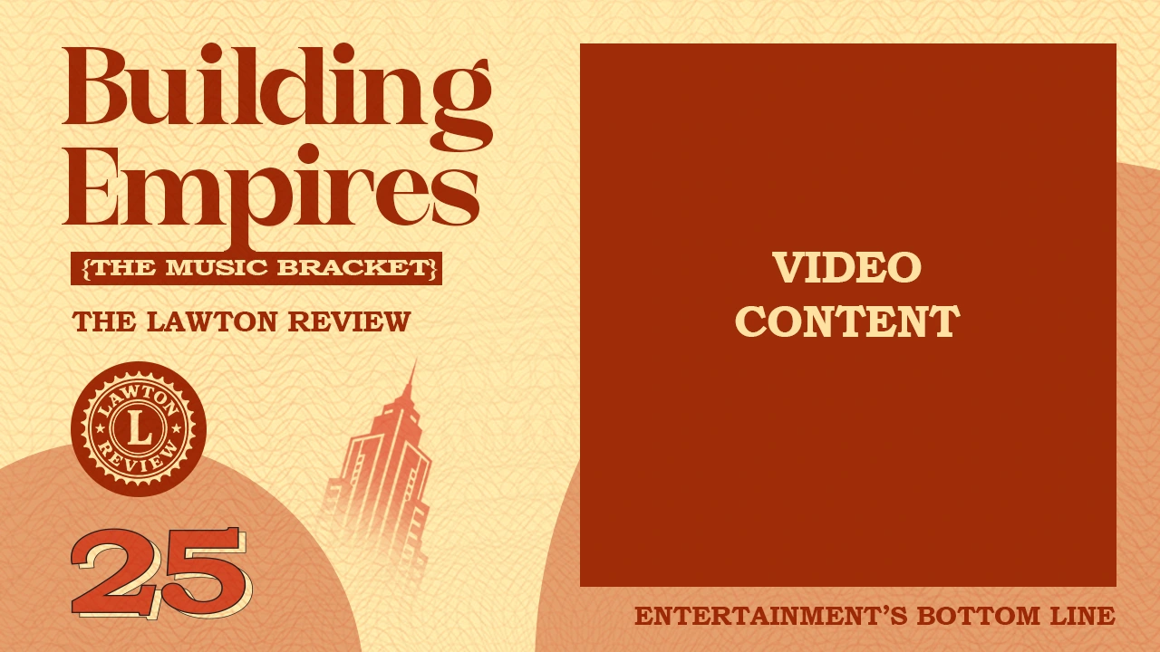
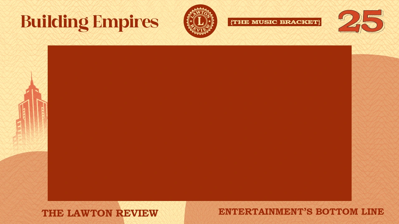
- Two video-content frames square and 16:9 for footage, charts, and business data
- Skyline and guilloché element kit for reuse across formats
What it gave the client
A system where a new episode is a color decision and a portrait crop, not a new design. Twenty profiles produced without twenty design briefs. And a visual position financial publication, not music channel that matches what the series is actually arguing.
Closing
For a series, the template is the brand. Design it once properly and every episode after is production, not design.

Like this project
Posted Aug 30, 2026
TLR was launching a YouTube series profiling twenty musicians who built businesses, ending in an NCAA-style bracket ranking whose enterprise is most durable.