Studio.KTC | Founder-Led Brand Identity & Web Design
Kaitlynn Hester

I started Studio.KTC to create a design practice grounded in clarity, originality, and intentional expression. The studio needed a brand identity and website that reflected the standard of work delivered while communicating a distinct perspective. One that feels unmistakably aligned with the clients it attracts, modern and creative at its core. This project established how the studio shows up across every touchpoint, from visual presence to strategic voice.

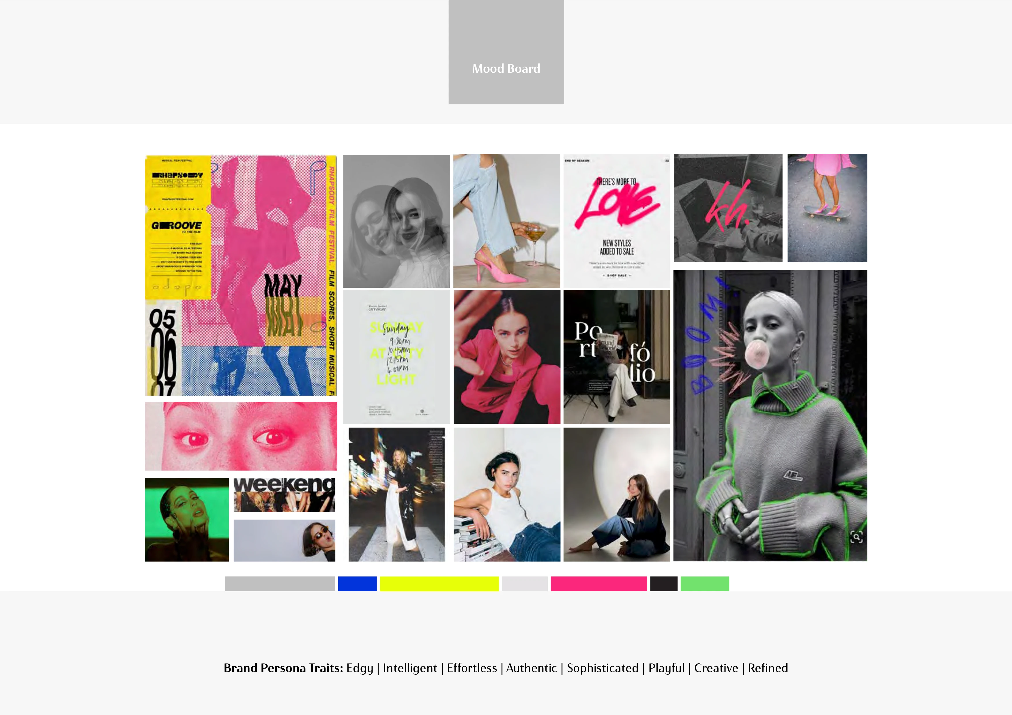
Brand Strategy & Personality
Studio.KTC was built to help entrepreneurs elevate their vision through thoughtful design and intentional storytelling. The strategy focused on making sophisticated, editorial design feel approachable and human while staying grounded in real outcomes rather than just aesthetics.
Instead of presenting design as decoration, the brand communicates it as an experience that shapes how people understand and engage with a business. The branding experience was meant to give clients the sense that they are stepping into a partnership rooted in clarity and creative direction. This personality is expressed through intentional contrasts.
Editorial structure sits beside expressive movement, allowing the brand to feel effortless and authentic. Clean typography pairs with handwritten accents to echo the studio's blend of precision and expression. Color brings momentum and energy, revealing the meaning behind the work. Each choice supports the mission to build brands that captivate, resonate, and create meaningful connection.
Visual Identity Development
The primary logo combines a classic serif wordmark with a fluid handwritten signature pulled from the brand's typography. Strategy meets intuition at this intersection, striking a balance seated at the heart of the studio.
Extending this idea, the typography suite features primary and secondary serifs that provide structure, clarity, and contemporary edge. Handwritten details embed an undercurrent of soft, refined authenticity throughout the system. The typographic system mirrors the Studio.KTC experience itself, layered with thoughtful, strategic detail. These points of contention are the cornerstone of the brand identity.
Color carries this duality forward. Black, white, and soft gray create a timeless, sophisticated base while vibrant accents invigorate the palette. Hot pink brings a balance of bold energy and soft approachability. Yellow offers optimism, intellect, curiosity and inspiration. Electric blue introduces quiet confidence and poise. Green adds reassurance, vitality, and ease. Through contrast, emotion, and momentum, the palette reinforces the studio's ethos, supporting a visual identity that feels elevated, expressive, and contemporary.
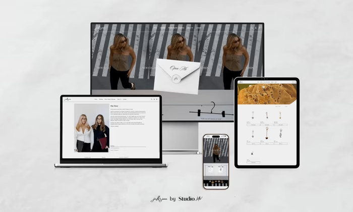
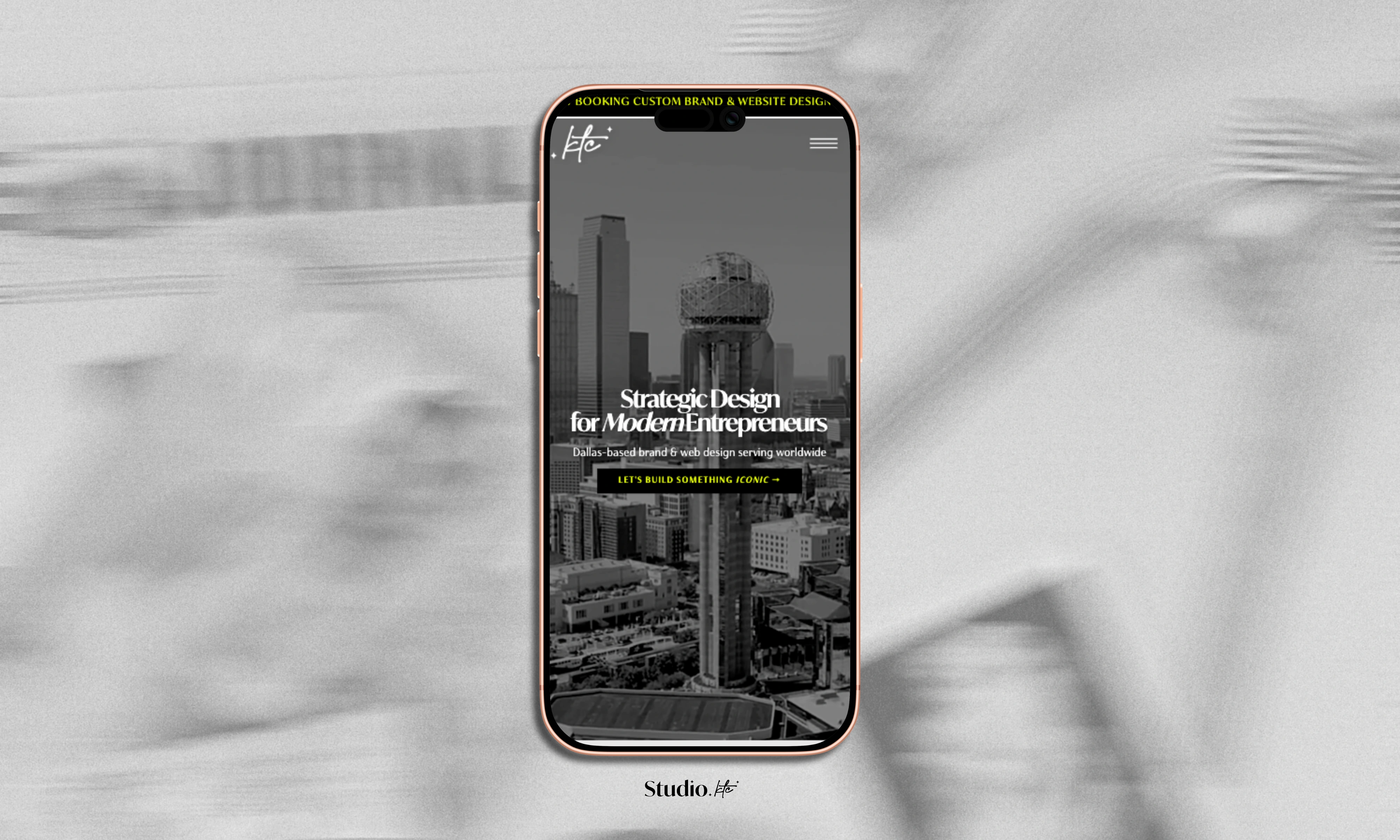
Website Development, Strategy, & Design
The Studio.KTC website was created as a lived expression of the work the studio delivers. From the first click, it needed to feel intentional. Visitors move through an experience mirroring the way the studio approaches design itself: thoughtful, intuitive, grounded in clarity. Acting as both a curated portfolio and an inviting entry point into services, the site was shaped by an understanding of how people move, how they explore, how they decide.
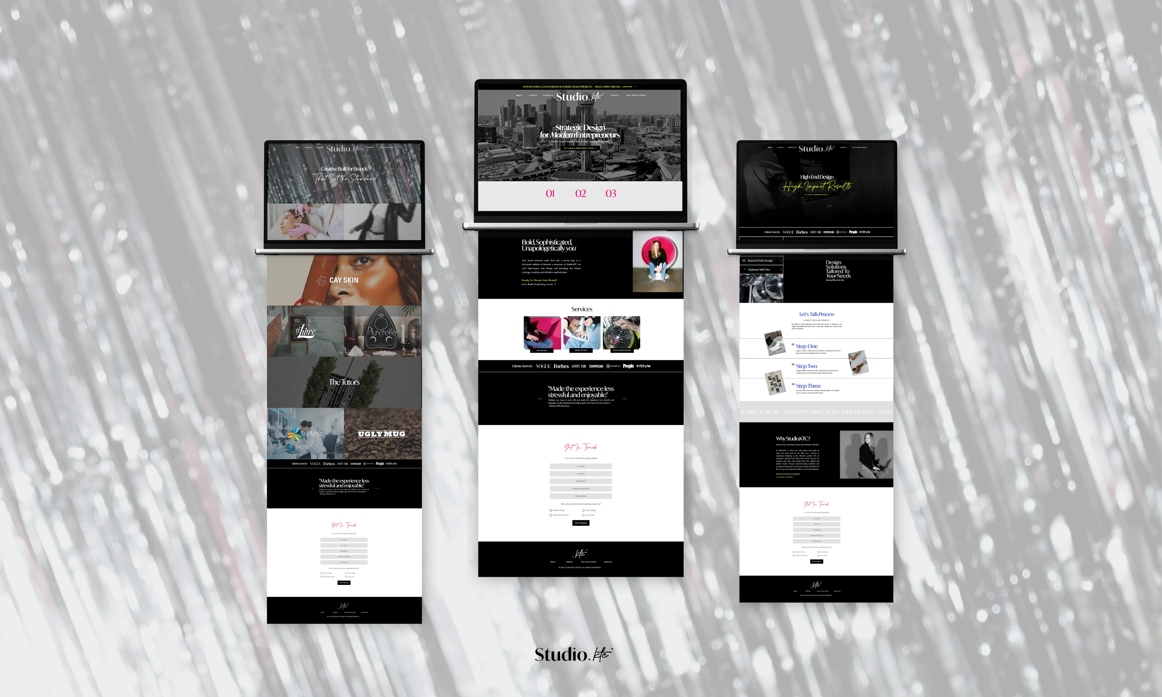
Natural and intuitive. That's how the user journey was mapped. Visitors can move with ease between Services, Portfolio, About, and the Free Consultation page, where each section supports a different stage of inquiry. Hierarchy, pacing, and color help visitors understand what the studio offers and how to take the next step without hesitation.
Visual identity carries this guidance throughout the experience. Typographic contrast, expressive photography, and vibrant accents give each page its own tone while still feeling unmistakably part of the same world. The studio's ability to adapt across industries while maintaining a clear point of view gets reflected here. Effortless to navigate, the entire experience was designed to gently direct visitors toward connection, whether they're exploring the work or ready to start a conversation.
Brand Collateral
Studio.KTC's collateral extends the identity into the everyday moments where the brand is seen, shared, and remembered. Designed to feel cohesive within the larger ecosystem, each touchpoint carries its own subtle personality.
Business cards pair the logo with clean, confident typography. First impressions that feel both modern and grounded. Social content follows the same creative direction, using the studio's color palette and type hierarchy to build visual rhythm across platforms in a way that feels expressive without losing clarity.
Reinforcing the brand's authenticity, photography and graphic elements bring in an editorial sensibility that mirrors the mood and energy of the studio. Together, these pieces create a world that feels intentional, warm, and creatively aligned with the experience clients have when they work with Studio.KTC.

Results & Impact
The website and brand identity gave Studio.KTC a clear, confident foundation, strengthening how the studio communicates its expertise and creative vision. The online experience offers a streamlined path from discovery to inquiry, enriching the client journey and supporting long-term growth. Now, the website attracts clients who resonate with the studio’s perspective and are able to recognize that alignment from the very first interaction.
Since launch, Studio.KTC has partnered with clients across industries on branding, web design, and packaging projects, reflecting how the identity naturally attracts those seeking thoughtful, high impact design.
Studio.KTC was created to bring clarity, creativity, and intention to every brand it touches, beginning with its own.
Like this project
Posted Dec 8, 2025
Building Studio.KTC: creative direction, brand identity, website development, and brand management systems establishing my agency's foundation.
Likes
3
Views
35