Finance SaaS identity, apparel marks and PowerPoint template

Vincent L. Anderson


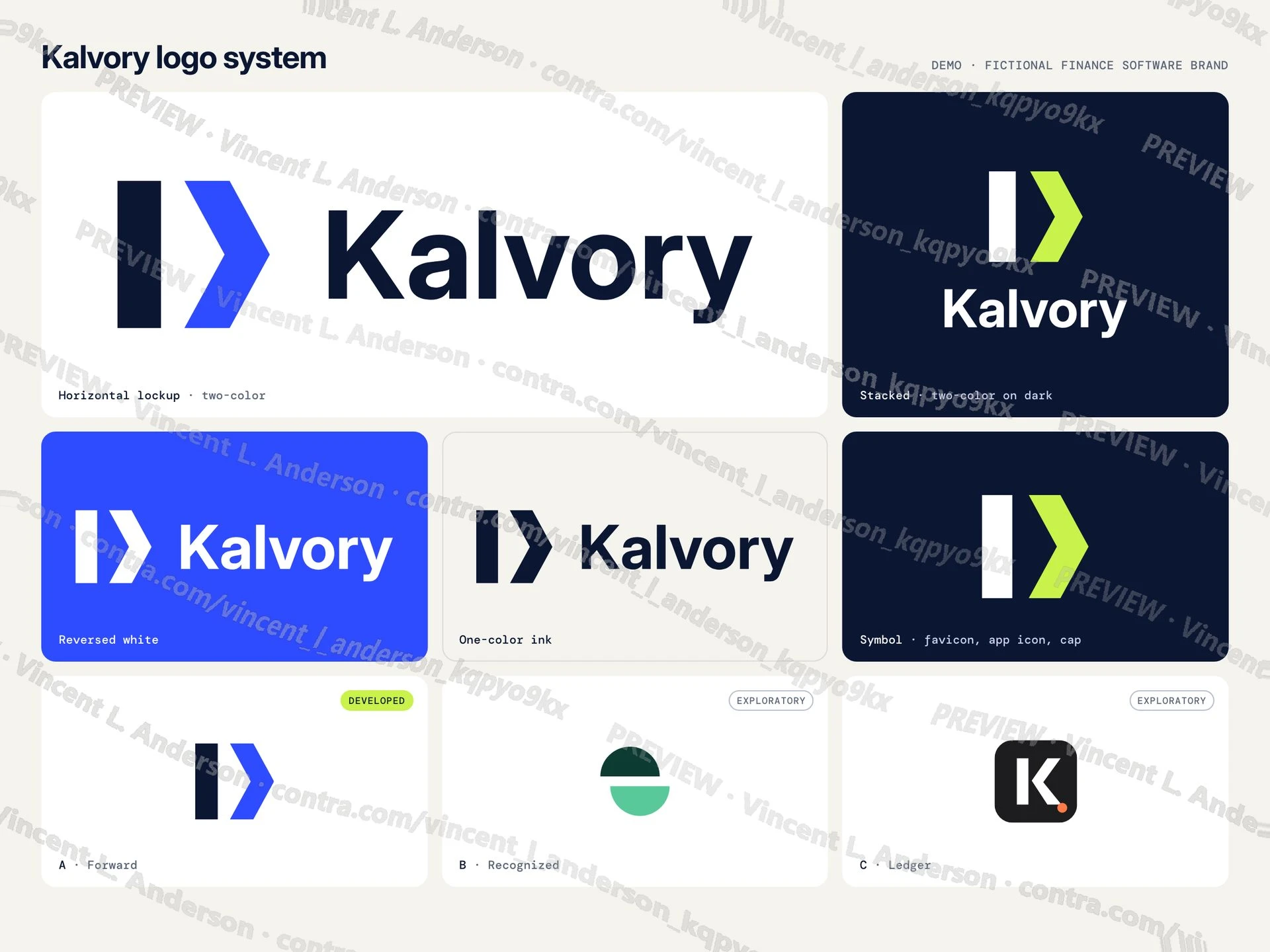
Demo: fictional brand, not client work.
I made a complete identity for a fictional revenue recognition app. The symbol is a solid stem and a forward chevron with a wedge of space between them, so it reads as progression without a staircase. The logo system has a wordmark, the symbol and horizontal and stacked lockups in five versions, including one-color and reversed white, as SVG, vector PDF and transparent PNG; three creative directions, two labeled exploratory; 15 pages of guidelines; a cap at 45 mm and a left chest thread lockup at 100 mm, actual size, whose thinnest stroke is 1.58 mm; a website hero at 1440 and 390 px with favicon and app icon; and a 16:9 PowerPoint template with one master, 10 layouts and theme fonts and colors, plus a 5-slide deck with an editable table, chart and shapes, usage notes and a checked PDF preview.
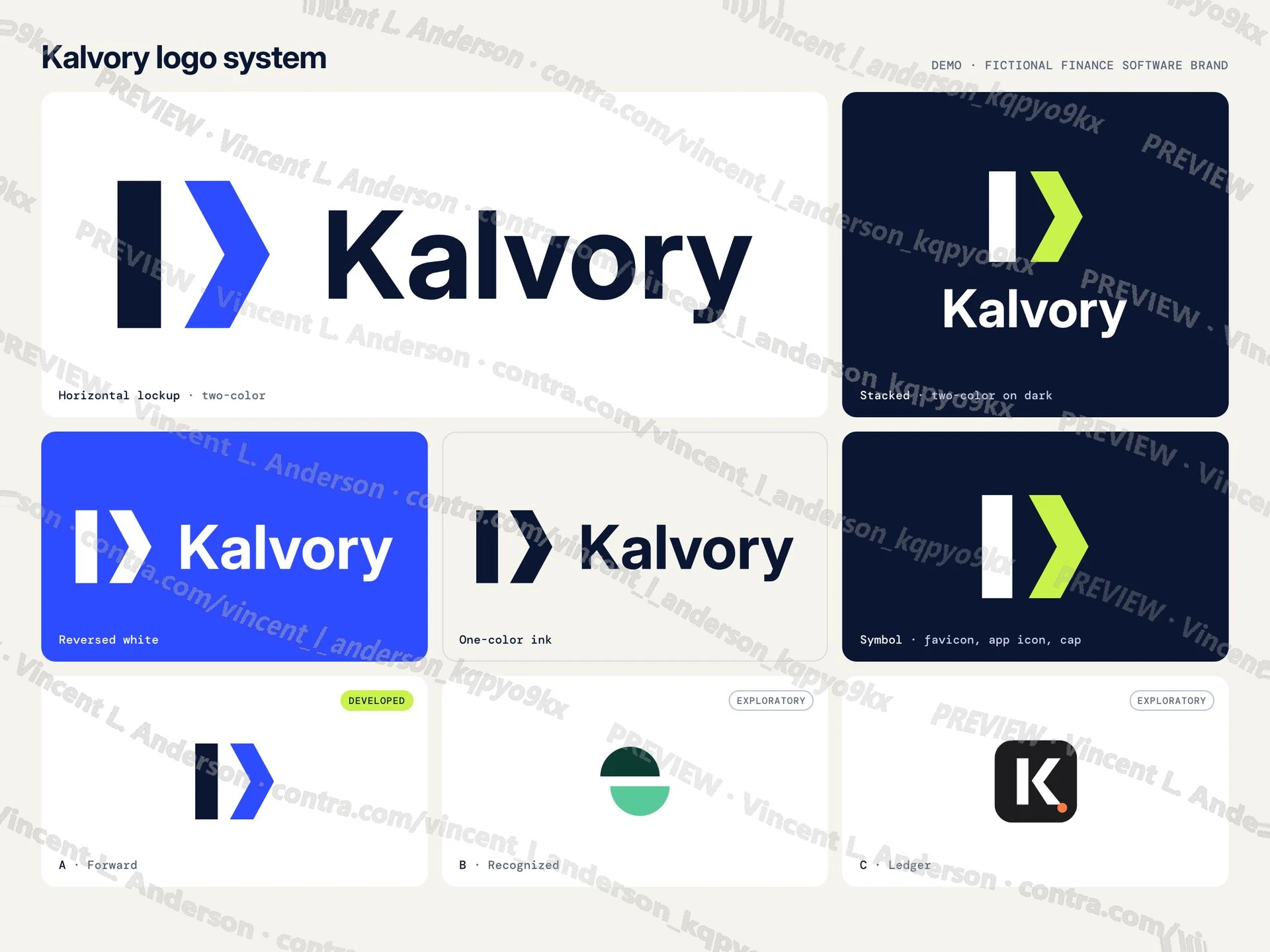
Logo system: lockups, one-color and reversed versions, three labeled directions
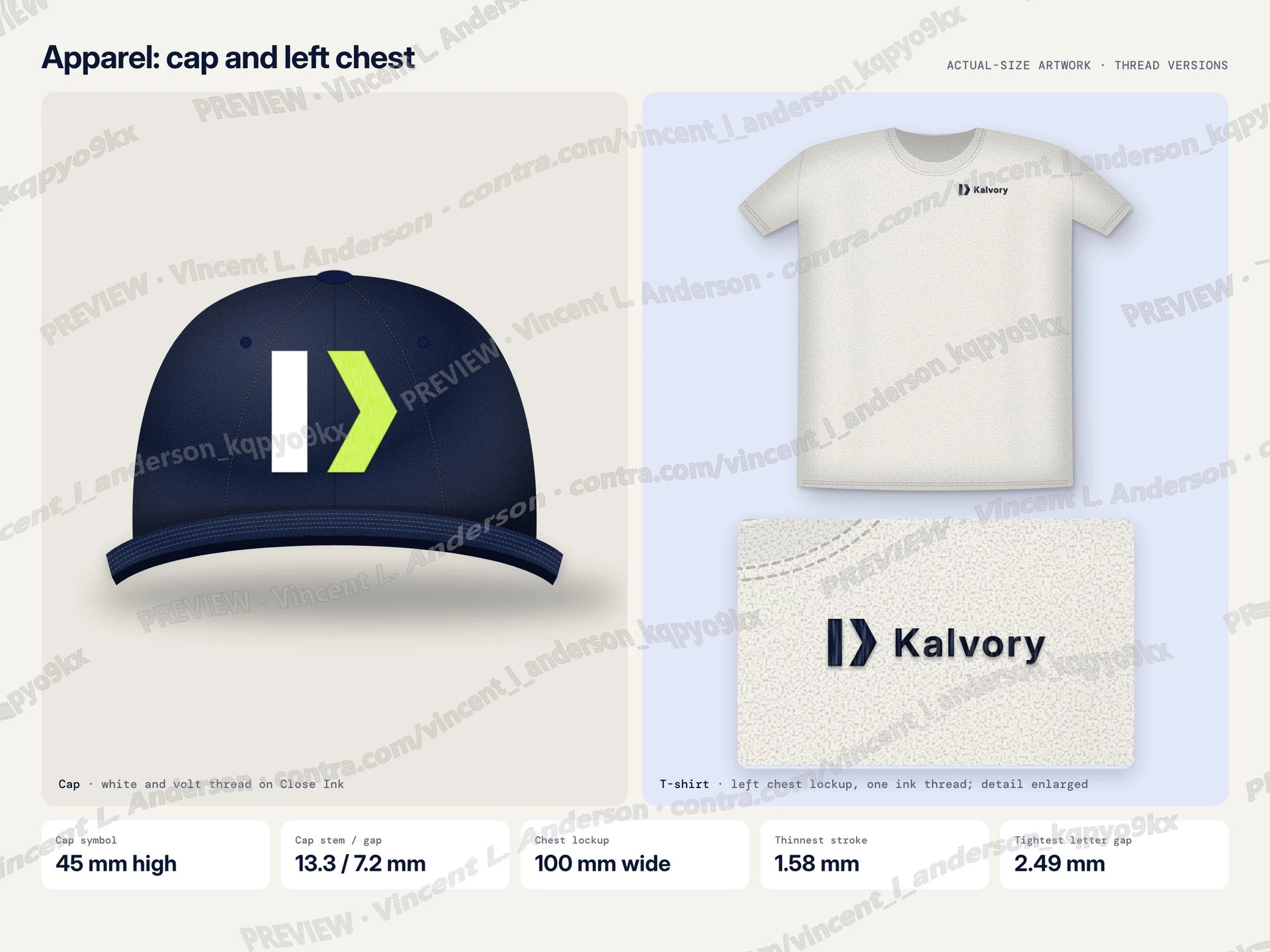
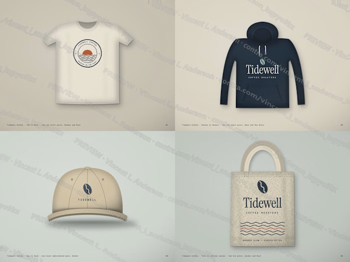
Cap and shirt embroidery with actual-size measurements
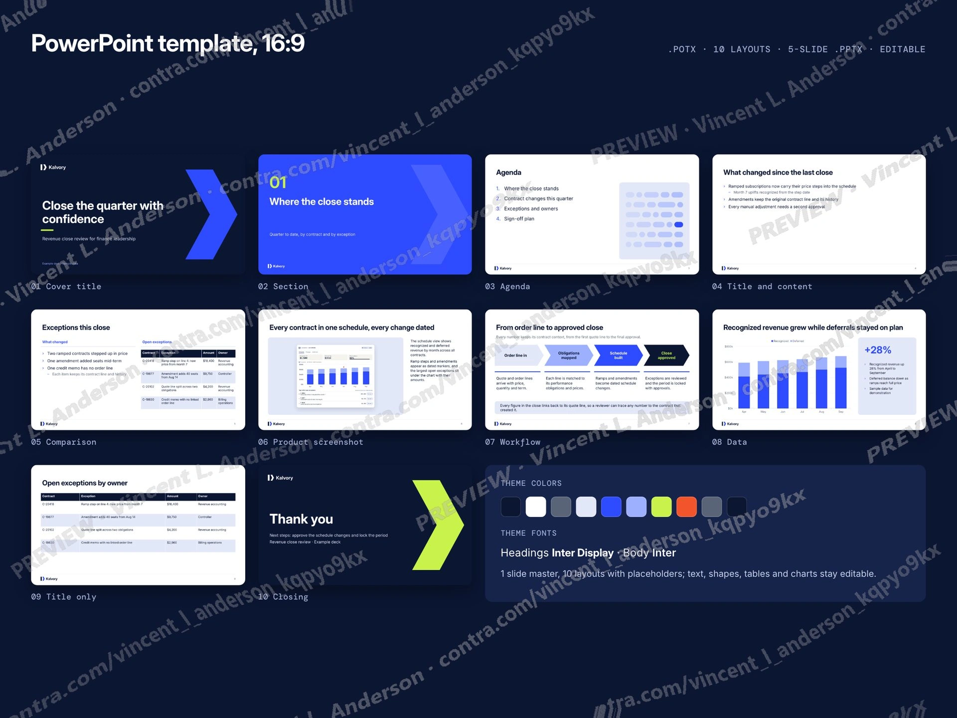
16:9 PowerPoint template: layouts with theme fonts and colors
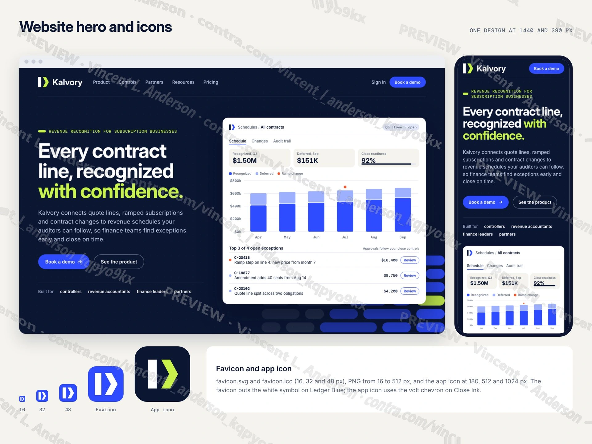
Website hero at desktop and phone width, favicon and app icon
Like this project
Posted Oct 7, 2026
Demo identity for a fictional revenue recognition app: logo system, three labeled directions, actual-size cap and shirt artwork, 15-page guidelines, web hero and icons, and an editable 16:9 PowerPoint template with 10 layouts.