Accomptare: Designing an experience for people to achieve goals
Hello, and Welcome, folks. I hope you find it interesting!

Made in figma
🔴 Problem Statement
I used to compose a lot of lists of to-dos while I was a student, but I never seemed to be able to complete any of them. The cause is that I put off doing anything, find excuses not to, and lose interest in it.
Then I noticed a similar pattern in many individuals around me; they had trouble staying accountable to their goals. By the end of the day, they didn’t feel productive enough, guilty, or demotivated to do anything else.

How might we ( Problem Statement )
🧐 Solution Explained
A. Finding and Booking themselves an Accountability Partner
Having an accountability partner increases that success rate to 95%.
They are motivated and driven. In this approach, you encourage one another, and their drive might also motivate you.
The motivation of the accountability partner passes onto you and encourages you to embrace the same mindset as well.
Booking an accountability partner
B. Gamifying your experience while engaging with the Accountability Partner
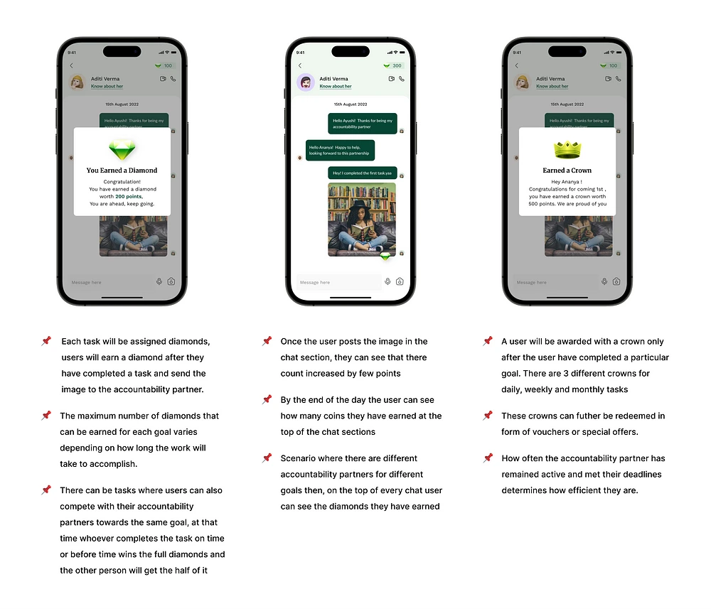
We are increasing user engagement with the application by gamifying the process, and this will also serve as a motivational component for users to fulfill their goals.
Now that users have statistical data showing why they can trust the other person, this serves as a credibility element/factor when people look for accountability partners.
Goal Gradient effect: The closer users are to completing a task, the faster they work towards reaching it. Therefore, users are more driven to do such tasks when they see a clear indicator and progress of their goal.
Gamifying the procedure also heightens the healthy competition between partners to achieve the goal and earn points more quickly.
How diamonds are earned
C. Add, Track, and Manage your own Goals.
Users can enter daily, weekly, and monthly goals, and their progress reports will be shown on the dashboard’s home screen in this scenario.
Users can also add different accountability partners to other goals, but at maximum, a user can add three accountability partners to one profile.
Users can also manage their goals by posting them on the community platform, dropping them when they no longer feel like working toward them, or deleting their tasks.
Adds goals while onboarding
D. Engaging with the community and exploring the content library.
The community platform on the app gives users the freedom to interact with other users by posting their personal stories and joining various challenges and activity clubs.
To make it simple for users to access adequate information for learning and knowledge purposes, the content library offers users resources from around the internet that have been specially curated for the app’s target audience.
Community and Library Content screens
👩🏻🦰 Roles & Responsibilities
User Research: Competitive Research, White paper Research (How the problem is being solved currently, Social proof where my problem statement is being verified), User Interview, Contextual Inquiry.
UI Design: Pen and Paper Sketches, Visuals
🔖 Project Context
Timeline of the Project: 4 weeks
Solo Project was done under the 10k Designer's cohort
Under Mentor Guidance
👩🏻💻 My Approach
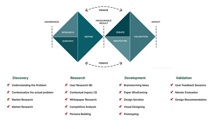
I looked into a few design thinking approaches before I started the project research so that I could proceed with my work more systematically. Among these, I found double diamond to be a straightforward approach because it is clear and easy to understand. It will also summarise the steps I will use in my research and design, regardless of the tools and methods used.
Discovery Stage: In this stage, I identify different keywords to understand the actual problem and then find insights about the problem
Defining Stage/ Research Stage: For this stage’s goal, I sorted through all the data I collected from stage one and elaborated on it to find the focus points.
Development Stage: During this stage of the process, my main focus was to find potential solutions to the problem, so I did brainstorming, mapped the ideas, took user interviews to understand the roots of the problem, and mapped out ideas
Delivery Stage/ Validation Stage: After a lot of iterations, back and forth going through each stage to either add new information or remove any old idea, I tried finding the right solution that would work.
Iteration/ Iterative Process: Iteration, in my opinion, is the most significant and crucial step in any design process. Iteration also makes it more fun for a designer to develop a creative solution to improve, and a project grows over time due to these improvements.
🔍 Starting with Research
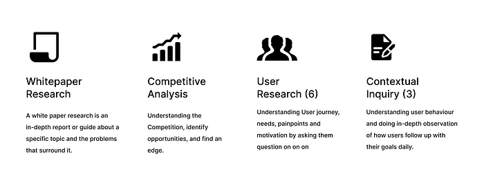
I divided the research for this case study into two stages:
The first was Primary Research, during which I identified the problem’s background, How the problem originated, any current solutions, and other relevant information. For example, how are people currently resolving this issue?
Then, to confirm my study, I conducted whitepaper research and competitive analysis of the current solutions and categorized and identified my target audience.
Target Audience: Age group of 15 to 25 years
Group 1: Age 15 to 19 years
These students, who are in high school or are just beginning their college careers
They are forming a mindset about how to accomplish goals, be more attentive to them, manage their time, and be more productive.
Group 2: Age 20 to 25 years
This group comprises college students who are in the process of establishing their desired careers and who need to be more productive because they have the opportunity to learn something new every hour of their lives.
They make a list of activities to complete because they are highly motivated to perform at their best and develop into their best selves.
After that, in Secondary Research, I performed six user interviews and three in-depth contextual inquiries. I then combined all of this information into an affinity map and card sorting, which helped me create my user persona and, after viewing the insights, helped me develop creative ideas.

Whitepaper Research
I begin to read about what exactly accountability partners are, how this partnership works, How do accountability partners work with each other.
I read articles about accountability partners, How people motivate themselves to achieve goals and watched youtube videos to understand what others think about accountability.
❓What is an Accountability Partner?
An accountability Partner is a person who coaches another person in terms of helping the other person keep a commitment. In other words, they are someone who understands your vision and goals and is committed to helping you achieve them.
But how does an accountability partner help you achieve a goal? What is the purpose of such people, and are they even willing to be part of such a thing?🤔
Purpose of Accountability partner’s
Accountability partners are made up of one or more individuals who are willing to help you and hold you accountable. The idea is that once someone other than yourself knows what you need to do or what you want to achieve, there is a greater incentive to go out and do it to avoid having to explain why you didn’t go to another person.
Each partner in the partnership agrees to hold the other accountable for their progress toward their own goals and to coach them toward success. Each partner benefits from this connection in keeping their responsibilities.
A good accountability partner can be a source of strength for you. They maintain mental focus and concentration while working hard and devotedly toward achieving their dreams.
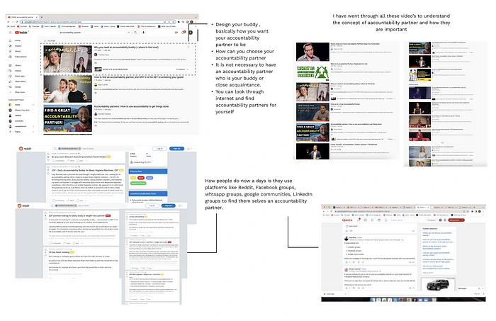
Online Research I did understand the accountability partner niche
Further, during my research, I came across a statement issued by the American Society of Training & Development study; according to them

While browsing through social media, I landed upon one profile that said :
Findings from a survey about the value of setting goals have been shared by Foundr, an educational platform with 3.6 million Instagram followers, and they told 85%+ of participants identified having an accountability partner as crucial

From Foundr Instagram page
After researching, I observed a set of design principles that can help me guide through the research, designing, and iterating process for the problem statement above.
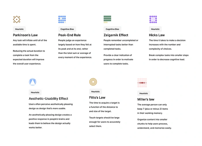
During the research phase, I pretty much got the idea that I was solving a problem that involved a lot of people or mainly two people together in one scenario, which means a lot of brain cells would be involved; hence I studied a few psychological theories to comprehend how people’s minds function in these circumstances.
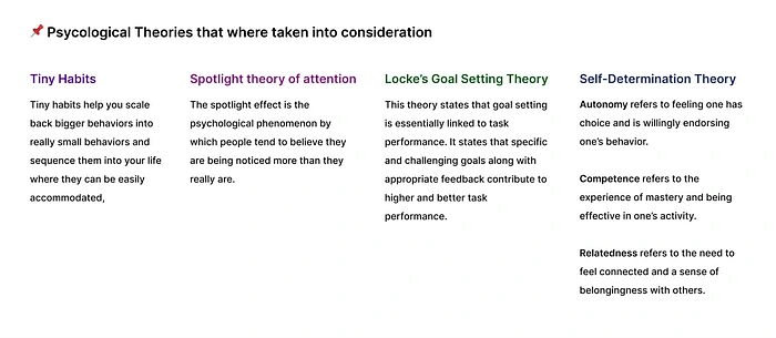
📊 Competitive Analysis
After completing the Primary and Secondary research, I found out about different competitors. So I tried to understand how they work in this niche, but surprisingly our competitors do not have any accountability and lack credibility.
Further, I researched how accountability experiences are currently in the market to understand the interactions and constraints of existing experiences.
After conducting a thoughtful analysis of the website and apps, I discovered that virtually none of them included this component of an accountability partner to help the user reach their goals.

Apps that I did competitive research on
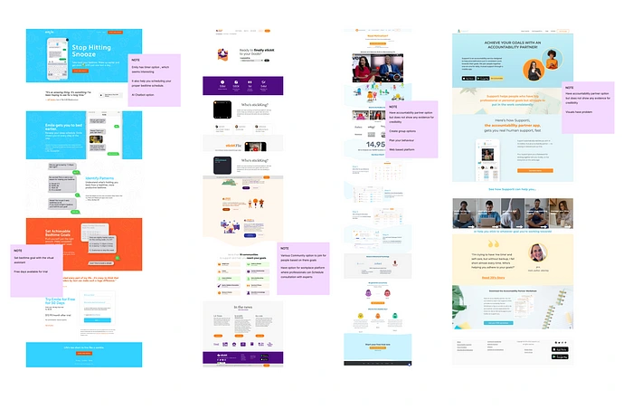
Websites available globally
👥 Conducted User Interview
The Interview Result shows that my audience is more likely to achieve their goals and stay accountable if they have an accountability partner in the present.
Conducting user interviews was the most important way of finding opportunities and reconfirming the problem statement to help me prioritize the problems and accordingly design solutions.
Here are set of questions that I asked to understand users’ view
How do you plan/ set your goals?
How is your routine/process when you have to complete your tasks?
Do you follow any plan for being consistent toward your goal?
What is your motivation factor while you are doing some task?
How much consistent are you while doing a task?
How do you track your progress on each task?
Have you ever observed what the reason why you were not able to achieve your goal is?
What driving factor makes you come back again to complete the task?
Do you like working on a task alone or in a group?
🔍 My findings from the research and interview shows
I compiled the following observations and insights based on my results from the user interview, affinity mapping, and card sorting. I also categorized related notes under related themes.
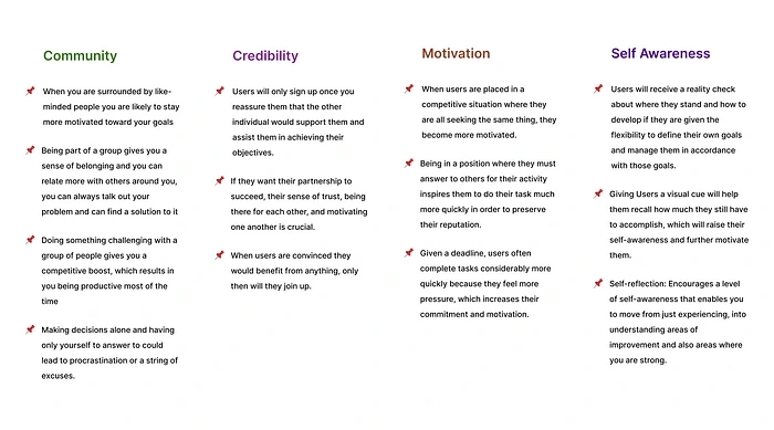
🖊 🎨 Bring Research to life: Design
💻 Visual Design Decisions Research
When I began working on the application’s visual design, I had to decide on my color scheme, typography hierarchy, the types of illustrations I would use, and — most importantly — what it would be called.
As a designer, I believe all of these choices should be made before the app is designed with the user’s perspective in mind.
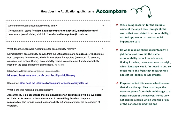
How this app got this name
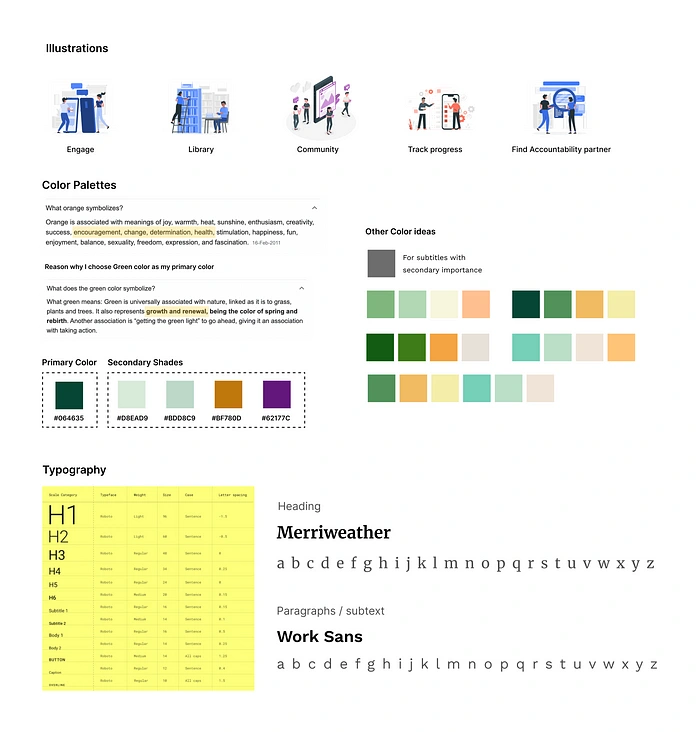
Style guide
📝 Wireframing
Here, I tried to decide where I should place what to make it easy for people to navigate and, more importantly, to solve their problems in the best way possible. This was just a very basic way of how the screens would look and what their flow would be.
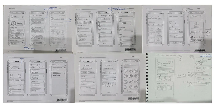
📱Converted My Ideas into Visuals
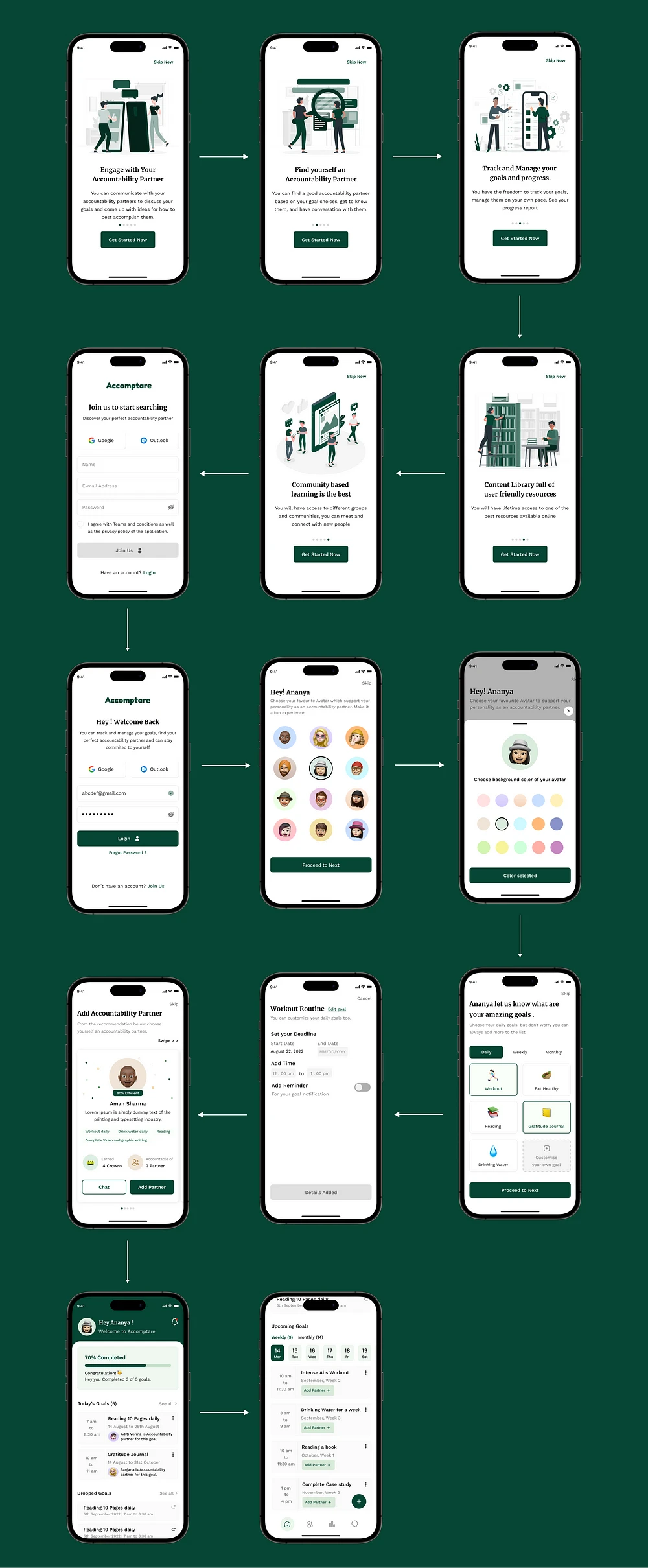
1️⃣ Onboarding flow
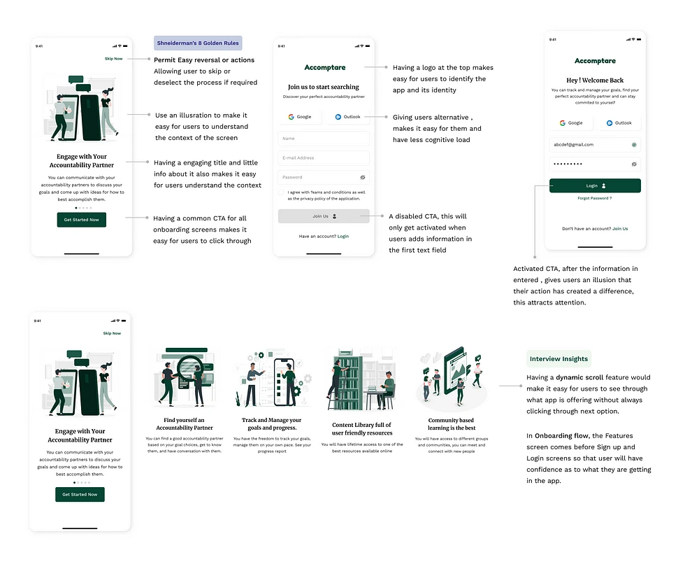
Being the very first section, I had to briefly explain the feature’s description and overall purpose so the user could understand it at a look. I also iterated the first screen of the onboarding process since users were more at ease with the iterated version, which decreased their click rate; this version was the result of user testing done at the wireframing stage.
While designing the Onboarding Screen, I answered the following questions:
How am I gonna lay the features information in the right way, so users get an idea about what they are signup for?
How should I win users’ confidence in the first few clicks?
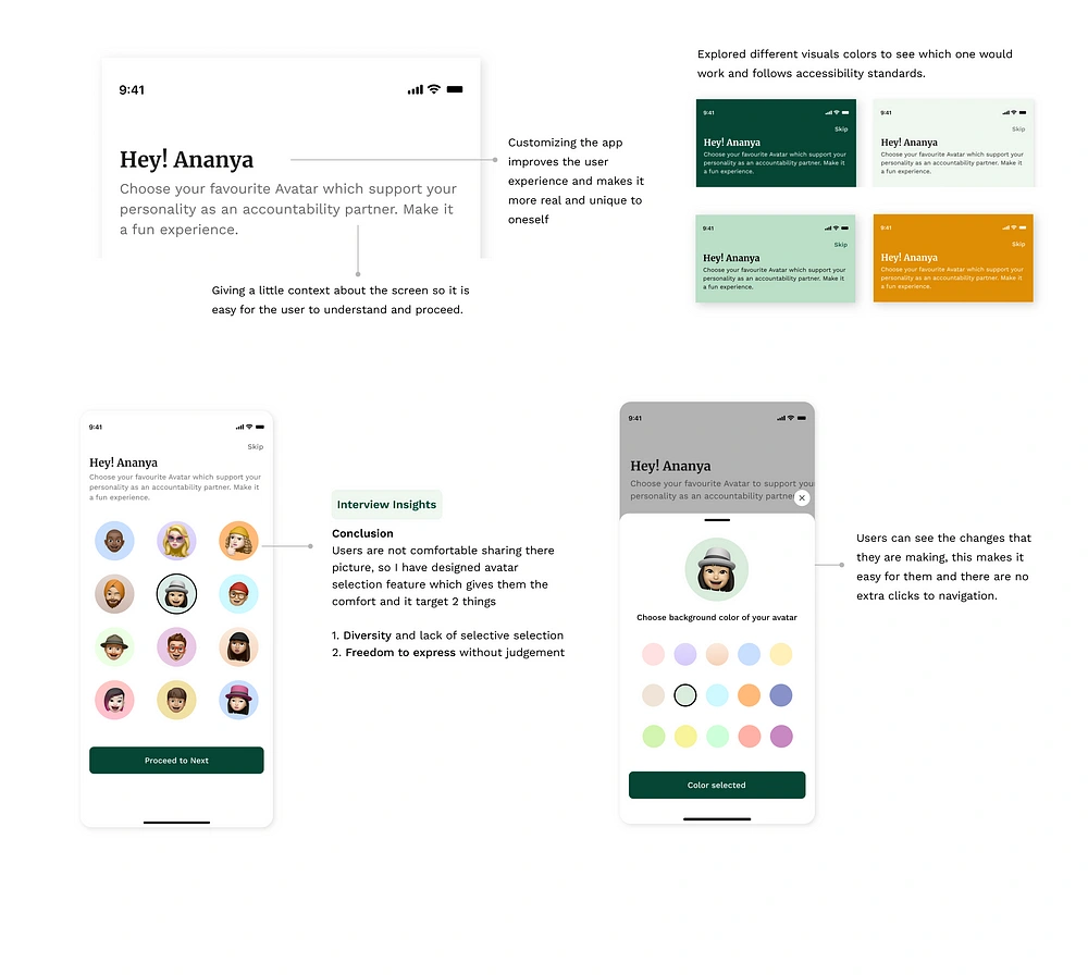
How should I customize users’ experience in the best possible way and make the app a bit fun and exciting?
Most important, How should I make users responsible from the very starting stage of the app?
To answer the above questions, I followed a few UX laws approach.
Hick’s Law: The time it takes to make a decision increases with the number and complexity of choices. ( Limited Choice of avatars and background color)
Minimizing choices when response times are critical to increasing decision time.
Break complex tasks into smaller steps in order to decrease the cognitive load.
Avoid overwhelming users by highlighting recommended options.
Fitts’s Law: The time to acquire a target is a function of the distance to and size of the target. ( Get Started button on the onboarding screen)
Touch targets should be large enough for users to select them accurately.
Touch targets should be placed in areas of an interface that allow them to be easily acquired.
Aesthetic-Usability Effect: Users often perceive aesthetically pleasing design as a more usable design. ( Overall design with green color based on user psychology)
An aesthetically pleasing design creates a positive response in people’s brains and leads them to believe the design actually works better.
Visually pleasing design can mask usability problems and prevent issues from being discovered during usability testing.
Parkinson’s Law: Any task will inflate until all of the available time is spent. ( Setting Deadline for goals feature)
Limit the time it takes to complete a task to what users expect it’ll take.
2️⃣ Home Screen
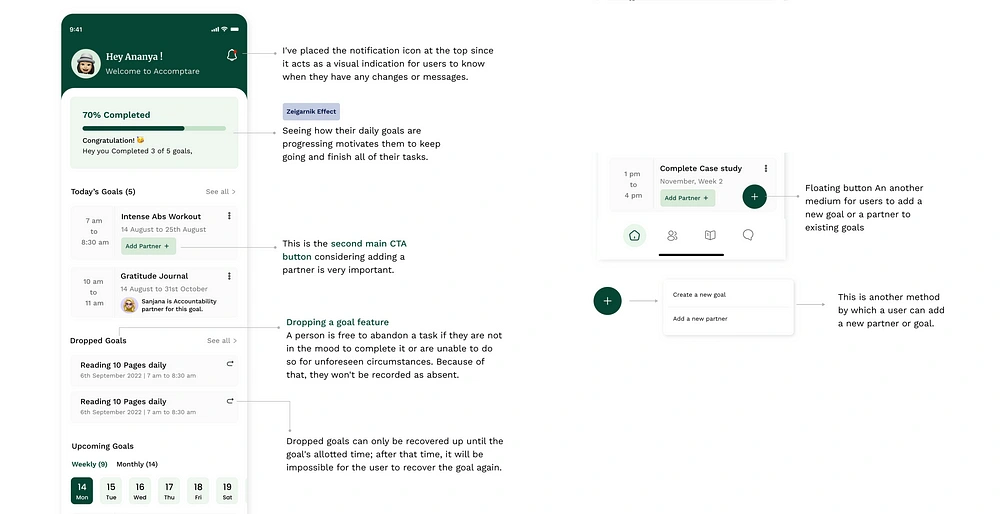
My first thought when creating the home screen was how information should be displayed at the top and what information should be provided in the navigation bars. While creating the application’s home screen, which serves as its center, I asked myself a few questions.
How should I lay the information so that users can easily browse through and understand their progress?
What would the customizable experience look like for the users?
How should I place the second primary CTA button so that it is easily visible?
How should I ensure the right hierarchy for the information?
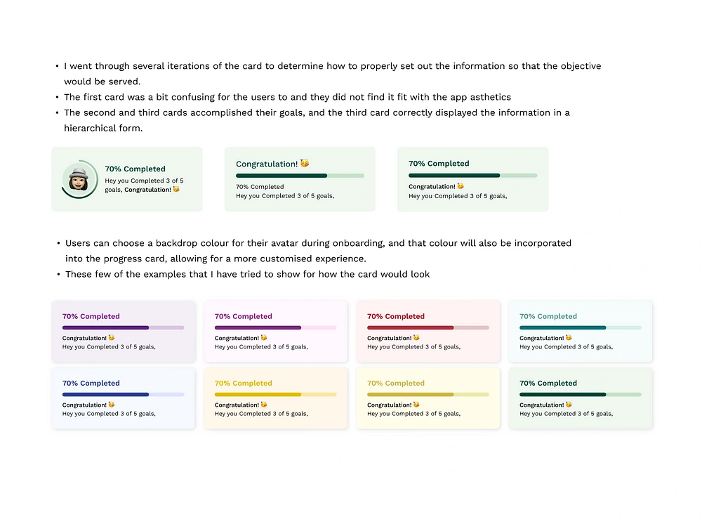
3️⃣ Booking an Accountability Partner
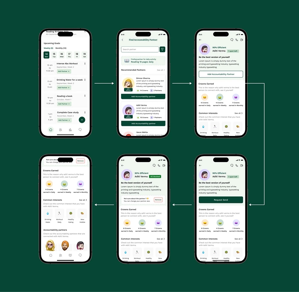
The app solves the purpose of accountability and completing the task with the help of another person. It involves human psychology and how they would behave and perceive. A few questions that I asked myself while I was designing these screens were
Is the information enough for the user’s to make the right decision?
Is it easy for users to browse through the screen without getting stuck anywhere?
In how many clicks is the user able to complete the flow?
Is the information laid out in the right way for users to understand easily?
To justify my decision for points 1 and 4, I followed Miller’s Law, which states that the average person can only keep 7 (plus or minus 2) items in their working memory. I have explained this future below in the profile section.
To justify my decision for points 2 and 3, I followed the Peak-End Rule, which says People judge an experience based mainly on how they felt at its peak and its end rather than the total sum or average of every moment of the experience. This rule is part of cognitive bias, keeping this in mind :
I reduced the user clicks to a minimum, so it’s easy for them to complete the booking flow smoothly and in a few steps only
There are in total 3–4 clicks in which a user can book an accountability partner
📌 Search Bar
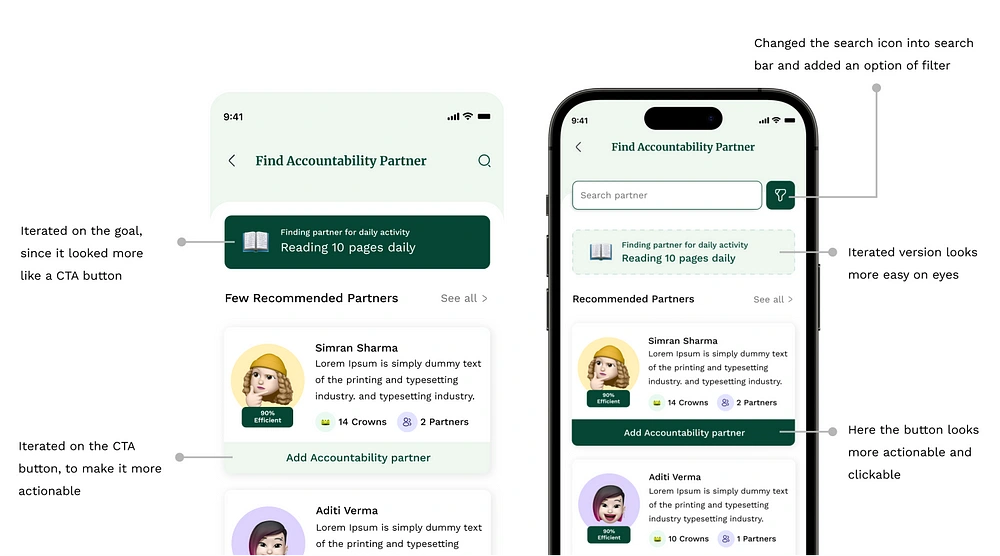
Since finding a partner is the most crucial aspect of this app, the search section was created to make it simple for users to look through partners. In addition, I added a filter section next to the search so users could look through various categories; at the moment, the filter includes options like gender, spots, and efficiency rate.
Since the search function is crucial to the displays, I iterated the search section from its previous design.
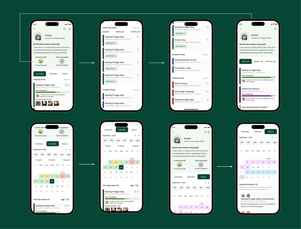
4️⃣ Profile Screen
I reached a point in my user research where I needed to build my profile screens, taking into account the user’s perspective when they see their profile and the accountability partner’s perspective.
These screens flow Miller’s Law: The average person can only keep 7 (plus or minus 2) items in their working memory.
Organize content into smaller chunks to help users efficiently process, understand, and memorize.
Remember that short-term memory capacity will vary per individual based on their prior knowledge and situational context.
Accountability partners profile: These screens are the most crucial in the app since they will determine whether the user thinks the other person is suitable to serve as their accountability partner.
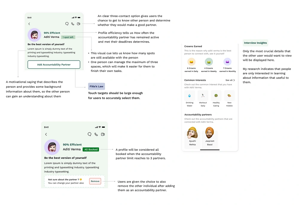
Users’ profile screen: This screen will carry the user’s personal information; thus, it must have all this data. This includes the user’s daily activities, achievements, and upcoming plans. The data should also be arranged so the user can easily browse through it.
5️⃣ Gamification Screen
While conducting my research, I discovered that every other program addressed the issue of accountability by allowing users to add each other and communicate images, but what I found was that there was no credibility element present.
Few questions that I asked myself while I was designing these screens
What if the accountability partner is not active throughout the journey?
What will happen in situations where the user wishes to take a break because they aren’t feeling well or aren’t in the mood to finish the task?
How will I show the credibility of the accountability partner?
How should I make this experience more fun and interactive?
How can I make my app different from the rest of the apps?
6️⃣ Notification Screen
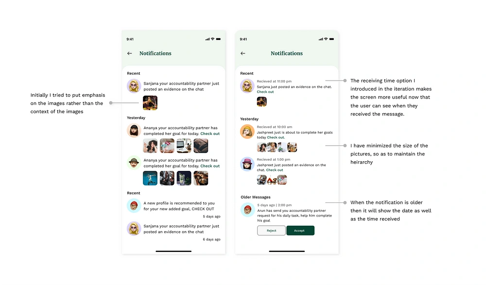
In most apps, this page is the least important. Still, in my app, it is equally important to other screens because changes regarding activity, accountability partners, or any reminders from the application will be visible on this screen.
While designing this screen, there were a few questions I asked myself
How should I make it easier for users to perceive information?
How should I design the content so users can browse through it easily?
What is the best way to show recent notifications and older notification’s on one screen?
Here is how the screens look :
And this is the end, folks 👋🏻
I appreciate you taking the time to read this essay and sticking with it; I tried to make it concise and easy to understand. At last, I would like to thank myself for being consistent and not giving up. Good job, Ananya 😁
⏭ What will I like to do in the future
If I ever returned to this project, I would conduct a more comprehensive survey with a wider range of audience to iterate the design more. I am sure I would learn new information that I could incorporate into the current version.
In the future, I’m considering including an entirely customizable experience with the avatar, similar to how Bitmoji does it. This will make it more enjoyable to interact with.
If I had more time in the future, I would like to work on the various states of screens as well as work on edge cases. For this version, I could not design empty states for every screen or how the app would appear when a user arrived for the first time.
Due to time constraints, I put less effort into working on UX writing for the screen, but In the future, for the next version, I will put more emphasis on the UX writing section.
Getting screens for the Android version and Apple watch version can also be considered a good idea, but only when other changes are implemented.
☕️ My Takeaways: Challenges and Learnings
Let's look into challenges and learning while having a cup of freshly brewed coffee.
Understanding Users Psychology: There was a time during my research when I found it difficult to understand how users perceive information when it comes to taking help from another person, how does there brain works, and all things they find interesting and worth investing their time into.
Not giving up: When I first chose this topic, many around me warned me that I might need to consider it carefully and thoroughly because there is no direct competition for the issue, and it is challenging to resolve a psychological issue.
Decision making: While reading through different case studies of designers, I always thought, how do they decide what to add and what to remove from the screens, but now experiencing it myself, I know that decision making depends upon the research and its outcomes, the more we understand the problems and pain points of the users, the easier it gets to make a better decision
Through the process of case study structuring, I learned how to arrange my information such that it would be simple for a reader to browse through and understand my choices.
In the end, I am happy that I finished it in a month. I learned a lot, and putting what I learned into practice made me feel really amazing. I have seen my growth in this project as a designer
🖥 Few Last Minutes Figma file view

A little Figma file view
👏🏻 Hey, do you see the clap icon down below? Yes, right there, bottom left of the article; if you could long press the clap icon, give it a few claps, and show your support, that would mean the world to me 😊.
You can also mail me at ananya.vashist21@gmail.com.
Like this project
Posted Sep 4, 2023
I used to compose a lot of lists of to-dos while I was a student, but I never seemed to be able to complete any of them. The cause is that I put off doing anyt…
Likes
0
Views
31


