Companion: Creating a better travel experience for travellers.
In this case study I focused on designing a memorable and user -friendly experience for travellers.
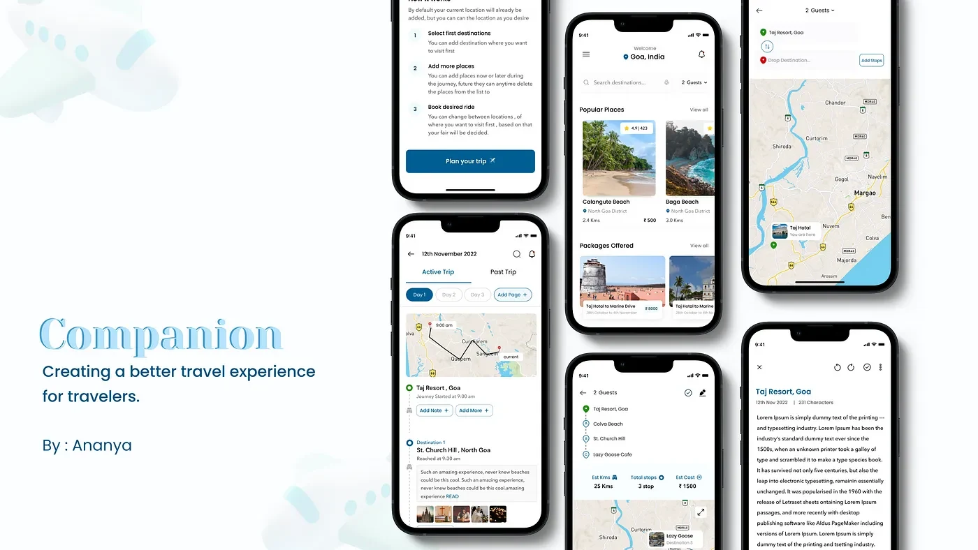
Made in Figma
📍 Case Study Context
Traveling is an amazing way to learn a lot of things in life. A lot of people around the world travel every year to many places. Some travel to learn more while some travel to take a break from their life. In my experience, traveling came naturally to me, thus as a child, I used to travel thrice a year to various destinations in India. But in doing so my family and I faced a lot of problems. A few of the problems were:
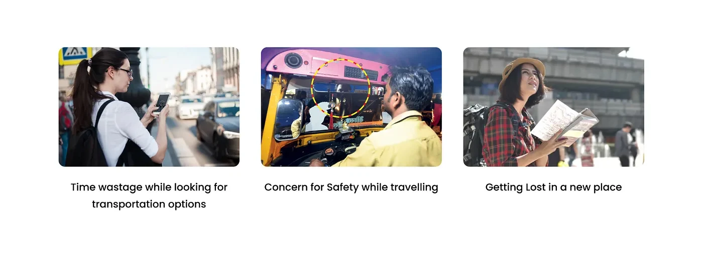
Therefore this experience served as the inspiration for the idea of this app
I spoke to other friends and family members of mine who frequently travel to understand if they too face similar problems while traveling and this is what they had to say
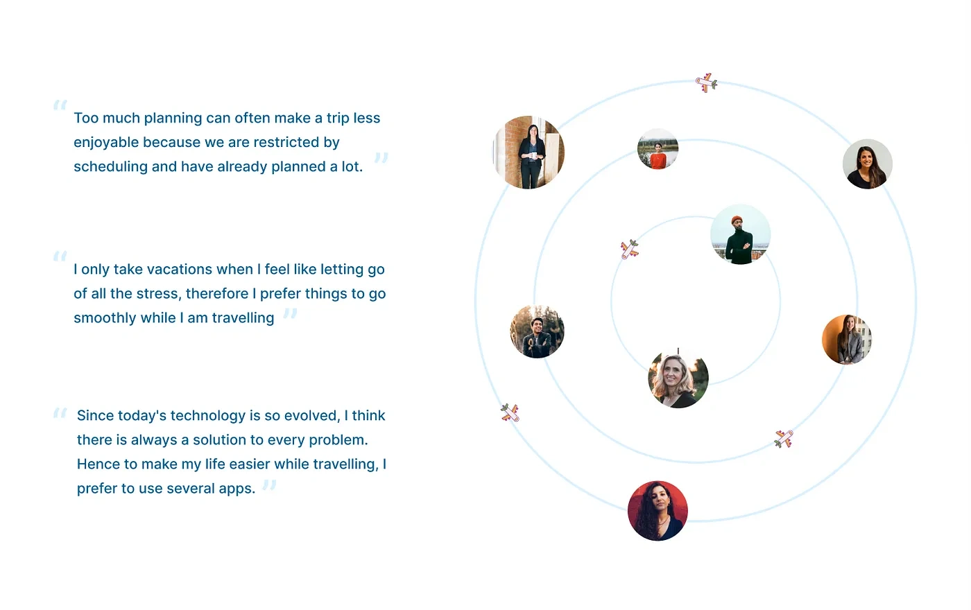
Through the conversation, I identified a few concerns that I would like my case study to emphasize. Those issues are as follows:

🚨 Problem Statement
Now that we have defined the context above, we can look at the problem associated with the context

Problem Statement
👩🏻💻 Roles & Responsibilities
Project Context
User Research: Desk Research, 5Ws, and 1Hs, Competitive Research, User Interview, User Persona, and Business model understanding.
UI Design: Pen and Paper Sketches, Visuals
Timeline of the Project: 3 weeks
🗺 Plan of Action — The framework
I started by implementing the following plan of action to make it simpler for me to move forward and spend less time selecting what to do next. I broke down the process into two main phases.

Design Planning
Problem framing
User Research: Learning and comprehending the context of the problems experienced by the travelers will provide insights to confirm whether the hypothesis is correct and what are the possible outcomes and solutions for the design.
Conducting User Interviews: To understand users (travelers) during the interview we ask existing or potential users questions to gain an understanding of their preferences, thoughts, and feelings.
Competitive Analysis: Analyze the market for the presence of existing products, and get a further understanding as to what users might expect and how a companion as an app could improve that experience.
Solution Framing
Information Architecture: With IA available, it becomes significantly easier to make key decisions for new features and implementations, understand timelines for product changes, and follow user behavior through multiple processes.
Low Fidelity sketches and idea documentation: The paper sketches are a necessary part of the design process because it helps convey the information architecture and user flow of an app in a simple way. . Along with this idea documentation in the final stage helps with designing better screens since now we have better and well-structured information.
Visual Design: With a solid basis of UX findings, the visual part of the app was designed, such as brand style, UI elements, mood boards, pixel-perfect mockups, and design systems.
📚 User Research
My research process starts with understanding the problem statement. It includes both primary research and secondary research.
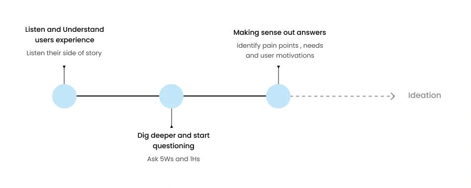
User Research Process
During the initial phase of my research, my go-to method for thoroughly understanding the problem statement is to frame the 5Ws and 1H queries. It helps in understanding the existence of the issue and serves as a roadmap for both secondary and primary research.
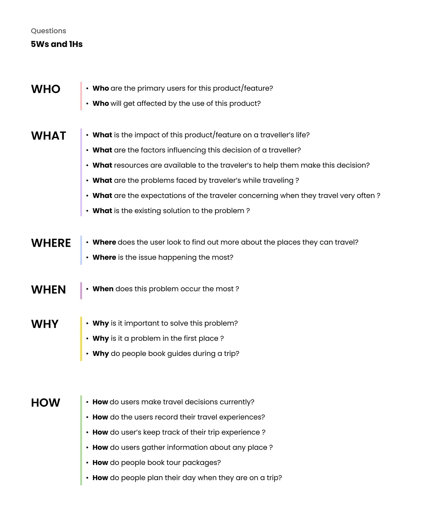
Questions
Secondary Research / Desk Research
Searching the internet or other sources you can locate for relevant information is known as secondary research. I searched for this information in a variety of news stories, Quora communities, videos, and travel blogs that were written by actual travelers who were sharing their adventures and experiences.
My secondary research focused on the following:
What is the average percentage of travelers in India who like to explore domestic destinations?
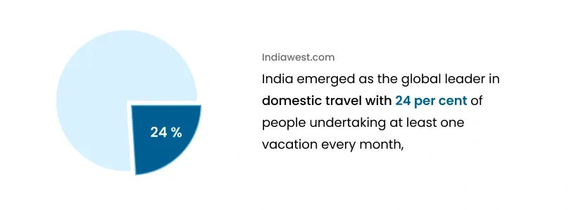
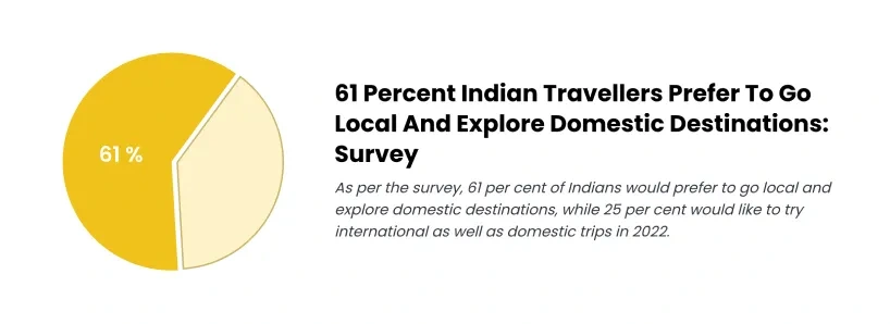
During my study on Quora, I came across a narrative in which a person discussed the value of keeping a travel journal.

Quora Community
What are the top problems faced by travelers?
After going through travel blogs online, these are my findings
Findings
Figuring out where and when to get food and water
This common travel problem refers specifically to whether you can drink tap water and what food sources you’re advised to avoid.
Most of the time people come across restaurants or cafes that seem to do well from the outside by inside they lack in quality and this is something most travelers encounter
Most of them compromise with the conditions and well other tends to bring bad taste with them about the place
2. Problem with multiple transportations
This problem primarily affects solo travelers, who place a higher value on seeing new locations. As a result, they require travel to be easier for them so they may spend more of their time on the activities they prefer.
They often have to switch between numerous modes of transportation to get to their destination, which takes a lot of time and frequently results in additional time wasted.
3. Expensive tour packages
There is no way around expensive tour packages; this is a problem mostly experienced by audiences who enjoy taking group trips with their families or friends. These people are aware that tour packages are expensive, with many of them being unnecessarily expensive but they are the only way to travel without wasting time.
4. Gross Accommodation
The hotel of travelers’ dreams doesn’t quite match the images online. You arrive and find; stain-covered carpets, a grime-covered bathroom, and four cockroaches crawling way too close to your wobbly bed.
How do people navigate to places if they do not opt for tour cabs?
Google map is a lifesaver for all people, it helps in navigating and finding easy routes, few percentages of people sometimes face a problem when maps tend to take longer routes to their destination, resulting in time loss, longer sittings, difficulty in navigation if new to the place but this is only they have their own vehicle.
Those who do not own the vehicle or cannot rent them, use local transportation options, which again are very time-consuming and often leave bad taste for tourists.
Do you know?
It’s crazy how most people don’t know that they can find restaurants on google map, after my research I concluded that people in btw age group of 18 to 40 are well versed with technology, but there are people with 40+ age still sometimes struggle with technology, so the easiest they can go is to search directly on the internet.
🔍 Primary Research
Participants in primary research are those who make up the intended user base. It gives us a chance to hear directly from folks who are dealing with actual issues. The primary data’s insights help to clarify the issue and suggest potential solutions.
After conducting secondary research, I was able to understand better the sample space of users that we need to focus on to arrive at our target users.
The user base is targeted based on secondary research data and fewer assumptions that I have made
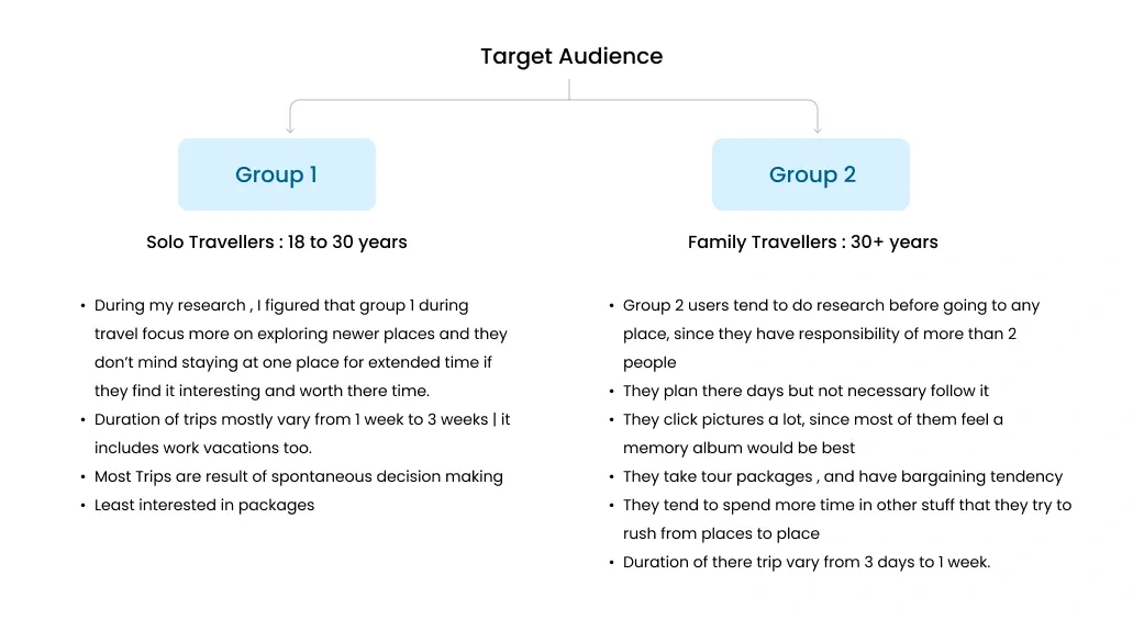
The target audience for the app
👥 User Interviews
After defining the users, I set out to prepare for user interviews. I wanted to gather qualitative data to understand the users and their problems well meanwhile also trying to fill in some gaps and find answers to questions that I found during my secondary research.
User Research Insights
Group 1: Solo Travelers
These insights are gathered after interviews with 5 different solo traveler participants aged between 20 to 30 years. Here I have shown the most common problem faced by all 5 participants in general.
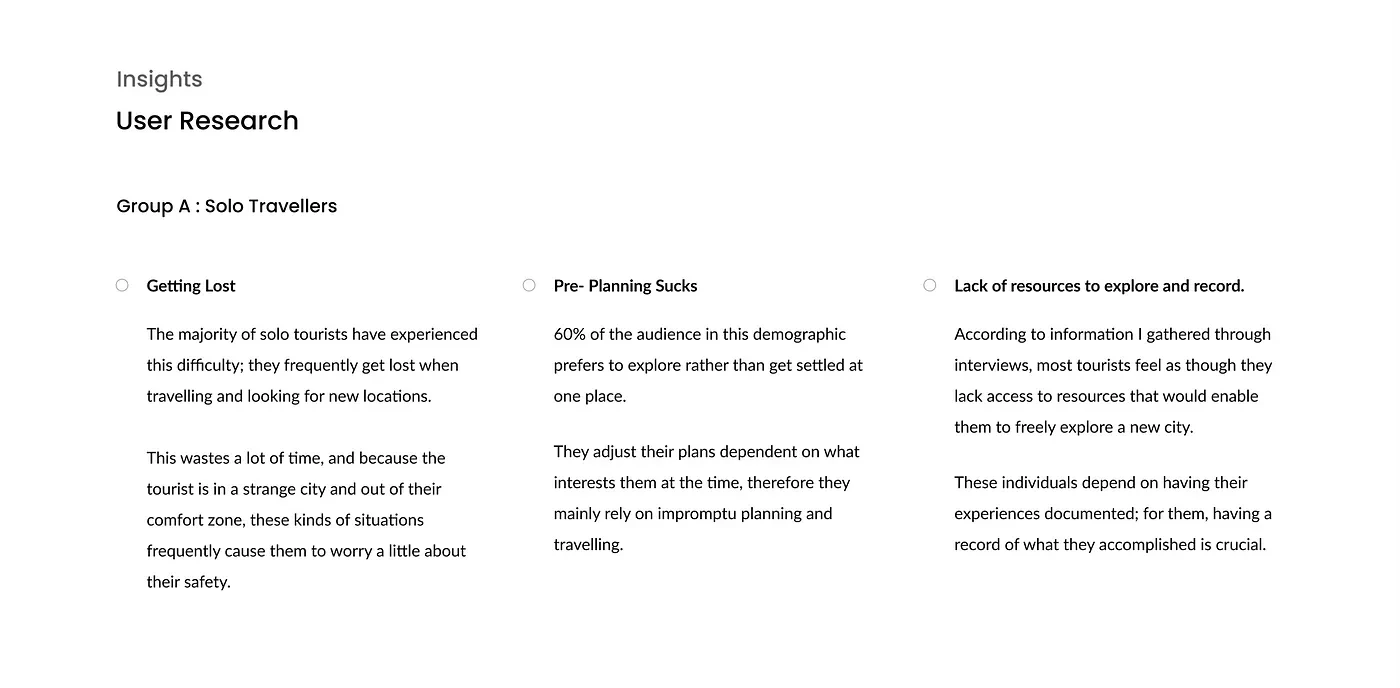
Group A
Group 2: Group Travelers
These insights are gathered after interviews with 3 different group traveler participants among them 2 are families and 1 is a group of college friends Here I have shown the most common problem faced by all participants.
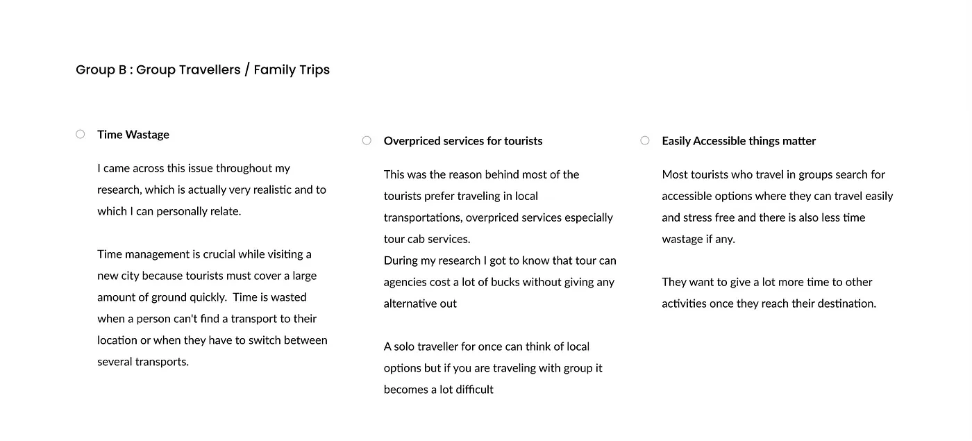
Group 2
General Interview Insights
After my research, I figured that most solo travelers make spontaneous decisions, hence they don’t do any beforehand planning and those who do not make spontaneous decisions, most have a surface-level idea of where to visit and what all places are famous
Group travelers or family travelers have less time to explore so they tend to schedule a plan beforehand and try their best to finish the plan as it is. They do not want to miss any place even if they have less time.
📈 Competitive Analysis
During the research, I did a competitive analysis to identify existing design patterns. I studied the user flow of travel apps and websites that I thought will fit in, I went through tour booking patterns, and whether these apps provide transportation options.
Competitive analysis was performed to gain a better understanding of other apps that solve the problems and understand if there is any alternative solution available to the problem.
Some of the applications were :
Airbnb
Make my trip
FabHotels
Cleartrip
Uber
🤔 Assumption
In order to work on this app, I felt it was necessary to make a few assumptions and set a few constraints.
The app (companion) only works for domestic destinations which means active for Indian tour destinations
We will go over the assumption that I have made in this case study as and when required.
Without any further do let’s get started with the design
🎨 Let’s Design
Design Guide
I worked on a basic design system that included buttons, iconography for screens, and card designs because I knew I would have to iterate on many different parts when I started the project. This enables me to edit the application more quickly and iterate more quickly.
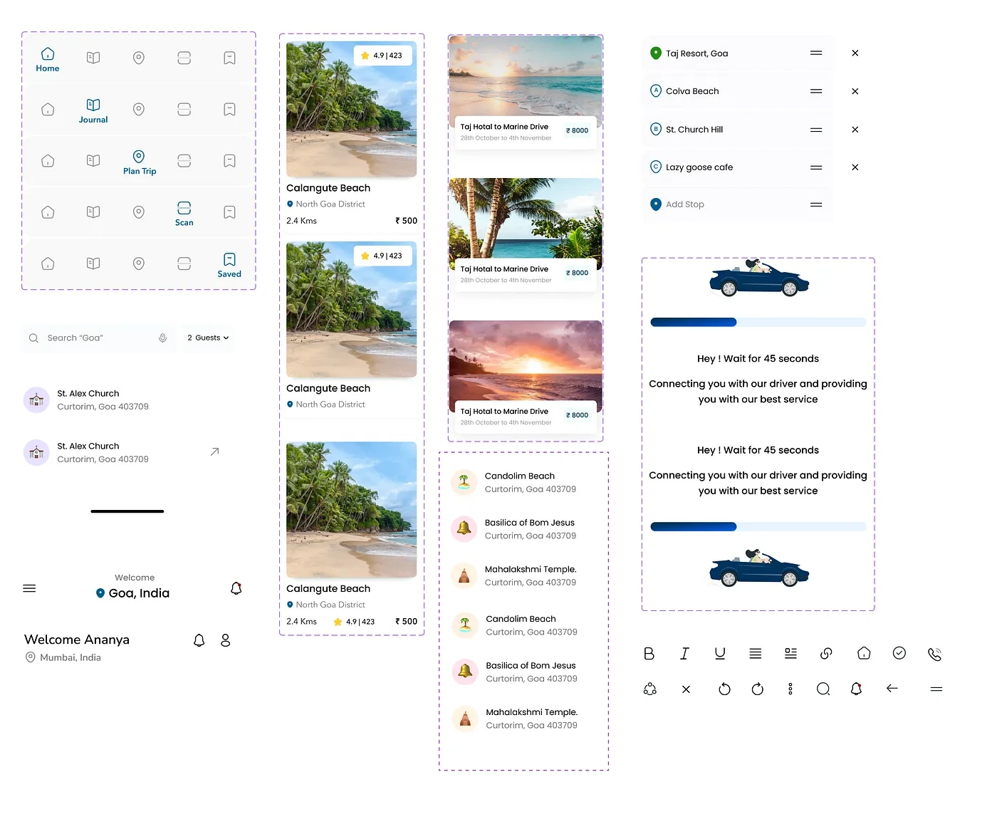
Design System guide
After completing the design system, I went through the process of choosing the right colour for the app. When designing a digital application, colour psychology is important since it establishes the brand identity.
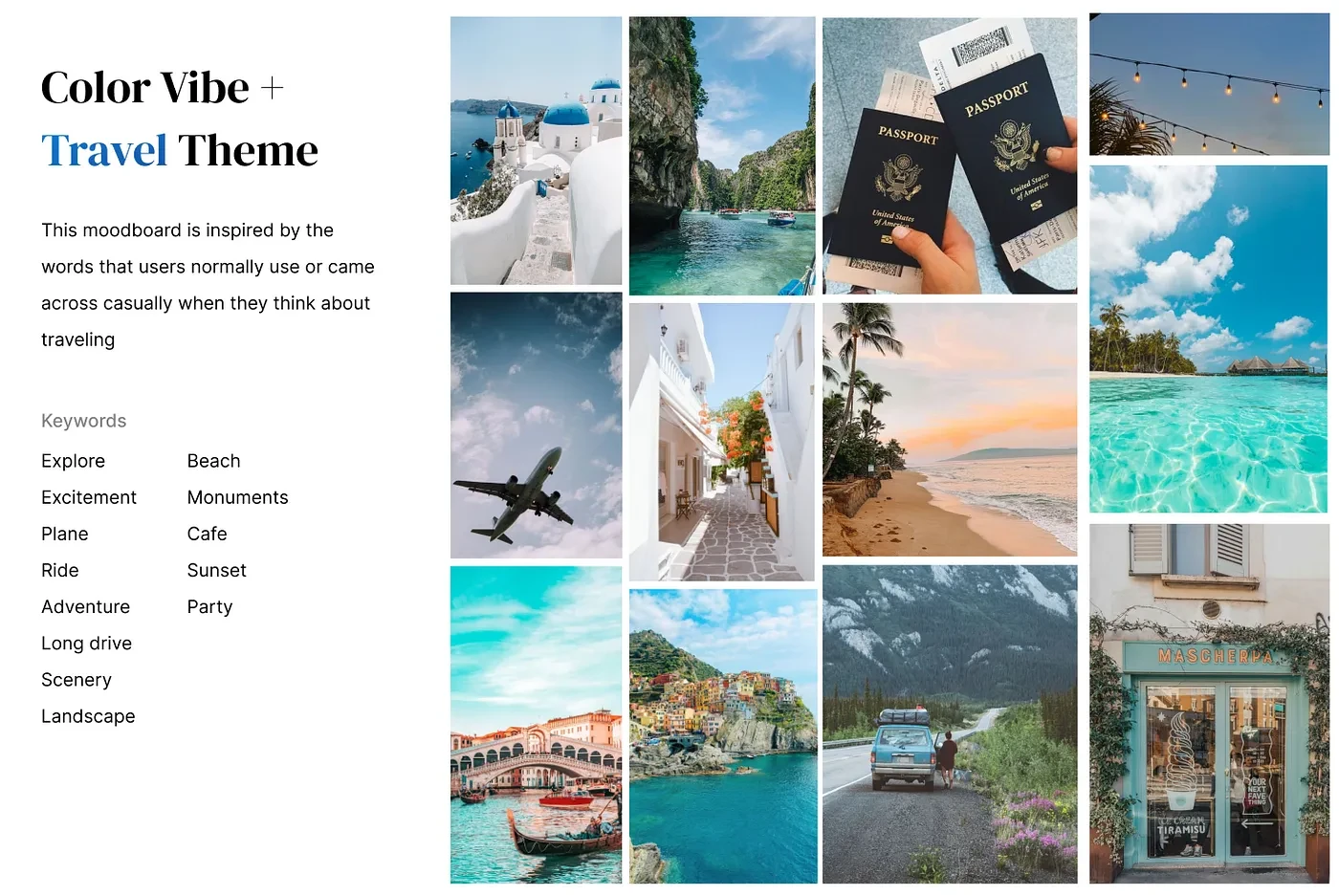
Color Guide for app
I tried to find inspiration for various screen aspects from online sources in order to establish a theme and a flow for the concepts.
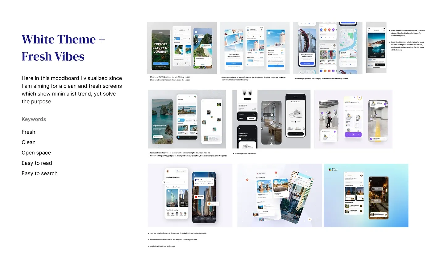
Booking Inspiration
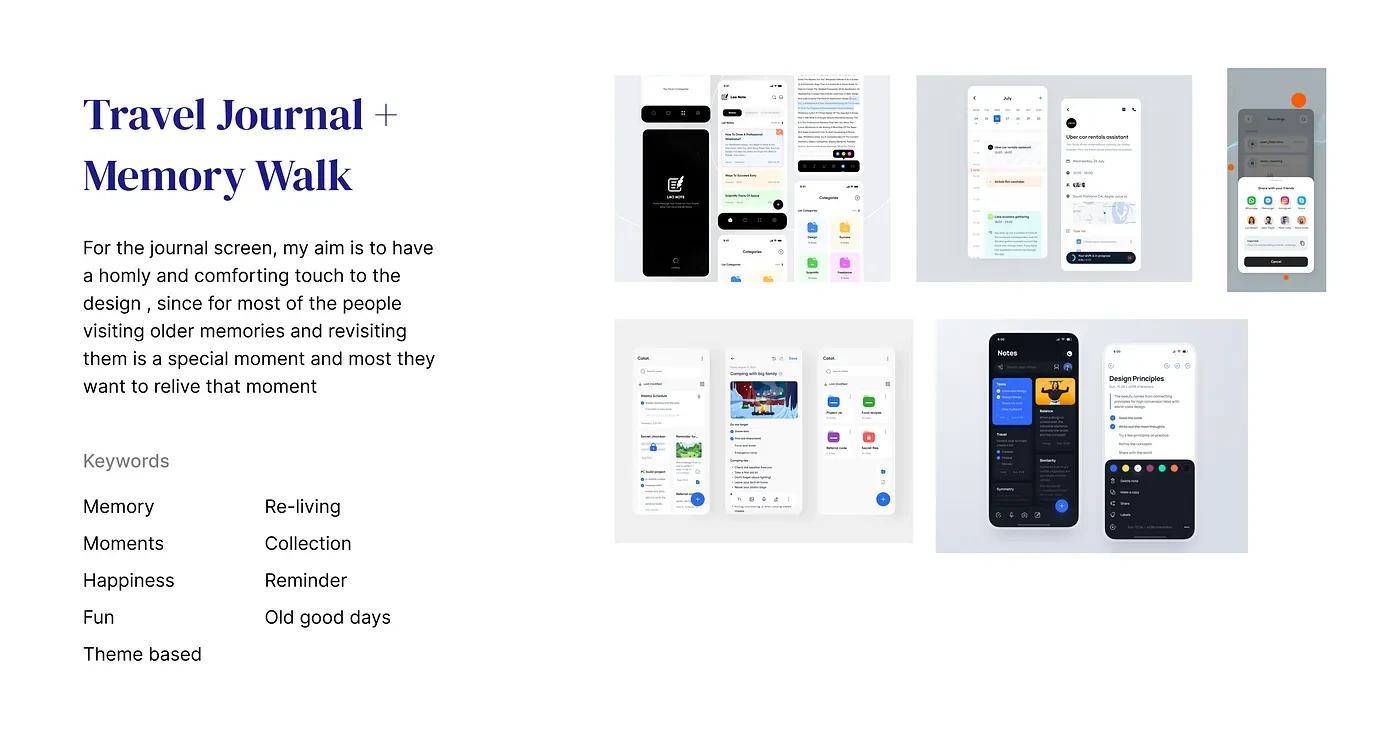
Journal Inspiration
Wireframing and Documenting Ideas
I drew out some possible screen designs when I initially started working on the design problem, taking into consideration all the user insights, so that the solutions I come up with will be user-friendly.
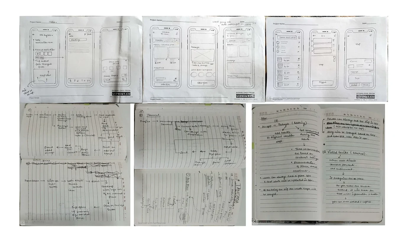
Wireframing and ideation
In order to make sure I didn’t miss anything, I simultaneously looked over my research and documentation while I was designing.

Idea Brainstorming
🖌 Final Solution: Visual Design
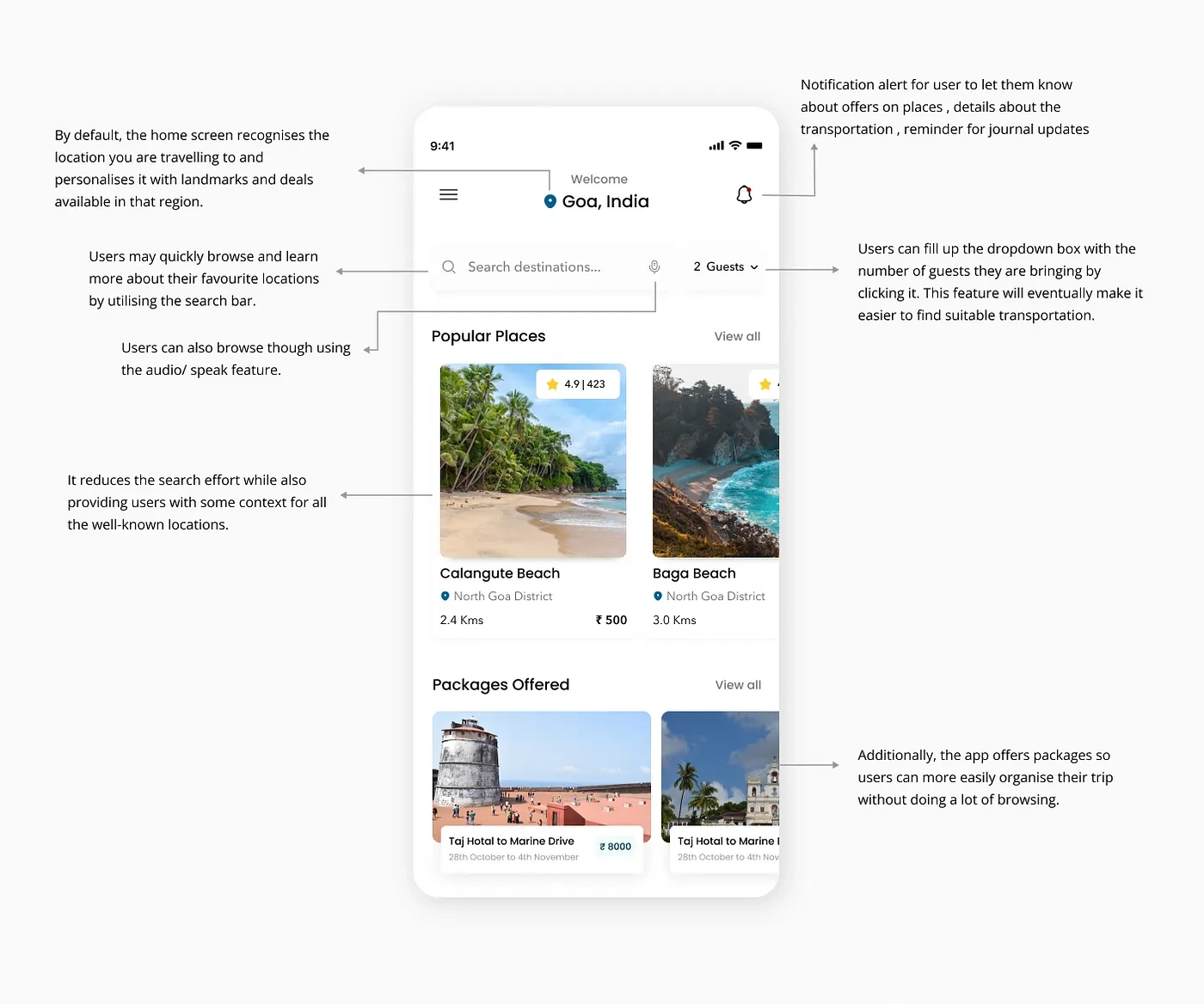
Home Screen
The home screen serves as the starting point for all the other vital features; hence, it serves as a showcase for the user’s favorite destinations, packages that can be booked, and links to app features in the navigation.
It was challenging for me to design home screen since , it does not have lot to offer but still holds a very important place amongest app screens .
To create the most recent design, I went through an iteration of the home screen and its components.
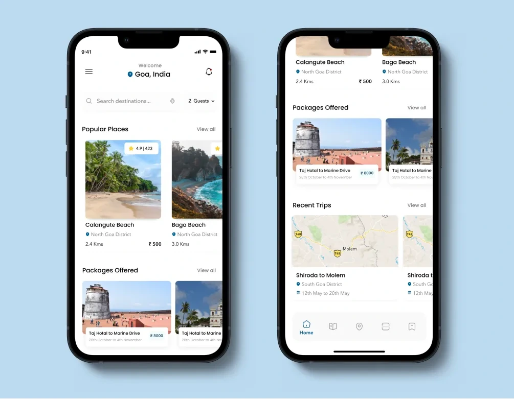
While designing the home screen, I went through the following questions
What all data points should I consider so that user does not have to spend more than 2 mins on home screen ?
How should I work on being minimalist with home screen yet help users navigate easily ?
How should I reduce searching efforts for users ?
How should I make decision journey easy for users ?
Location Card Iterations
The location card should visually describe the location and give the users an idea about the things that a particular location has to offer.
Let’s take a look at the different changes I made to this card and discuss the decisions I made in terms of design at each step.
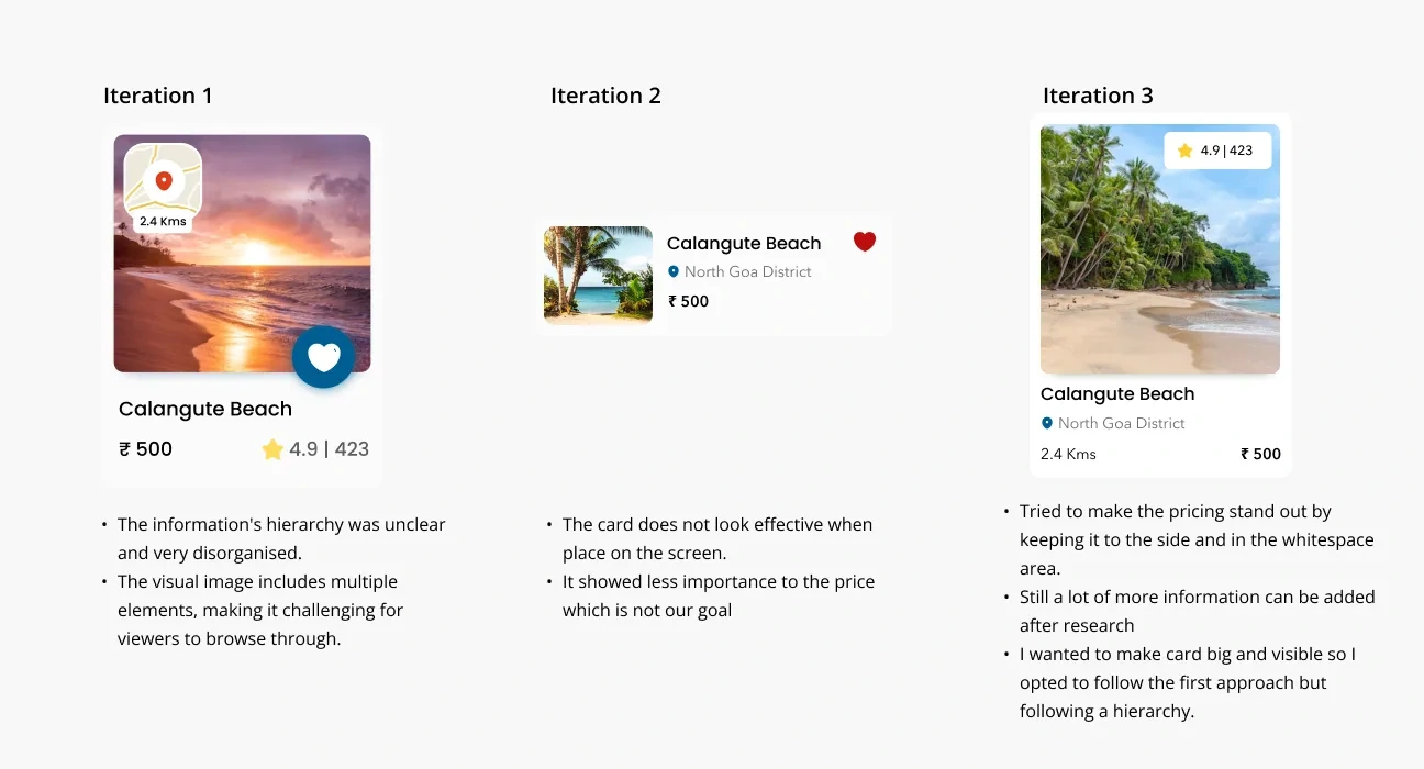
The most difficult aspects of designing these cards is to determining the priority order between each data point, which information is required, and how to make these cards simple for users to follow.
Helping users in booking customised rides to save time and give them more time to explore the locations
Time is crucial and becomes a constraint to so many things when you are in a new location because you have to cover so much ground quickly. This is one of those problems that both solo travellers and even group travellers have.
The current solution to this is available tour cabs, but they also charge hefty sums of money just to visit one single location, which returns us to the initial point that if we devote our entire day to a trip and we only get to visit one place, that is undoubtedly a time wastage and even a financial waste.
☝🏻Solution
Customized Ride option
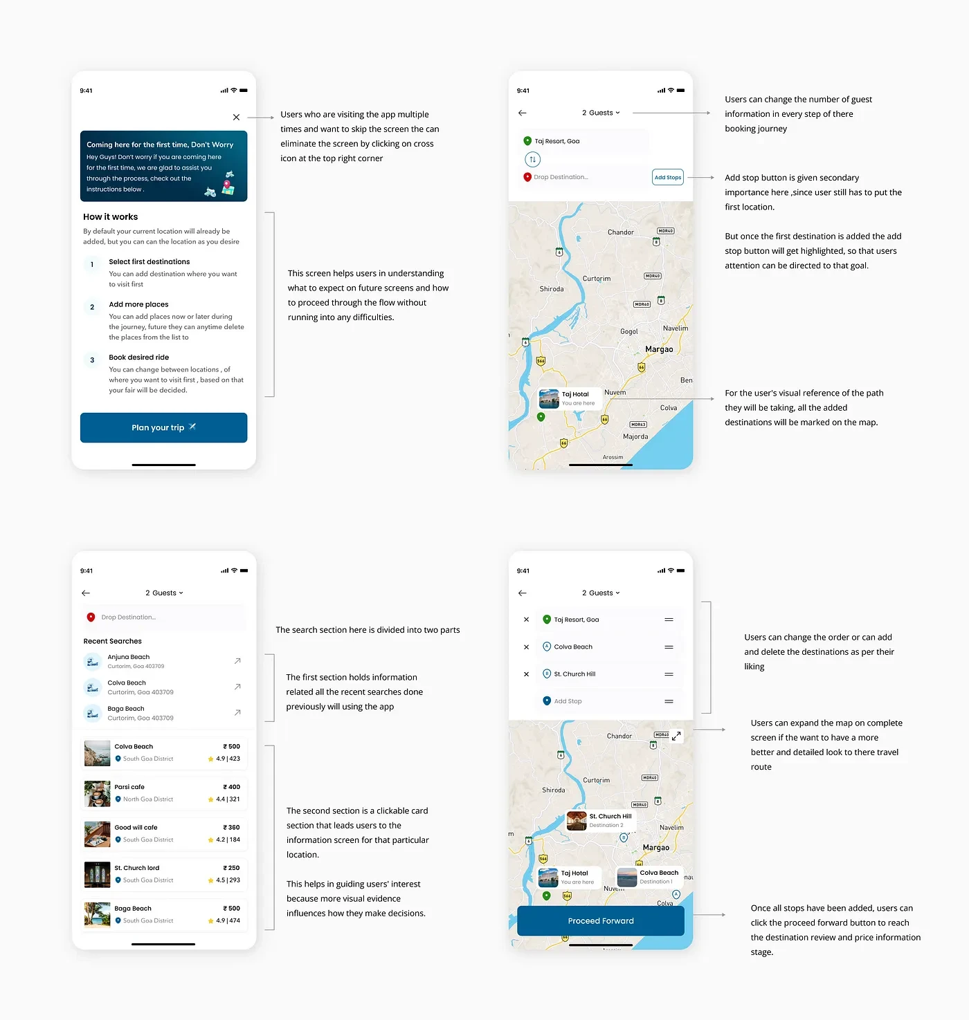
Based on the number of guests travelling, the user is free to book a taxi for themselves.
While using the app, users can add up to 6 locations at once, When on the route, they can also add or remove locations also.
Users will be charged based on the distance per km fair and peak pricing
Booking prototype
During designing the booking flow, I asked myself the following questions?
Is the information laid out in the right way for users to understand easily?
How can I make my app different from the rest of the apps?
How should I make it easier for users to perceive information?
How should I design the content so users can browse through it easily?
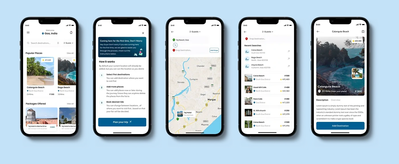
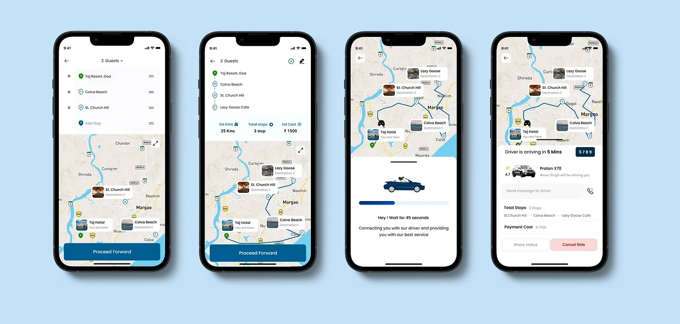
While designing for the booking flow, I went through the following questions
How should I make the process understanding easy for users ?
Where should I place the Add stop CTA button so that it is easily visible and also does not breaks the design?
How should I ensure the right hierarchy for the information?
How should I arrange the information in search bar section, so that user can easily navigate ?
How many users are right handed and how many are left handed ?
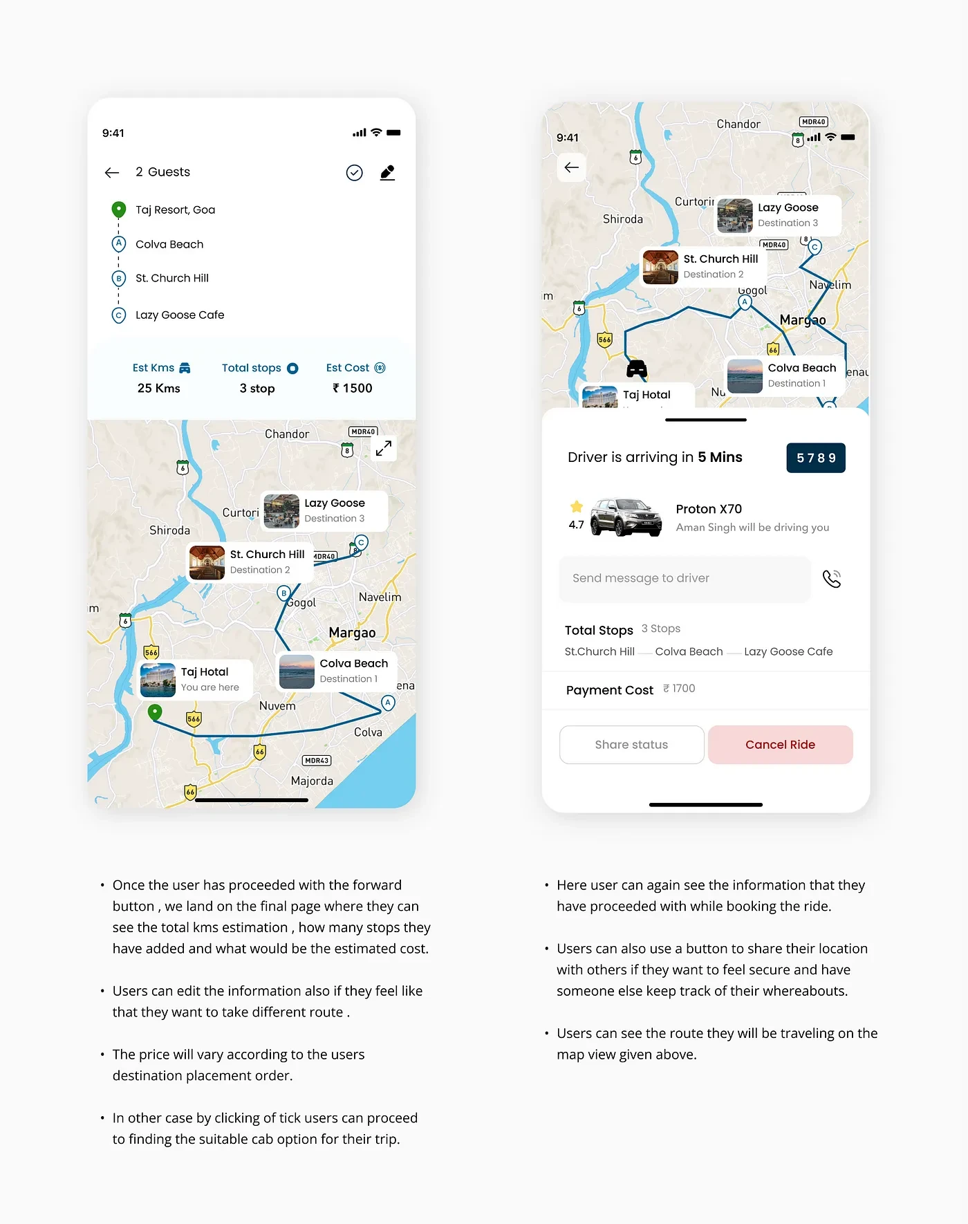
How should I present the information at the end so that the user have clear idea of what they have selected?
How to make users feel secure while try are traveling ?
Adding a travel journaling feature will make it easier for customers to gather all their priceless experiences in one location.
Being emotional beings, we have a tendency to value and constantly refer to our memories whenever we can as memories play a very important part in our lives.
I’ve added a personalized feature which is a travel journal so that users can record their entire journey and its experiences.
“ Travel journals, are a place for you to think back on all the adventures and trips you take. It is a wonderful way to capture memories of your trips, with your emotions”
Travel Journal Benefits
It becomes a great resource: A travel journal can be a useful resource or log for your journey. Imagine visiting Manali and finding a fantastic restaurant with outstanding food and service. Make a note of any such treasures you come across. You can then recommend that to your family, friends, and coworkers when they will ask you for suggestions.
Photo Memories: Photos can bring back memories of the places you visited during your travel. You can stick photos in your travel journal and revisit them later — sometimes years later.
Makes a great companion: Some people just love or have to travel alone, They can capture their thoughts, share goals, or simply use a travel journal as a diary to share their experiences and learnings.
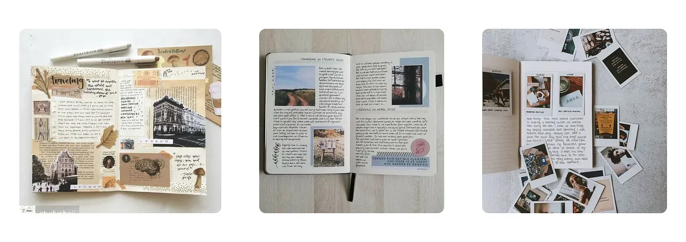
Examples of how people currently make travel journals
☝🏻Solution
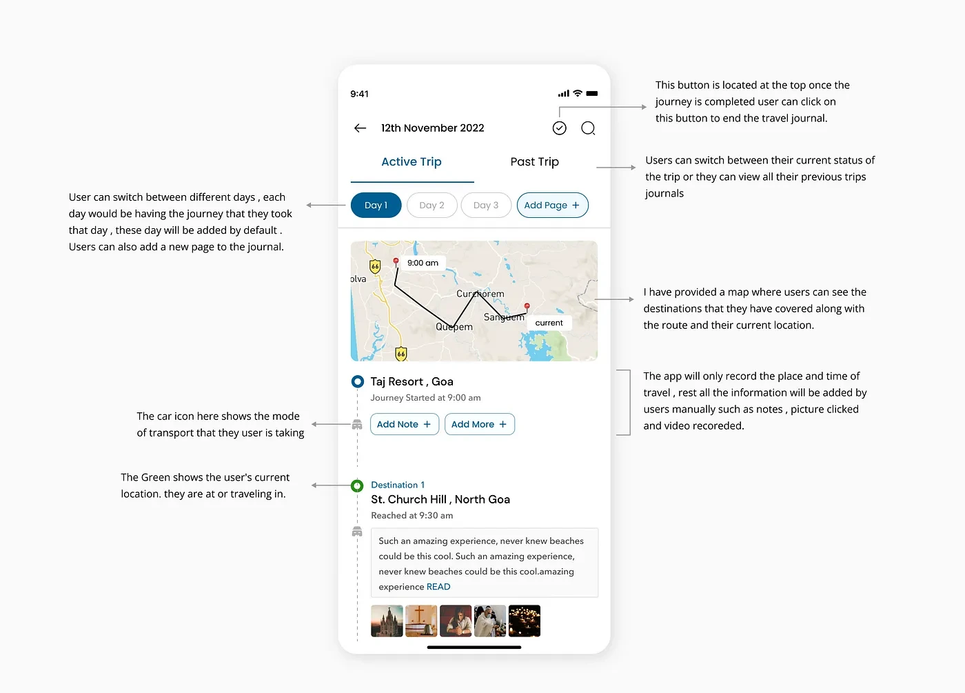
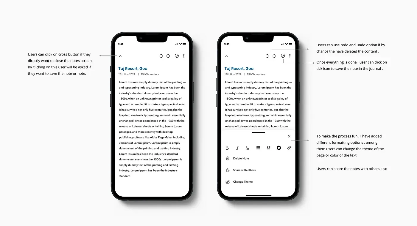
I have therefore added a manual travel journaling feature to attempt to recreate that emotion and experience that users have while writing a travel journal.
The app will record the time and location the user is in throughout this part of their journey.
They can add notes below the recorded timelines and photos and videos captured from their cameras.
During designing of the Travel journal flow, I asked myself the following questions?
In how many clicks is the user able to complete the flow?
Is the information laid out in the right way for users to understand easily?
How can I make my app different from the rest of the apps?
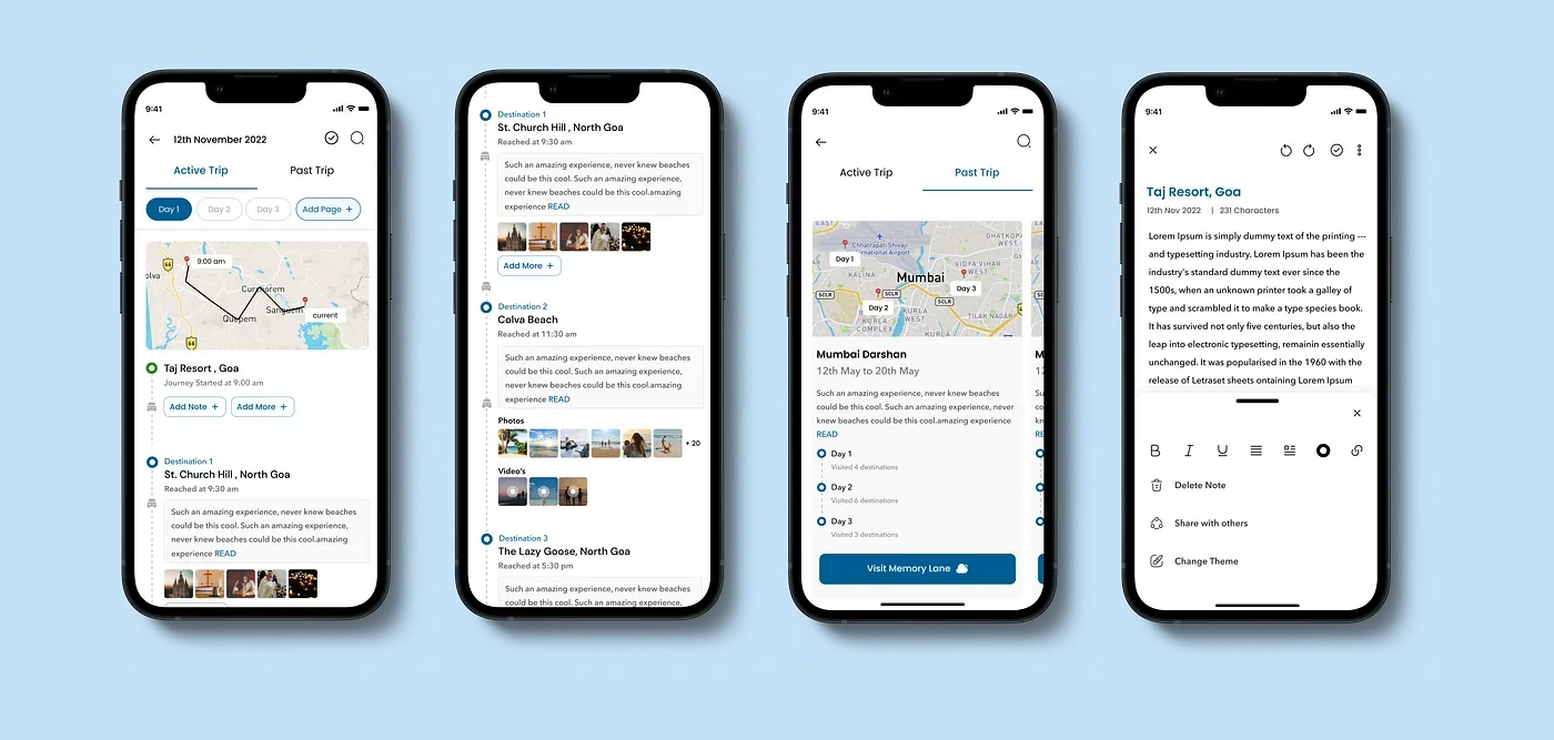
Journal Screen
For designing the Journal screen, I answered the following question
How should I make journalling fun for users ?
What all data points will be added by default ?
How should I gain the interest of the users while they are journalling ?
Why is journalling is a good practice ?
👋🏻 This is the end, folks!
I appreciate you taking the time to read and continue to read this article; I attempted to make it clear and concise. Finally, I’d like to thank myself for continuing and never giving up 🥳 .
☕️ My Takeaways: Challenges and Learnings
Time Management: The case study was quite helpful in helping me understand the value of time and how to arrange my work in order to finish it on schedule.
Understanding the “Why” behind each issue that the user has encountered was more important than anything else in this project,
For me, the part that helped me a lot was creating documentation since it guided my research phase as well as helped me in making the right design choices.
To find the best answer, I went through iterations. I came to understand that iteration is the key to any ideal design solution during this process. There is no other option.
🕵🏻♀️ Behind the screens
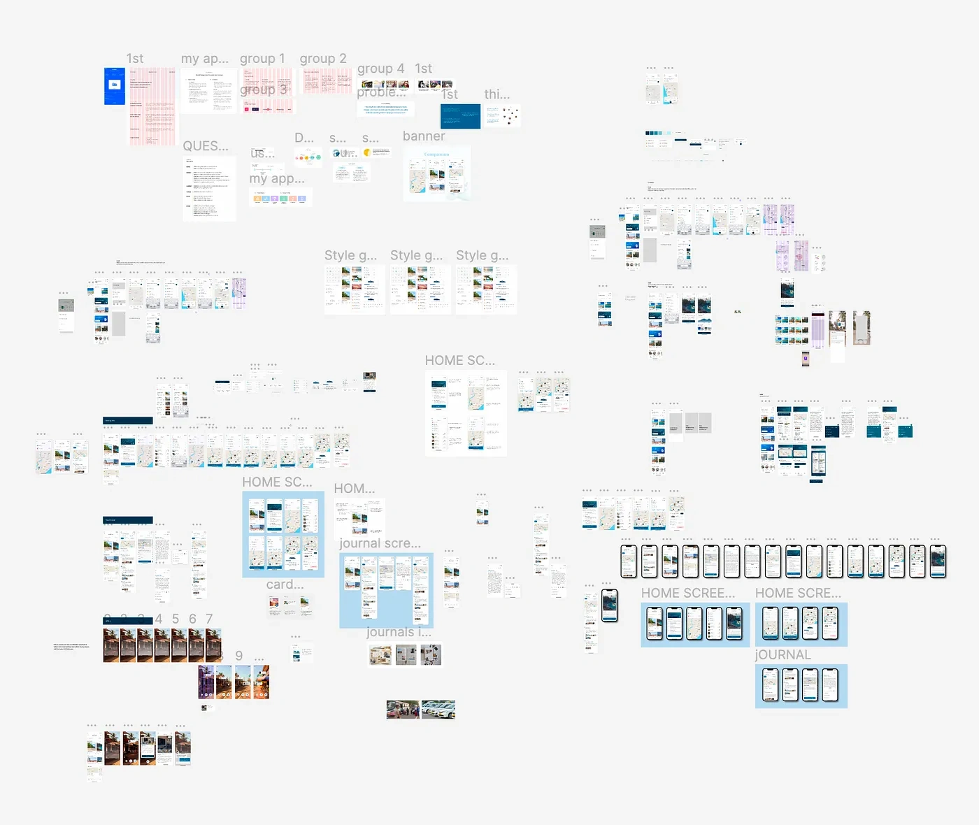
When I was the last working on finishing this project, which had to be finished in a short amount of time, this is how my workstation looked.
👏🏻 Hey, do you see the clap icon down below? Yes, right there, bottom left of the article; if you could long press the clap icon, give it a few claps, and show your support, that would mean the world to me 😊.
You can also mail me at ananya.vashist21@gmail.com.
Like this project
Posted Mar 31, 2023
Traveling is an amazing way to learn a lot of things in life. A lot of people around the world travel every year to many places. Some travel to learn more whil…
Likes
0
Views
21

