Increasing User Retention and Click Rate and Reducing TAT queri…
Overview
We’re all aware that for businesses serving online customers, ensuring a user-friendly experience during clicks and navigation is essential. This principle holds true even when users face issues and seek prompt solutions.
Post-booking experience is important for keeping consumers by establishing confidence, certainty, and a feeling of brand trustworthiness.
The goal of the post-booking flow is to give consumers a seamless and satisfying experience from the time they make the reservation until they leave or the service is finished.
In the flow, after a booking has been made, the refund screen plays a significant role as well. This is because it promotes transparency in the company’s procedures and protocols, providing a clear understanding of how refund matters are managed. This, in turn, fosters confidence among customers.
⏳Roles and Responsibilities

📌 Problem Statement
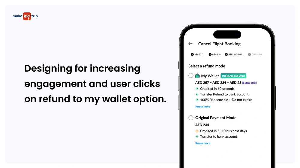
How might we increase engagement and click rates on the refund to wallet option and reduce the TAT query call ?
📌 Observations noted
From a business aspect on the GCC side (Gulf Cooperation Council), there was a drop of 86% from January 2023 to June 2023 in contribution to Refund to the wallet.
TAT (Turnaround Time) queries have increased in the last few months.
DSAT rate was increased in number
Increase in PSP (Payment Service Provider) charges on the transactions for the amount paid via Wallet.
🔍 User Understanding of the current screen
While figuring out the problems of the existing screen a small research was conducted within the team with other fellow designers to understand the thought trajectory of the users when they land on this screen
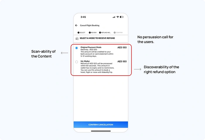
The screen is cluttered with so much content, that it’s difficult to focus on one option.
Users generally move forward with the default option
Users are not able to differentiate between the options and what benefits each of the options is offering.
The average time spent on the page is 7 seconds.
📌 Problems identified: Current Screen
When assessing the current refund modes screen, a number of challenges that often lead to issues and a significant decrease were pinpointed.
The Refund Selection Mode does not clearly signify the benefits of the refund modes available
The Scanability of the information along with the discoverability of the benefits that each mode offers is difficult is figure out.
Incentivization persuasion elements for users are missing on the screen
There was also an issue from the technical side ( Under the guidelines of the Tech department, only the PM was aware of it )
Existing Screen
Let’s look at how we addressed the problems identified above.
➿ Solution Approach
As I moved into solving the mentioned problems, I broke them down into “How might we” statements. This helped me better understand and approach the exact issues.
User Persuasion
How can we persuade users and increase clicks on the Refund to My Wallet option which will result in the reduction of calls?
Discoverability
How might we increase the discoverability of the content and the benefits in both refund modes?
Scanability
How might we make sure users are able to scan the relevant content and make an apt decision faster?
🎨 Improvising —Cleaning up the existing
Throughout the process of designing solutions, a few rounds of design iterations were conducted, guided by feedback received from design tests involving potential users.
MMT design system guidelines were kept in mind and followed while designing the solutions screens.
🅰️ Iteration A
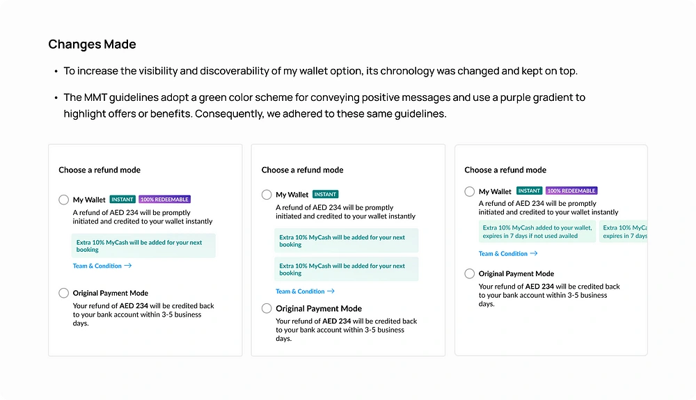
In the initial stage as a designer, I made certain decisions related to the business aspects. These decisions primarily involved categorizing benefits and were discussed with the Product Manager, who is a key stakeholder.
Placement of Benefits
The strategic arrangement of benefits on the screen is a pivotal stage, as their ease of scanning, discoverability, and how effectively they engage users are of great significance and have a substantial impact.
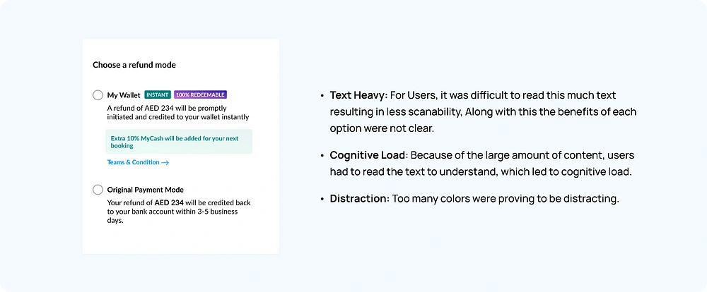
Feedback on Iteration A
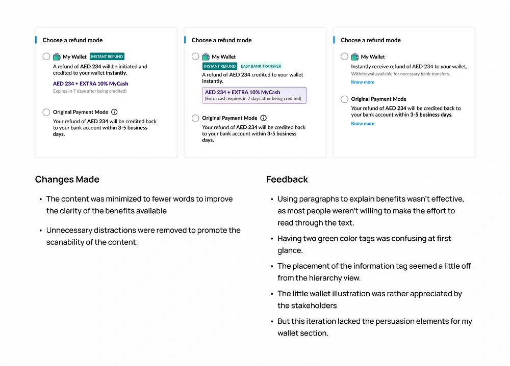
🅱️ Iteration B
During the second iteration phase, I aimed to enhance the placement of benefits for clarity. I minimized the text to essential words and limited the use of colors to prevent unnecessary distractions.
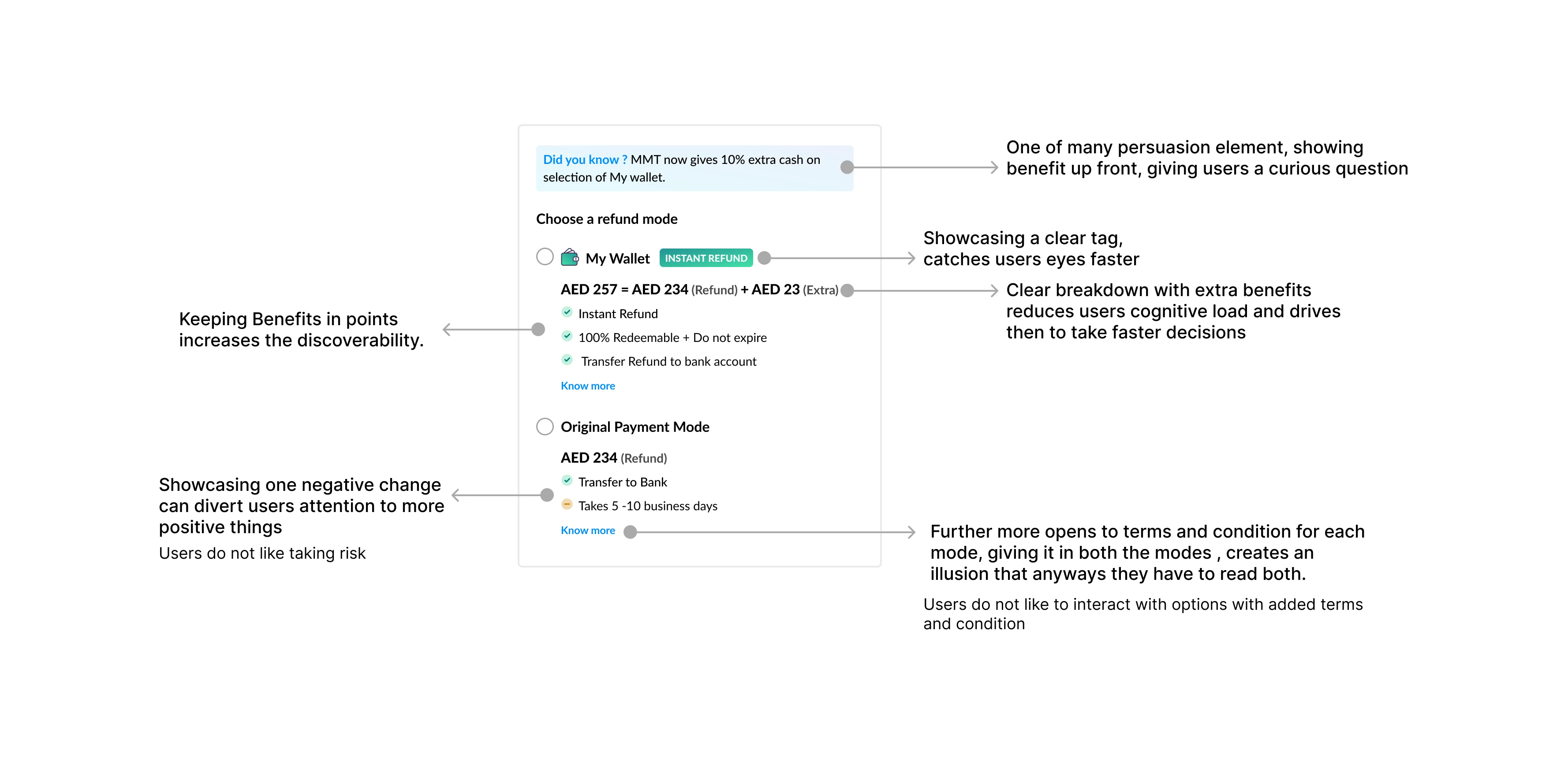
✨ Final Iteration
After several design iterations, this became the ultimate design, which was then discussed and approved by all the key stakeholders involved.
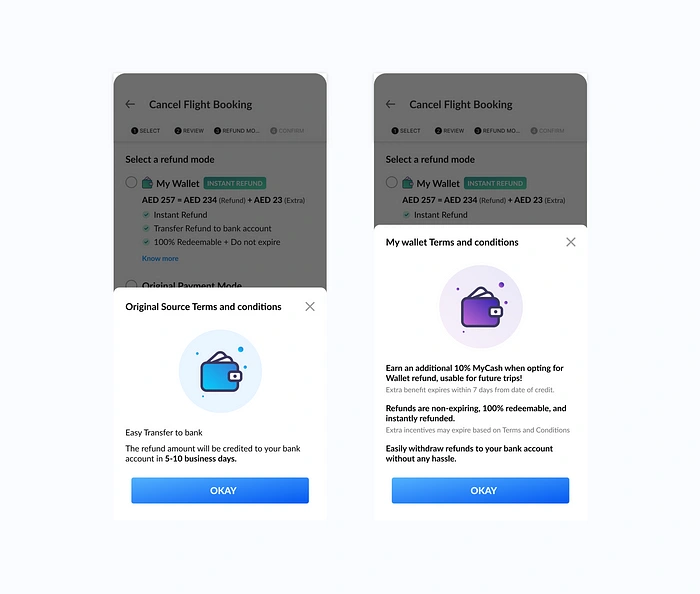
Terms and Conditions screens
User awareness about their commitment is crucial, and the terms and conditions screen serves this purpose by establishing transparency regarding the product for the users.
Presenting concise and transparent information about both refund modes, enabling users to access all the necessary details for making informed decisions.
In any product, establishing customer trust holds immense significance. Simplifying their processes contributes significantly. This applies equally to the post-booking journey, where guiding users from the booking process back to the app holds considerable business value.
Various metrics, including user engagement, retention, and TAT rate, can be influenced. As a result, it’s crucial to prioritize not just the initial stages but also the experience from start to finish.
Thank you for coming so far, I appreciate your time.
Like this project
Posted Sep 4, 2023
We’re all aware that for businesses serving online customers, ensuring a user-friendly experience during clicks and navigation is essential. This principle hol…

