ORA: Biotech Skincare Brand Identity & Packaging

Nimesh Soni


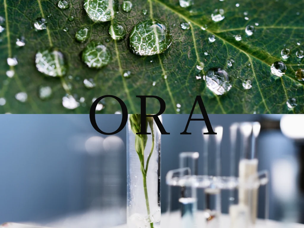
ORA: Biotech Skincare Brand Identity & Packaging System
Overview
ORA is a premium, biotech-driven unisex skincare line launching with a foundational 3-product skin cycling system. The brand introduces bio-engineered actives, including marine algae and plant stem cells, powered by an eight-hour slow-release formula. This technical approach delivers clinical results without the redness, irritation, or barrier damage often caused by harsh active ingredients.
The Challenge
The brand introduces bio-engineered actives, including marine algae and plant stem cells, powered by an eight-hour slow-release formula. This technical approach delivers clinical results without the redness, irritation, or barrier damage often caused by harsh active ingredients.
Wordmark
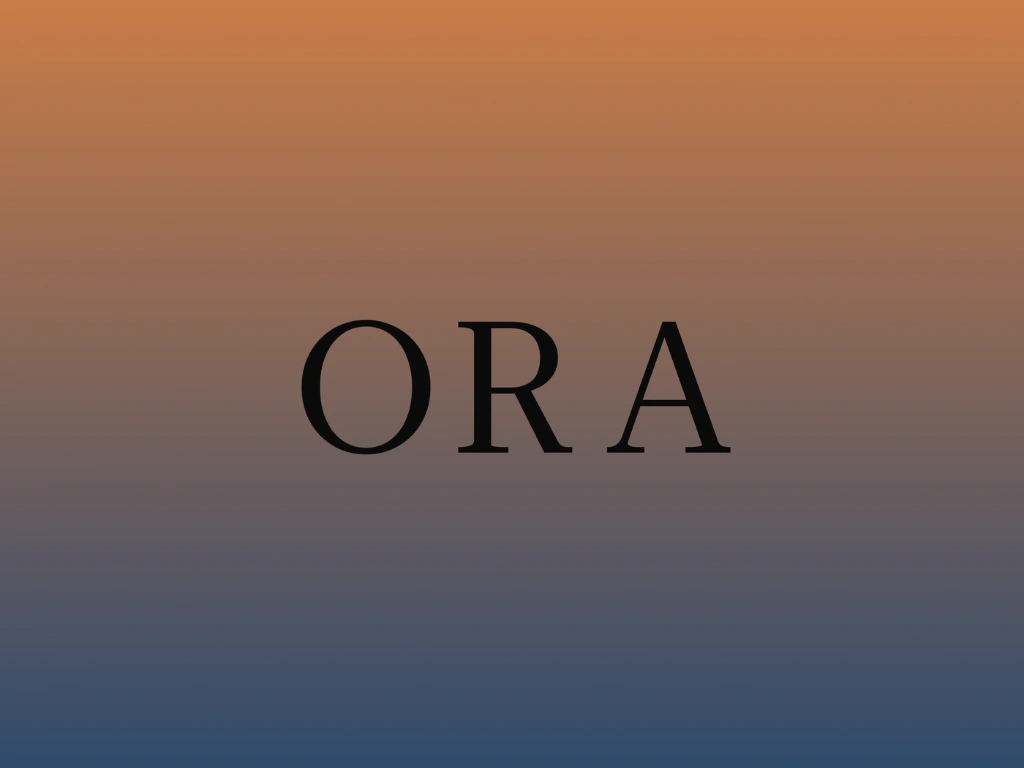
The Primary Wordmark
To visually represent the core product truth of time-released delivery and steady pacing, the ORA wordmark uses wide, generous letter spacing. The open space between the letters creates a calm rhythm, symbolizing precision dosage and the steady release of ingredients into the skin over time.

Typography
Typography
The font selection brings together lab precision and organic beauty:
Headings (Roboto Serif): Blends sharp, mechanical serifs that represent science with subtle, natural curves that reflect organic plant life.
Body Text (Roboto Light): A clean and functional sans-serif that ensures dense ingredient lists, safety notices, and usage instructions remain easy to read on small packaging labels.
Color Palette
The Color System
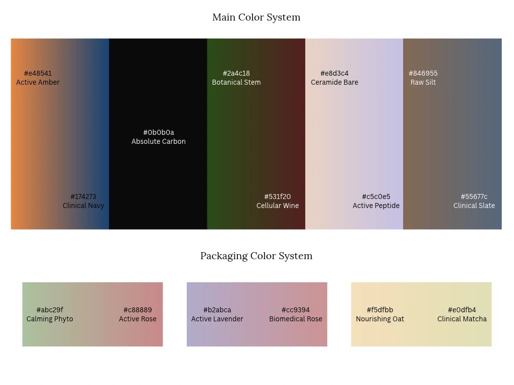
Instead of flat, static colors, ORA uses smooth dual-tone gradients. These gradients reflect the transformation between nature and science, as well as the transition between morning and evening skin routines.
Main Identity Gradients:
Active Amber (#e48541) to Clinical Navy (#174273)
Absolute Carbon (#0b0b0a) for grounded typography contrast
Botanical Stem (#2a4c18) to Cellular Wine (#531f20)
Ceramide Bare (#e8d3c4) to Active Peptide (#c5c0e5)
Raw Silt (#846955) to Clinical Slate (#55677c)
Packaging Gradients:
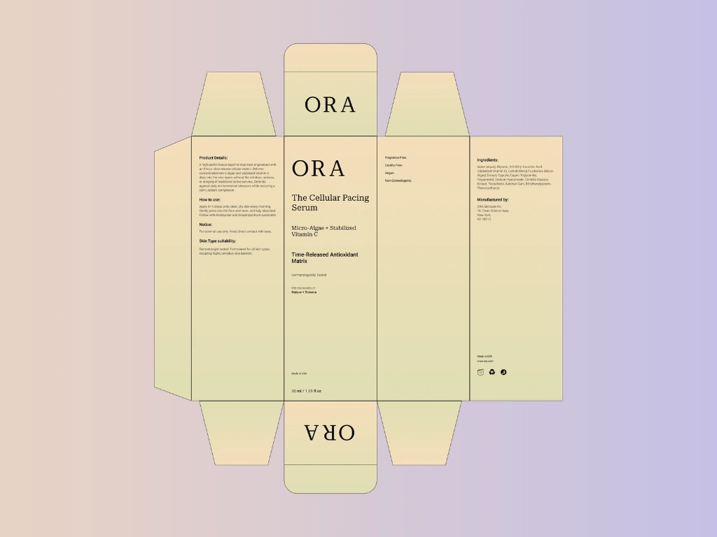
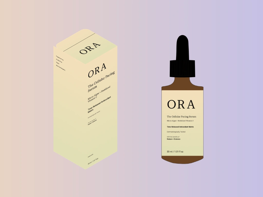
Nourishing Oat (#f5dfbb) to Clinical Matcha (#e0dfb4): Used on the daytime serum.
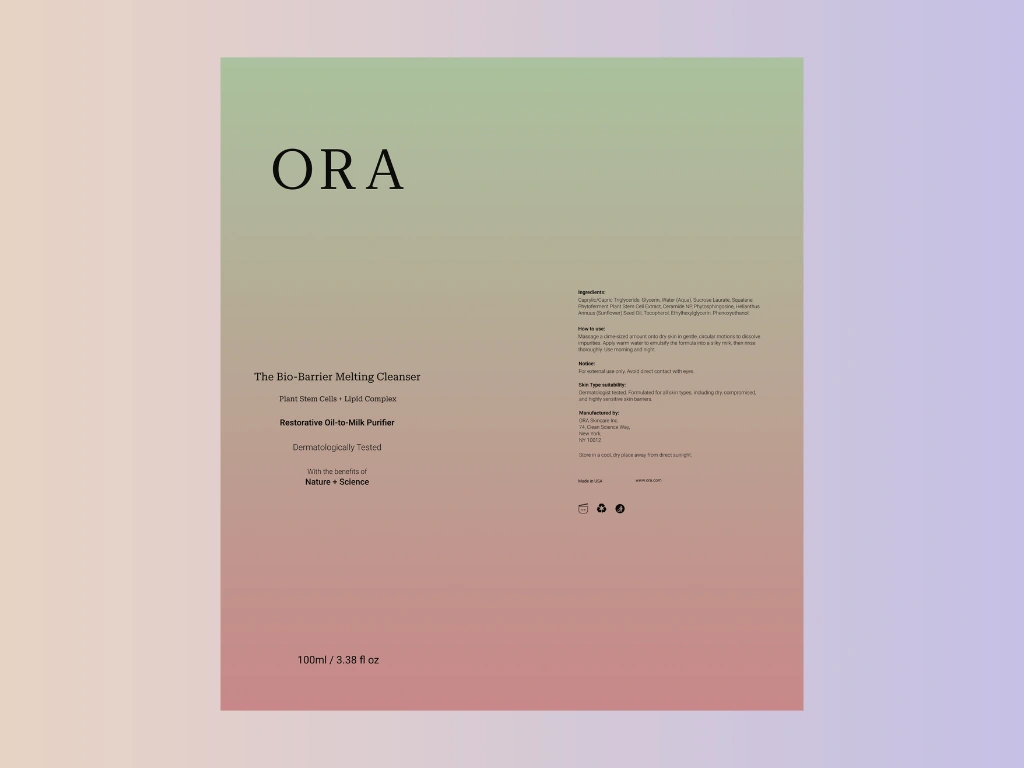
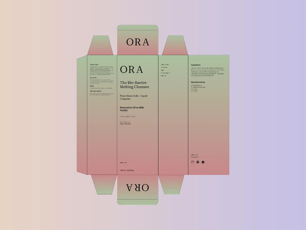
Calming Phyto (#abc29f) to Active Rose (#c88889): Used on the melting cleanser.
Active Lavender (#b2abca) to Biomedical Rose (#cc9394): Used on the overnight cream.
Serum Label Design
Serum Box Design
Dropper Bottle & Box Packaging
Cleanser Label Design
Cleanser Box Design
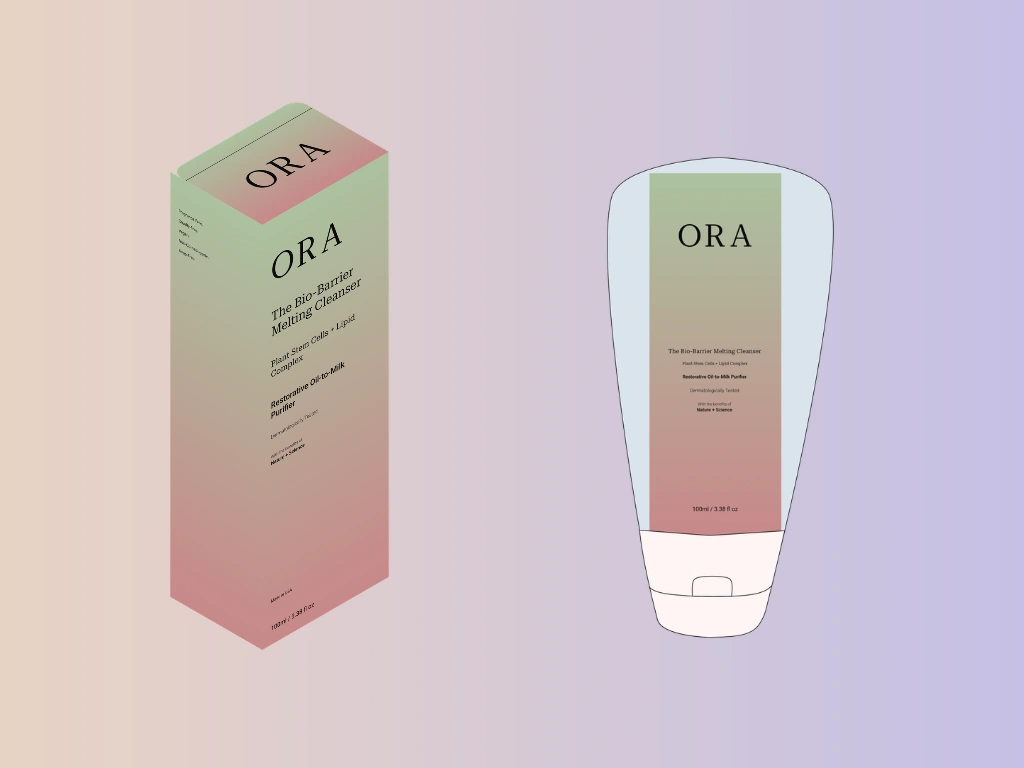
Tube & Box Packaging
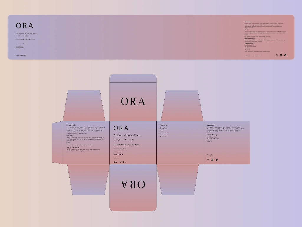
Cream Label & Box Design
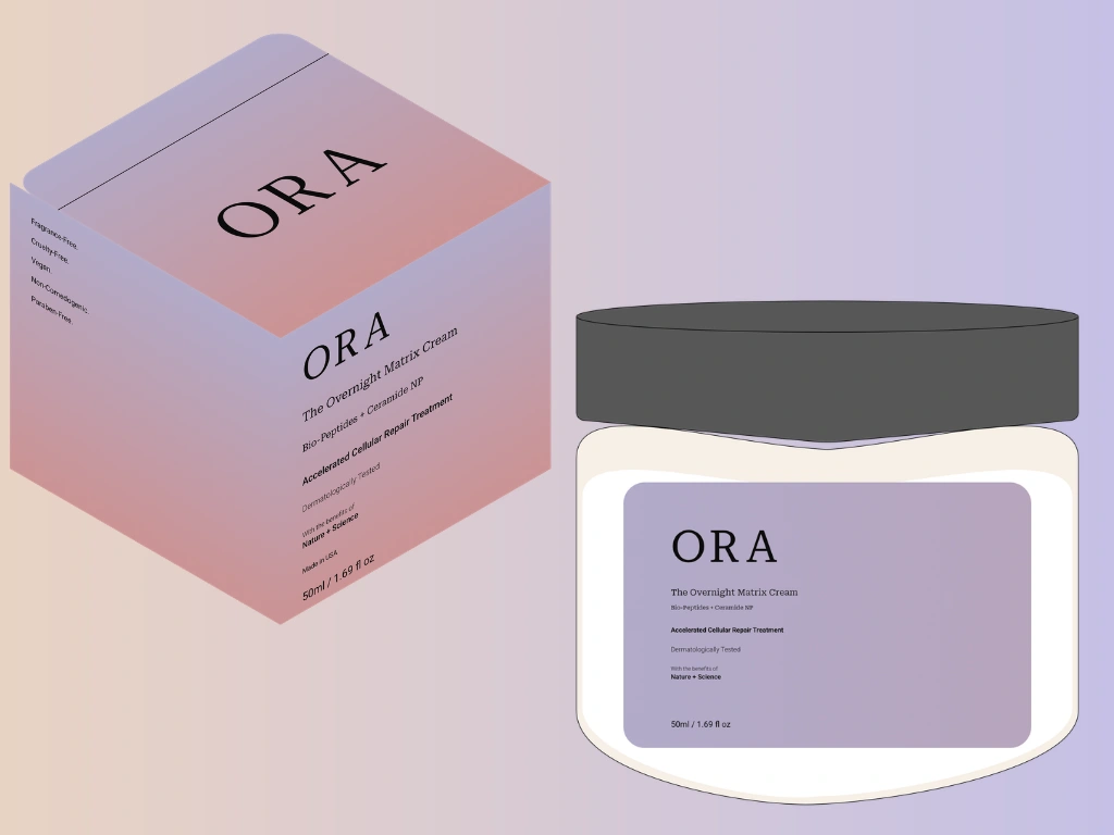
Jar & Box Packaging
Packaging Architecture & Production Dielines
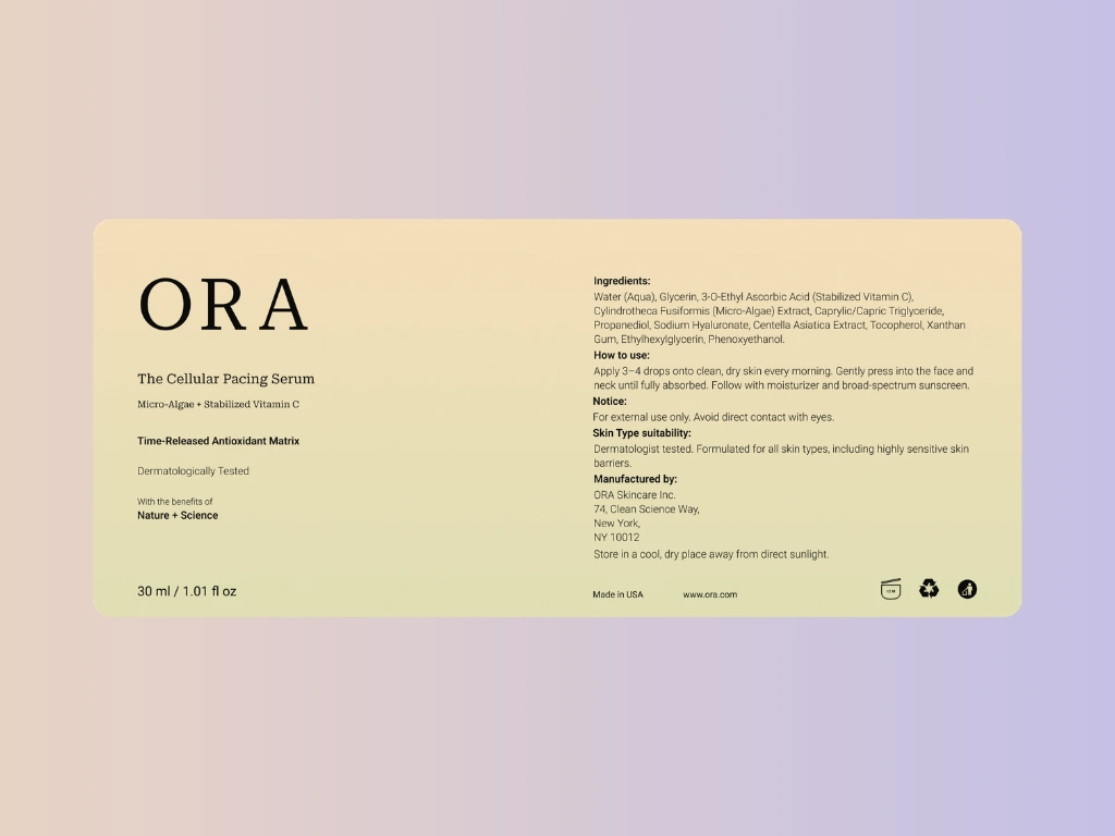
Every product was designed with real-world production in mind, featuring custom flat dielines complete with tuck flaps, directions for use, full ingredient lists, and cosmetic compliance symbols:
The Cellular Pacing Serum (30ml): Designed with an amber glass dropper bottle to protect active ingredients from light, paired with an outer box.
The Bio-Barrier Melting Cleanser (100ml): Housed in an ergonomic squeeze tube and protective box, built for daily sink use.
The Overnight Matrix Cream (50ml): Packaged in a wide-mouth glass jar and box, creating an intentional nighttime skincare ritual.
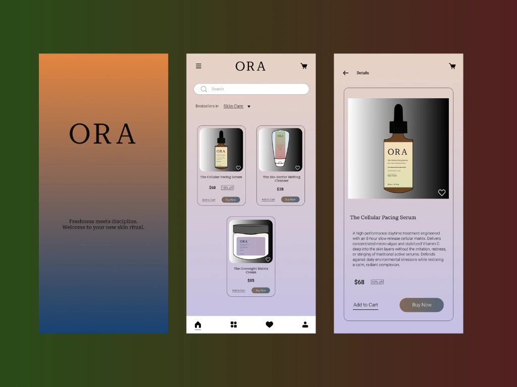
Mobile App UI
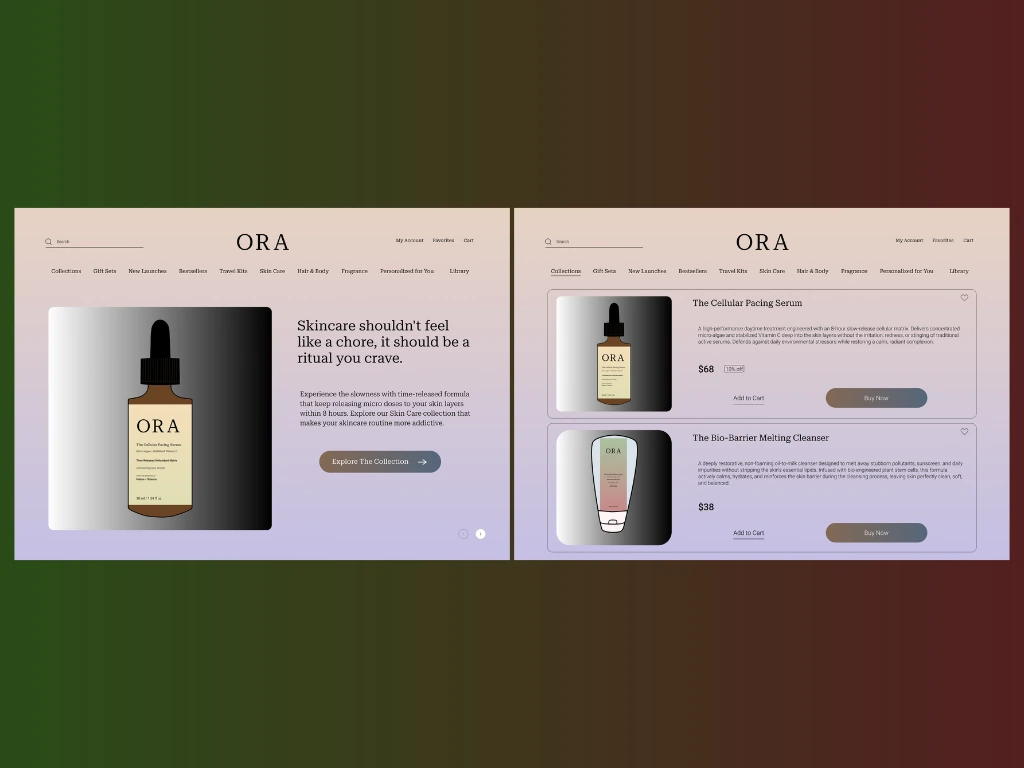
Website UI
Digital Experience & E-Commerce
The digital storefront was designed to make buying simple and informative:
Mobile App UI: Built with warm background tones, simple navigation, and clear product cards so users can manage their daily skincare cycling routine easily.
Desktop E-Commerce: Expands the mobile interface into an editorial layout with clean product breakdowns and quiet brand messaging like "Skincare shouldn't feel like a chore, it should be a ritual you crave."
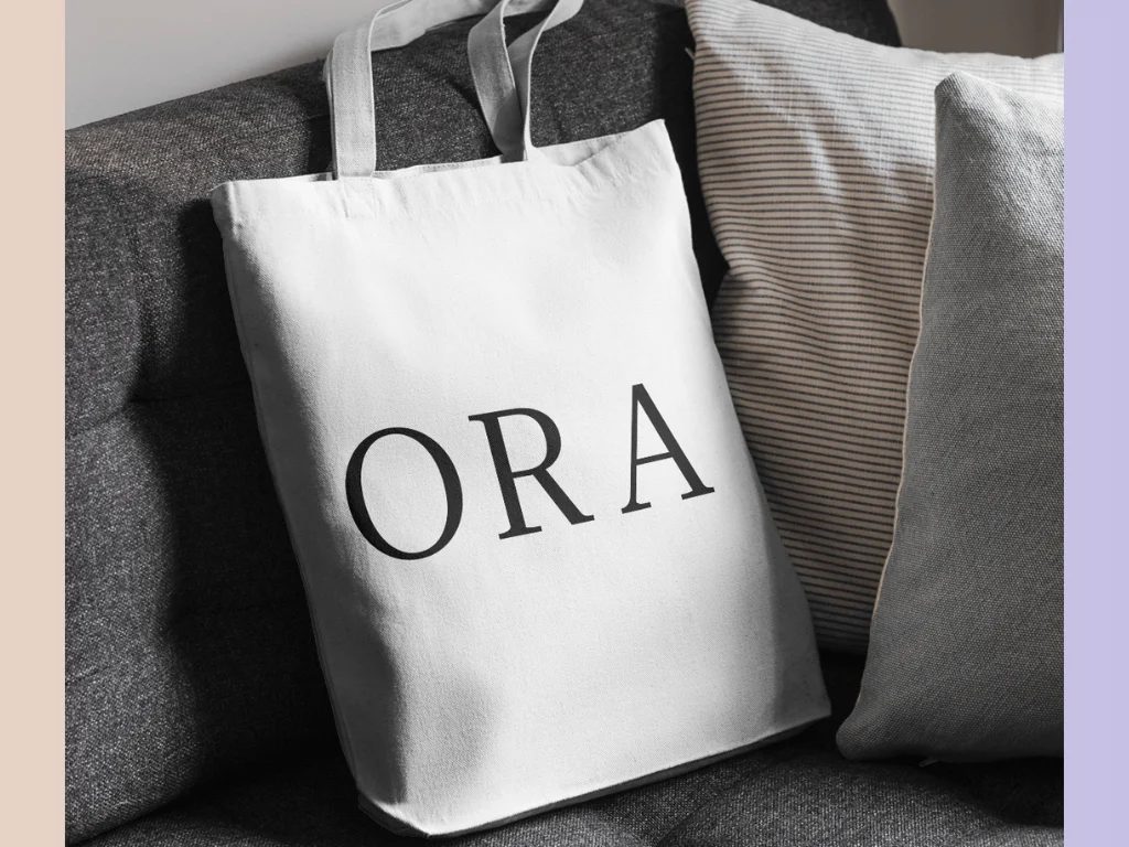
Tote Bag Mockup
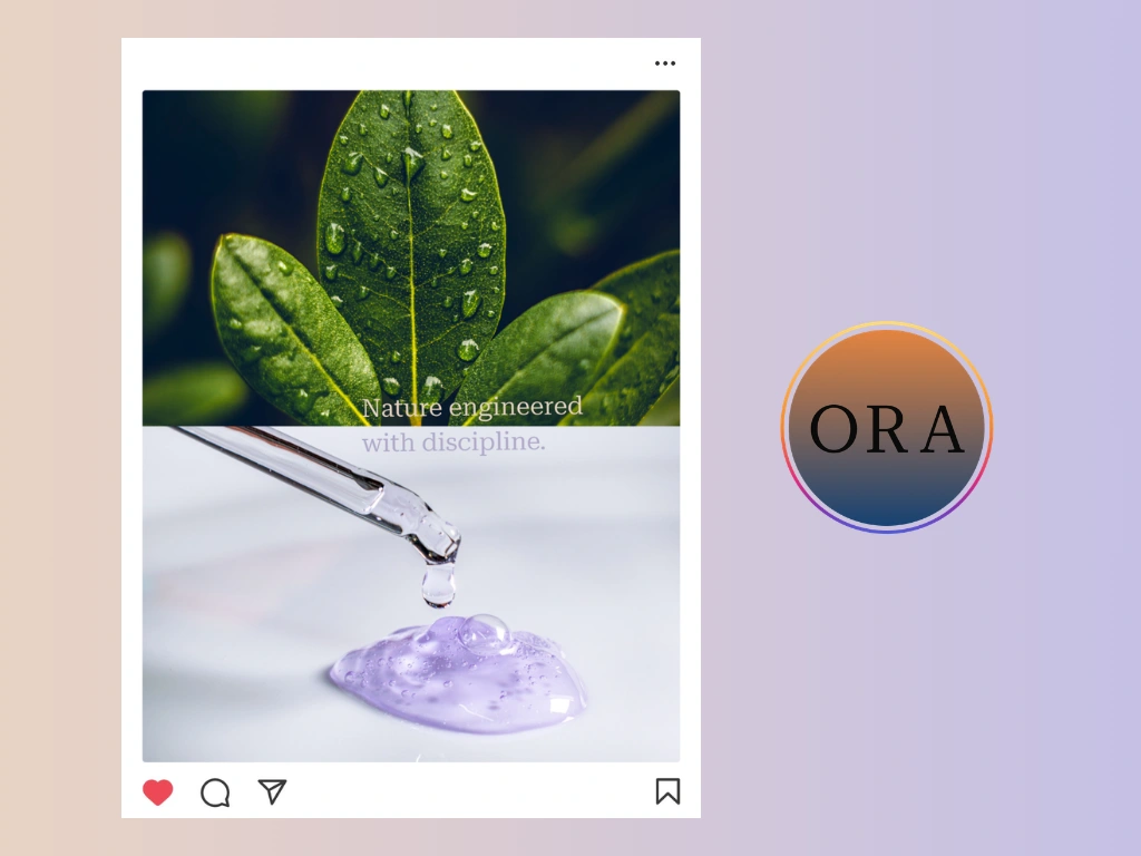
Social Media Presence
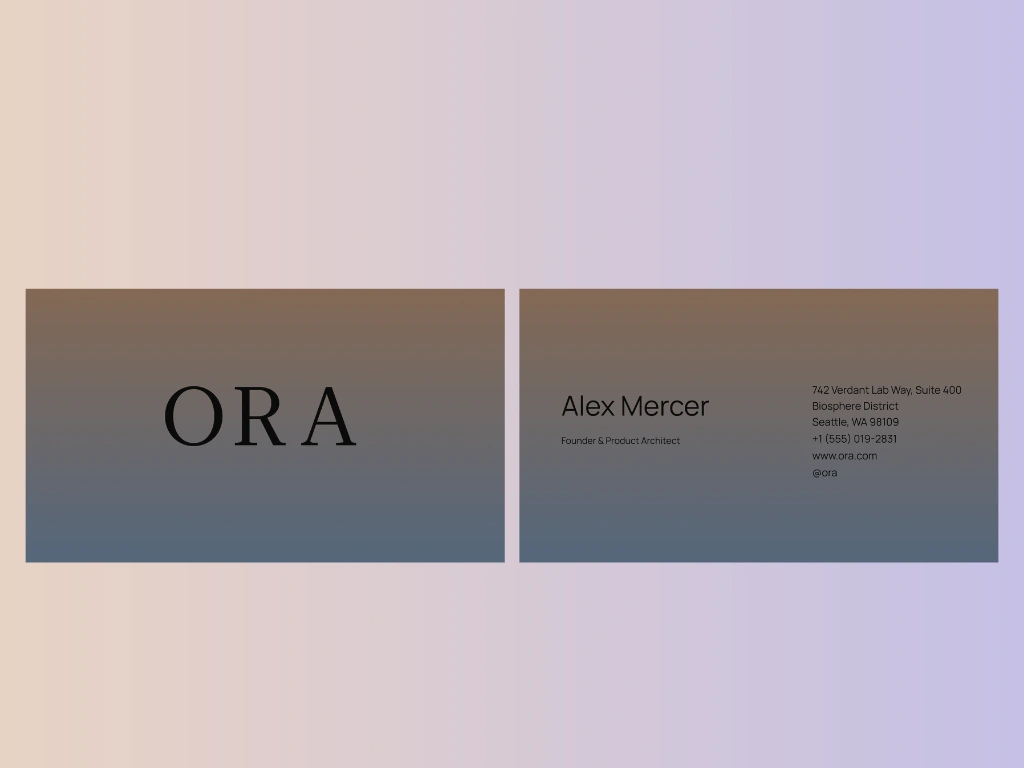
Business Card
Retail & Social Touchpoints
The Tote Bag: A heavy natural canvas bag carrying the oversized ORA wordmark for a minimal retail unboxing experience.
Social Media Concept: A split visual pairing a dewy plant leaf directly with a laboratory pipette, reinforcing the tagline: "Nature engineered with discipline."
Stationery: Clean business cards featuring the brand gradient on the front and minimalist contact details for the founder on the back.
Want a creative identity for your brand?
Let's Collaborate! I am available for hire.
Message me directly to discuss more.
Thanks for watching!
Like this project
Posted Nov 2, 2026
Developed brand identity and packaging for ORA's biotech skincare line.