Dynamic & Playful Event Branding System for Orlando

Nimesh Soni


Orlando — Dynamic & Playful Event Branding System
Overview & Project Brief
Orlando is an energetic, youth-centric event planning service specializing in music festivals, campus culture, creative pop-ups, and live social experiences.
The objective of this project was to break away from traditional, corporate event aesthetics and build a bold, vibrant, and approachable visual identity. The identity needed to feel hand-crafted, high-energy, and versatile across everything from digital ticketing to physical festival merchandise.
The Custom Hand-Drawn Logotype
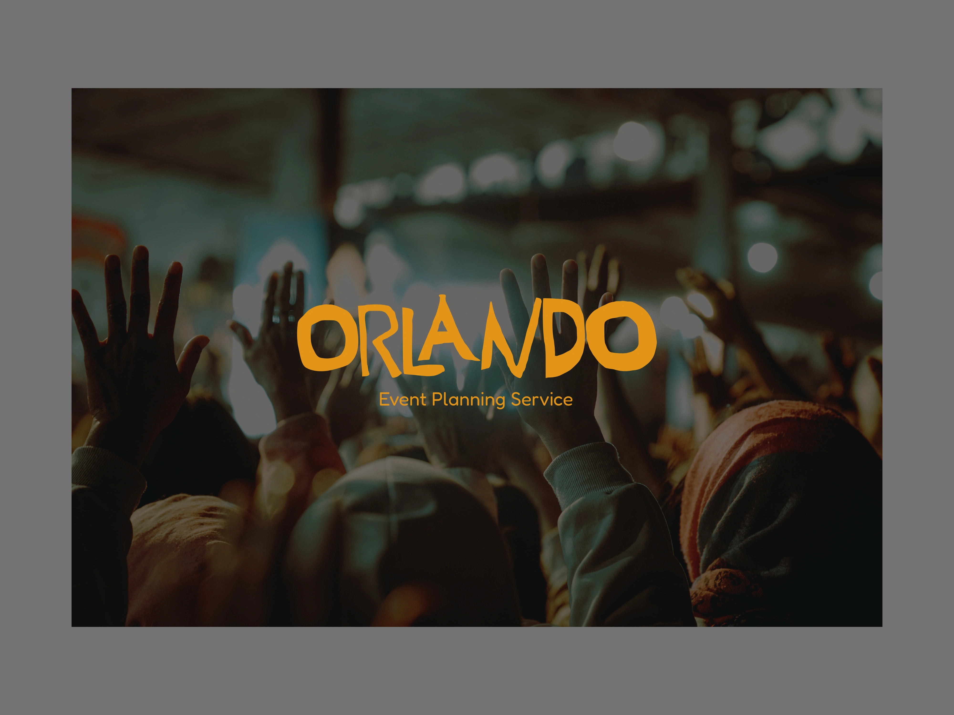
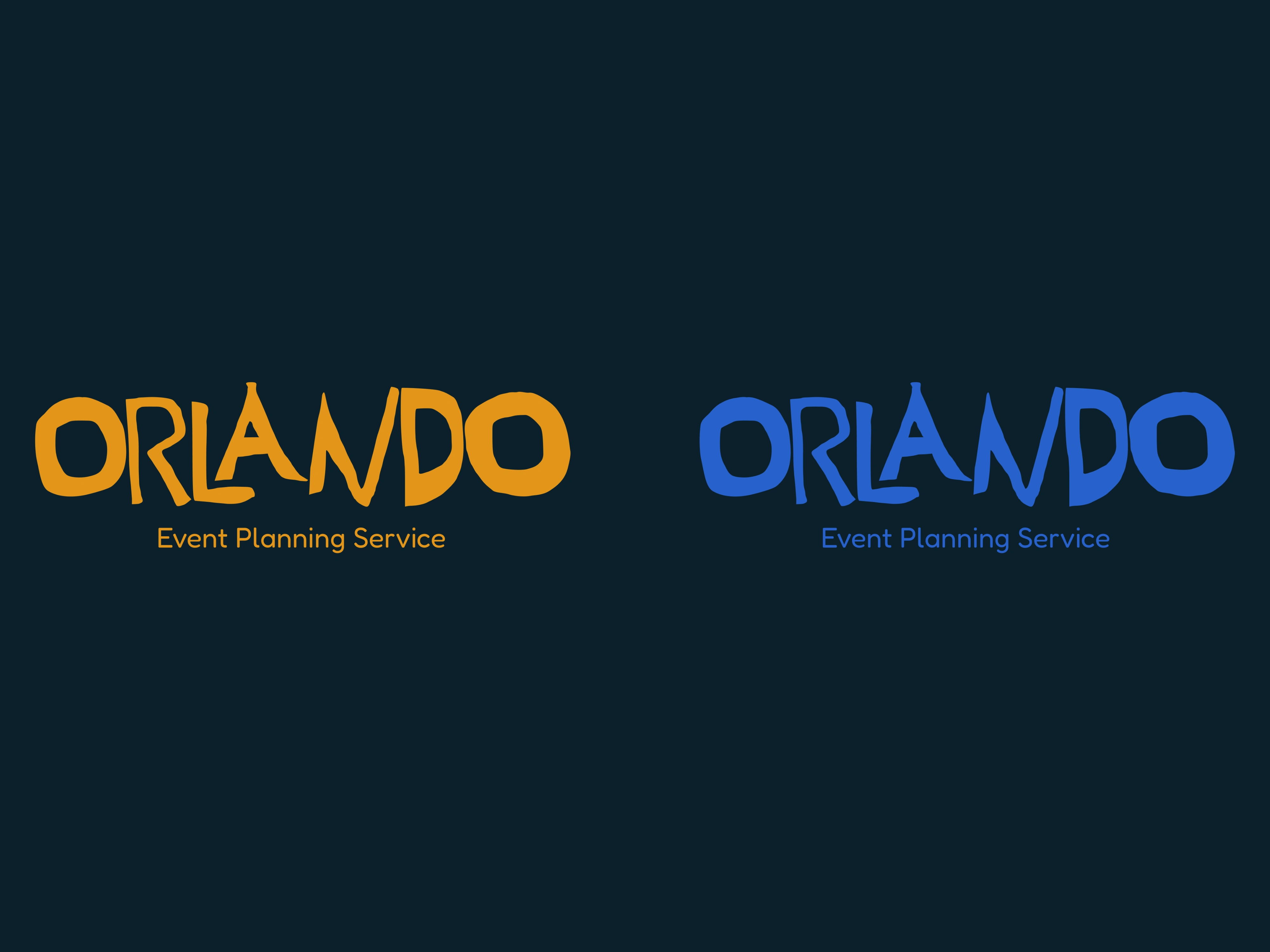
Rather than relying on pre-existing digital typefaces, I engineered a bespoke hand-lettered logotype from scratch:
Organic Rhythm: Designed with playful baseline shifts and chunky, expressive letter weights to reflect the kinetic energy of live crowds and celebrations.
Balanced Subtext: Paired with clean, highly legible secondary type (Event Planning Service) to ensure immediate commercial clarity across small and large scales.
Dual Primary Colorways: Developed in high-contrast Golden Mustard and Royal Cobalt Blue for effortless legibility across dark and light environments.
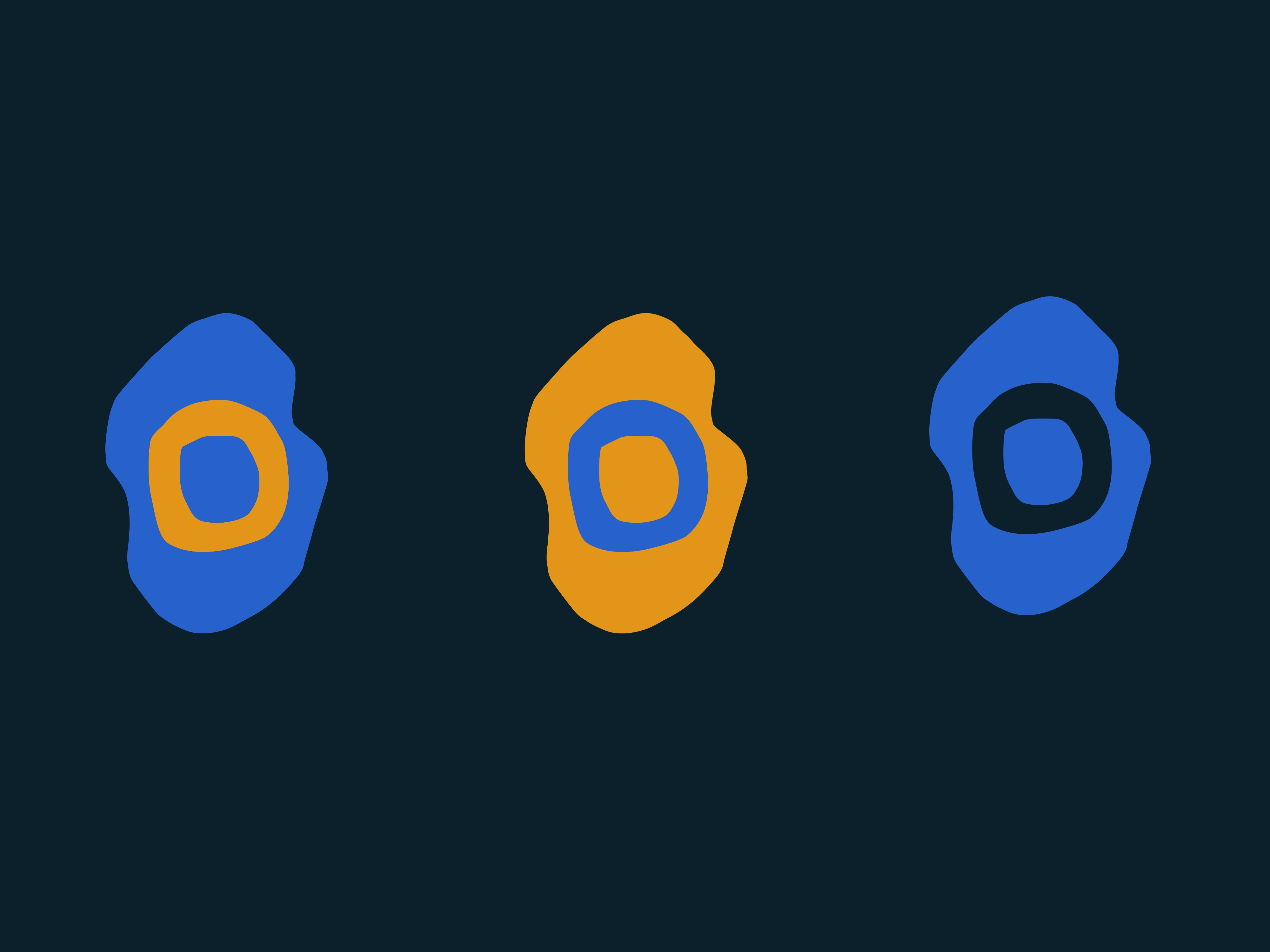
The "O" Blob Submark & Icon System
For compact touchpoints where the full logotype isn't practical, I created a modular submark system:
Designed an organic, pebble-shaped layered badge framing the brand’s signature hand-drawn "O".
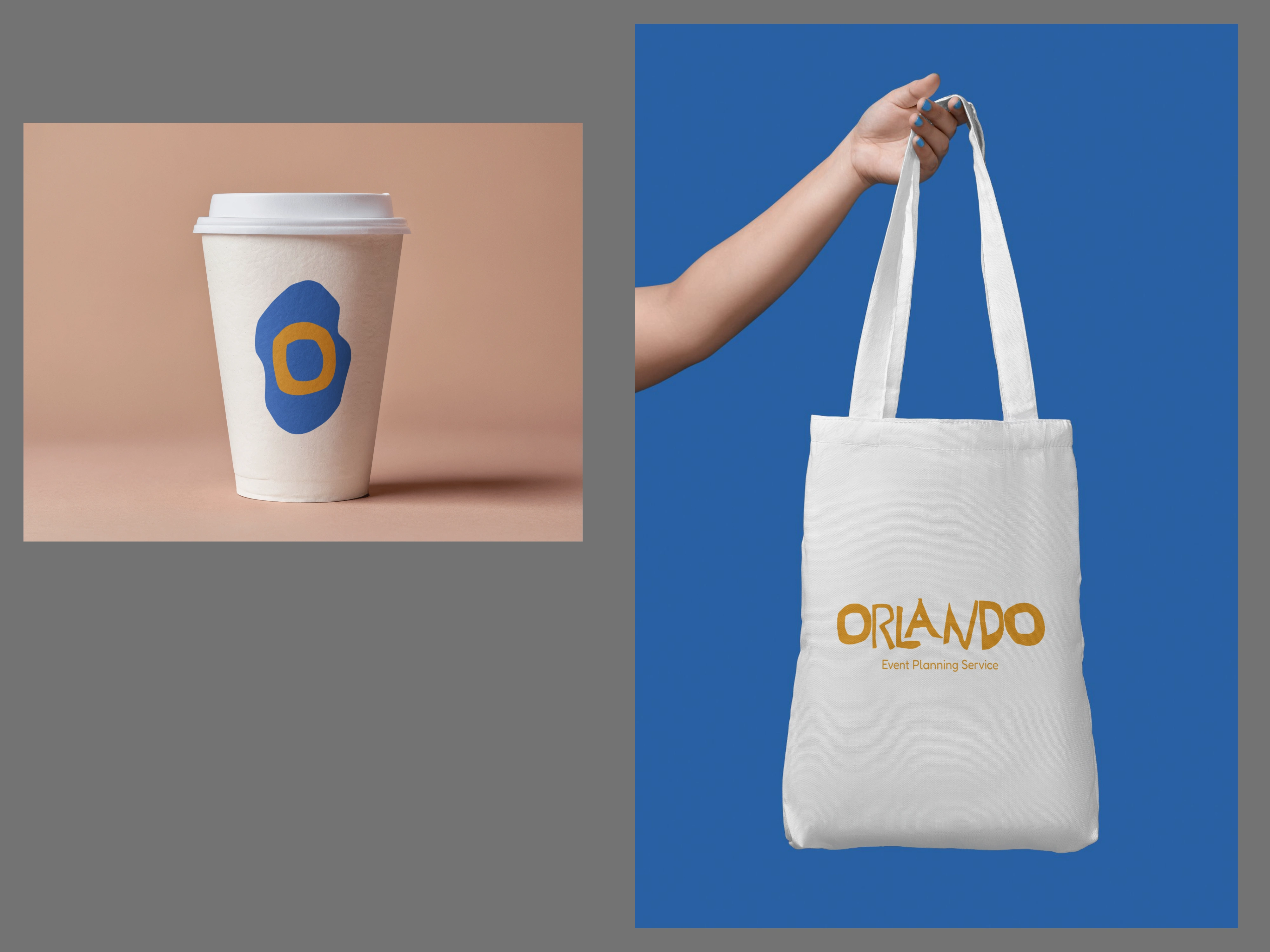
Engineered in multiple color variations for use as festival stamps, coffee cup branding, event app icons, and holographic stickers.
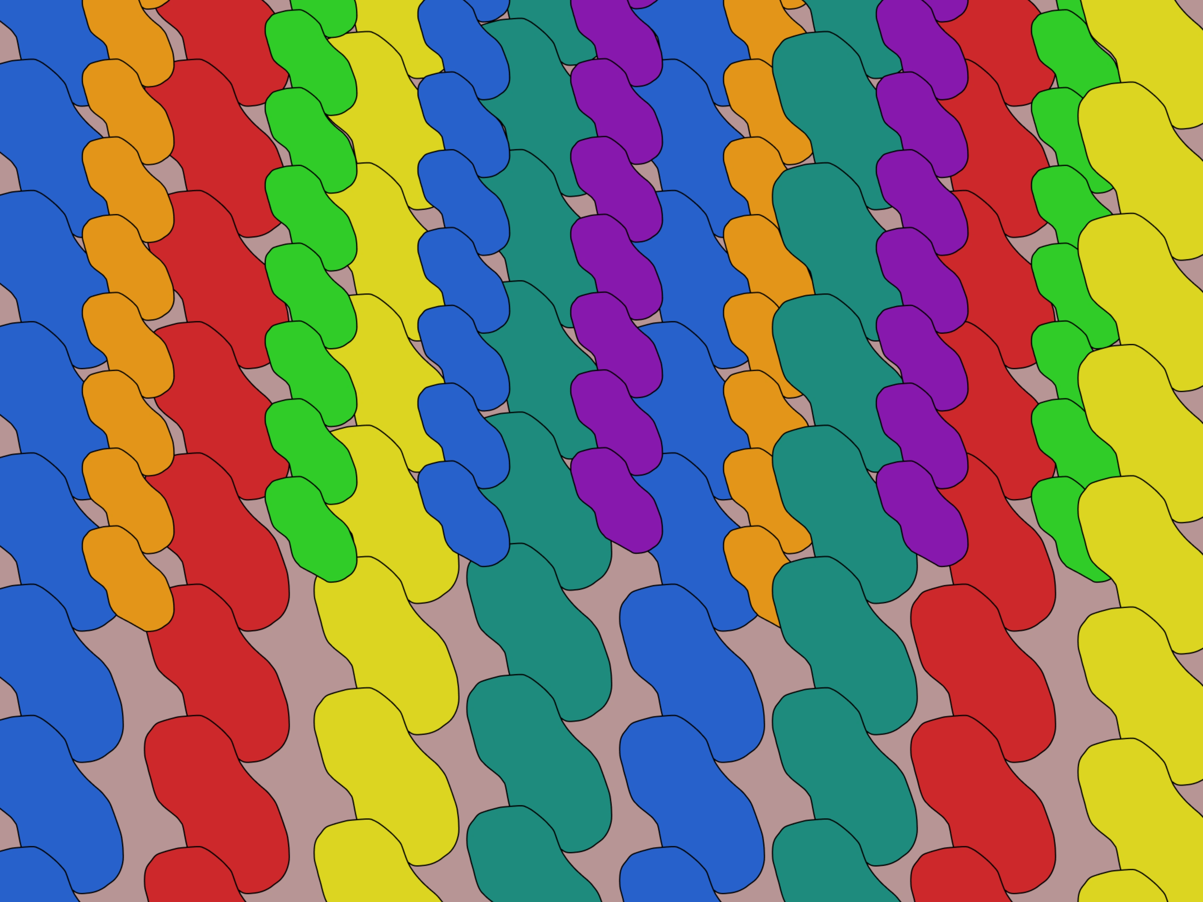
Bespoke Interlocking Brand Pattern
To give the identity depth beyond static logos, I illustrated a custom repeating brand pattern:
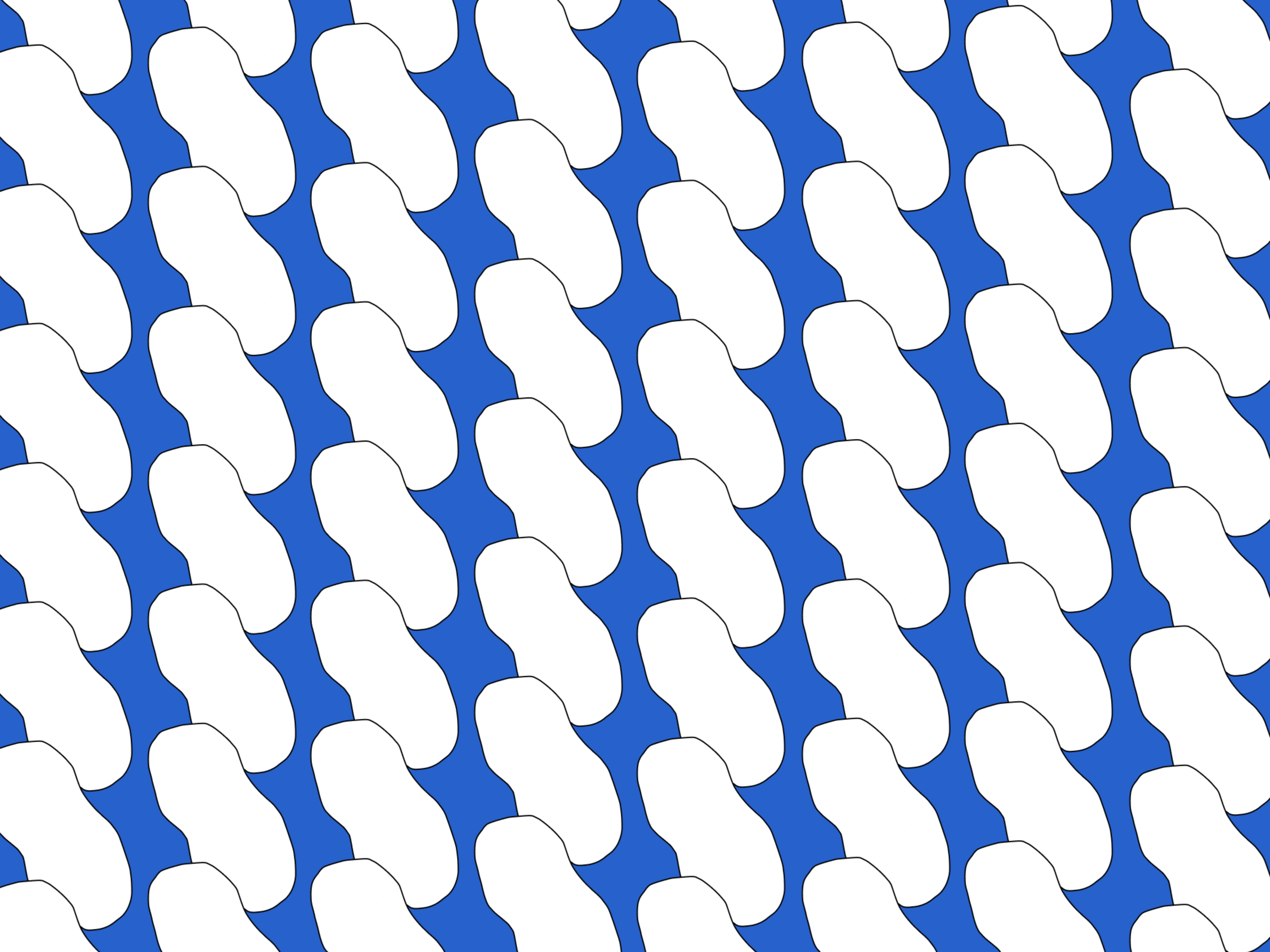
The Monochromatic Structure: A clean two-tone interlocking pattern used for official stationery, digital backdrops, and subtle packaging details.
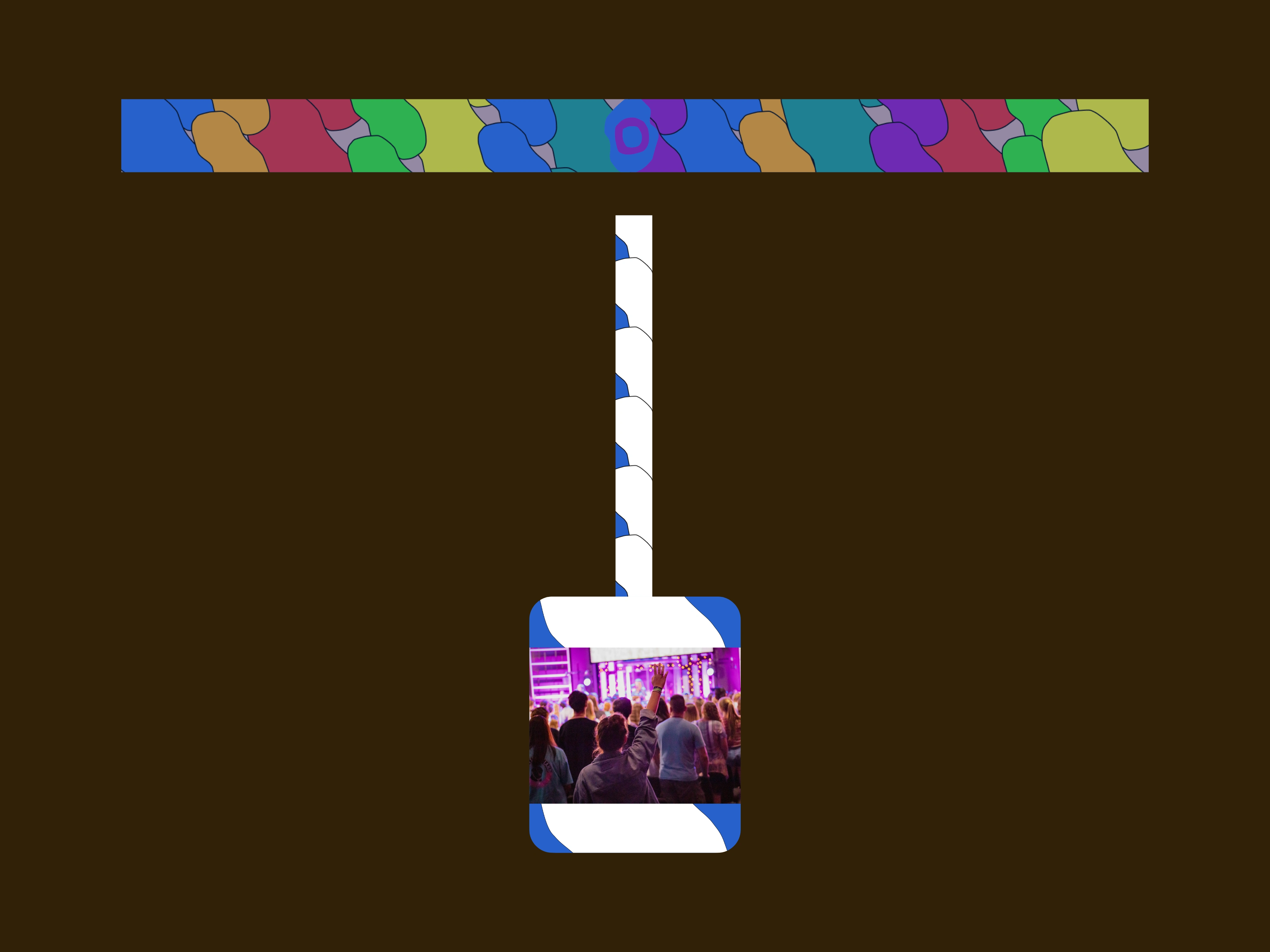
The Multi-Color Festival Edition: A vibrant, multi-tonal rainbow arrangement evoking confetti, crowd energy, and festival wristbands.
Typography & Color Psychology
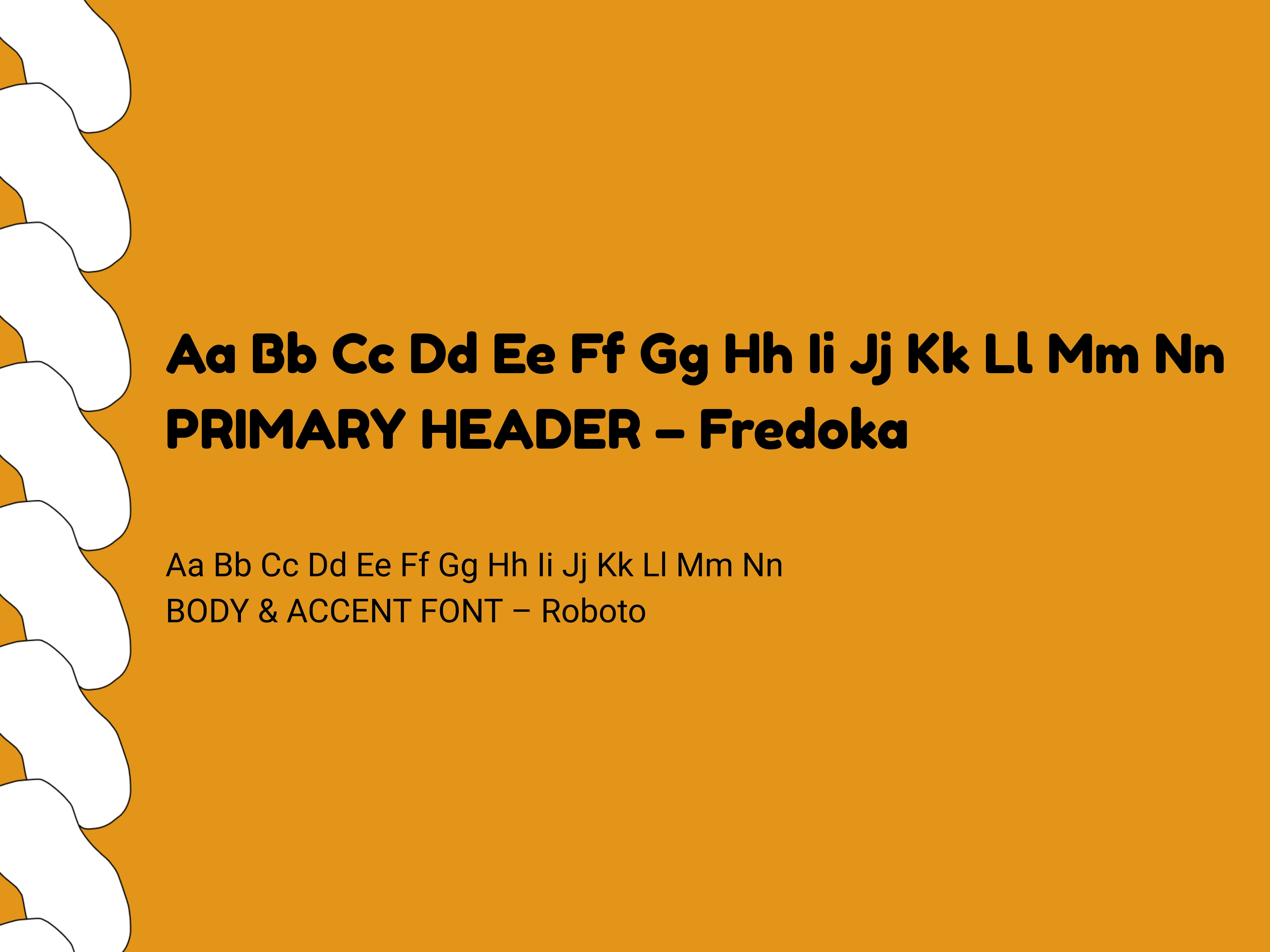
Primary Header — Fredoka: A chunky, rounded geometric sans-serif that reinforces the friendly, accessible, and youthful personality of the brand.
Body & Accent — Roboto: A neutral, functional workhorse typeface that guarantees maximum readability across schedules, tickets, and event maps.
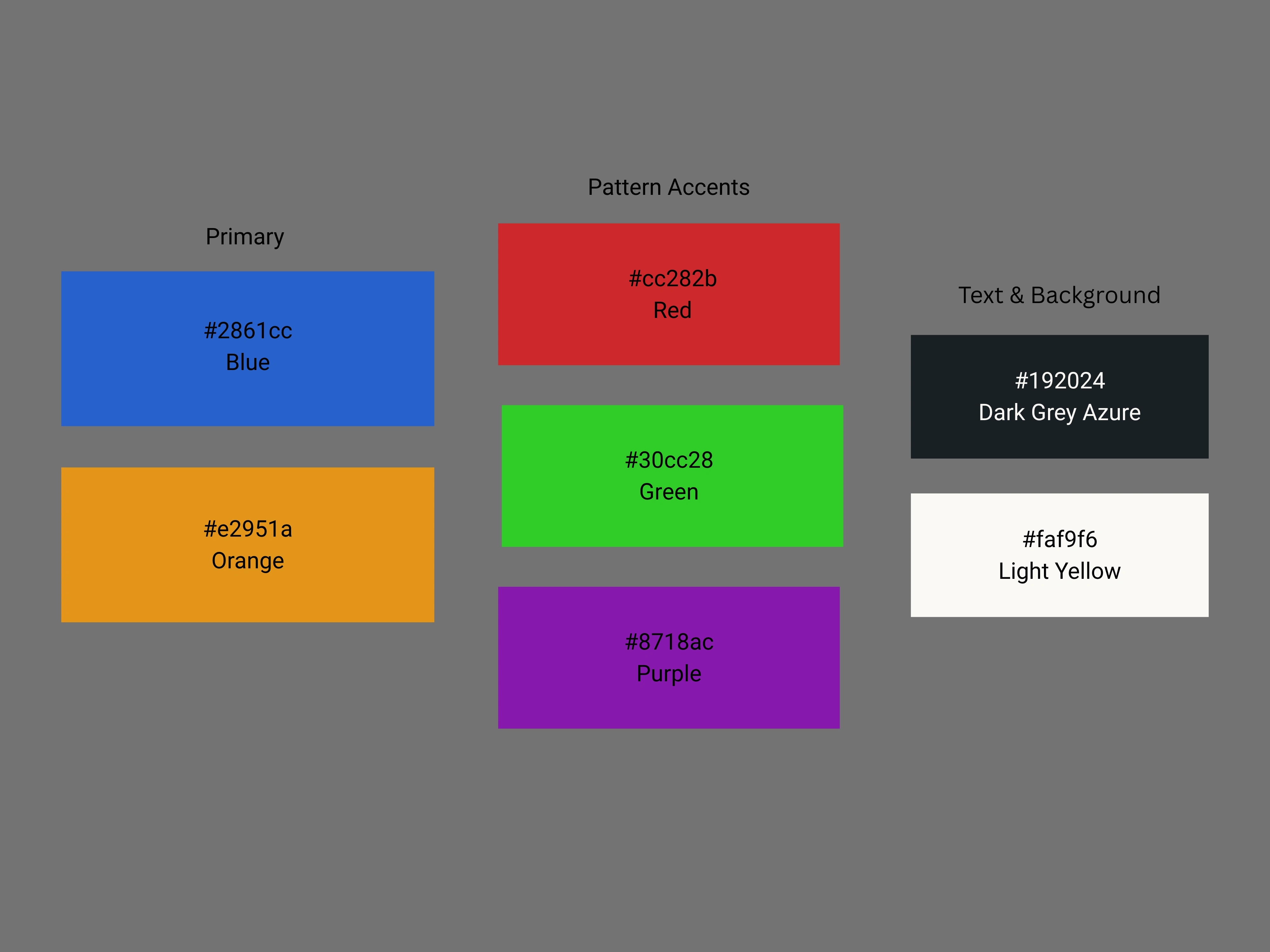
Color Palette: Grounded by electric Cobalt Blue (#2861cc) and warm Golden Orange (#e2951a), supported by a high-energy secondary palette (Festival Green, Electric Violet, and Deep Slate) for seasonal event campaigns.
Key Deliverables & Real-World Application
To validate the identity system in real-world scenarios, the branding was translated into physical event collateral:
Custom-printed woven VIP lanyards & backstage event badges
Large-scale concert and festival stage visuals
Festival merchandise: screen-printed cotton canvas tote bags
Pop-up event coffee cups and takeaway packaging
Planning an event, festival, or launching a bold lifestyle brand?
Send an inquiry or book a service directly through Contra to collaborate!
Like this project
Posted Oct 5, 2026
Dynamic branding system for energetic event planning service.
Likes
0
Views
1