Vintage-Inspired Brand Identity for Rodney's Spa

Nimesh Soni


Rodney’s Spa – Vintage-Inspired Wellness & Spatial Identity
Overview & Creative Vision
Rodney’s Spa is a holistic wellness retreat and spa designed around vintage craftsmanship, intricate details, and natural serenity. The objective of this project was to craft an approachable, elevated visual identity that translates the calming sensory experience of a spa into a timeless design system.
The Strategy: A Two-Part Brand System
The concept was inspired by foundational elements of the spa experience: rolled linen towels, botanical leaves, calming basins, and grounding hot stones.
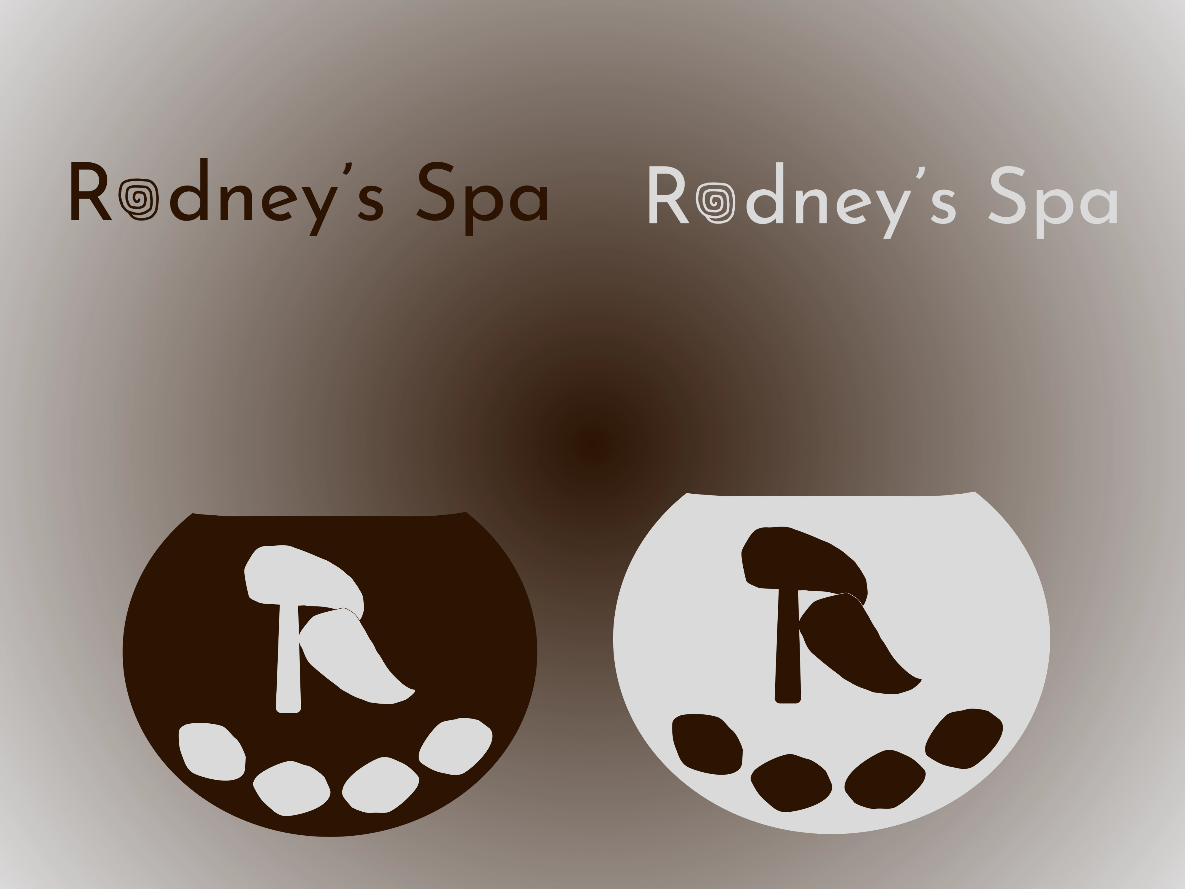
Rather than overloading a single mark with visual clutter, I engineered a balanced, two-part brand system:
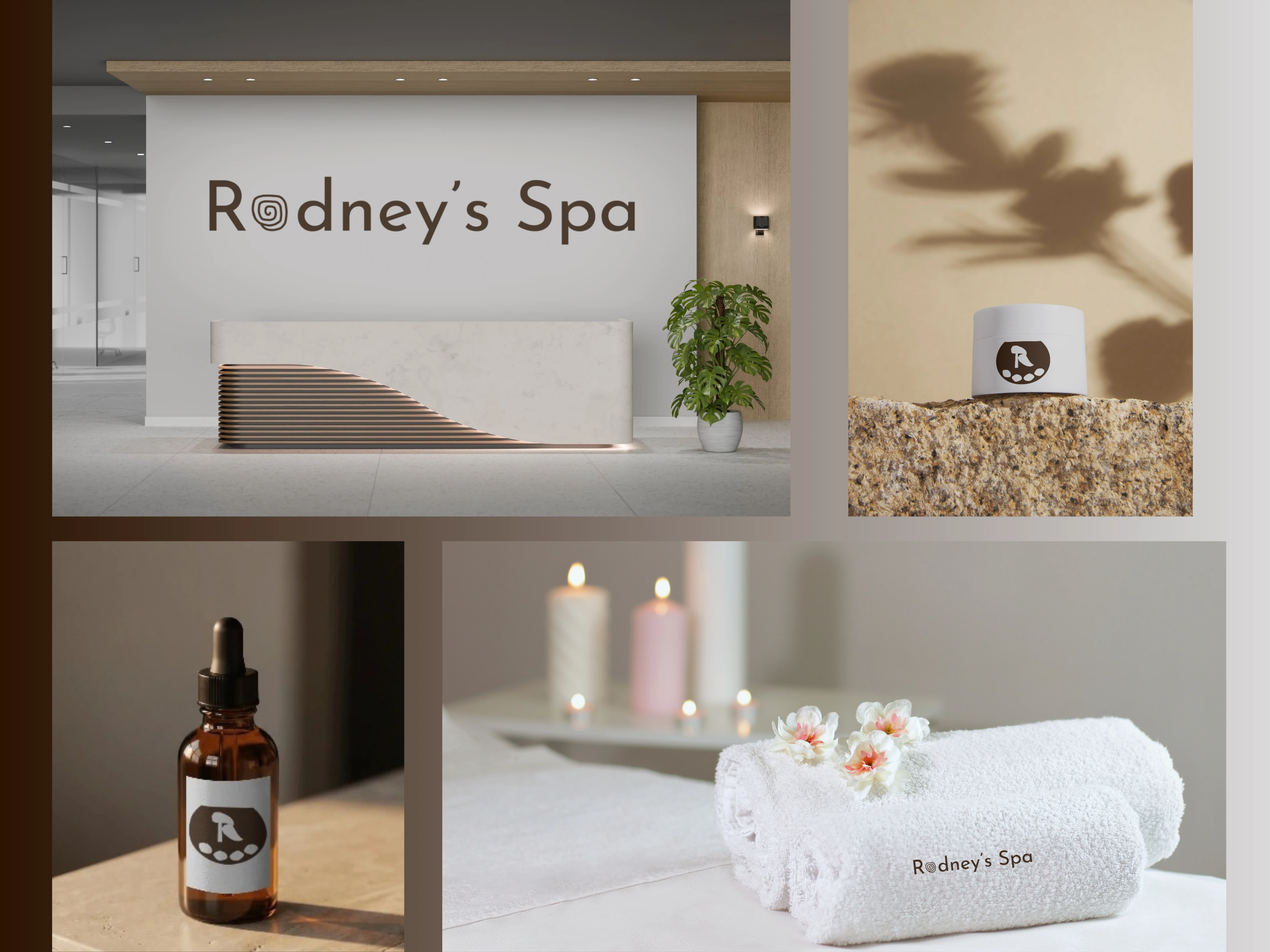
The Primary Wordmark: The core brand signature featuring a custom rolled-towel spiral integrated into the letter ‘o’ – engineered for maximum legibility across architectural reception signage, website headers, and plush embroidered towels.
The Secondary Submark & Emblem: A grounded basin silhouette framing an organic "R" monogram, flanked by smooth massage stones and botanical leaves. Designed specifically for compact packaging touchpoints like amber glass apothecary bottles and cosmetic cream jars.
Typography Hierarchy: 1920s Elegance Meets Clarity
To capture the vintage character without feeling dated, I curated a harmonious typographic pairing:
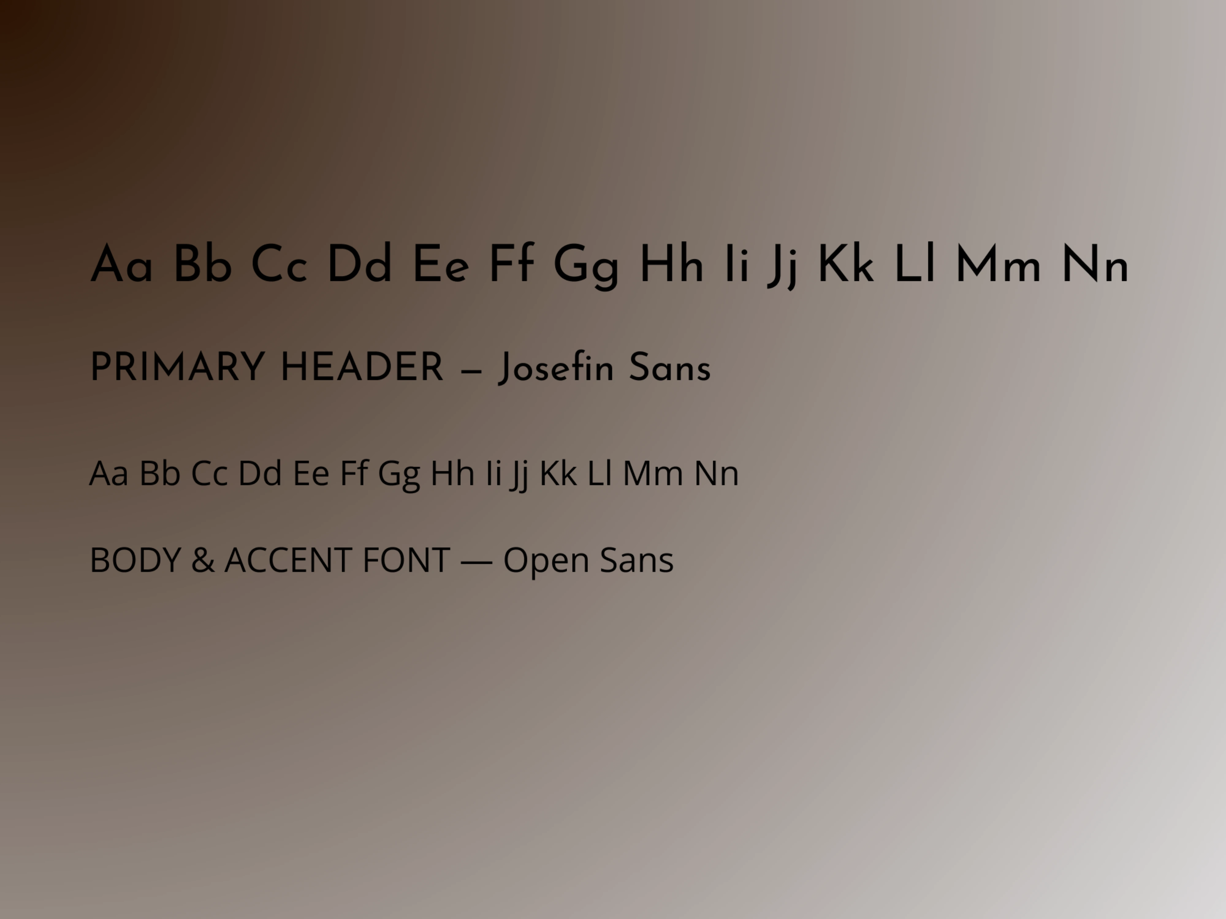
Primary Header – Josefin Sans: An elegant, geometric sans-serif inspired by 1920s Art Deco and classic mid-century design. Its vintage proportions lend an architectural, high-end feel to headlines.
Body & Accent – Open Sans: A clean, neutral, and highly readable typeface that ensures effortless clarity across ingredient lists, treatment descriptions, and website copy.
Grounded, Natural Color Palette
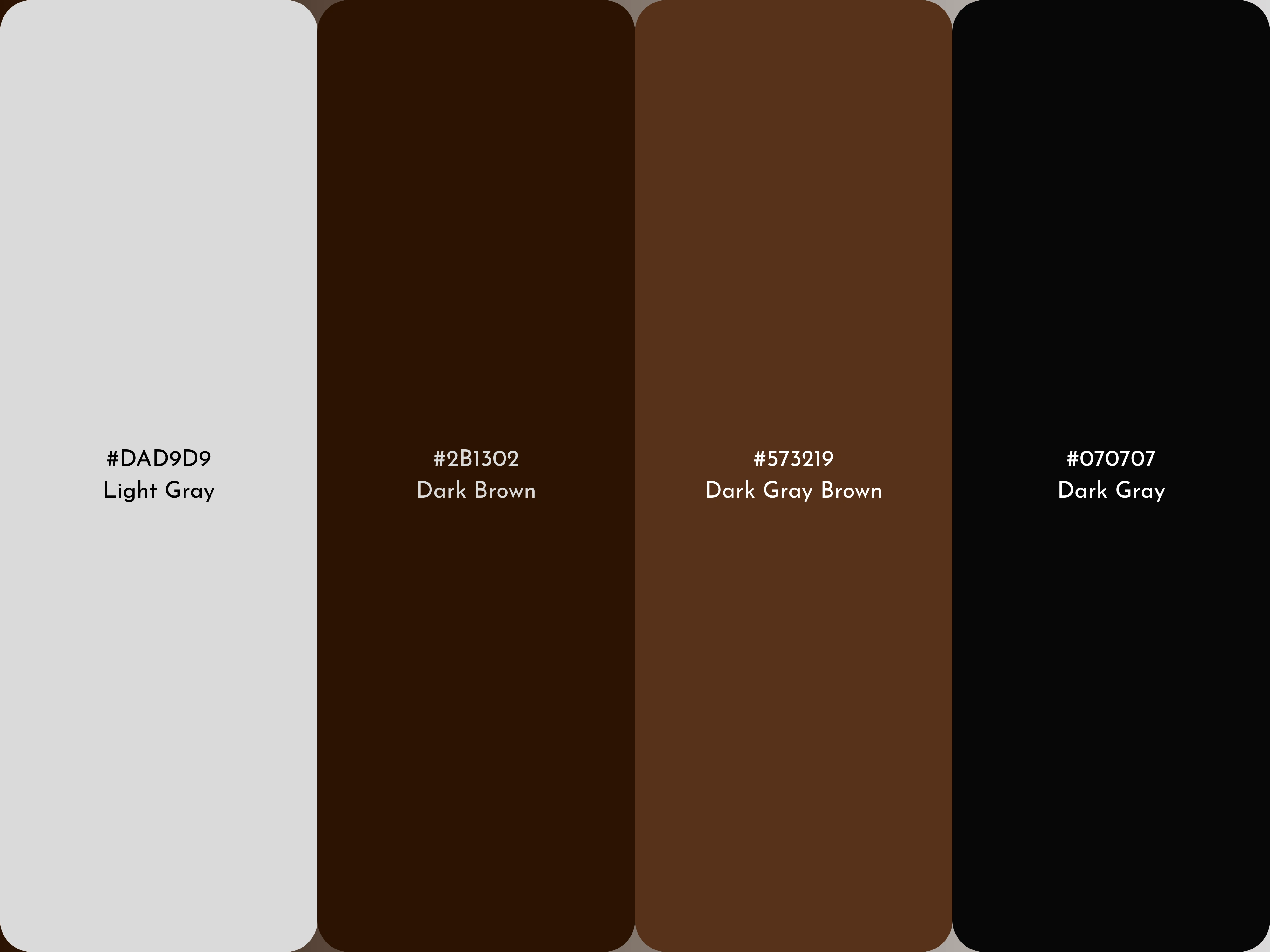
A wellness brand relies heavily on color psychology. I developed a warm, earthy neutral palette:
Warm Stone Grey: Provides an airy, soothing, tactile background reminiscent of natural clay and limestone.
Deep Espresso Brown: Represents grounding earth, warm timber, and organic botanicals.
Charcoal Brown & Slate Accents: High-contrast tones engineered for crisp, accessible typography and packaging details.
Spatial & Packaging Touchpoints
To ensure the identity works seamlessly in physical environments, the visual system was applied across key spa touchpoints:
Architectural wooden reception desk signage
Minimalist amber glass apothecary dropper bottles
Matte cosmetic cream jars
Plush embroidered rolled linen towels
Looking for an intentional brand identity for your wellness, lifestyle, or interior brand?
Send an inquiry or book a service directly through Contra to collaborate!
Like this project
Posted Sep 29, 2026
Created a vintage-inspired brand identity for Rodney's Spa.
Likes
0
Views
4