Loom & Loomis Brand Identity Creation

Nimesh Soni


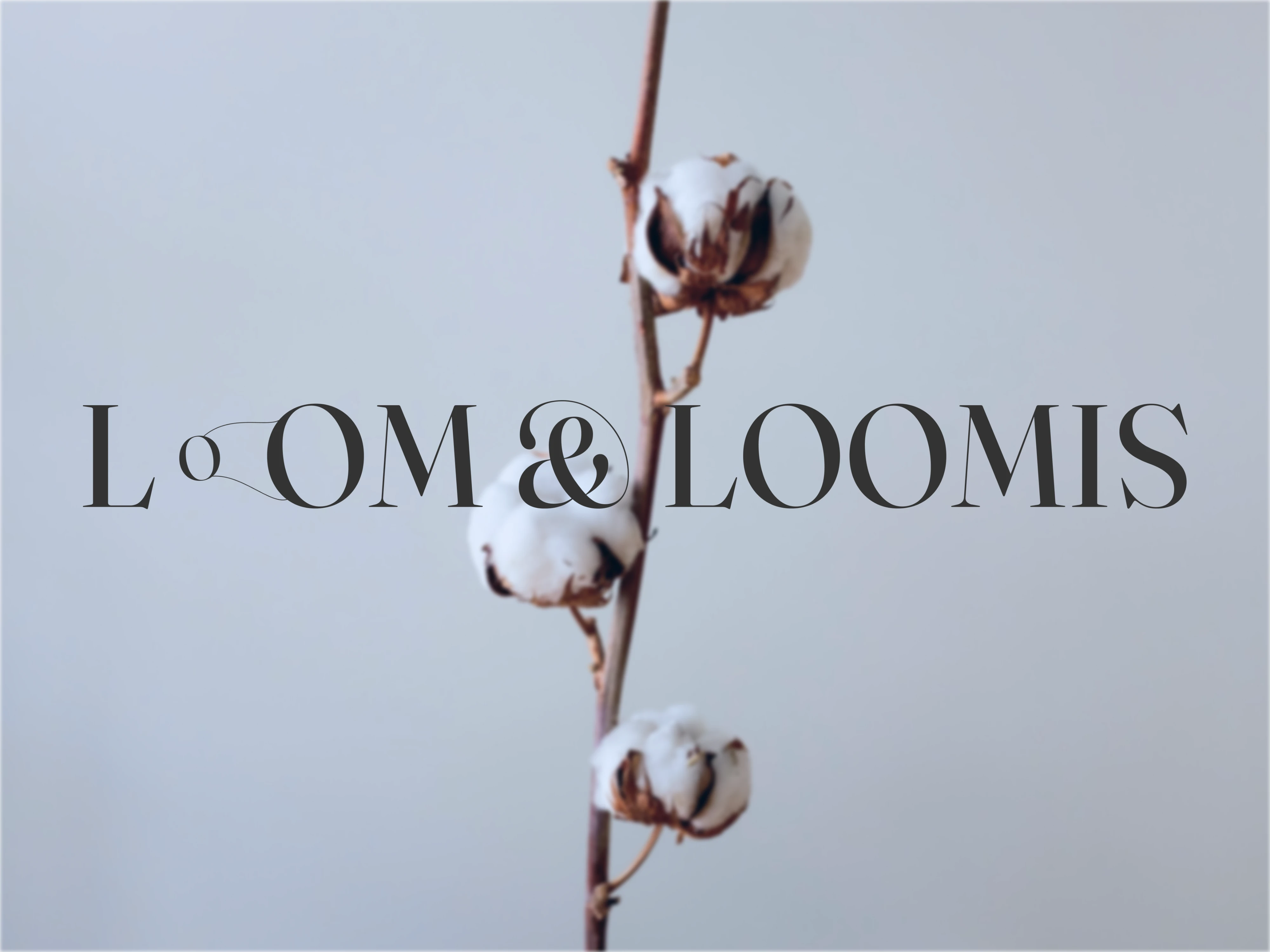
Loom & Loomis — A Premium Home Textile Brand Identity
Overview & Creative Vision
Loom & Loomis is a premium home textile and bedding startup specializing in organic bedding, bath linens, and elevated loungewear. At its core, the brand is grounded in the tactile reality of raw natural elements. It stands out in the market through an innovative, closed-loop bamboo and cotton blend that is completely organic, zero-waste, and exceptionally soft.
To separate Loom & Loomis from traditional fashion labels and mass-market lifestyle brands, the visual identity intentionally avoids generic apparel tropes. Instead, the design language focuses on quiet luxury, deliberate restraint, and the authentic beauty of raw textile manufacturing. This establishes a sensory presence that feels grounded, architectural, and timeless in the modern home.
Logos
Thinking Behind the Design
The Primary Wordmark
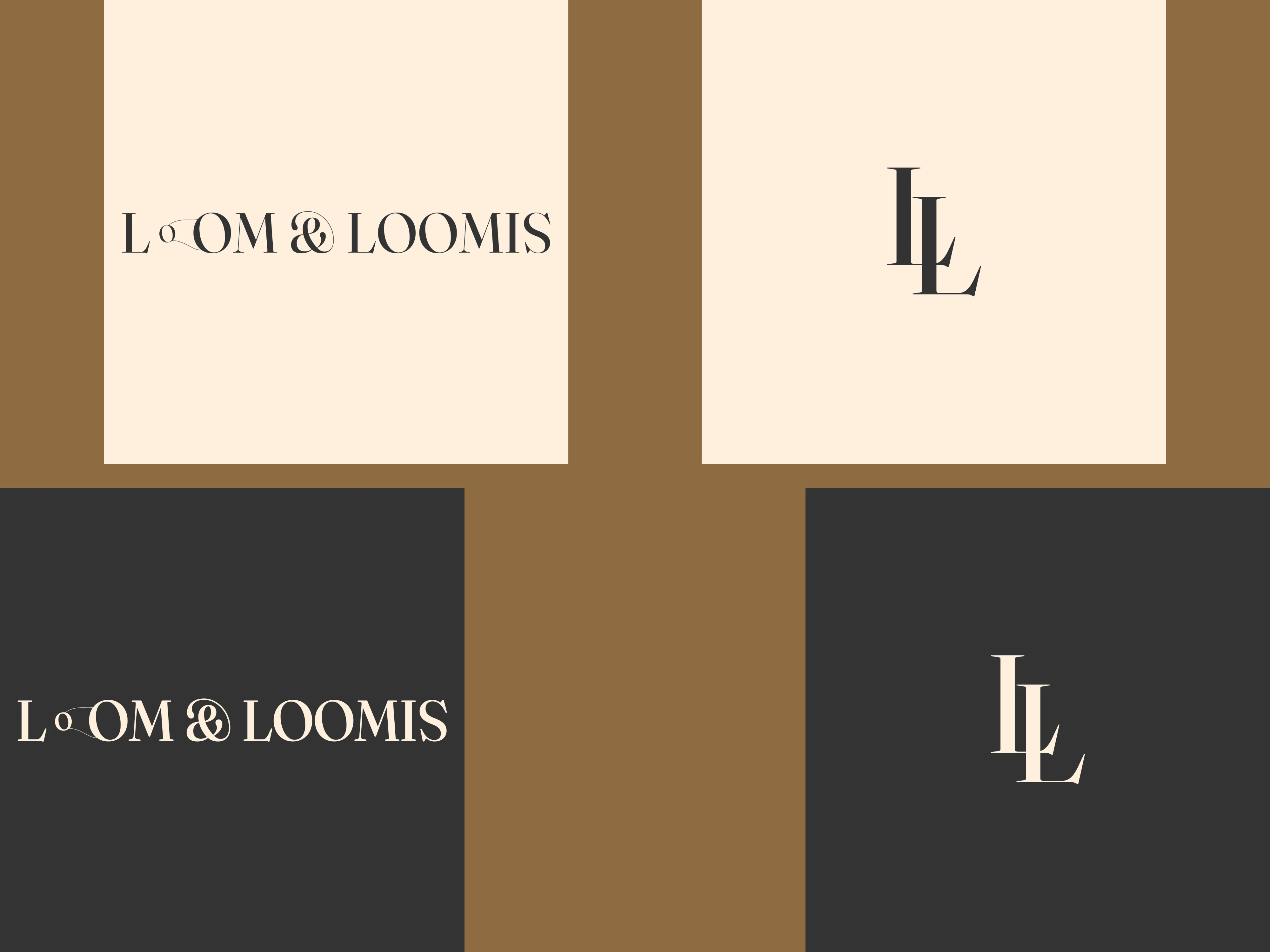
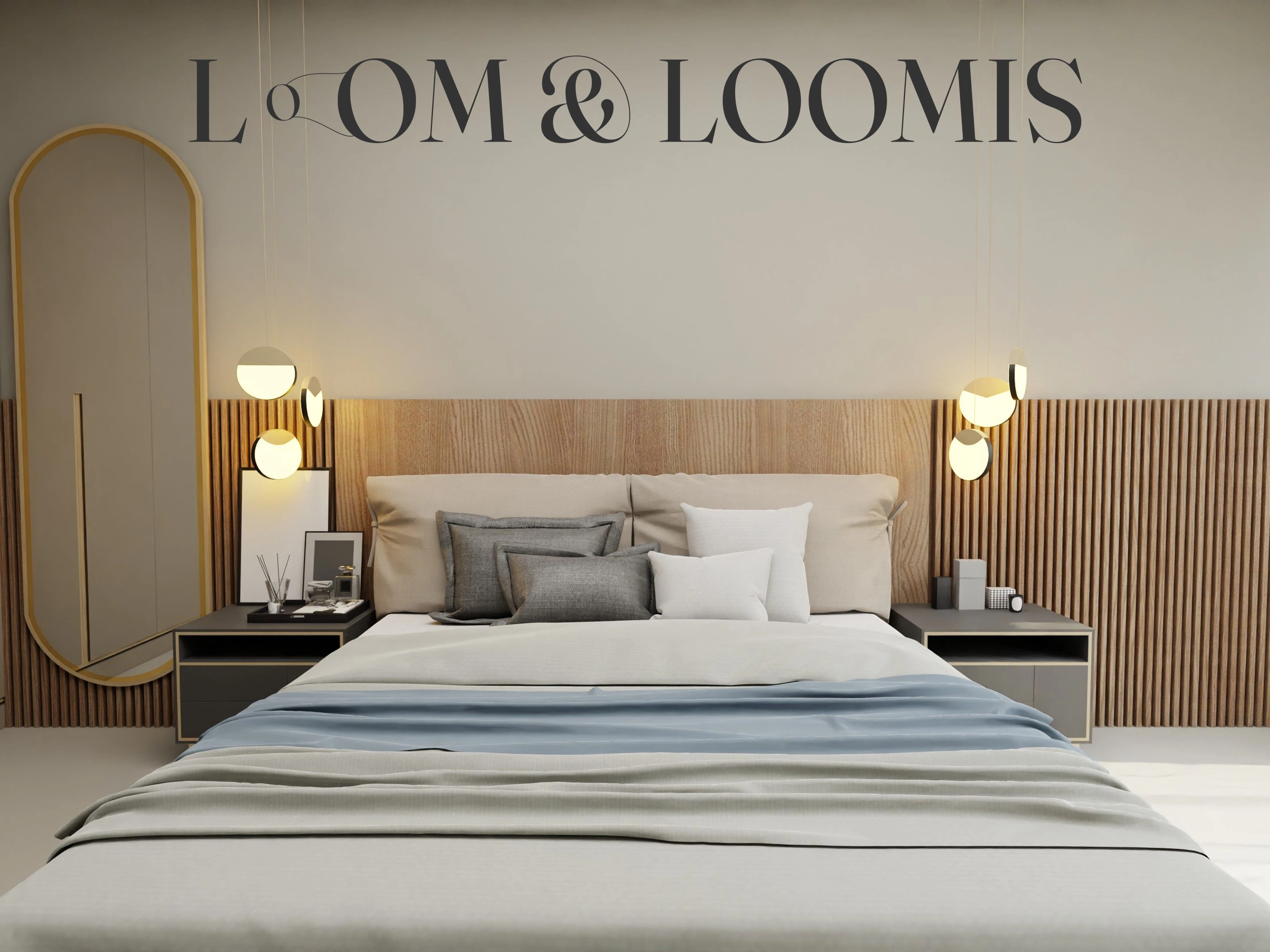
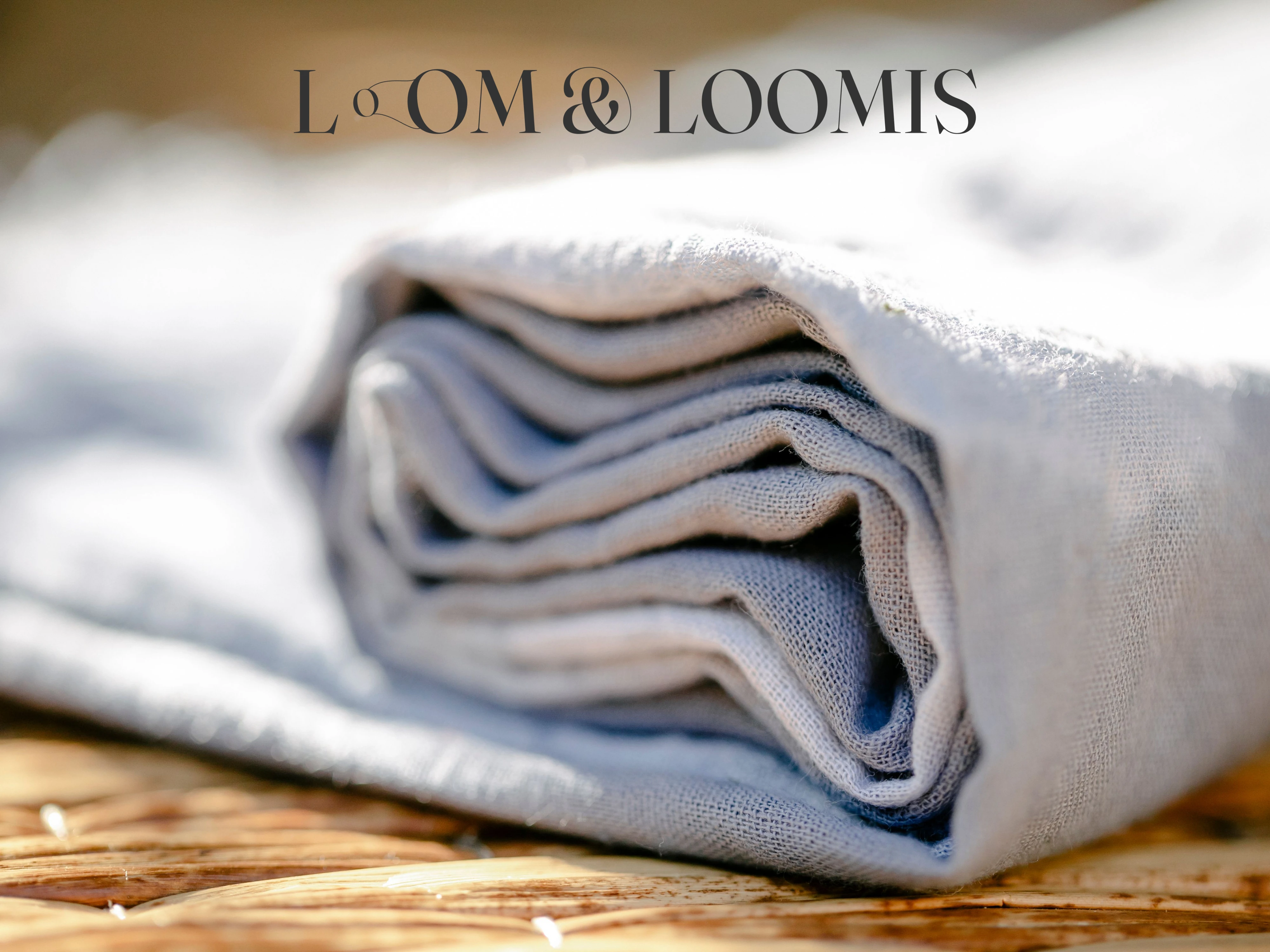
The custom letters 'O' in the word "loom" are transformed into a wheel loom process, where the thread is organically spinning around the wheels under gentle tension. This custom detail roots the brand in the tactile craft of weaving, giving Loom & Loomis a strong, core identity.
The Submark
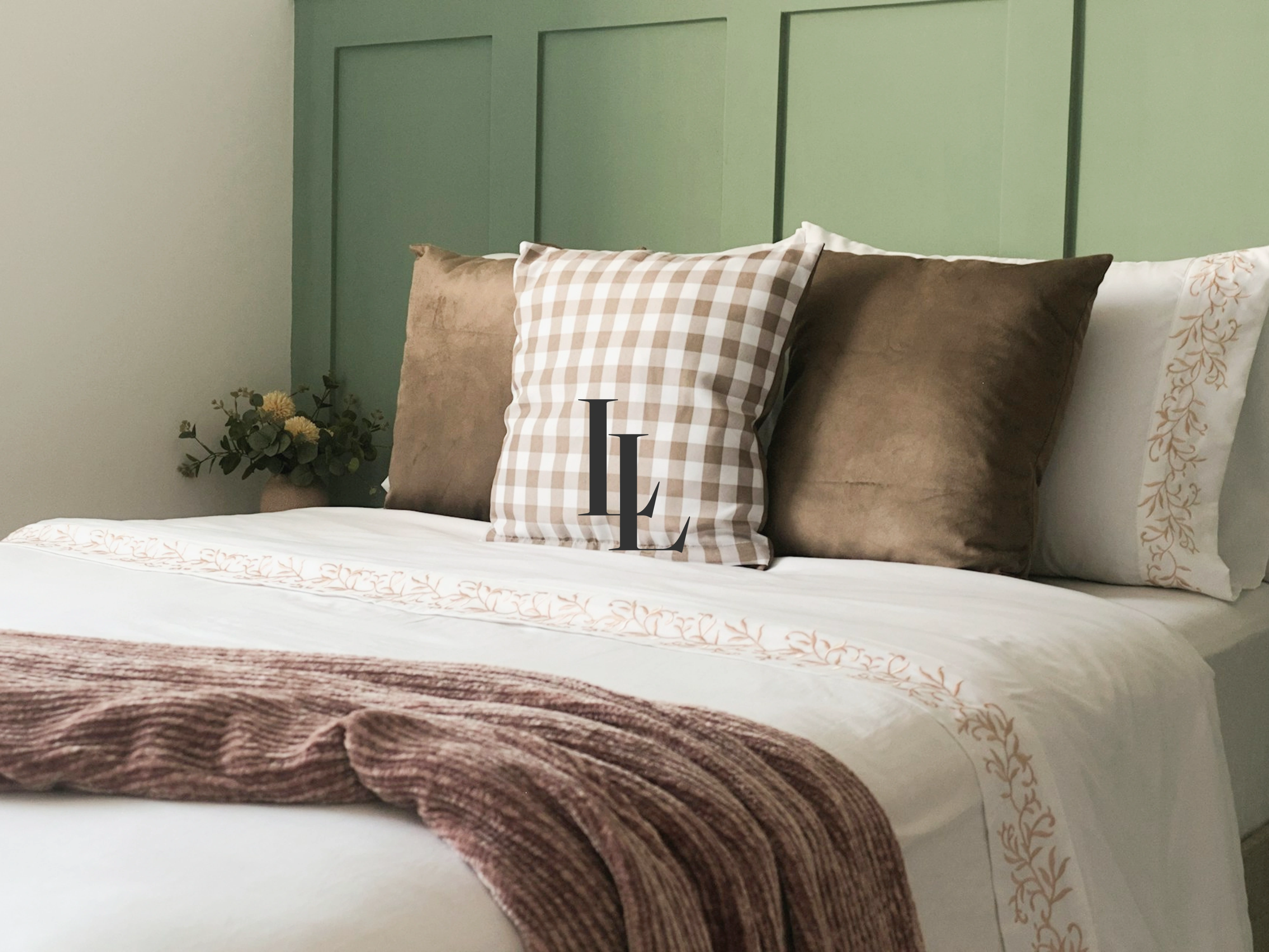
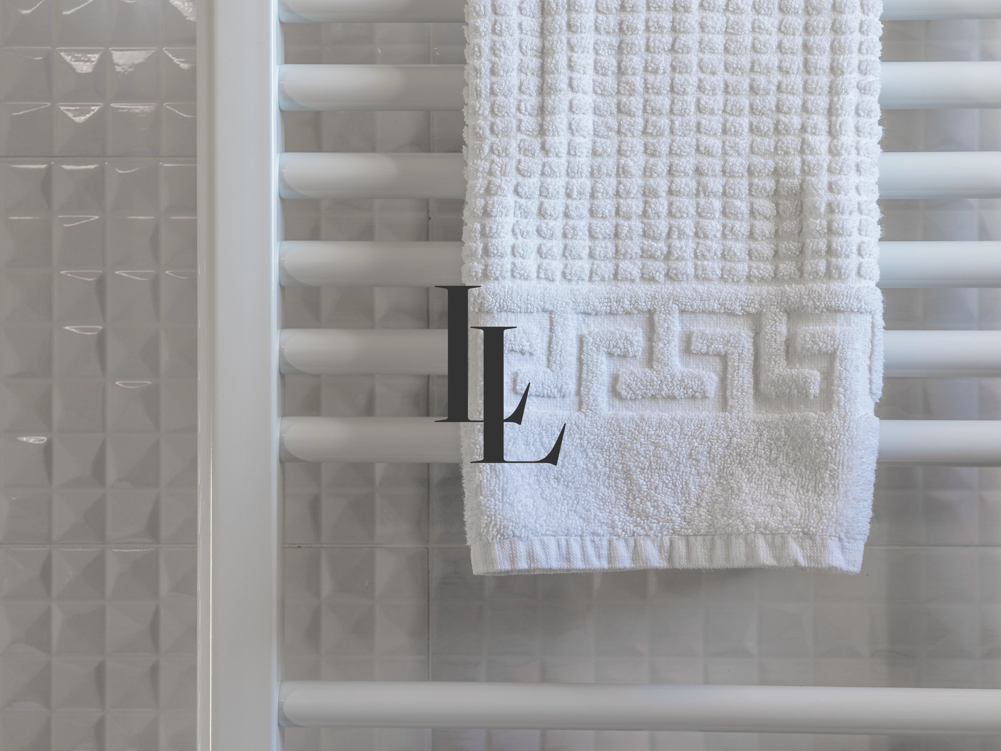
For the submark, I designed a clean, interlocking 'LL' monogram that looks incredibly premium. It features one core element that distinguishes Loom & Loomis from other home textile brands, which is the organic cotton blend. The interlocking 'LL' is highly intentional — the way the letters weave into each other directly mimics the brand’s core value of raw, blended, and high-quality sustainable textiles.
Typography
Typography Selection
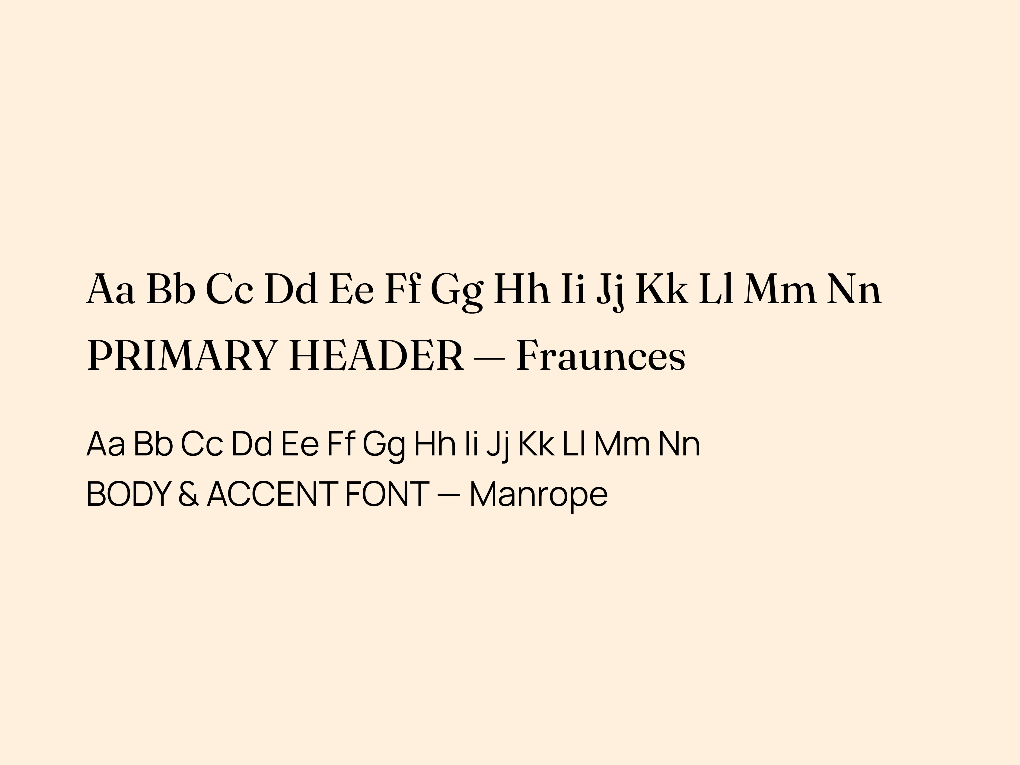
The font pairing perfectly bridges timeless heritage with a modern, digital-first touch.
For the headings, I selected Fraunces — An editorial, old-style serif typeface with expressive curves. It brings an upscale, sophisticated feel to headings, accentuating the crafted look of the brand. Paired with Manrope body font — A clean, geometric sans-serif font. It delivers absolute clarity, structural balance, and a modern edge for digital touchpoints, product descriptions, and care labels.
Color Palette
The Color Palette
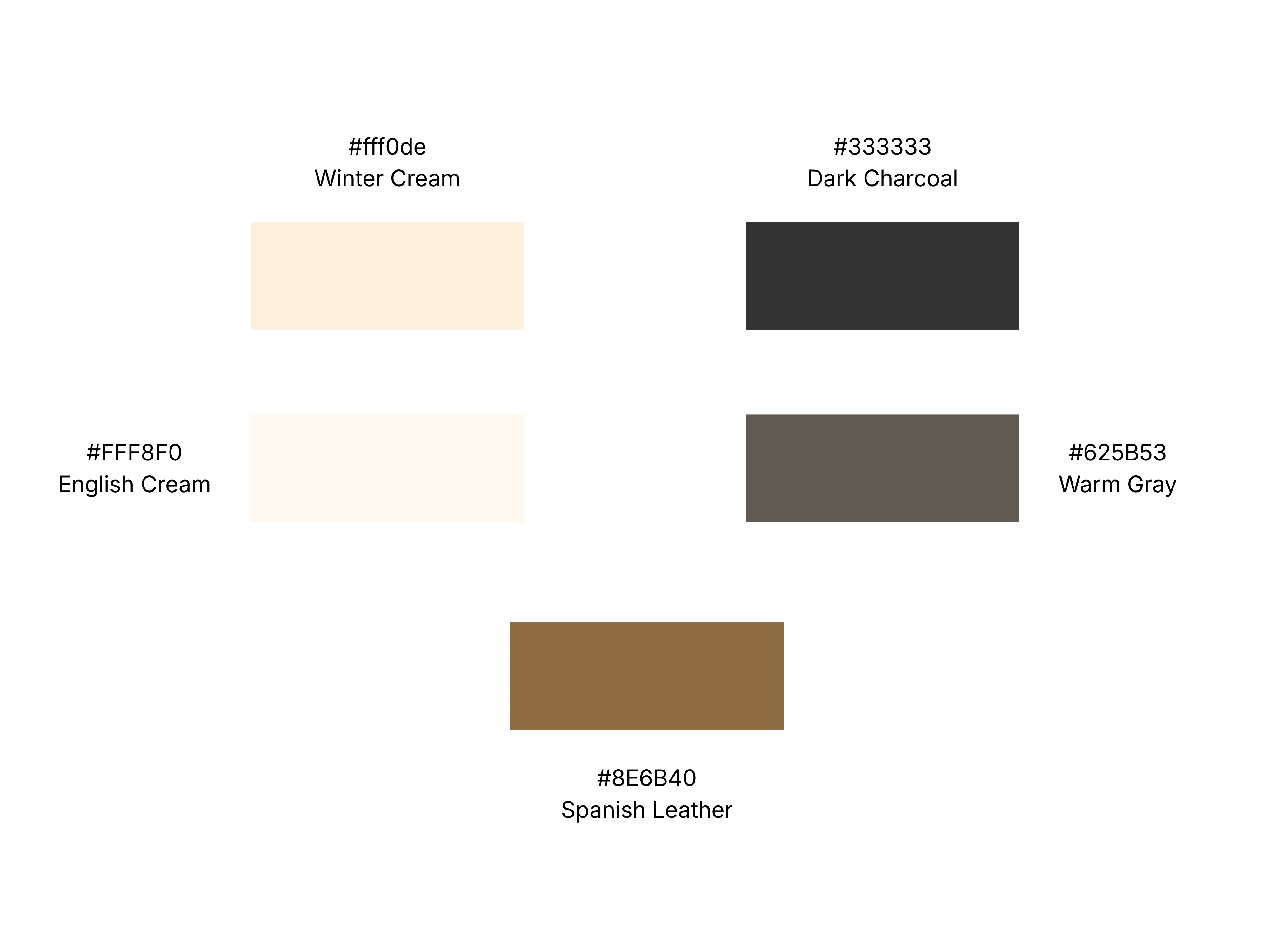
The color system is drawn directly from the tactile world of sustainable textiles and raw earth. Winter Cream (#fff0de) and English Cream (#FFF8F0) form a soft, organic foundation reminiscent of unbleached cotton and gentle bamboo fibers. Dark Charcoal (#333333) and Warm Gray (#625B53) provide grounded, high-contrast clarity for typography and digital interfaces, while Spanish Leather (#8E6B40)introduces an artisanal warmth inspired by traditional wooden loom structures and leather accents. Together, these quiet neutrals evoke an atmosphere of understated luxury, timeless comfort, and natural stillness in the modern home.
Real-World Context: The Collections
The Home & Bedding Collection
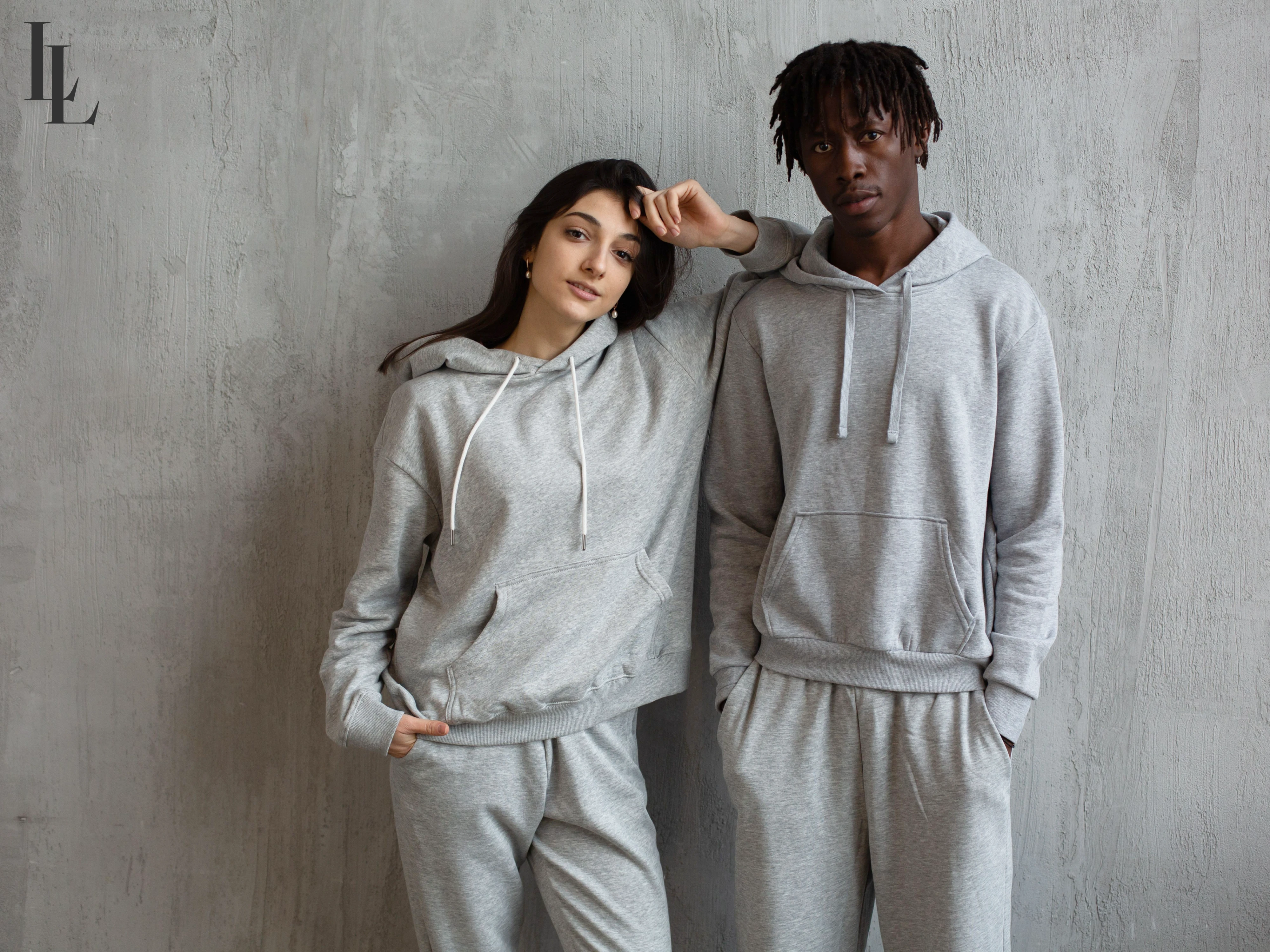
Bringing the tranquil aesthetic of premium boutique hotels into the private sanctuary of the home. The main wordmark acts as a statement of luxury, while the interlocking submark adds a subtle stamp of quality on fine fabric textures.
The Loungewear Collection
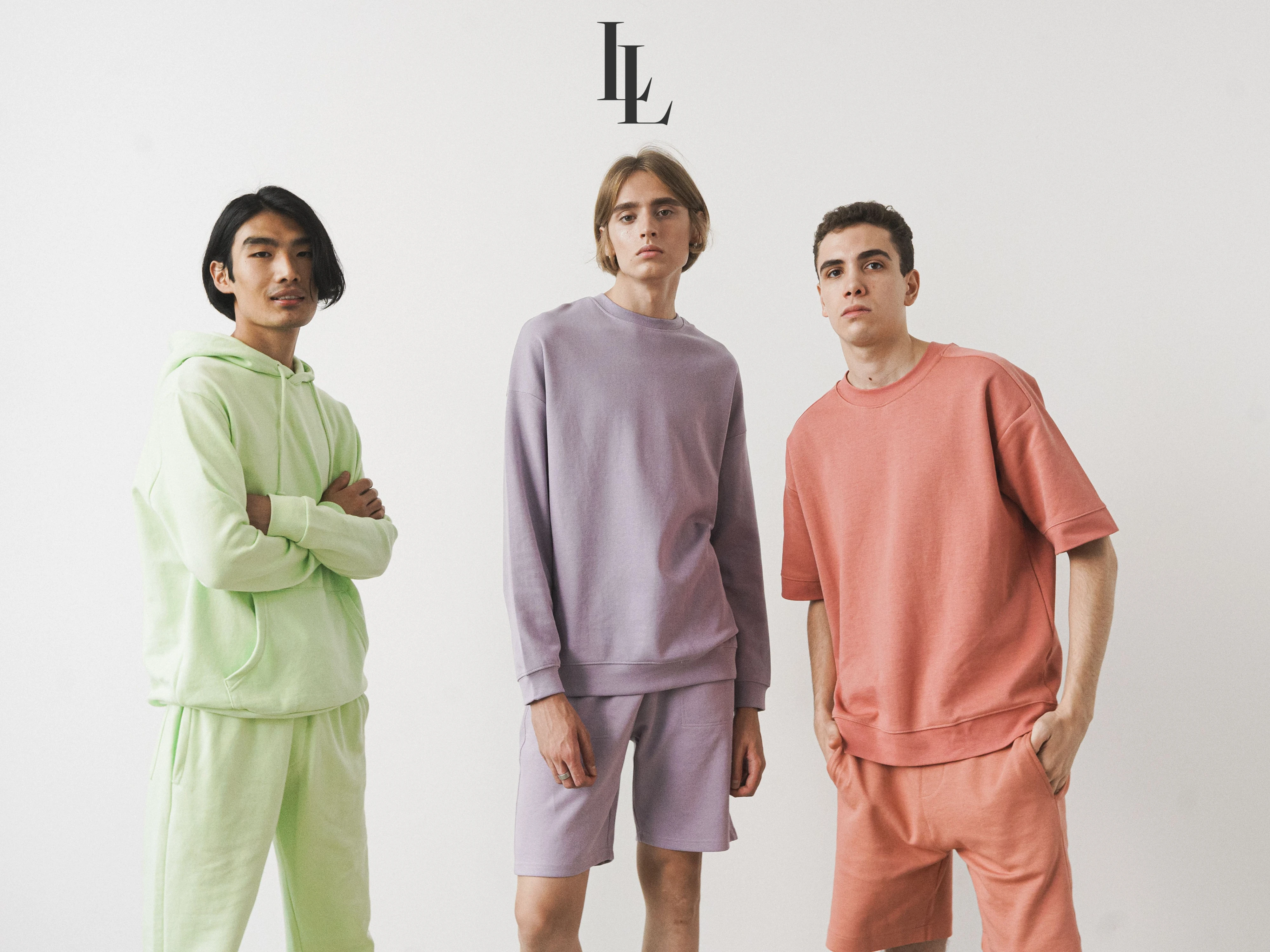
The Loungewear Collection — Crafted from the signature zero-waste bamboo and organic cotton blend. Designed for effortless comfort and slow living, where minimalism meets luxury through premium material selection.
Packaging & Tactile Detailing
The Unboxing System
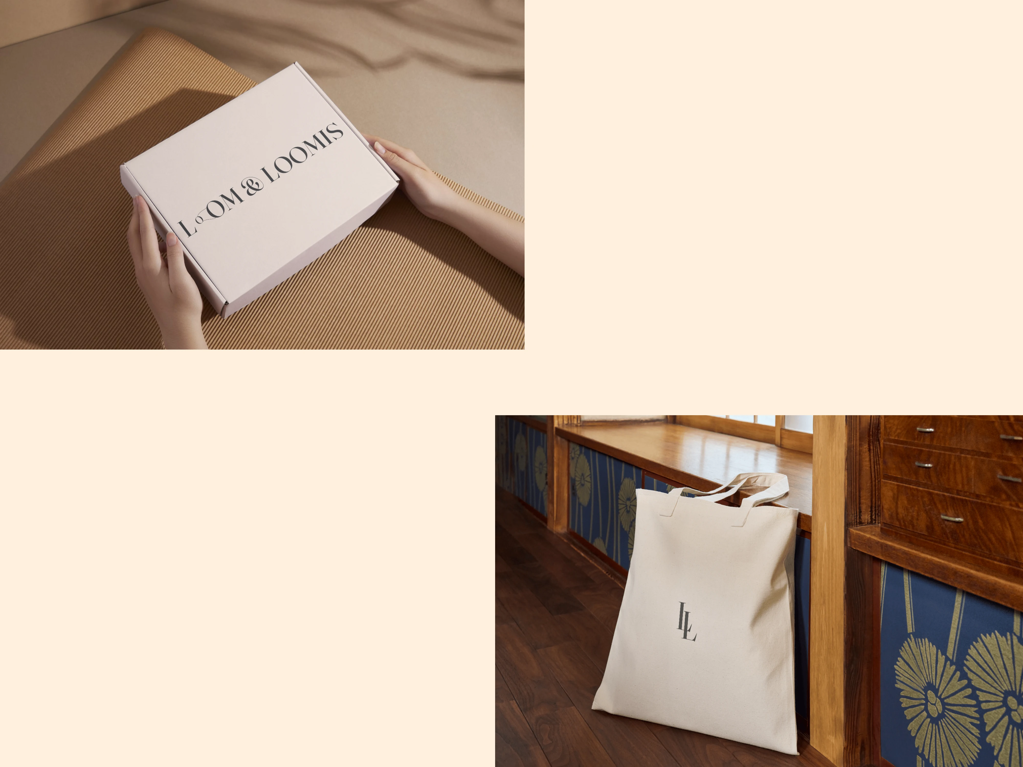
Luxury textiles require an intentional unboxing process. The identity utilizes a robust, minimalist shipping box stamped cleanly with the primary wordmark. For the interior packaging, a premium canvas fabric tote bag featuring the embroidered monogram houses the bedding, eliminating single-use plastics entirely.
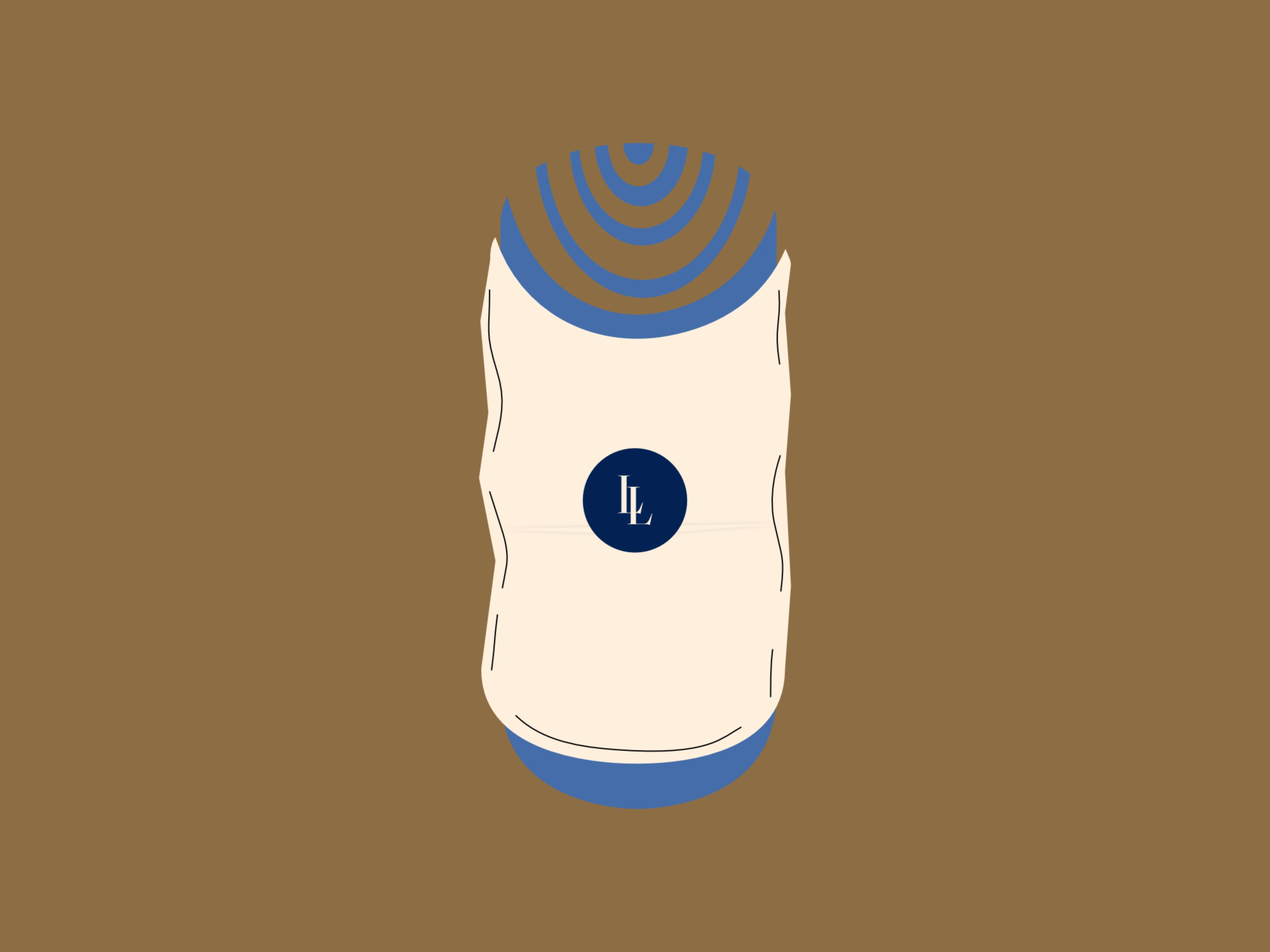
Product Wrapped in Tissue Paper with Sticker
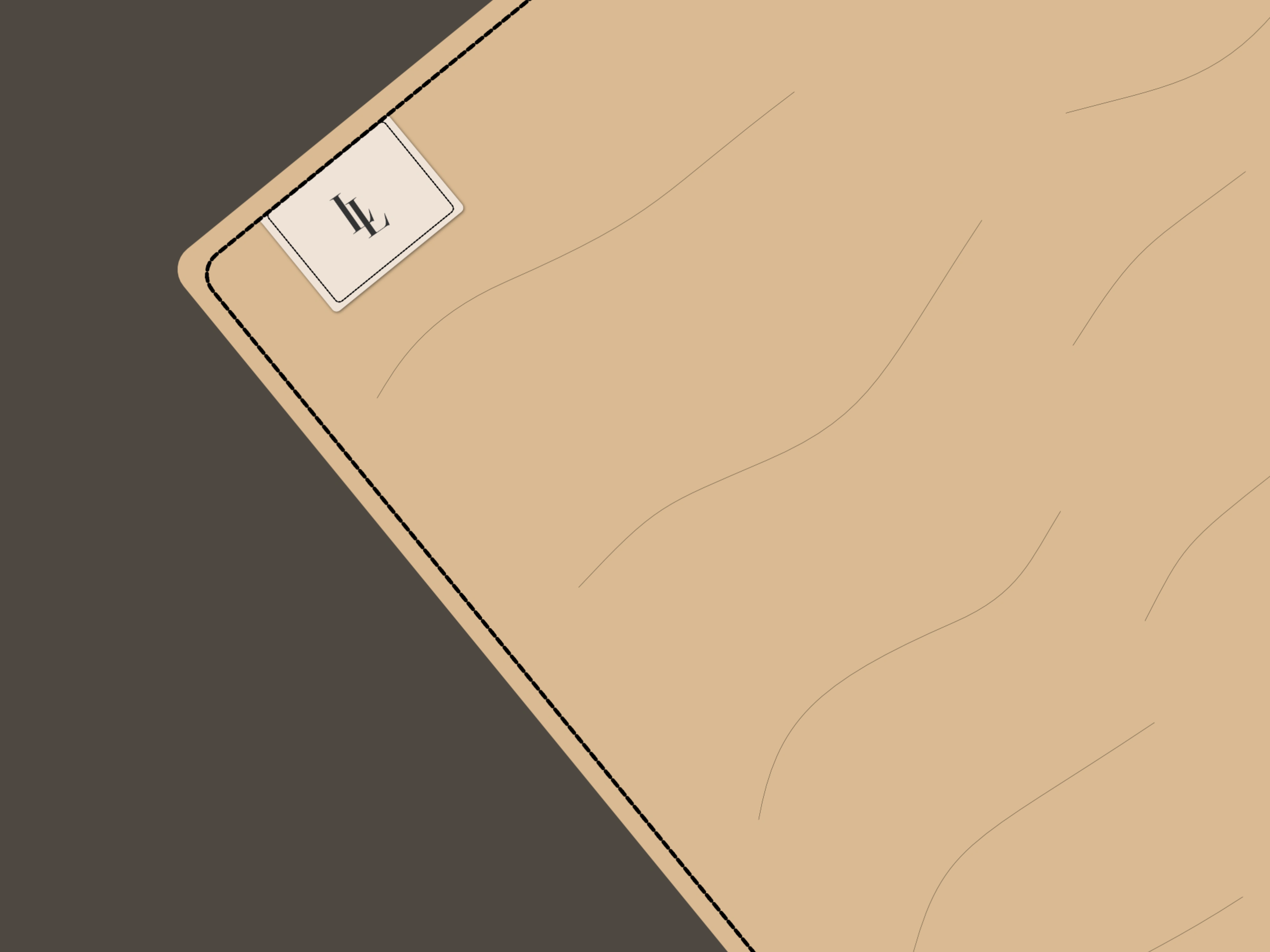
Woven Seam Label
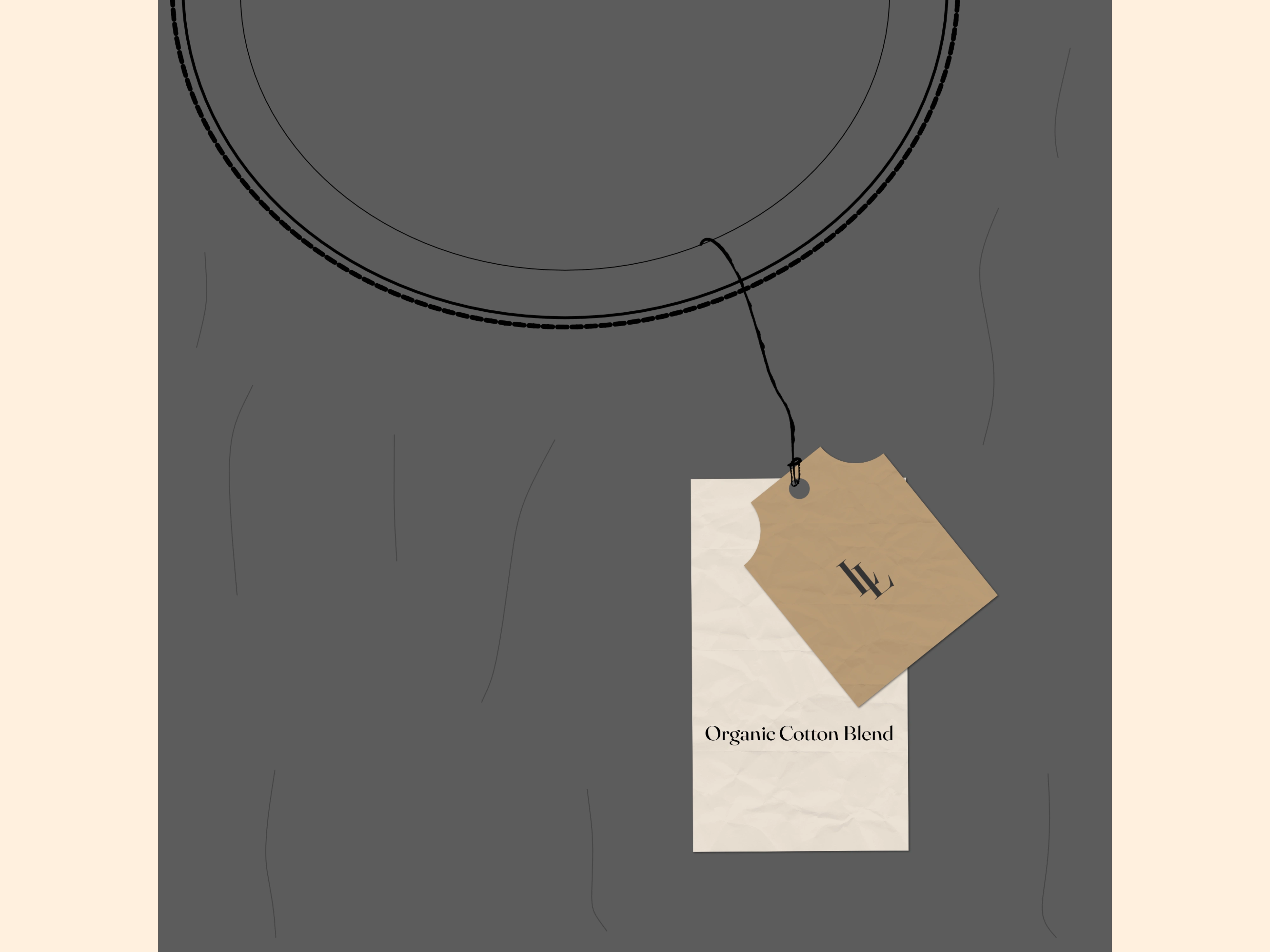
Dual-Material Product Hangtag
Custom Vector Product Details
To bring the visual narrative into physical production, I designed a suite of custom vector detailing assets that seamlessly showcase the brand’s identity.
This collection features a minimal, woven seam label that serves as a non-intrusive stamp of quality directly on the bedding's edge, alongside an abstract textile product illustration wrapped in tissue paper with monogram. Finally, a dual-material product hangtag combines a raw cardboard accent with a crisp linen card to tell the brand's organic story through precise, elegant typography.
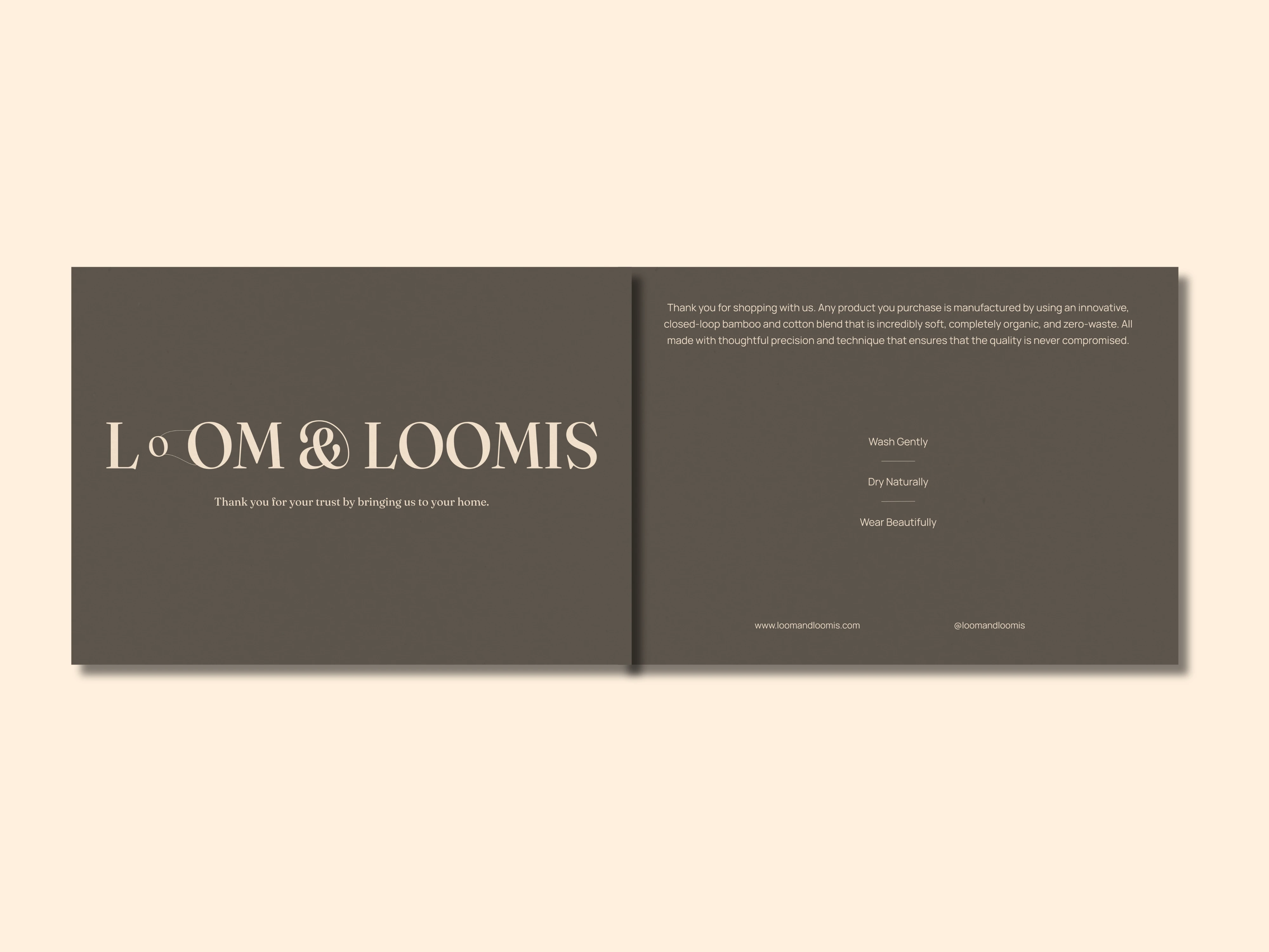
Thank You Card
Post-Purchase Care
Thank You Card Insert
This touchpoint is a folded post-purchase insert card included inside every shipping box. It welcomes the consumer to the family and outlines proper washing instructions to ensure the longevity of the artisanal product.
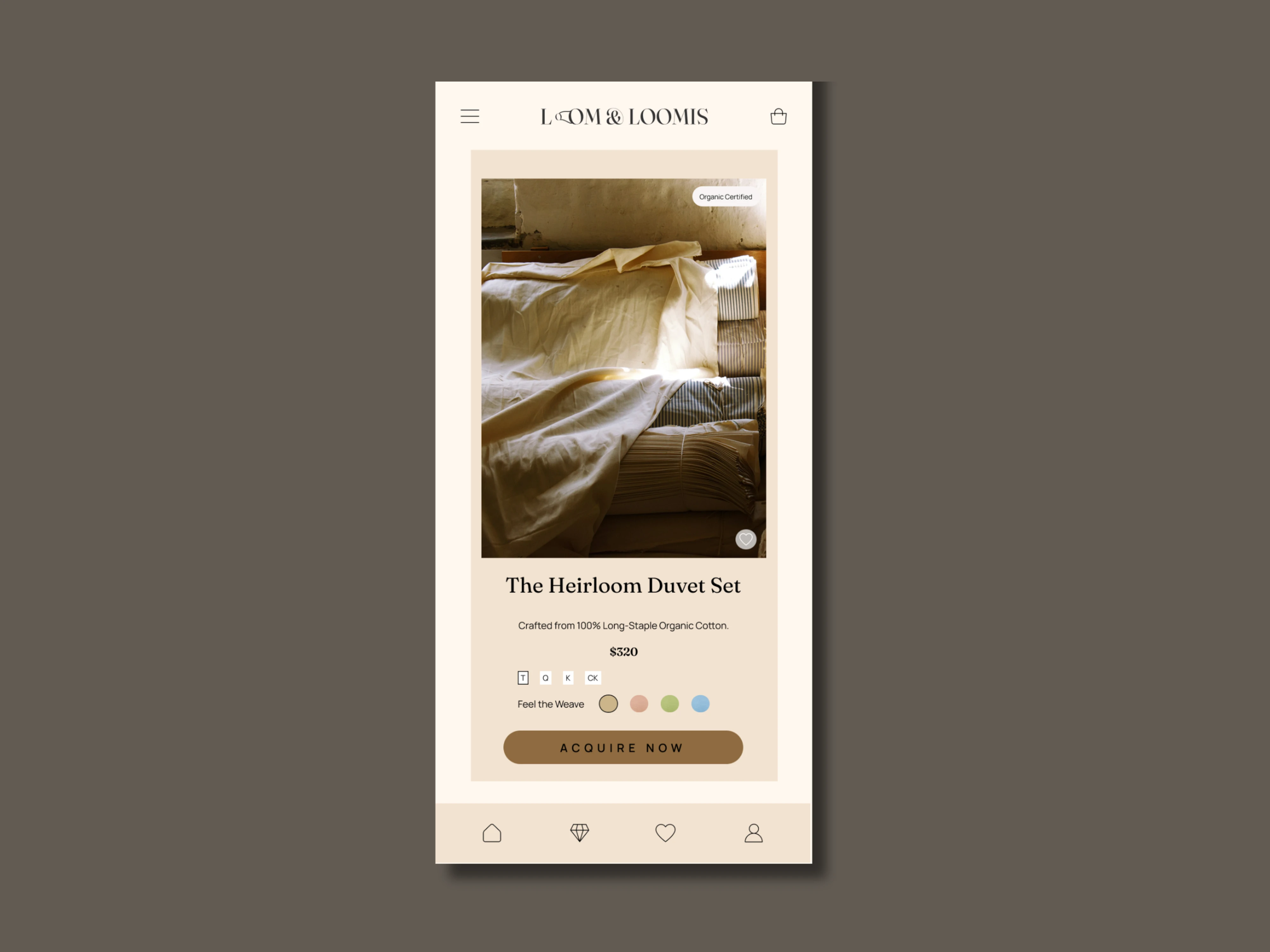
Mobile UI
Website UI
Digital Touchpoints & E-Commerce
Mobile Experience
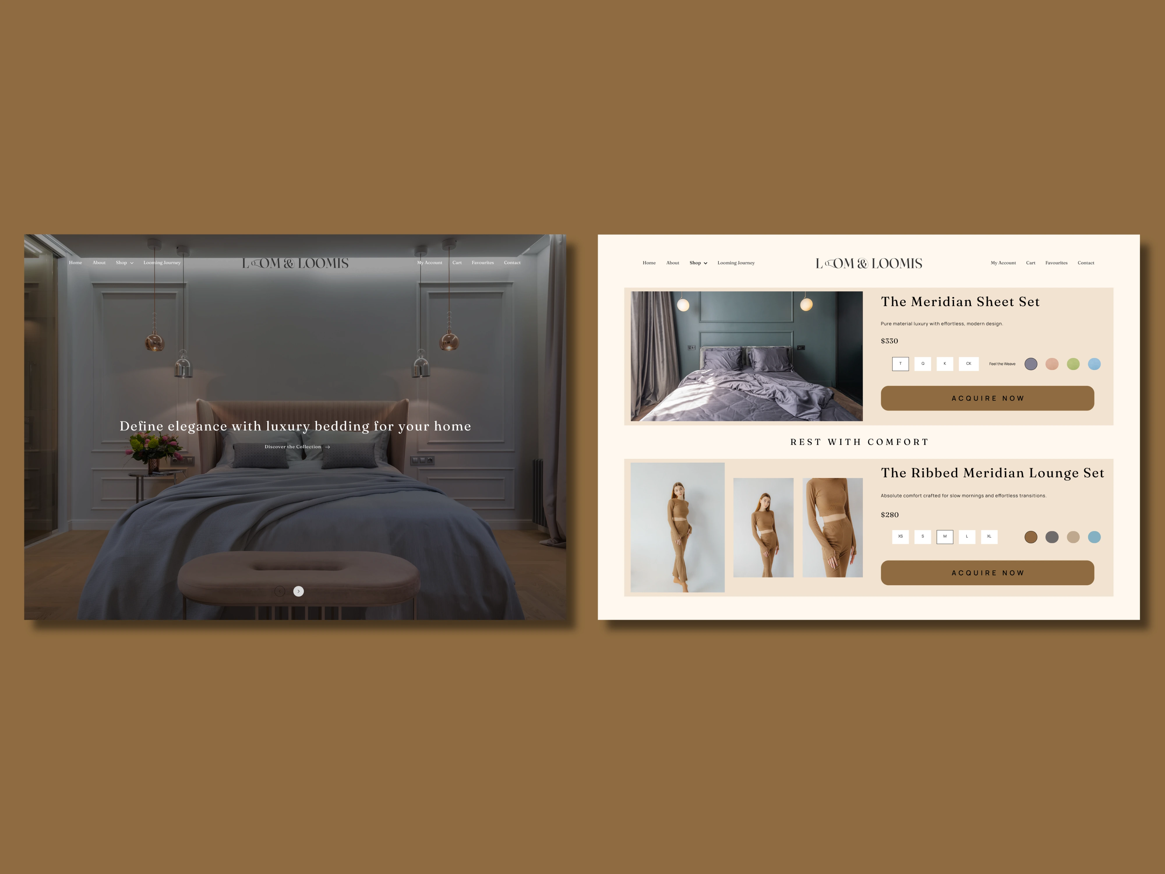
The mobile interface prioritizes a clean, layout-driven design that enhances user interaction. Using a soft, tactile background instead of a clinical white screen makes the digital shopping experience feel warm and aligned with physical home comfort.
Desktop E-Commerce Interface
The web experience balances full-bleed editorial imagery with highly legible typography. Clear spacing, minimalist product descriptions, and custom call-to-action buttons frame the website as a high-end digital flagship boutique rather than a standard commercial storefront.
Business Card
Premium Business Cards
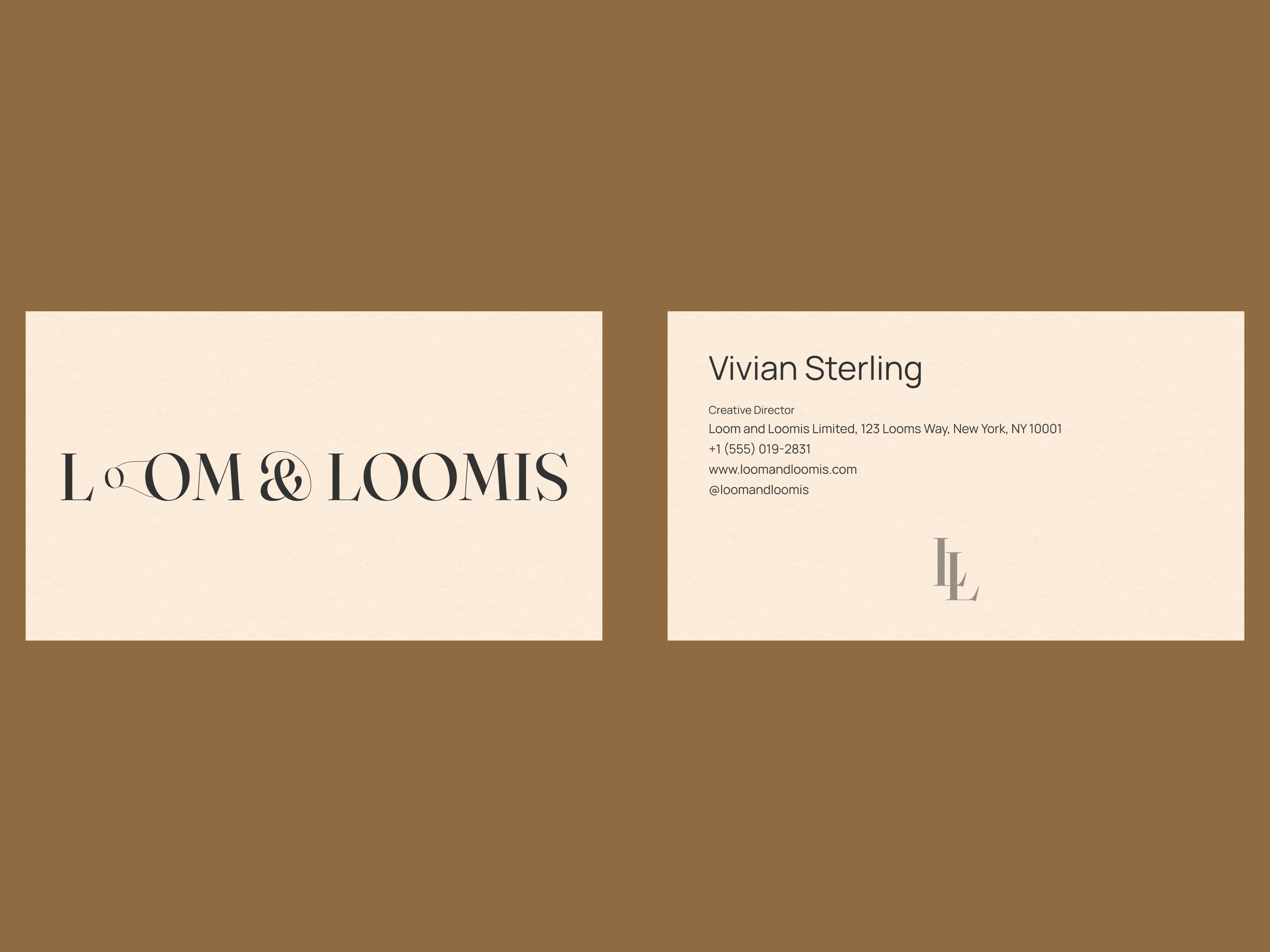
As the definitive close to the presentation, the corporate business cards demonstrate how the identity scales down to tactile stationery. The front features a clean, beautifully balanced execution of the custom 'loom-and-thread' wordmark, while the back cleanly balances contact details with a minimalist placement of the interlocking LL monogram against a signature English Cream background.
Want an identity built with this much of a premium feel for your brand?
Let's Collaborate! I am available for hire.
Message me directly to discuss more.
Thanks for watching!
Like this project
Posted Oct 24, 2026
Designed premium brand identity for Loom & Loomis, emphasizing organic luxury.