Building Yakuza Tea Place's Brand Identity
Bohdan Andriyushchenko
Yakuza Tea Place — a brand built like a clan
A tea house in Dnipro, built from one strategic idea: a place where people don't visit — they belong. Identity direction, packaging, signage, and an editorial language where every tea becomes a named, photographed, bilingual object. Sept 2024 – ongoing.
The strategy first
Everything here came from one idea, not one image. The city outside is industrial, fast, grey. Inside is the opposite: slow Chinese tea, low music, hookah, time that forgets itself. The brand had to live on that exact contrast — and the strategy that resolved it became the whole system.
The strategy was a single sentence: a tea house that works like a clan. Not customers — members. People who know each other, who meet beyond these walls. Every design decision after that traces back to this line. That's how I work — the concept is set in strategy before a single mark is drawn.
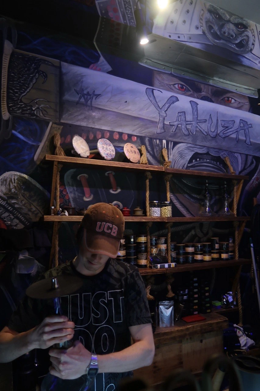
The cultural code: not crime — clan
"Yakuza" here has nothing to do with gangster iconography. It names the structure of a clan: family, belonging, an inner circle. The regulars train together, go to the spa, drive out to the river. The place doesn't have a customer base; it has a family.
So the brief I set myself was: translate the form of a clan into the brand of a place where people become each other's people.
Choosing the mark
I worked through seven symbolic directions — Tiger, Tiger Claw, Koi, Lion/Dog, Chrysanthemum, Gingko, Hanya — judging each on meaning and readability, not taste. Tiger carried the right "against the current" symbolism but wouldn't survive at social scale; Koi meant prosperity but a neighbour already owned it; Chrysanthemum and Gingko risked reading as temple symbolism.
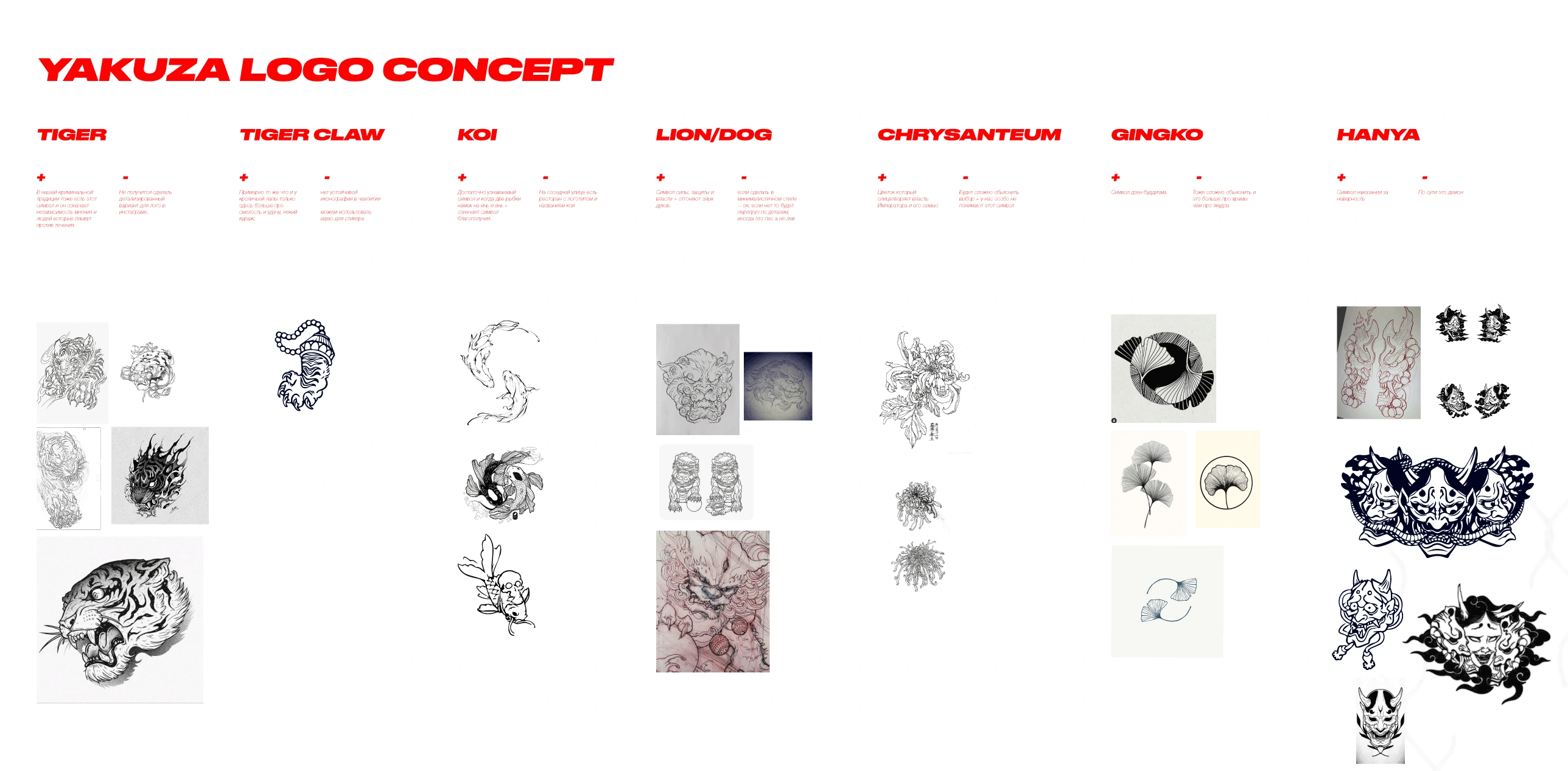
The resolution was to stop hunting a symbol and commit to a format. A kamon — the Japanese family crest — is literally the visual grammar of a clan, so I sourced an existing, commercially-licensed kamon on a gingko/wave motif and made it the brand's seal. Held inside a kamon, the gingko stops reading as religion and starts reading as identity. My work here was the strategic call and the integration — choosing the right inherited sign and building a system around it — not illustrating the crest.
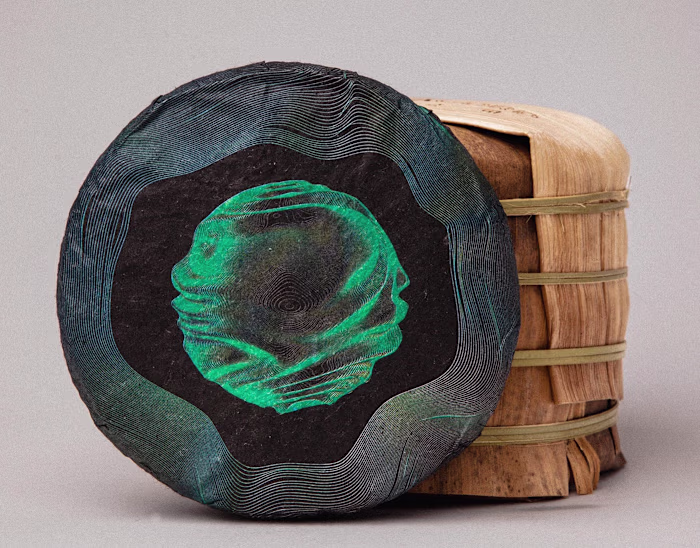
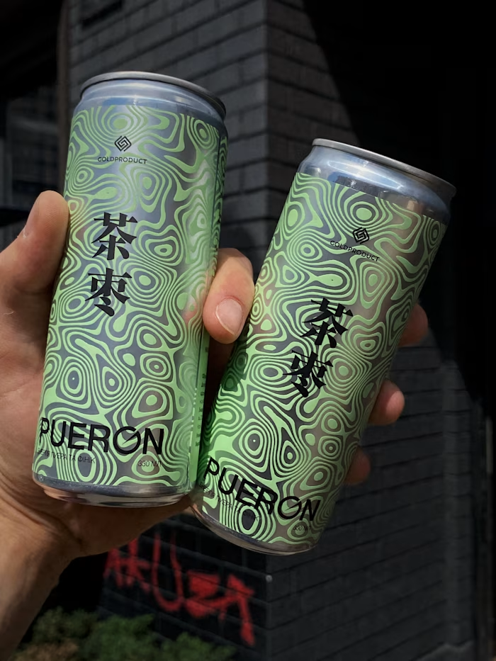
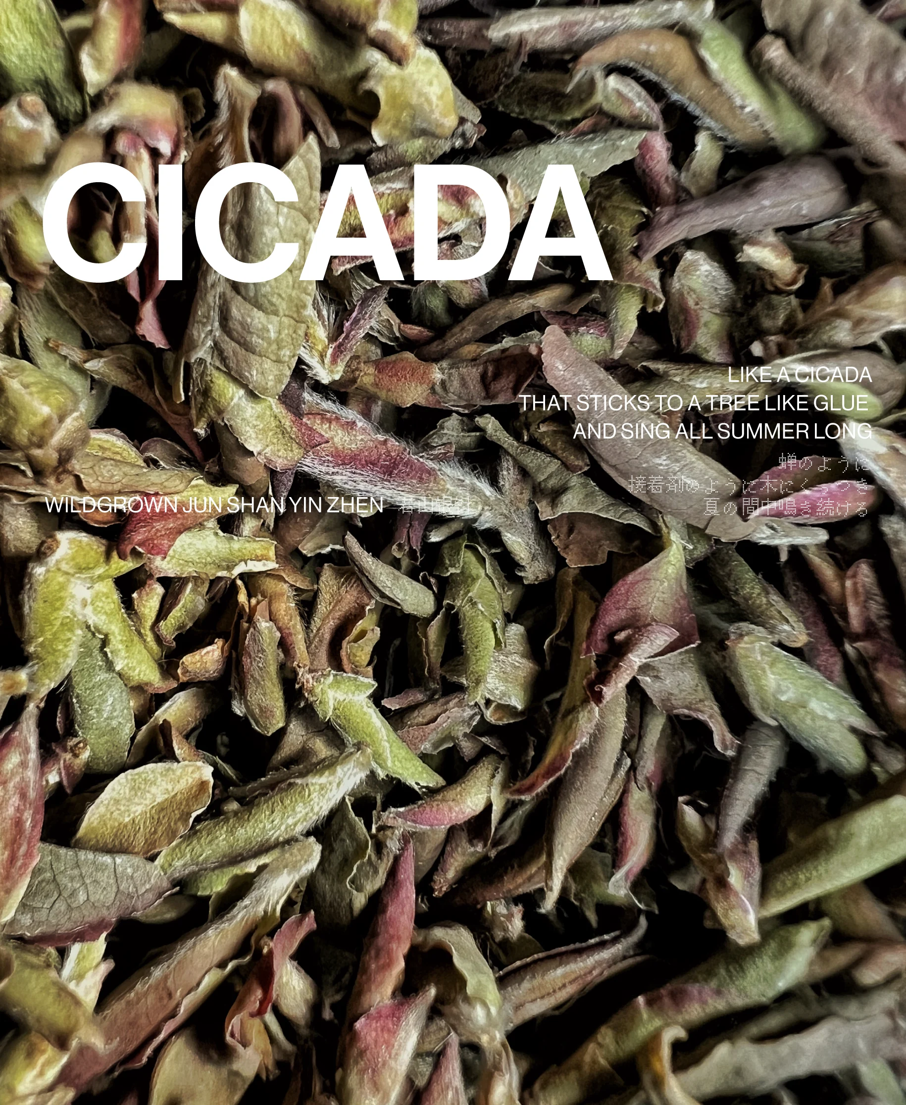
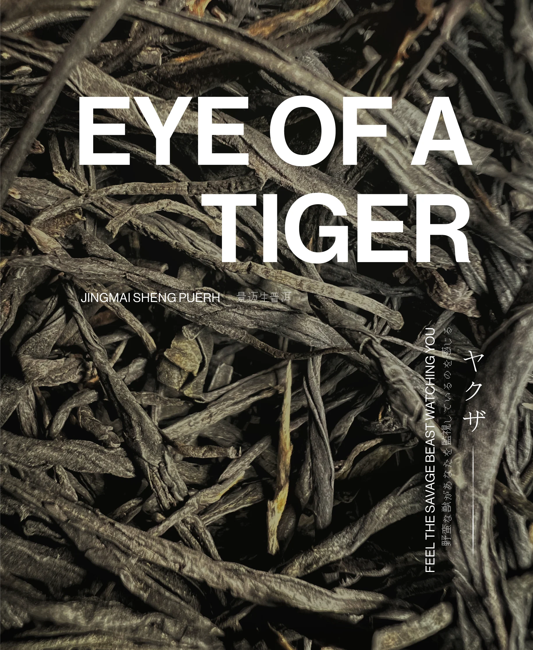
The teas become a language
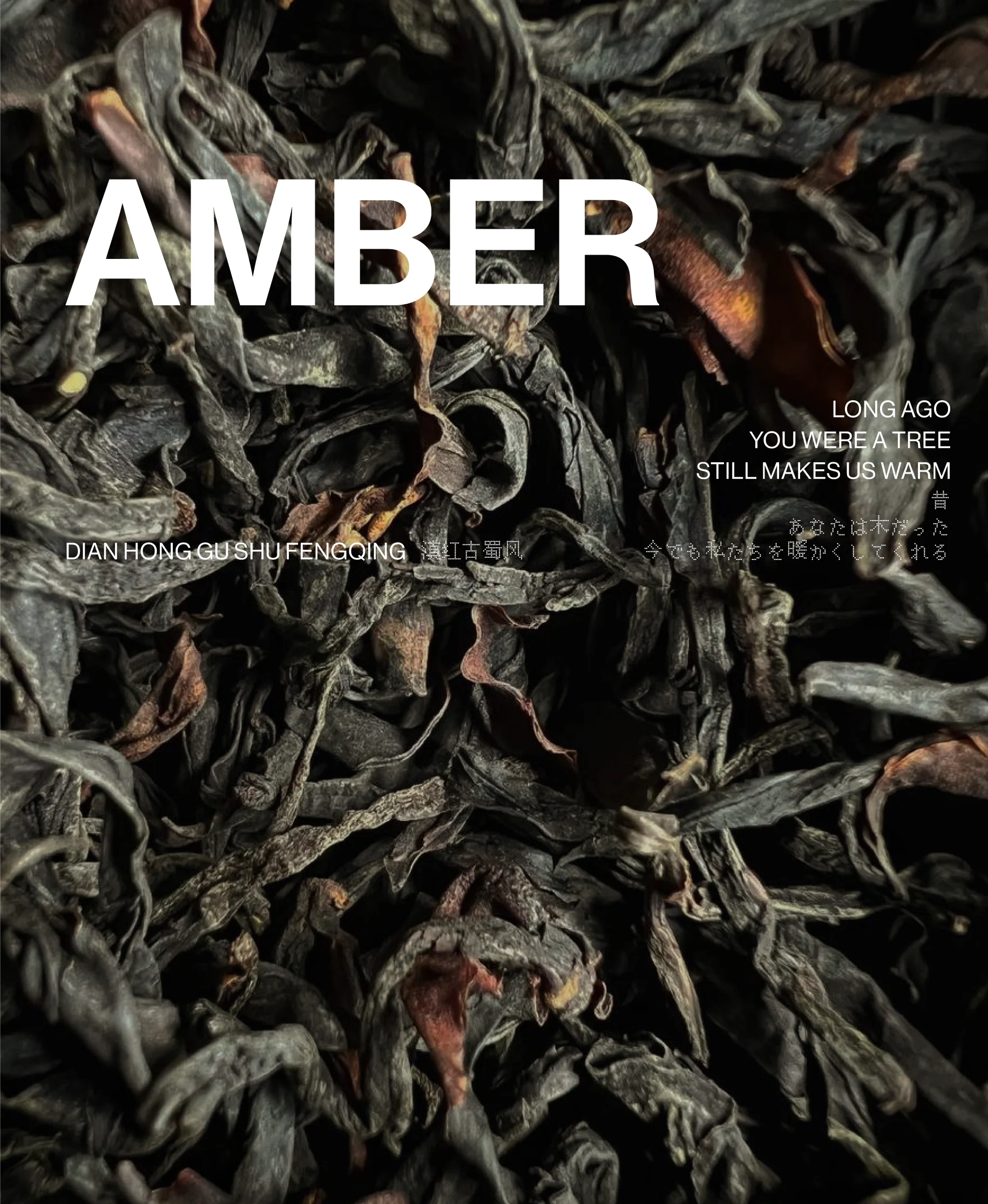
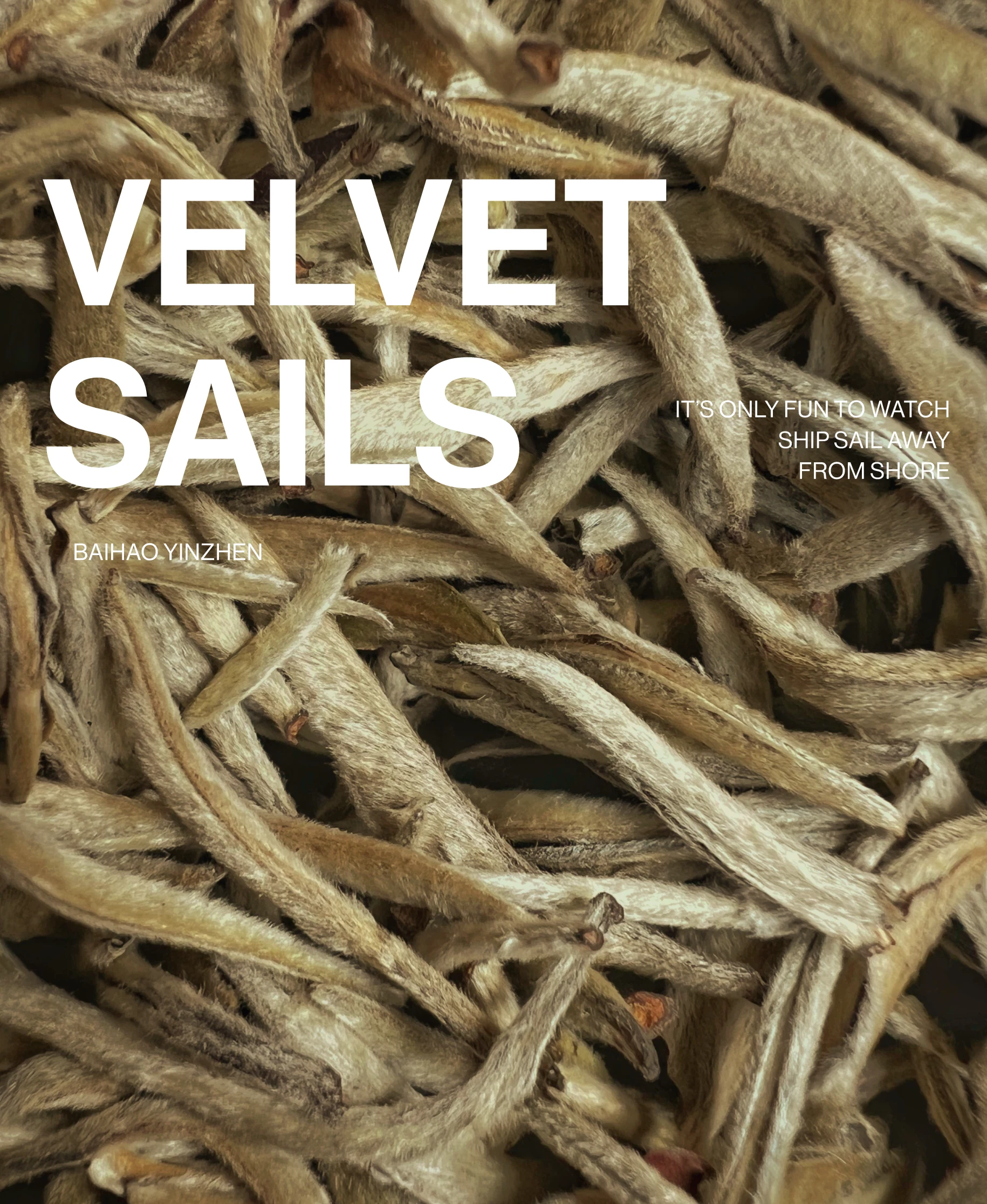
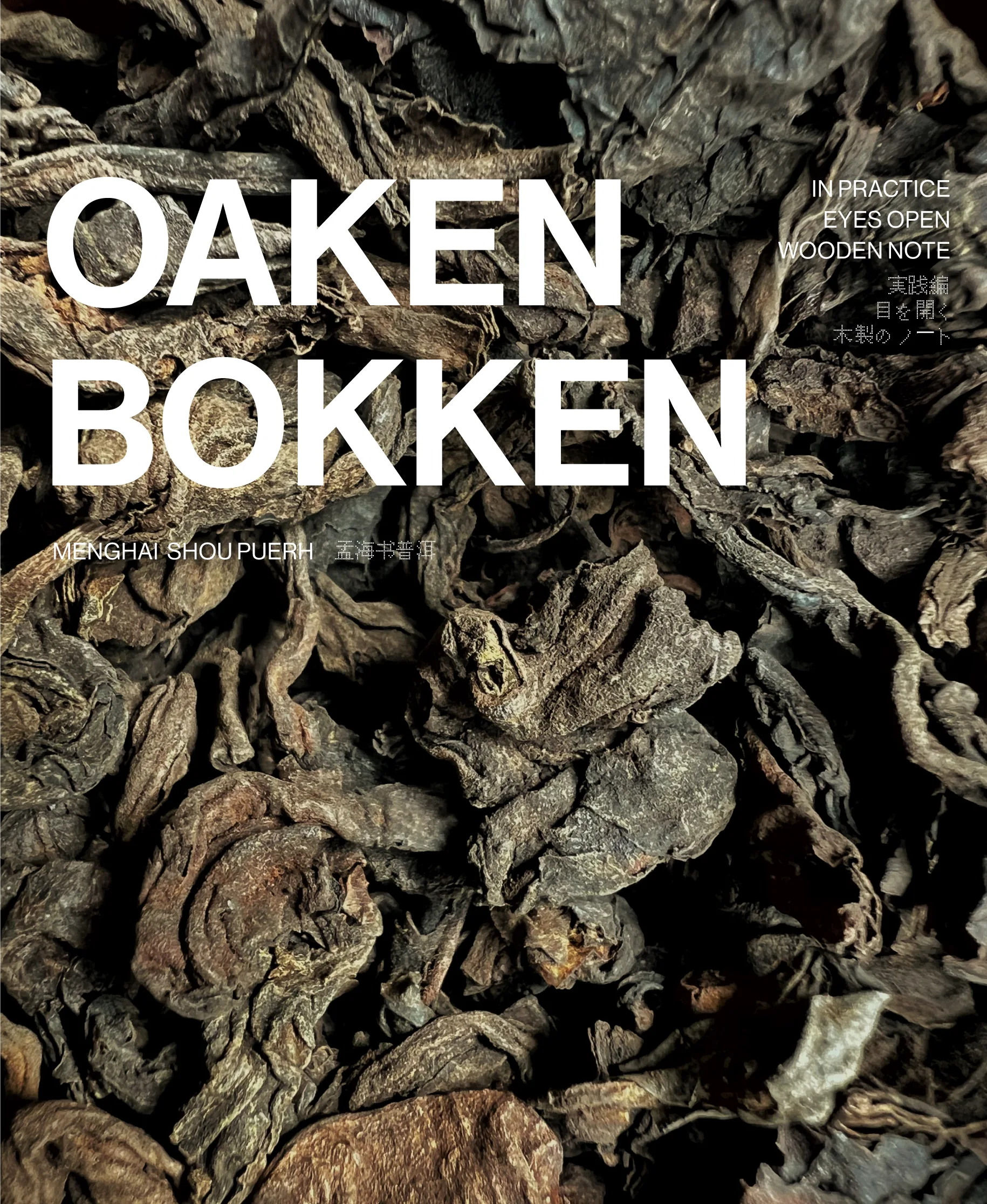
This is the heart of the brand, and the part I authored end to end — photography, retouching, naming, and the poetry. The social feed isn't a menu. It's an editorial system where every tea is rebuilt as a named object.
Each release takes a real Chinese varietal and renames it into something you can feel:
CICADA — Wildgrown Jun Shan Yin Zhen
VELVET SAILS — Baihao Yinzhen
HEATWAVE HONEY — Dian Hong Sun Zhen
AMBER — Dian Hong Gu Shu Fengqing
EYE OF A TIGER — Jingmai Sheng Puerh
OAKEN BOKEN — Menghai Shou Puerh
Each gets a three-line poem in both English and Japanese, set over my own macro photography of the dry leaf. A "white tea" becomes a feeling; the inner-circle world of the clan extends into language. The whole brand voice carries in one move. (EYE OF A TIGER even pulls the Tiger direction I'd set aside for the crest back into the copy — nothing in the system is wasted.)

The system
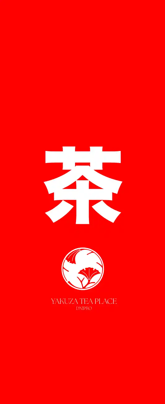
Typography works on two axes. A refined serif carries the wordmark — heritage, stillness, tea. A pixel/bitmap face carries the Japanese lines and product names — digital, urban, young. A bold 茶 typeface anchors everything as the hero character. Three registers, one balance: clan and contemporary, held in tension on purpose. That balance — young and in-motion without fighting the Japanese aesthetic — was the brief for every layout.
Palette runs two poles. Vermilion red for energy and the Japanese code; deep tea green for calm. The colour system is the strategy — energetic, but slow.
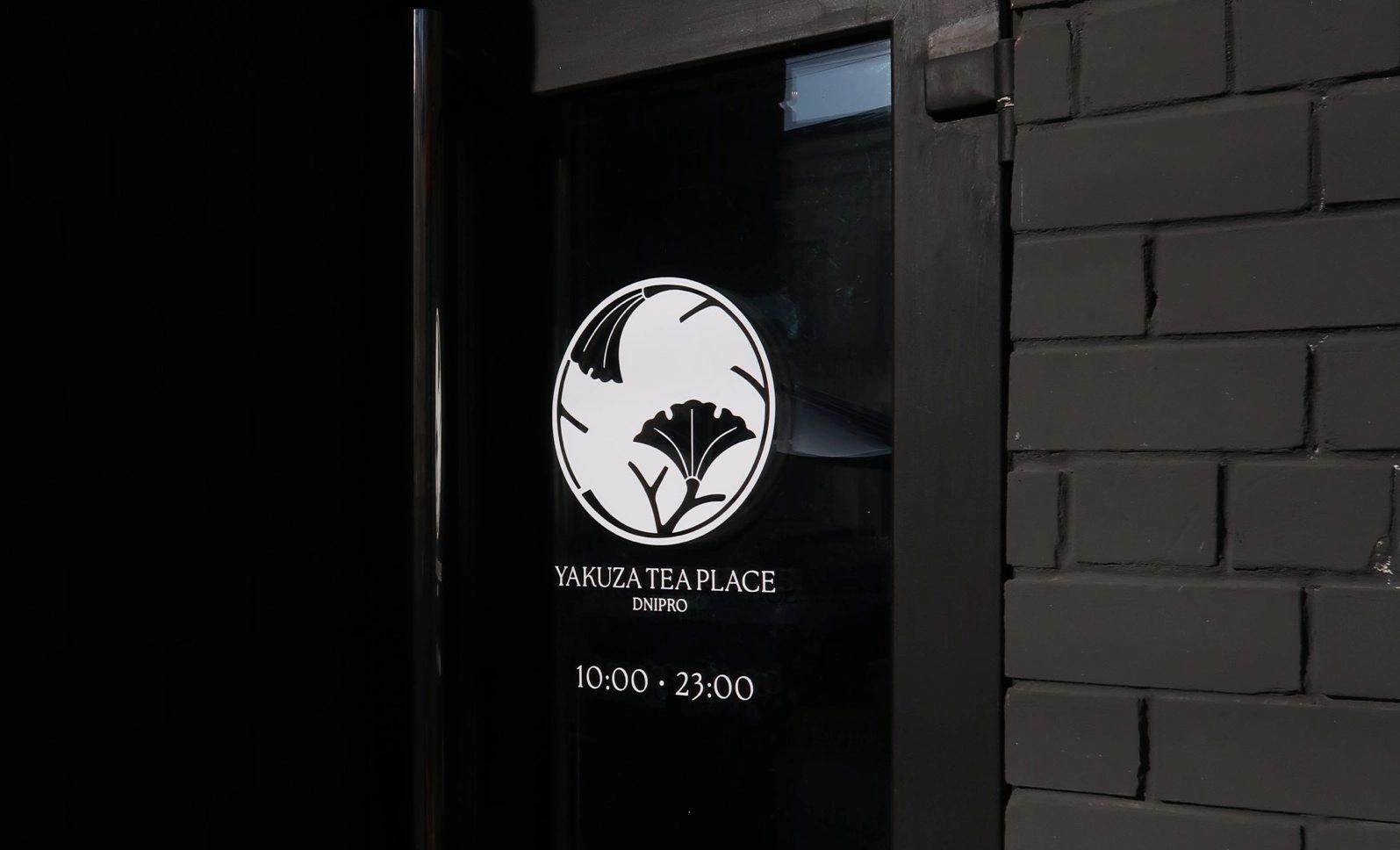
The packaging reads like a scroll. 茶 as hero up top, the kamon as a seal in the middle, the serif wordmark at the base. The eye travels top-to-bottom like a hanging scroll — a Japanese reading order, not a Western one. One composition, adapting across full wrap, foil pack, and label.

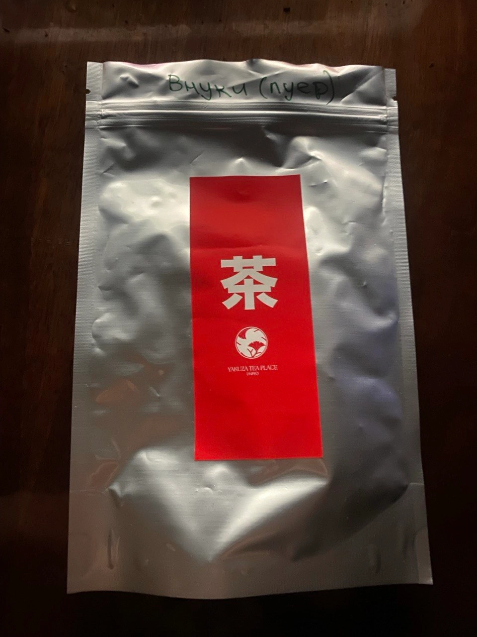
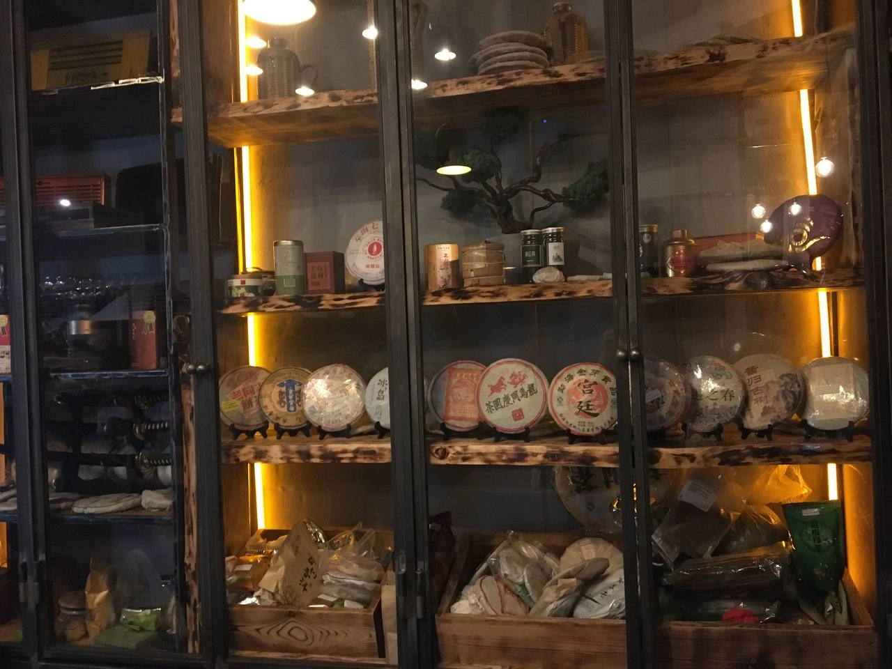
The system rolls across every touchpoint a guest meets: packaging, foil tea bags, etched signage, and the ongoing editorial feed that treats the tea house as a publication.
The result
The brand didn't stay on screen. It became a place.
The feed runs the editorial format above — 830 followers, 7–22K impressions a month, growing since September 2024. But the real proof isn't analytics. It's behaviour.
The community the strategy imagined actually formed. Regulars meet beyond the venue. They celebrate birthdays and holidays inside Yakuza — people spend their most personal occasions here, with their people. They post the place themselves, unprompted: "our ❤️ place," "team," tagging @yakuza_dp. There's a wall of instant photos of the regulars — a physical answer to the kamon: the clan, in faces, on the wall.
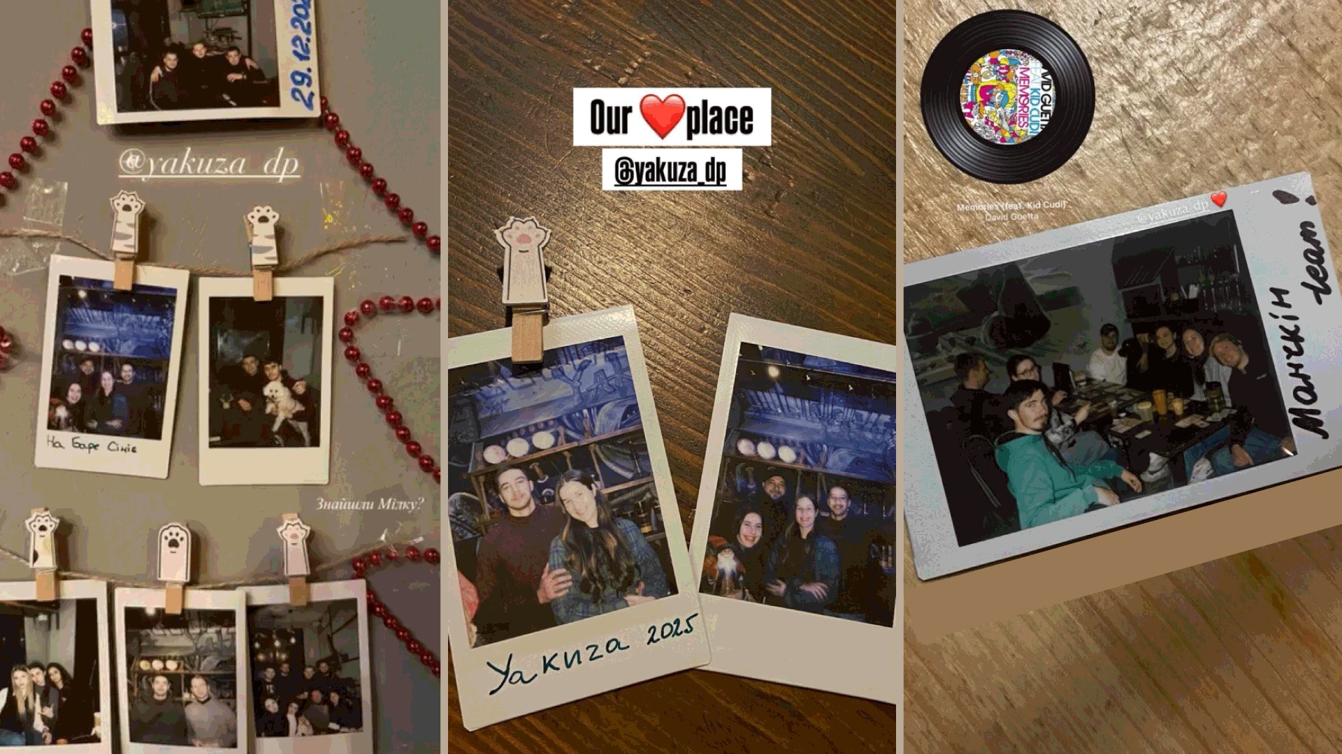
The strategy was "a tea house that works like a clan." The result is a clan that calls the place home. The brand was confirmed not by a metric, but by the way people behave inside it — which is the only proof that ever really matters.
Role & authorship. Mine: the brand strategy and concept; the editorial language — naming, bilingual poetry, photography and retouching for the full line; packaging and its vertical composition; the typographic system; palette; retail packs; signage layout; plus strategic input beyond graphics (a planned takeaway-coffee entry concept to pull park-bound foot traffic into the tea world). Built on existing elements I selected and integrated rather than authored: the kamon (sourced, commercially licensed), the 茶 typeface, and the venue's pre-existing mural and interior.
Like this project
Posted Jun 28, 2026
Idea of tea house as a yakuza clan — turned into an identity system, editorial language, and packaging. The community the strategy imagined actually formed.