Defenders Saint Barthelemy | 2019
Bohdan Andriyushchenko
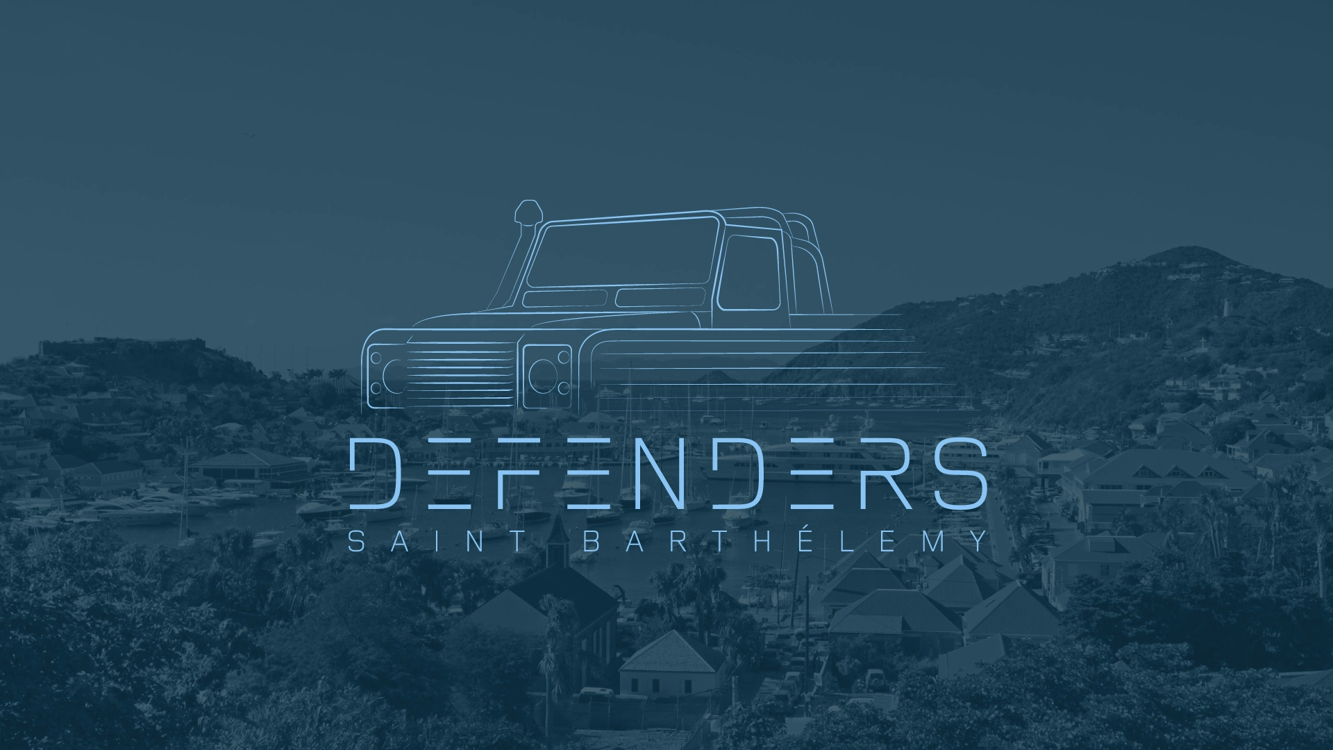
DEFENDERS Saint Barthélemy
Brand identity, positioning, print — 2019
Context
Saint Barthélemy is one of the most concentrated luxury markets in the world — an island where the clientele arrives by yacht and private jet, and where the Land Rover Defender isn't transportation, it's part of the island's visual identity. Defenders Saint Barthélemy customizes, rents, and sells these vehicles to that exact audience.
The challenge: the company operates in a market where "luxury branding" defaults to gold serif logos and yacht-club clichés. But the Defender itself is the opposite of that — utilitarian, mechanical, honest. The brand had to hold both truths at once: the precision of an engineered machine and the effortlessness of island life.
Positioning
Before touching visuals, I defined the brand's position: not a car rental, not a dealership — a curator of an island icon. The Defender on St. Barth is a cultural object, like a vintage Porsche in Los Angeles or a Riva boat on Lake Como. The brand needed to speak to people who understand that distinction.
This positioning shaped every decision that followed: the brand doesn't sell cars, it sells belonging to the island's visual culture.
Identity
The wordmark is built on a custom display typeface with horizontal cuts through the letterforms — a direct nod to the Defender's signature grille and the slatted, engineered geometry of the vehicle itself. Extended letter-spacing gives it the unhurried rhythm of the island: nothing here is in a rush.
The line-art Defender illustration distills the silhouette to its essential contours — recognizable instantly, reproducible at any scale, from a website header to an embossed contract cover.
The palette is anchored in deep maritime blue: the meeting point of the island's two defining surfaces — ocean and dusk sky. One color, used with discipline, instead of a "tropical" palette that would cheapen the brand within a season.
Deliverables
A complete brand system designed to work across every client touchpoint:
Logo system — primary wordmark, line-art vehicle mark, and lockups for different contexts
Custom typographic treatment and brand typeface pairing
Color system built around the signature deep blue
Print materials — including a designed client contract, turning the brand's most bureaucratic document into a brand experience
Art direction guidelines for photography and brand applications
The result
A brand that reads as premium without borrowing a single luxury cliché. It gives a niche island business the visual presence of an established marque — coherent from the website to the paperwork a client signs. The identity has remained in use since 2019, unchanged: the most honest metric of a brand system that was built right.
Scope: positioning, brand identity, custom typography, print design, web design, art direction.
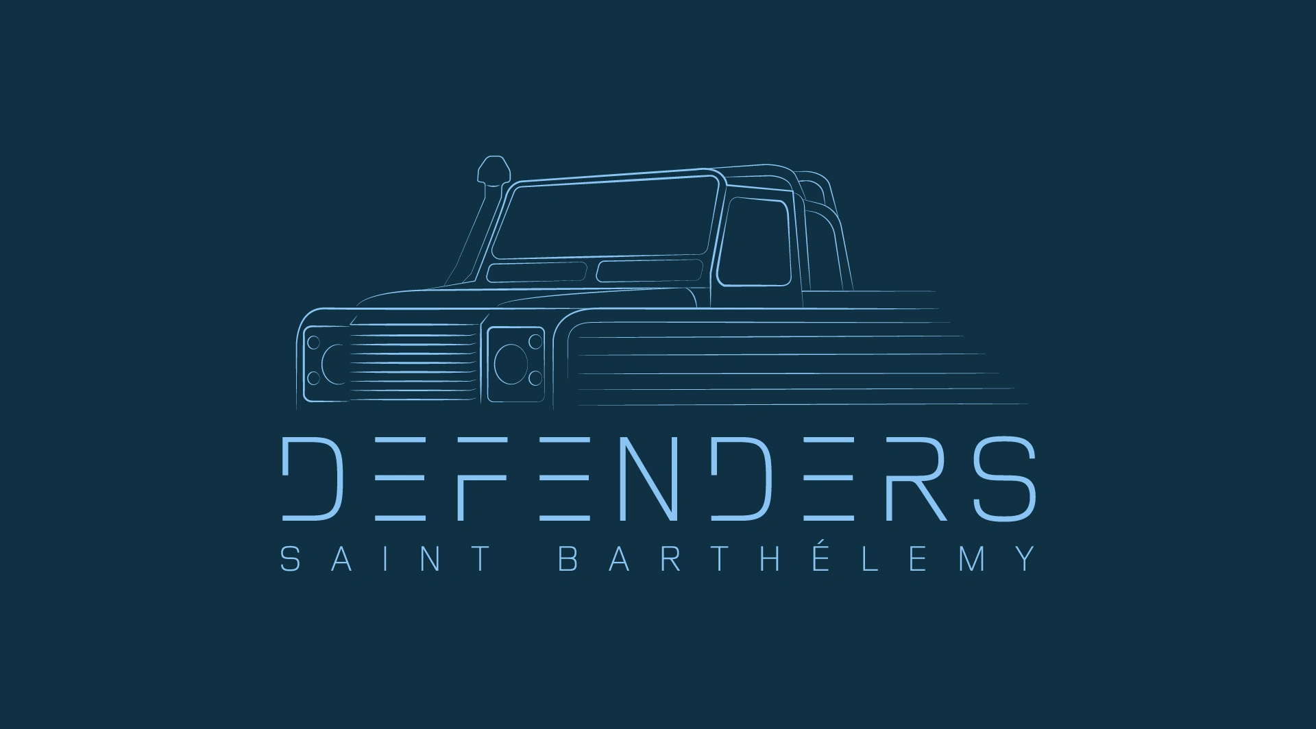
Primary brand lockup. The horizontal cuts in the letterforms echo the Defender's grille — the typography carries the vehicle's DNA even when the illustration isn't there.
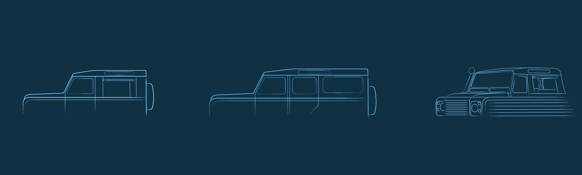
The vehicle mark system: three Defender body types drawn as continuous line-art. Each model the company customizes gets its own mark — recognizable at a glance, scalable from web icons to large-format print.
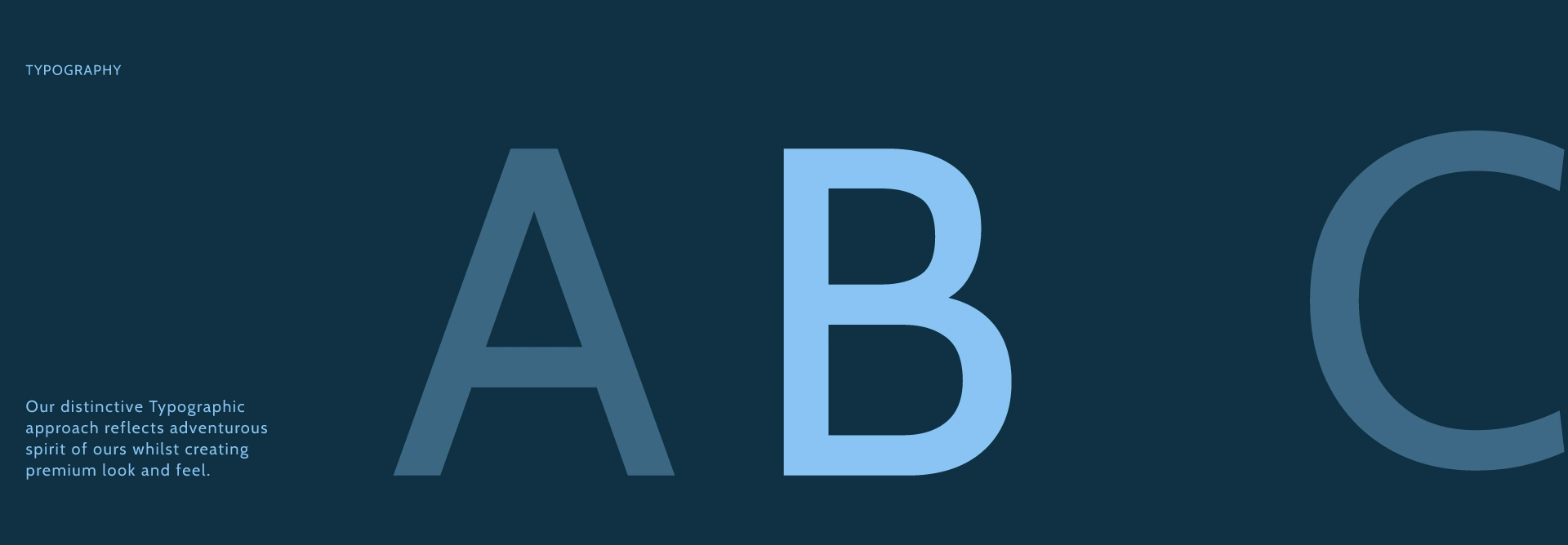
The typographic system in two weights and tonal steps of the brand blue. Extended spacing and engineered geometry — precise like the machine, unhurried like the island.
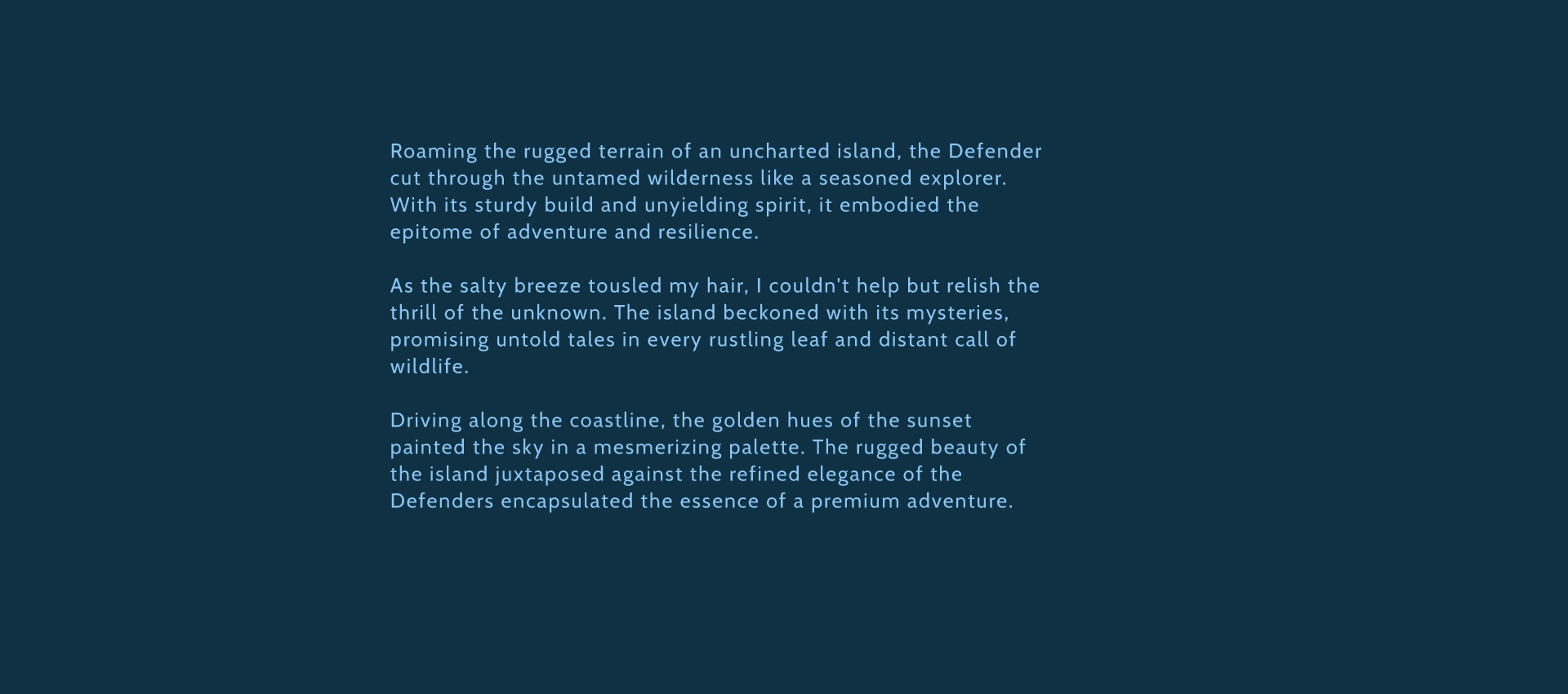
Brand voice exploration: copy that frames the Defender not as a rental, but as the way you experience the island. Tone guidelines were delivered alongside the visual system.
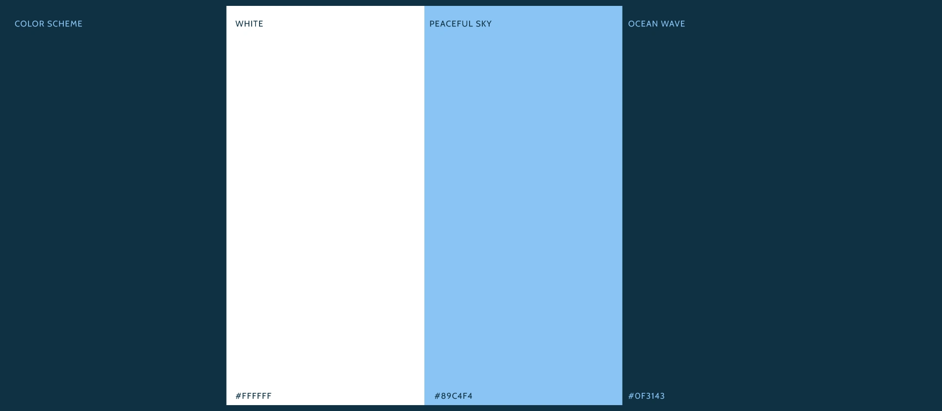
Three colors, no more. White for air, Peaceful Sky for the island's light, Ocean Wave as the brand's anchor — deep enough to feel engineered, soft enough to never shout. A palette built to age well in a market where "tropical" branding expires in a season.
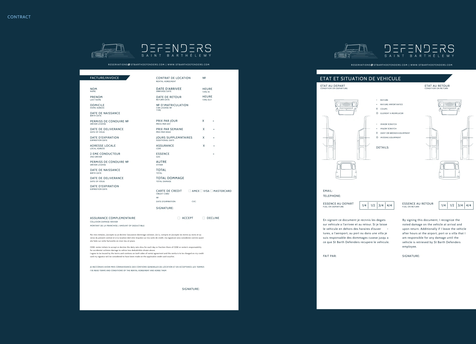
The client contract, designed as part of the brand — not an afterthought from a Word template. Bilingual rental invoice and a vehicle condition sheet with custom Defender line-art diagrams for damage marking. The most bureaucratic touchpoint a client handles became the most quietly impressive one.
Like this project
Posted May 9, 2026
Delivered a complete brand ecosystem — positioning, identity, custom typography, print, and art direction — as one coherent system.
Likes
0
Views
4
Timeline
Jun 9, 2019 - Jul 11, 2019