KUURACORP. 2023 'Unison' Raw Pu-erh Tea
Bohdan Andriyushchenko
KUURACORP — "Unison" Raw Pu-erh Tea
Packaging design & art direction, 2023
Context
KUURACORP is a tea company working with raw pu-erh — a product that resists fast consumption by nature. It ferments for years. Its flavor unfolds in stages. Its audience reads labels, researches origins, and notices details.
The packaging market around it splits into two clichés: tradition-heavy design borrowing dragons and calligraphy, or sterile Scandinavian minimalism that says nothing about tea at all. The brief was to escape both — to design a wrapper that feels as layered and deliberate as the product inside it.
The thinking
I started with a question rather than a moodboard: what does raw pu-erh actually look like as a process? It's a natural material transformed by precise, almost invisible human intervention. Controlled chaos. That tension became the concept.
Three references shaped the visual language:
Suminagashi (墨流し) — the Japanese art of marbled ink, where the artist doesn't draw the pattern but creates conditions for it to emerge. Each print is unrepeatable. This became the core surface logic of the wrapper: organic pattern, born from a controlled process — exactly how pu-erh itself is made.
Joy Division's "Unknown Pleasures" — data rendered as texture. Scientific information becoming an aesthetic object. It informed the rhythm and density of the pattern: lines that read as topography from a distance and as signal up close.
The Fairlight CMI — an interface philosophy where technology conceals its own mechanics behind pure, quiet geometry. During research I found a description of it that became the brief for the entire project: forms that propel through space in almost complete silence, a surface so smooth it signals refined, completely concealed dynamics. That's what the wrapper had to do — look effortless while being precisely engineered.
The design
The wrapper reads differently at every distance. From across the room: an organic, almost geological surface. In hand: engineered line-work with deliberate rhythm and density shifts. The green seal at the center acts as a focal point and a moment of color discipline — one accent against a restrained field, marking the tea like a stamp marks a document.
Typography stays out of the pattern's way. No decorative tea iconography, no borrowed orientalism. The hierarchy is built so the eye lands on the name, then the year, then sinks into the texture — mirroring how you'd approach the tea itself: identify, date, then explore.
The result
A wrapper that behaves like the product: natural at first glance, precise on inspection. It positions KUURACORP away from both clichés of the category — and gives a slow product a visual language that rewards slow looking.
Scope: concept, art direction, pattern design, typography, packaging layout.
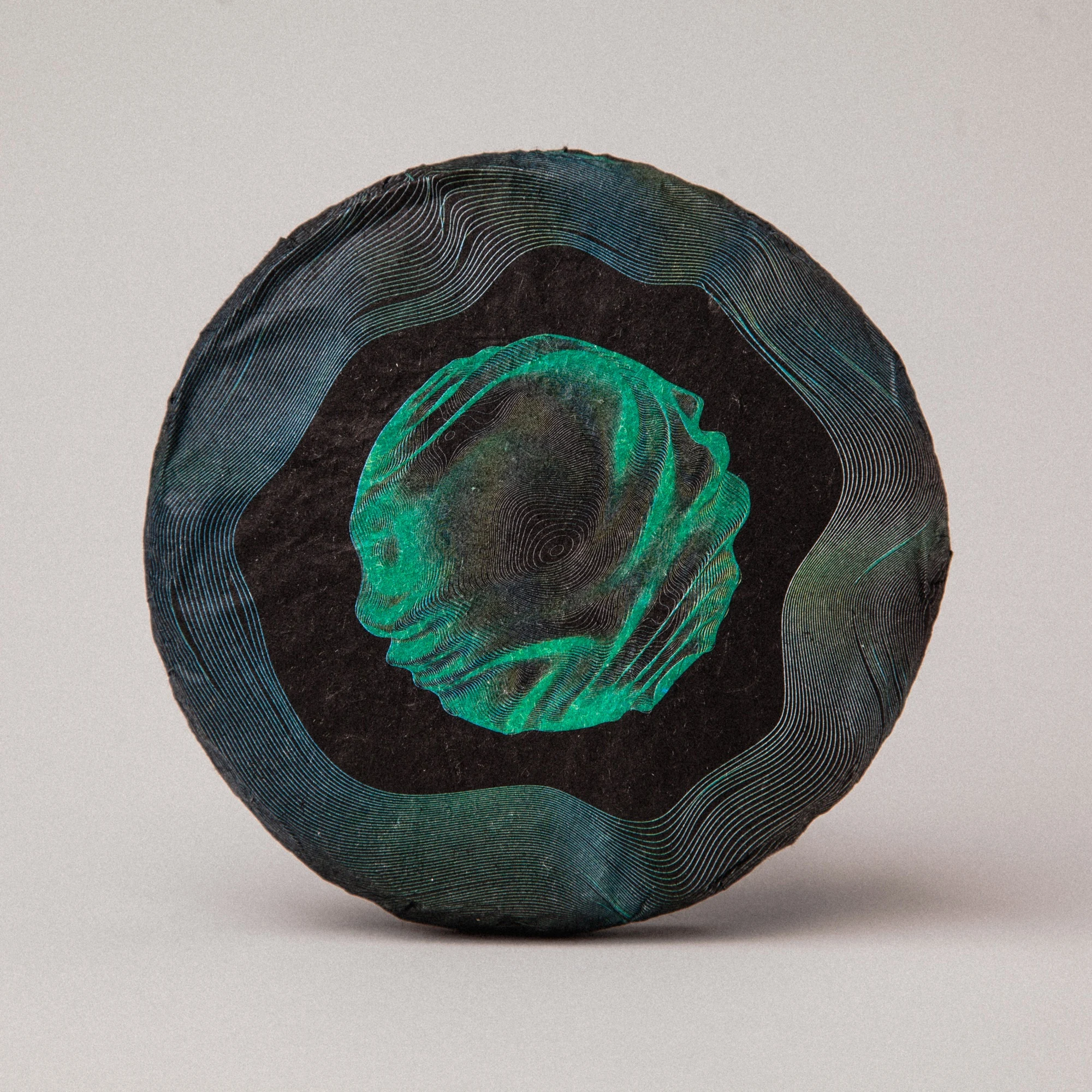
The seal in print — silkscreen-like density of lines over handmade paper. The pattern shifts with light, like the surface of brewed tea.
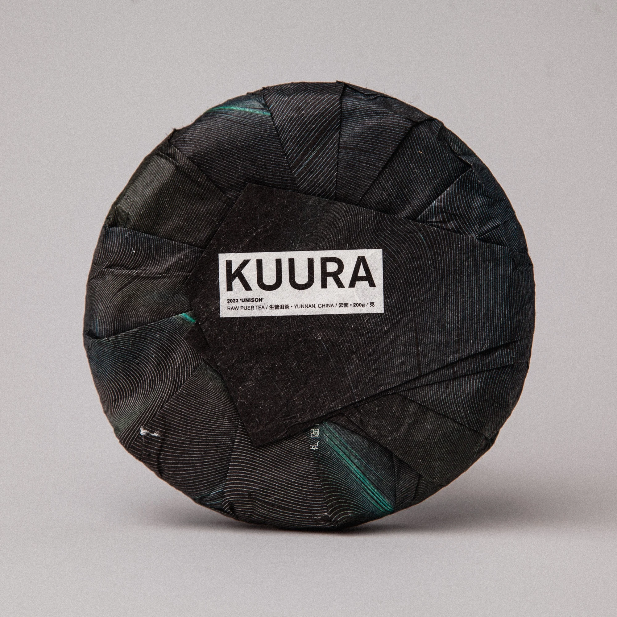
The reverse: traditional pu-erh wrapping folds meet a typographic label. Tension between heritage format and contemporary voice — by design.
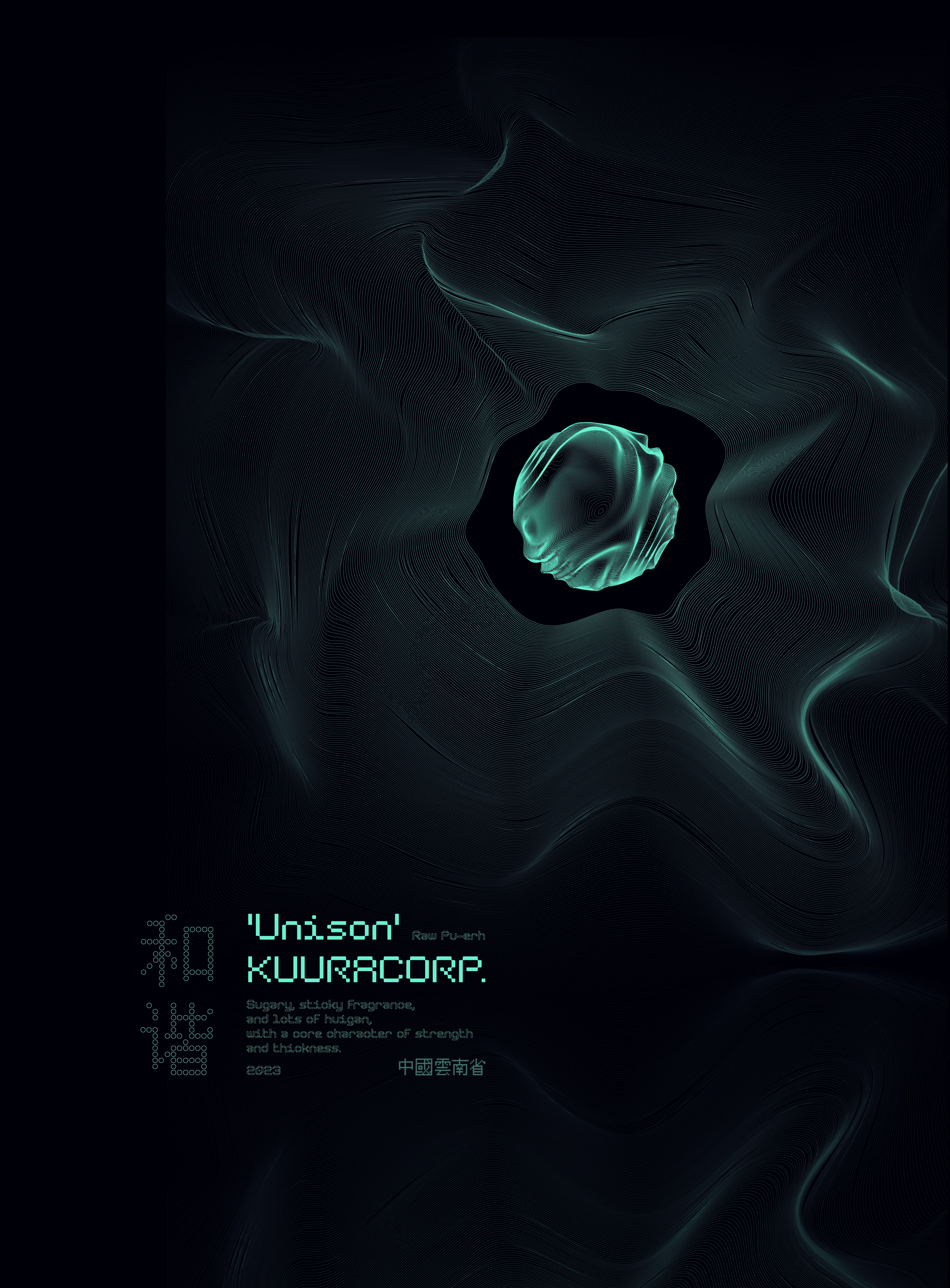
The campaign poster: the wrapper's pattern unfolded into pure signal. The pressed tea cake floats at the center like an object transmitting — the same line-work, now behaving as light instead of ink. One system, two surfaces: paper and screen.
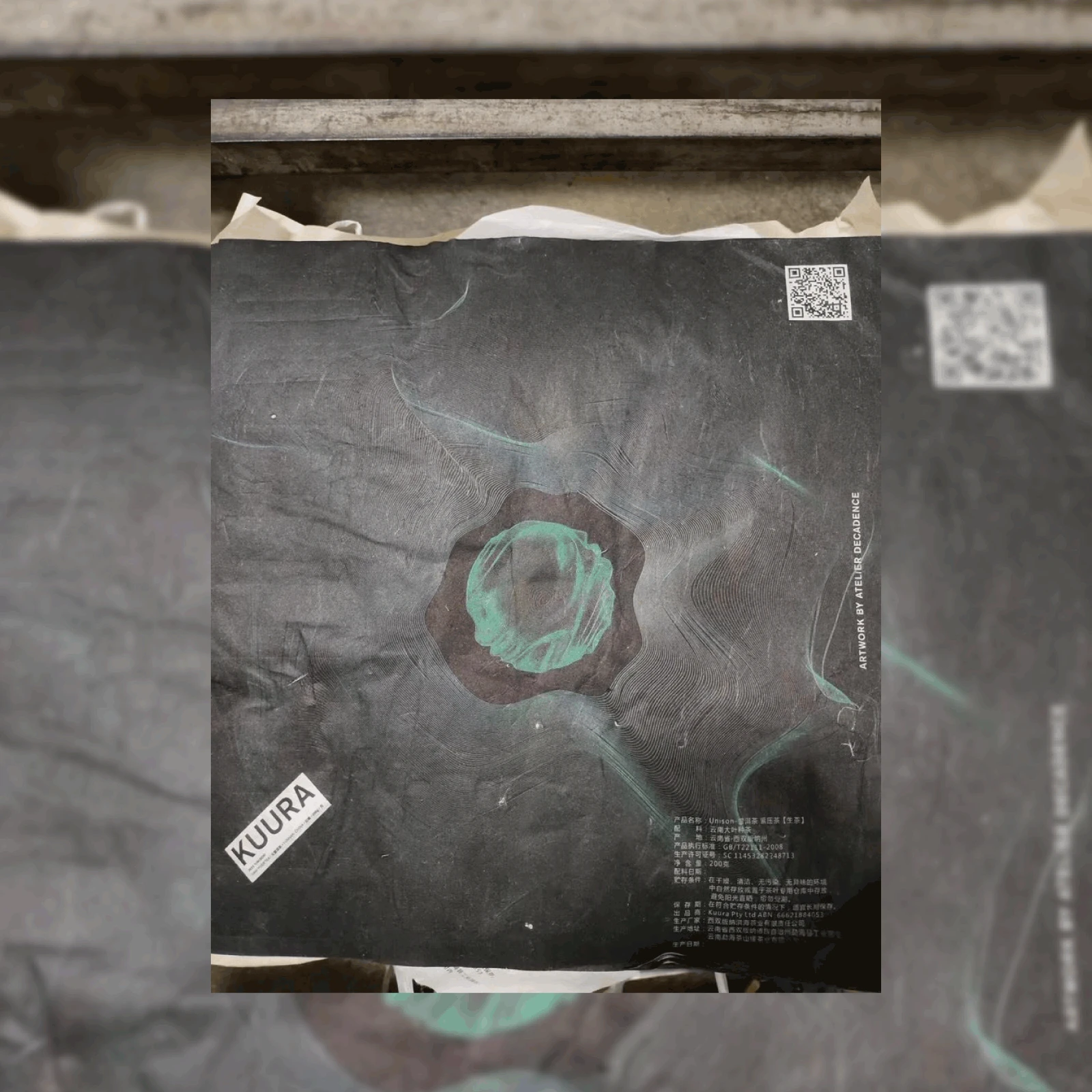
The wrapper photographed at the factory in Xishuangbanna: full Chinese regulatory marking, GB/T22111-2008 standard, production license — and "Artwork by Atelier Decadence" running along the edge. The design didn't stop at the front; the mandatory back was typeset with the same care.
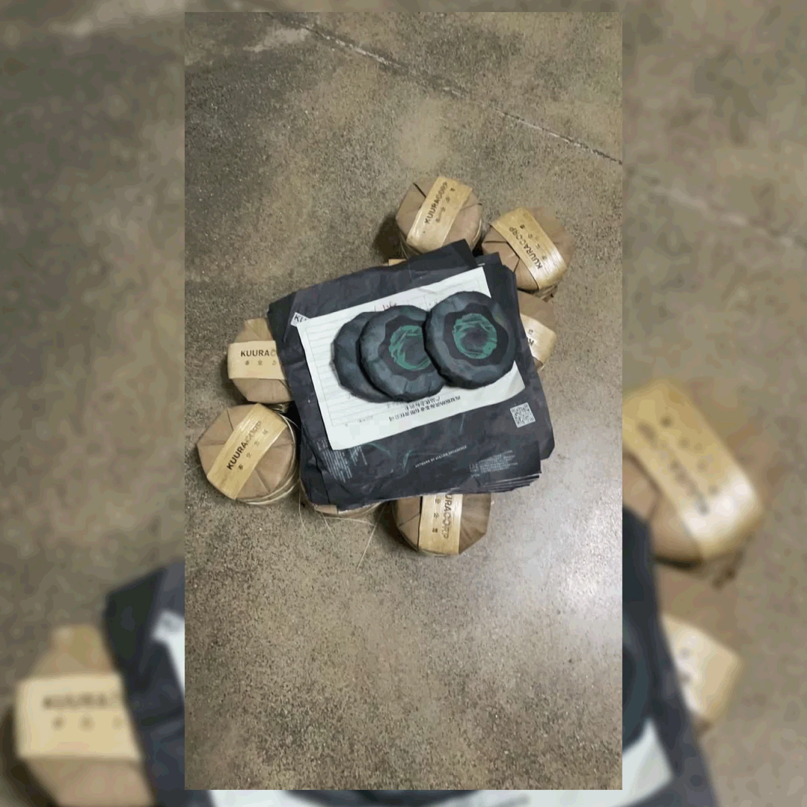
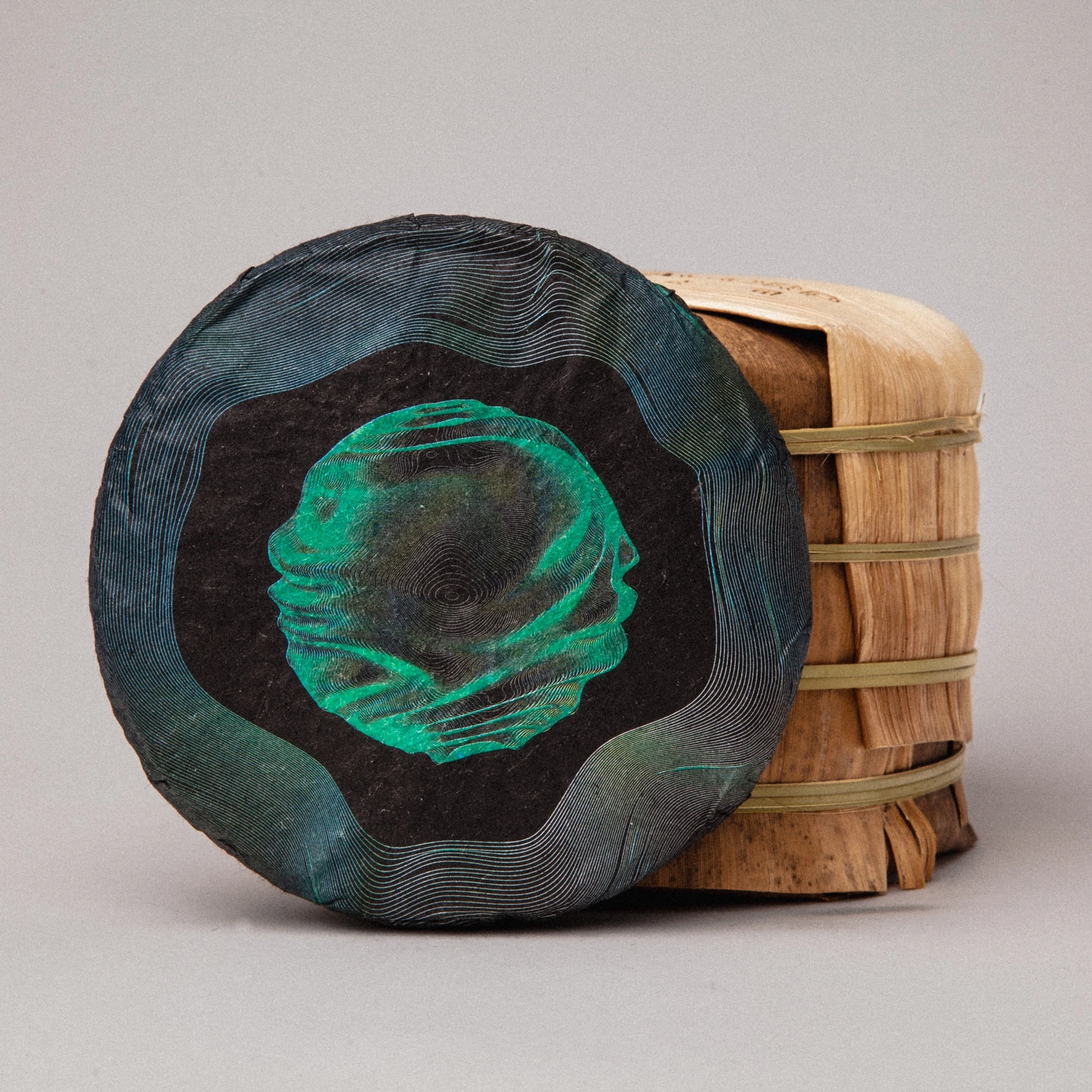
Production day in Yunnan: the print run stacked on the factory floor, surrounded by tongs in traditional bamboo wrapping with KUURACORP bands. The pattern meets the format it grew from.
'Unison' was a limited single-harvest release by KUURACORP.
Credits
Photography & video — pingle.pictures
Additional tea designs featured in the video — eroductions
Design, art direction, pattern — Bohdan Andriyushchenko
This project began as cultural research — Suminagashi, signal-as-texture, interfaces that hide their mechanics — and ended as a wrapper you can hold. That's the work I do: turning a brand's character into something physical.
Raw pu-erh from a protected reserve in Yunnan: it sold out and cannot be repeated — when the tea is gone, the edition is closed. The wrappers remain with those who got one.
Building a brand in tea, food, or culture-driven space? My inbox is open.
Like this project
Posted May 9, 2026
Designed the wrapper for a one-time release: limited raw pu-erh from a protected nature reserve. The tea sold out and will never be reissued.
Likes
0
Views
1
Clients
KUURACORP