Ventureramp website
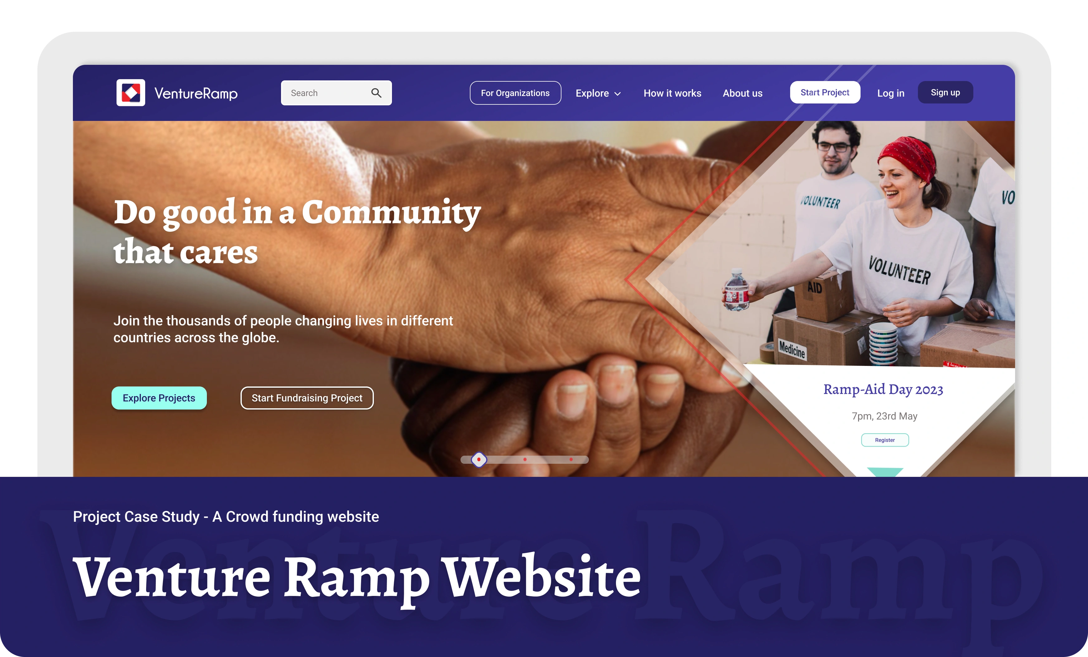
Project Thumbnail
🔁 Overview
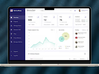
VentureRamp is a crowdfunding website for Nigerians specifically. It offers campaigns for businesses as well as individuals to raise funds for several causes whether for personal needs or as a group initiative with other fundraisers.
Client: NASD PLC
Project duration: Around 3 months
🔒 Problem
This UX case study addresses the challenge faced by aspiring projects in securing adequate funding. Despite many impactful ideas, current crowdfunding platforms lack user-friendly features that effectively connect projects with potential backers. The study focuses on designing a user-centric crowdfunding website to fill this gap. By analyzing user needs, improving accessibility, and fostering trust through intuitive design and transparent communication, the goal is to empower projects to attract funding more efficiently and bring their visions to life.
🚀 Goal
The goal is to create a user-friendly crowdfunding website that allows fundraisers to easily create projects and raise funds, enabling them to connect with potential backers and bring their ideas to life.
🔍 Research
Competitive Analysis
I conducted a study of similar crowdfunding websites to understand the competitive landscape and identify trends in the space. I discovered four or five platforms, but the ones that truly stood out were GoFundMe and Indiegogo—direct and indirect competitors, respectively. Both had a large customer base, strong exposure, and impressive branding.
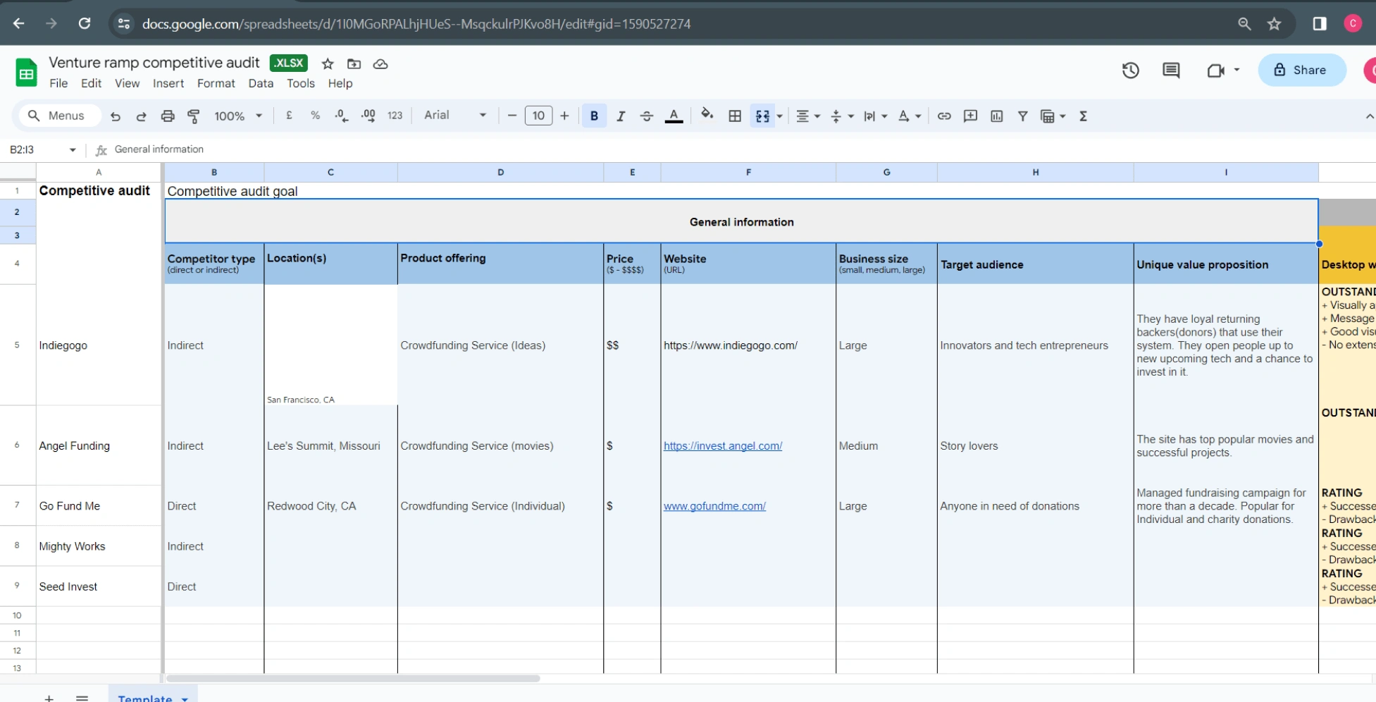
Competitive Audit
Secondary Research
Although I didn't conduct extensive foundational research through interviews and surveys, I gathered valuable secondary data from online sources and conducted in-house user interviews with staff to get their thoughts on crowdfunding sites. This research helped me identify two major pain points: the risk of fraud and poor communication, which became key concerns to address while designing the website.
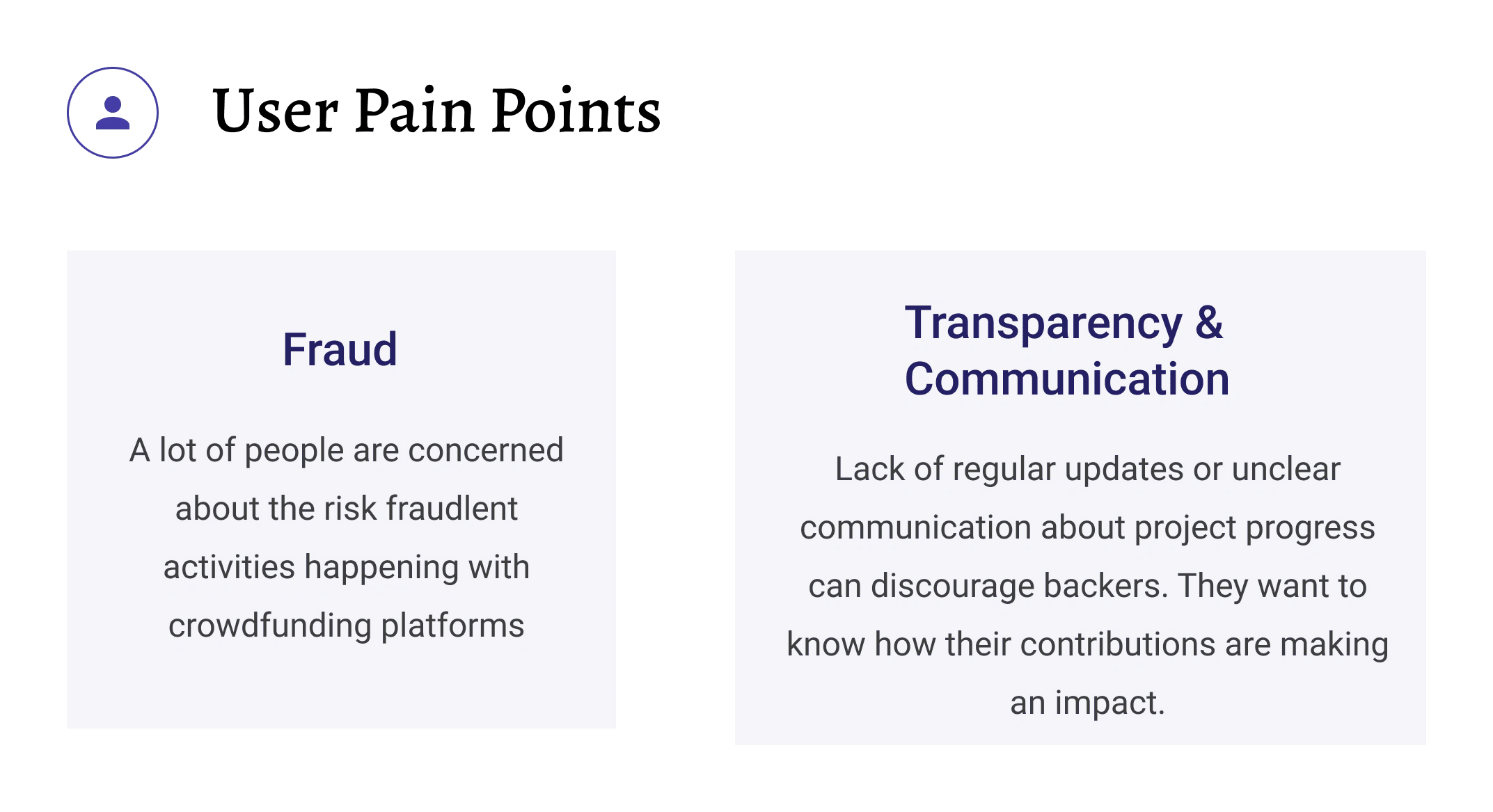
User pain points
Low Fidelity Screens
During the case study, I focused on using mid-fidelity wireframes as an important step in the design process. These wireframes helped me explore layout details and user interactions before moving on to higher-fidelity designs. This approach made it easier to iterate, gather feedback, and build a solid foundation for the final polished interface.
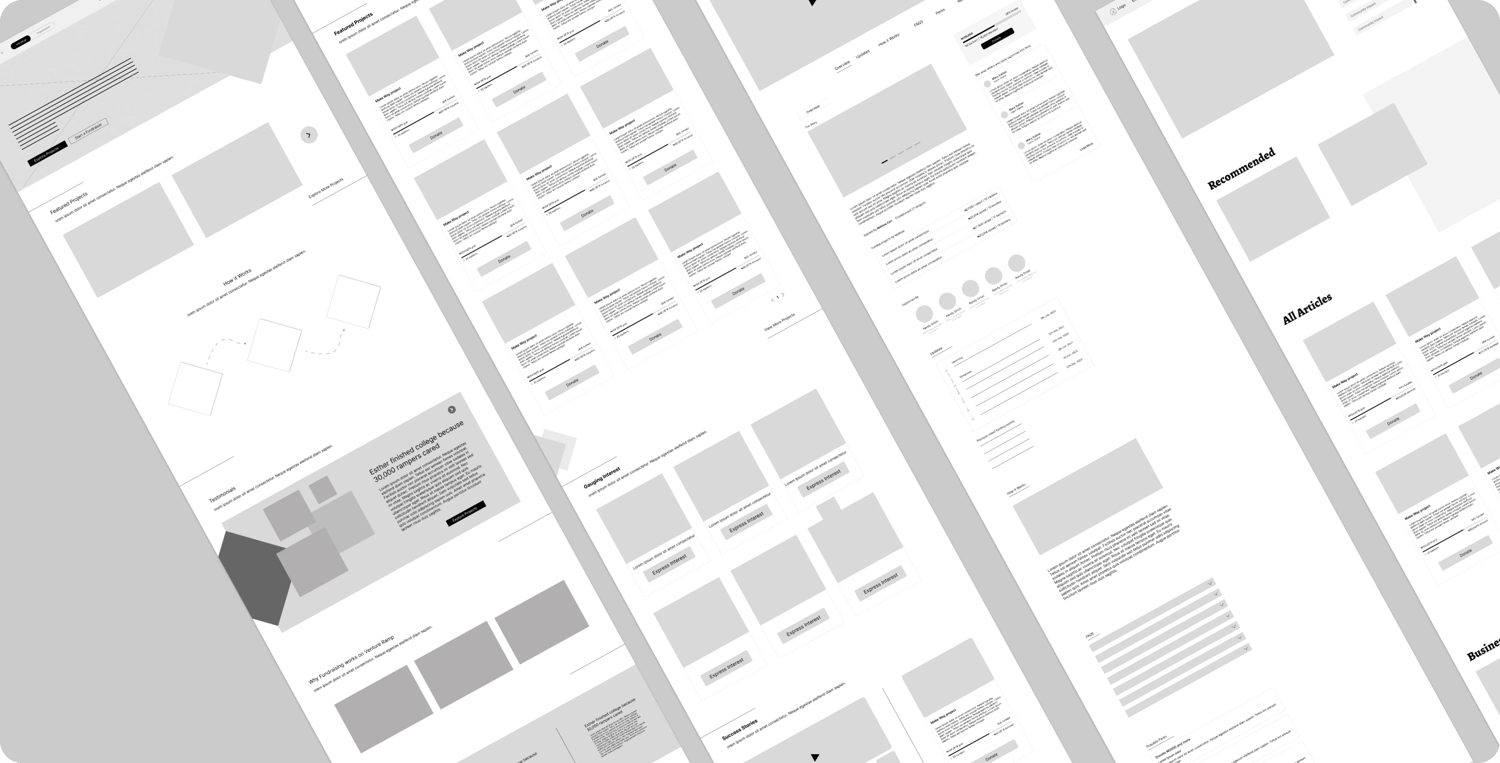
Low fidelity wireframes
🎨 Design Assets
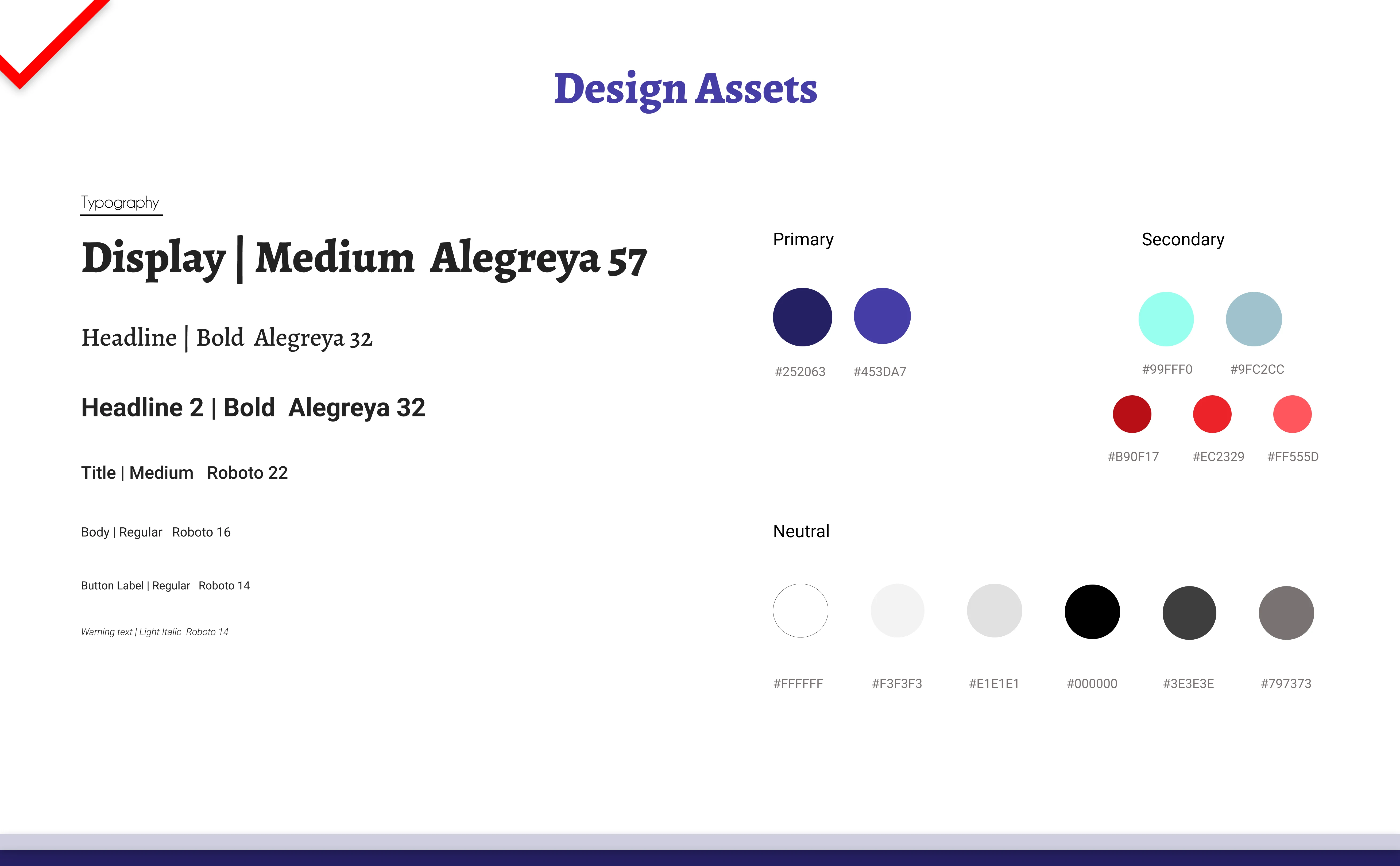
Design Assets
📸 High Fidelity Screens
Onboarding Screens
During registration, they can choose to sign up as a fundraiser looking to create a project or as a donor looking to donate to projects.
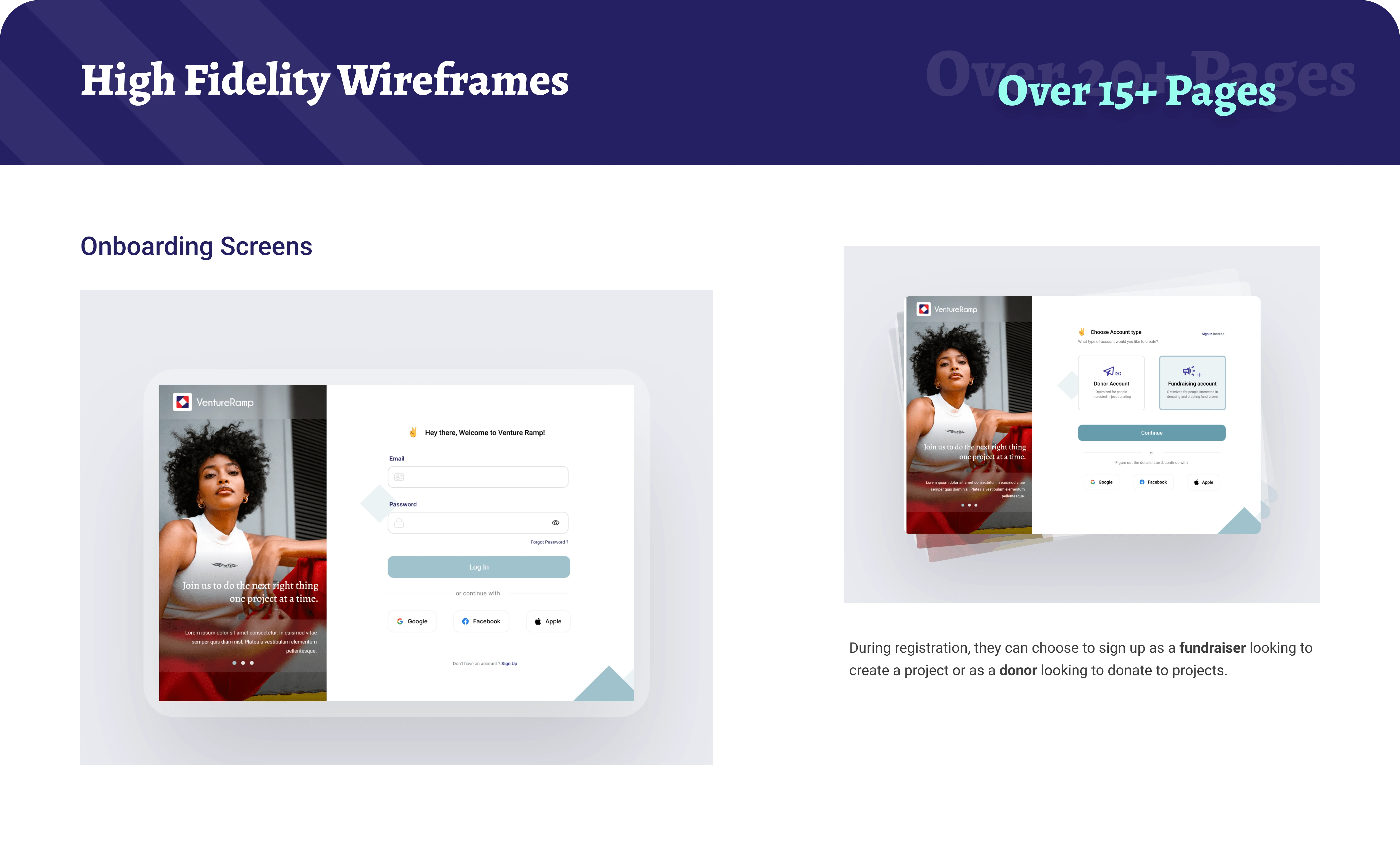
Onboarding screens
Landing page
I designed part of the page content to highlight the safety and transparency of the projects on the platform. This decision came from our earlier research, where we found that users were concerned about fraud.
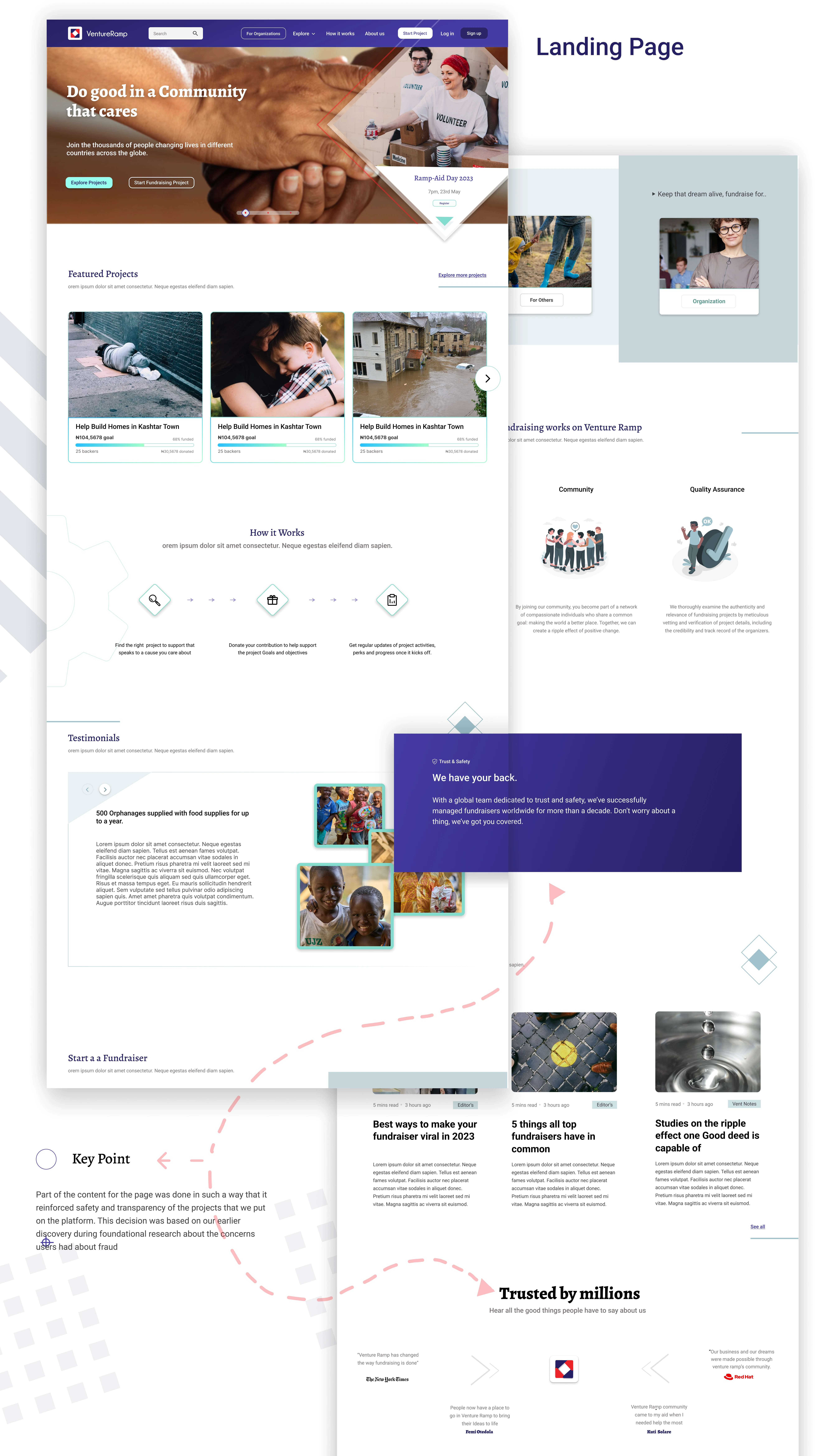
Landing/Home page
Project details
As part of the project detail page, I added a comment section and an updates tab. These features allow donors to track project progress and share their thoughts on the project.
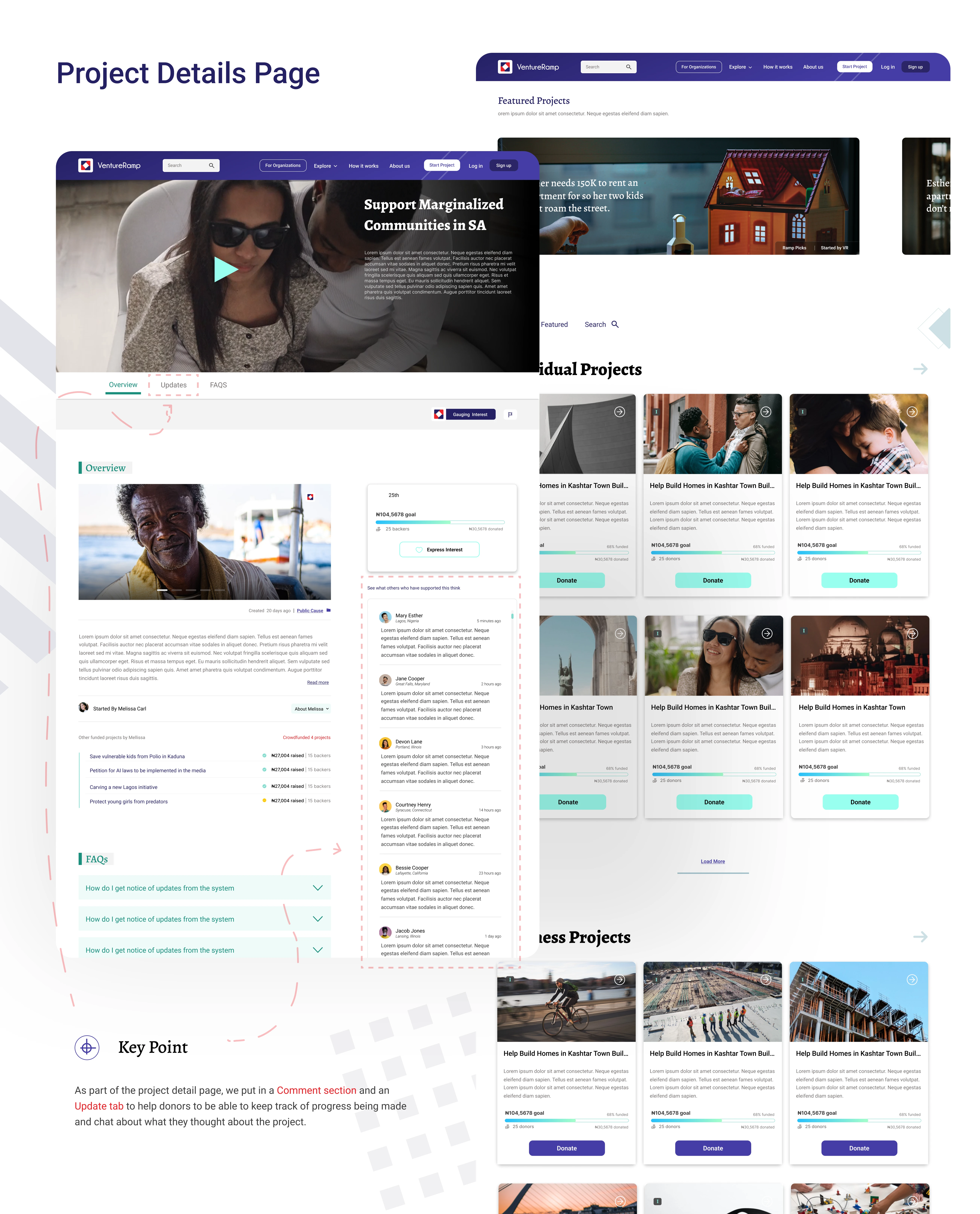
Project Details
Other screens
Blogs
How it works
About us
Ramp academy
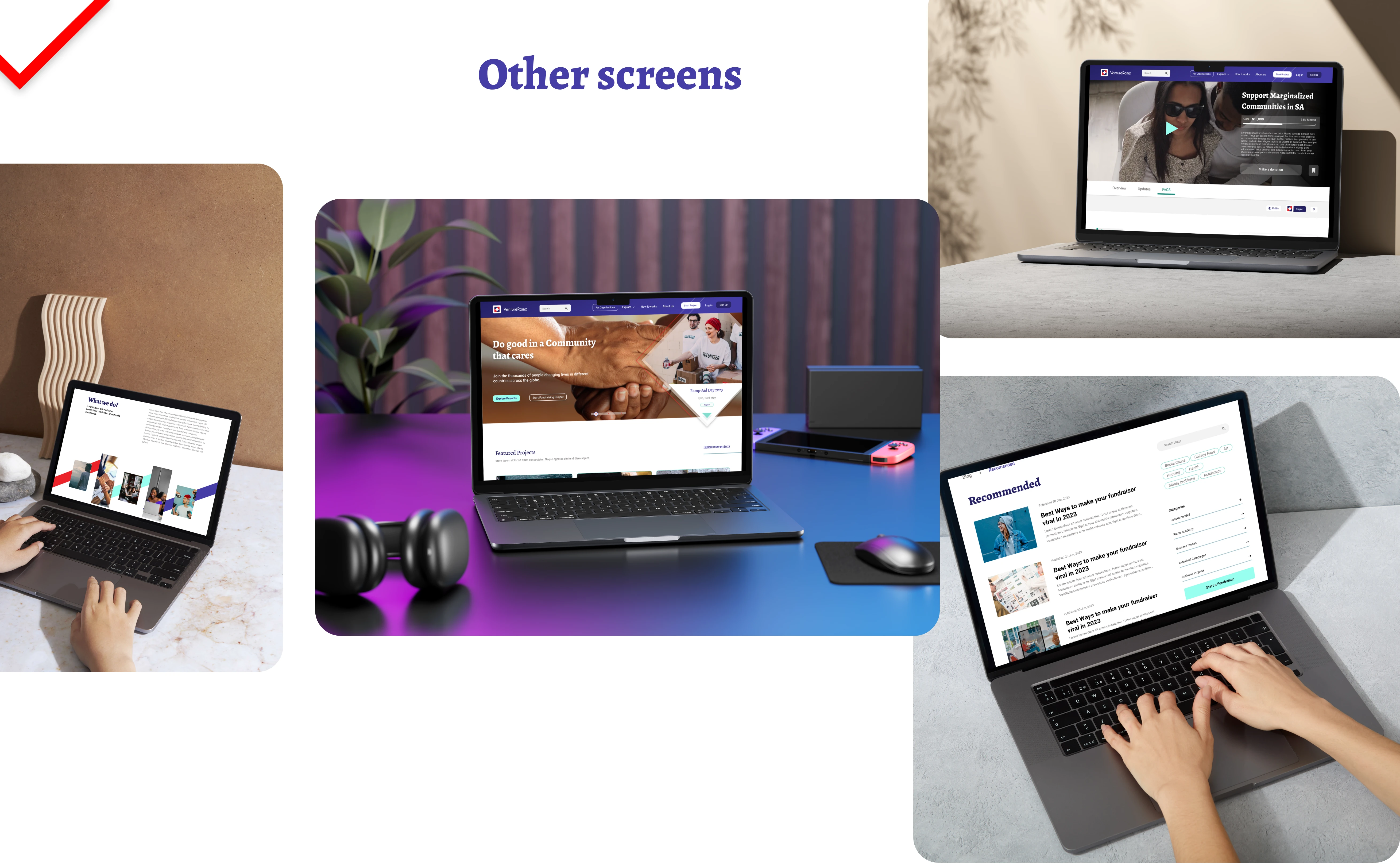
Other screens
🌊 Responsive designs
I created responsive versions of the designs for tablet and mobile to ensure the website adjusts seamlessly across different devices users may access it from.
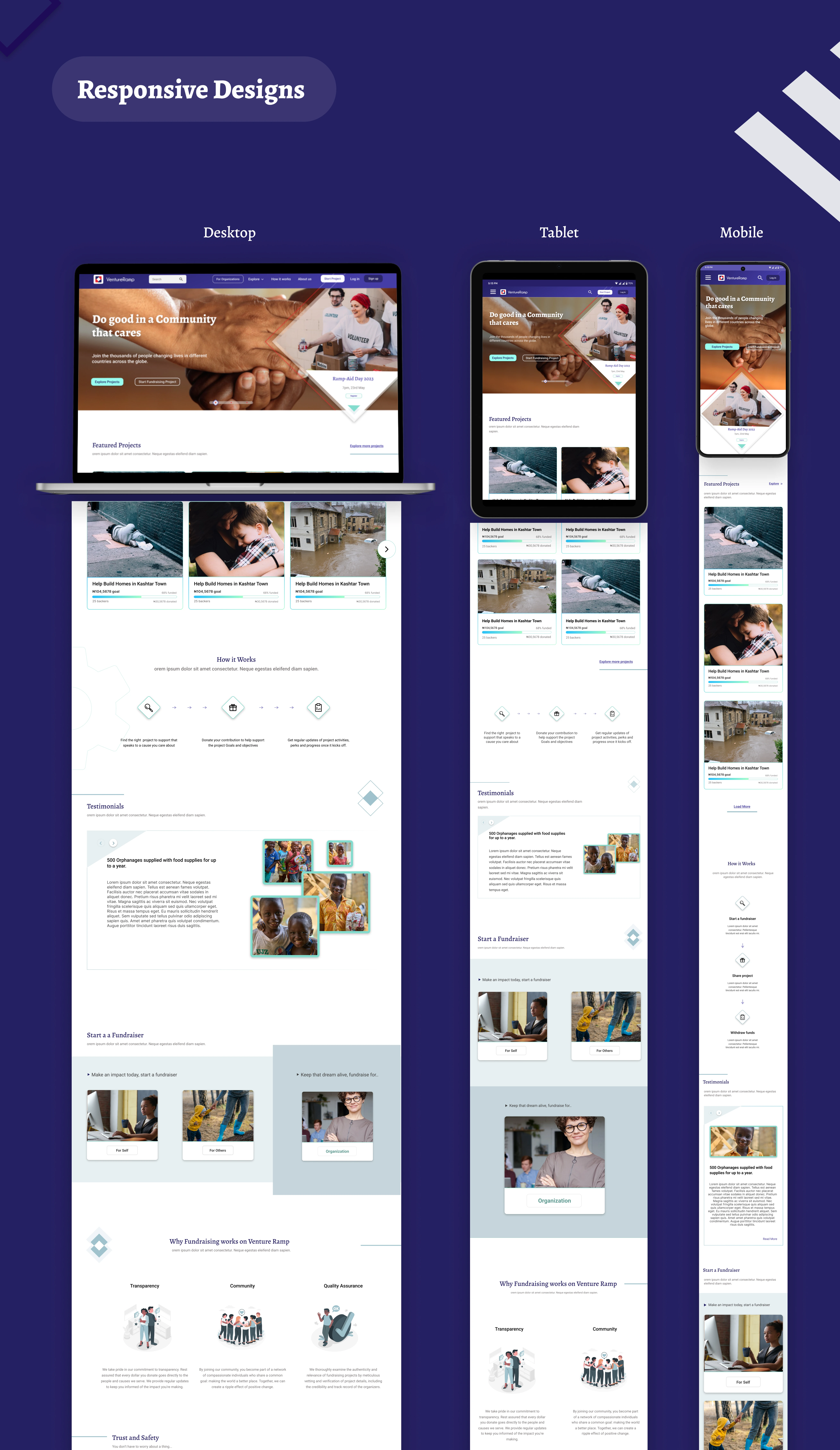
Responsive designs
🧑🏽��🦱 Usability study
I conducted an in-house usability study for the website to get an idea of how well they could navigate to different parts of the site. Some of the insights I got from that were:
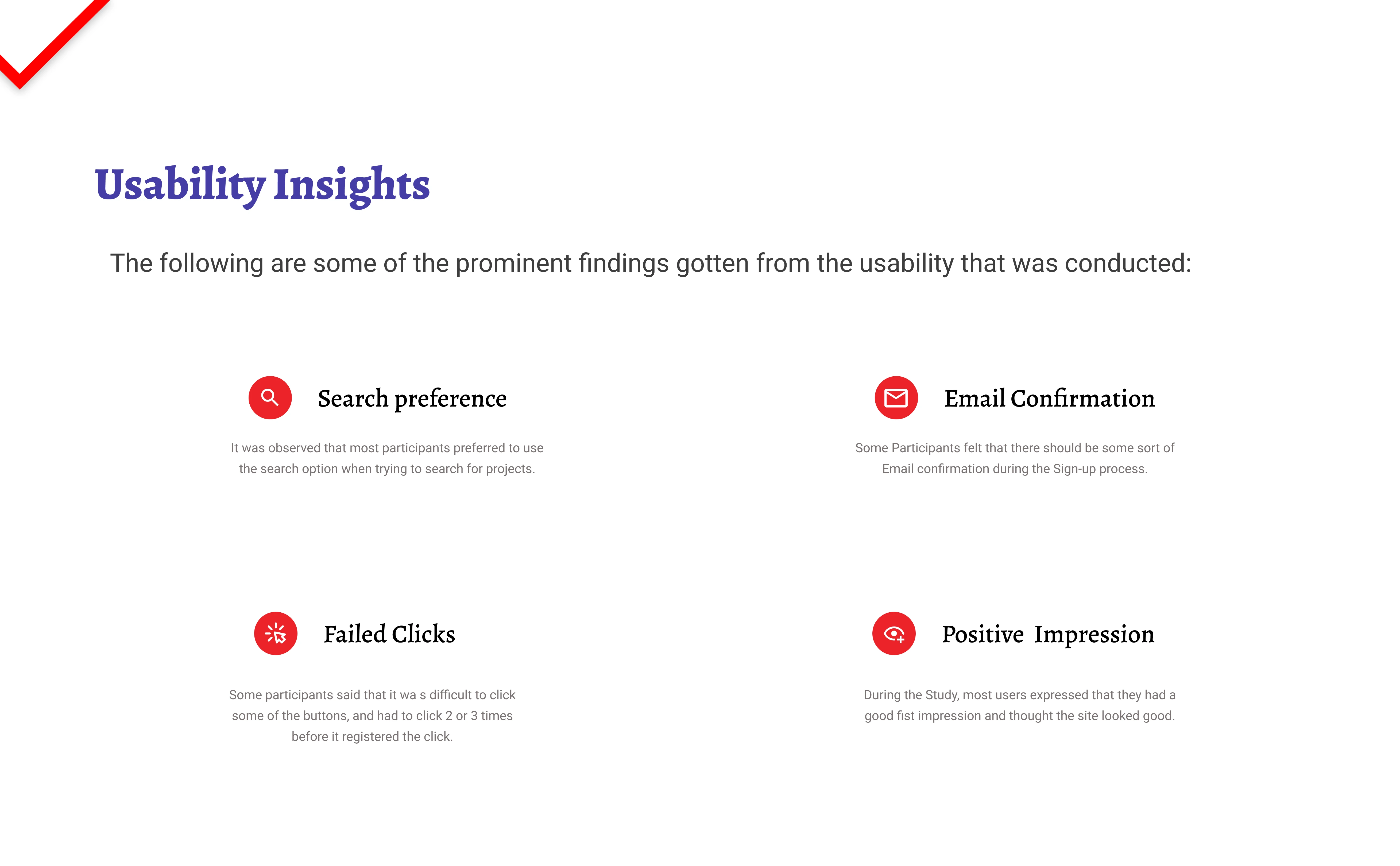
Usability insights
Refining the designs
Some of the key changes we had to make as a result of the study were:
Search improved
The search functionality in the top navigation was improved to display recent and trending search keywords, making it easier for users to find the projects and resources they’re looking for.
2. Email verification
Email verification was added to the flow to enhance security and ensure we have the correct email address for better communication and password recovery.
3. Improved click radius
We increased the button radius beyond the standard boundaries to reduce click errors and improve usability.
🎥 Check out the Prototype Demo
Throughout the case study, I focused on creating high-fidelity prototypes and refining micro-interactions to enhance the user experience. This attention to detail helped craft immersive interactions, improving usability and engagement. Click the link below to view a demo of the interactive prototype.
Like this project
0
Posted Sep 15, 2024
VentureRamp is a crowdfunding website for Nigerians. It offers campaigns for businesses as well as individuals to raise funds for several causes.
Likes
0
Views
4


