NASD Trading mobile app redesign
Christian Oweazim
Project Thumbnail
⚫ Project Overview
The NASD mobile app is an OTC trading platform that allows investors to trade publicly listed companies in Nigeria's OTC market. The app empowers investors by eliminating the need to manually place trades through brokers. It also provides access to market news, announcements, and corporate disclosures.
Details
Client: NASD PLC
Project duration: 3 months
Project in progress (development)
🔒Problem
The current NASD mobile app was designed to help investors easily access the market, make trades, and manage their portfolios. However, it lacks key features and user flows that would facilitate a smooth experience, particularly for new investors. The onboarding process is cumbersome, as KYC verification often needs to be completed via email, creating friction for users.
A redesign of the UI and improved user flows was needed to make the app more seamless, intuitive, and delightful to use.
🚀 Goal
Redesign the app to have a better visual UI design as well as seamless and intuitive user flows for ease of use
📃Requirements
Seamless KYC operations: an easy user flow that allows investors to complete the KYC verification in the app.
Enhanced Portfolio management: Better ways to manage and track portfolios and trades made
Clean and user-friendly UI: Basically a better more aesthetically pleasing UI
Support: A support section for investors to communicate with admins
Advanced analytics: Better ways to track securities and price movement.
Learn option: Educational resources to learn more about security trading on the app for beginners.
🔁 Design Process/IA
User Personas
I created user personas to keep our target users in focus during the design process. Our goal was to attract and engage tech-savvy young investors while also accommodating older, more traditional investors who prefer trading through brokers.
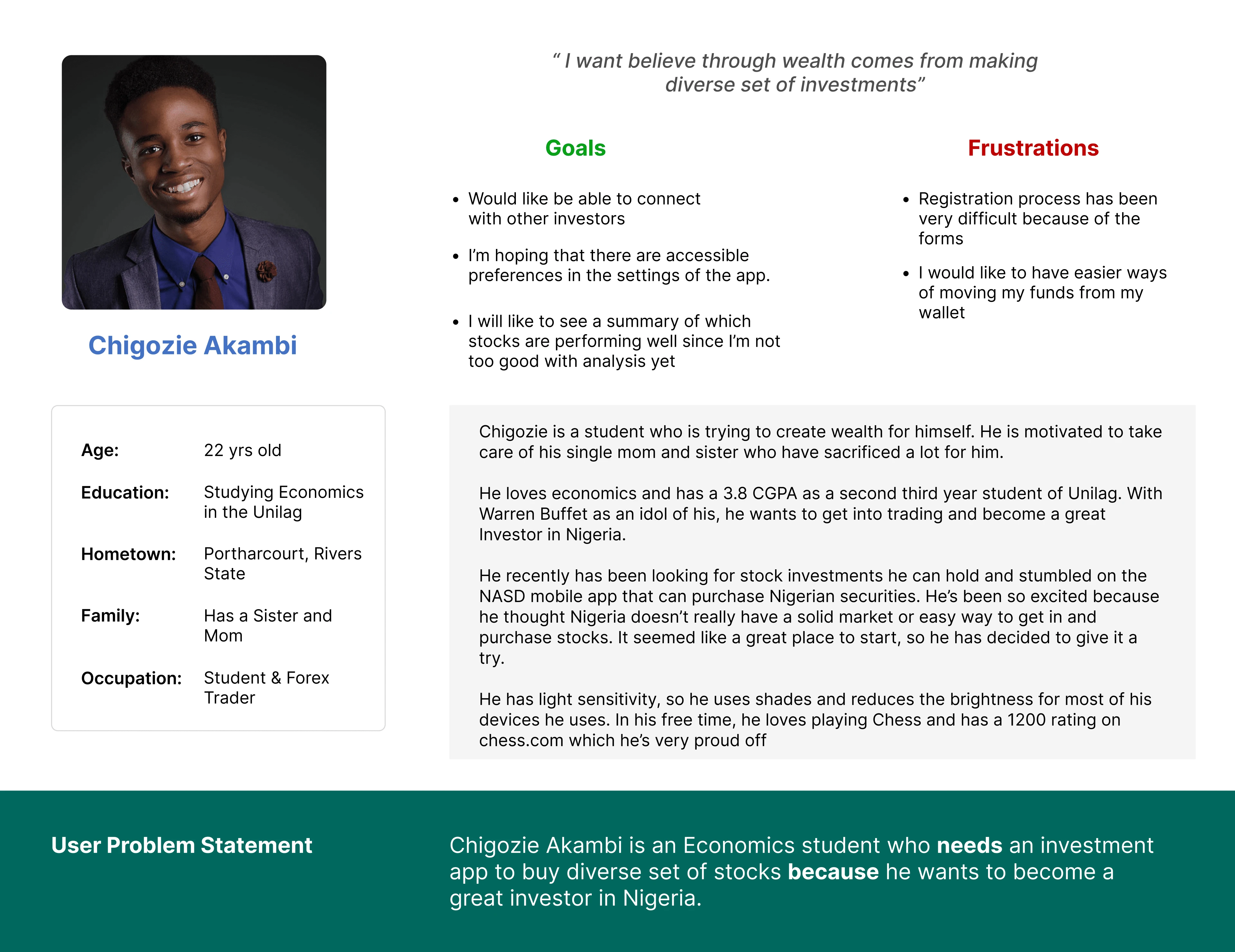
Persona 1
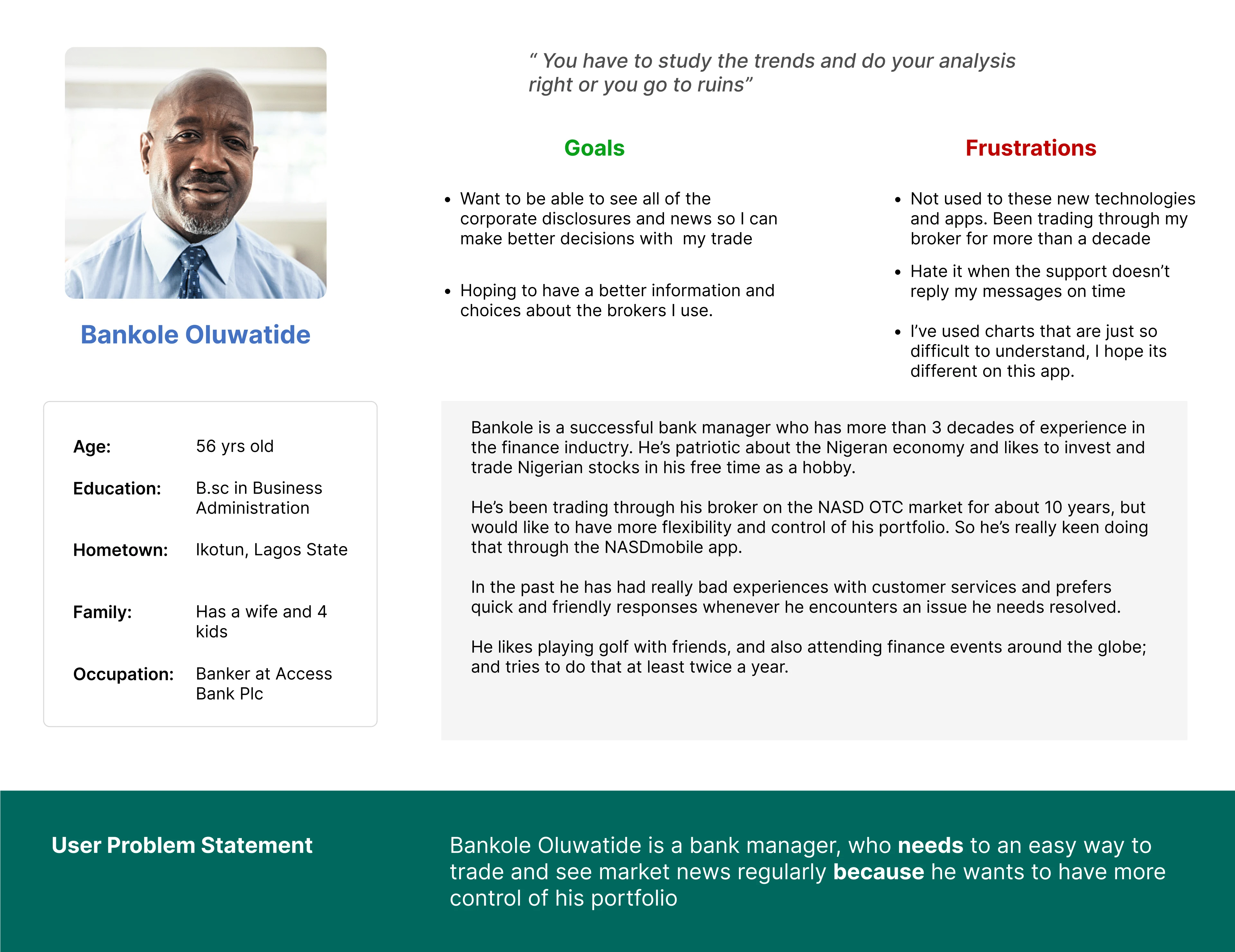
Persona 2
🥅 Information Architecture
To capture all the necessary sections and information needed to meet the specified requirements and design goals, I created a sketch of the information architecture.
Low fidelity Designs
To better understand how everything would work together and to facilitate iteration and idea generation, I designed low-fidelity screens and created a prototype. I shared these with stakeholders to gather their initial feedback, which helped refine the design. Due to timeline constraints, we decided to reserve user testing for the higher-fidelity designs.
LF Home screen
LF Portfolio
📲 Previous Screens
Here are some screens of the first version of the mobile app which needed improvements. As you can see there are issues with the Hierarchy and spacing of elements as information looks clustered.
🎨 High fidelity designs
These are some of the key screens created for the project
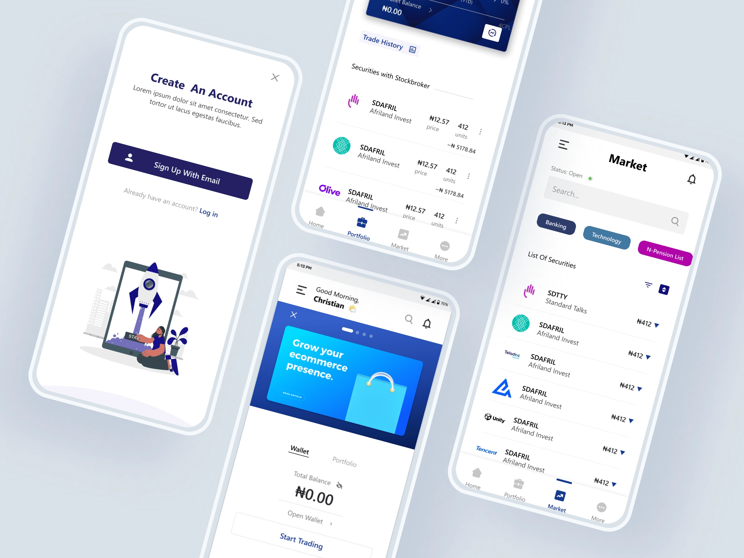
Onboarding screens
Added a customized welcome screen for the brand and also single sign in options (Google, Apple) for easy sign-up
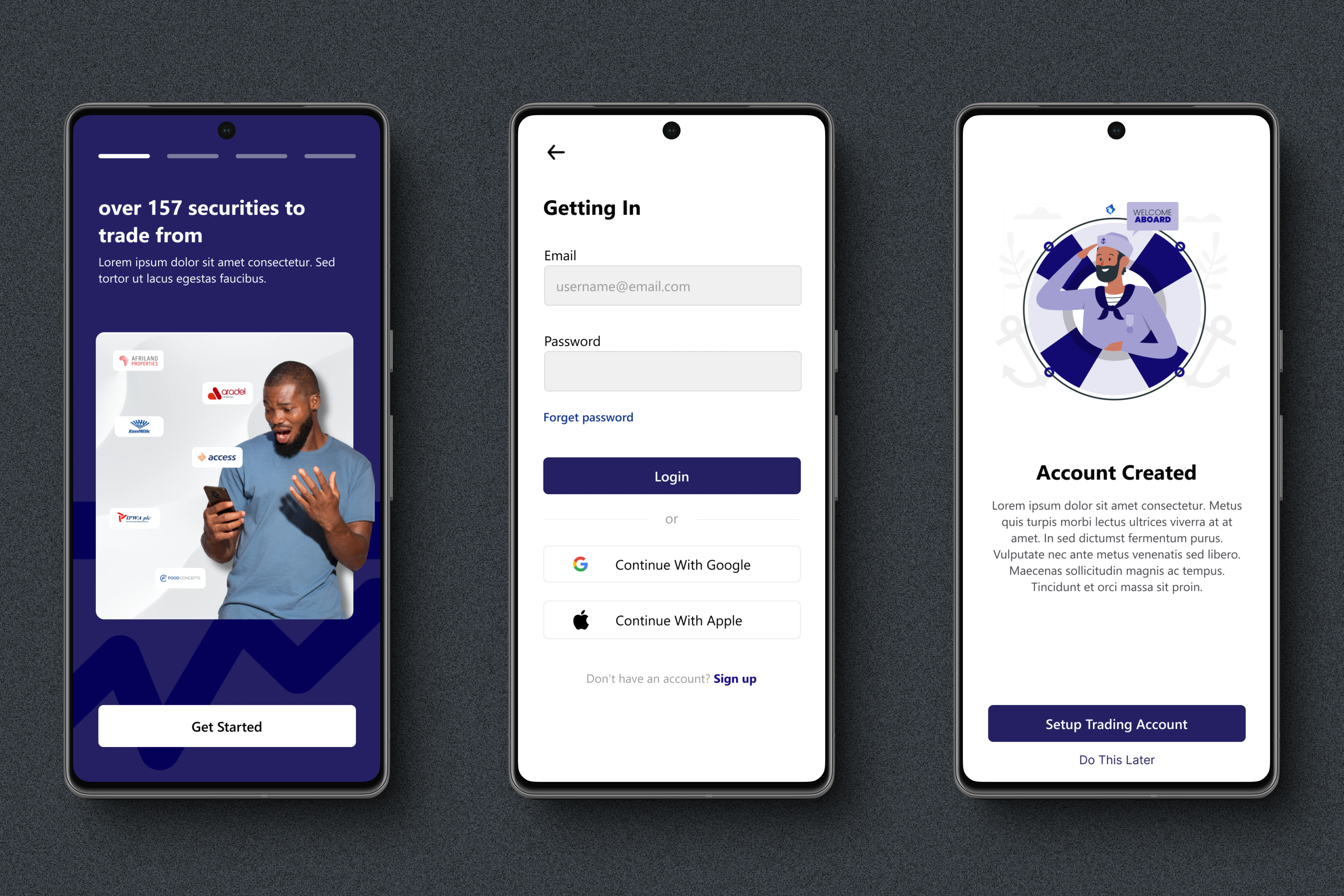
Onboarding screens
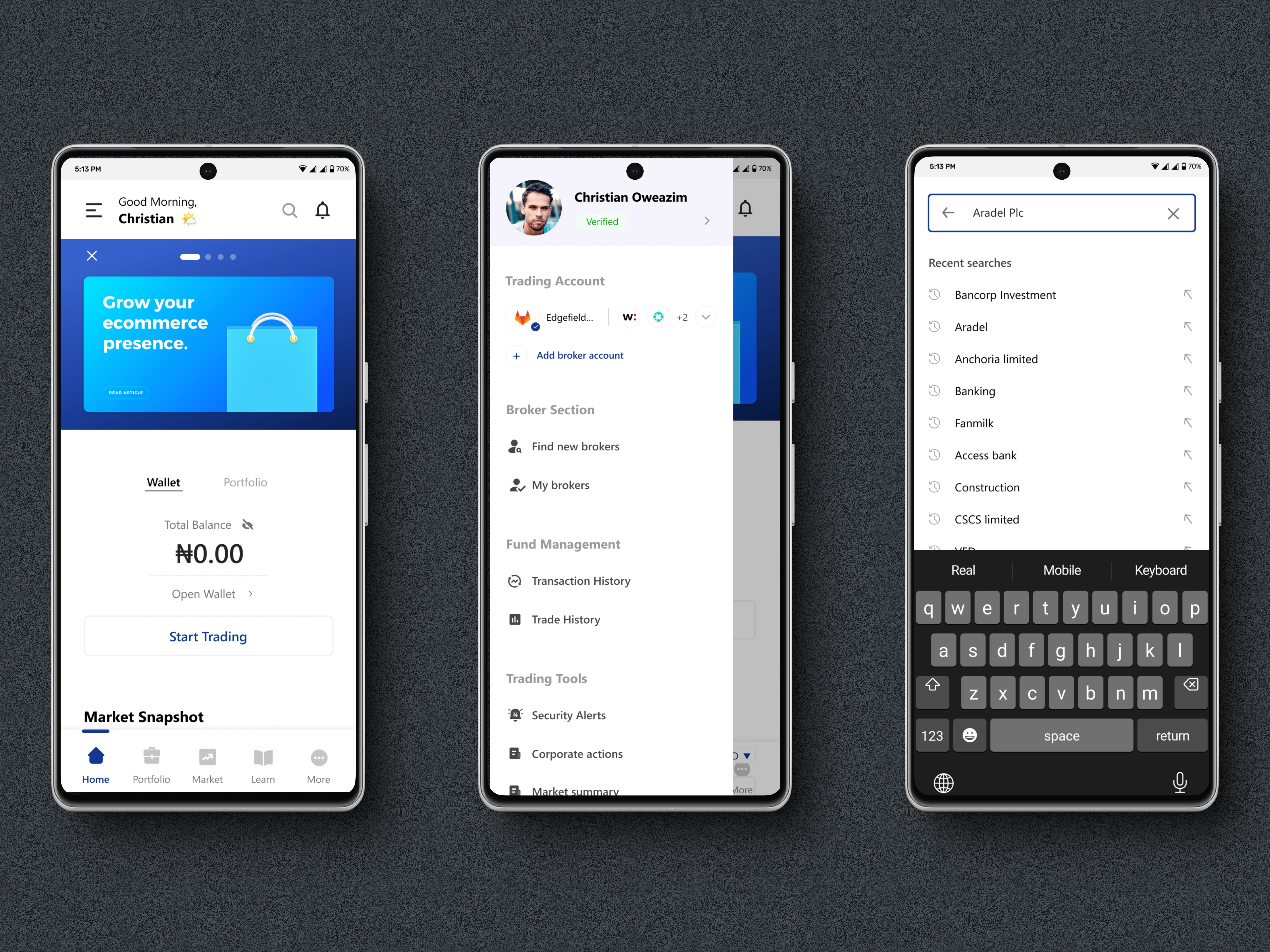
Home Screen
The new Market screen features a secondary hamburger menu for easier navigation to other areas of the app. It also includes a search bar to help users find security pages. Additionally, unlike the previous version, notifications are now displayed on this screen, allowing users to track trades, alerts, and other operations within the app.
Homepage screens
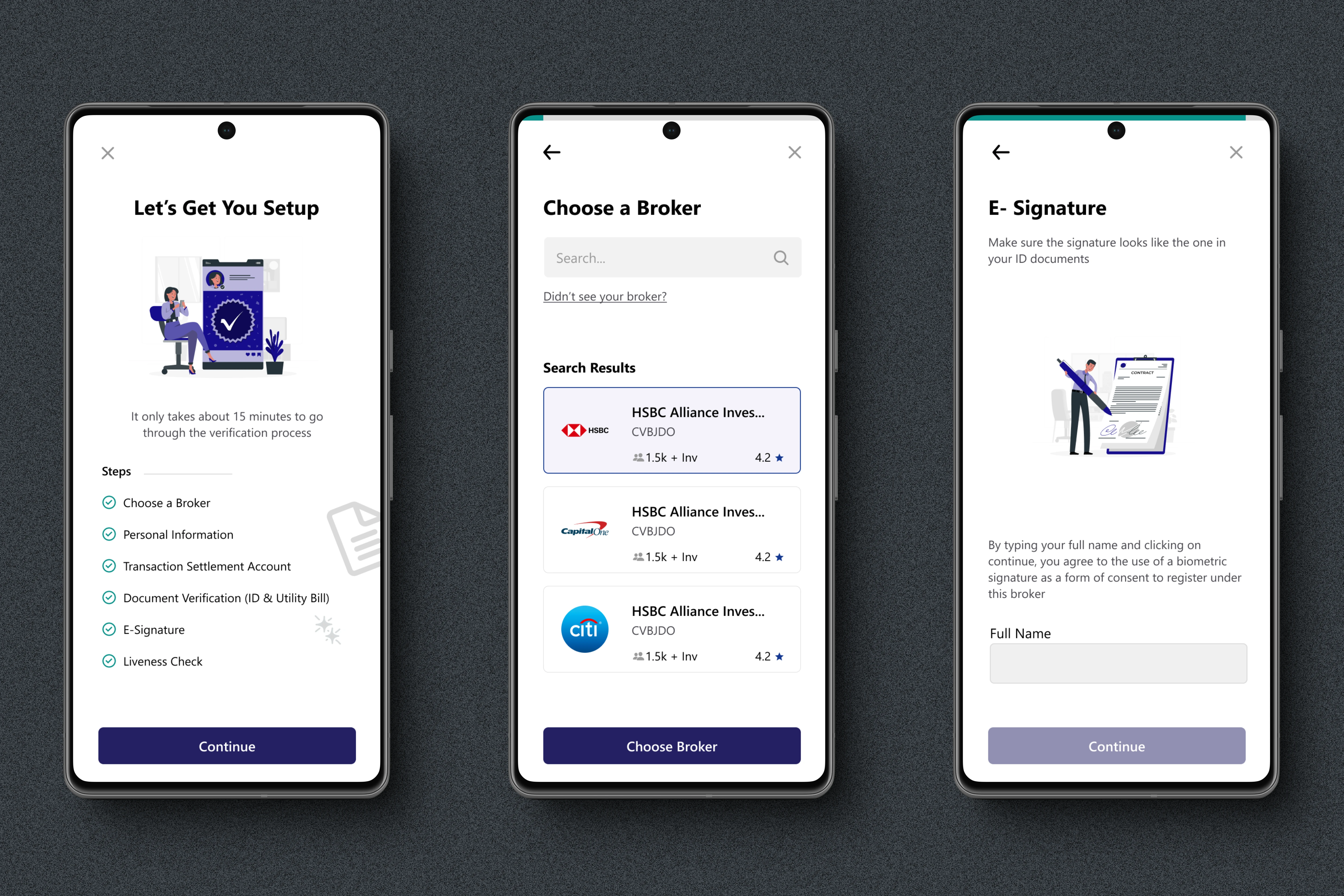
Verification Process
With the new KYC verification flow, users can now submit all requirements directly through the app, eliminating the need to send forms via email for verification.
Verification Screens
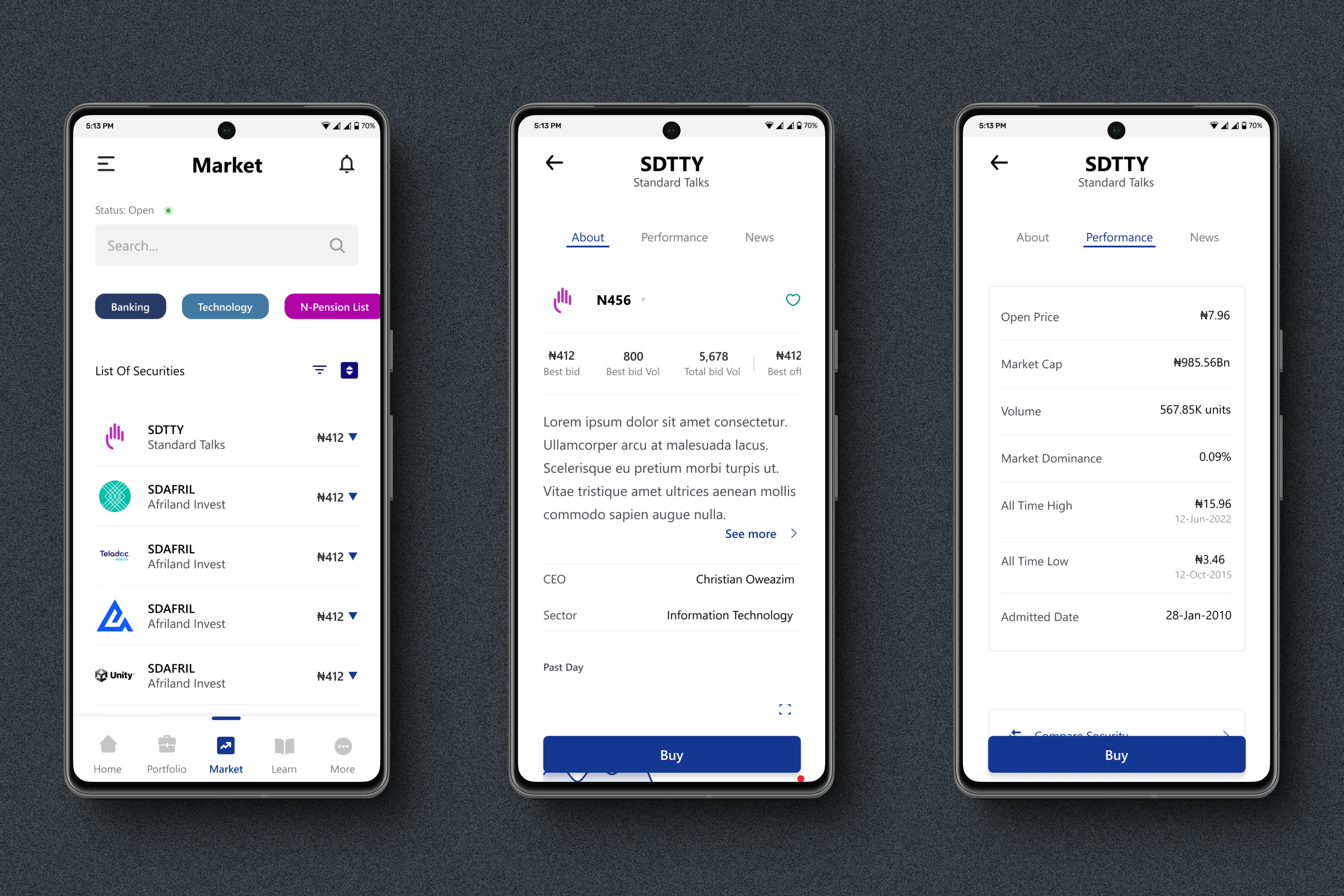
Market & Security pages
I focused on providing more contextual information for securities, addressing gaps from the previous version. The app now displays the CEO, sector, brief history, and top products of the publicly traded companies on a connected page, along with market performance and news updates. Additionally, the market page now features categories that users can click to view securities within specific sectors.
Market & Security pages
Portfolio & Trade History
The portfolio trade section now features an improved UI, allowing users to create wishlists set alerts for securities, and track recent news for those securities. The trade history includes clear visual indicators for buy and sell trades, and a connected page provides real-time updates on the status of trades.
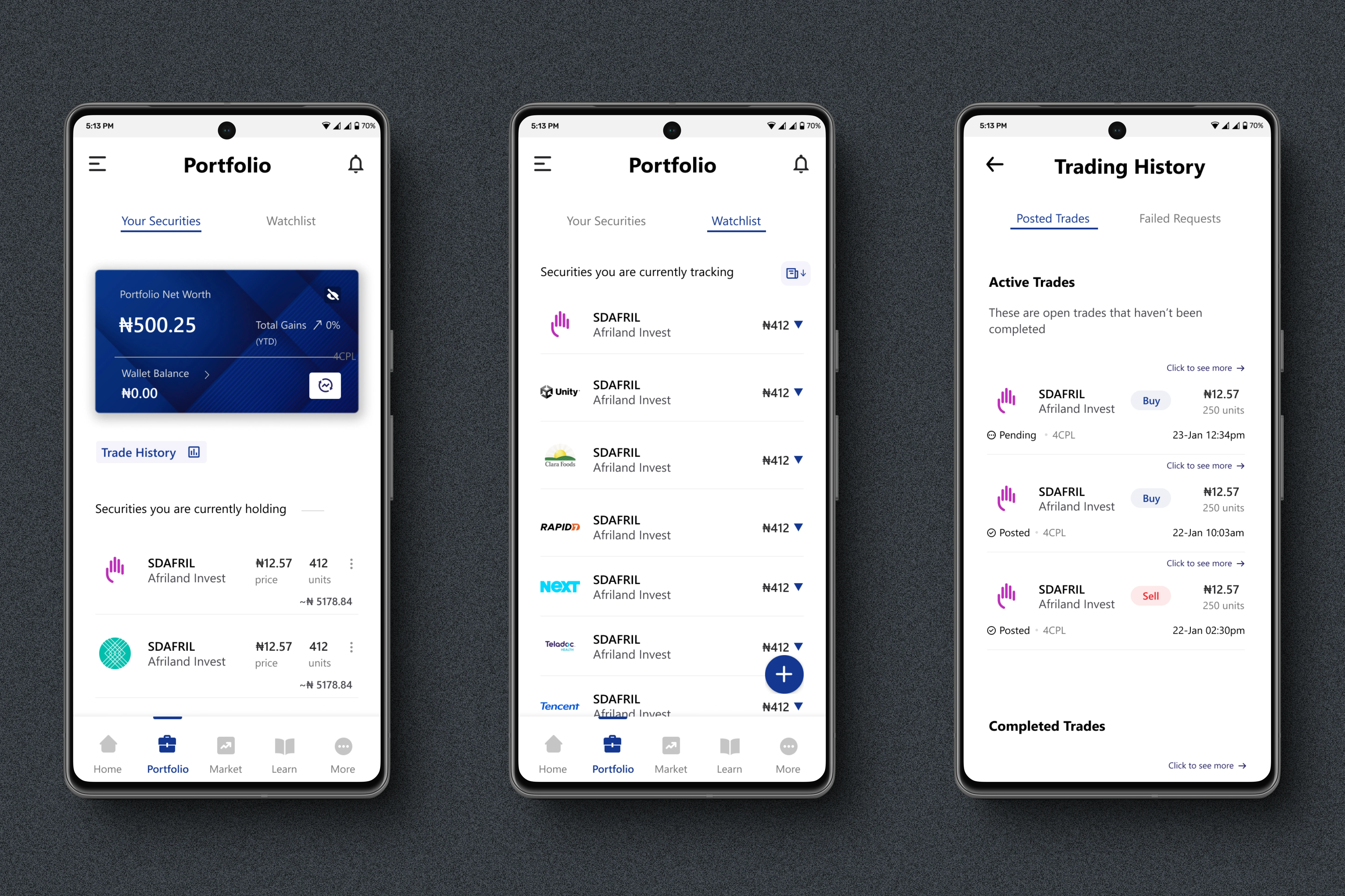
Portfolio & Trade history pages
Wallet balance & Fund wallet
The wallet section now includes details about the selected settlement bank, a feature that was previously absent. It also offers filtering options by date and other metrics for improved usability.
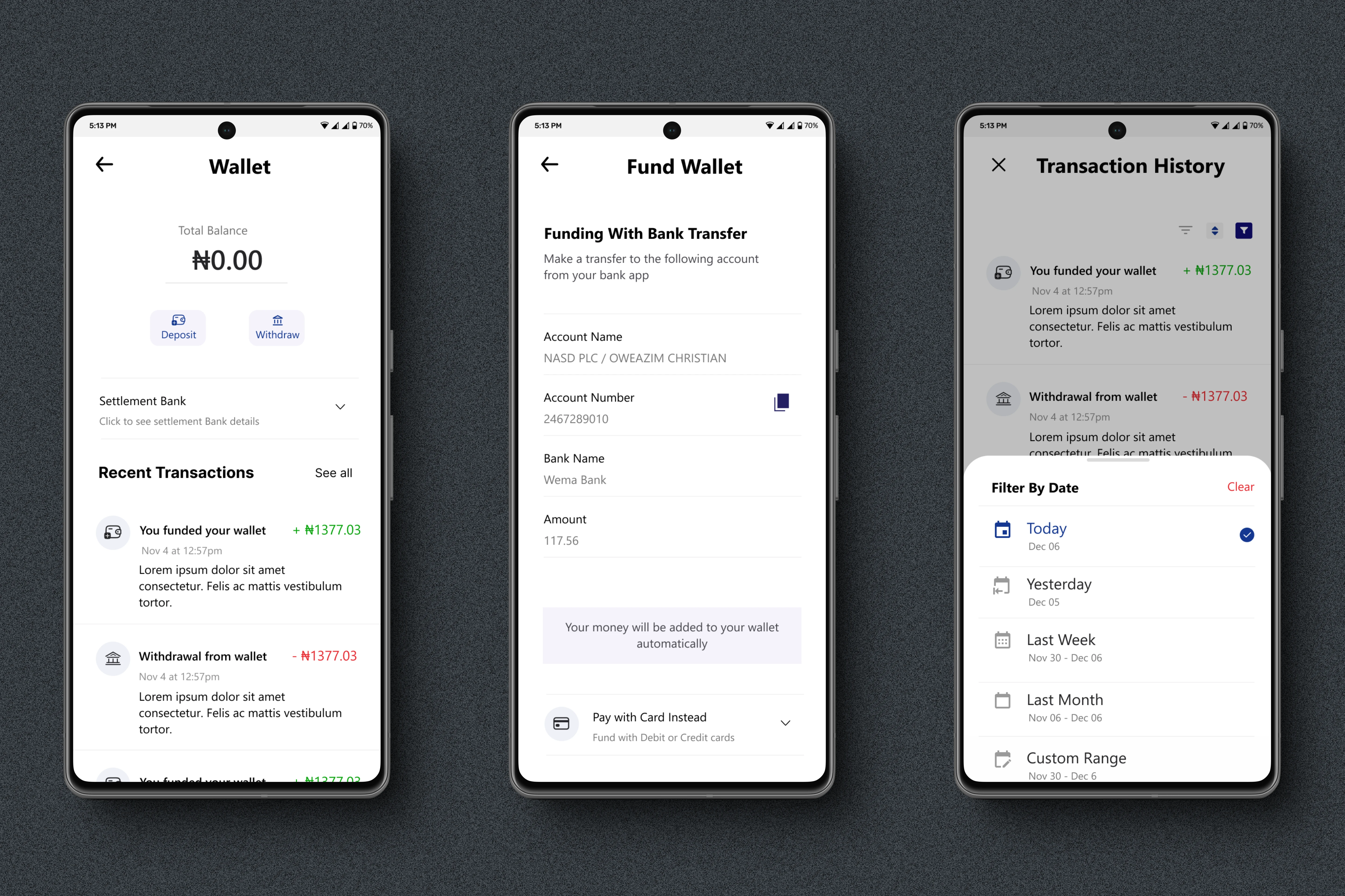
Wallet balance & Funding screens
Support, Learn & Security alerts
I added a support section to help users easily resolve issues directly within the app, a security alert feature to track volume and price movements, and a learn section to help users quickly gain more knowledge about the market.
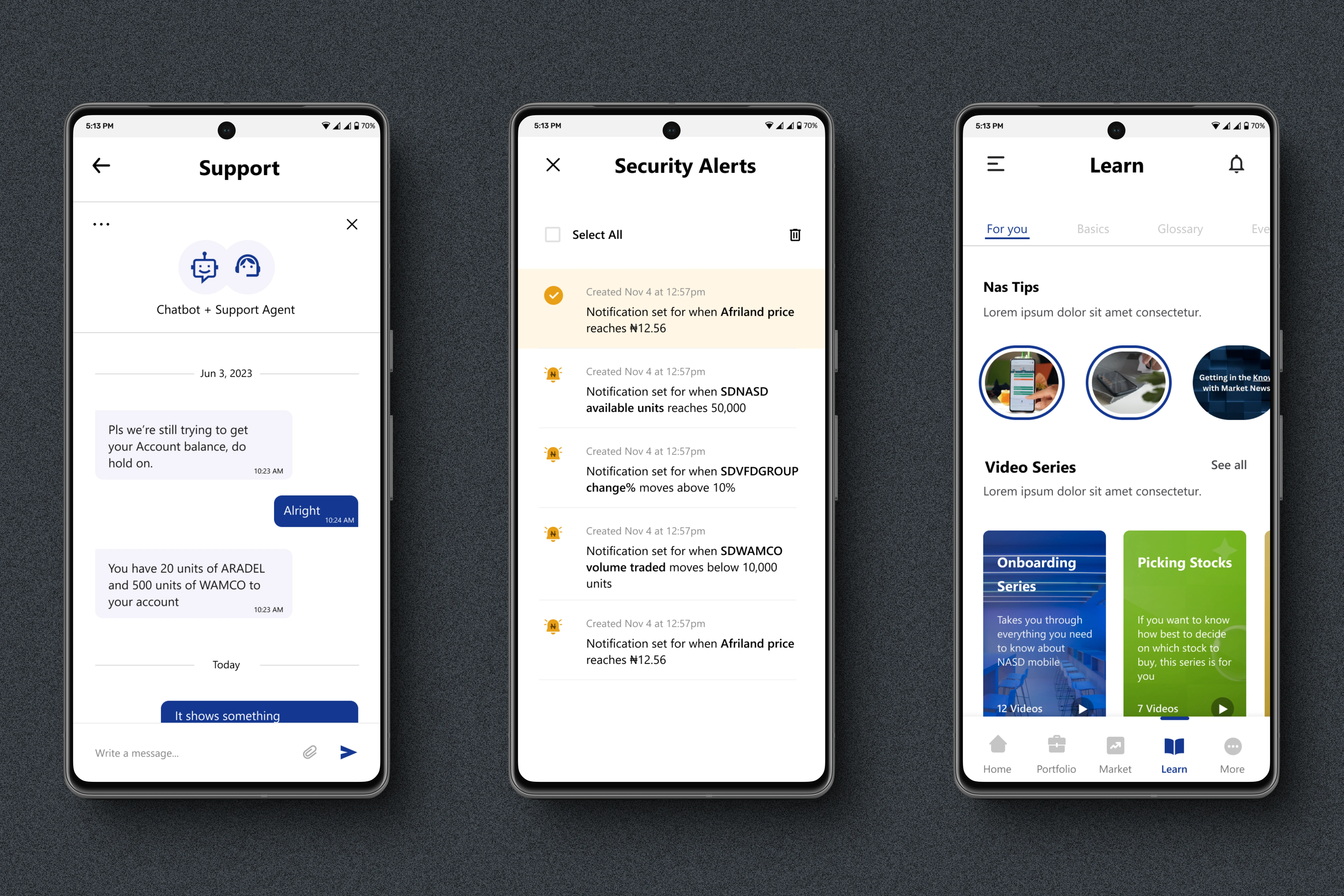
Support, Learn section & Security alerts
🧑🏽🦱 Usability study
Once the prototype was ready, we conducted a small usability study to gather feedback from prospective users, primarily current app users or individuals actively involved in investments. The goal was to determine whether the trading app was intuitive and easy to use for asset trading. Understanding user feedback on the app and its new features will help us gauge how close we are to achieving this goal.
Type of Research: Moderated Usability Study
Location: Board room (Office)
Date: 12th-13th February, 2024
Participants: Three(3)
Length: 50 minutes
Compensation: Participants were provided with refreshments during the study and received monetary compensation for their time, which was a surprise revealed only after the study was completed.
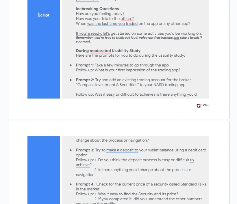
Script/Questions for Usability Study
💫 Reviews/Feedback from clients
We got a lot of insights from the study, and even new complaints about the current app which we were not aware of. Some of the top insights we got were:
Most participants wanted to use the search function to find brokers. At the time this, section of the app wasn't prototyped, but all users tried to use it to find brokers.
Action: From this, we looked at ways to make the search option give more helpful results2. Users are used to making decisions based on the top bids and offers that they see on security on similar exchange apps
Action: Add the list of top 5 bids and offers to the trade section. 3. From the reactions given, most participants loved the feature of adding multiple brokers.
Action: We could use this in our ad campaigns about the app.4. Based on the theme that: all participants did not know click trades in "trade history" for more details.
Action: We could create and educate users during the onboarding series. We could also look at the UI to see if there's any other subtle way to show that they can click on the trades.5. Most participants said they liked the idea of having the learning resources of the app.
Action: We could make sure the content in that section of the app is given priority, and updated regularly when the new version is launched6. Another insight was that users feel, that even though they may go through the KYC verification, it was still a lengthy process
Action: We decided to review the registration process to know if there are steps to remove. We could also look at using documents such as NIN, to capture some of the needed details for verification.7. Some users mentioned they would prefer the option to upload documents directly from their computer, rather than capturing them on the spot. A notable example was the e-signature process we had in place at the time.
Action: We decided to look at some of the documents and process, and decide on where we can allow a direct upload of documents.8. We also found out that some users are frustrated with their issues taking a long time to resolve on the current mobile app
Action: We took this feedback back to the support team, and also looked at the new support system from the admin side to see how to add ways to place processes that help the admins deal with complaints raised fasterThese were just some of the insights I got after breaking down the individual studies with participants into themes. I then worked on working with stakeholders to find solutions to some of the design problems identified.
Download the app on Play store and IOS App Store
👉 Check it out:
Google Play: https://play.google.com/store/apps/details?id=com.nasd
App Store: https://apps.apple.com/ng/app/nasd-mobile/id6462697635
Like this project
Posted Feb 11, 2025
I worked on the redesign for an OTC trading app. It included over 60 different screens and I had to do extensive prototyping and usability testing on it.