B2B SaaS Web App | DevOps Reporting Product Redesign
Challenge
Redesign an existing web app with usability problems and unappealing design
Solution
Create effective workflows and interface to monitor database for DevOps
My Role
Sole designer for a small startup. Worked closely with the CEO and developers
Understanding the product & setting goals
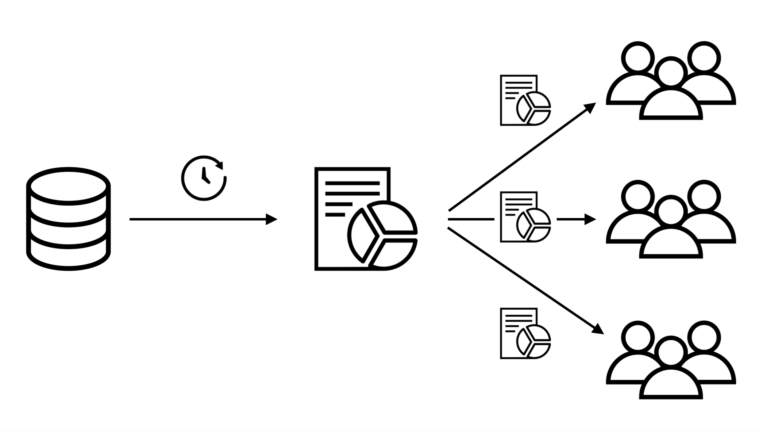
The client saw an opportunity in the marketplace when they realized data visualization tools, such as Kibana and Grafana, didn’t provide an easy way to automate the delivery of reports. They created the reporting and alerting automation tool as a simple and affordable solution for DevOps engineers to monitor changes in database.
Stakeholder Meeting
When I started the redesign process, the first thing I wanted to do was to understand what it does and how it works very thoroughly as it was a technical product to grasp without prior knowledge in database or visualization tools.
To do so, I conducted interviews with the internal team members to capture business goals and functional requirements. This was done in multiple sessions through in-person meetings and online product walkthroughs. By talking to the stakeholders at the company, I was able to review the status of the product in details and also how it compares to other products in the market.
Insights:
The product consists of two distinctive sub-products: Reporting & Alerting
Reporting brings a big competitive advantage over similar products
The company wants to combine Reporting and Alerting into one product
The company wants to minimize the setup time
Main target audience is DevOps engineers
Success Metrics
I wanted to establish goals and objectives, along with key performance indicators (KPIs) to measure periodically. Without a surprise, the stakeholders shared that their number one goal was to increase sales. There were also other aspects they wanted to improve, such as making the installation process simpler as the existing process required users to study extensive getting started documents, which led many of them contacting the support team. Based on these facts, I identified the following:
Key Performance Indicators
Download to Installation
Installation to Purchase
Support Tickets (Decrease)
Cancellation (Decrease)
Understanding The Users
Target Audience
One of DevOps engineers tasks is to automate the delivery of notifications that can impact business outcomes. They install and configure software for the company or for their clients to monitor key performance indicators, which is mostly on a server, cloud, or data center. They help product managers and business analysts to generate reports and monitor anomalies. They regularly read articles to inform their software purchasing decisions.
Product managers and internal business users use a reporting automation tool to monitor various activities. To use software like our product, they most likely need the assistance from a DevOps engineer to install and configure it. Because of this difference in roles and technical abilities, they may not need the full admin capabilities and act as a report creator or a simple viewer. They may influence the purchasing decision.
User Interviews
One thing I wanted to do differently was applying design thinking to the process. With limited knowledge and resources, the company hasn’t made a big effort to understand customers’ needs and pain points in depth. Before I delved into the redesign process, I suggested conducting interview sessions with customers to listen to how they use the product on a daily basis.
Before I talk to customers, I wrote some guiding questions to frame my research activities.
Research questions:
What are biggest challenges in installing the product?
What are biggest challenges in creating and scheduling a report?
What are main reasons for trial users decide not to purchase the product?
What are biggest challenges outside of using the product? (ex, customer support)
After talking to customers, I gathered the following insights:
Interview summary:
There is a learning curve in getting started and creating a report
It’s not intuitive to see how to use templates, which is a must
When creating a report, can’t see how the graphs will be turned out
Standard functions are missing (ex, drag-n-drop to move pages, auto-saving)
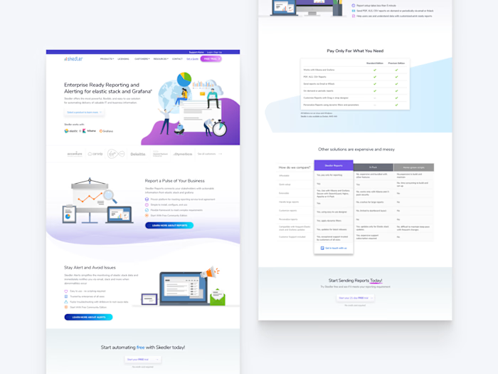
The website’s product pages don’t communicate features clearly
Understanding the product
Heuristics Evaluation
To understand the current status of the product, I conducted usability reviews to identify areas of improvements. I also evaluated competitive and related products in data visualization space, including the Elastic Stack, Grafana, and other open source software, to see how our product measured up against them. Here is the summary of usability reviews:
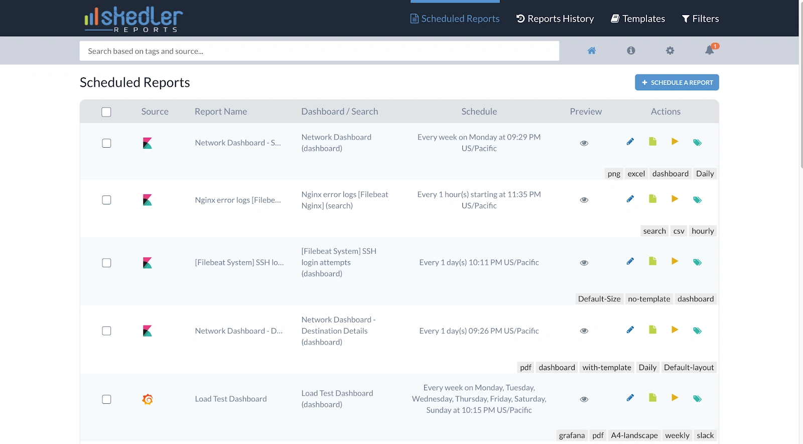
When you first launch the product, you see the dashboard screen. There is the button on the top right to create a new report. If it’s the initial launch, the screen will be empty. In that case, it needs a clear call-to-action so the user knows what to do.
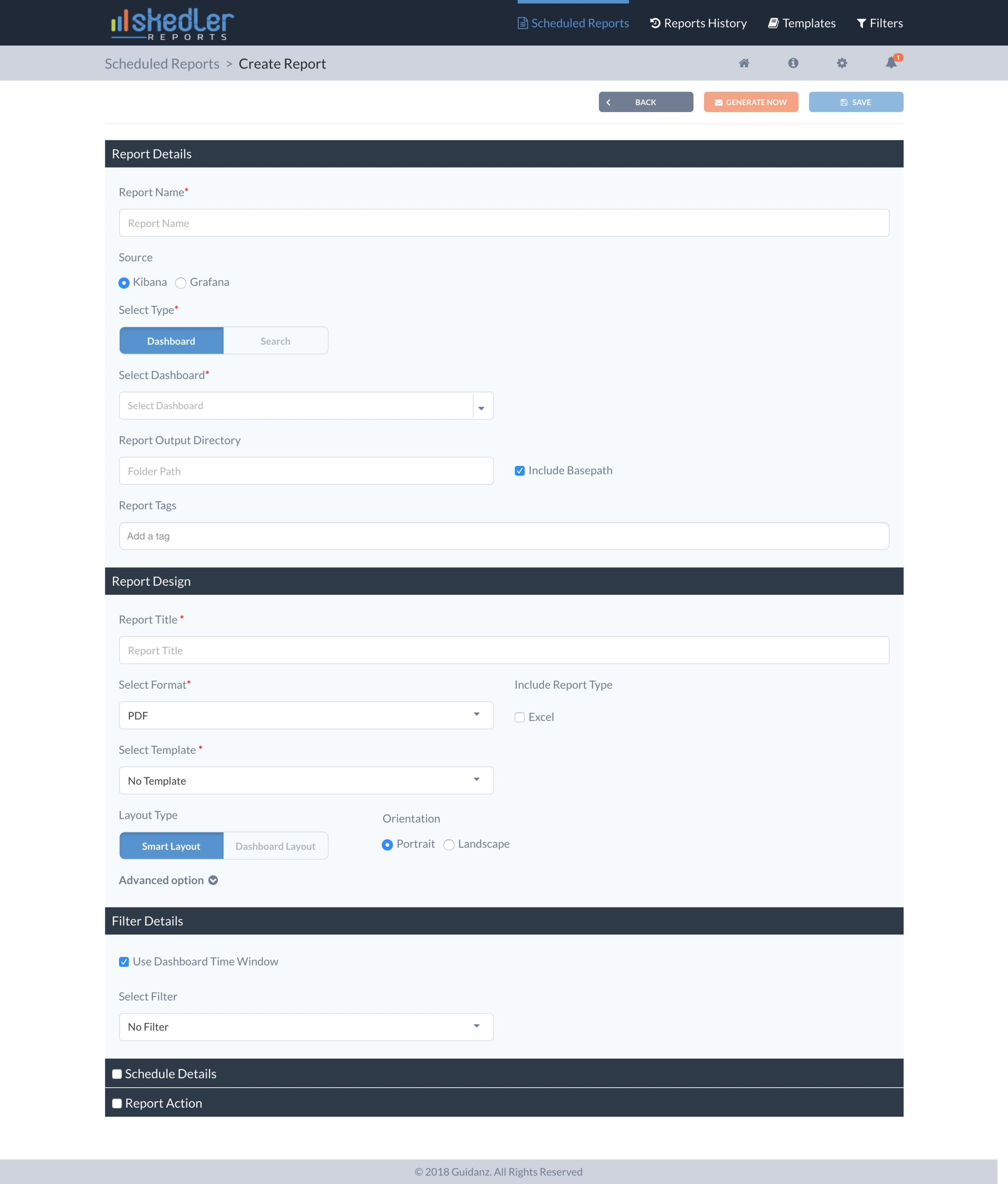
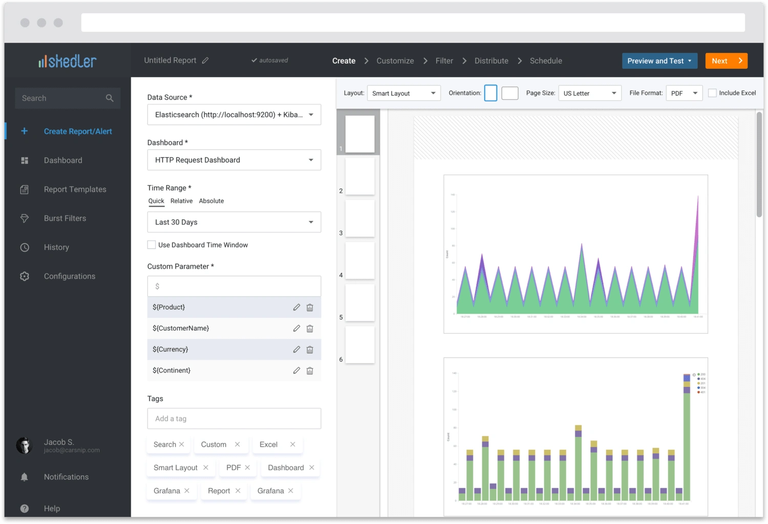
The create report screen offered all input field at once, which felt overwhelming and doesn’t provide any guidance. The last two sections were hidden by default without a clear reason. Each section is a major step in creating a report, which deserves an undivided attention from the user.
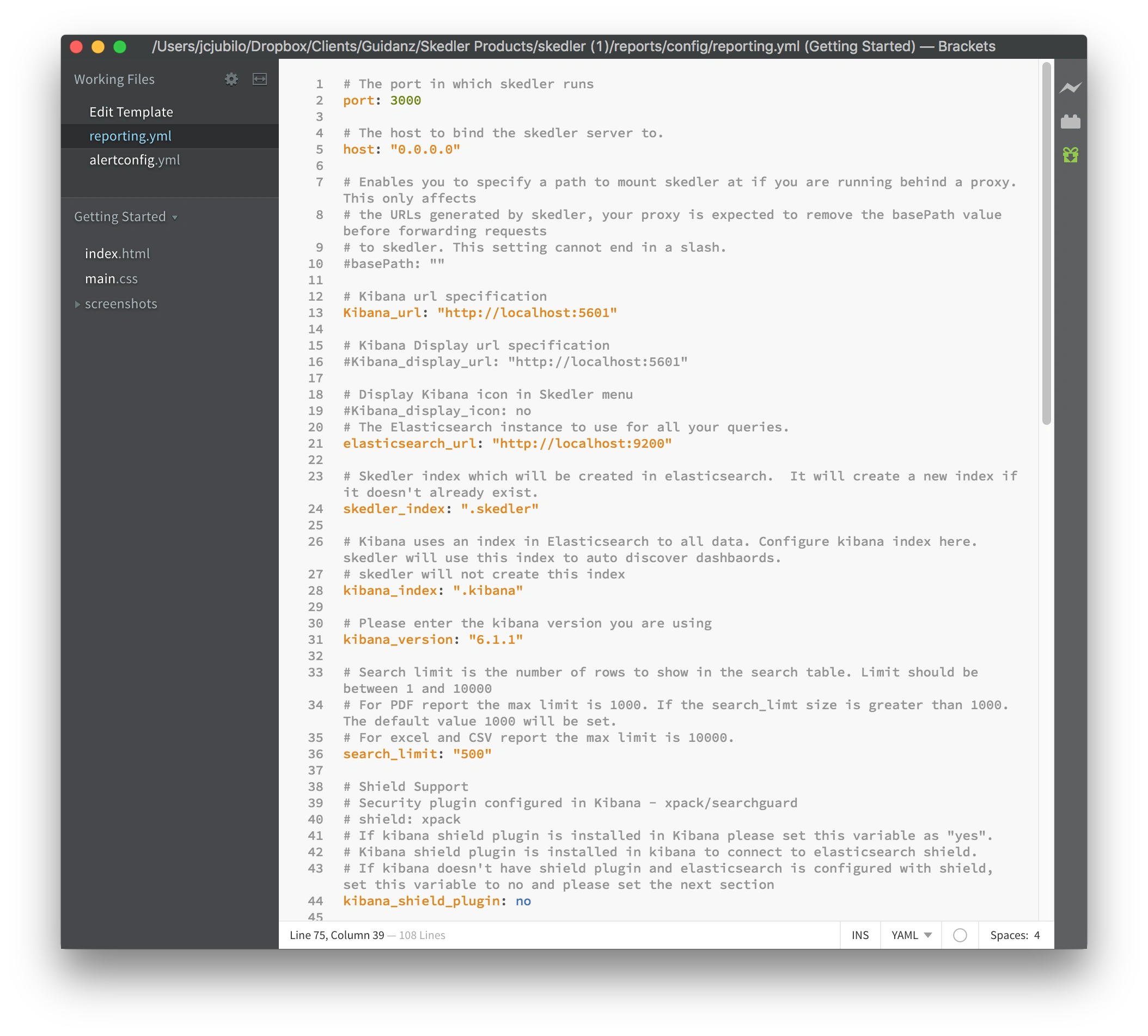
There is no initial setting options in the interface as the software relies on DevOps engineers to configuration through .yml file. All of the settings should be available through the interface. The required fields need to be displayed at GUI launch, if not setup properly through .yml file.
Key findings:
The interface should accommodate selecting from multiple data sources
Designing a report process should be more visual by previewing changes
Templates should be easy to apply and easy to edit
Filters should be integrated into the burst reporting feature, which isn’t clearly defined
Users should be able to add multiple notification channels
Competitive Analysis
Key findings:
Premium products offer comparable features but it’s an overkill if a customer is looking for a simple automation tool
The features may not cover important user needs, such as burst reporting
There are open source projects that offer more complete functionality but they usually only work with a specific product or don’t support adding multiple data sources
For open source products, there is no option for enterprise customers to get support
Many of them work with Kibana and follow its typical dashboard interface conventions
Synthesizing Insights
At this point, we had a lot of information gathered through different research activities. I also wanted to have an opportunity to capture any unspoken insights that individual team members had because the project has begun a while before I joined.
Affinity Mapping
I chose the affinity mapping as a method to synthesize findings into actionable insights. We wrote all our findings and personal insights on sticky notes and grouped them based on similarities. Another important step was to determine which features to include in the next update as not all of them were critical for the immediate release.
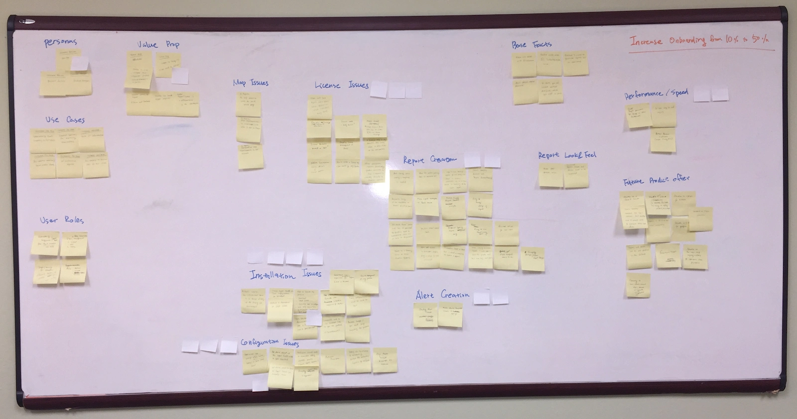
Feature Prioritization
Based on this exercise, we categorized features into four groups:
Must have
Simplify installation and configuration processes
Combine Reporting and Alerting as one product
Eliminate having to obtain a trial license and offer as freemium
Make report creation and usage of template more visual and intuitive
Clearly define the burst reporting feature
Auto-saving while creating a report
Automatic time zone setting
Should have
Real-time preview when the user makes changes
Drag-n-drop between pages
Could have
Automatic sizing of graphs to the template
Support more file formats for download options
Won’t have
Support different levels of access based on user roles
Offer our product as a Kibana plugin
More report templates for better design choices
Use Cases
Before I could design actual screens, I needed to understand the product on a micro level. I wrote use cases for all main tasks to describe steps to accomplish them. It also allowed us to exchange feedback on how the product should work before creating any visuals. As we discussed use cases, I was able to gradually refined them until everyone felt like we had the intended experiences for all major tasks. Because of the time constraint, I focused on the main flows and left out alternative or fringe case scenarios.
Preconditions: A user configures the product
Triggers: A user selects to create a report
Main Flow
The system sets the default name ‘Untitled Report’
A user enters the name and saves
A user selects Data Source > Dashboard
The system automatically displays a preview of the report from the selected data source
The system auto saves the changes
The system provides an option to further customize the report
The system provides an option to apply a time filter (default, bring Kibana time filter)
The system provides an option to change the location of the generated report
A user has an option to:
A user exits to a list of reports
IA Diagram
Based on user needs and our goals, I identified the app structure as a diagram:

Visualizing the solution
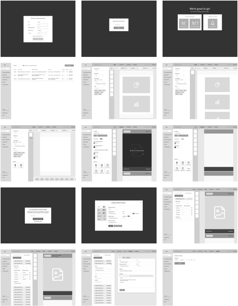
Wireframes
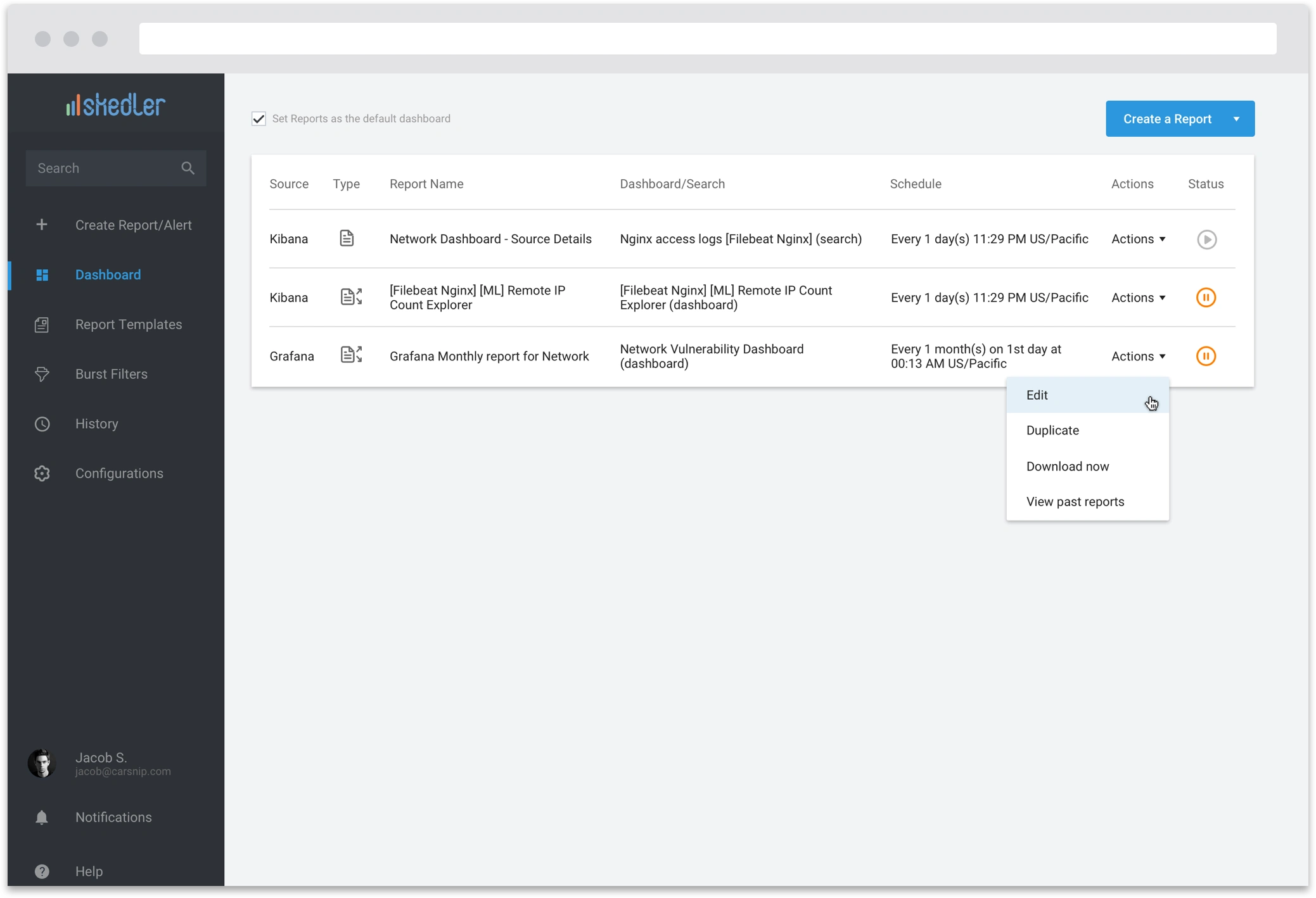
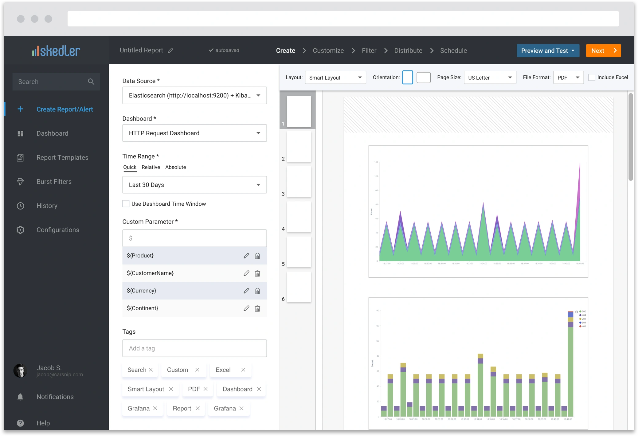
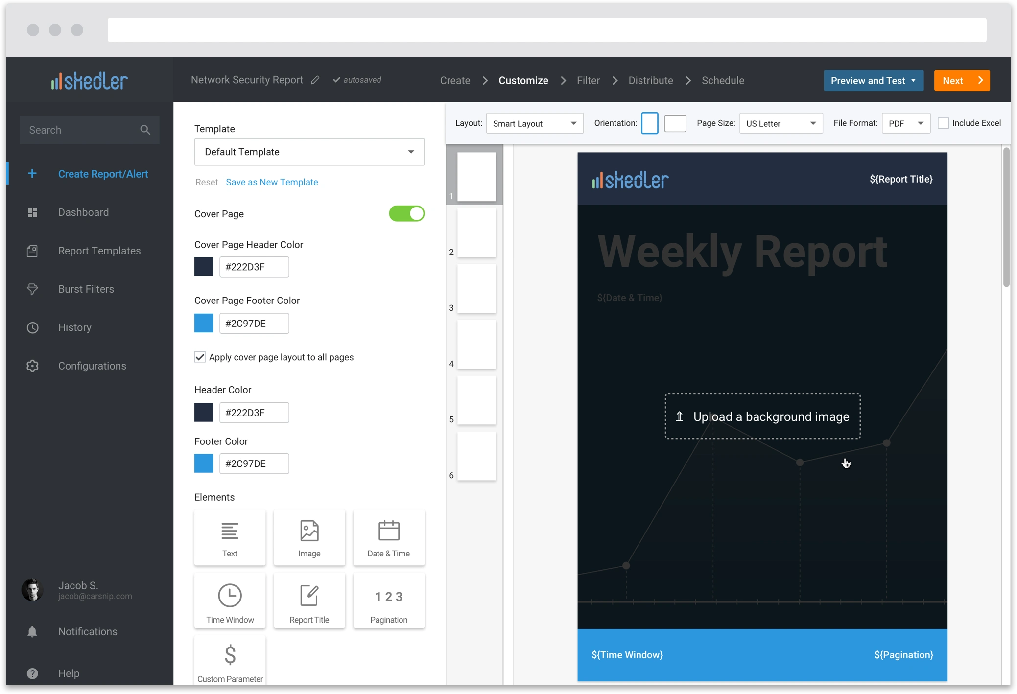
Visual Design
Like this project
Posted Aug 9, 2024
Crafting The End-to-End Experience Through Navigating Ambiguity
Likes
2
Views
35

