Website Redesign | Software Product Marketing Website
Challenge
A software marketing website doesn’t explain product features clearly and has the outdated design. It doesn’t have the optimal sales funnel to maximize the number of downloads, which could lead to more sales.
Solution
By redesigning the website that will have the optimal sales flow and attractive visual design, we will maximize the number of downloads and increase sales.
Product Background
The software company wanted to redesign their marketing website to optimize the sales funnel from download to installation to purchase. After talking to the stakeholders, I found out the following needs and insights:
Key findings:
The redesign needs to be done gradually in the order of a business impact
There are obviously important pages, such as Free Trial page and Pricing page
The product line has two individual products, hence two different sets of content
The overall flow and visual design need to be improved greatly
Customers are mostly engineers and they purchase software on behalf of their company
Success Metrics
To measure the success of our redesign efforts, I wanted to establish goals and objectives, along with key performance indicators (KPIs). Without a surprise, the stakeholders shared that their number one goal was to increase sales. There were also other aspects they wanted to improve, such as making the installation process simpler as the existing process required users to study extensive getting started documents, which led many of them contacting the support team. Based on these facts, I identified the following:
Goal
Increase sales
Objectives
Increase the conversion from trial to paid users from 10% to 33% over the next 12 months
Key Performance Indicators
A percentage of unique visitors converting to downloads compared to last month
A percentage of downloads converting to installations compared to last month
A percentage of installations converting to purchases compared to last month
A number of support tickets related to installation related issues
Target Audience
Primary: DevOps engineers
One of DevOps engineers tasks is to automate the delivery of notifications that can impact business outcomes. They install and configure software for the company or for their clients to monitor key performance indicators, which is mostly on a server, cloud, or data center. They help product managers and business analysts to generate reports and monitor anomalies. They regularly read articles to inform their software purchasing decisions.
Secondary: Product managers and business analysts
Product managers and internal business users use a reporting automation tool to monitor various activities. To use software like our product, they most likely need the assistance from a DevOps engineer to install and configure it. Because of this difference in roles and technical abilities, they may not need the full admin capabilities and act as a report creator or a simple viewer. They may influence the purchasing decision.
Data-based Design Decisions
Besides what I found out from talking to the stakeholders at the company, I wanted to verify and discover the facts about the site by looking at the analytics. The company has set up Google Analytics and has been collecting data. Based on the data, I found out that the traffic volume is small but it’s quality traffic based on bounce rate and time spent. However, it’s not showing an upward trend, which is concerning in a long term. Users are mostly males, the age between 25-34 working professionals looking at the site on their desktop, which matches the description of target users. Most visited pages are blog articles, products, pricing, and free trial pages, which confirms our previous assumptions.
User Testings
Based on interviews and analytics, I wanted to set priorities in my design efforts. I decided to conduct user testing for key pages with customers and people who resembled the target user profiles. Although I was pressed for time and resources, I felt strongly about getting feedback from users, not making design decisions solely on my opinions no matter how obvious it looks.
Each session lasted from 30 min to an hour. I used Zoom (a video conference tool) to ask the participant to share their screen and think out loud. Here are findings from user testing sessions for some of the key pages:
Pricing page feedback:
Pricing wasn’t clearly explained for different products and versions
When the customer service reached out, a scheduling software they used was great
Some of the color codings didn’t serve any purpose and actually confused people
Standard vs. Designer editions table wasn’t clearly explaining the differences in features
Free trial page feedback:
Some of the wording and form field labels need revising
Well-known customer logos will help convincing visitors to download
After downloading, it auto-redirects from thank you page to Get Started, which is confusing
Need to remove auto-redirect and stay on thank you page with links to Get Started articles
Visual Design
When it was time to think about visual design, I reached out to the stakeholders and asked for references to see the style I needed to consider. The clients referred to brands, such as Asana, Slack, Intercom, and UserTesting.com, which had modern, airy layouts with a certain style of illustrations.
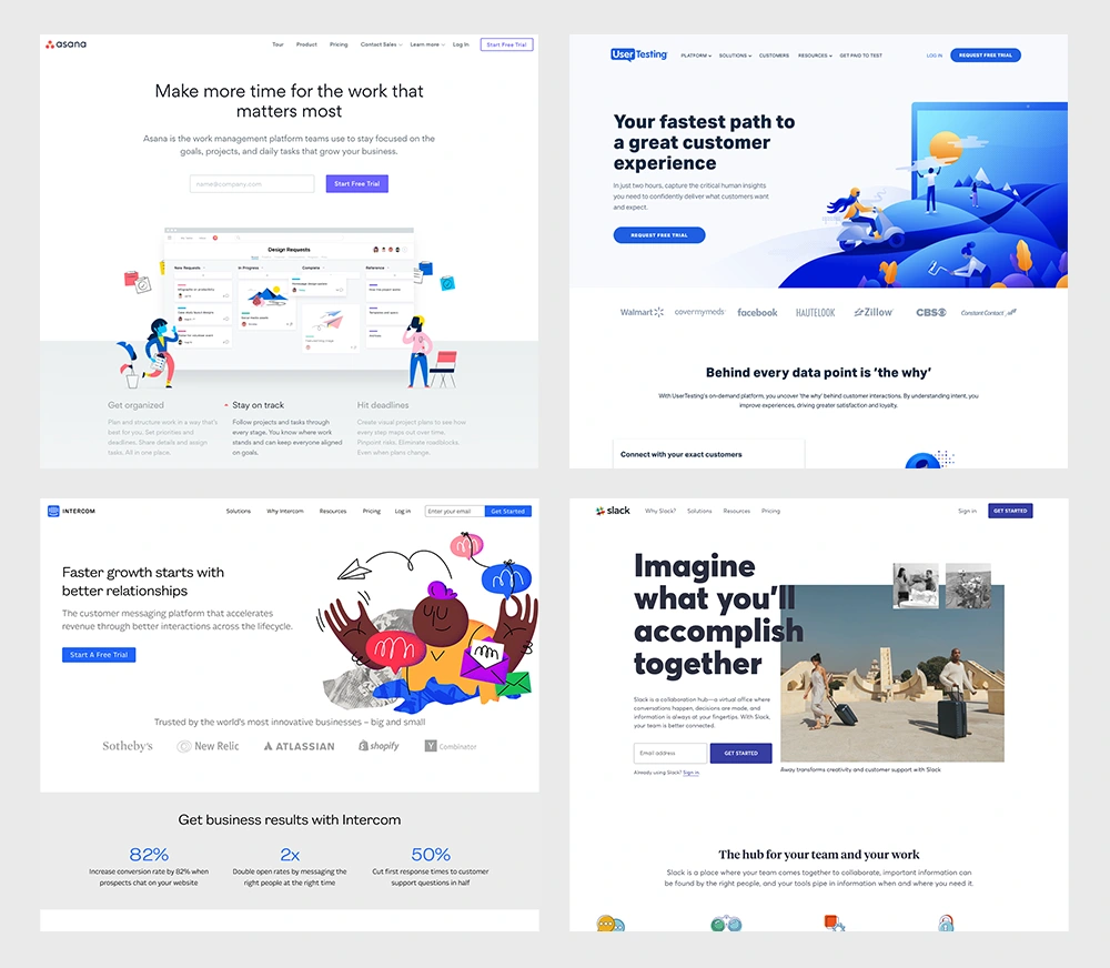
With these references in mind, I designed final mockups. I used Sketch to create the assets and Zeplin to deliver them to the developers. We also used Slack to communicate follow up requests and exchange feedback.
Homepage
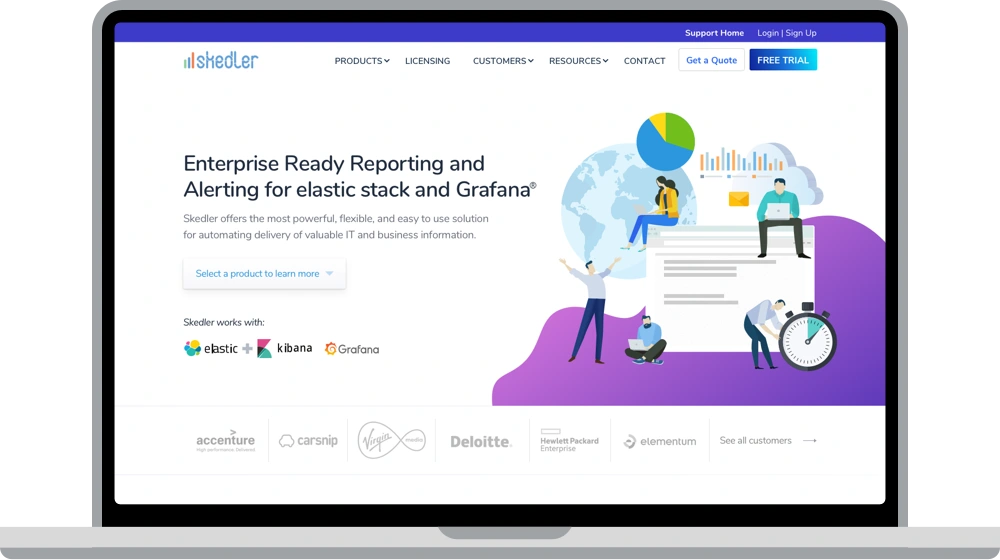
The main navigation has been simplified with an emphasis on the free trial download button. The style of the illustrations has been carefully chosen based on the design direction. The summary of each product is displayed with inviting visuals to learn more.
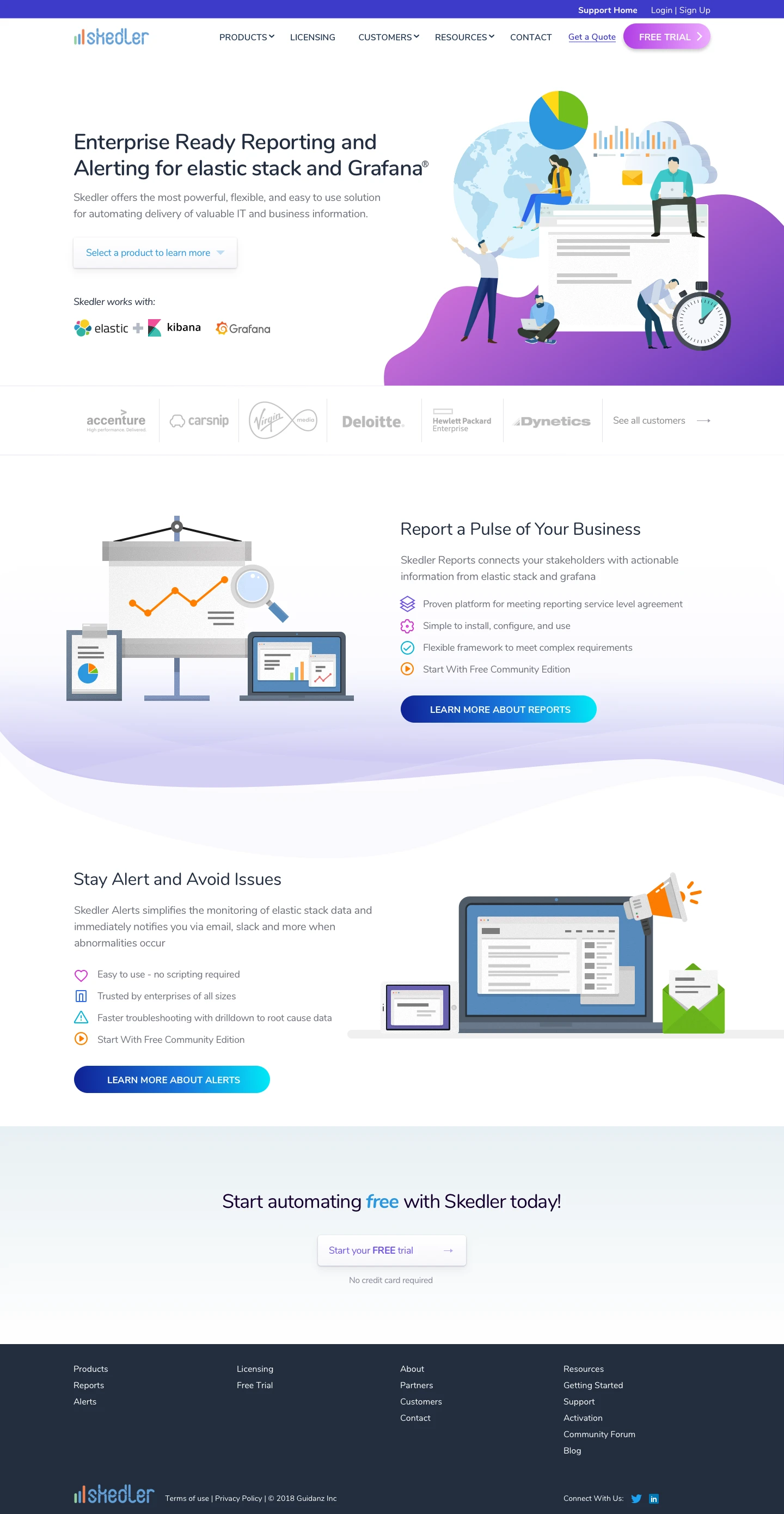
Product Main
The short intro video provides at a glance view of the product features. The customer logos are added to convey credibility. Simple illustrations and icons give a visual break throughout. The comparison chart clearly communicates the superiority of our product over others.

Licensing (Pricing)
The page title has been changed to Licensing and customers are now encouraged to contact the customer team to get a quote. The tabs separate the two products with a comparison chart to show the differences between Standard and Premium editions. A scheduling tool has been embedded to set up an appointment based on the user testing feedback.
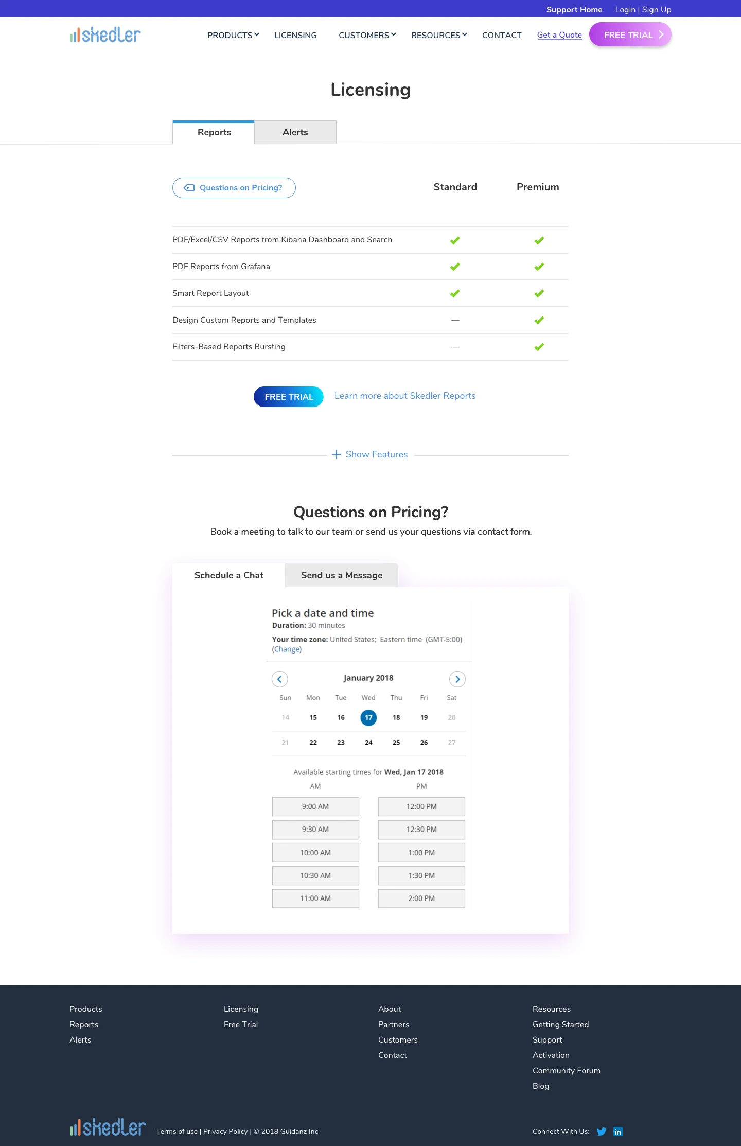
Free trial
The main navigation is strategically removed for visitors to focus on downloading the product without any distraction. The form has been simplified to contain only the essential fields.
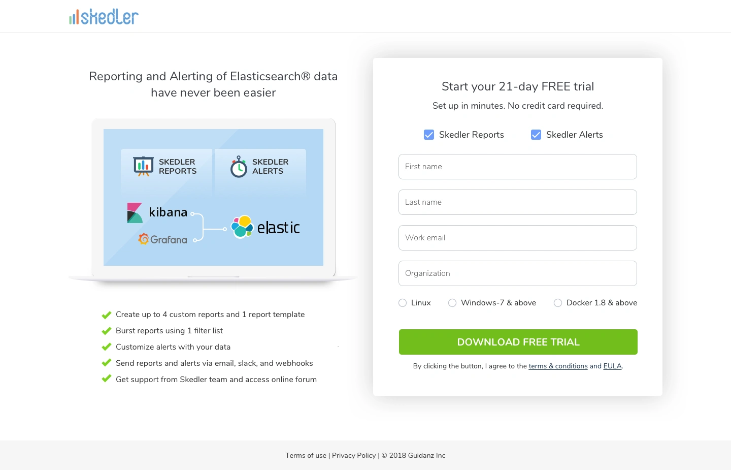
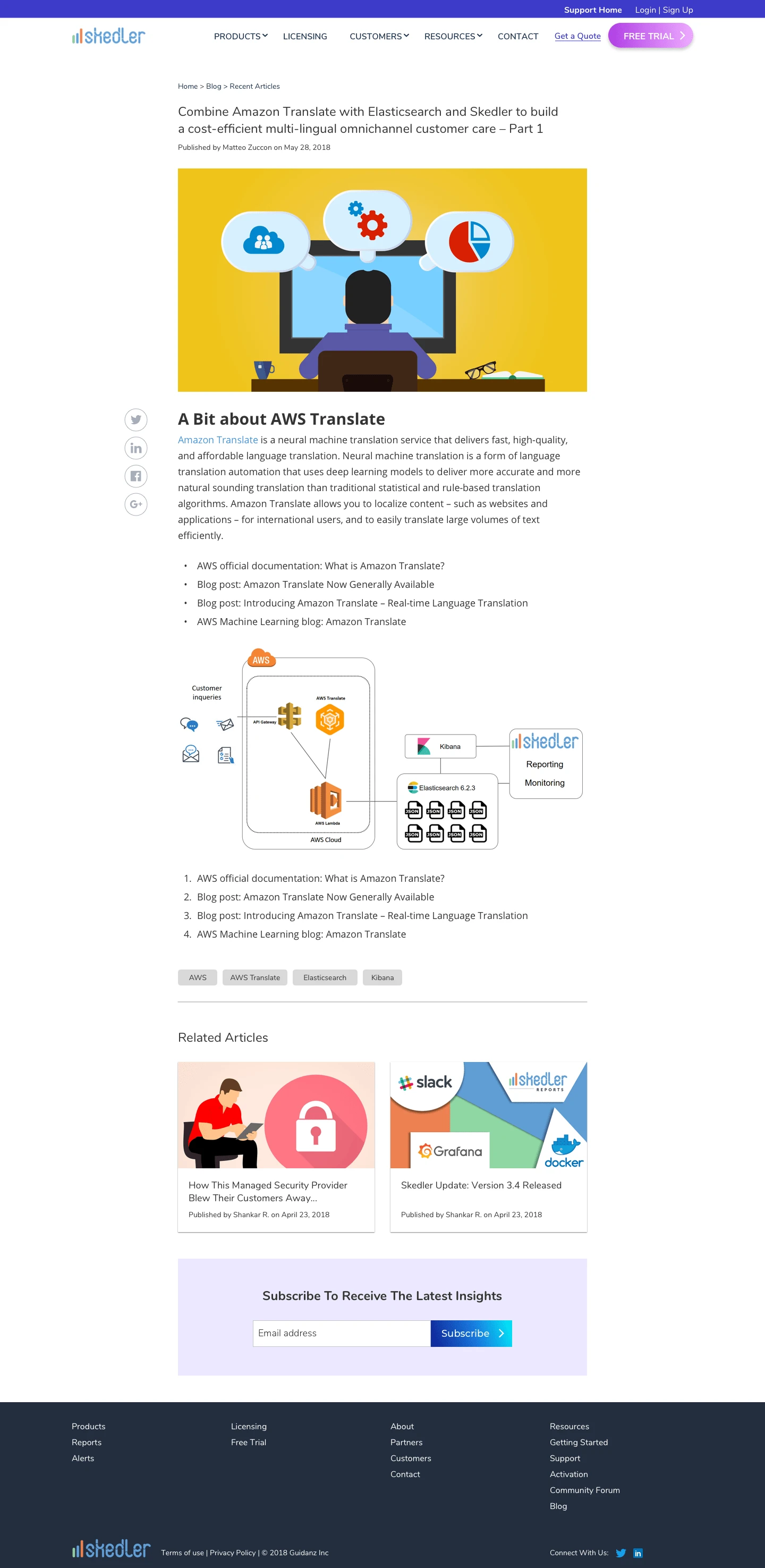
Blog article
The content width is narrow to reflect the modern blogging site styles and the optimal horizontal reading length. The featured image has been chosen based on the style guide of the site.
Like this project
Posted Aug 9, 2024
Enhancing Visual Appeal and Increasing Conversion Rates
Likes
0
Views
7

