B2C SaaS Web App | Push Notifications Feature Design
I was the lead designer for this project. I collaborated with 1 product manager, 2 back-end, 1 front-end, 2 iOS, and 1 Android engineers. I led research efforts from planning to execution and defined the end-to-end experience.
Challenge
Customers didn’t have a way to engage with their members on mobile
Solution
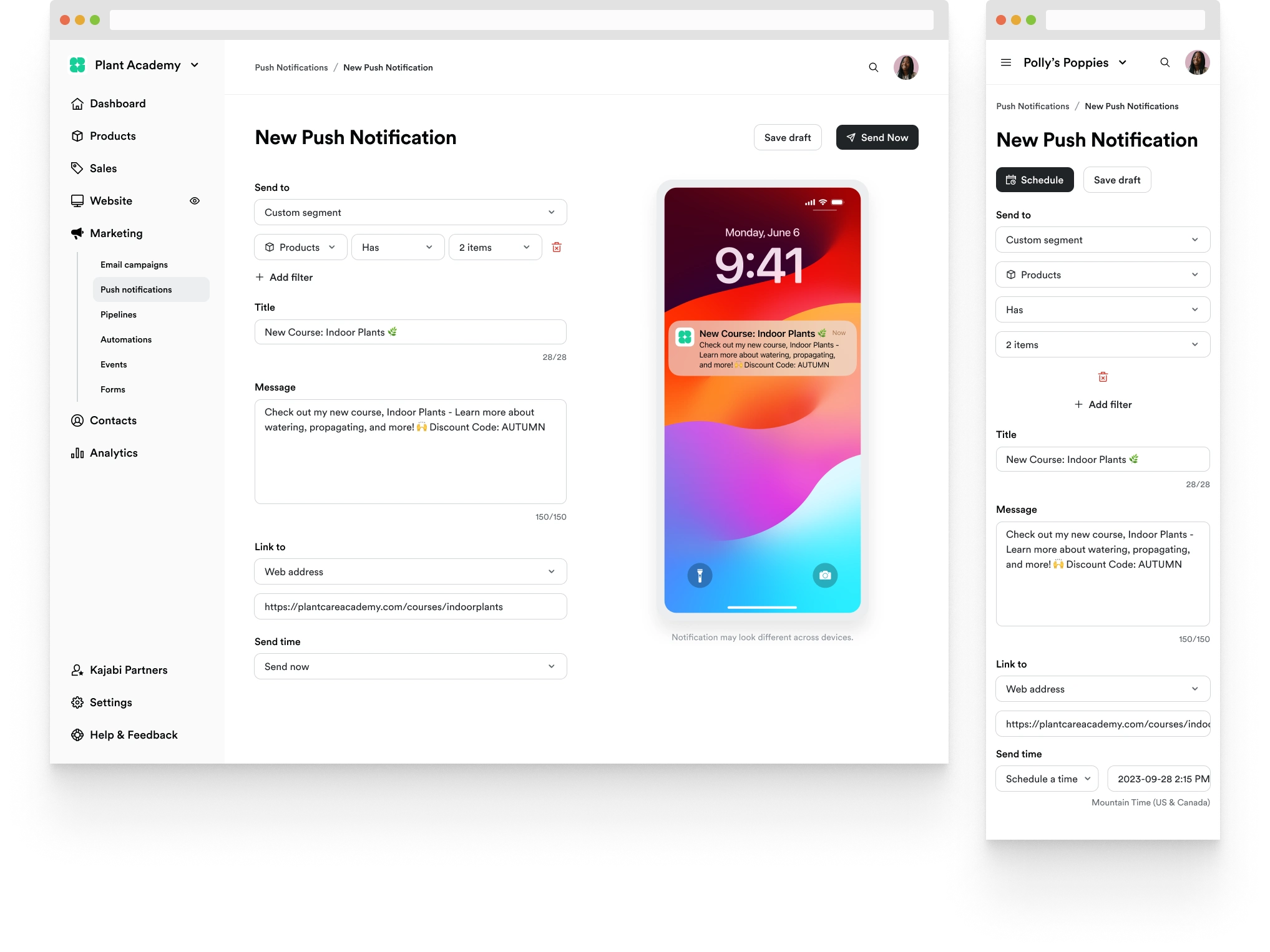
Design a flow for customers to send push notifications
My Role
Lead designer, leading the project from start to finish in Sep 2023 - Nov 2023
Project summary
Customers who published their own branded mobile apps wanted the ability send push notifications as part of the add-on offering. The new feature now provides a unique and powerful opportunity for customers to engage with their members that didn’t exist before.
The problem
In a survey with customers who launched their own branded app, we’ve discovered that the ability to send mobile push notifications was one of the most requested feature.
User goal (Jobs to be done)
When I have my own branded app, I want to send push notifications to my members so I can engage them to help grow my business.
Business goal
We want to build a push notifications feature to increase the perceived value of the branded app offering and drive signups.
Discovering the WHY
When I first started thinking about a push notification feature, it was straightforward to figure out individual components that make a push notification, such as title, message copy, link, etc. Although including all these was a possibility, one question kept coming up in my mind, “Why do people want to send push notifications?”
At the time, I was in touch with two customers who were part of the beta program for the branded app. To take a peak at customers’ minds, I reached out to them and asked why they want to send push notifications. Their answers were insightful and made me curious what a larger number of customers would want.
Survey
After getting some initial feedback, I kicked off the official research, starting with a survey. The survey results were mostly in line with the anecdotal responses. When I looked at the top responses, I was able to see customers wanted to send their members to a new piece of content in the app. The other use cases were covered by having an option to open a web URL. At this point, I had enough information to craft the initial solution knowing I’ll have opportunities validate it with customers in usability testing.
Official Guidelines
It was important to understand the anatomy of a push notification in both iOS and Android platforms so I can clearly understand the full capability. I selected the common denominators between iOS and Android, title and body text, as essential. I slated other elements for future iterations because they were not critical for the first release.
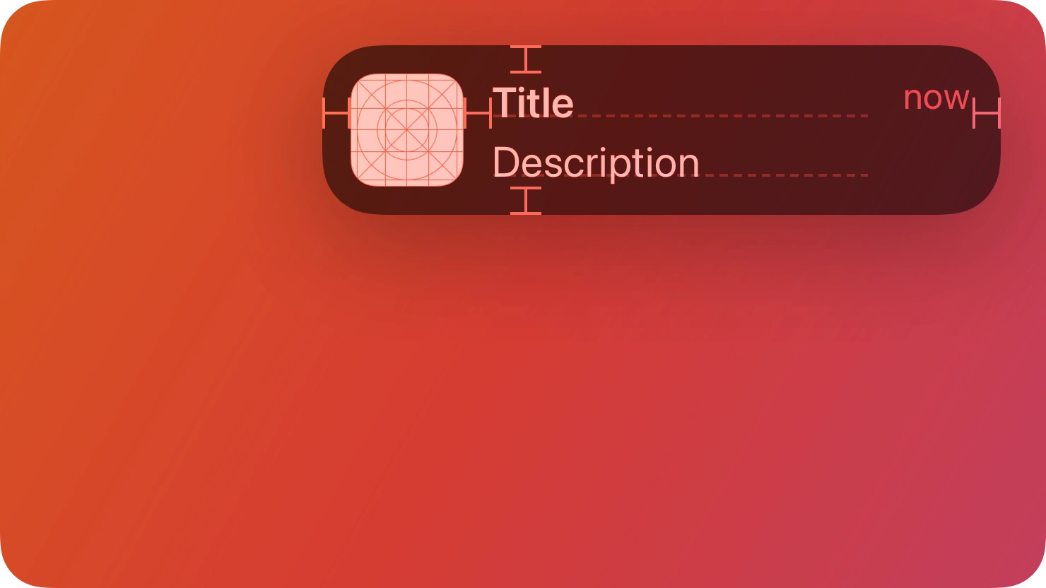
iOS notifications
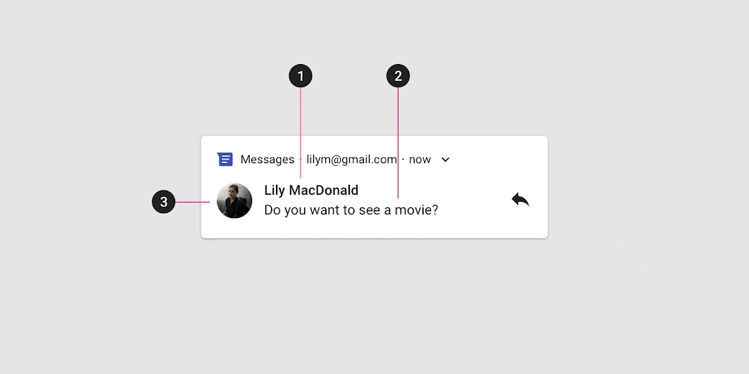
Android notifications
Exploring other products
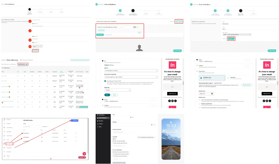
After gained the full understanding of push notifications, I explored the competitive and comparable products to see what customers might be familiar with as conventions and get ideas for the general layout. I thought the preview was helpful to see changes in real-time and will create a delightful experience. Some products had advanced segmentation and send time optimization features and made me wonder if our customers would want advanced options.
Moderated Usability Testing
When the design was finalized, I’ve conducted usability testing with 4 participants selected from the survey respondents. Overall the solution was well-received and customers particularly liked that it resembled our email system, which was what they were already familiar with. All participants had very positive reaction to the preview. To my surprise, customers were satisfied with the two send time options citing that they preferred a simple solution for ease of use over something more complicated.
Want to Track Opens
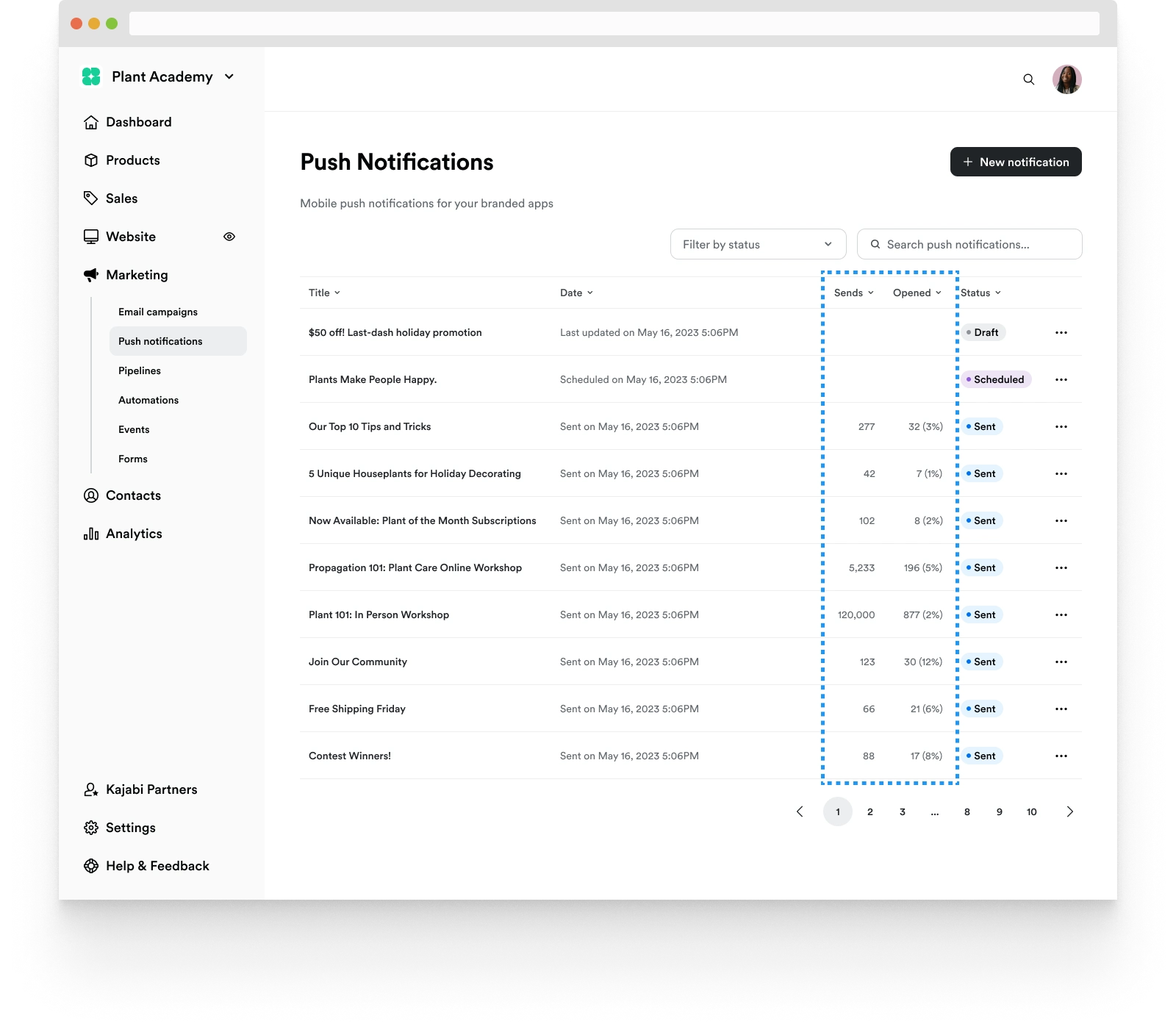
I designed the list view to include not only opens but also sends and the open rate so customers can see which campaigns were successful and take action to duplicate those successful ones.
Familiar Targeting System
They also liked how the targeting worked because it was how filtering worked on the Contacts page, which was an intentional design decision to eliminate a need to learn a new pattern where possible.

Preferred simple send options
To my surprise, participants preferred the simple send options over more advanced ones. Our customers usually worked on their business on our platform as a side hustle, meaning they wanted a tool that was easy to use and not complicated.
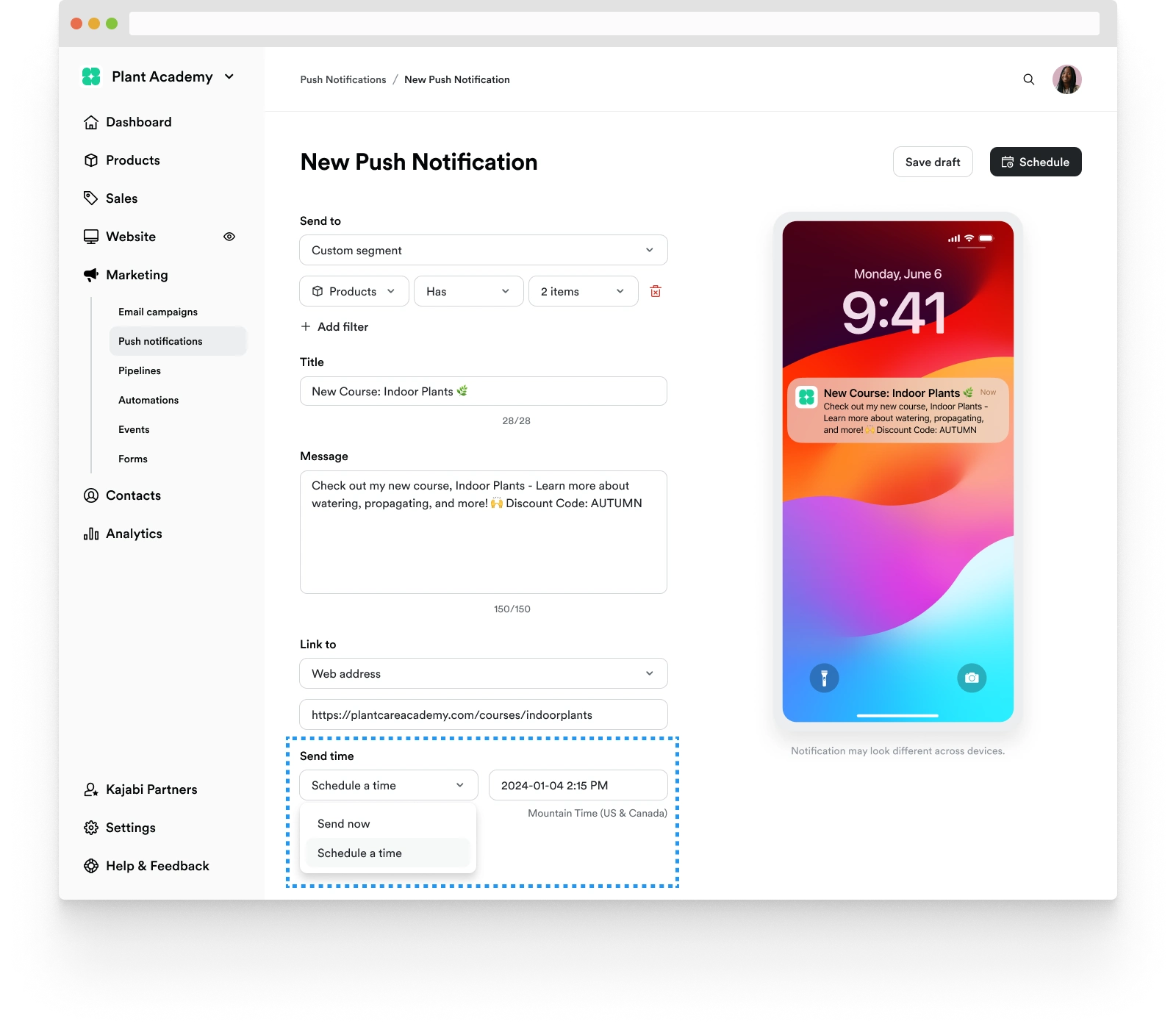
The Solution
The Outcome
Branded app customers have widely adopted the feature, with a 50% adoption rate, significantly higher than the average 24.5% according to Userpilot. Within six months of the product launch, over 500,000 push notifications were sent.
Along with usage data, one specific data point I'm interested in is the revenue growth between customers who adopted the feature versus those who didn't. It'll be a great piece of evidence to know if the feature actually helps our customers grow their business.
Future Plan
For the future iteration, I’m excited to improve the product by checking with customers. In order to develop the feature further and increase the open rate, these are ideas I’m planning to explore:
Rich media example
Adding an option to upload a rich media, such as an image or animated GIF will make a push notification more enticing
Android preview
Adding the Android preview as a follow-up release. iOS was prioritized by usage.
Like this project
Posted Aug 9, 2024
Designing a New Feature from 0 to 1 for Web and Mobile
Likes
1
Views
29

