B2C SaaS Web App | Opt-in Analytics Product Redesign
I’ve been a lead designer on this project, defining design principles for our analytics features, collaborating with the product manager on requirements, and creating all design assets for implementation.
Challenge
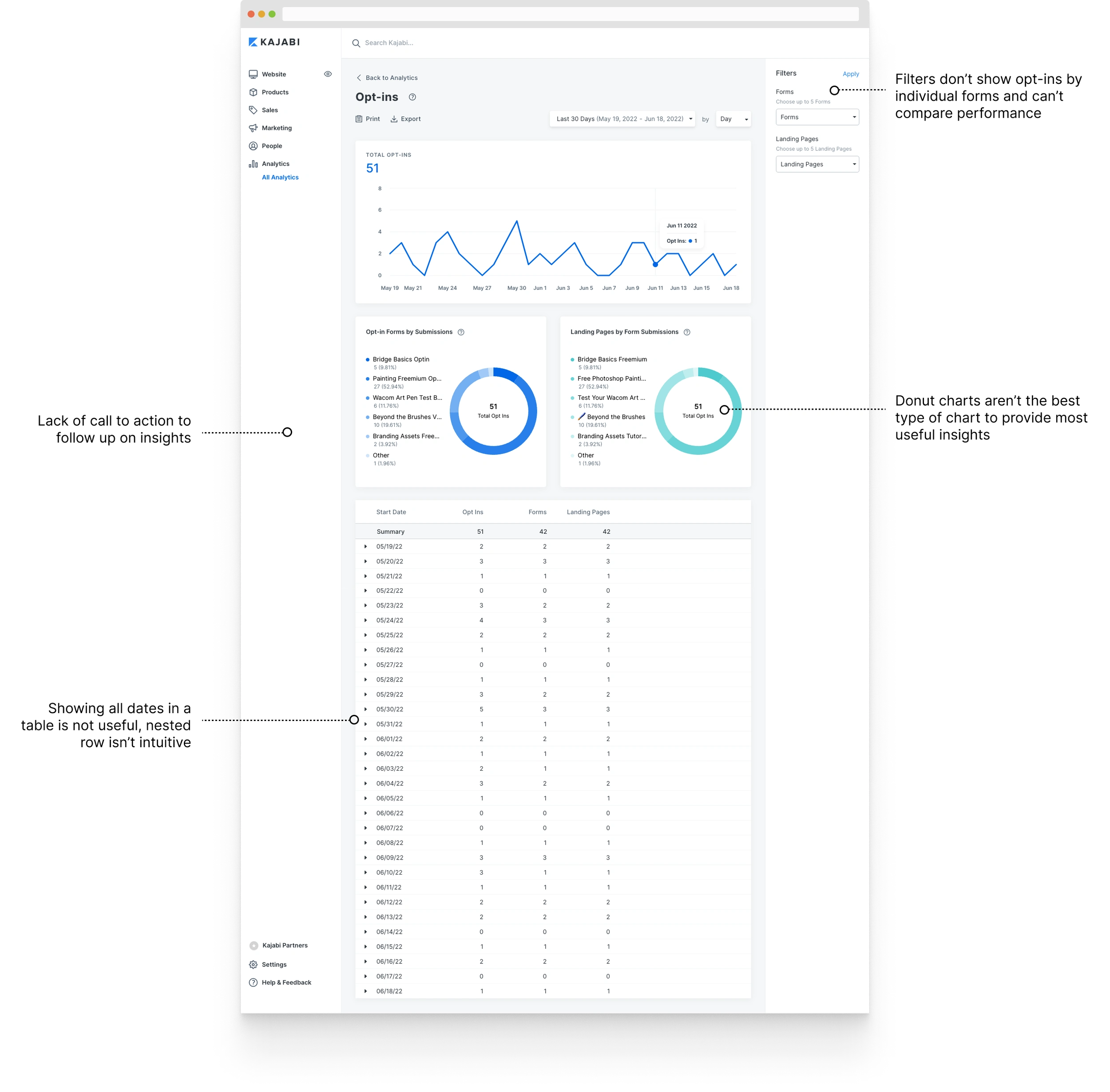
Opt-ins report is not easy to understand and take actions
Solution
Create better opt-ins report to help customers get more leads
My Role
Lead designer, led user research and created all design assets
Project summary
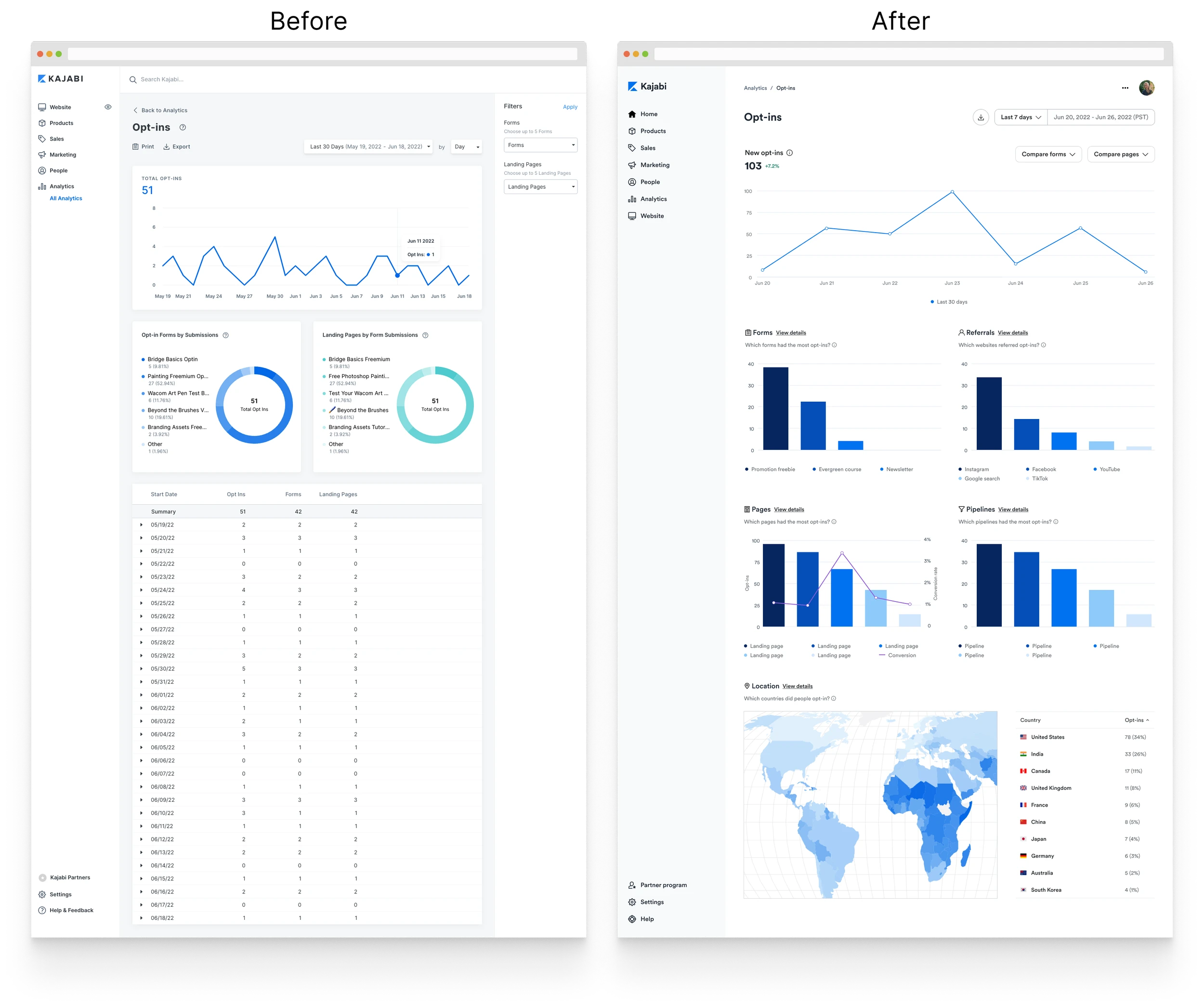
Analytics exists on the platform today, but the data is presented in a way that's not easy to understand and is not optimized to take action. The new opt-ins report displays data that is easy to understand and provides call to action to follow up on insights. As the first initiative in redesigning all analytics features, it'll inform the future redesign of other reports on the platform.
The problem
According to qualitative evidence we've collected over the years, customers are hungry for better analytics. Some told us they even replaced elements of our platform with competitors because they provided better analytics.
For the business problem, we believe inadequate analytics contributes to the decline in feature adoption and churns.
After considering all the analytics sections, my product manager and I landed on the opt-ins report for its frequent usage and technical feasibility.
User goal (jobs to be done):
When I check new leads in the opt-ins report, I want to see what’s working well so I can optimize my setup.
Business goal:
We expect to see an increase in feature adoption and a decrease in churns attributed to analytics.
Design principles
Before I dived into the design process, I had a conversation with my product manager about what our design principles should be. We thought this was important because analytics was a relatively unexplored area in the organization. We wanted to align on overarching goals for analytics as a whole.
Analytics should provide answers to questions.
Analytics should provide call-to-action on insights.
Survey
The survey results showed that customers who use the opt-ins report regularly were keen on seeing which landing pages generated the most opt-ins. For the call to action, customers wanted to take actions, such as viewing individuals who opted in and adding a tag to a group of contacts.
Pages generated most opt-ins (91%)
New contacts gained in a period (78%)
Websites people came from (74%)
View individuals who opted in (61%)
Add a tag to a group of contacts (52%)
Duplicate the best performing form (30%)
Usability testing
Overall, customers were excited about the new opt-ins report. They recognized it was a big improvement from the current version and particularly liked how data was visualized. Although customers understood the information on the page and used most of the features easily, some new findings called for a revision:
The most valuable charts: Pages and Referrals -> Moved the charts to the top
Wanted to know how the numbers were calculated -> added info icon next to the title
Wanted to compare Forms and Landing pages -> Surfaced the two filter options
The solution
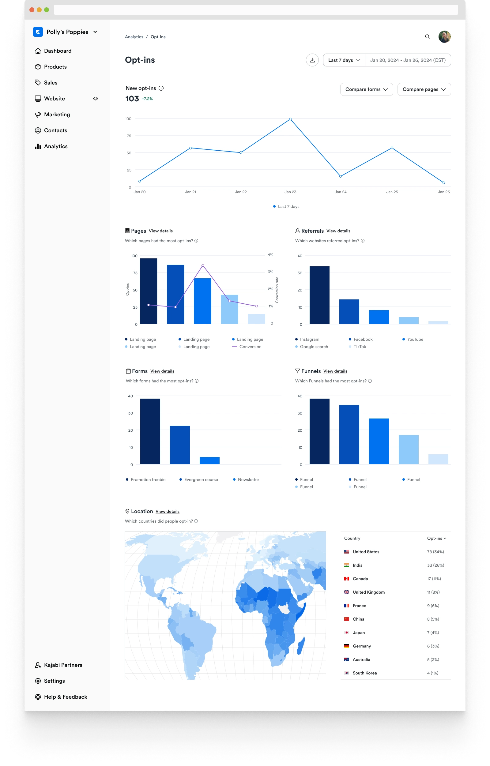
The new opt-ins report is easy to understand what's working in getting leads and optimized to take action.
Prototypes
Main page
Main page
Quick actions: Popular filter options are surfaced to compare the performance of forms and pages
Prioritization: The most valued charts are located on top. The popular call to action is shown in the tooltip
Data visualization: The chart type matches the data point, making it easy to understand and gain insights
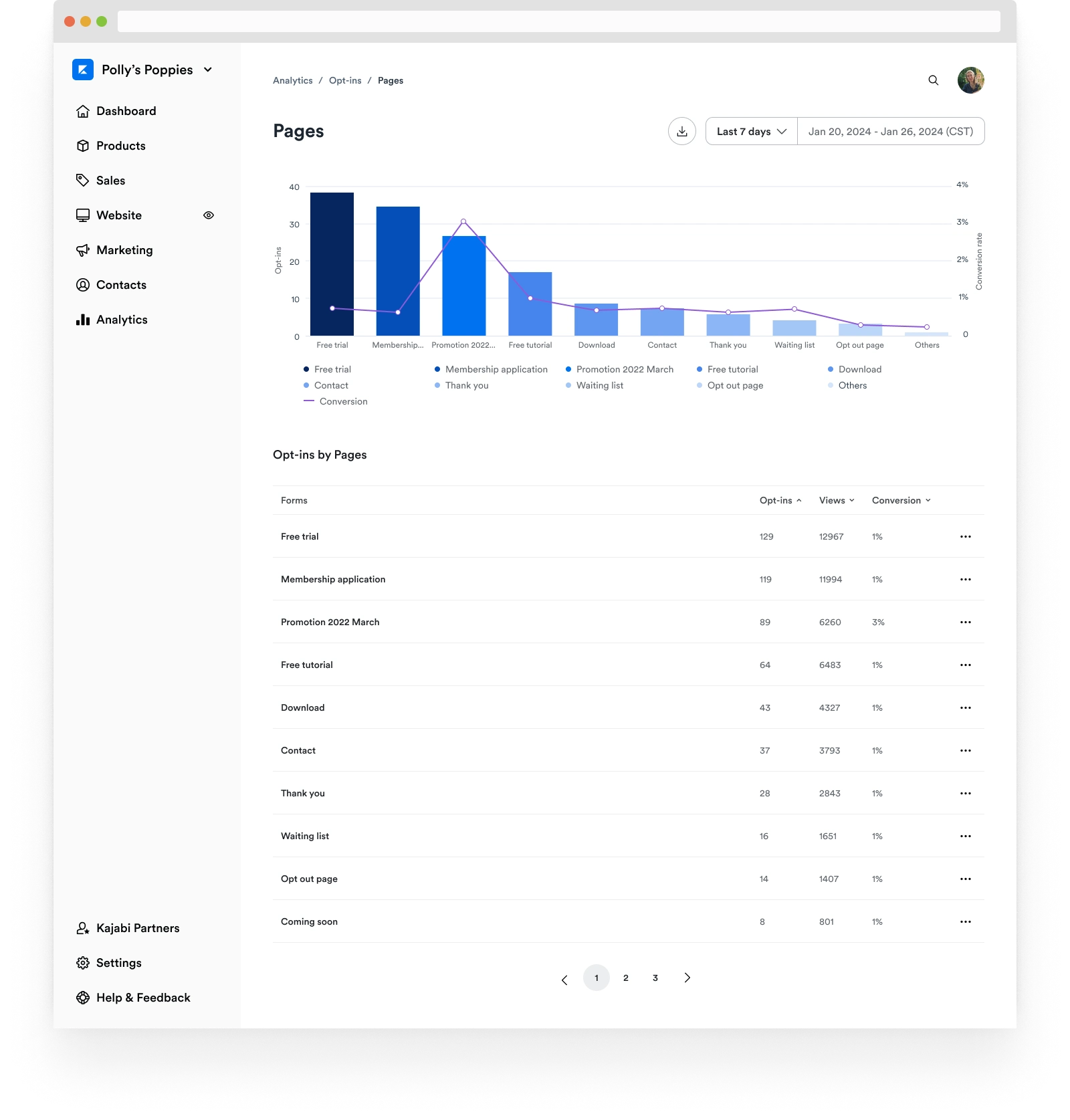
Details page
Details page
Full visibility: Deep dive to see the performance of all assets in the chart or table view
More actions: More options are available to take further actions on individual assets
Like this project
Posted Aug 9, 2024
Optimizing The Product Using Quantitative and Qualitative Data
Likes
1
Views
19

