Foundational Branding & Website for a Business Owner
STARTING POINT
Nora's language coaching program connects people across cultures and regions around the world. As her business grew, she knew her online presence was ready for a refresh. Her growing content strategy also required formatted templates and a consistent visual look. Nora already had a website built on Wordpress.com.
Wordpress.com is a paid service with limited templates, limited customization and dedicated customer support. It has fewer options but is more beginner-friendly. (It's different from the more common Wordpress.org! Learn more.) This mix was a good fit for Nora. She wanted to keep her website on that platform while taking advantage of customization options to tell her unique story.
She hoped for clear guidance that would introduce her to marketing concepts but not overwhelm. She needed to be able to update the site herself as a "non tech savvy" person, and wanted to make decisions about how it looked every step of the way. She also wanted to use Canva more. As a very small business, her budget was limited.
Nora shared a few inspirations: a beautiful batik painting to inspire the brand palette, and websites she hoped to emulate.
SERVICES
Foundational branding, Canva template design, graphic design, website wireframe, website updates
RESULTS
Nora's refreshed website now showcases elements that are key to her mission and growth: a donation call to action, videos section, photos, testimonials and a consistent color palette. The site is a home for her mission-led offerings while introducing people to her warm, relational approach.
IN DEPTH
Foundational branding
Style guide: "Just enough" guidance to keep Nora's materials cohesive while not overwhelming with options. This 3 page guide was the perfect size for her needs! The guide included Canva fonts and a digital focus to align with Nora's operations. It was created in Canva to make it easy to apply.
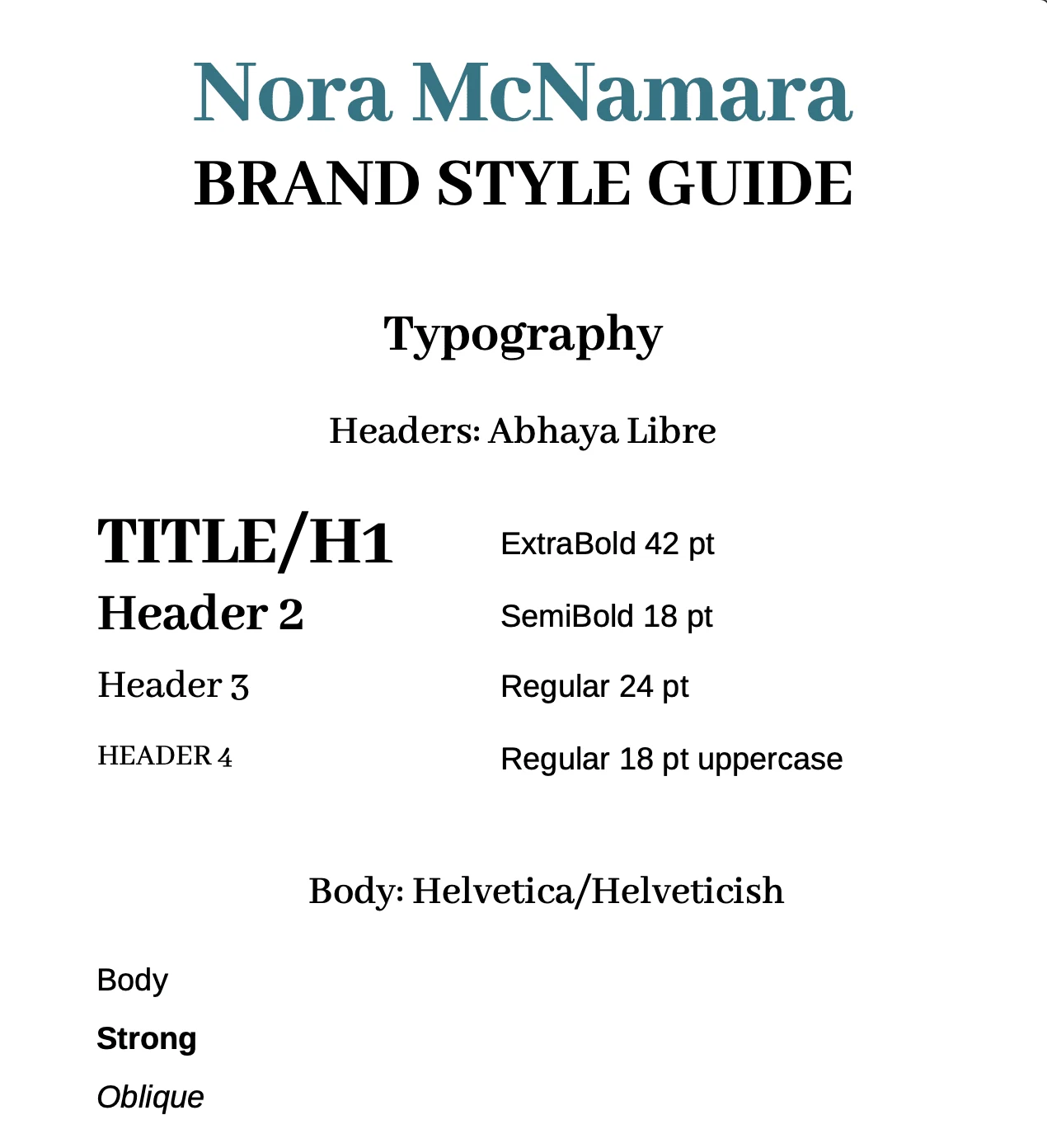
Style guide page 1
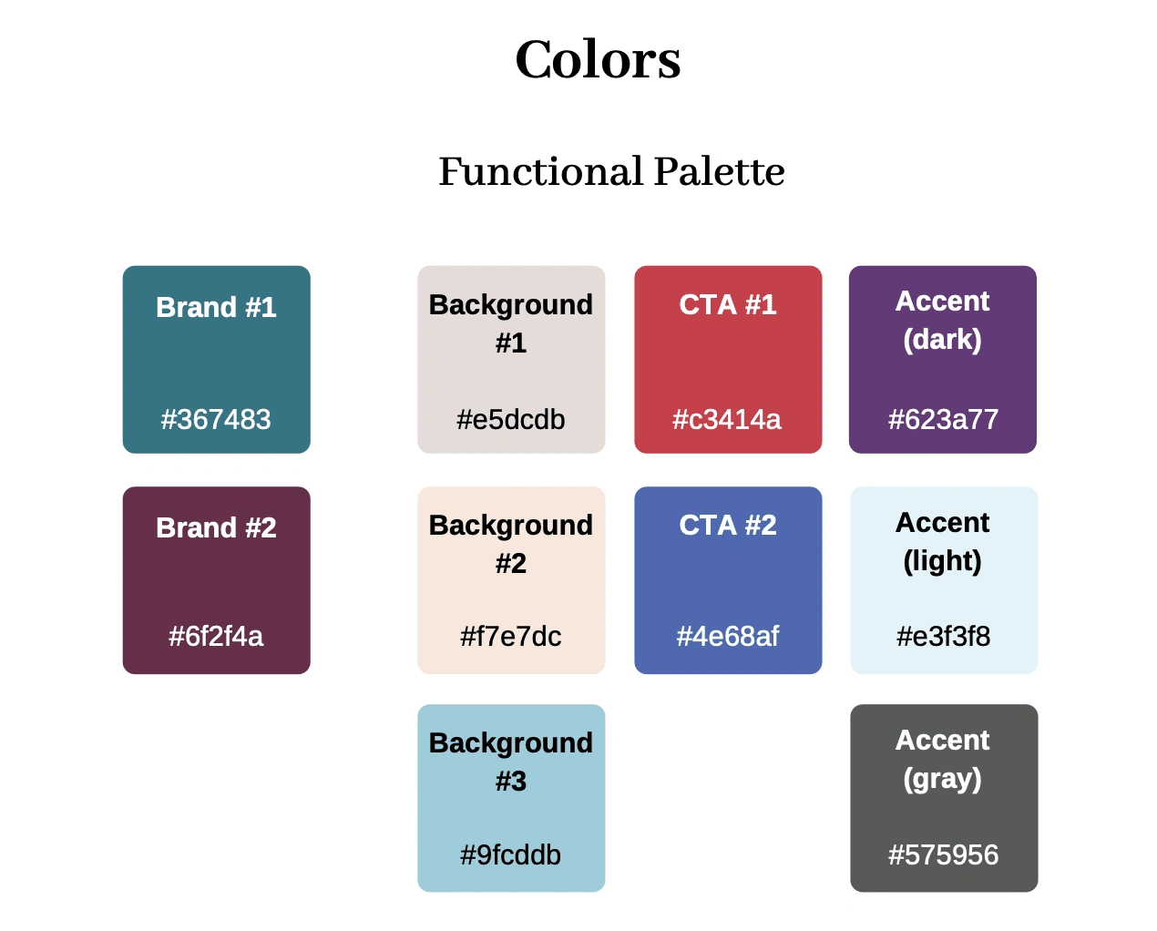
Style guide page 2
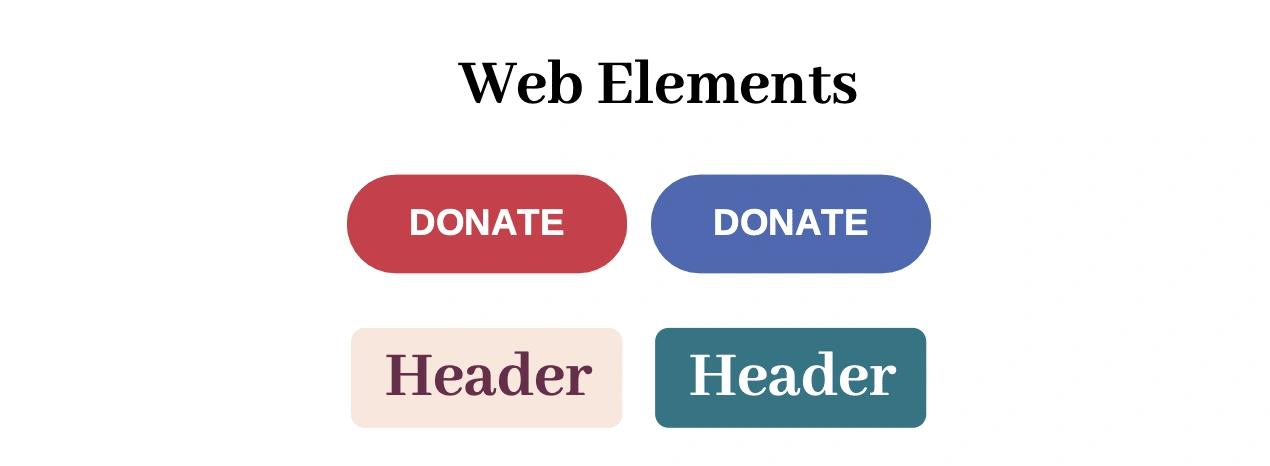
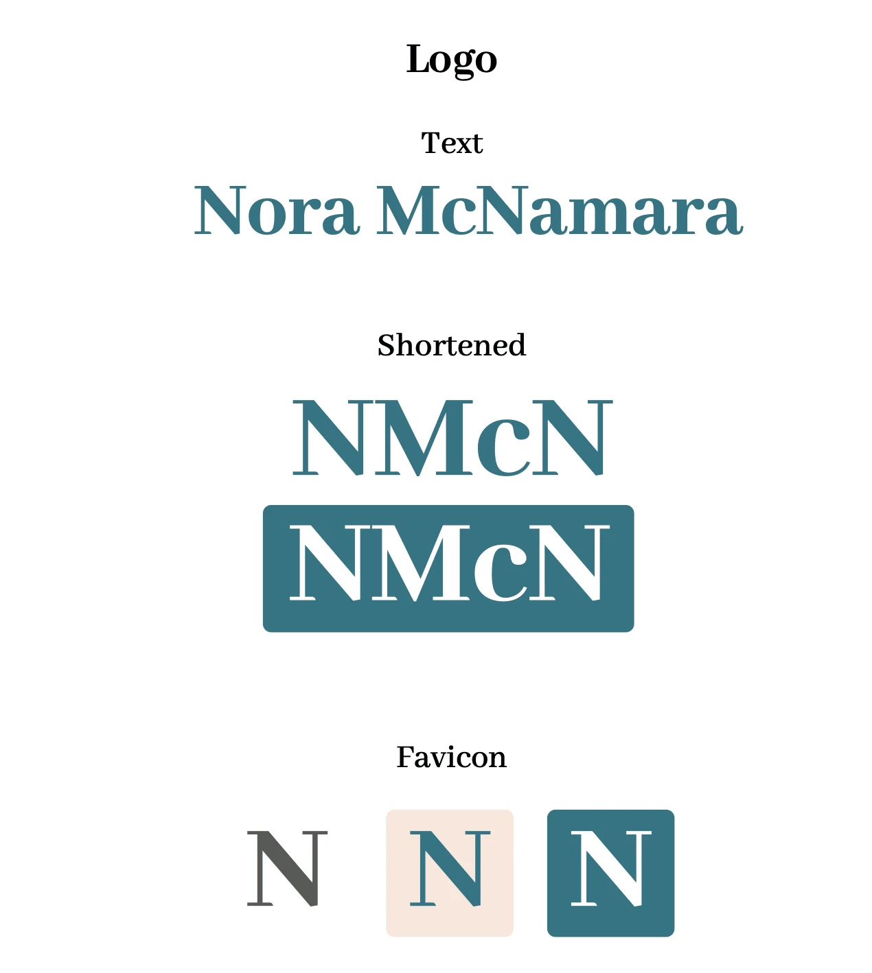
Style guide page 3
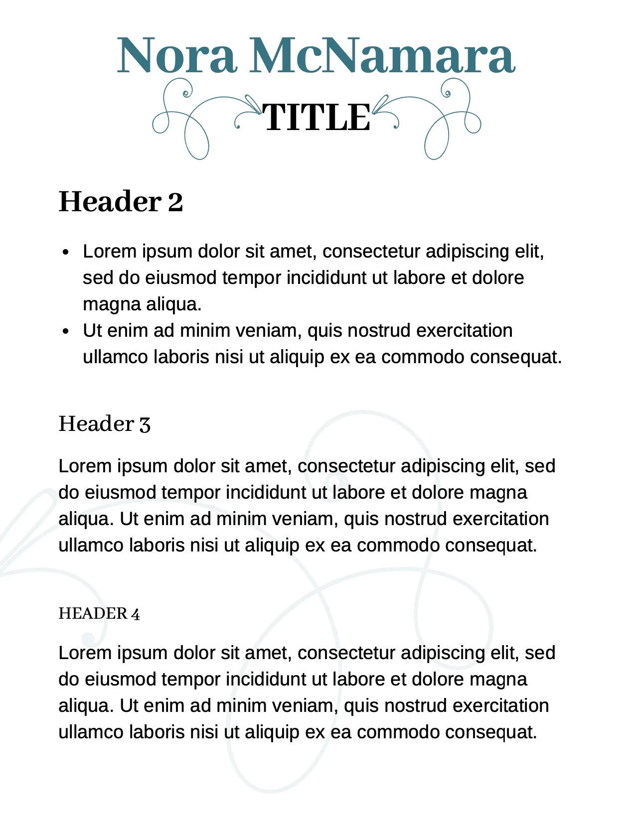
Canva template
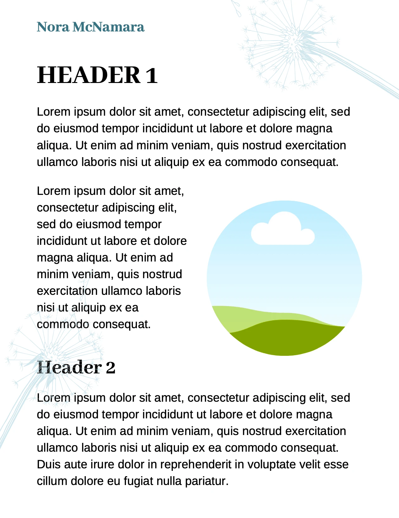
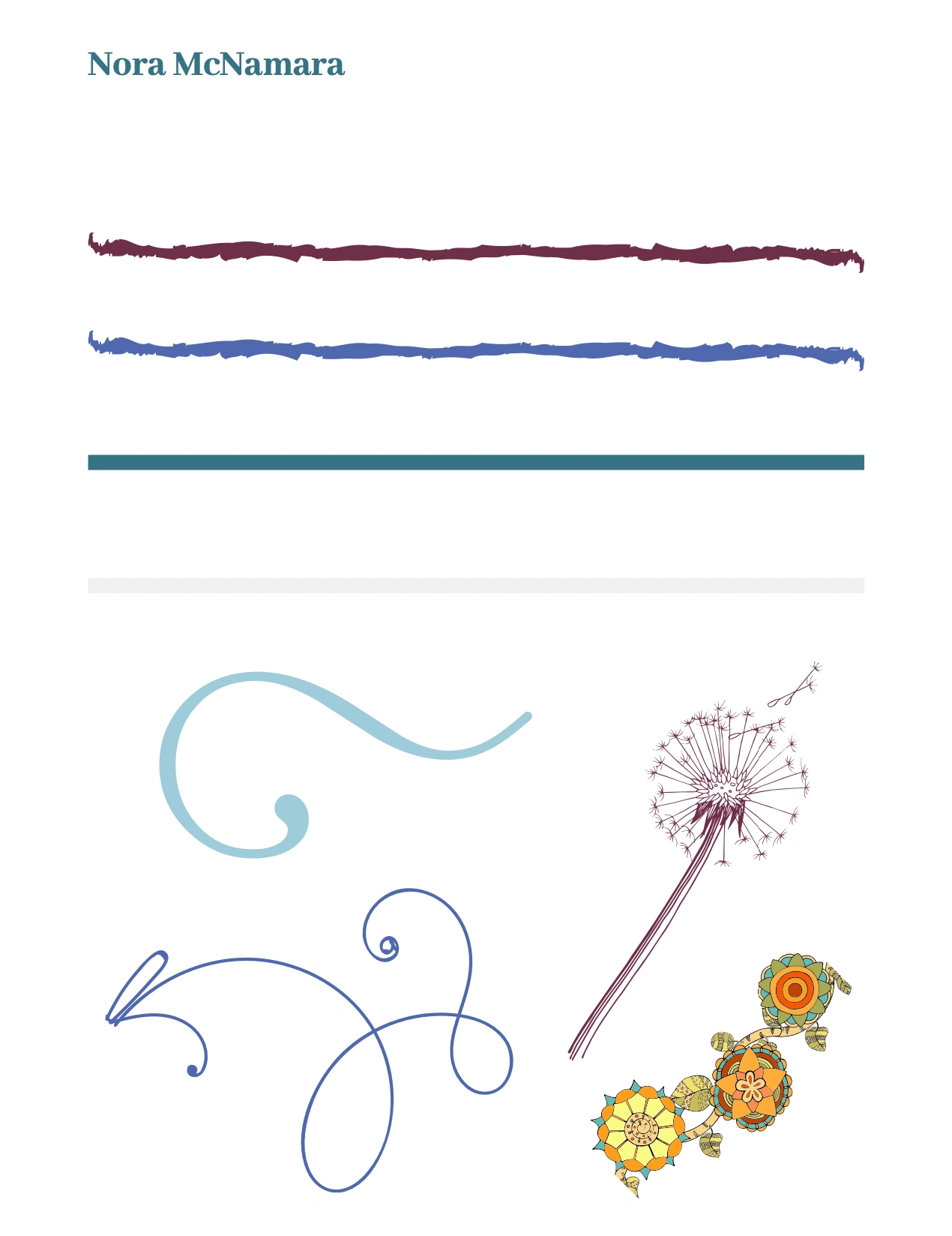
A 3-page flyer template designed in Canva to allow for immediate use. The template aligned with the brand guide and included a small library of ornamental elements selected by the client.
Website
A wireframe ensured we were on the same page (so to speak) before launching into the redesign phase.
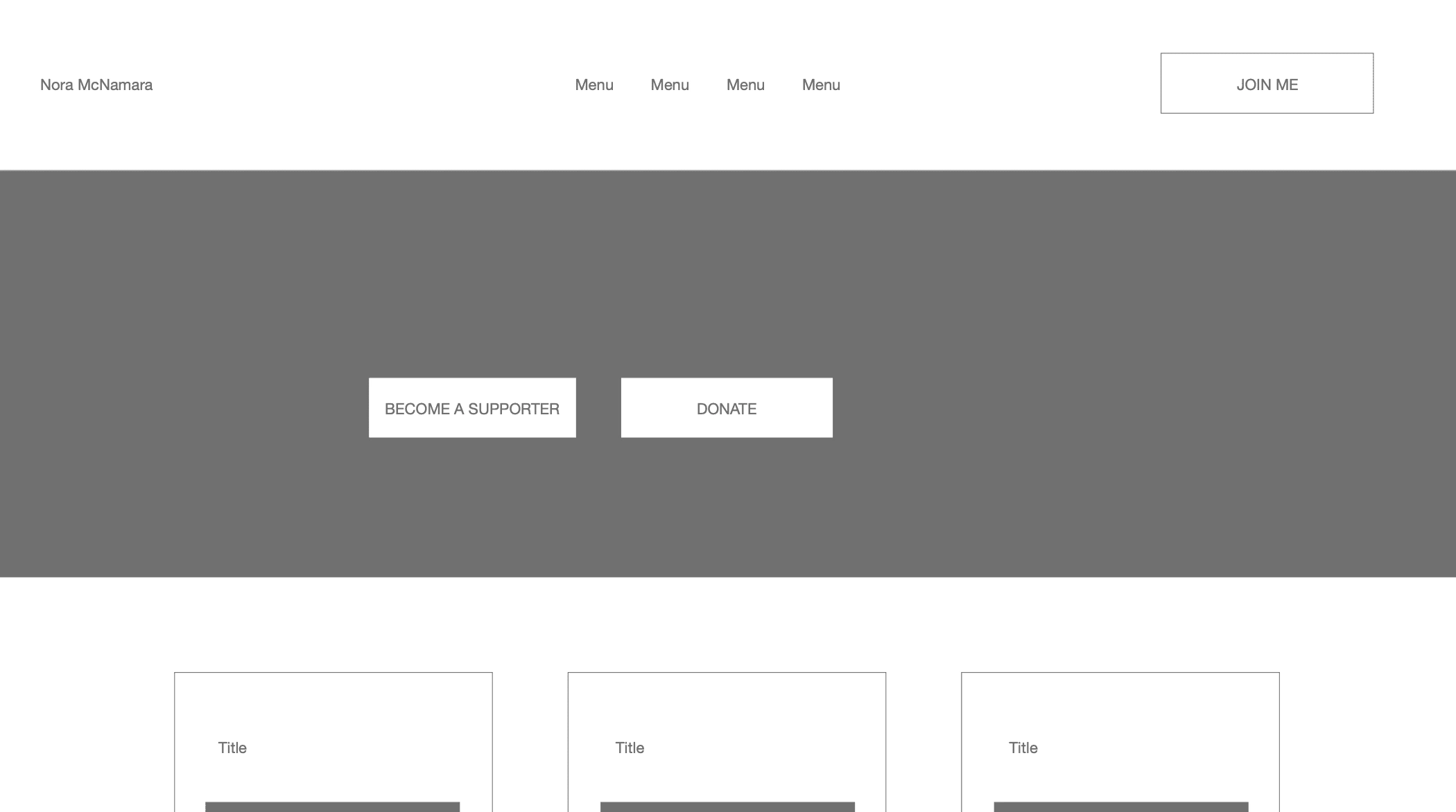
Wireframe page 1
Process
Knowledge is everything, especially when a business owner is first looking into branding and marketing. My goal is to underline the ownership and autonomy each person brings to their venture; I believe strongly this supports leaders in building their own best foundations for long term impact.
Working remotely, we used a Google Doc to make design decisions together. I presented design decisions in different categories, including diagrams of how some of the decisions might look in their final application. Presented next to each other, it was easy to see how each decision impacted the others. We discussed the options and rationale, and I highlighted the decisions Nora wanted to go with. These informed the development of the brand and website.
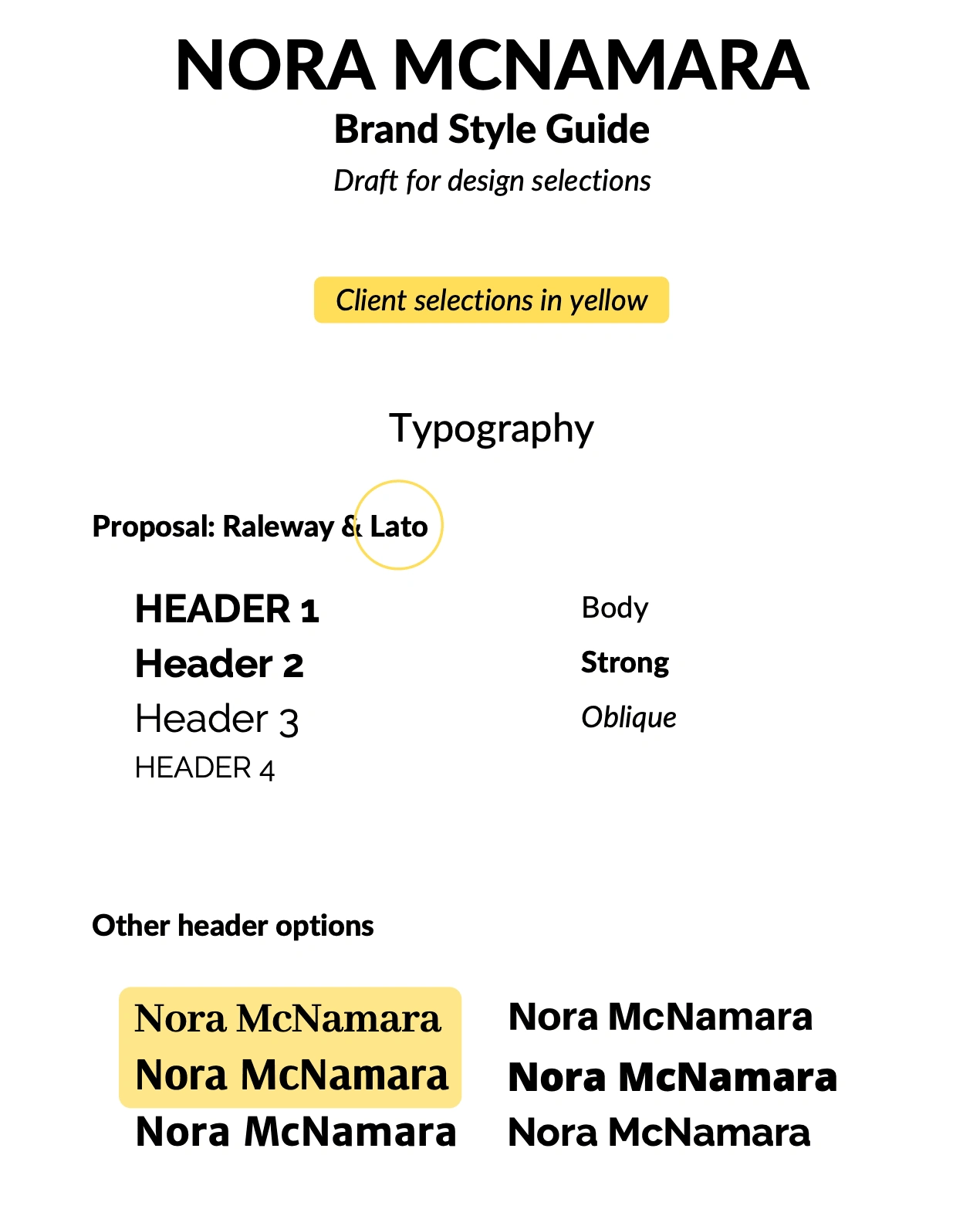
Page 1 - typography
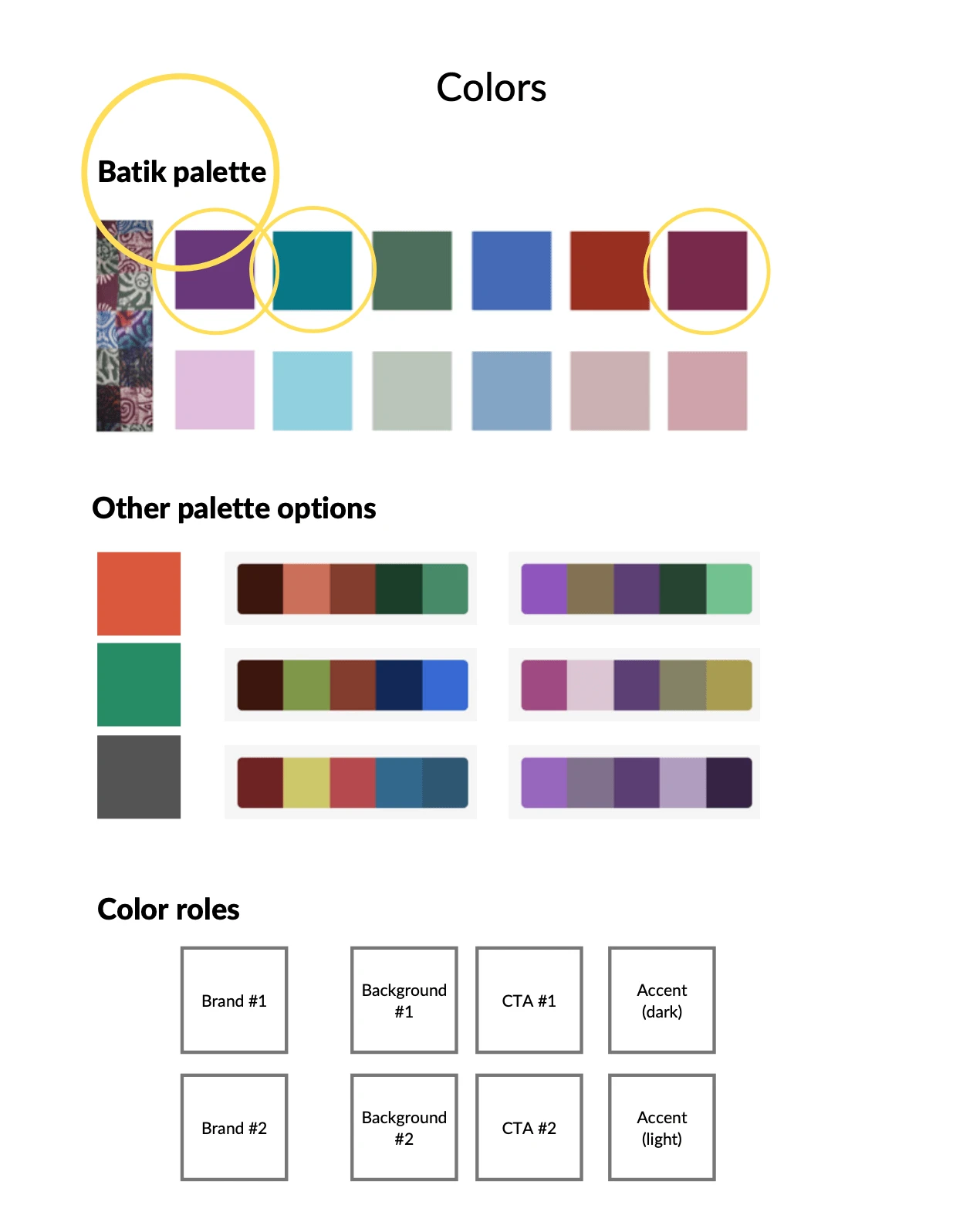
Page 2 - color palette
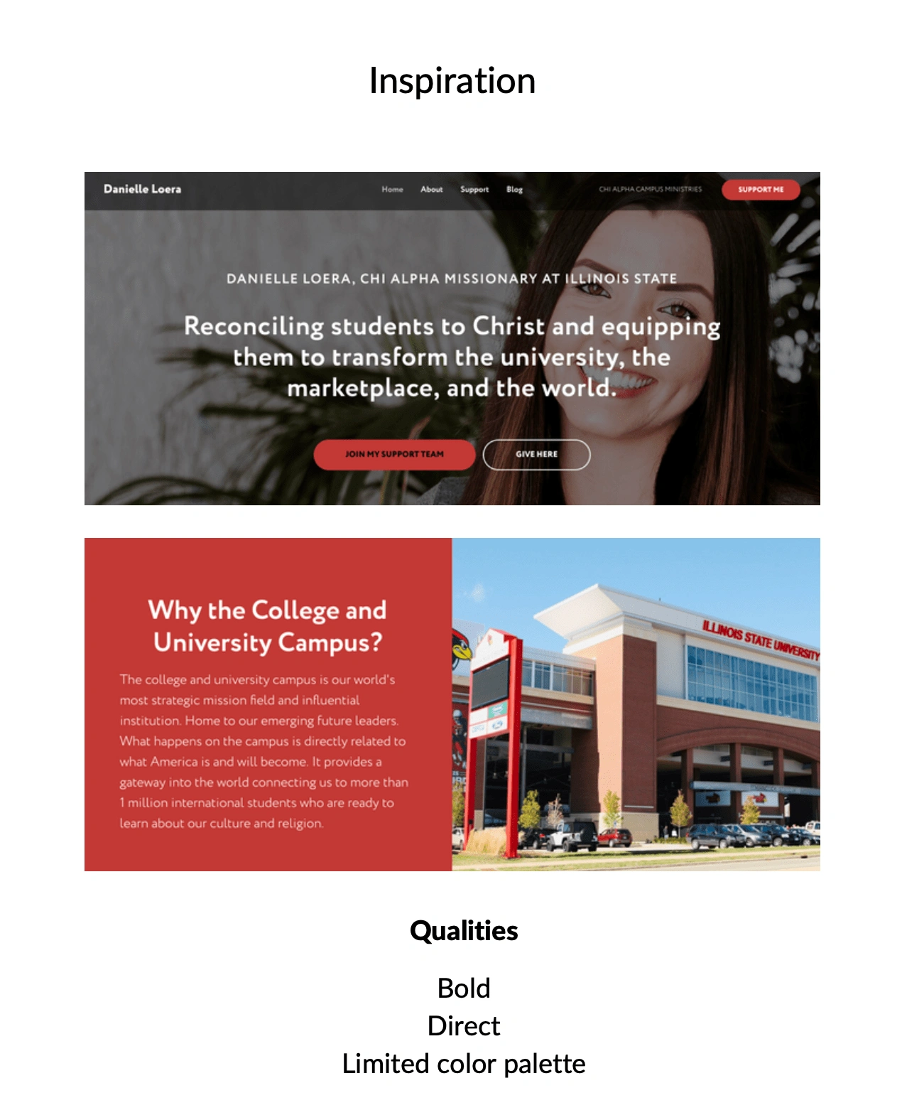
Page 3 - inspiration
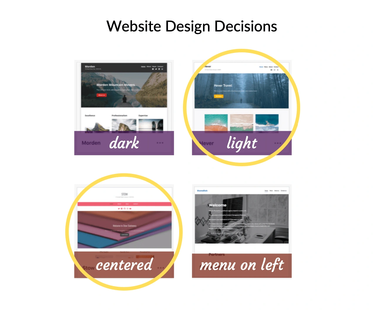
Page 4 - website
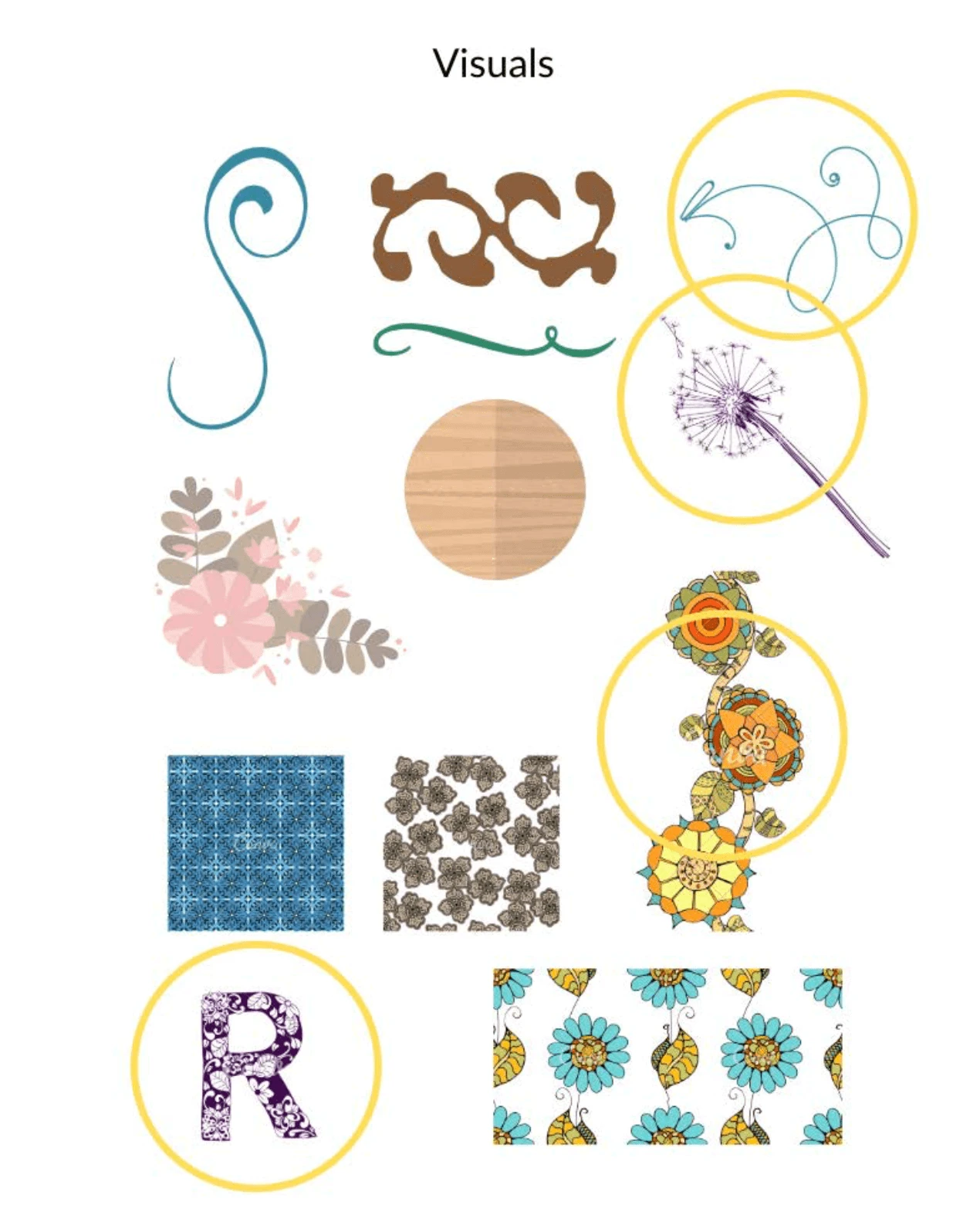
Page 5 - visuals from free Canva library
Like this project
Posted Feb 20, 2024
Created a business owner's first brand style guide and drew on the guide to refresh her website.
Likes
0
Views
10

