Streamlining the mentor booking process
Stephen Dempsey
Opportunity
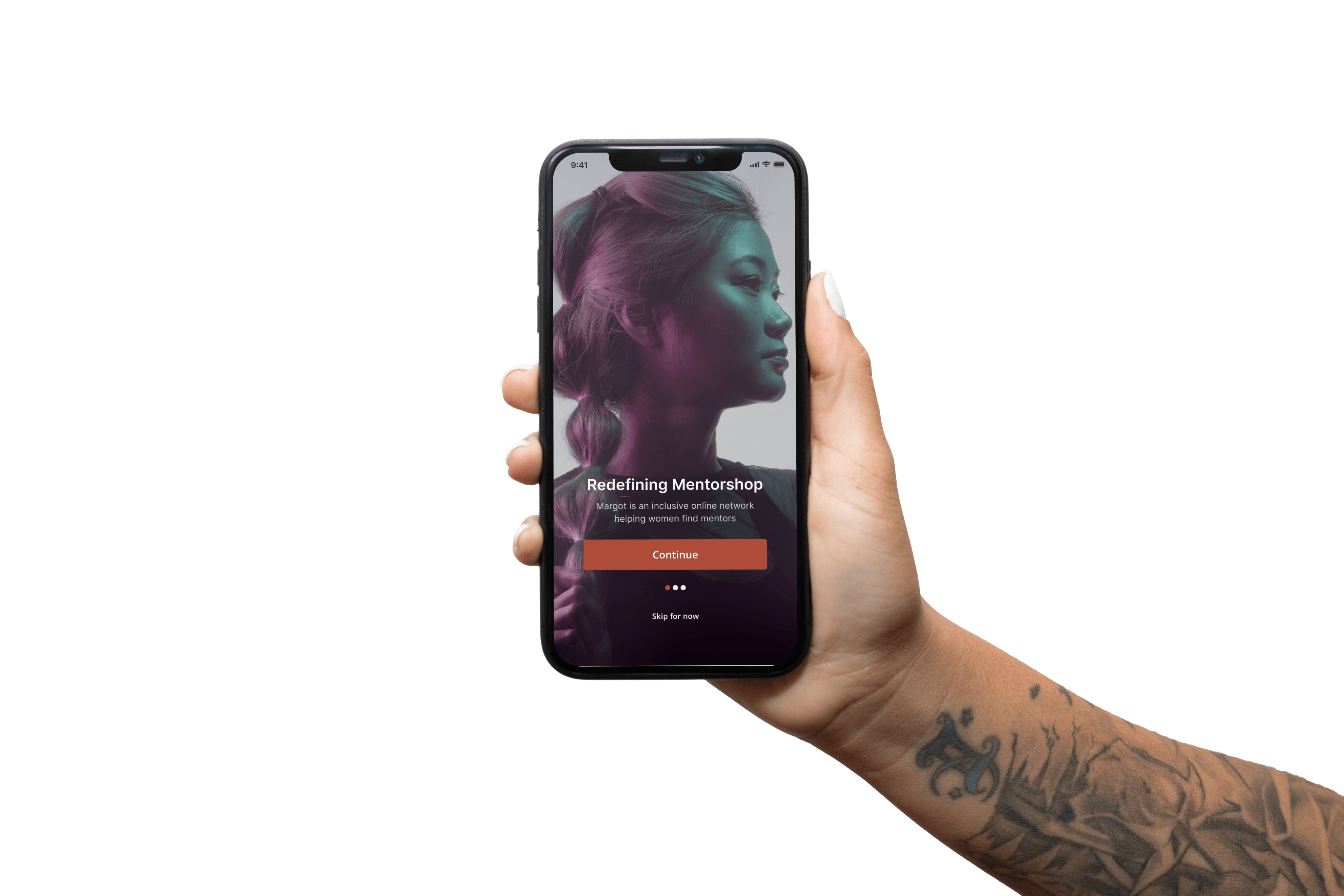
Margot is an inclusive online network helping women and gender-marginalized individuals find qualified, established mentors from various industries all over the globe and provide them the opportunity to learn from them.
The problem
Who was involved: me and a fellow Product Designer
To help me better understand any problems with the product, I began forming observations and questions about the product. To easily document these, I followed the structure [situation], [response], [problem to business or experience] to ensure I'm aware of users and business needs.
When mentees complete their session, Margot do not get notifed unless the Mentor/Mentee reach out or Margot reaches out, Which causes extra manual work for the Margot Community.
When scheduling a catchup, Users have to manually type multiple time slots to be requested to a mentor, Which causes the Margot team to manually contact and go back/forth until a time slot is agreed.
Our solution
The Margot Community website had limited search and filters as well as no visibility of mentors availability. Our solution includes a more intuitive search, enhanced filters and the specific availability of each mentor. This allows the mentee to find their perfect mentor with ease.
Another way of measuring success would be to use the 5 E's ease of use framework. Effective, Efficient, Engaging, Error tolerant, Easy to learn. Following this framework allows you to eradicate potential issues the user may encounter, the time or speed it takes to complete a task, error prevention and error recovery, designing a UI that is self explanatory by indulging in predictability.
Our strategy
We looked at how we might streamline the booking experience to make it more intuitive. We set out to create a mobile first case study that solves the problem of mentees scheduling time with a mentor on Margot, and conducted research on the problems of scheduling time with mentors.
We moved forward with the idea that adding mentors availability to the booking experience, for users to view and choose a time that works for them, would increase the booking rate as well as remove the manual back and forth for the Margot team.
We explored the potential solution through UX research and surveys, synthesising the data with affinity mapping and ideating through mind maps. This allowed us to create a user story and review the current user flow of the existing booking experience.
With all of the research we had gathered, we created a new user flow to simplify the booking process and streamline the experience for the mentee looking to book a session with a mentor.
Questions and observations
To help me better understand any problems with the product, I began forming observations and questions about the product. To easily document these, I followed the structure [situation], [response], [problem to business or experience] to ensure I'm aware of users and business needs.
When mentees complete their session, Margot do not get notifed unless the Mentor/Mentee reach out or Margot reaches out, Which causes extra manual work for the Margot Community
When scheduling a catchup, Users have to manually type multiple time slots to be requested to a mentor, Which causesthe Margot team to manually contact and go back/forth until a time slot is agreed
Initial assumptions
We believe that adding mentors availability to the booking experience, It will make it easier for users to view and choose a time that works for them, Which will [increase booking rate as well as removing the manual back and forth for the Margot team.
Research goal
Before conducting my research, I decided to create this research goal to help me keep my questions aligned to both the User and Business goals. Our research goal was: Make the process to find the right mentor as simple and useful as possible while streamlining the scheduling process to make taking / managing catchups easier.
Synthesising
After synthesising the data with affinity mapping, we noticed trends, patterns and a few keywords that were consistently being used throughout the responses:
Structure, Confidence, Trusted, Experienced, Engaging, Guidance, Clarity, Sharing, Direction
With our research mapped out, we looked back to our initial observations to validate our earlier assumptions and define the primary user problem, and create our How Might We statement to give us the structure needed to find our solution to the problem.
Ideation
In order to steer clear of prematurely settling on the first concept that emerged, I embarked on a deliberate and structured ideation process. This approach was instrumental in cultivating a diverse array of potential solutions, fostering creativity, and ensuring a thorough exploration of possibilities.
Diverse Ideation Techniques: I systematically employed a series of ideation techniques to stimulate innovative thinking and expand our horizons. These techniques encompassed brainstorming sessions, sketching exercises, and collaborative idea generation with team members. These activities served as catalysts for exploring unconventional angles and refining our problem-solving approach.
Mapping Improvements and Additions: Following the ideation phase, I transitioned into a critical evaluation stage. During this phase, I meticulously mapped out the aspects of the product that could be enhanced or introduced. This involved a comprehensive review of the ideation output to identify common threads, emerging themes, and opportunities for improvement.This process of mapping improvements and additions served as a pivotal bridge between ideation and solution development. It ensured that the solutions we pursued were not only innovative but also directly aligned with addressing the identified user needs and pain points.
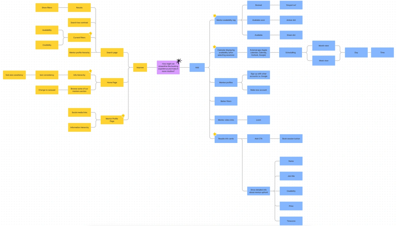
User flows
Subsequent to the ideation phase, our focus shifted towards the refinement and optimization of the user flow within the existing product experience. This critical step was driven by our commitment to aligning the user journey with the overarching objectives of both the business and the end users.
Creation of Existing User Flows: We initiated this phase by meticulously documenting the existing user flows within the product. This involved a comprehensive analysis of the current user journey, pinpointing pain points, bottlenecks, and areas for potential enhancement. This step was instrumental in gaining a holistic understanding of the existing user experience.
Improvement Aligned with Goals: Building upon this foundation, we undertook the task of enhancing and optimizing the user flows. Our approach was rooted in the idea that each proposed enhancement must seamlessly align with the strategic goals of the business while simultaneously addressing the specific needs and preferences of the users.
Alignment with Business and User Goals: It was imperative that our refined user flows harmonized with the overarching vision of the organization. Thus, every alteration, addition, or optimization was rigorously assessed to ensure it contributed to both business objectives and user satisfaction. This meticulous alignment ensured that our efforts resulted in an improved user experience that also advanced the strategic interests of the project.
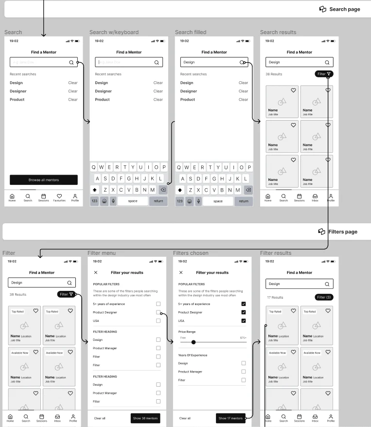
Wireframes
I used a neutral color palette to avoid any decision bias and would use this prototype to get feedback internally. I used Autoflow in Figma to help me easily map the user flow between each page ahead of converting the pages into a prototype. During this process I followed the 4px rule in which to properly space all of my elements apart and allowing the design to be breathable as well as functional.
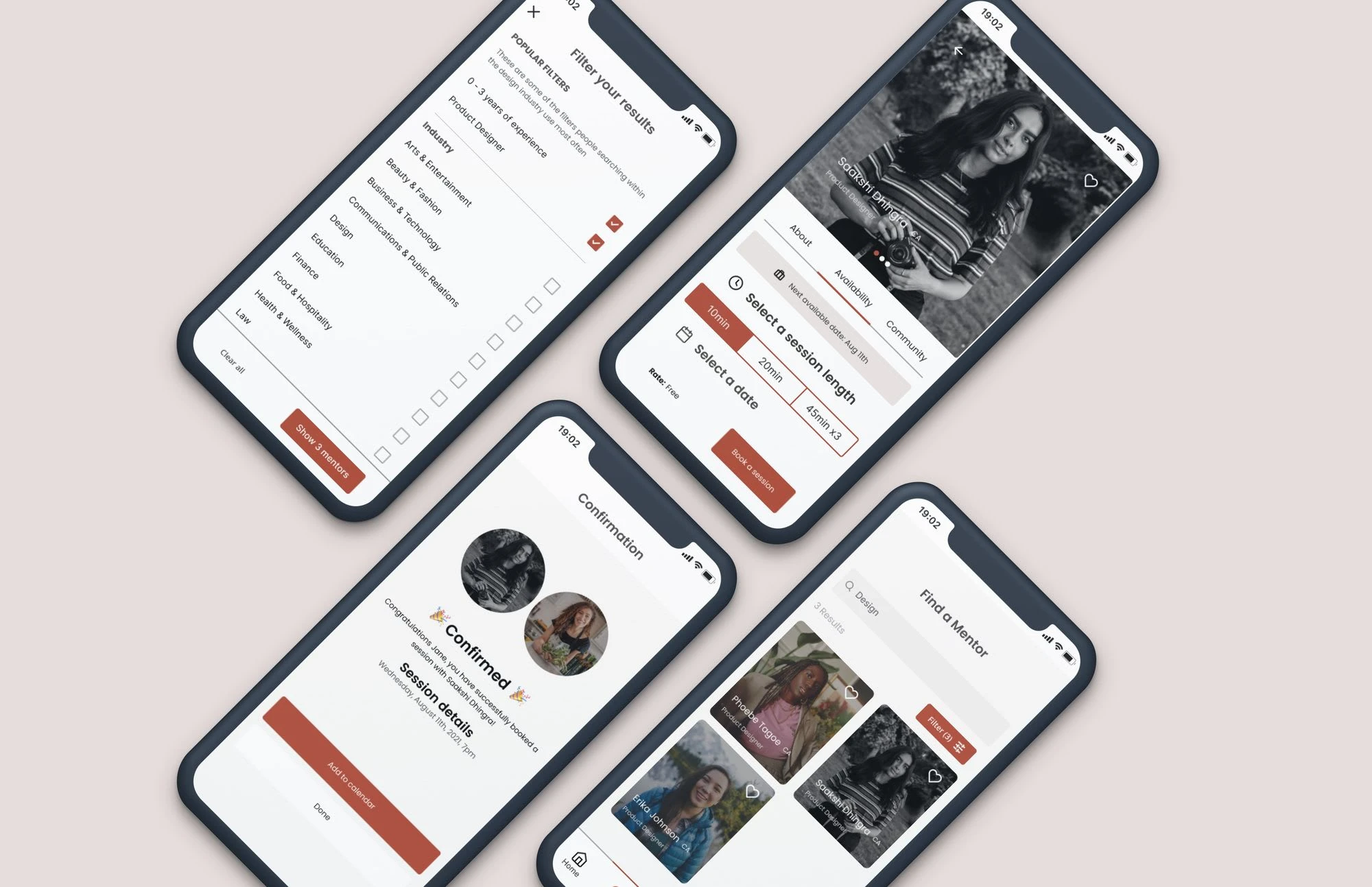
Prototype
Moving from mid-fidelity to high-fidelity prototyping, I recognized areas for improvement in the user experience. To create the high-fidelity prototype, I meticulously assessed and adhered to the product's style, following the '8pt rule' for consistent spacing and design.
Prior to prototyping, I defined a standardized set of styles and components, ensuring a rapid and consistent design process. This systematic approach enhanced efficiency while delivering a polished and cohesive user interface that addressed previous frustrations.
Testing
Once the high-fidelity prototype was ready, I crafted a comprehensive testing script that included scenarios and tasks designed to validate the prototype with real users. Employing Maze, I conducted usability testing sessions, gathering feedback after each task to iteratively refine the prototype. This approach ensured that user insights were systematically integrated into the design process.
Like this project
Posted Sep 7, 2023
Streamlining the mentor booking process within the Margot Community App.
Likes
0
Views
23