Naxi CRM website
Lois Nwanze
Backstory
When I first started working on Naxi, it felt like another product design brief: a sleek landing page, a clean dashboard, a CRM powered by AI. Straightforward enough.
But a few days in, something clicked.
I realized I wasn’t just designing another SaaS tool. I was designing for people drowning in spreadsheets, for sales teams juggling too many leads, for founders chasing growth while trying to stay sane.
Every button, every section, every headline needed to take away friction, not add to it. The goal wasn’t to make “just another CRM,” but to make one that actually feels like it works with you, not against you.
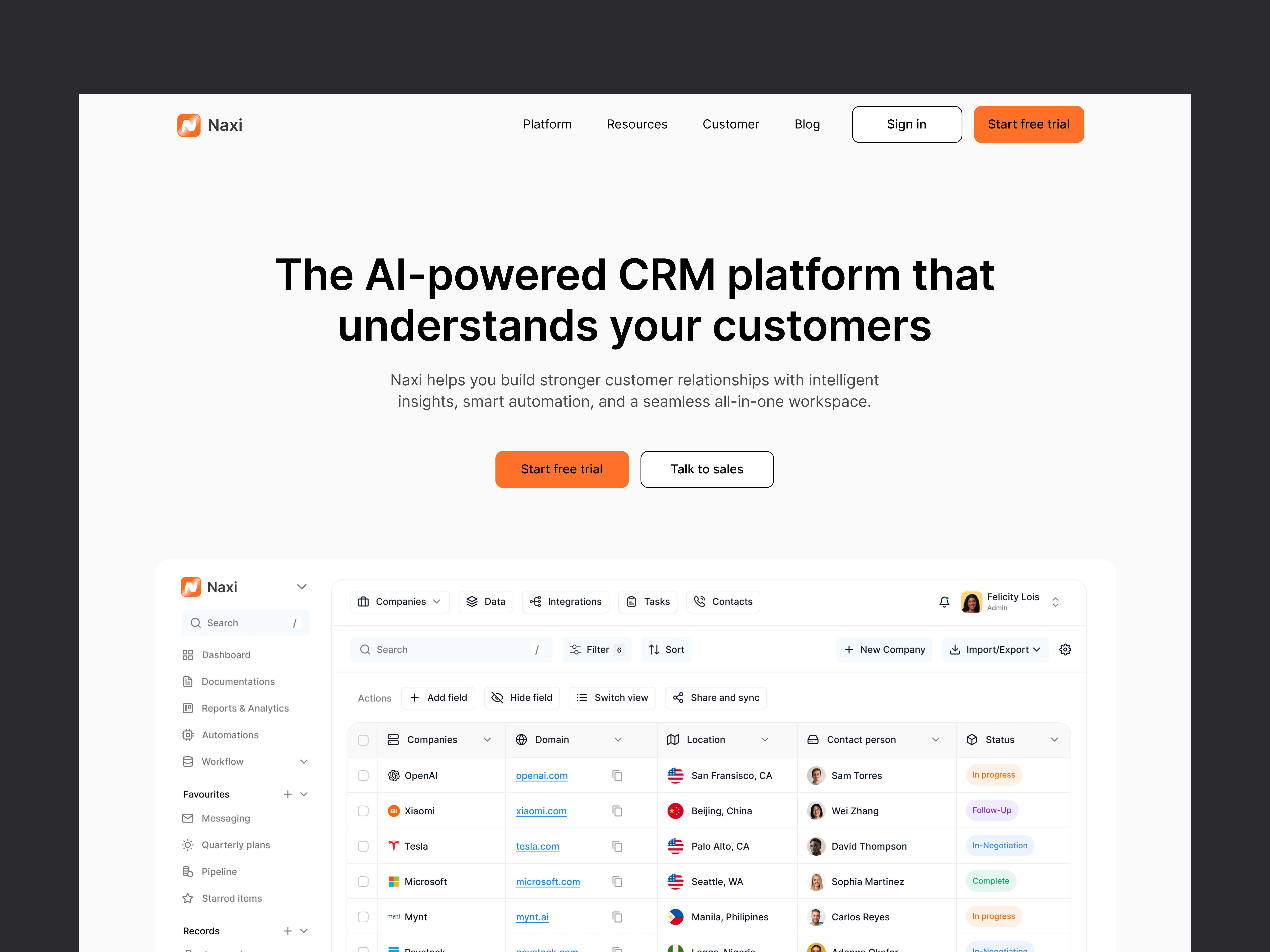
Hero section
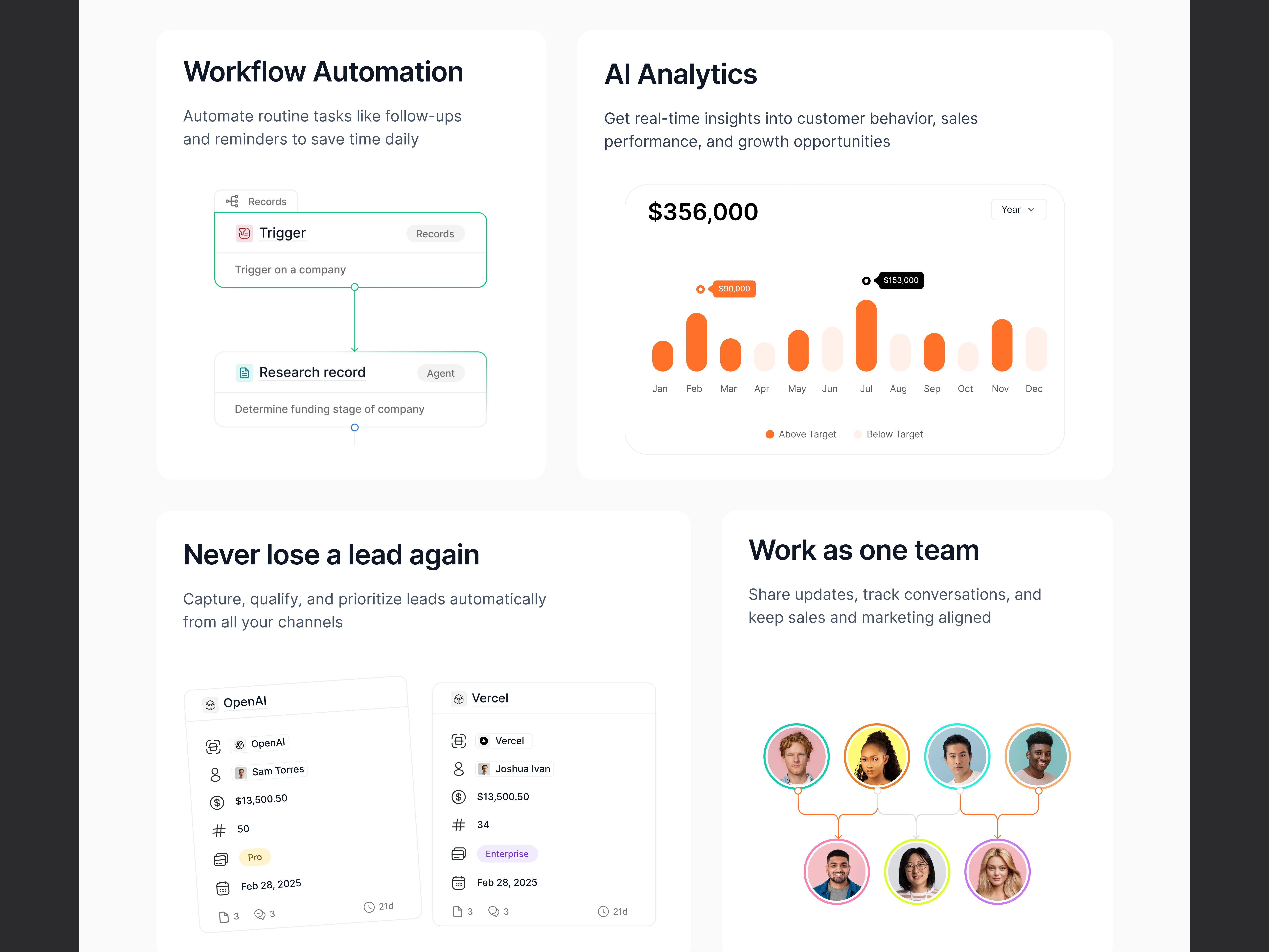
Feature section
My Approach
Crafted a landing page with a bold hero section, clear value propositions, and strong social proof.
Designed feature sections for AI analytics, collaboration, workflow automation, and lead management.
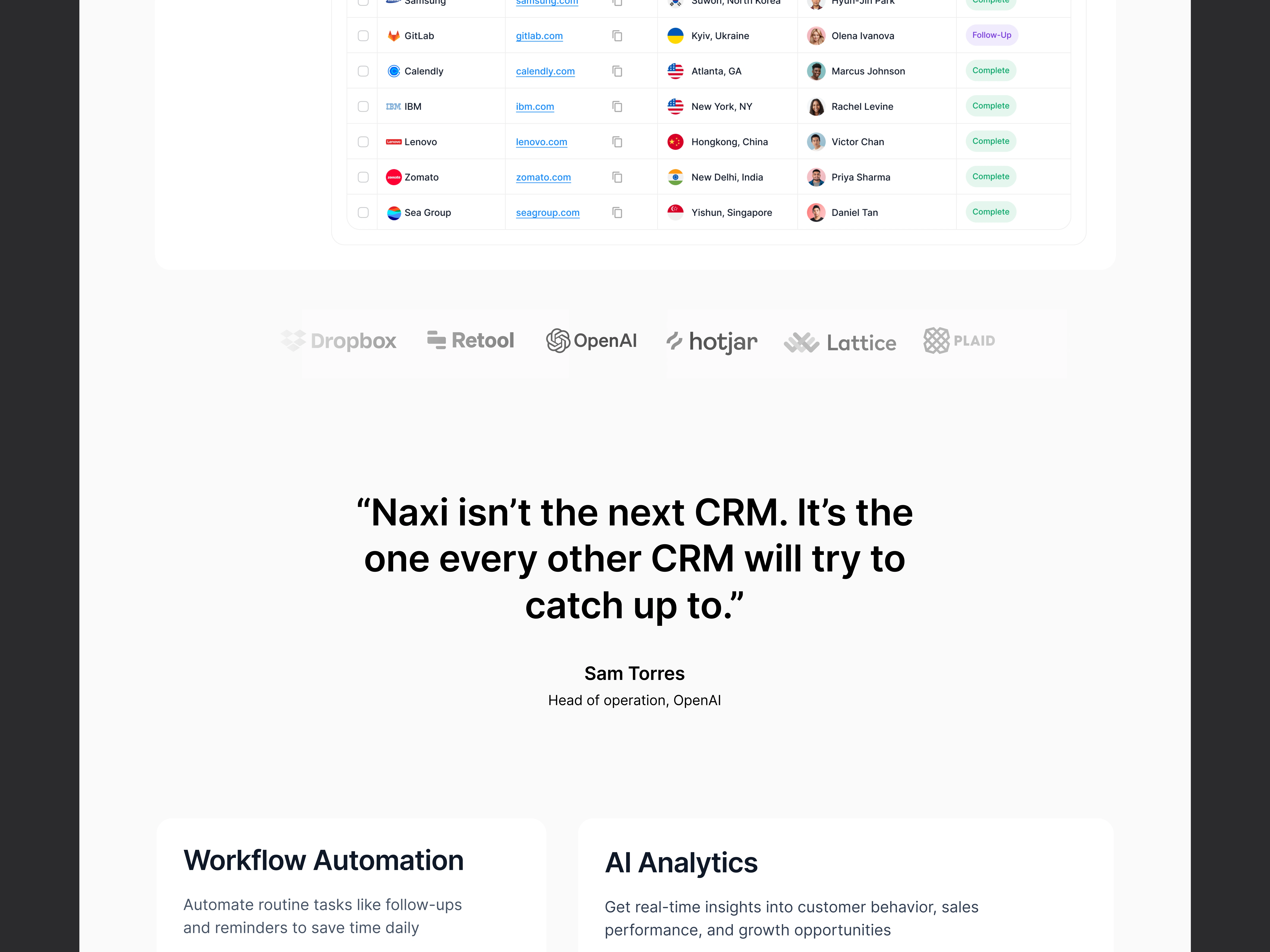
Built testimonials, FAQs, and supporting visuals to make the product feel credible and user-first.
Focused on simplicity and storytelling, ensuring the design balances innovation with usability.
Feature section
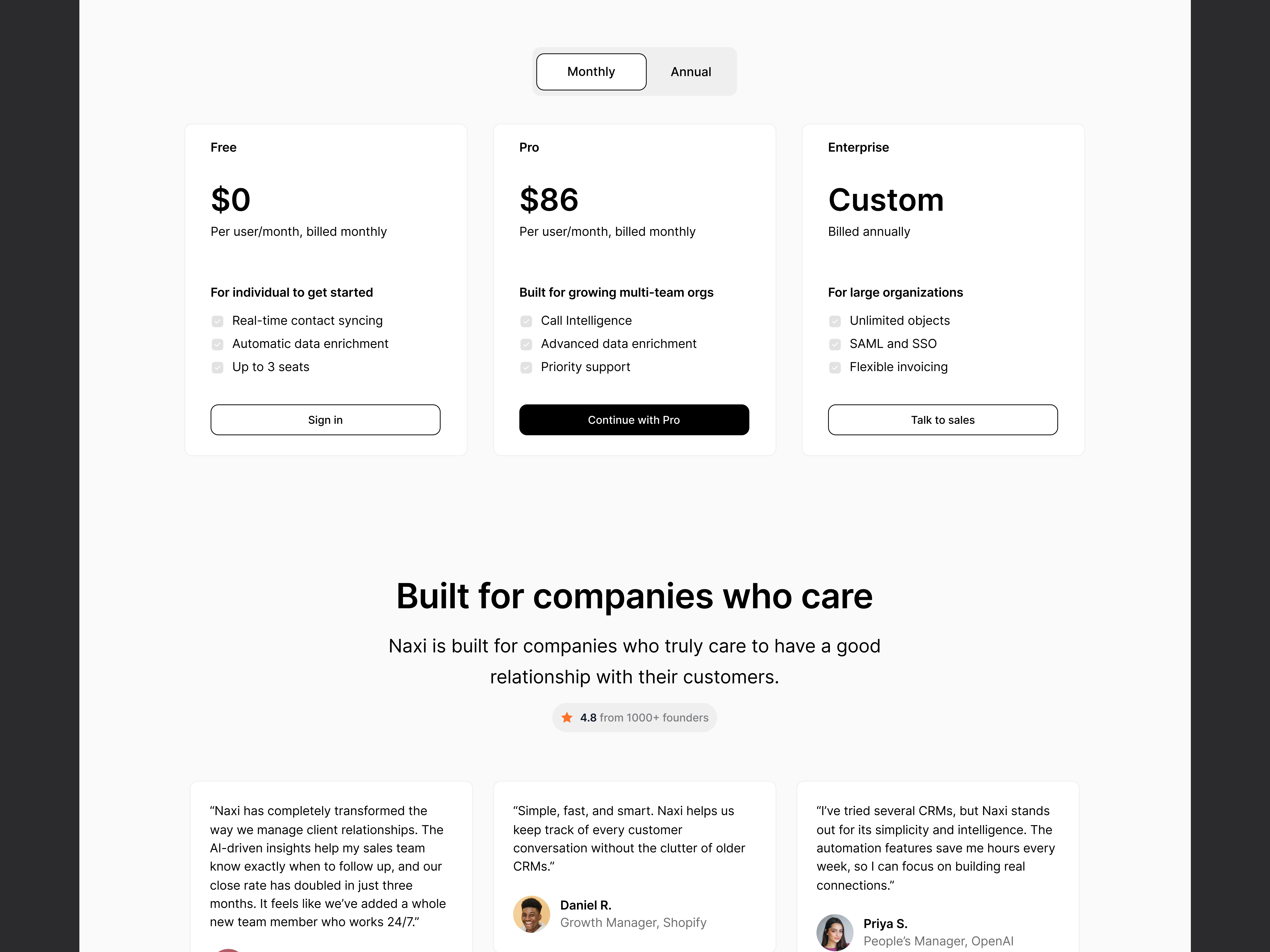
Pricing section
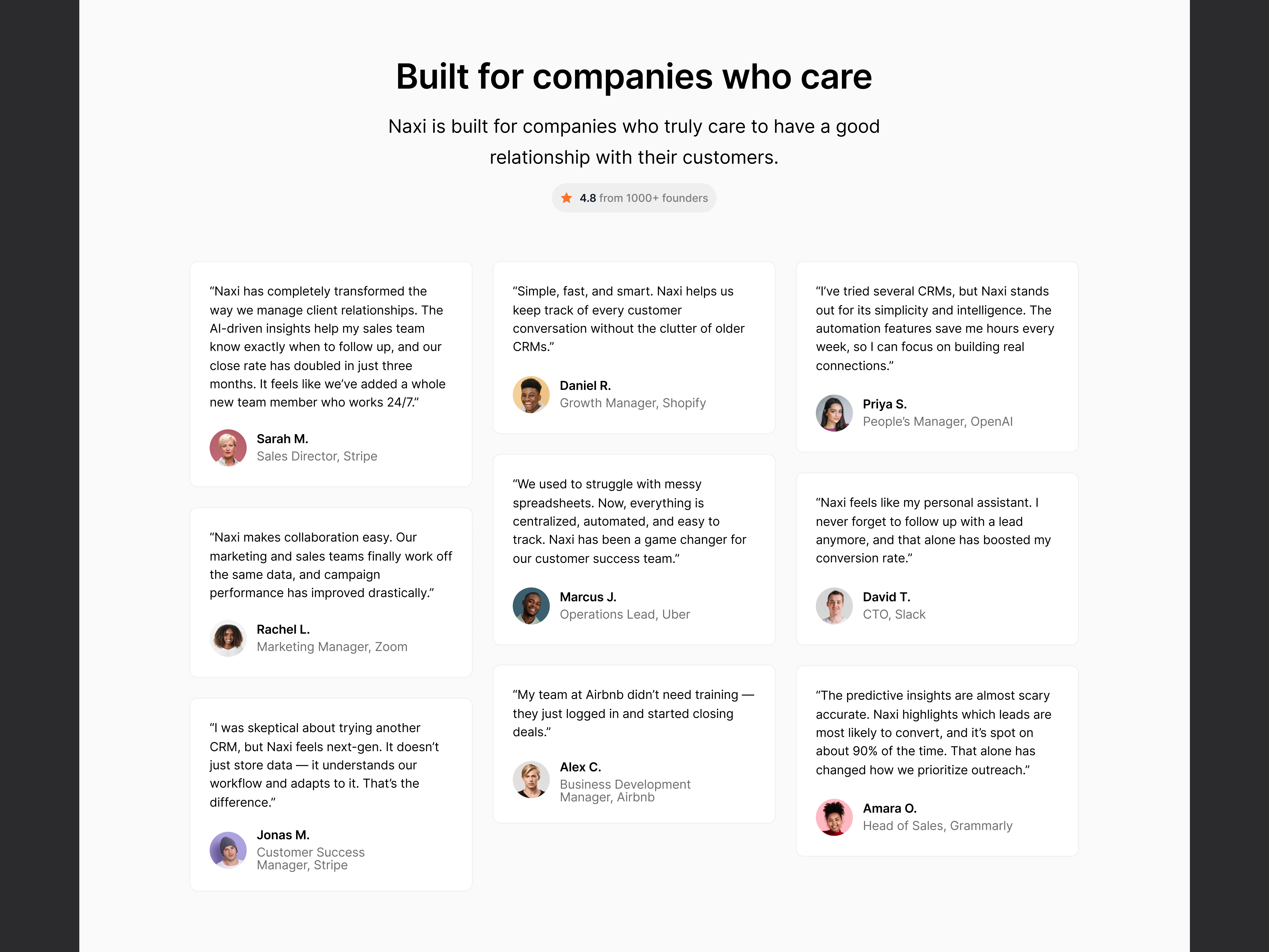
Testimonials
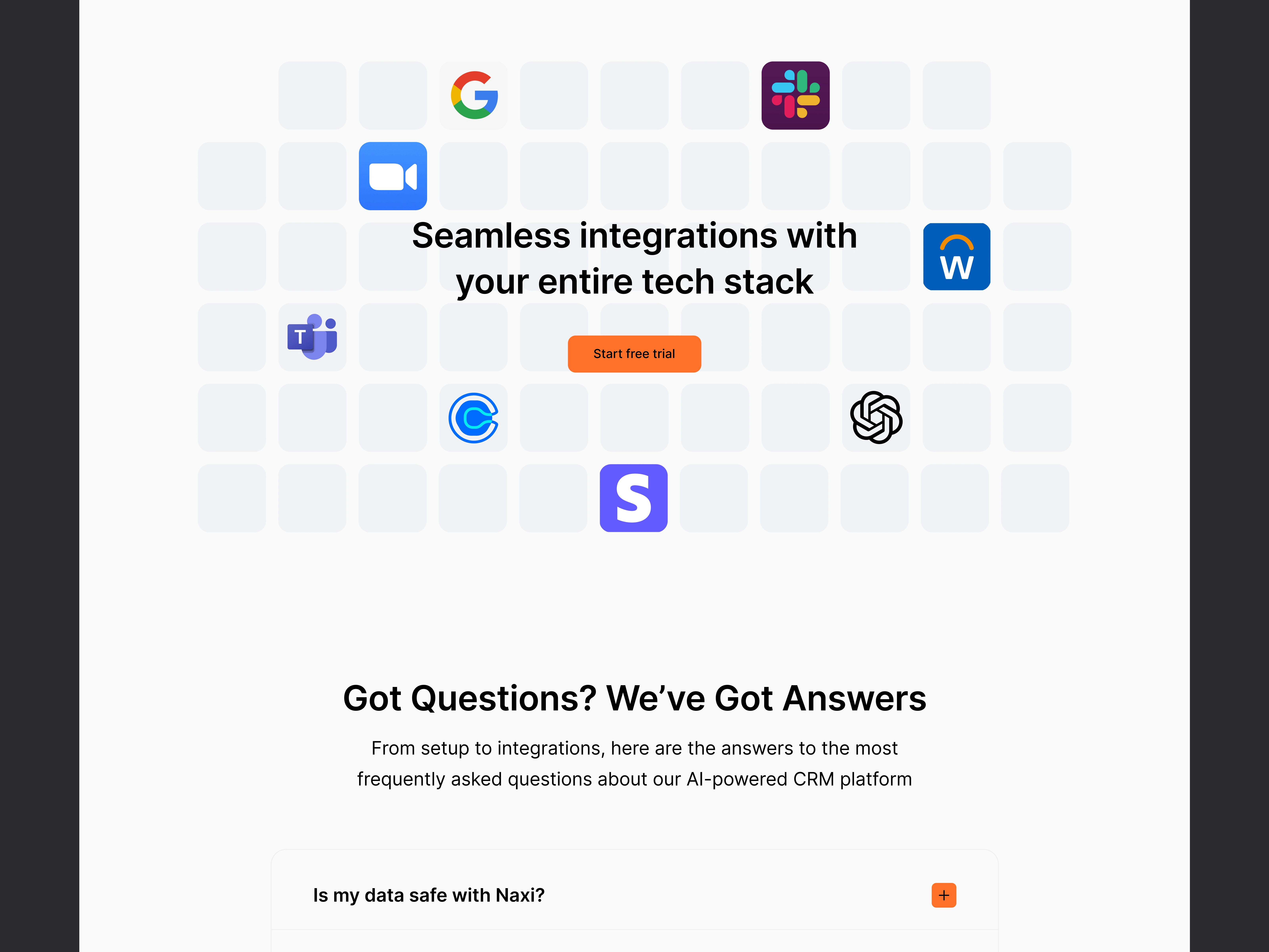
Integration/FAQs
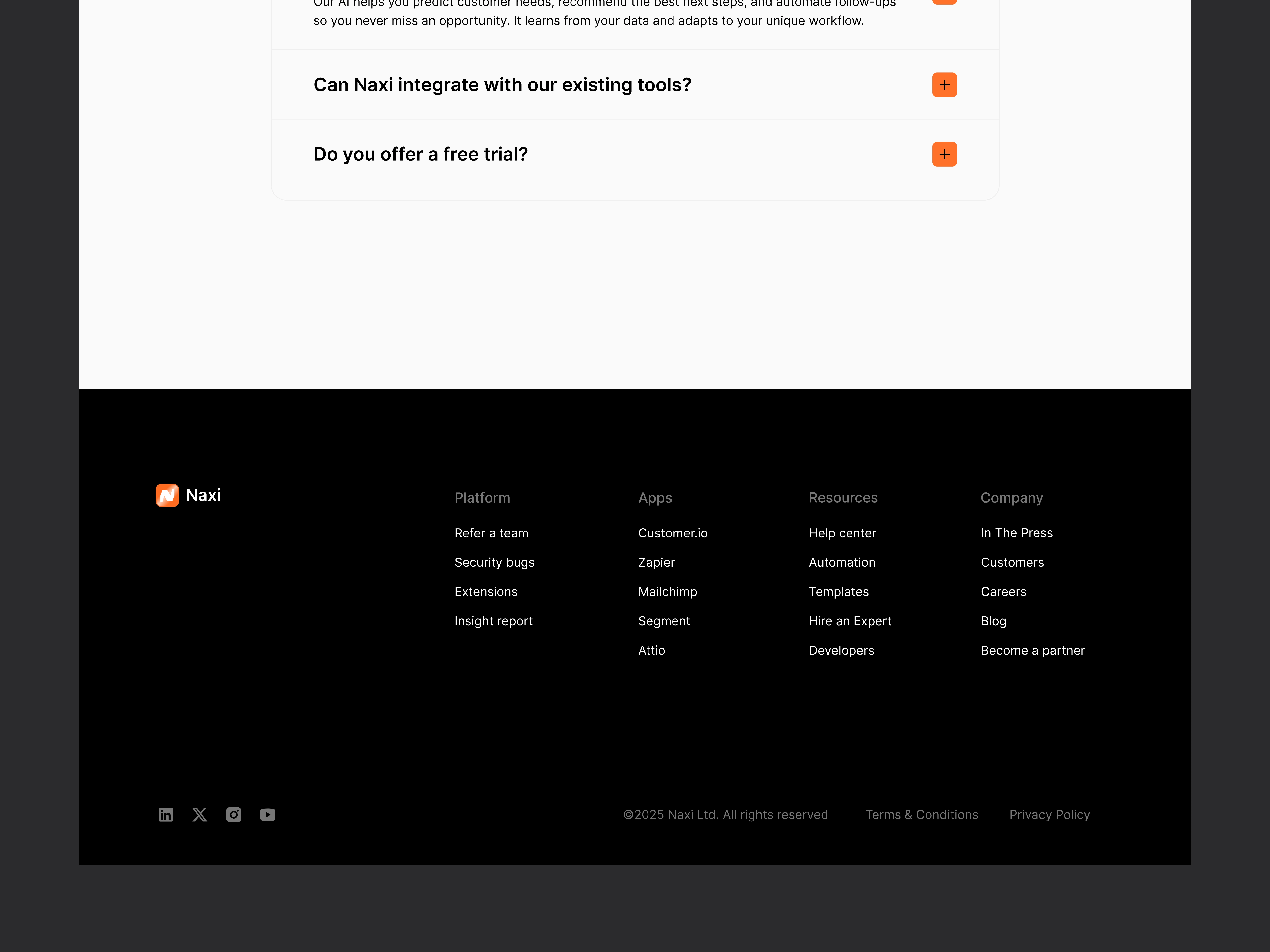
Footer section
The Outcome
A sleek, conversion-focused landing page and product dashboard that position Naxi as a forward-thinking CRM. The designs highlight its AI capabilities while staying approachable for startups and enterprises alike.
Takeaway
This project was a chance to merge brand storytelling with functional UI/UX. I enjoyed bringing Naxi’s vision to life and creating a design system that feels both intelligent and human.
Like this project
Posted Sep 30, 2025
Designed a modern AI-powered CRM experience with a sleek landing page, intuitive dashboard, and a clear story that puts relationships first.
Likes
1
Views
7
Timeline
Jul 1, 2025 - Aug 30, 2025