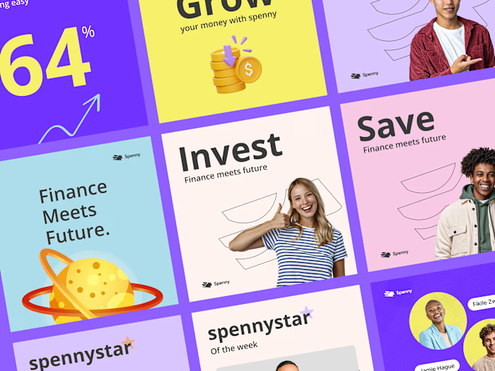
Fintech Web App UI/UX Design
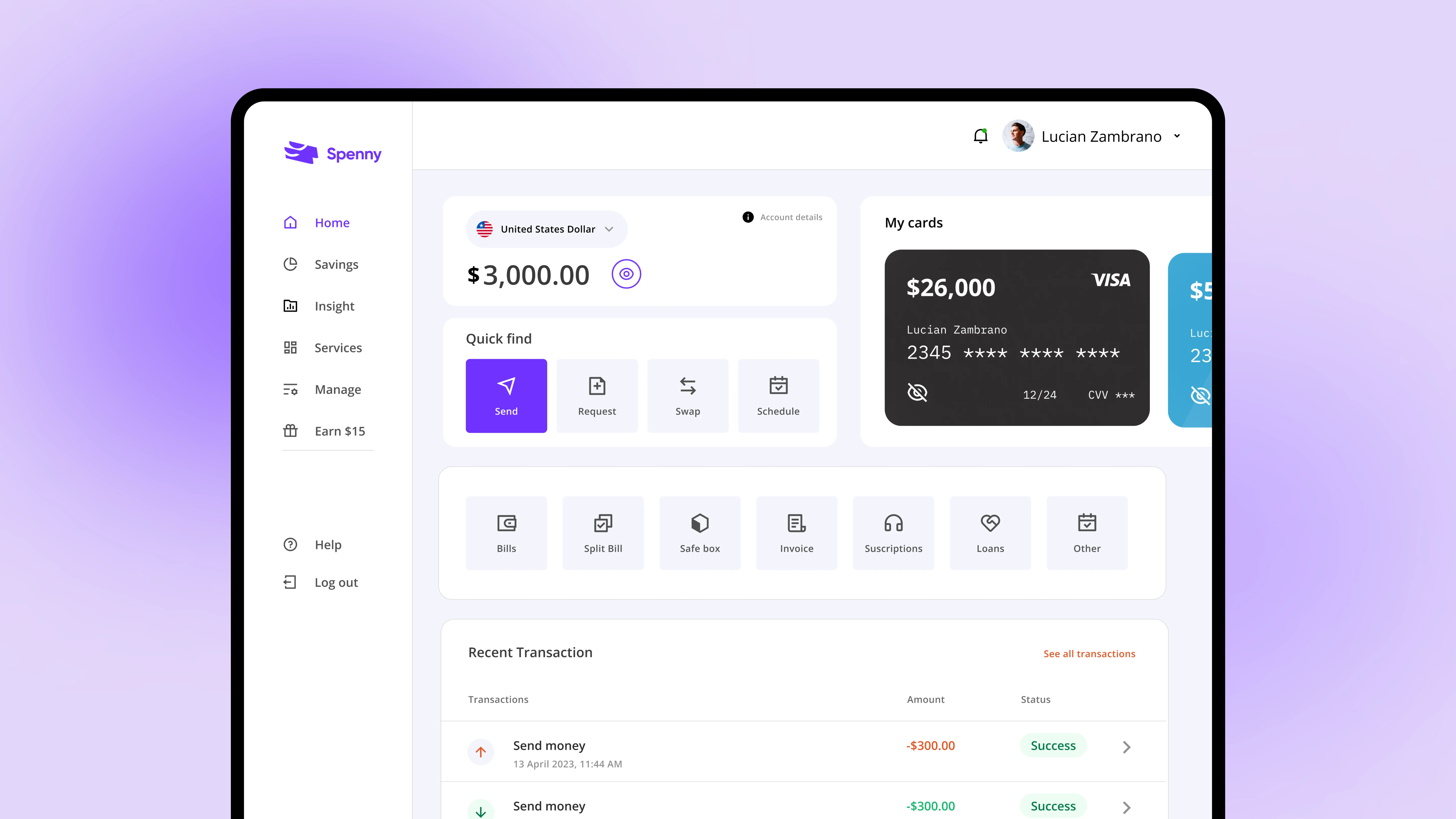
Improving Spenny's dashboard and payments for a smoother financial journey
My role
Simplify transaction categorization: I conducted in-depth user interviews, oversaw usability testing, and analyzed competitive landscapes to gather data on user needs and industry best practices.
Improved financial management: Through user research, I identified key pain points with the existing dashboard and payments system. This included information overload on the dashboard, limited customization options, and a cumbersome payment flow.
Designed solutions: I conducted in-depth user interviews, oversaw usability testing, and analyzed competitive landscapes to gather data on user needs and industry best practices.
Collaborated with cross-functional teams: I actively collaborated with developers, engineers, and marketing teams to ensure the feasibility and successful implementation of the design solutions.
Background
Spenny is a leading fintech company offering a mobile application that helps users track their spending and manage their finances. This case study details the redesign process of Spenny's spending tracker app, focusing on improving user experience (UX) and engagement.
Research and analysis
To understand user needs and pain points, the following research methods were employed:
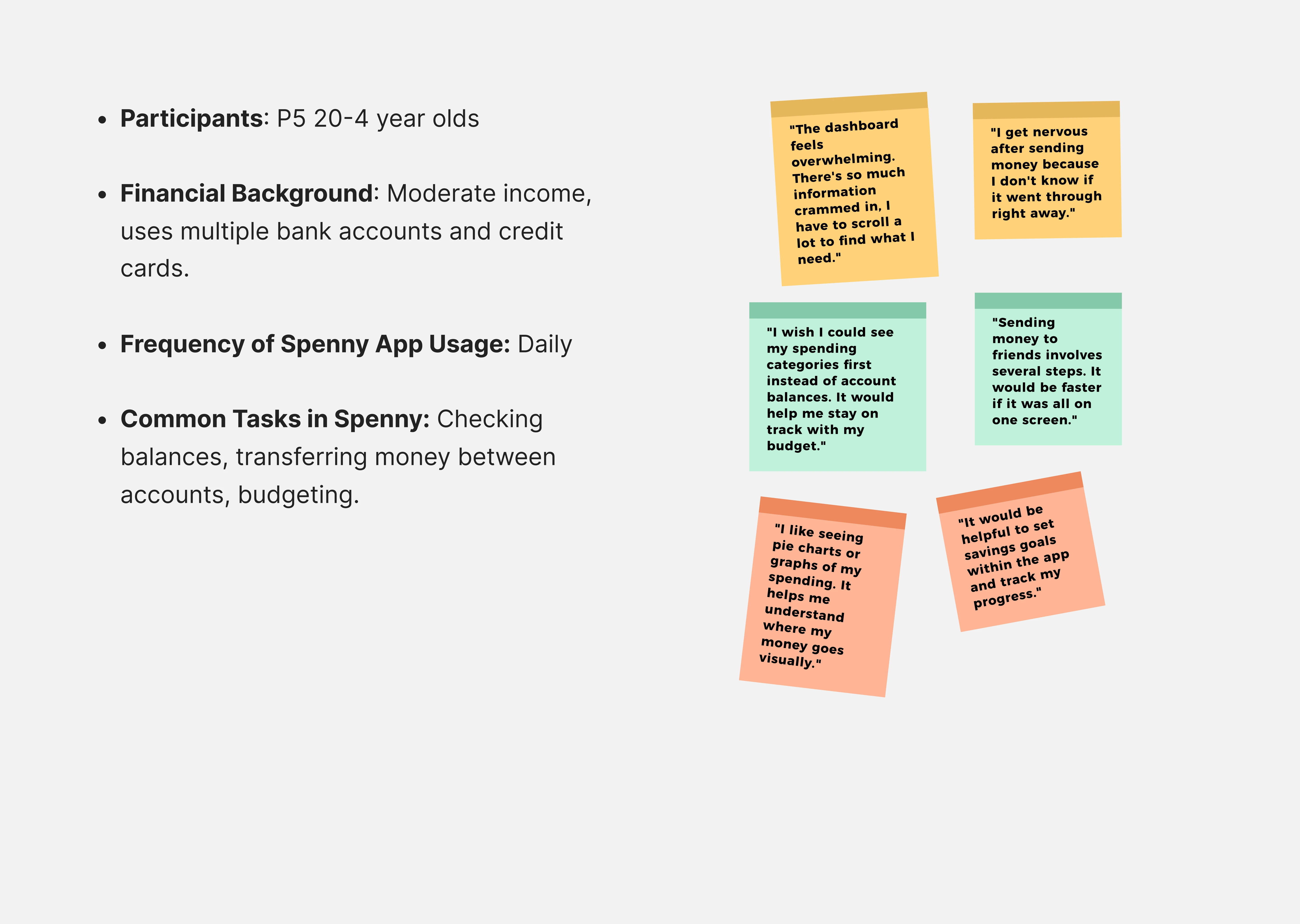
User Interviews
Conducted in-depth interviews with a representative sample of Spenny users to understand their financial tracking habits, challenges faced with the web app, and desired functionalities.
Competitor Analysis
By leveraging the strengths of its competitors while addressing their weaknesses, Spenny aimed to establish itself as a user-centric and feature-rich fintech platform.
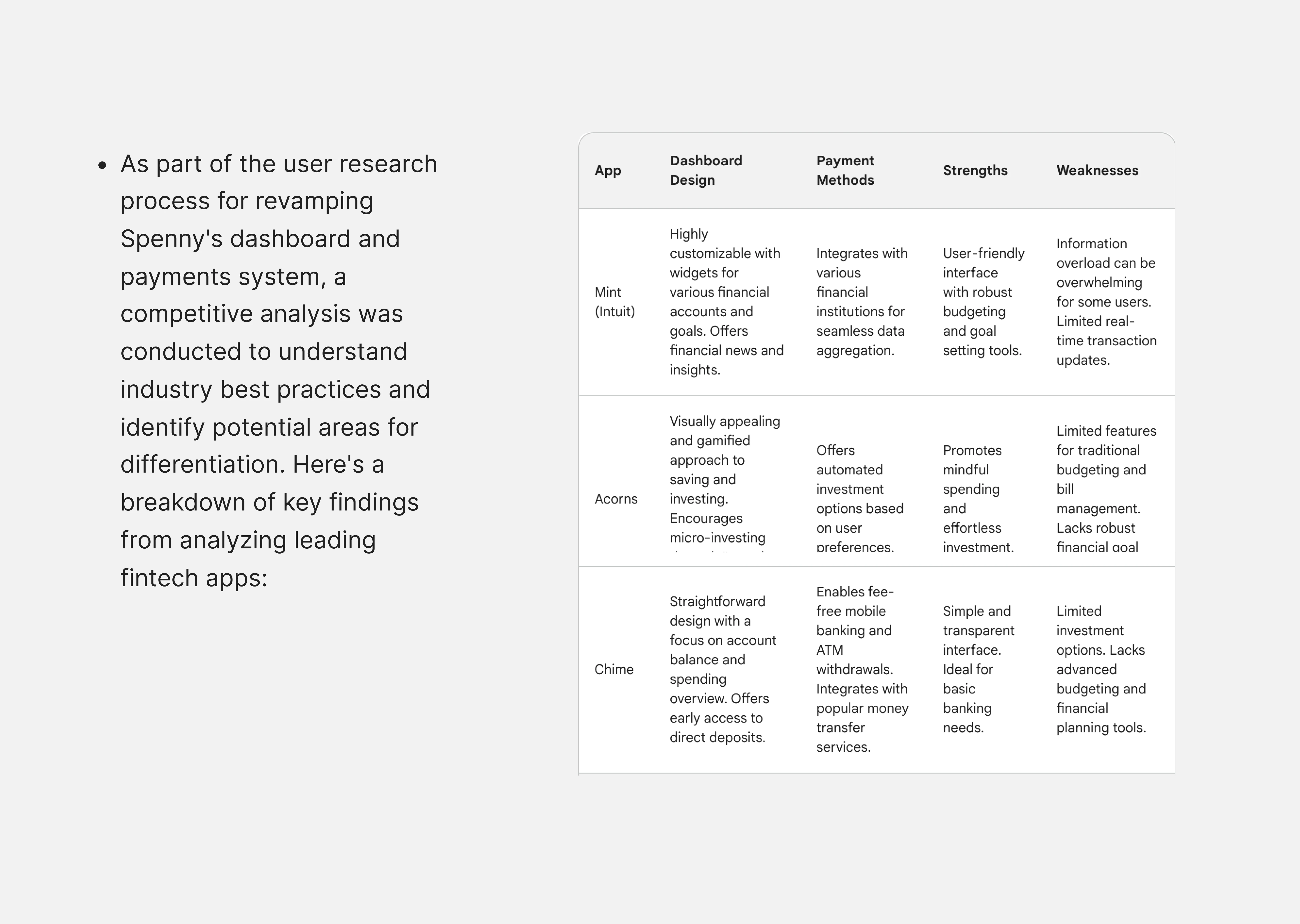
Spenny Competitor analysis
Usability Testing
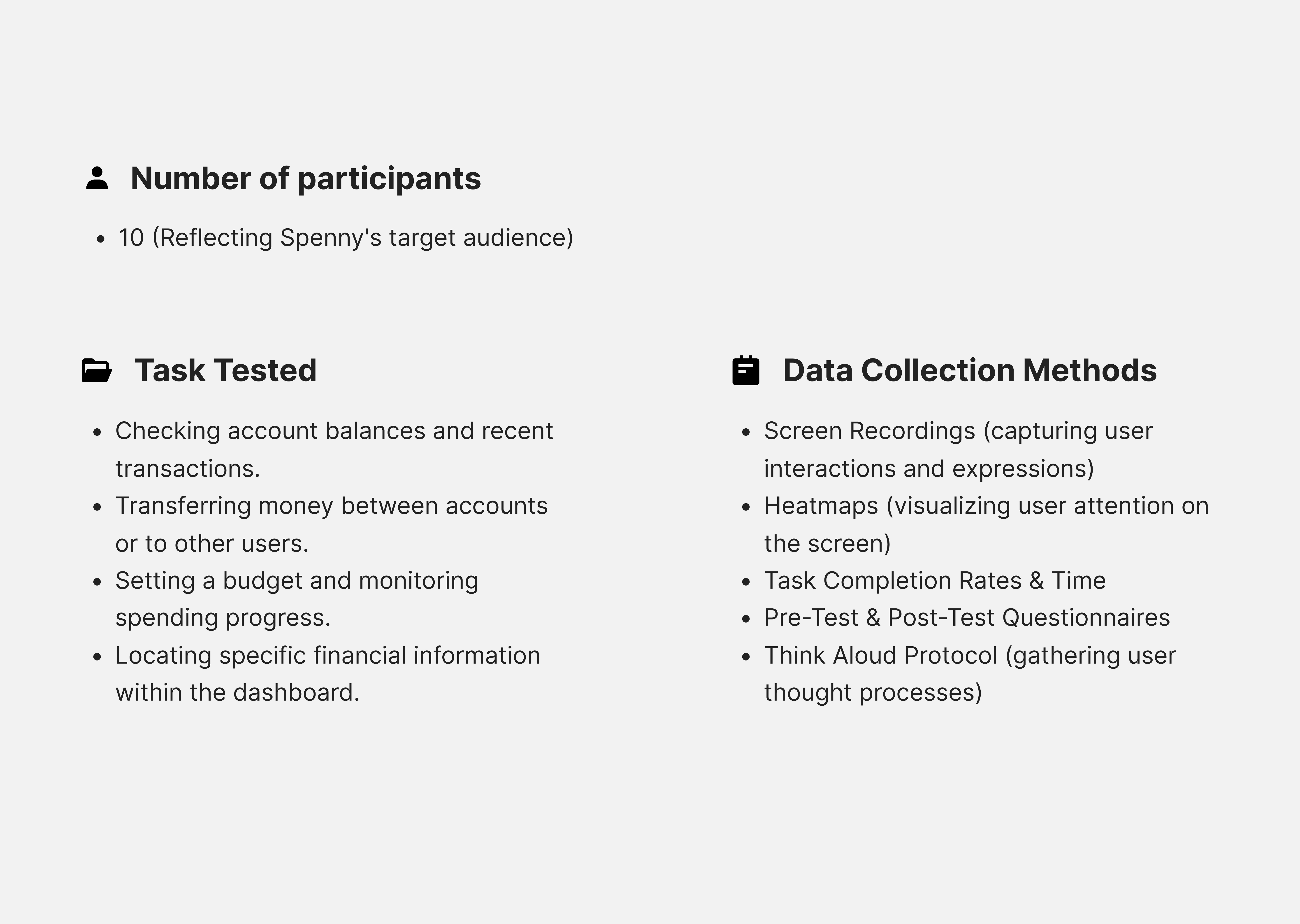
Conducted usability tests with the existing Spenny web app to observe user behavior and identify usability issues.
Usability Testing
Pain points
The research revealed several key findings:
Cluttered dashboard
Users reported feeling overwhelmed by the amount of information crammed into the dashboard.
2. Cumbersome payments
The process for sending and receiving payments felt clunky, lacking efficiency and real-time updates.
3. Lack of financial insights
Users expressed a need for actionable insights and trends to gain a better understanding of their spending habits.
Design goals
Based on the research findings, the following design goals were established:
Simplify transaction categorization
Make categorization quick, easy, and intuitive.
2. Enhance data visualization
Implement clear and engaging visualizations to present spending insights.
3. Offer actionable recommendations
Provide personalized recommendations to help users manage their finances effectively.
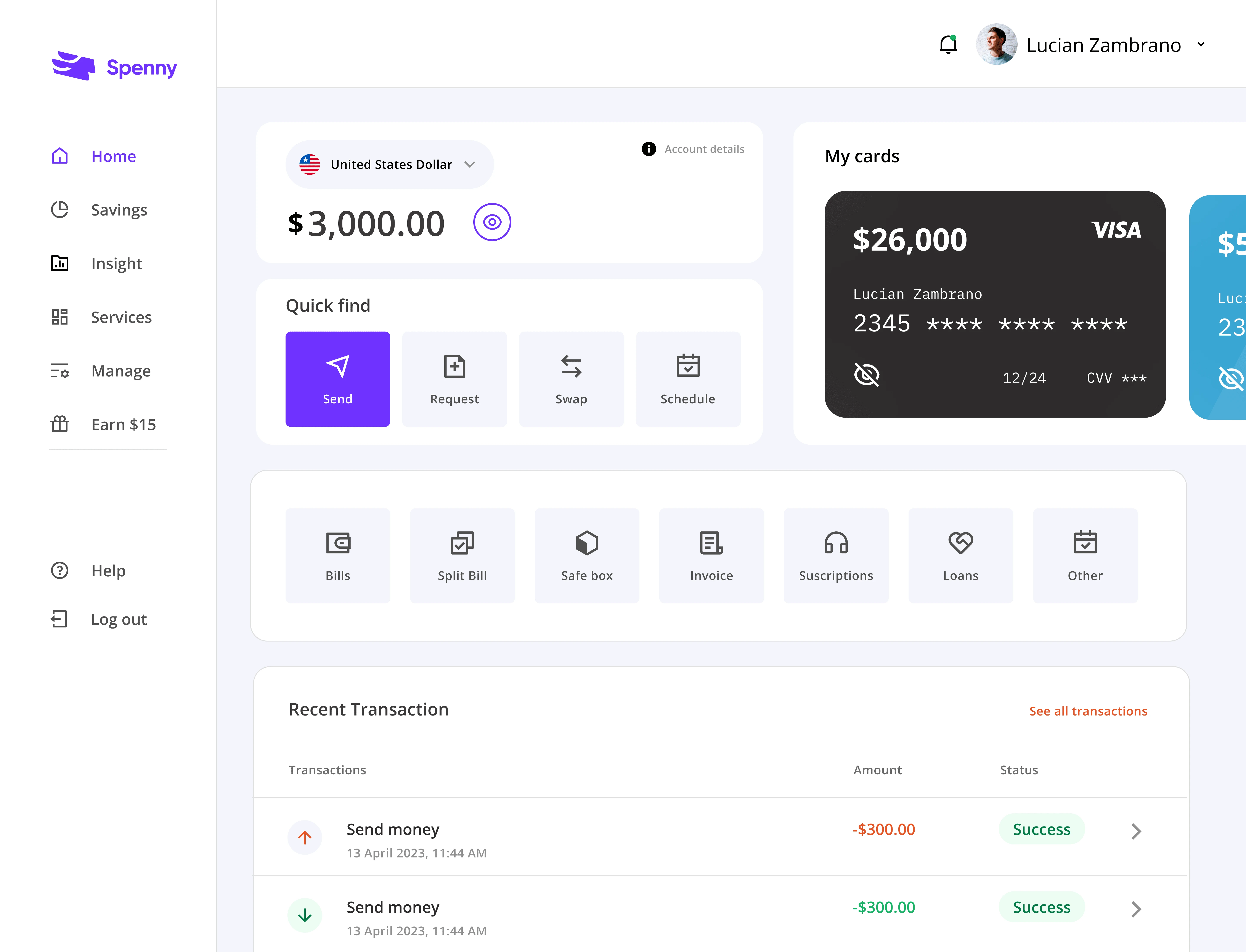
Design solutions
The web app was redesigned with the following key features:
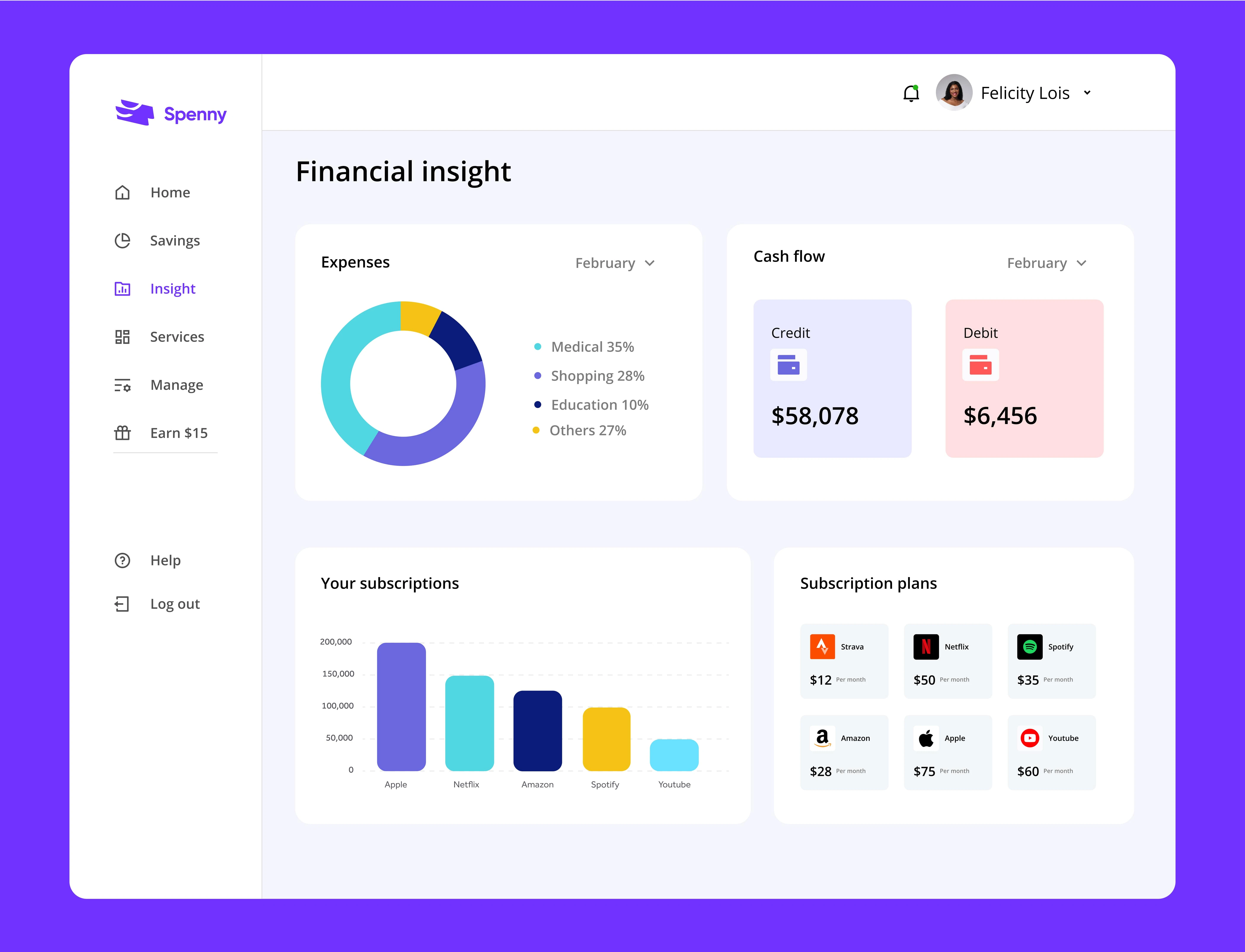
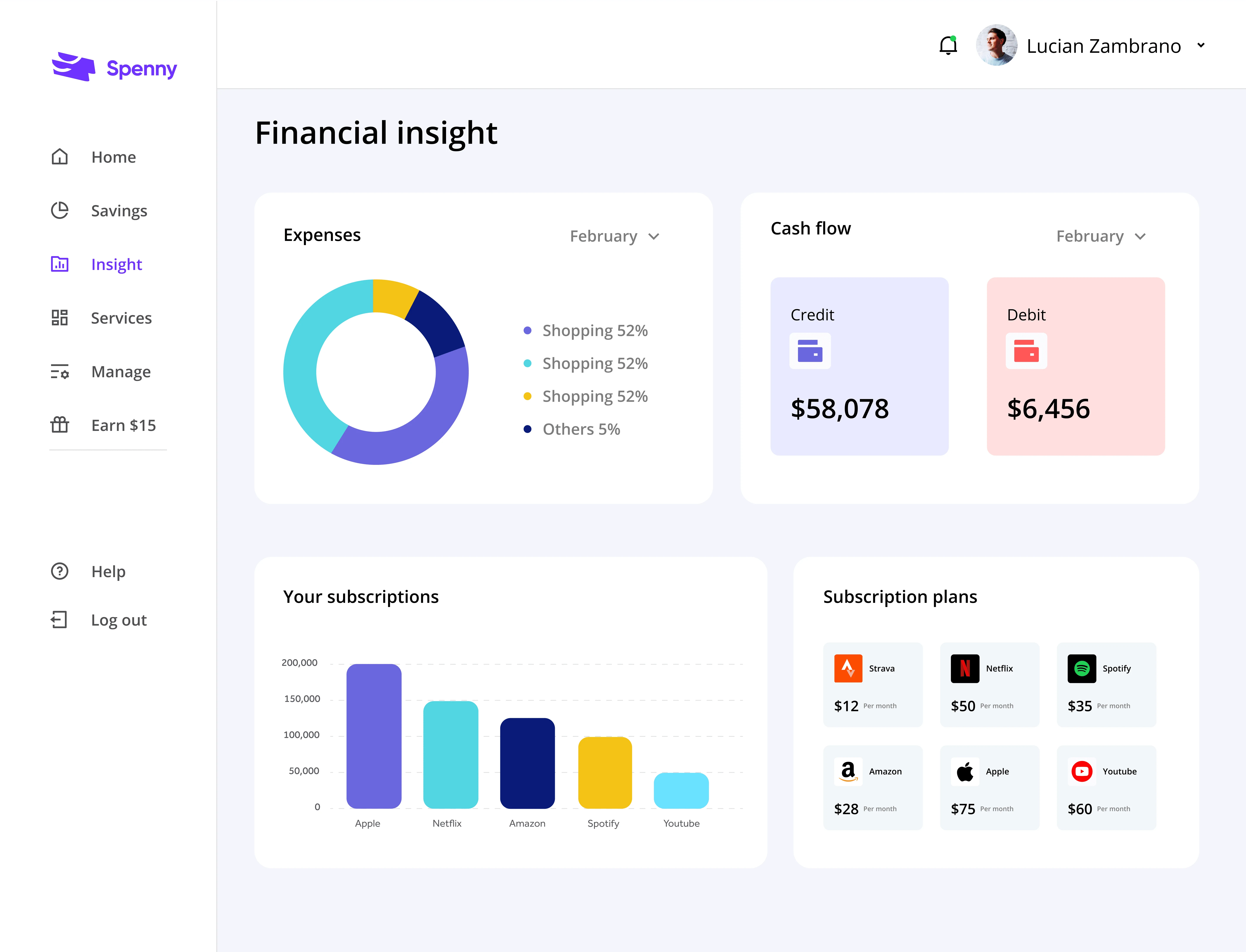
Financial insight
Provide users with personalized data visualizations and analytics to understand their spending habits better.
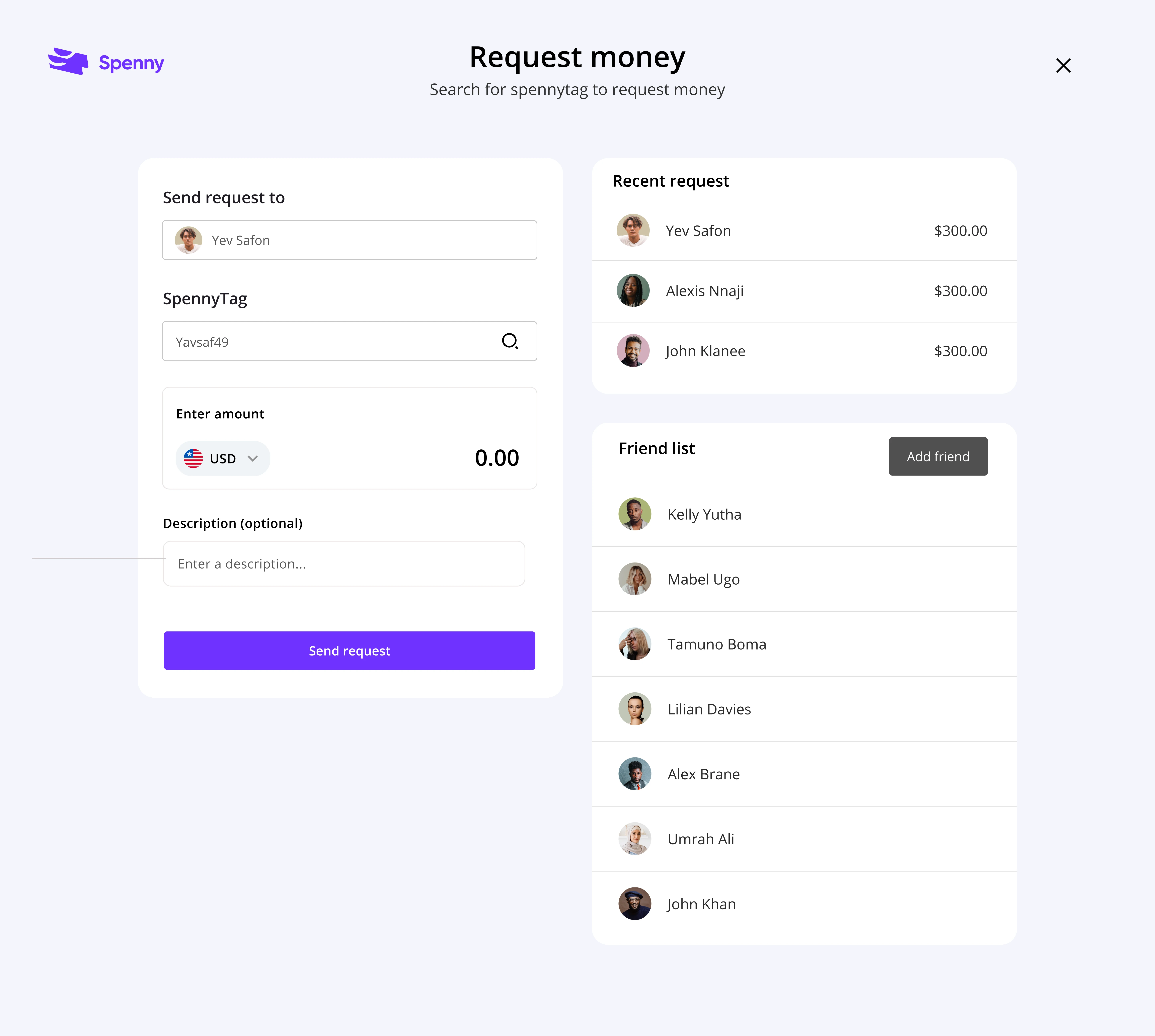
2. Request money
Implement clear and engaging visualizations to present spending insights.
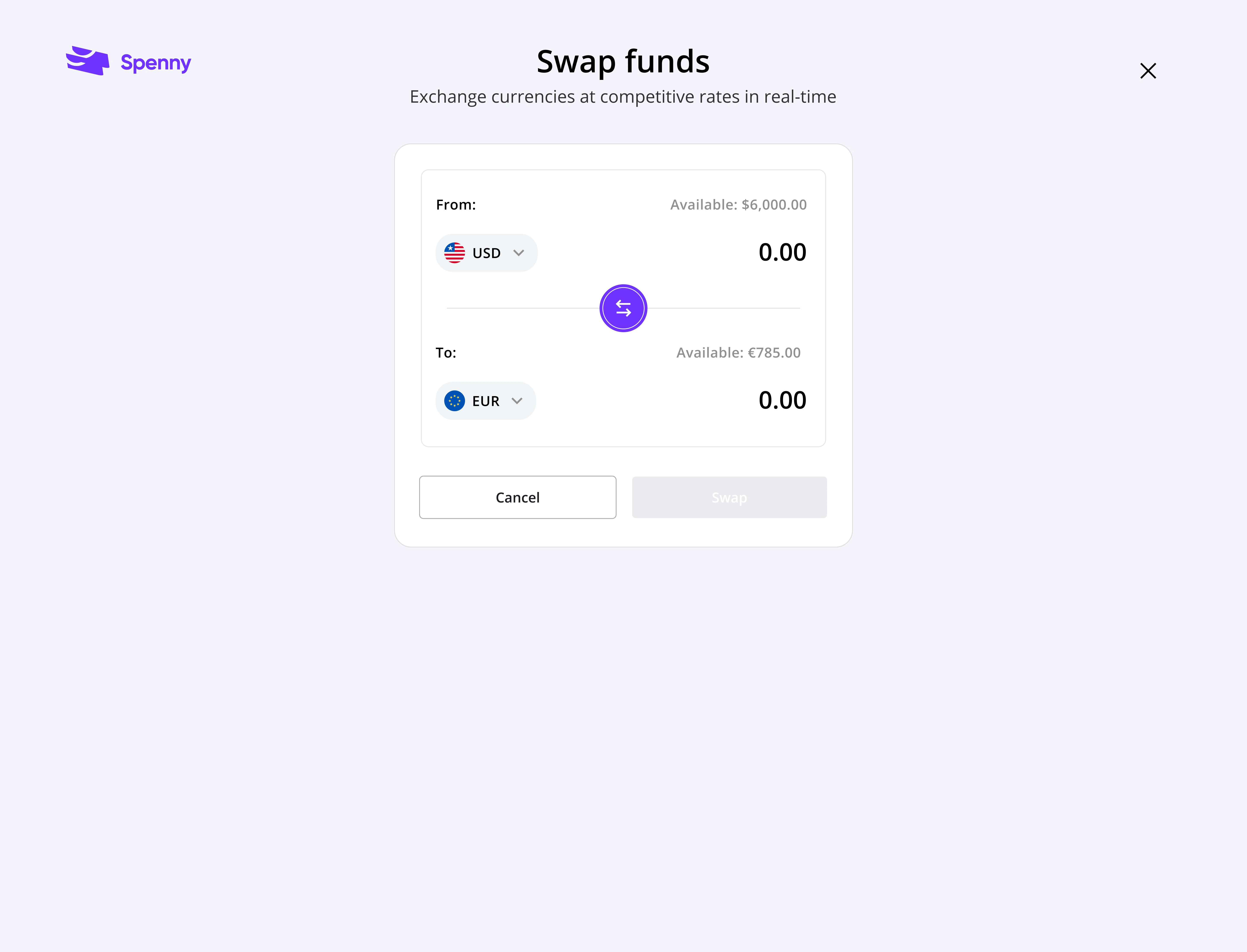
3. Swap funds
Effortlessly exchange currencies within the Spenny app, eliminating the need for multiple conversions or third-party services.
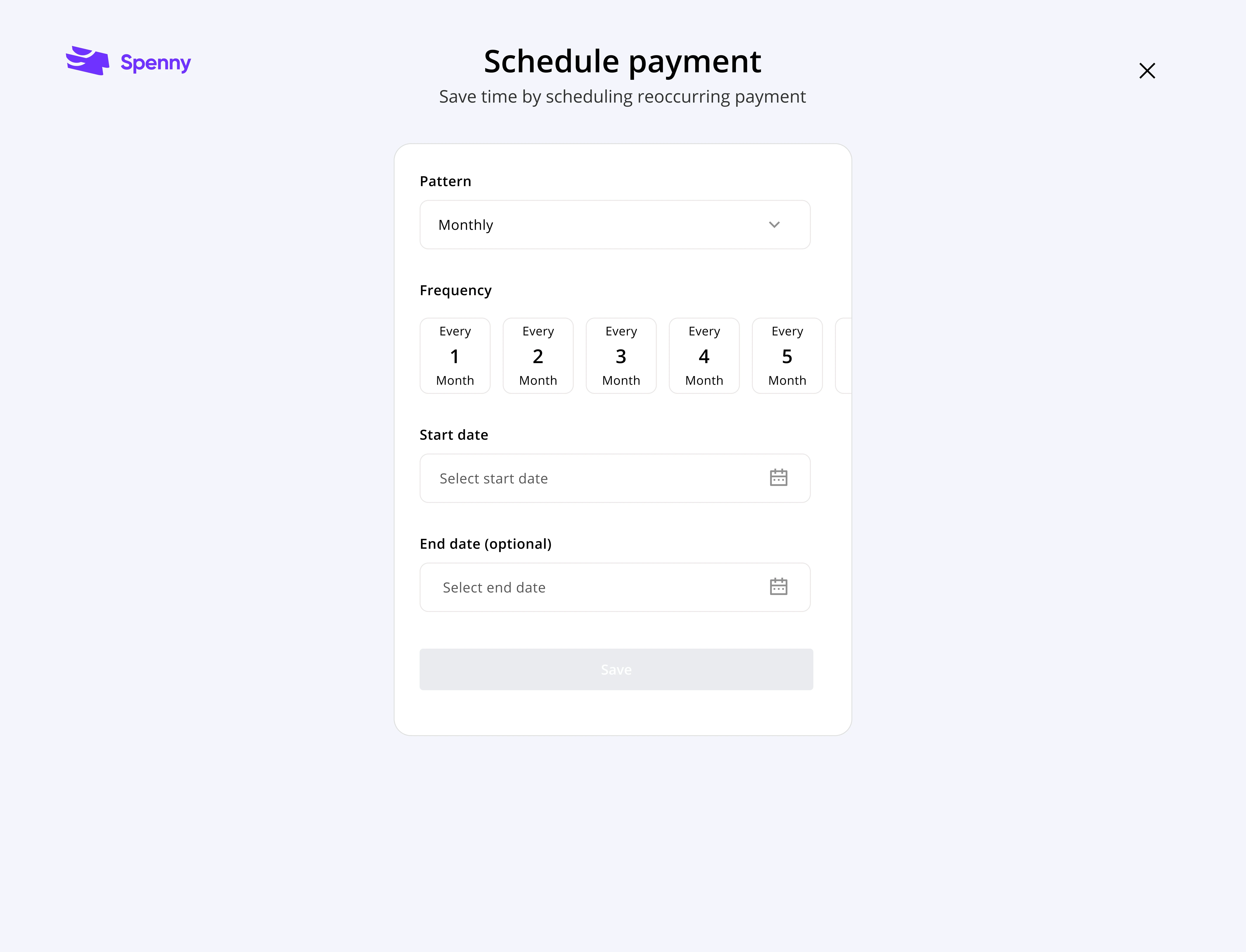
4. Schedule payment
Set up automated bill payments or transfers for recurring costs, like rent or utilities.
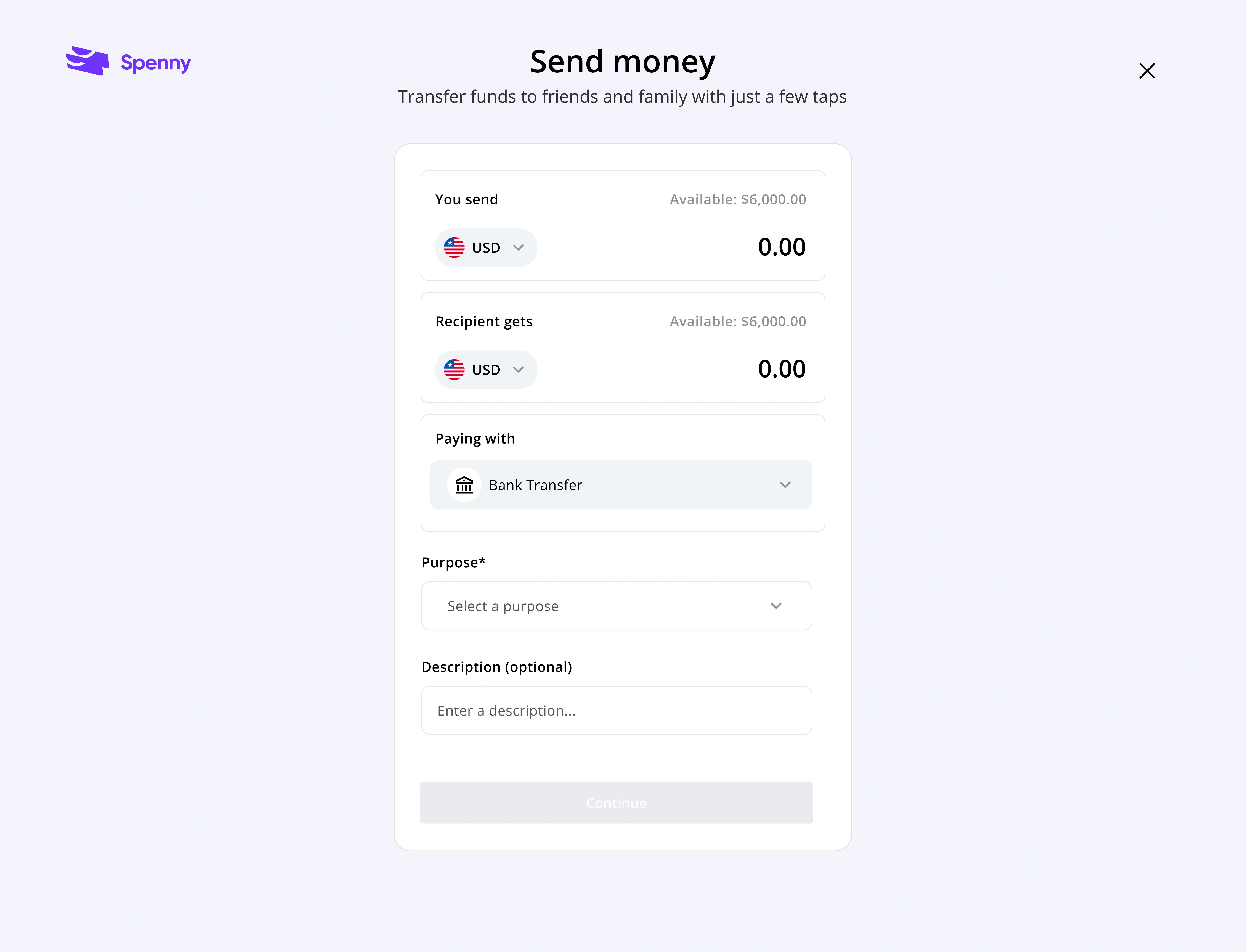
5. Send money
Seamlessly send money to others through various channels like bank transfers or P2P payments directly from Spenny.
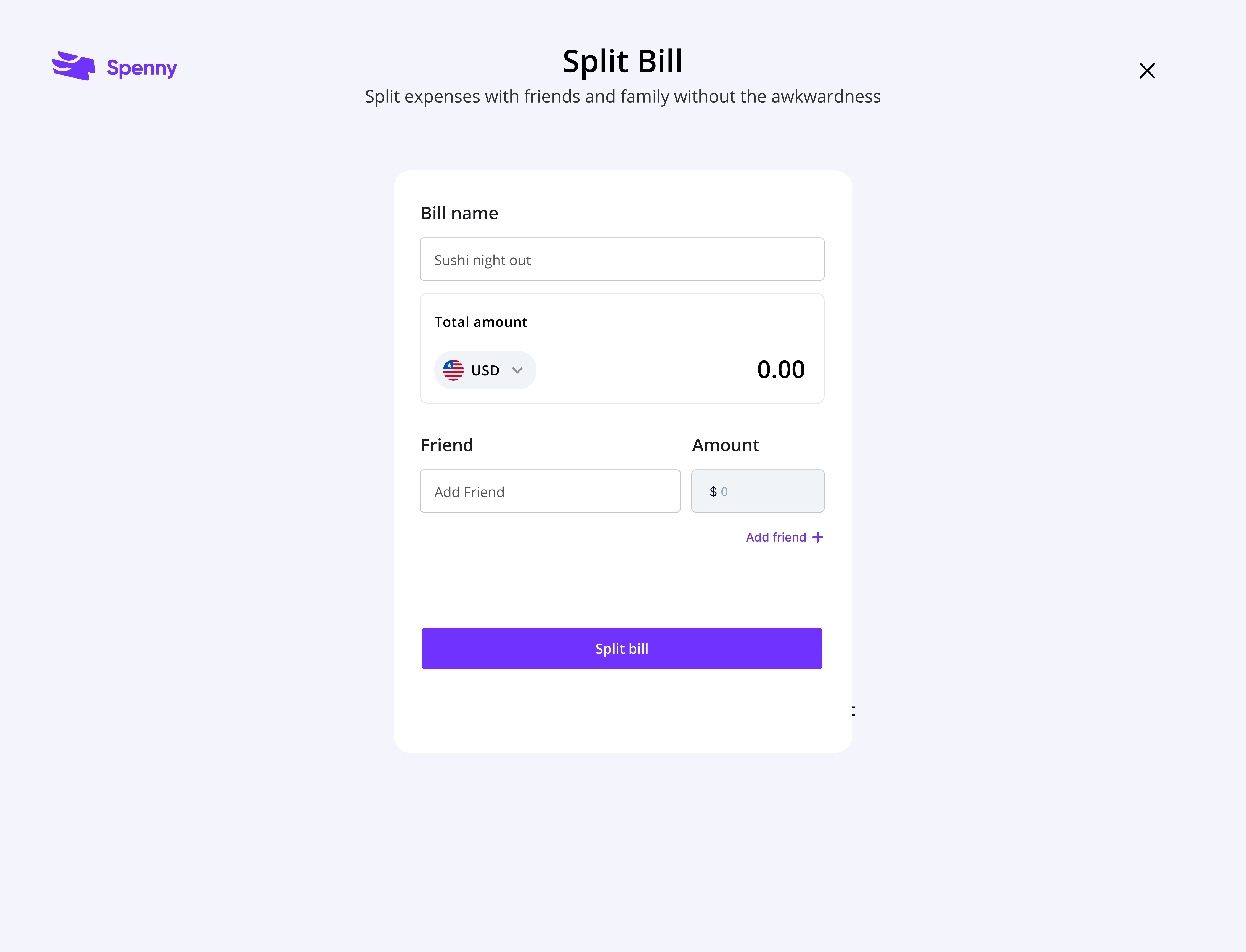
6. Split payment
Say goodbye to complicated calculations and awkward moments when splitting bills. Spenny allows users to effortlessly split bills among friends or colleagues with just a few clicks.
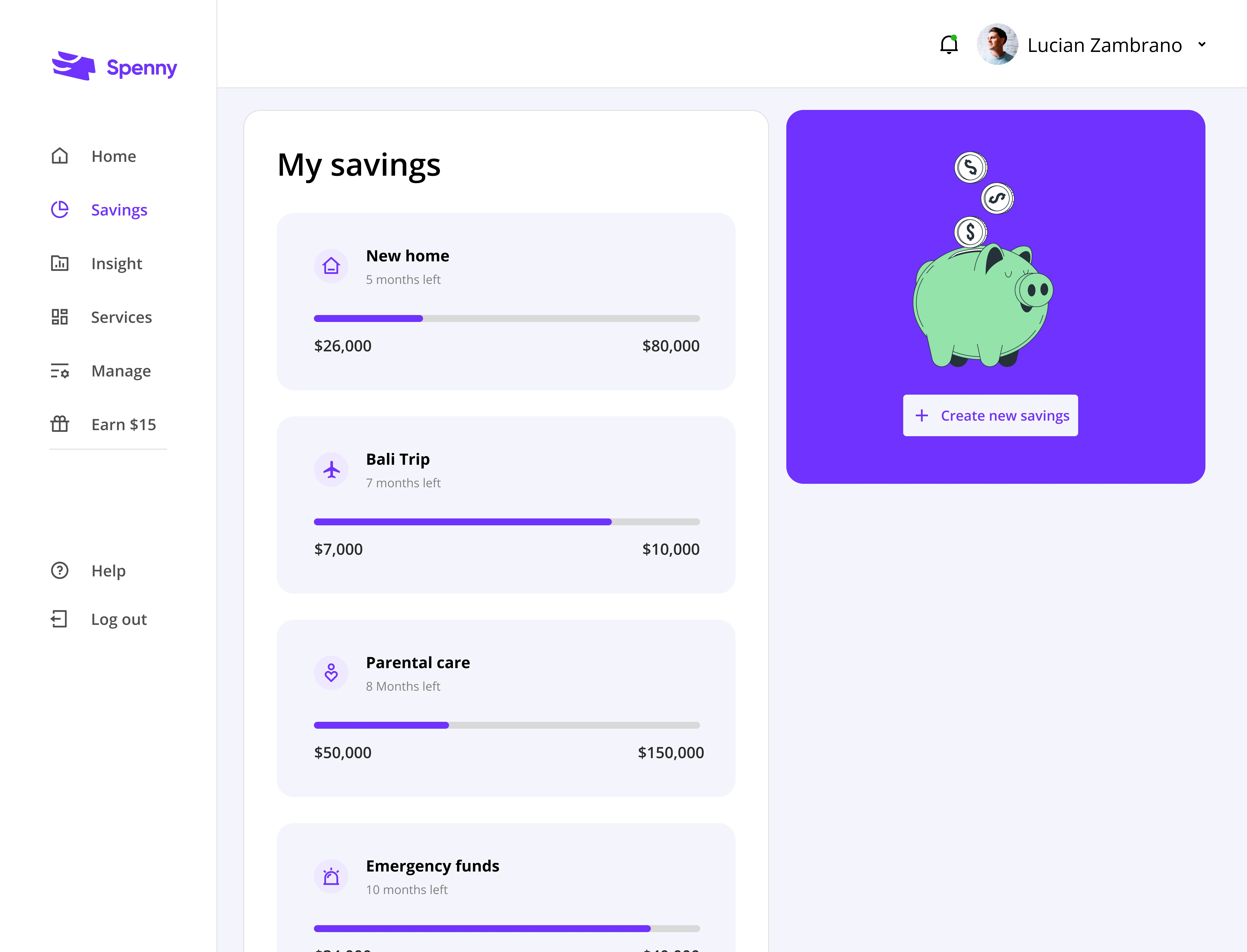
7. Savings
Set up specific savings goals within the app and track your progress towards achieving them.
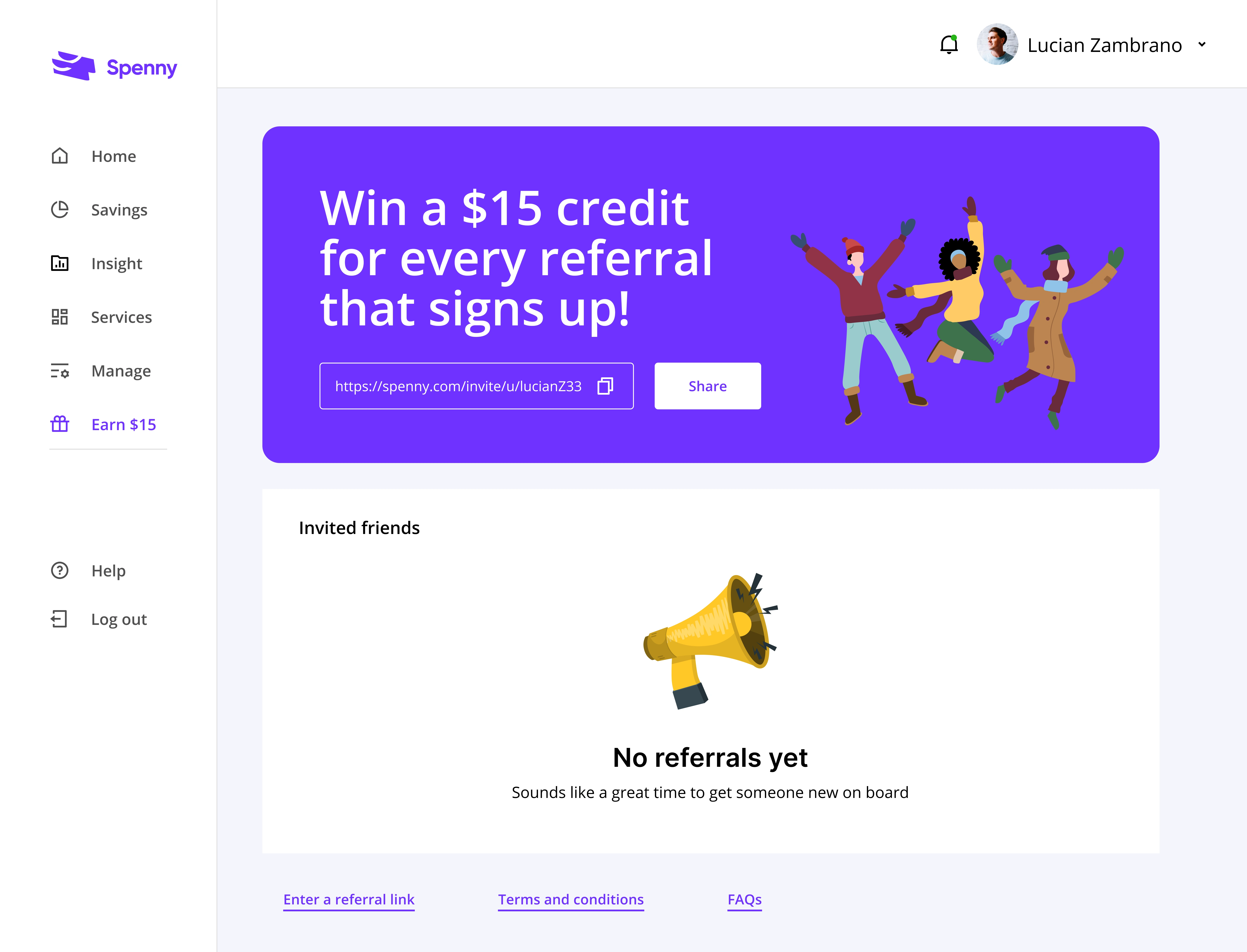
8. Refer and earn
Users can earn rewards for inviting friends and family to sign up and use the app. This can be a win-win situation, attracting new users and rewarding existing ones for their loyalty.
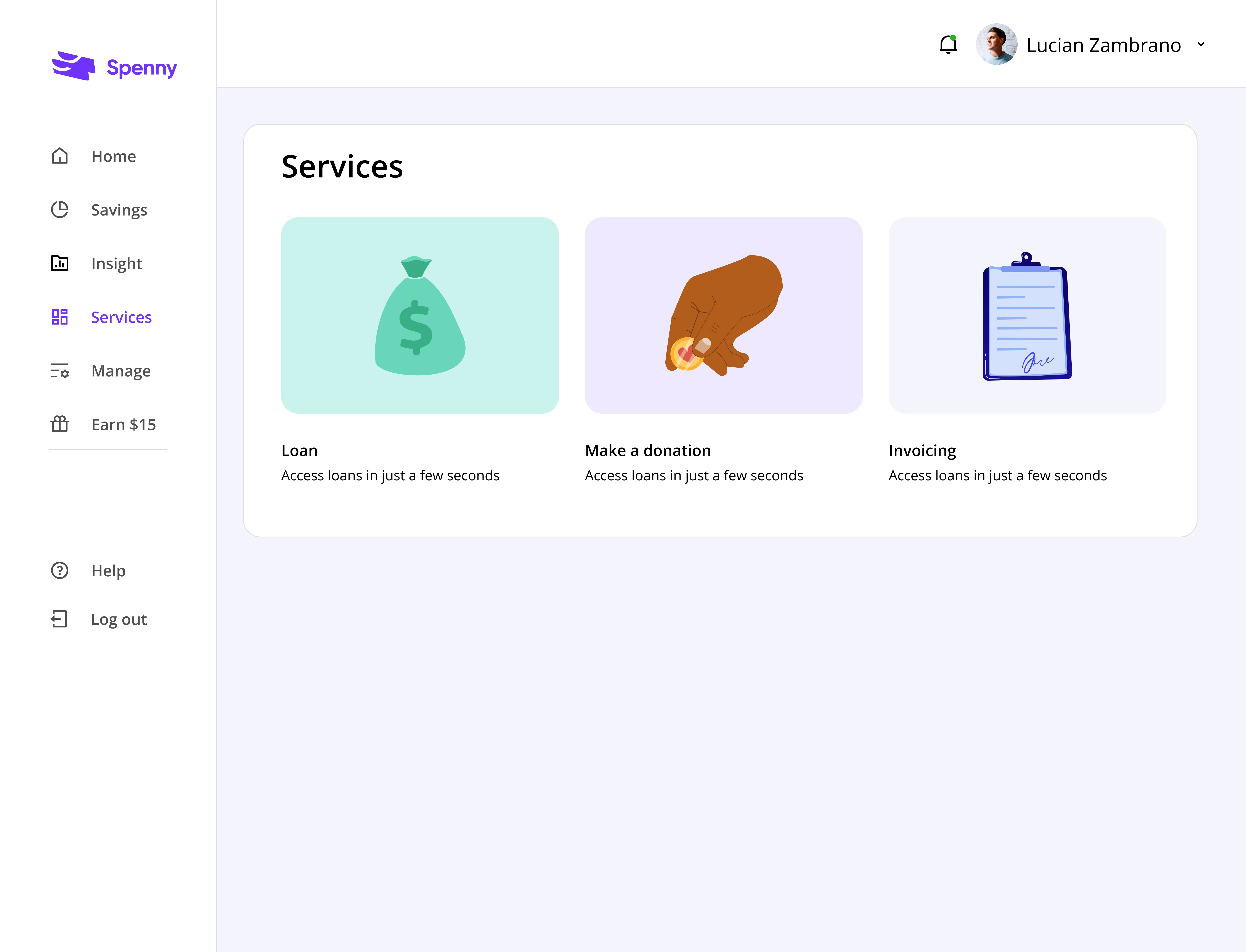
9. Services
Spenny allows users to conveniently access and apply for loans directly within the app. And also donate to their favorite causes or charities seamlessly within the app.
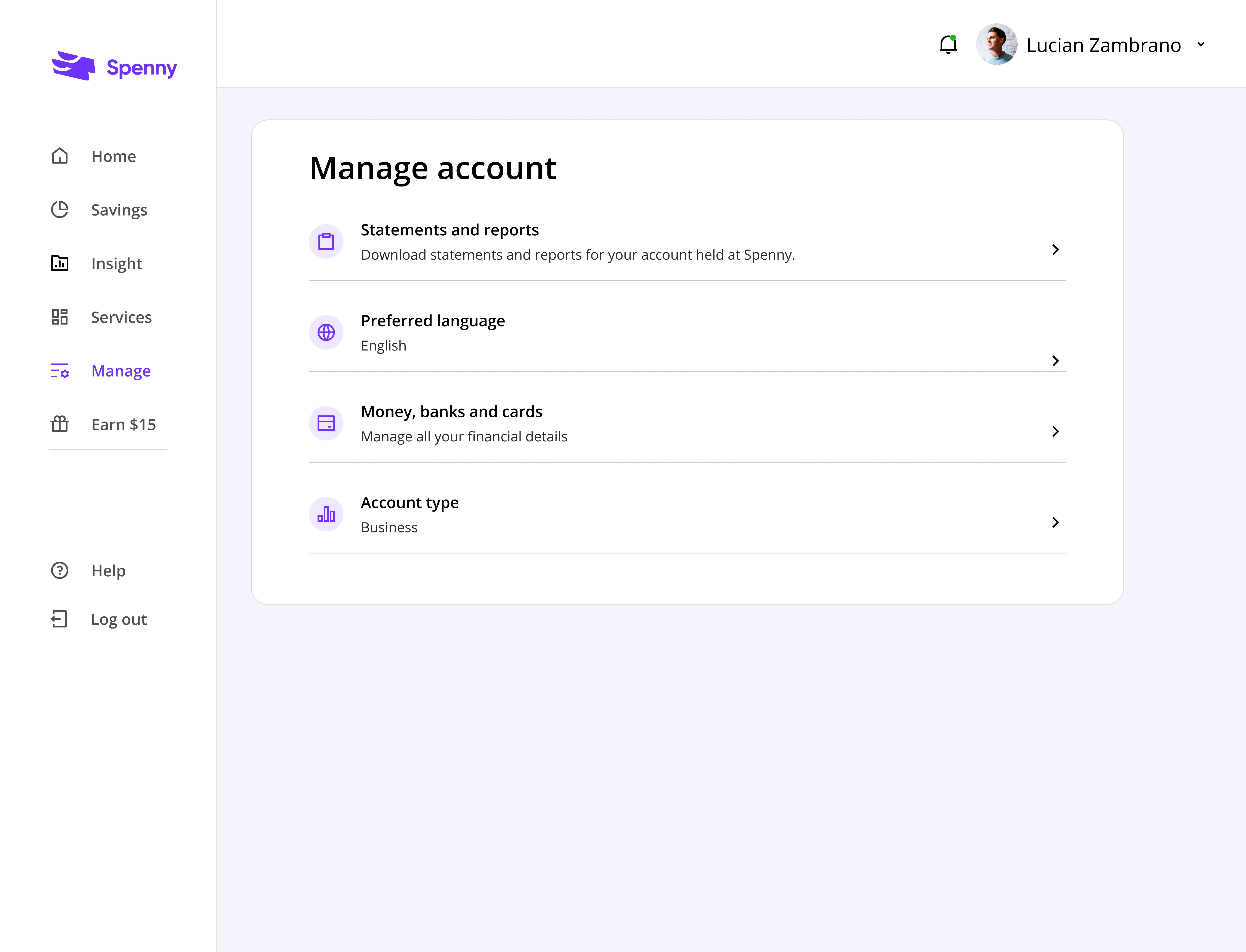
10. Manage account
Provide users with a central hub to view and manage their account details, statements and reports, account type, and preferred language.
Results & impact
Some of the results achieved
Simplify transaction categorization: User engagement with the app increased by 30%, indicating a more positive user experience.
Improved financial management: User feedback highlighted a better understanding of their spending habits and an increased ability to manage finances effectively.
Enhanced brand perception: User feedback highlighted a better understanding of their spending habits and an increased ability to manage finances effectively.
Lessons
There are always lessons to learn on every project; here are a few I learned:
The value of user research: By deeply understanding user needs and frustrations, we designed solutions that directly addressed their pain points.
2. Data-driven decision making: User research combined with usability testing provided concrete evidence to guide design decisions and measure success.
3. Iteration is key: The design process wasn't linear. We gathered user feedback on prototypes, iterated on the design, and tested again to ensure optimal solutions.
Future improvements
Advanced analytics: Analyze user data to understand financial behavior patterns and personalize insights & recommendations further.
2. Integration with financial tools: Explore integrating Spenny with external financial tools for a more holistic financial management experience.
3. Accessibility: Continuously evaluate and improve the design for accessibility, ensuring all users can navigate the platform seamlessly.
Like this project
Posted Nov 3, 2024
Improving Spenny's dashboard and payments for a smoother financial journey
Likes
0
Views
26

