Spenny - Fintech Brand Identity design

Problem
Spenny, a fintech app for young investors, lacked a relatable and engaging brand identity, making it hard to connect with its target audience and stand out in a crowded market.
Solution
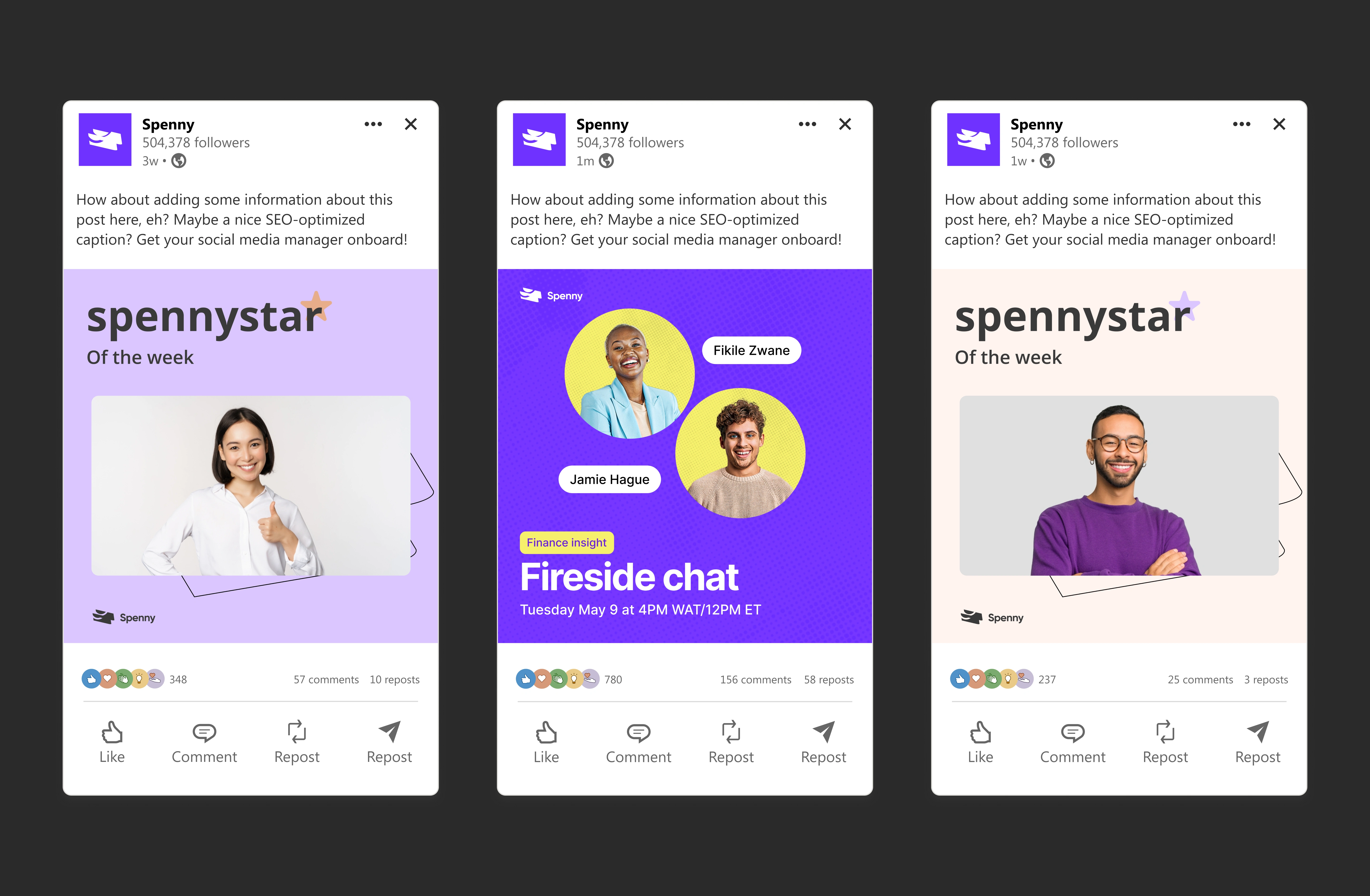
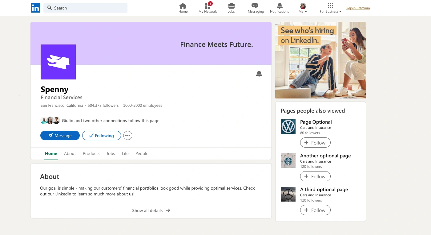
I crafted a fresh brand identity with a vibrant color palette, approachable typography, and custom illustrations to simplify financial concepts. The new design conveyed trust and ease, making Spenny more inviting and accessible.








Impact
The rebrand led to a 35% increase in sign-ups and improved user engagement, positioning Spenny as a trusted, friendly platform for first-time investors.
Like this project
Posted Nov 3, 2024
Redesigned Spenny’s brand to make investing accessible and engaging, driving a 35% increase in sign-ups and solidifying user trust.

