Admin Panel Glow-up - Part II 🧖🏼
Laura Castano
The Everything Tab refresh 🪄
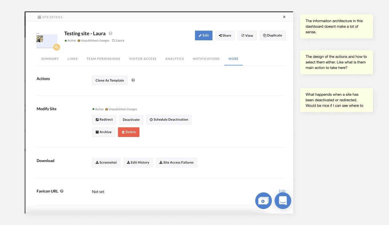
This was the Popurri tab in the site admin panel. That Tab where nothing and everything lived, those actions that had no visible owner or were just the result of tech debt accumulation. Much like your storage room (cough couch).
The idea was to add Site Export Feature to the admin panel that were visibly not allowed anywhere else but the More tab.
After considering it with the team and running it by the CTO I proposed we performed a face lift to the More Tab. Analytics was already done so we might as well show it some long overdue love.
Some things to consider:
The CTO should be able to develop the whole experience within a week. No more than that
Stay within the scope of work of this tab, and this tab only.
First appointment with the Design Doctor 🩺
This was one of those projects where you know everything is wrong but can be so right. So I took a screenshot, took it to Figma and explored what was in it, why was it designed like so and what could I do to make it better.
A few of the things that popped:
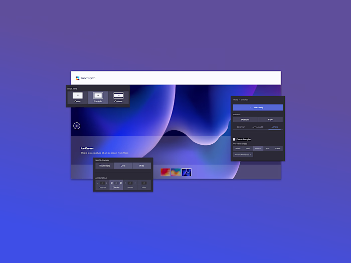
What's with the use of buttons for everything? 13 Buttons ! and 1 sneaky link.
What exactly is each section intended for ? Total lack of context of what can be achieved in this tab
This all comes down to: I know I'm supposed to look here for important actions, but where?
More Tab in the Site Admin Panel
2 options were proposed : 1 must survive
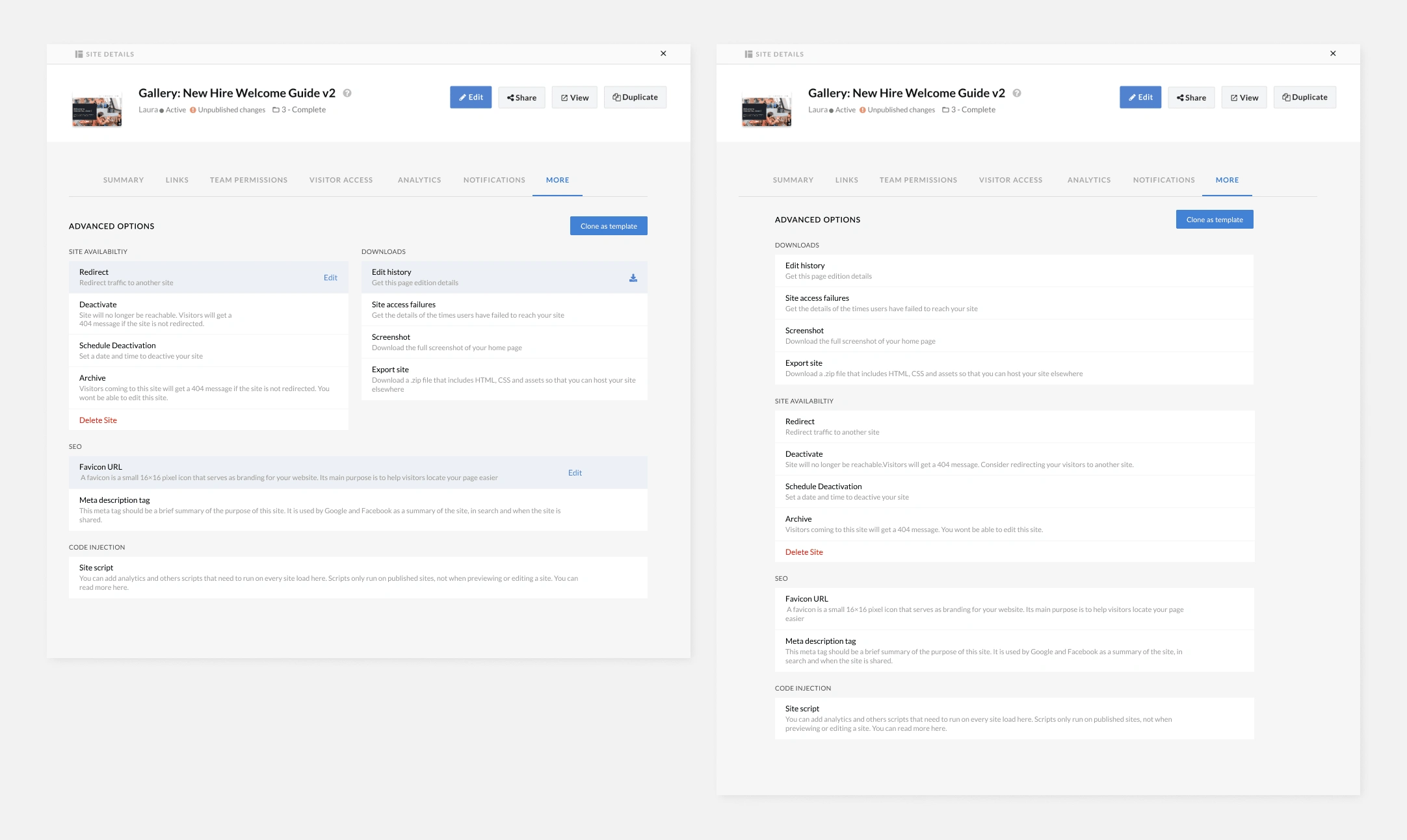
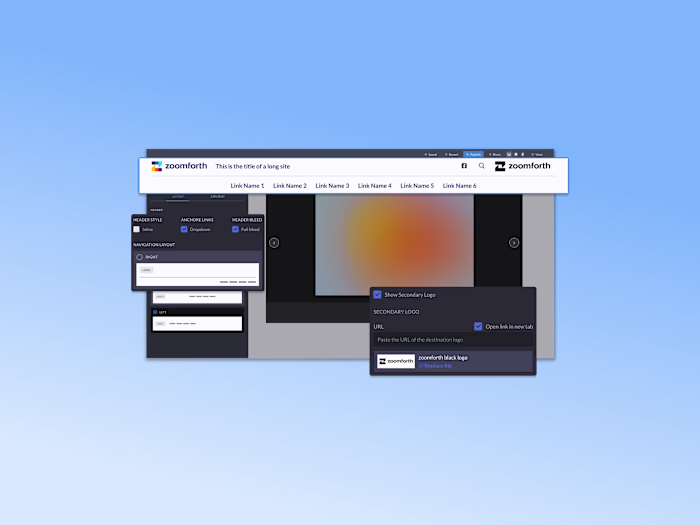
Option 1: Column - Option 2: Single column
In both options, these were the changes:
Improved the information architecture of the tab by grouping actions that belonged to the same type of setting.
Improved the hierarchy of the actions inside each group, which allowed me to surface the explainer text and avoid the overuse of tooltips. This improved recognition over recall.
Gave clarity as to what the main action was: added hover effects to each action box to surface the link to take the action.
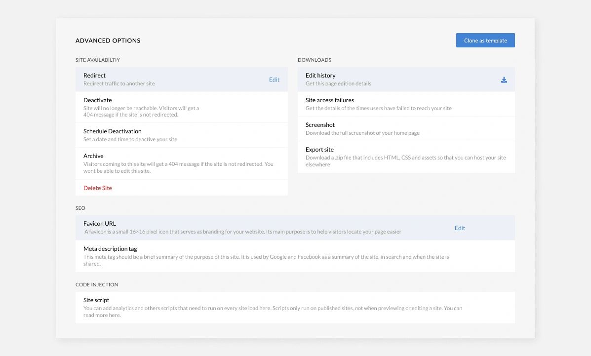
Detail of the design
In both options I proposed, one was a single scroll, single column. But the clear favorite was the one with the two columns. Why? Simple, it made better use of the space we had and allowed users to see the range of actions they could take above the fold.
So we went with the 2 column option, I was able to add more actions to the advanced settings and create a design that allowed the team to add new actions if needed seamlessly.
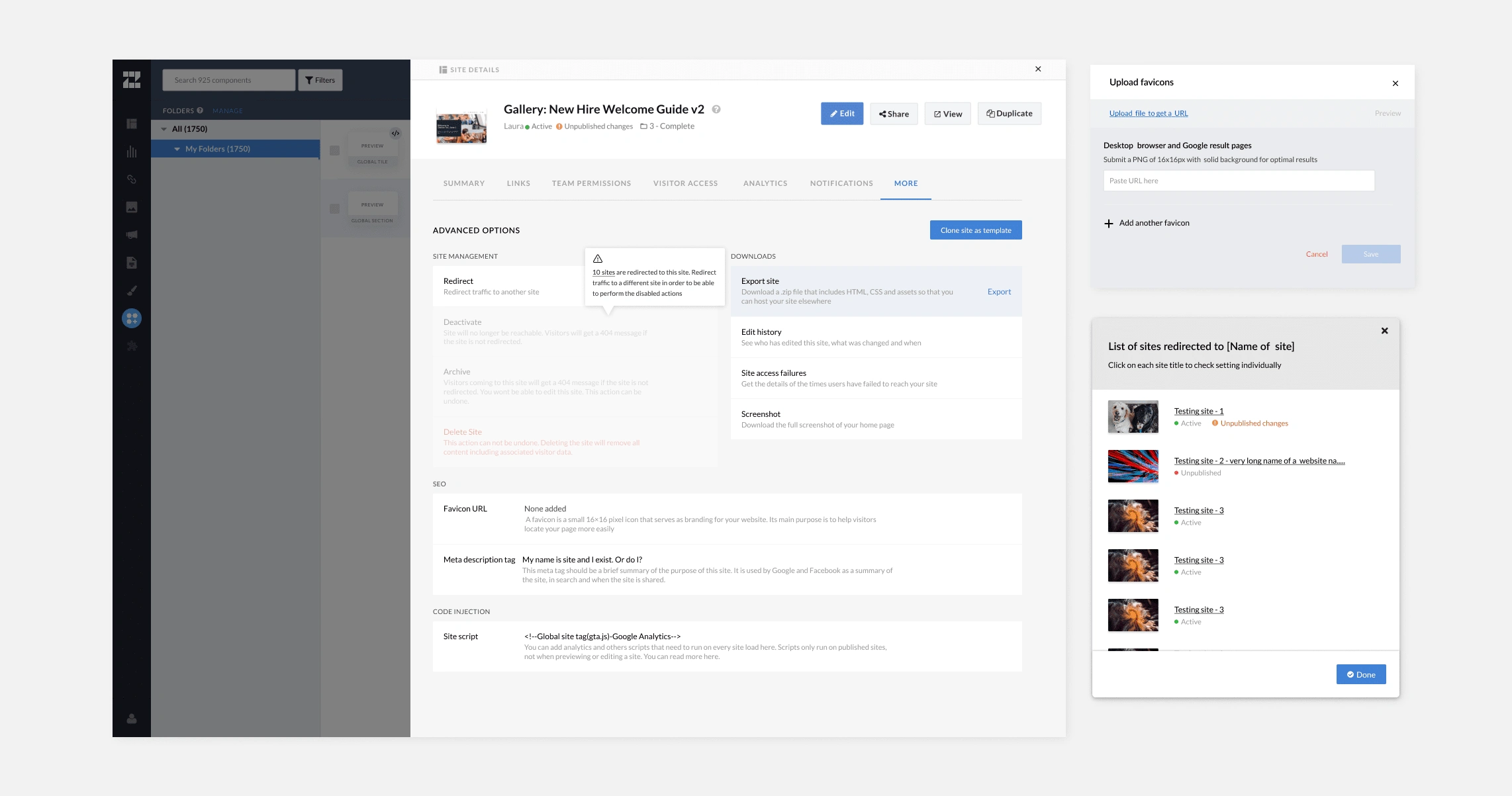
What about edge cases?
This wasn't just a tab refresh, no Sr. I also covered:
What if I want to redirect a site that has other sites redirected to it? Or deactivate it?
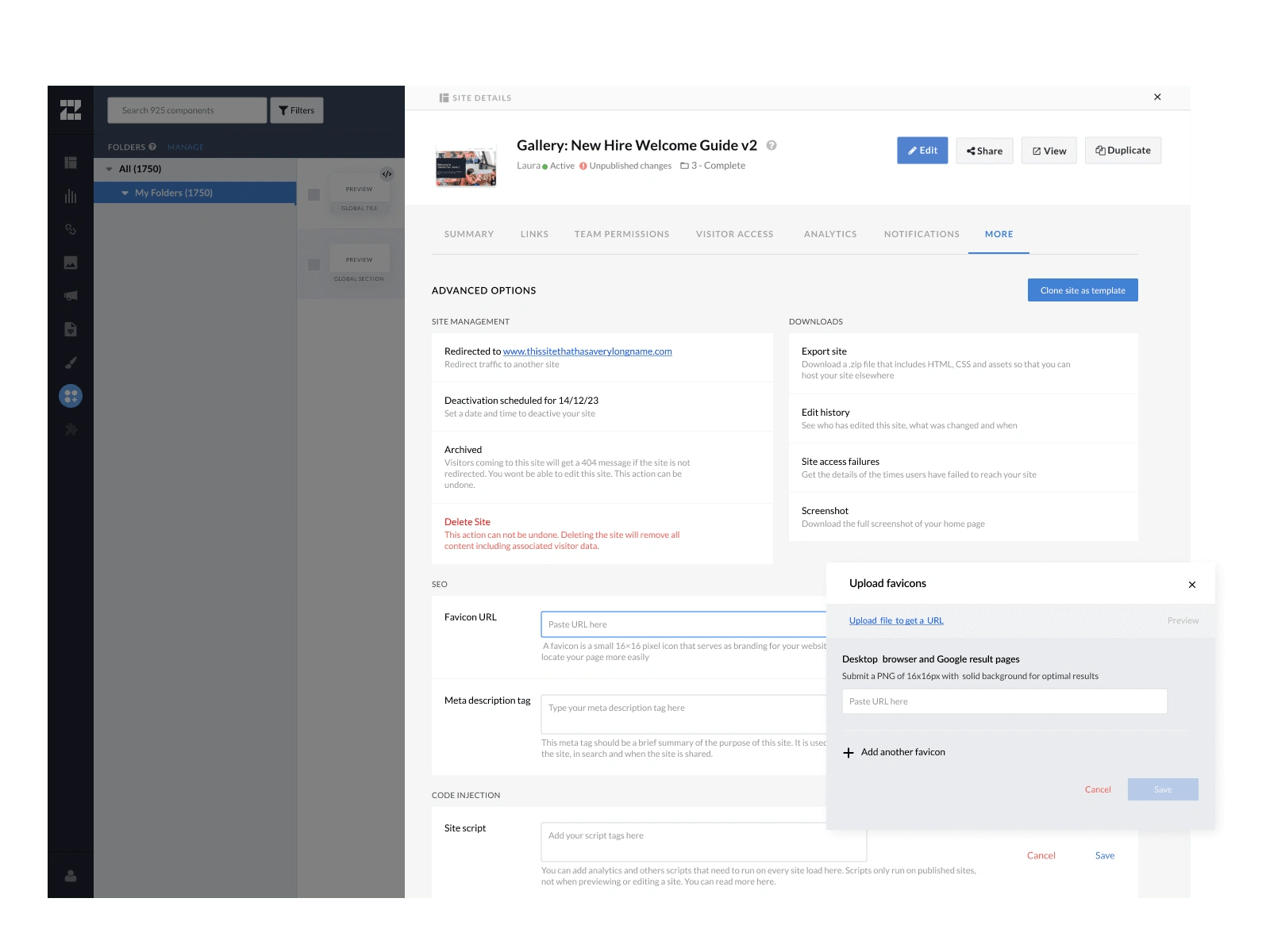
How can I add Favicon for different browsers?
What if I want to export my site? What will be included? Can choose not to include the header?
Can everyone perform any action? What happens if I'm not allowed to clone a site?
Happy CTO happy life!
The CTO of the company was the one in charge of bringing this design to life, and dare I say he was excited. Because he was excited to finally be able to develop something that looked good! Those were his words, not mine... I swear.
Users are everything to me
More than whatever the CTO would have enjoyed developing this design, the ones that truly benefited from this Glow-up were the users.
They now know what they can find in this tab
Know what to expect when they click to take an action
Confusion is now gone as to what are all those buttons for
Like this project
Posted Sep 4, 2023
Redesign of the Advanced Settings Tab and how to make your CTO happy.