Slideshow feature improvement for a site-building platform 💻
My impact as Lead Designer for this project
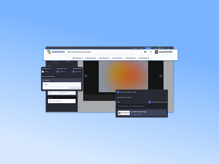
I upgraded the design of the Slideshow section feature that allows users to:
Achieve new layout options
Full-width slider with images spanning the full width and height of the container
Edit the behavior of the slider (autoplay and speed)
Edit the location of the caption container (left, right, bottom) and text inside the caption (top, center, or bottom)
Full-screen view of assets

Challenges with Single Image Display and Editing Options
Single image display
Users had to rely on memory to be able to edit titles and descriptions
No option to make images take the full width of the container
No options to edit the navigation appearance (thumbnails, dots, or hidden )
Limited or hidden controls
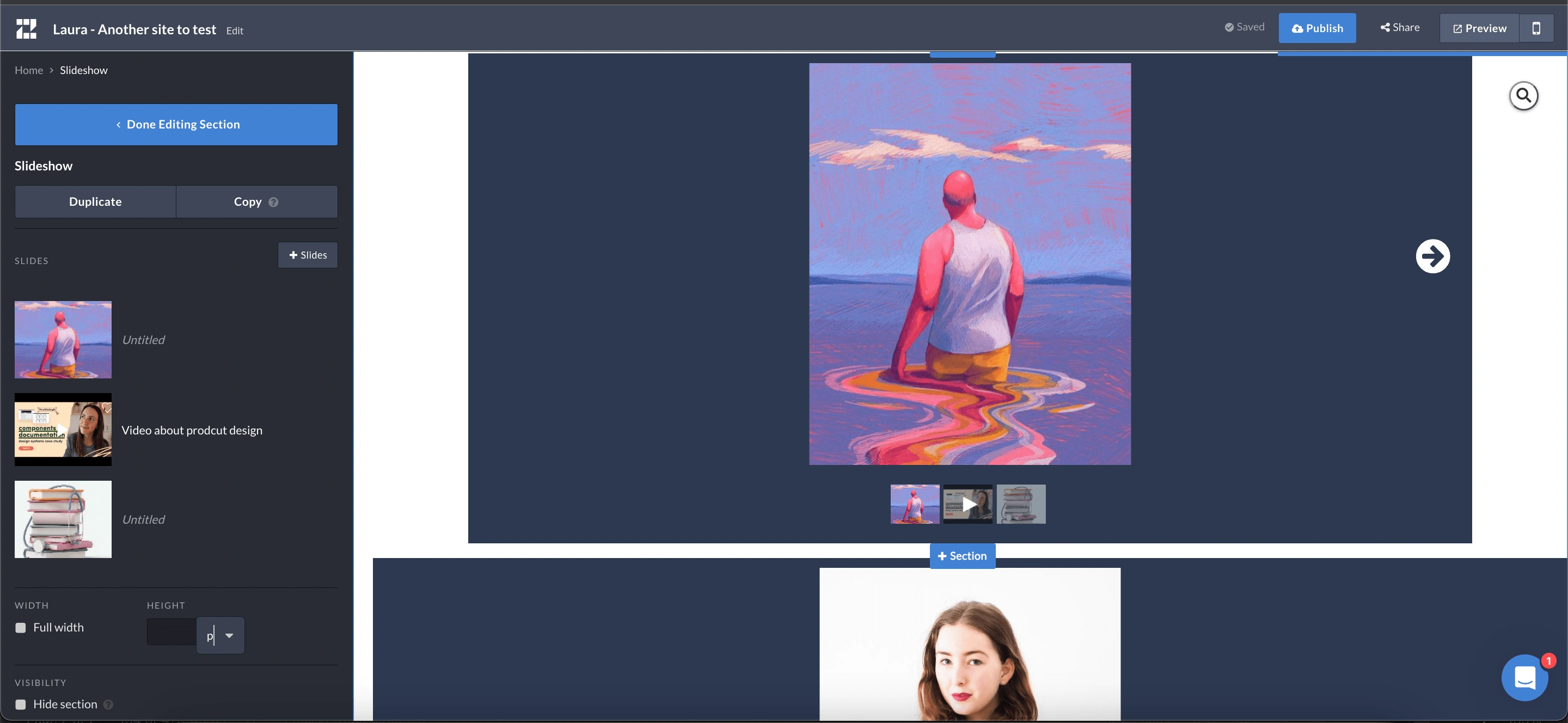
Screenshot of the previews slideshow section
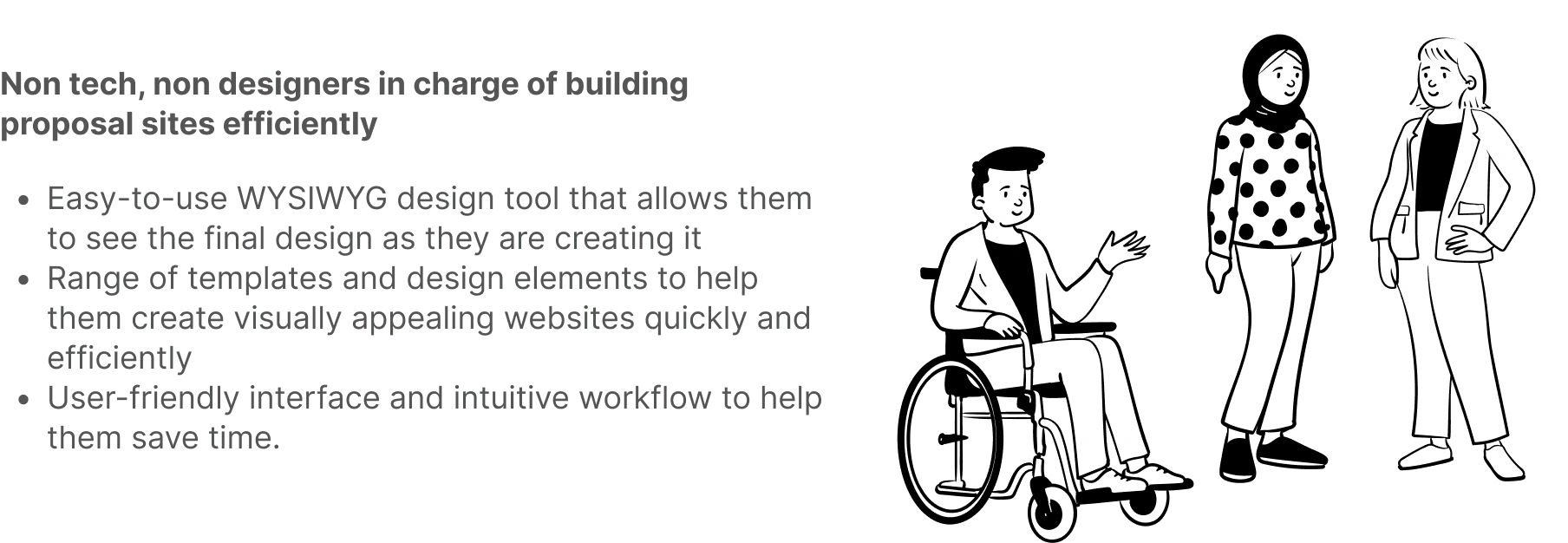
The user we design for
The Process
Unveiling the Foundation by Exploring User Experience, Competitors, and Customer Insights
Inhouse: Performed a UX Audit and some interviews with the team to get an in-depth view of what issues the teams and clients face when using this feature. What would be important aspects to consider for legacy websites once we deployed the new feature?
Competitors: Other WYSIWYG platforms like Squarespace and Webflow
Productboard: Gathered 12 detailed insights and requests from customers around slideshow expected behavior and customization
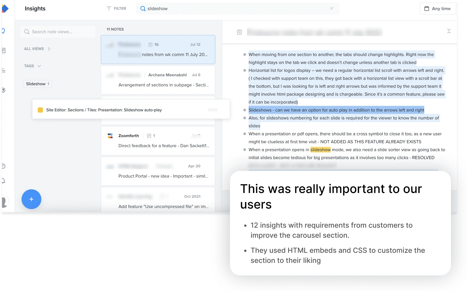
Screen capture showcasing challenges and requests from users
Crafting Innovation Through Design Exploration and Validation
I started by designing all the possible layouts focused on the result rather than the controls needed to achieve those and shared the result through a Loom video. I wanted to validate that I was in line with the PRD and that the layouts would be possible to achieve from an engineering standpoint.
Iteration through User Testing and User-Friendly Tool Confirmation
I performed some user testing sessions with 4 simple tasks to complete, simulating a design brief. I wanted to confirm that the new tools were easy to find and encouraged users to explore the new possibilities.
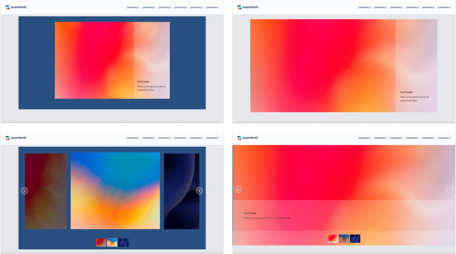
User Testing session material
Uncovering Insights: Enhancing User Experience and Design Consistency
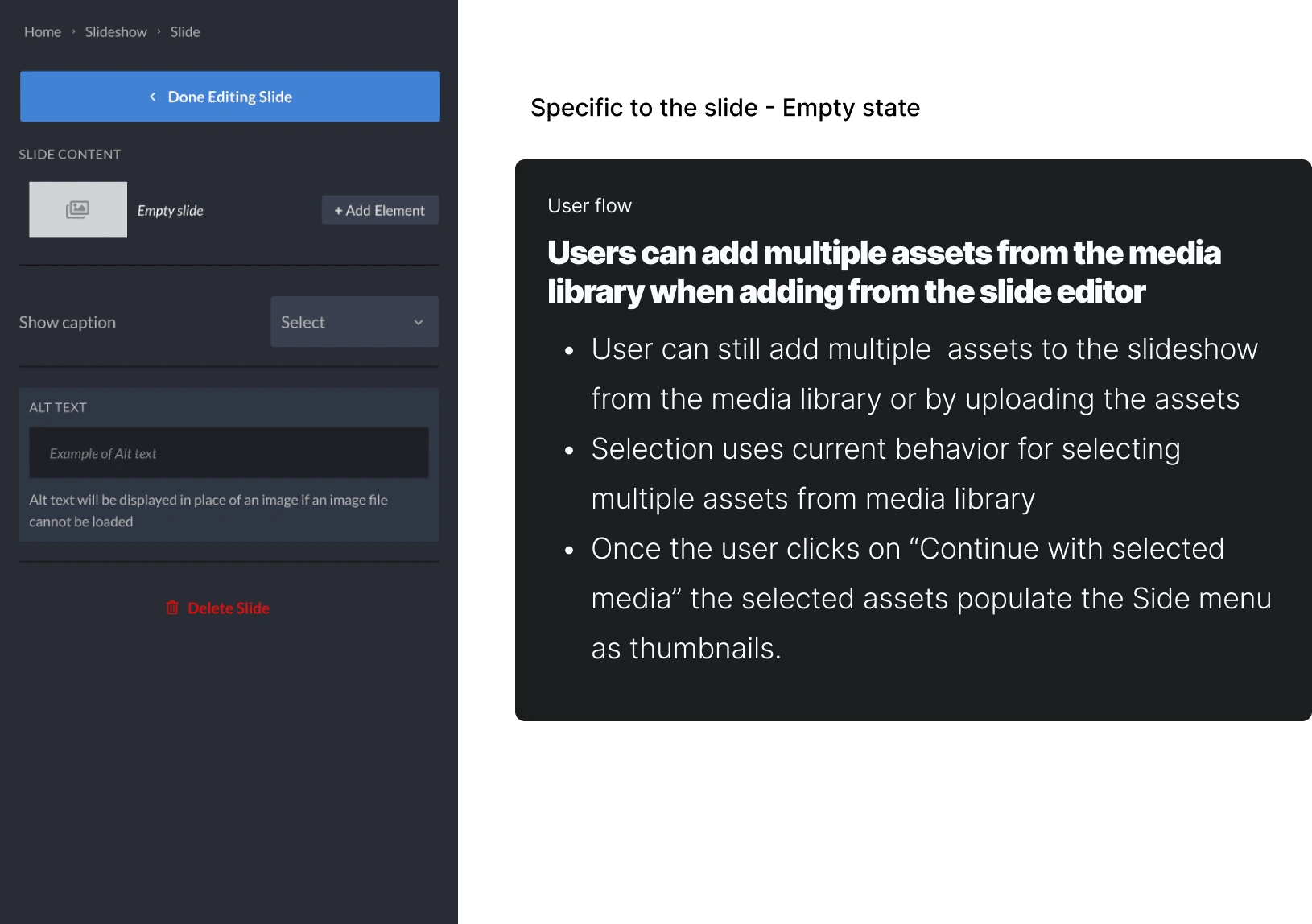
The path to edit a single slide is not clear enough and relies on the user’s memory
Should allow users to decide to hide the navigation of the slideshow the arrows (thumbnails or dots)
Style of the slideshow: background colors and arrow types should be from the theme editor to keep the style guide consistent.
When CS explains the platform to new users, they try to tell a story (a pathway from general to specific)
Caption edition: The position of the caption and text position should be separated, as the text position leads to thinking that it's going to change the caption position, not the text.
The Results
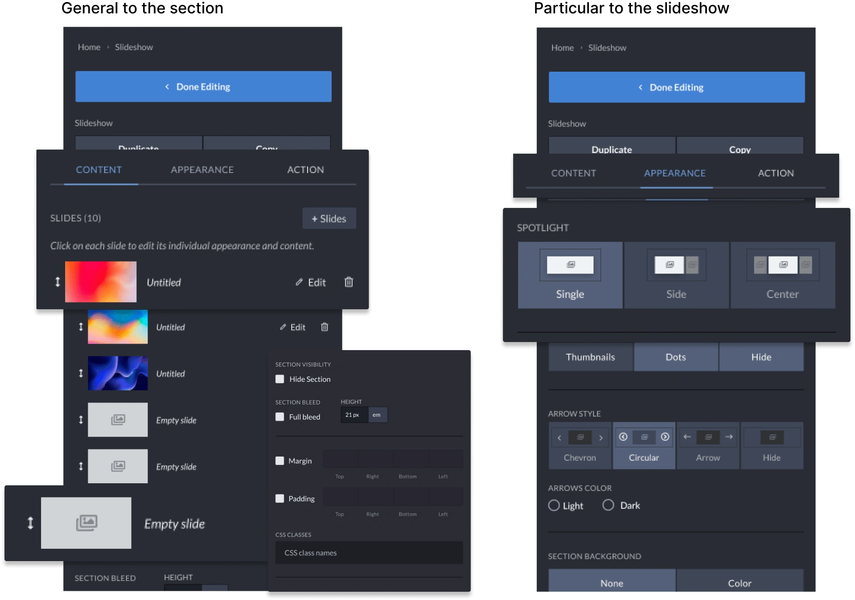
New layout options
Full-width slider with images spanning the full width and height of the container
Edit the behavior of the slider (autoplay, fade in, fade out)
Edit the location of the caption container (left, right, bottom) and text inside the caption (top, center, or bottom)
Full-screen view of assets
Easier to navigate and obtain the desired results for non-techies
Key Lessons for Effective Design Process
Starting the design process by first outlining the desired results was an effective design process. It was possible for me to align with the PRD and make sure to design all the possible variations expected and a way for users to achieve that.
Running a quick user testing session on the current state of the feature as part of the research process helps to identify flawed design patterns and avoid those errors being brought into the new design.
Future considerations
With the rise of AI, I've been looking into ways how I could integrate this technology into my design process, and leverage this tool to help me design more powerful and intuitive features. Some ideas or improvements that would result from this integration could look like this:
Implementing AI-powered image recognition to suggest captions, titles, and design layouts based on content analysis. Especially interesting for the Alternative text that is needed to make a site accessible.
Offering AI-assisted content creation for generating compelling descriptions.
Like this project
Posted Jan 9, 2023
How I redesigned a feature for non-tech, non-designers allowing them to add more visual interest to their microsites 🤌

