Header controls improvements for a no-code site builder
Laura Castano
Header controls
How I redesigned a microsite platform feature that led to a dramatic improvement in
customer experience and operational efficiency
My impact as Lead Designer for the project
I delivered the design for a header feature that allows users to:
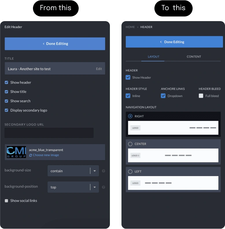
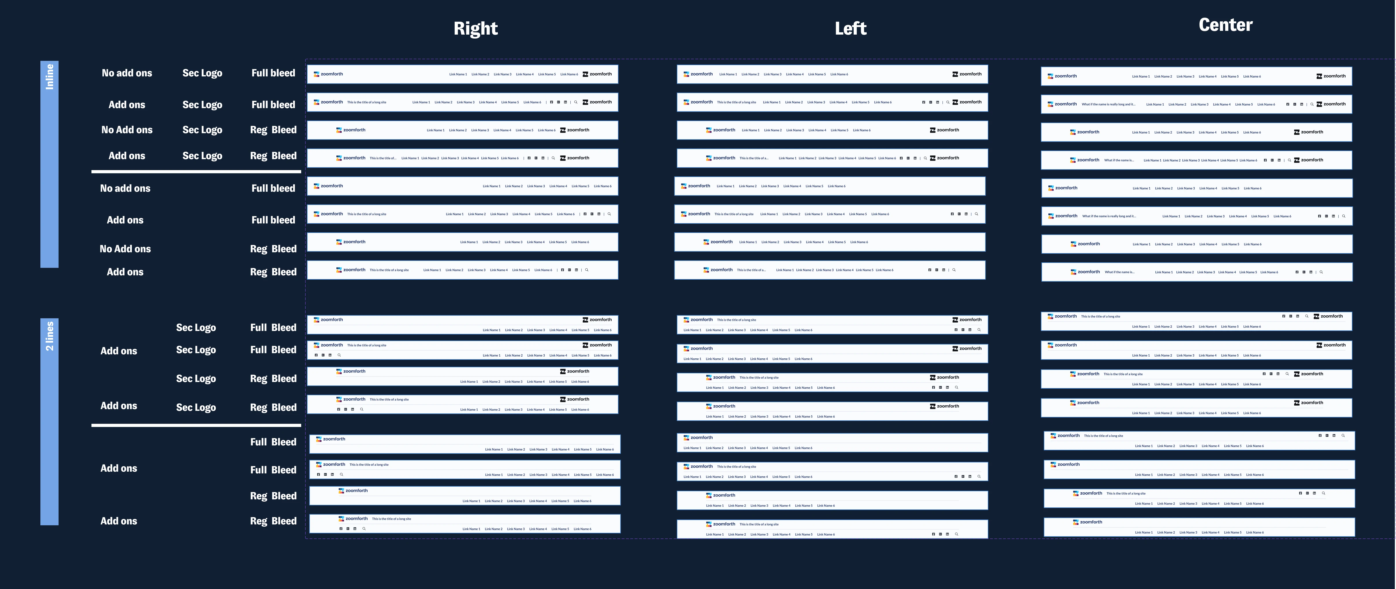
Configure the header in 48 different ways without writing a single line of code
Choose from a visual menu of navigation options
Add logos, social links, search icons, and site titles at the click of a button

Unlocking Customization by Addressing Challenges in Zoomforth's No-Code Design Platform
Zoomforth is a no-code / low-code design platform that enables enterprise clients to create trackable and secure microsites, at scale.
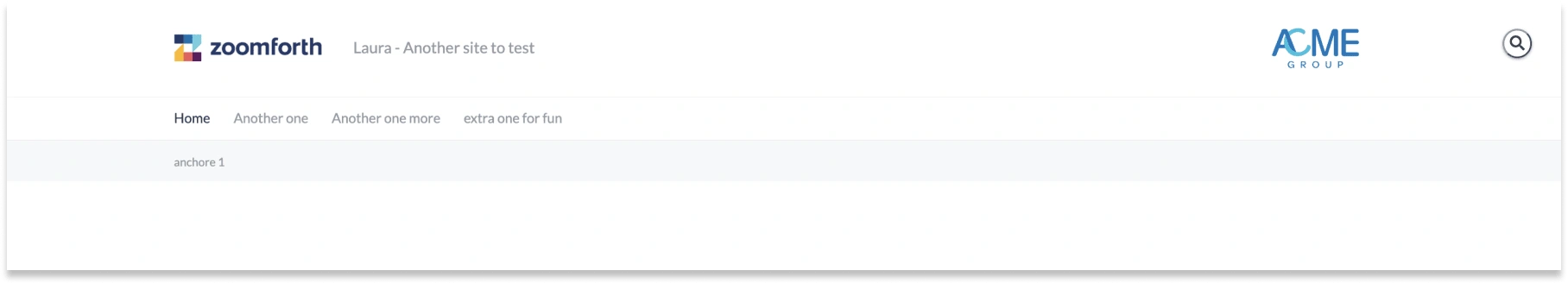
The platform offers a standard header layout that requires no coding.
To customize the standard header layout, however, the user needs knowledge of CSS, which many customers do not have.
This leads to:
Customer - frustration, delays, and reliance on Zoomforth’s in-house design/support team
Company - a constant stream of support tickets (170 in the last X months), taking an average 20-30 mins to resolve
“Laura’s ability to assimilate customer feedback, negotiate with engineers and iterate on UI design has led to this awesome new feature. Not only is it a game-changer for our users, but it has also reduced our support overhead significantly.”
Wendie Michie, CEO
The user we build for

The process
Step 1: Research
Reviewed customer insights and 170 support tickets
Interviewed the in-house design team
Reviewed several leading website-building platforms for inspiration
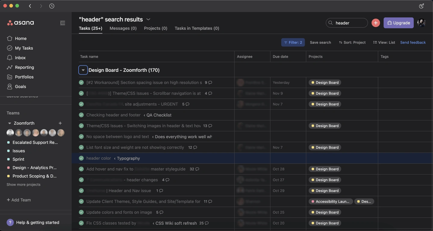
170 support tickets in Asana
Step 2: Design
Created low-fi drawings/wireframes
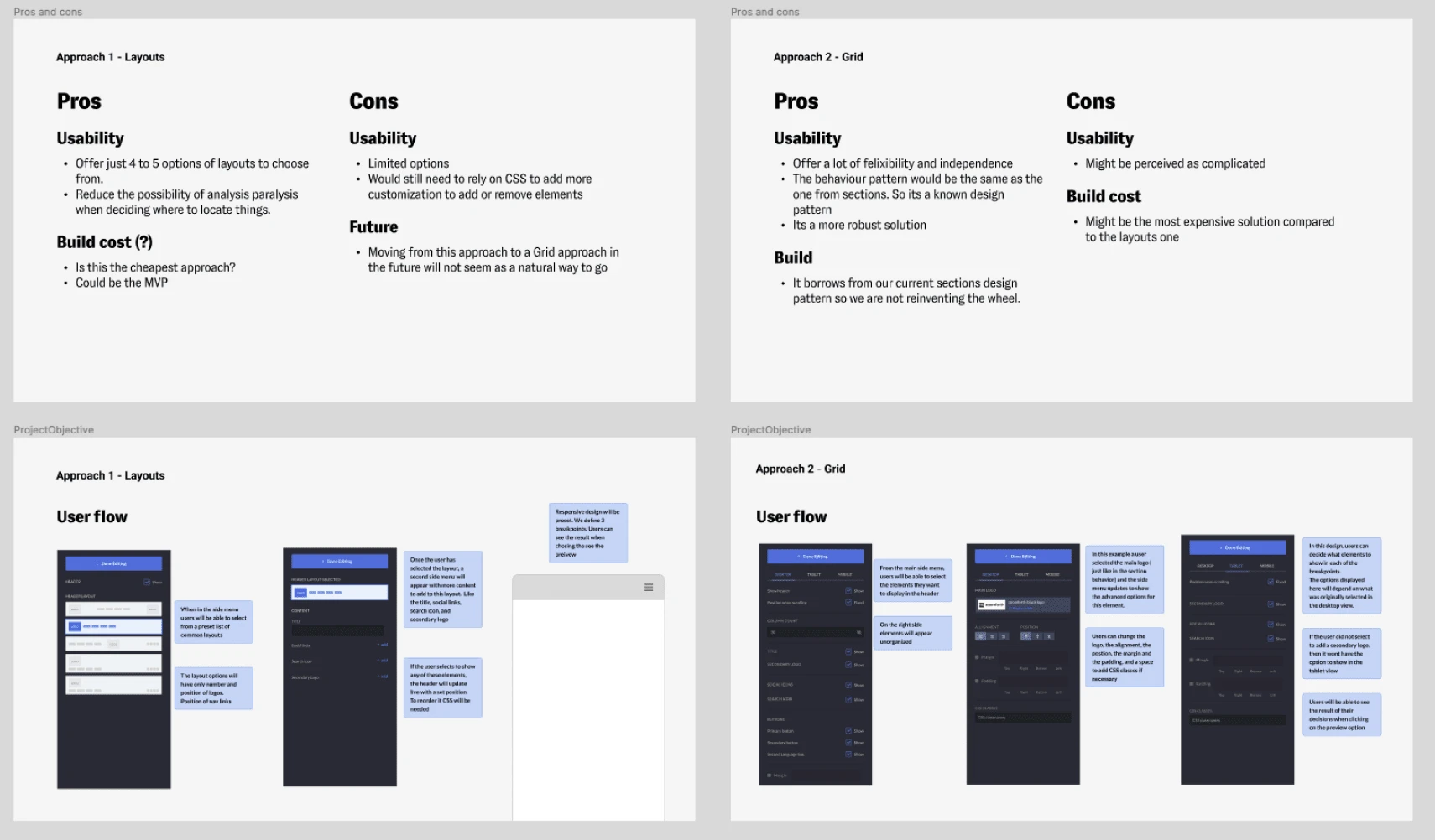
Discussed options with stakeholders and engineers, including one that leveraged existing grid functionality from the platform’s site editor
Decided on the minimum viable product for the v1.0 release
Step 3: Iterate
I performed some user testing sessions with two simple tasks to complete, simulating a design brief. I wanted to confirm that the new tools were easy to find and encouraged users to explore the new possibilities. I also wanted to confirm that users were going to be able to add and remove elements from the header seamlessly.

User testing material. Two header layouts to replicate
Findings
Participants were able to complete the task.
Liked the overall flow and the options provided
They liked that they could see the header is updating from the editor without having to hit preview.
Also confused about calling “inline right” or “inline left” because the Nav (links) are the ones being aligned through those layouts.
Add the possibility to add a secondary logo in all of the alignments
The Results
48 new preset header layouts
Reduced the amount of time needed to tailor the header
Improved website performance in mobile browsers
Allowed for more flexibility and options to achieve without help from our support or design team
Gave power back to users.
Key Learnings
Ensure the whole team is clear on the target user persona for the feature at outset (this would have saved time in team discussions)
Conduct user testing early in the process
Ensure documentation is clear and version-controlled
Like this project
Posted Dec 2, 2022
Quick wins project: Improved the existing header feature to simplify the process of site building in our no-code site building platform.