Design System
Sarassola
Design System Template — Derived from a Recent Fintech Rebrand
Introduction
A reusable, production-ready system distilled from a real end-to-end product redesign.
From a recent fintech rebrand, I abstracted the most reliable UI/UX patterns into a flexible Design System Template. It packages tokens, components, interaction rules, and documentation so teams can clone, theme, and ship faster—without losing brand coherence or accessibility.
Project Goals
Turn proven product decisions into a scalable, portable system.
The template converts battle-tested interface decisions into reusable building blocks. It’s optimized to balance brand expression with product velocity.
Key objectives included:
Codify a cross-platform token architecture (color, type, spacing, elevation).
Provide a robust component library with variants and states.
Document interaction patterns, microcopy, and motion specs.
Enable rapid theming for new brands or markets.
Benchmarking & Research
Reference what works, then generalize it.
I analyzed 12 fintech and payments platforms (crypto and fiat) to extract stable patterns across:
Clarity of value proposition
Visual consistency
UX in core flows (onboarding, send, convert, verify)
Tone of voice, regional adaptability, and microinteractions
These inputs informed component scope, variant strategy, and naming conventions.
Navigation Architecture
Clear information hierarchy that scales with features.
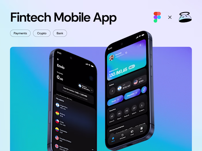
The template includes sample navigation schemas for common fintech surfaces:
Home: balance overview, primary actions, recent activity.
Activity: searchable, filterable history and detail views.
Wallet: multi-currency management and conversion.
Settings/More: account, security, limits, business tools.
Each area ships with page templates and recommended route structures.
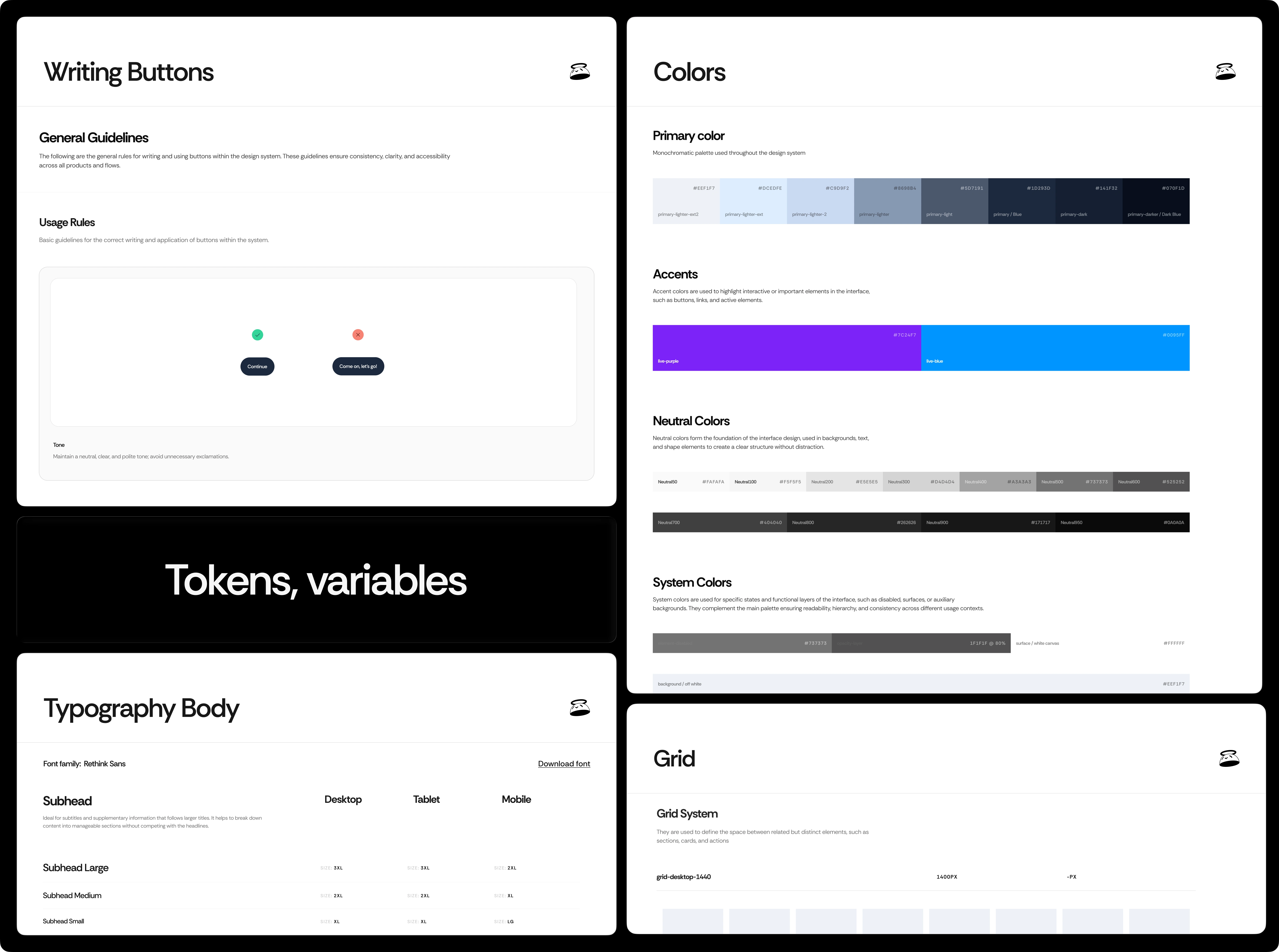
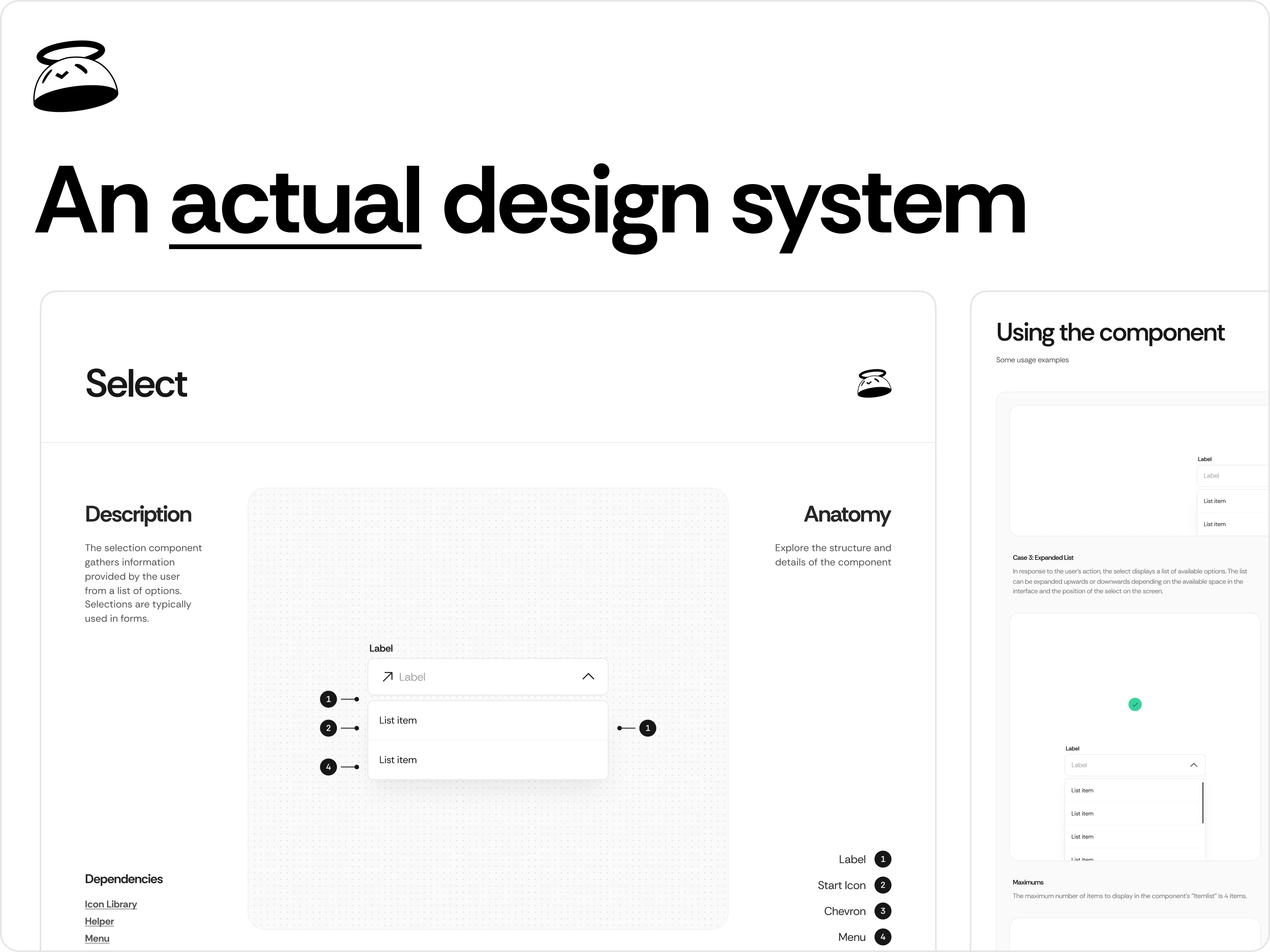
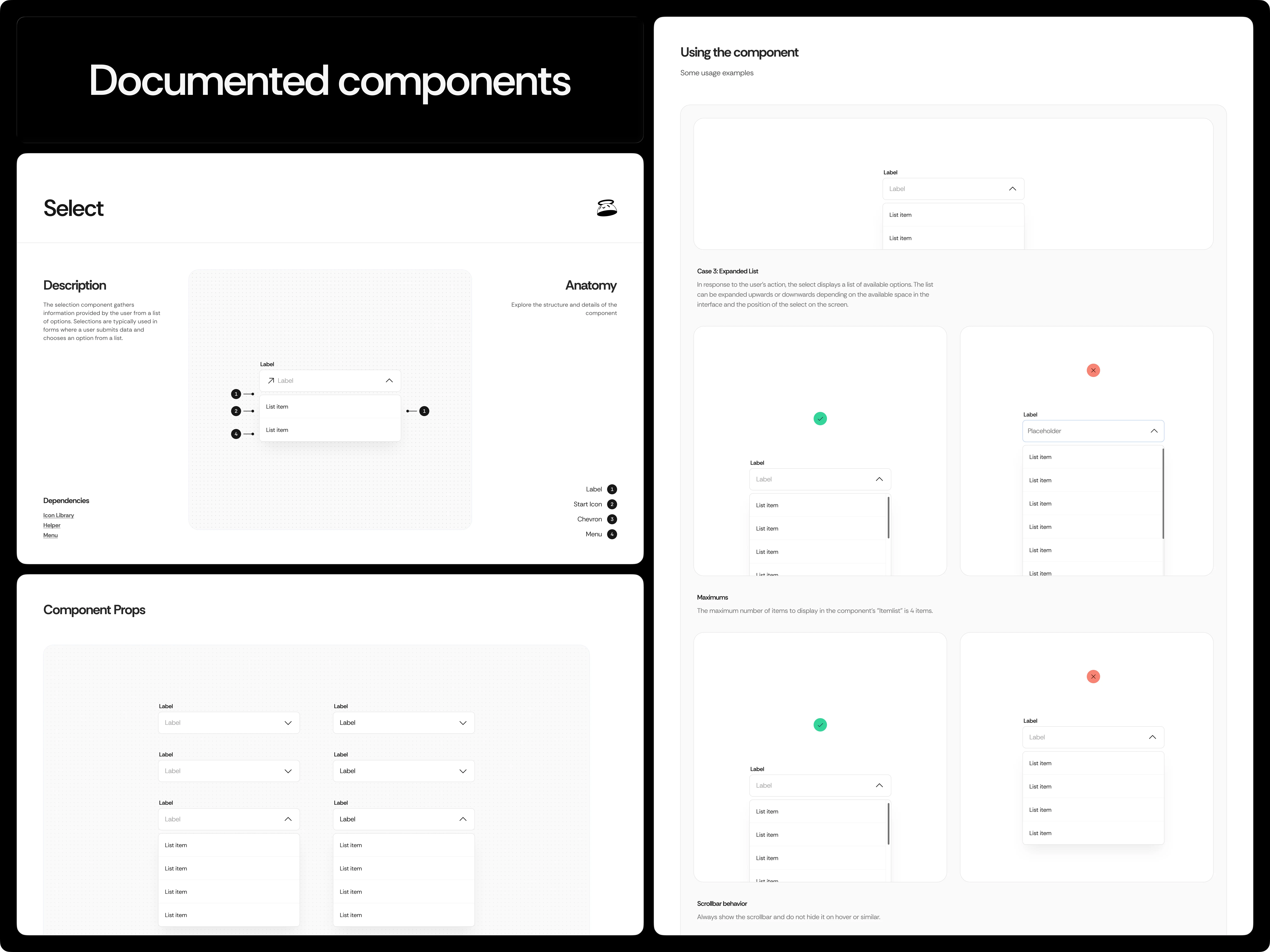
Design System
The implementation toolkit: tokens, components, patterns.
After auditing real screens, I defined a first-class set of reusable assets.
Core components
Buttons (primary, secondary, icon, ghost)
Inputs (text, password, select, OTP, textarea)
Cards (user, transaction, CTA, contact)
Navigation (topbar, tabbar, drawer)
Lists (transactions, contacts, steps)
Modals (confirm, success, bottom-sheet)
Feedback (loader, empty, status)
Utilities (numpad, progress, avatar, badge)
Defined tokens
Typography scales and line-height ramps
Neutral/accent palettes with contrast steps
Spacing grid and sizing primitives
Elevation, radius, and motion durations
All assets use scalable naming (e.g.,
ds/button/primary) and map to screen-level usage guidelines.
Results
Faster delivery, fewer inconsistencies, easier handoff.
Teams can theme the template for new brands, reduce design debt, and hand off code-ready tokens to engineering. The result is a consistent, modern, and accessible UI foundation that accelerates launches while preserving a human, trustworthy feel—especially critical in fintech experiences.
Like this project
Posted Oct 24, 2025
A thoroughly documented design system made in Figma. Everything is built to be both scalable and reusable and to have purpose.
Likes
1
Views
5