Wallet - A Fintech Experience
Sarassola
Wallet - Rebranding & Design System
Introduction
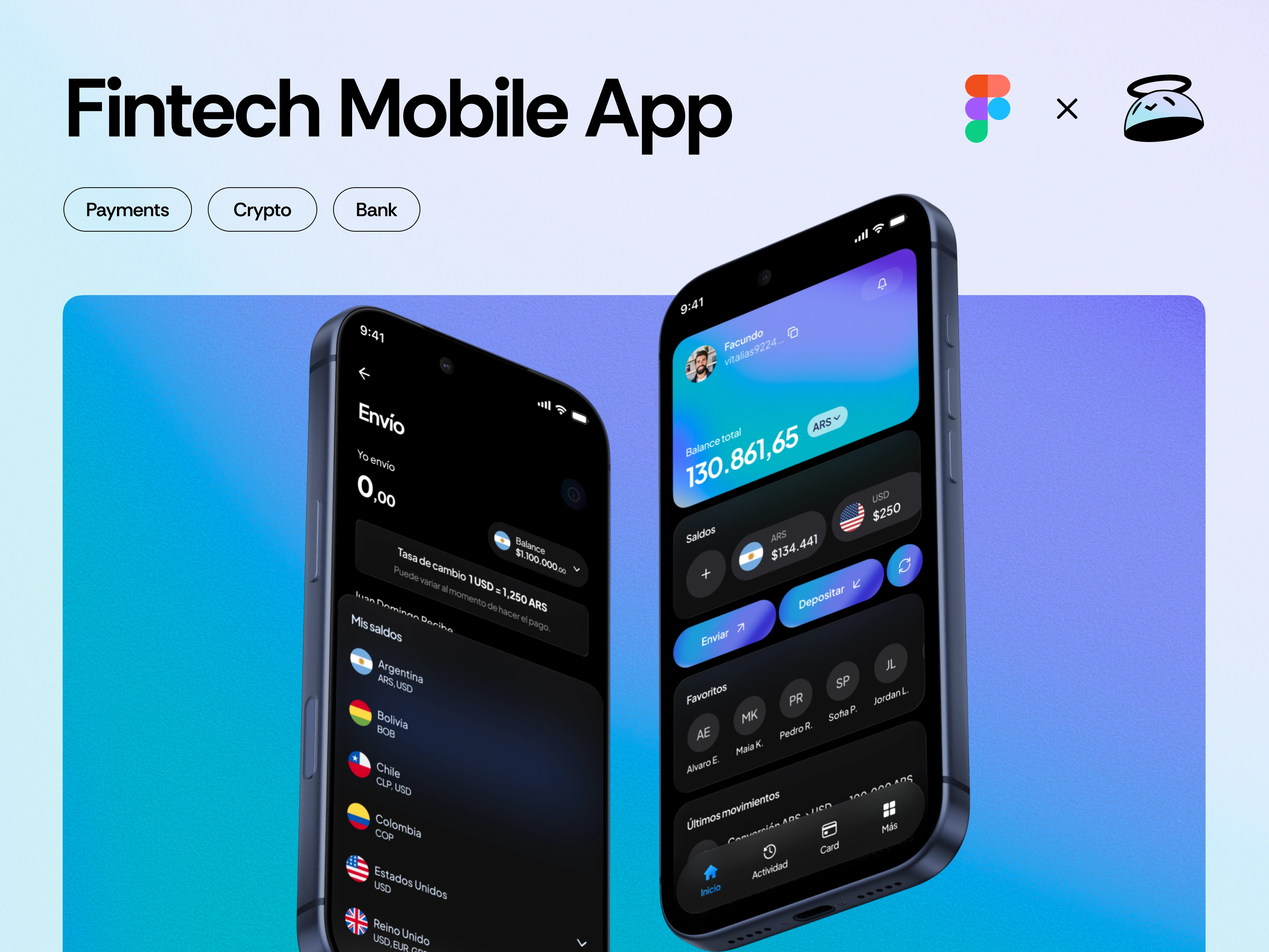
Complete redesign of a Latin American fintech focused on international transfers and crypto.
Wallet is a Chilean fintech that facilitates sending and receiving money internationally, with support for both fiat and crypto. In collaboration with an agency, I worked for two months on the development of the new Design System, as part of a full rebranding process that covered the entire product: app, web, and brand communication.
Project Goals
Rebuilding Wallet's visual and functional identity.
The project aimed to reposition the brand with a more human, approachable, and consistent identity. This involved redesigning the product's experience and visuals, aligning all interfaces under a single strategic vision.
Creating a scalable and documented Design System.
Elevating the product’s visual and emotional tone.
Unifying visual standards across mobile, web, and marketing.
Improving usability in key flows (sending money, converting, onboarding).
Benchmarking & Research
Real-world inspiration for real-world decisions.
I analyzed 12 platforms from the fintech, crypto, and global payments space: Revolut, Payoneer, Wise, Deel, Global66, Coinbase, Fintual, Airwallex, among others.
Clarity of value proposition
Visual consistency
UX in key operations
Tone of voice, regional adaptability, and microinteractions
This benchmark was crucial in determining which components were priority, which UX patterns to adopt, and what kind of brand tone to develop.
Navigation Architecture
Modular organization designed to scale clearly.
Together with the team, we defined a hierarchical navigation structure based on four main sections:
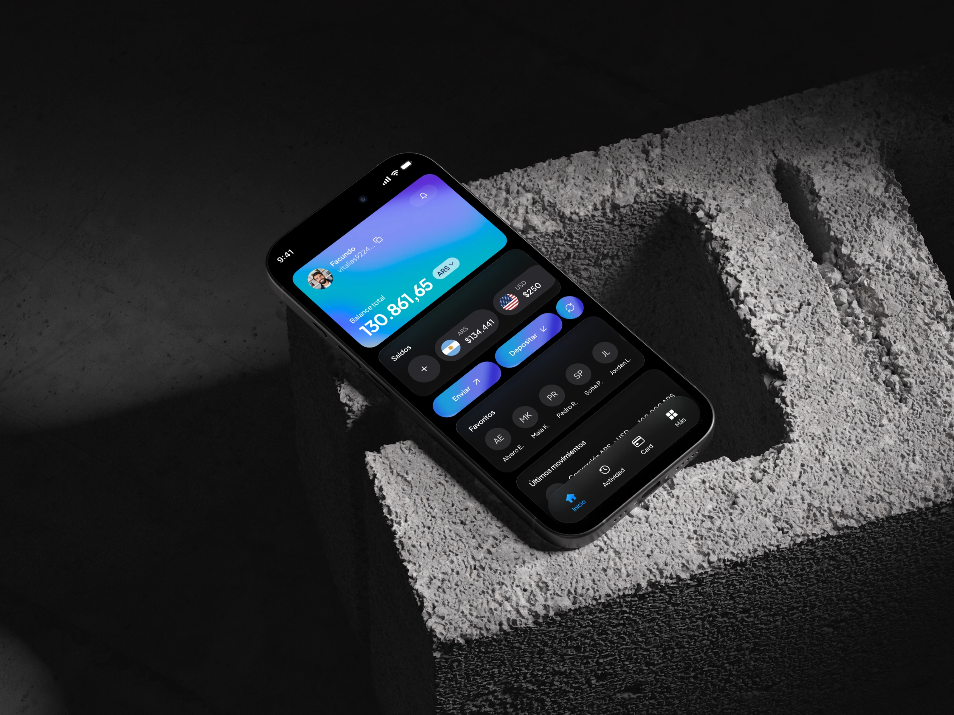
Home: balance summary, main actions (send, deposit, convert), favorites and recent transactions.
Activity: full transaction history and details.
Card / Wallet: funds management and conversions.
More: settings, security center, and business tools.
This mapping helped define flow priorities, components, and navigation rules.
Design System
The visual foundation for Wallet’s product ecosystem.
After a full app audit, I identified and documented the main reusable components. The first version of the Design System includes:
Core components
Buttons (primary, secondary, icon, ghost)
Inputs (text, password, select, OTP, textarea)
Cards (user, transaction, CTA, contact)
Navbars (topbar, tabbar)
Lists (transactions, contacts, steps)
Modals (confirm, success, bottom-sheet)
Feedback (loader, empty, status)
Others (numpad, progress indicator, avatar, badge)
Defined tokens
Typography scales
Neutral and accent colors
Spacing system
Iconography and styles
All components were named with a scalable naming convention (e.g.,
ds/button/primary, ds/card/transaction) and mapped according to real use in each screen.Results
A consistent, modern and flexible system.
The result was a Design System that allows Vita to scale without losing identity or consistency. The product now has a cleaner, modern, emotionally grounded visual base that is much easier to maintain for the internal team.
This work laid the foundation for the next stage of the project: a full redesign of the app and website, aligned with a new brand identity that aims to differentiate Vita within the LATAM fintech ecosystem.
To check how much in depth I go into design systems feel free to peek at my template on www.sarassola.com
Like this project
Posted Oct 24, 2025
Redesigned a LATAM fintech end-to-end: a crisp design system and brand that makes cross-border money flows feel instant, trusted, and human.