WeShort - UI Design
The Challenge
WeShort’s previous app struggled with a lengthy, complex registration process, which discouraged potential users from completing sign-ups. Additionally, the brand identity lacked distinction, failing to communicate the platform’s unique offering in a crowded market. WeShort needed a streamlined user experience that aligned with their brand values and facilitated smoother onboarding, without overwhelming users with too many steps or personal information upfront.
The Approach
1. Research & Discovery
We kicked off the project by conducting in-depth user research and analyzing feedback on pain points within the current app. Users expressed frustration with lengthy registration processes and the inability to explore content without committing to a subscription. Additionally, they wanted personalized content recommendations to help them navigate the vast library of short films. We gathered behavioral data with the help of a data analyst to understand user patterns and preferences, confirming the need for a more streamlined onboarding experience and smarter content discovery tools.
2. Strategy & Planning
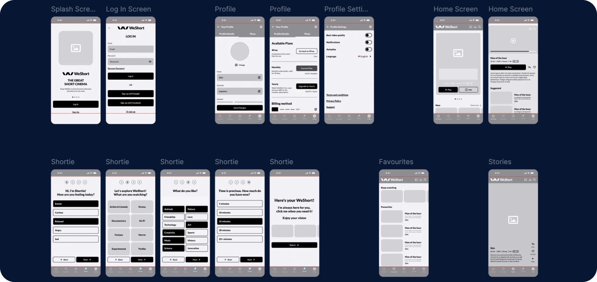
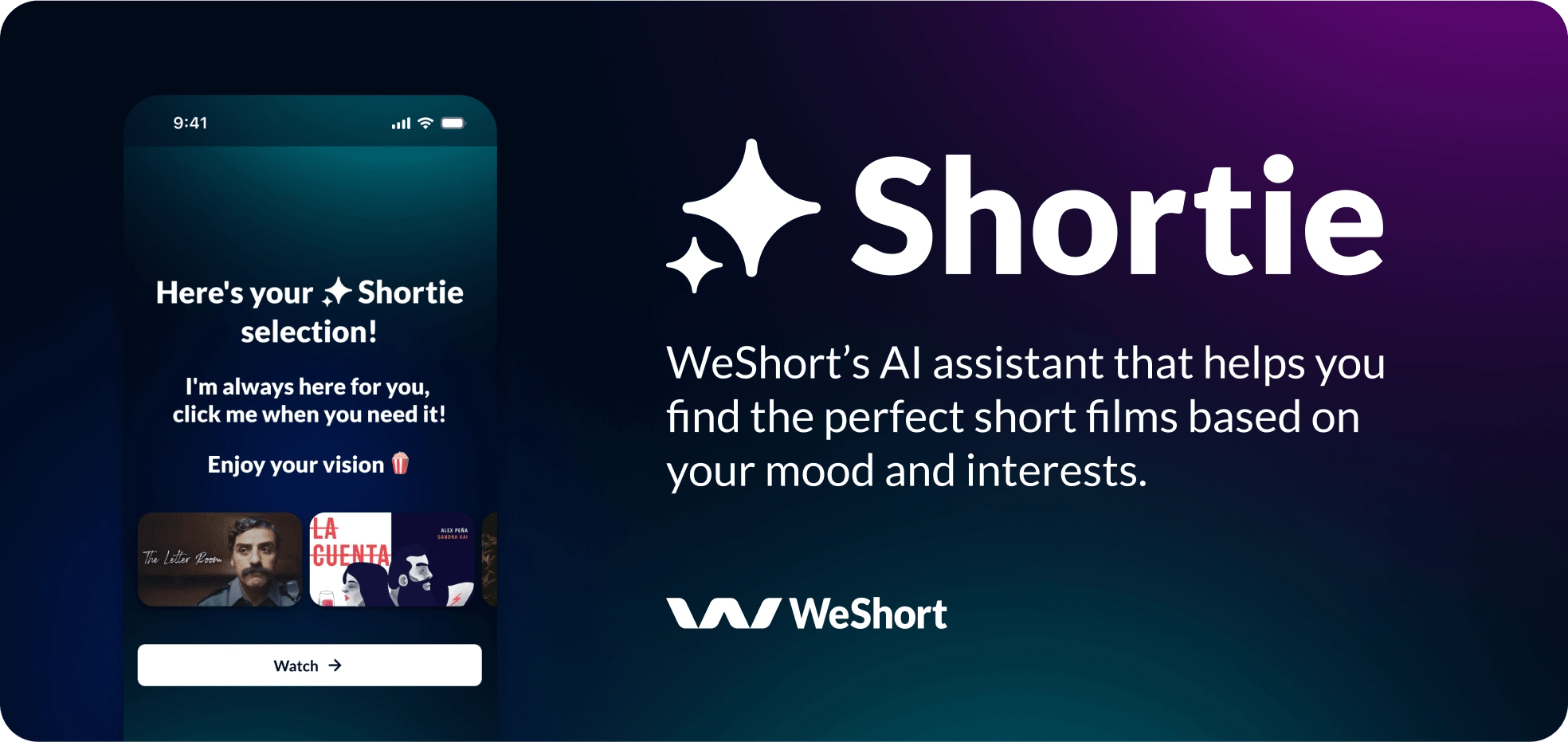
The primary goal was twofold: simplify the registration process and introduce Shortie, an AI-powered recommendation engine. We envisioned Shortie as a personal guide that would tailor content suggestions based on user interests and mood. This required careful planning to ensure that the user experience was both intuitive and highly engaging. By removing unnecessary barriers during sign-up and letting Shortie handle the content curation, we aimed to increase user retention and satisfaction.
3. Design System & Prototyping
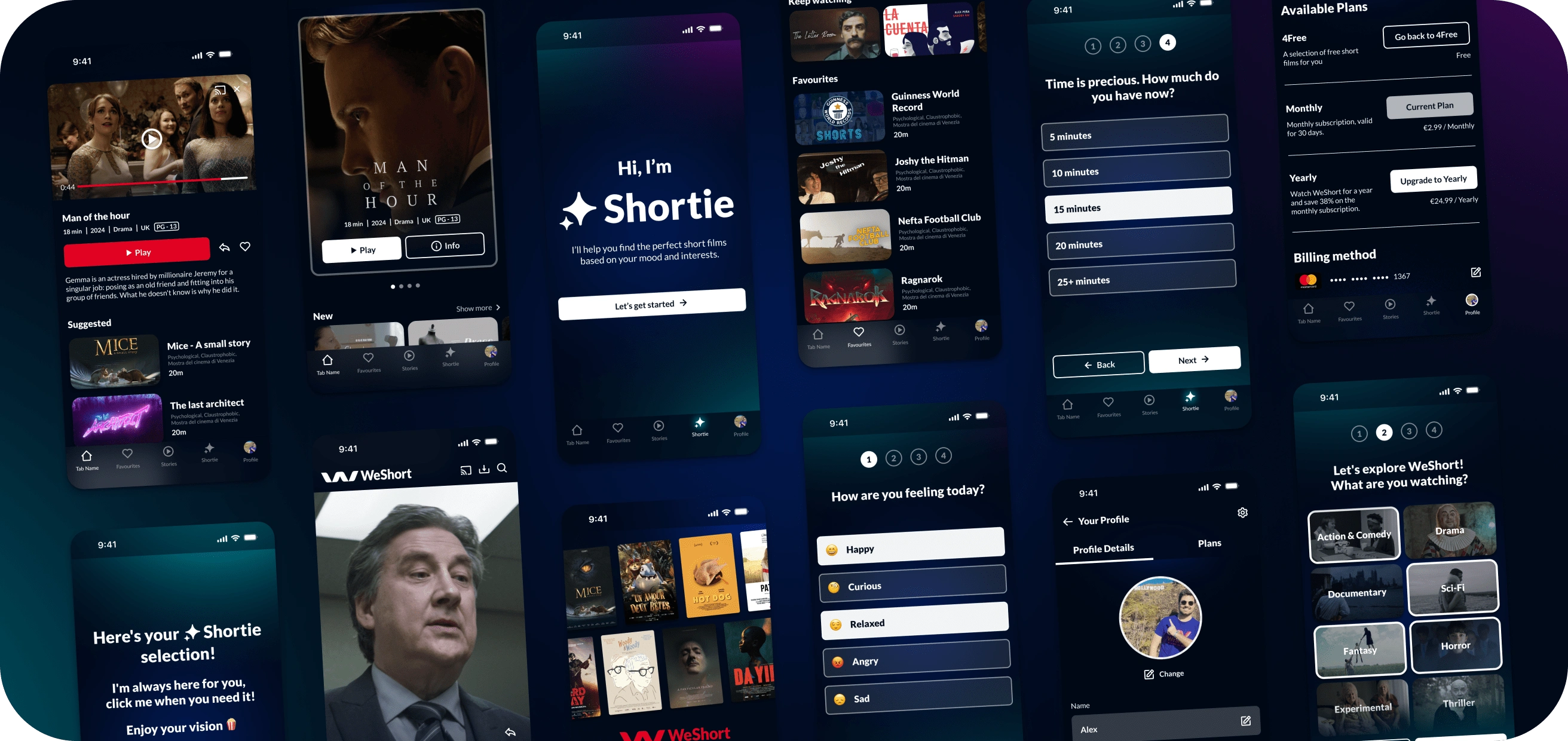
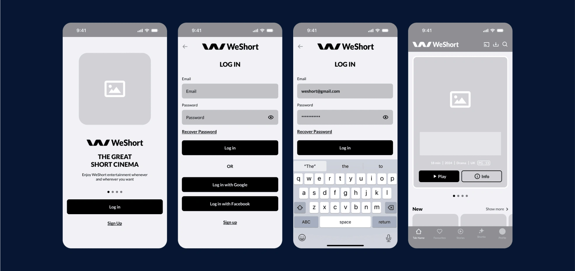
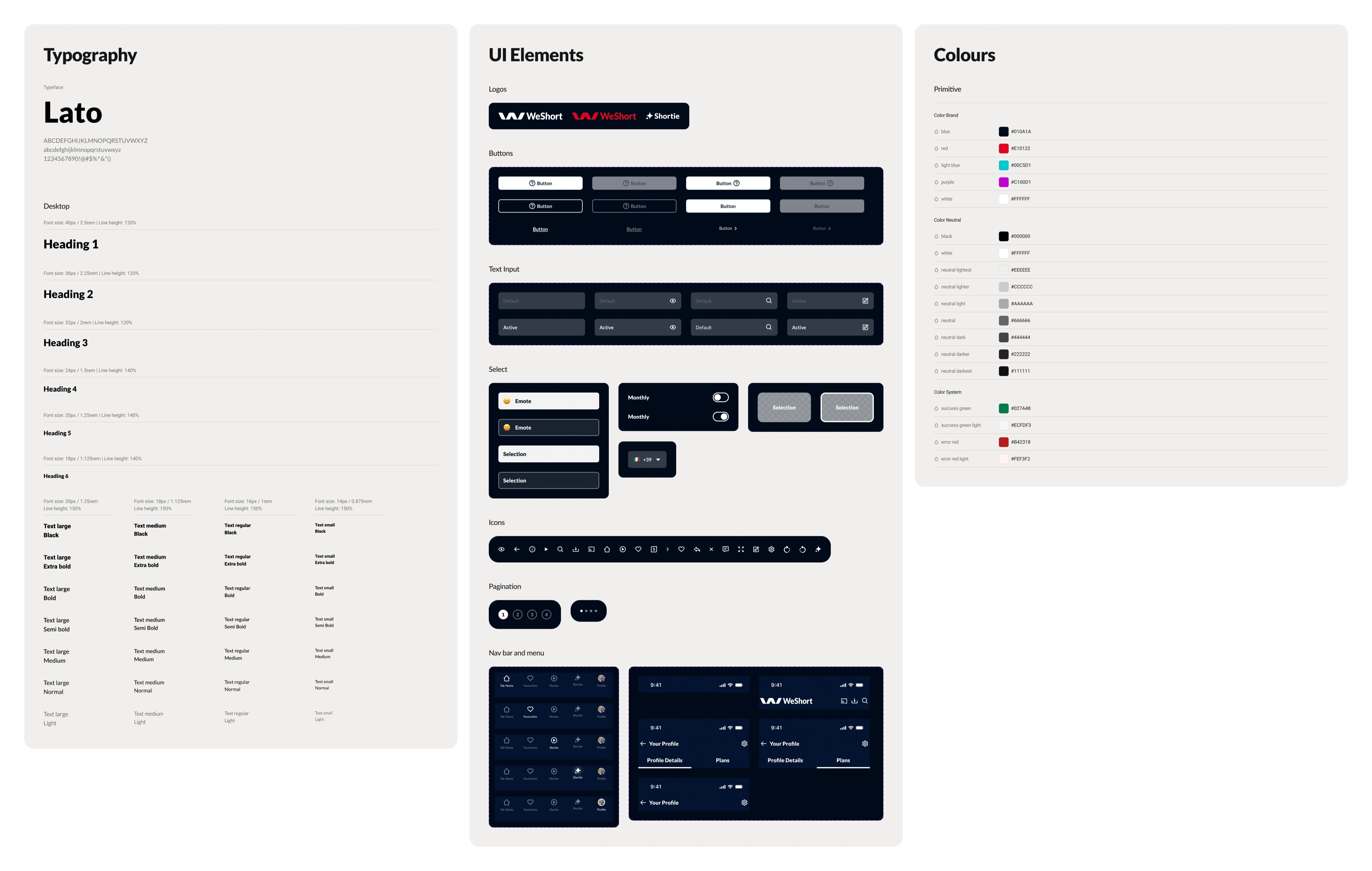
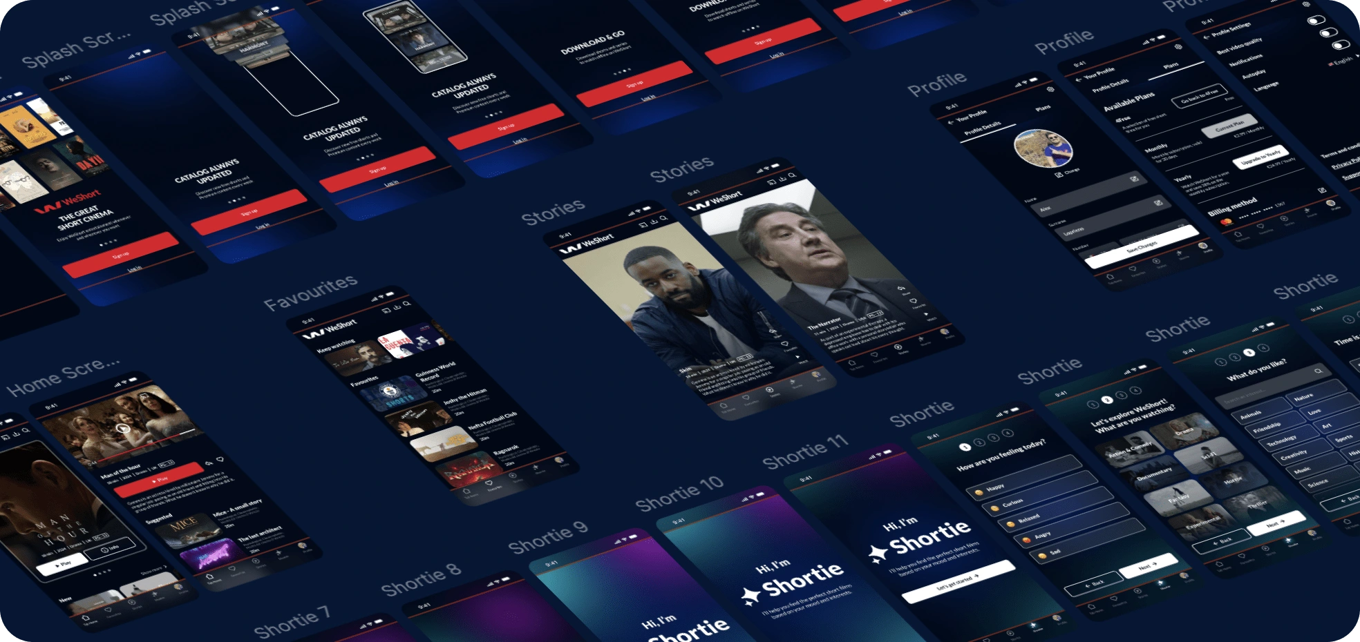
I developed a comprehensive design system that unified the visual identity across all digital touchpoints. A key focus was to make Shortie a seamless part of the user journey. We created prototypes that showcased how users would interact with Shortie, from mood-based content suggestions to personalized film recommendations. The interface design was minimal, allowing Shortie to take center stage while maintaining brand consistency. To complement this, we designed a simplified, one-step registration screen, collecting only essential information and allowing users to explore the app without the friction of upfront payment requirements.
4. Collaboration & Iteration
Throughout the project, I worked closely with the data analyst and development team to refine Shortie’s algorithm and ensure its smooth integration into the app. We iterated on the prototypes based on user feedback, ensuring that Shortie provided accurate and relevant recommendations. This collaboration helped optimize Shortie’s functionality, making it a core feature that significantly enhanced the user experience. The design system I created ensured a streamlined workflow for the programmers, enabling quick and efficient implementation of both the app’s interface and Shortie’s recommendation engine.
The solution
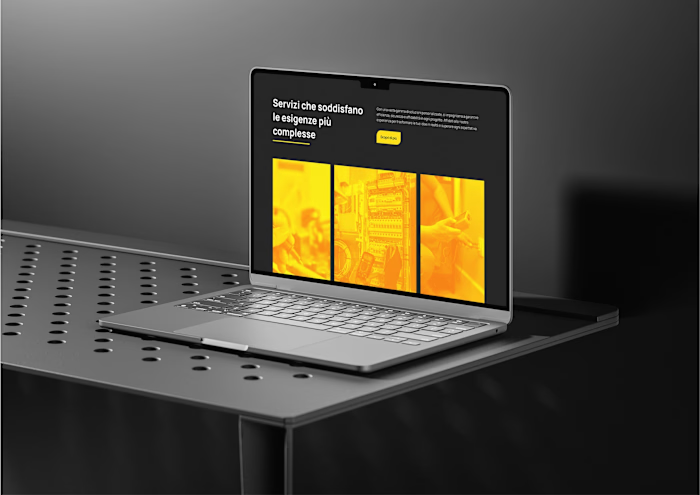
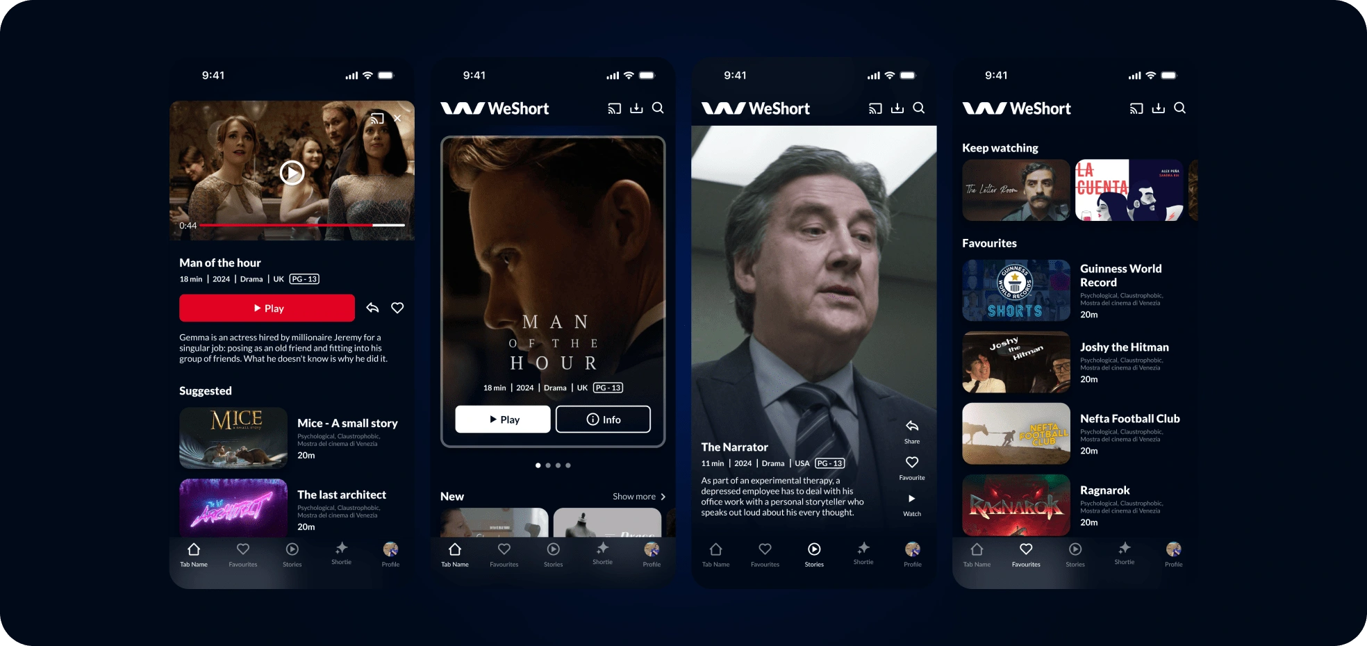
The redesigned WeShort app featured a simplified, one-step registration process that aligned perfectly with user expectations. By minimizing the amount of information required upfront, users could quickly access the platform and explore its features before subscribing. The updated interface was not only more user-friendly but also reflected a cohesive brand identity with a professional, modern look.
Like this project
Posted Oct 7, 2024
UI design for a multi-device streaming platform.
Likes
0
Views
3
Clients
WeShort

