Elettrotek: Powering Innovation
Valerio Colazingari
Elettrotek
Logo, Brand Identity, Web Design
Elettrotek specializes in consulting, designing, and implementing electrical, electronic, and industrial automation systems.
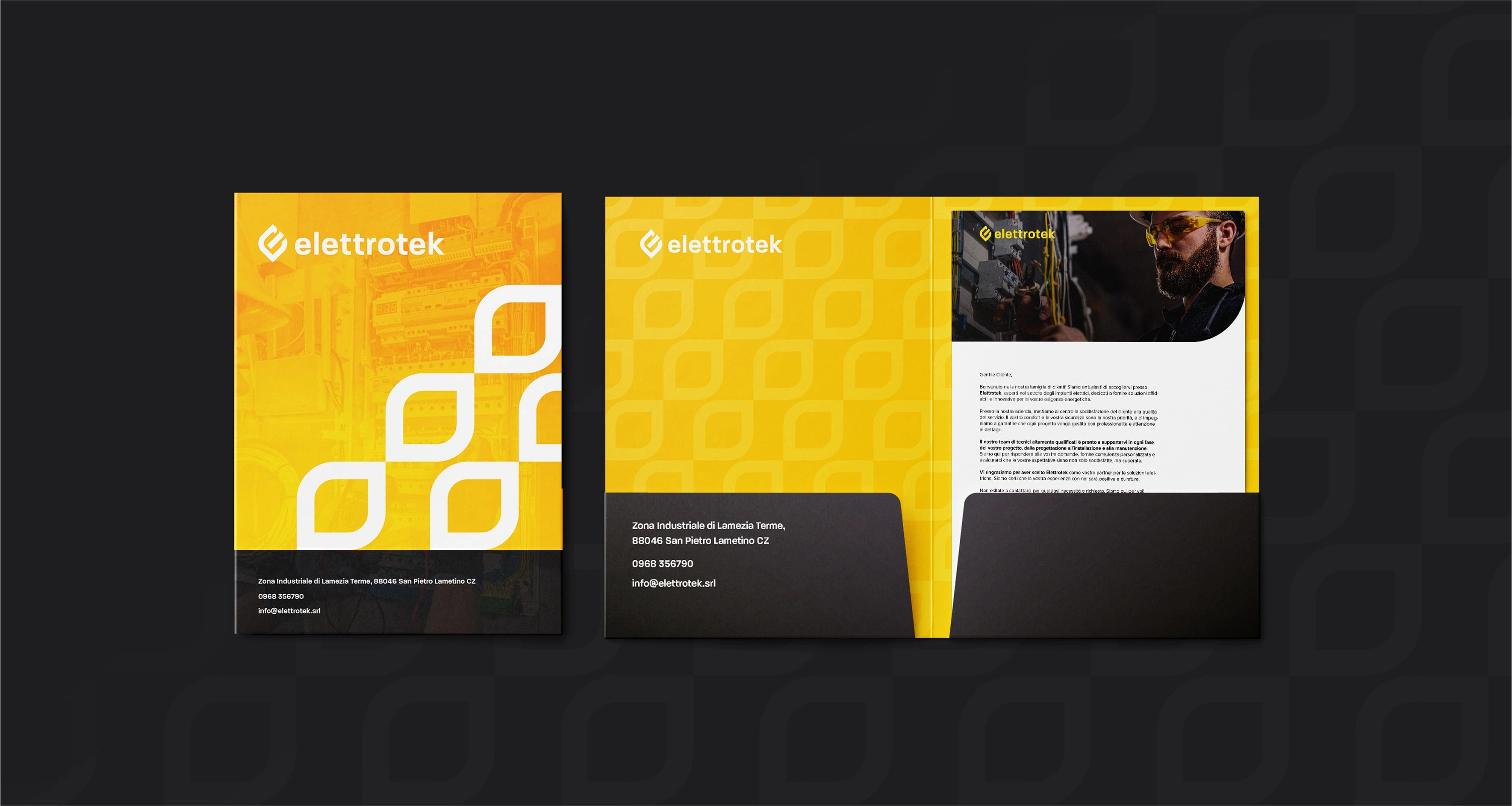
My task was to create a completely new brand identity, moving away from their old logo to establish a more professional and competitive image that reflects their expertise.


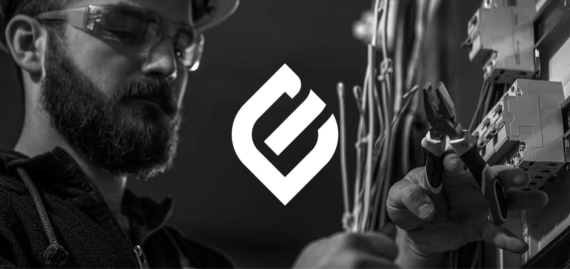
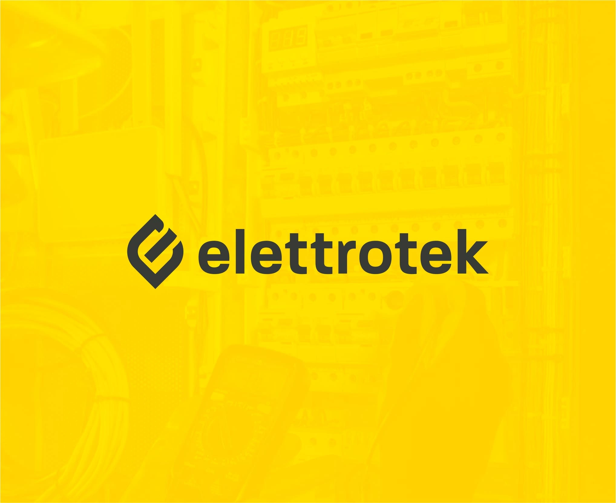
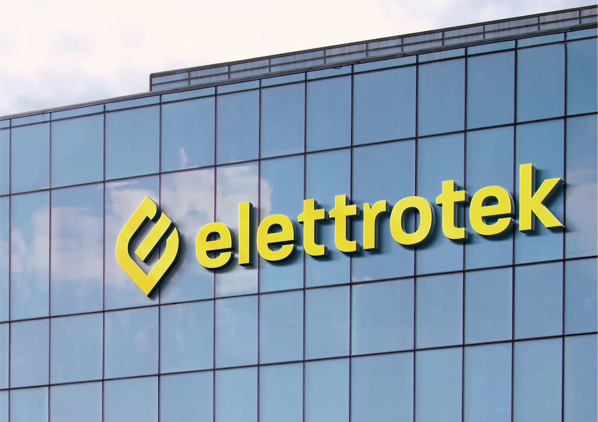
The new logo integrates elements that highlight both the company's services and values. A leaf-shaped pictogram symbolizes sustainability and renewable energy while also forming the letter "E," linking directly to the brand name. The divided central line of the "E" references the power on/off symbol, reinforcing Elettrotek’s connection to electricity and commitment to innovation.
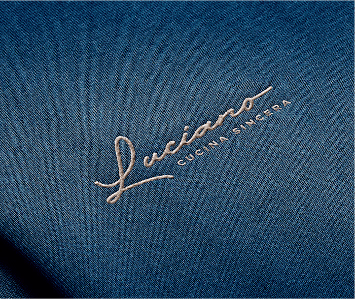
The logo features a handwritten font, giving a personal touch as if Luciano were signing each dish. The "L" resembles both strands of spaghetti and sea waves, blending culinary craftsmanship with elegance. A small drop over the “i” adds a final flourish, symbolizing a drop of sauce, wine, or any essential ingredient, reinforcing the hands-on authenticity of the restaurant.
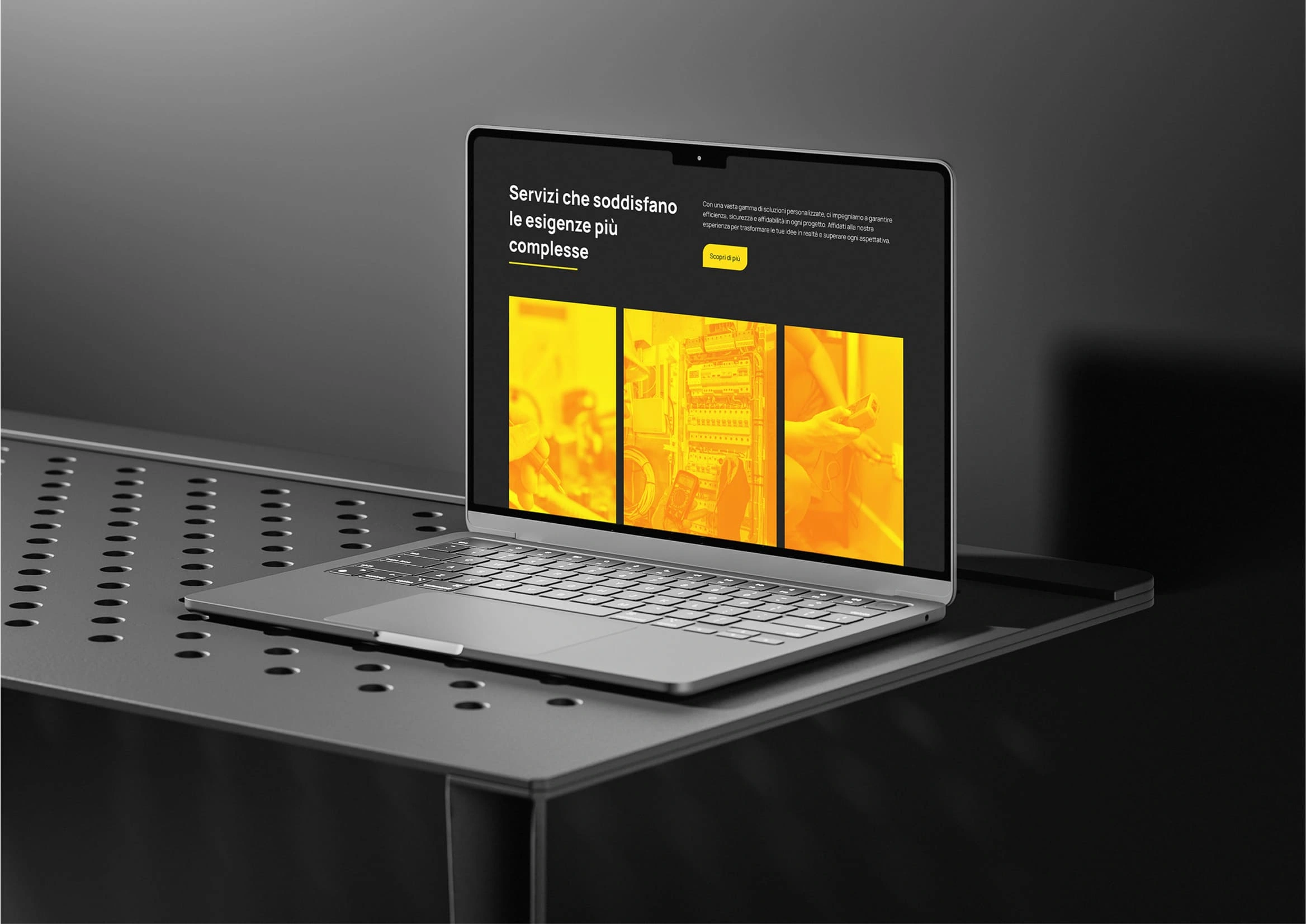
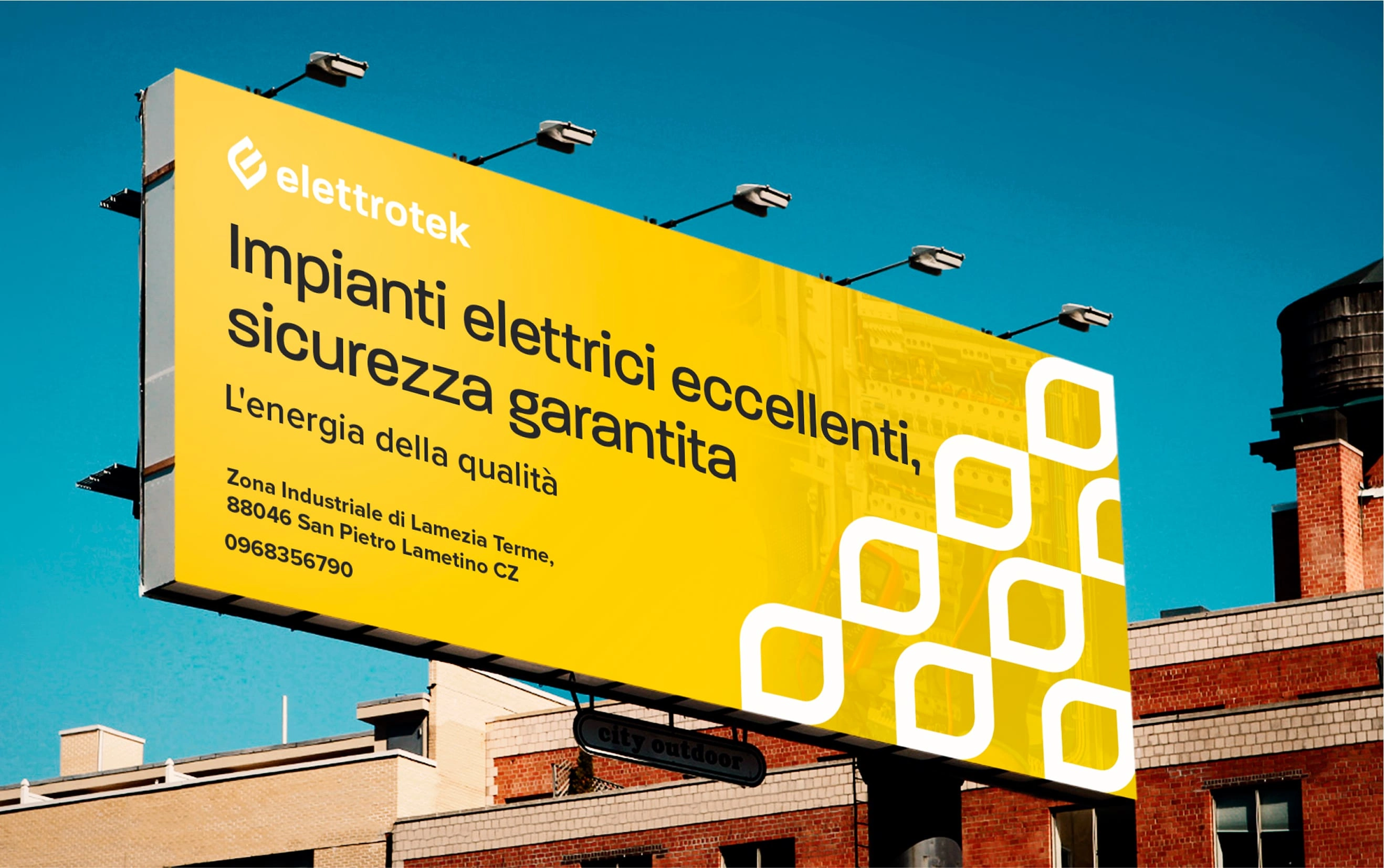
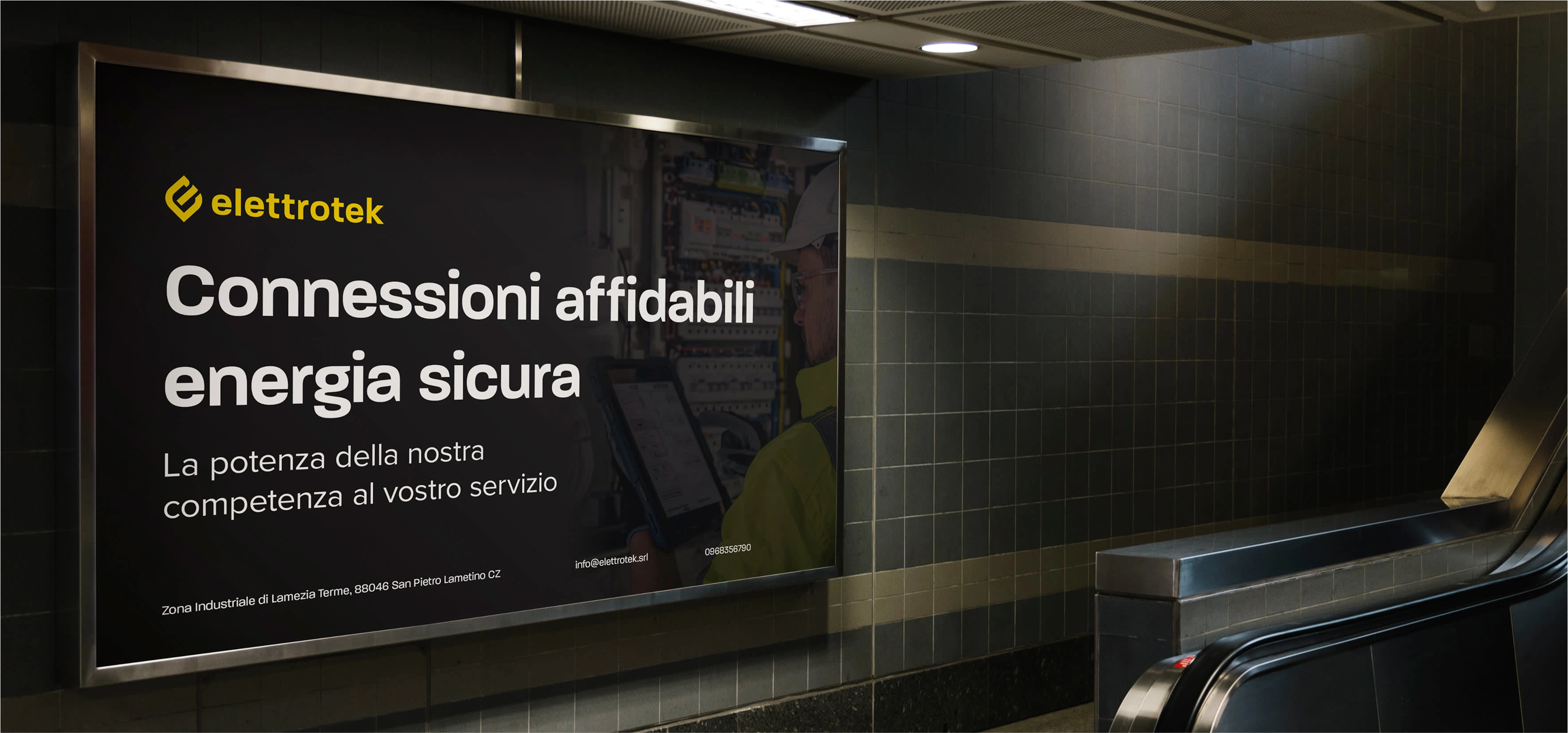
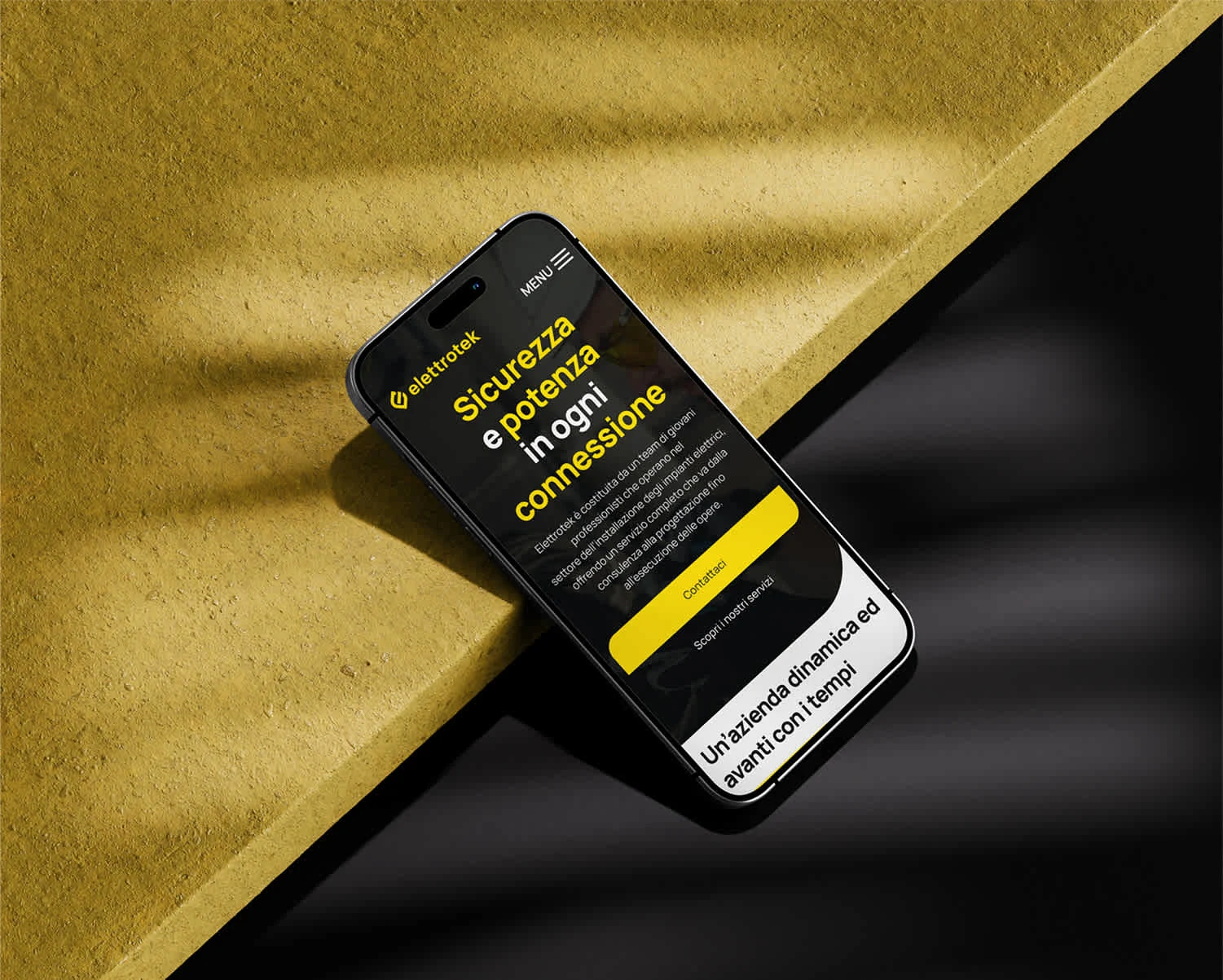
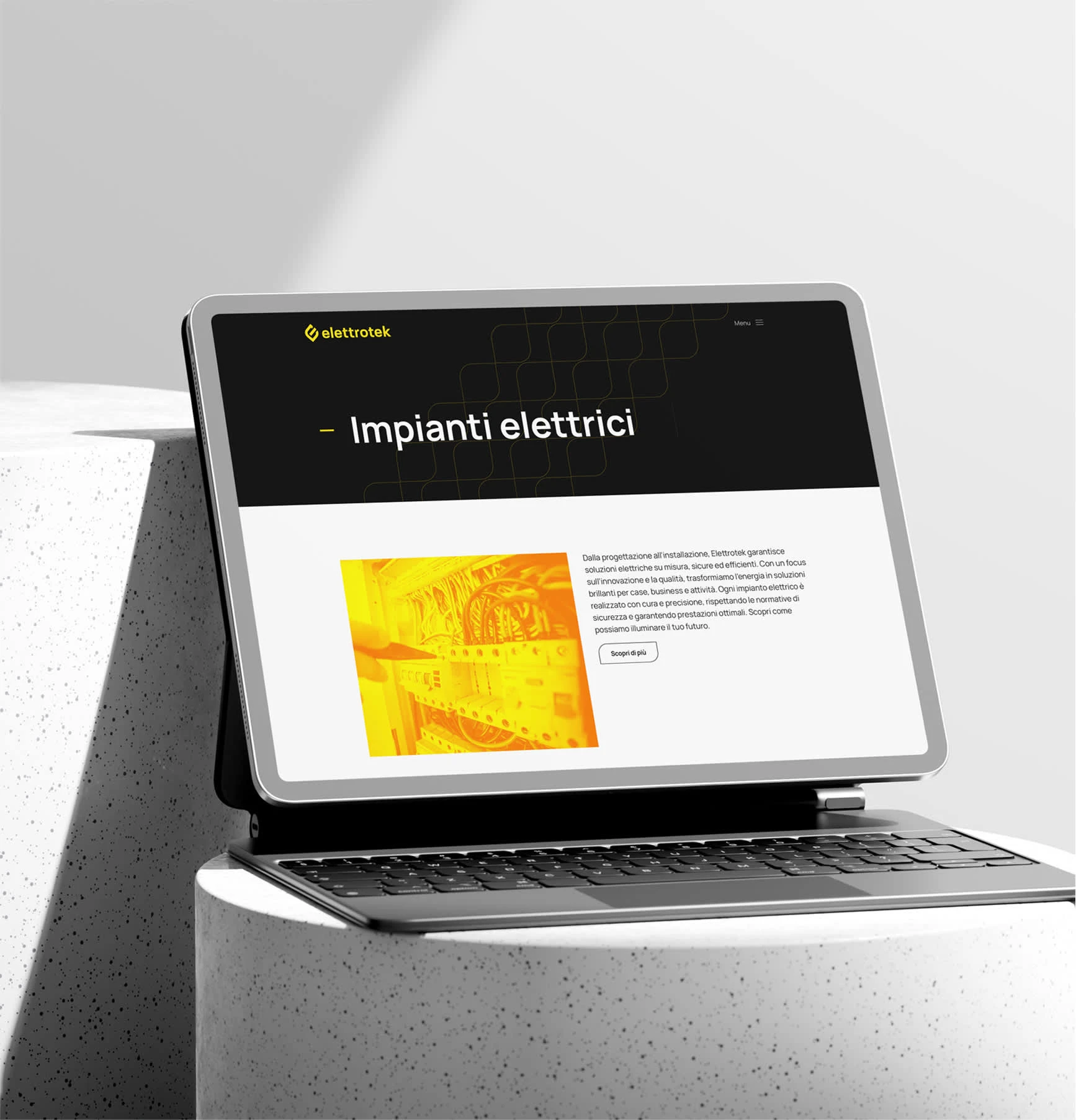
Elettrotek’s previous website lacked a strong identity, making it hard to stand out. The redesign aimed to create a clear, professional digital presence that reflects their innovation and expertise.
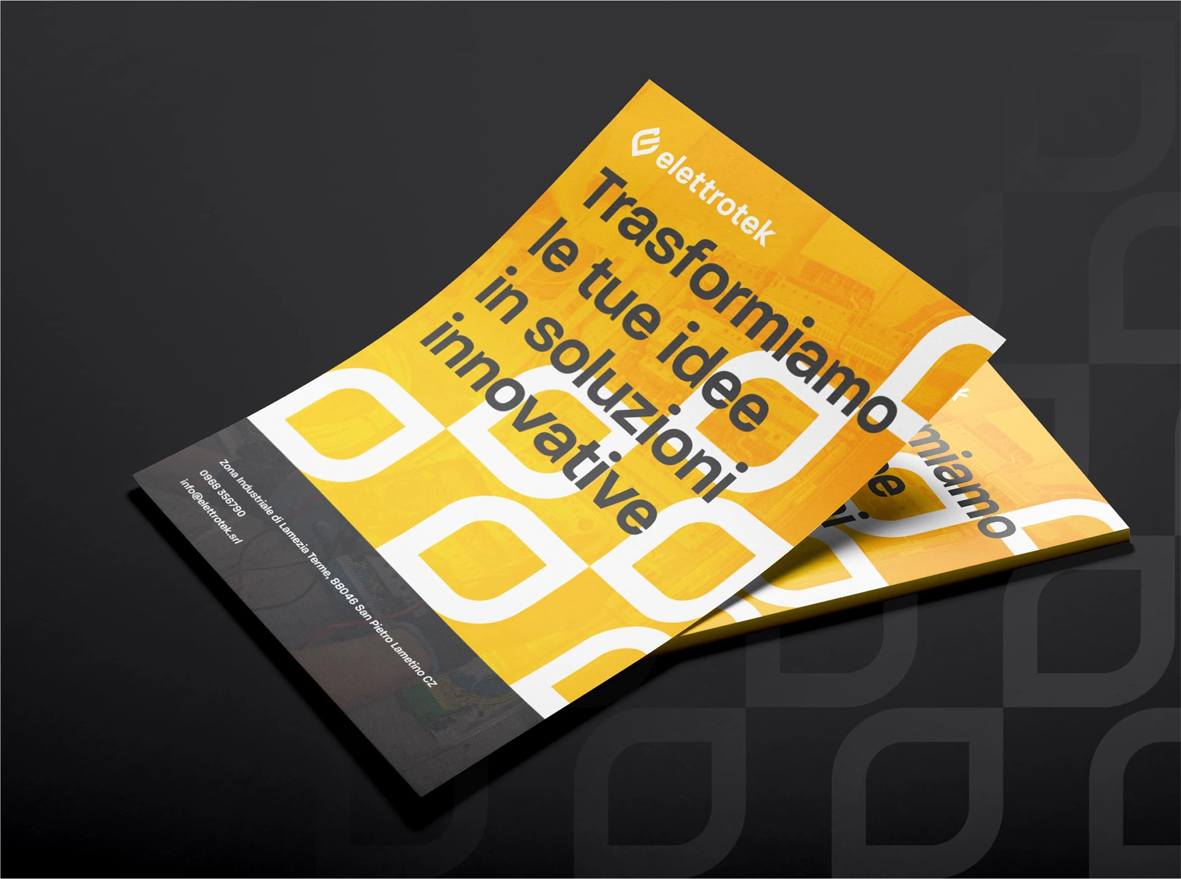
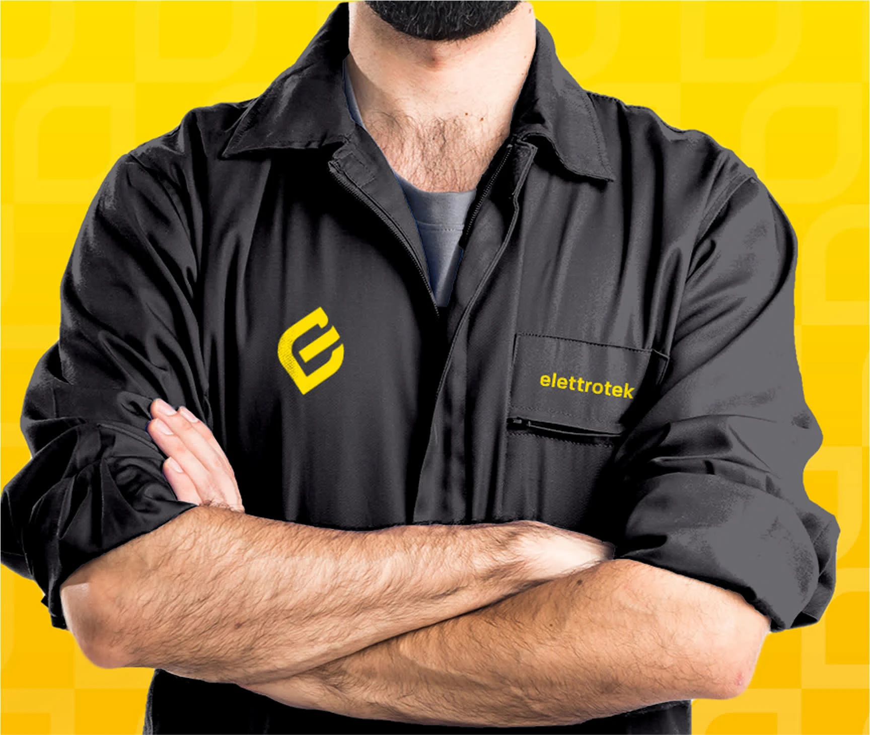
The minimalist design emphasizes clarity, functionality, and consistency, incorporating the new logo, pattern, and color palette for a cohesive and recognizable brand experience.
Like this project
Posted Mar 28, 2025
A new brand identity and website with a bold logo featuring an "E" shaped leaf and power symbol, reflecting sustainability, expertise, and clarity online.
Likes
0
Views
5
Timeline
Oct 2, 2023 - Oct 25, 2023